


Tío Pepe “De ida y vuelta” – Estrella de los Mares
A contemporary interpretation of historical Sherry identity
The visual identity of Tío Pepe Estrella de los Mares is conceived as a graphic system rooted in heritage, not as a nostalgic revival. The project translates historical references into a contemporary packaging language while preserving the authority and recognisability of the Tío Pepe universe.
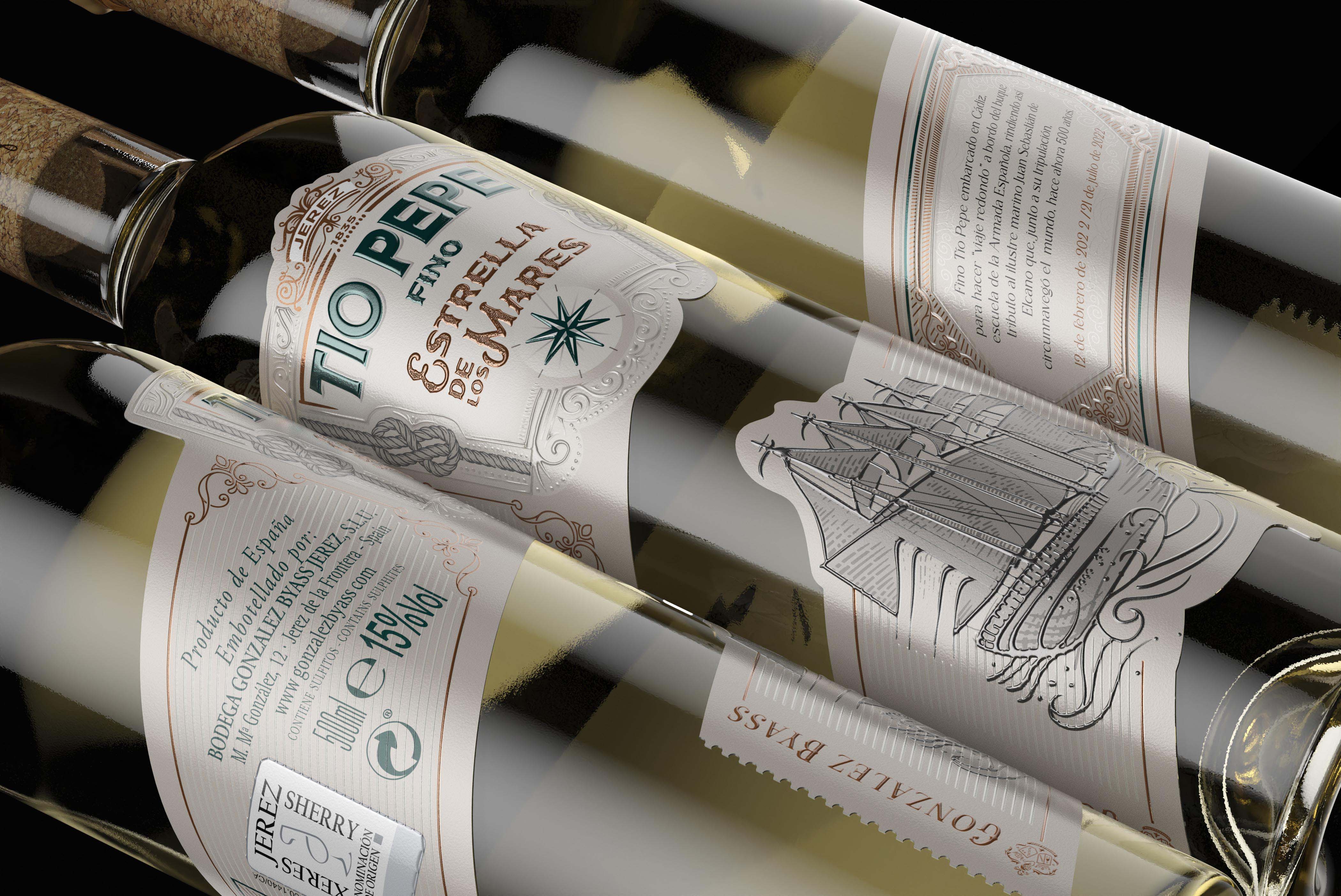
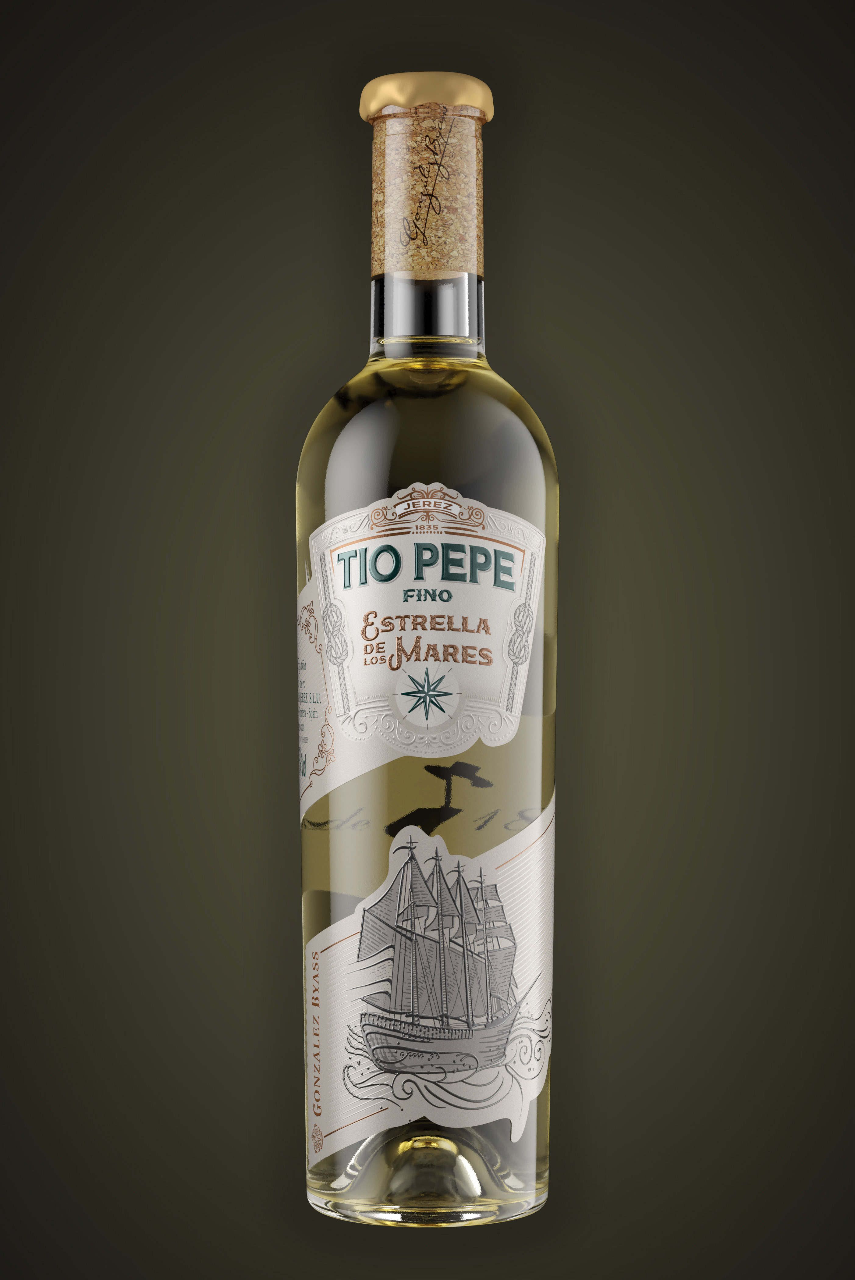
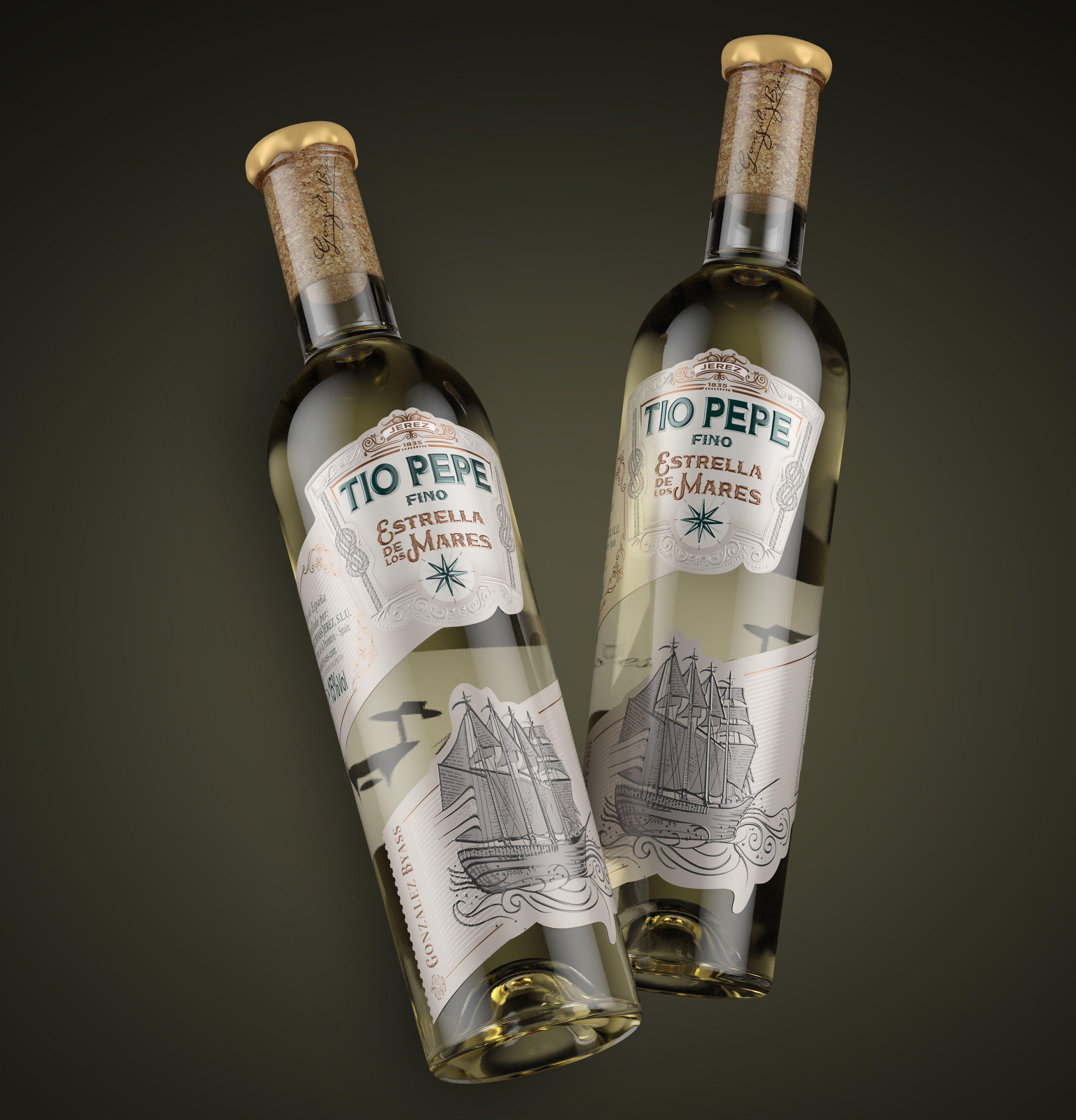
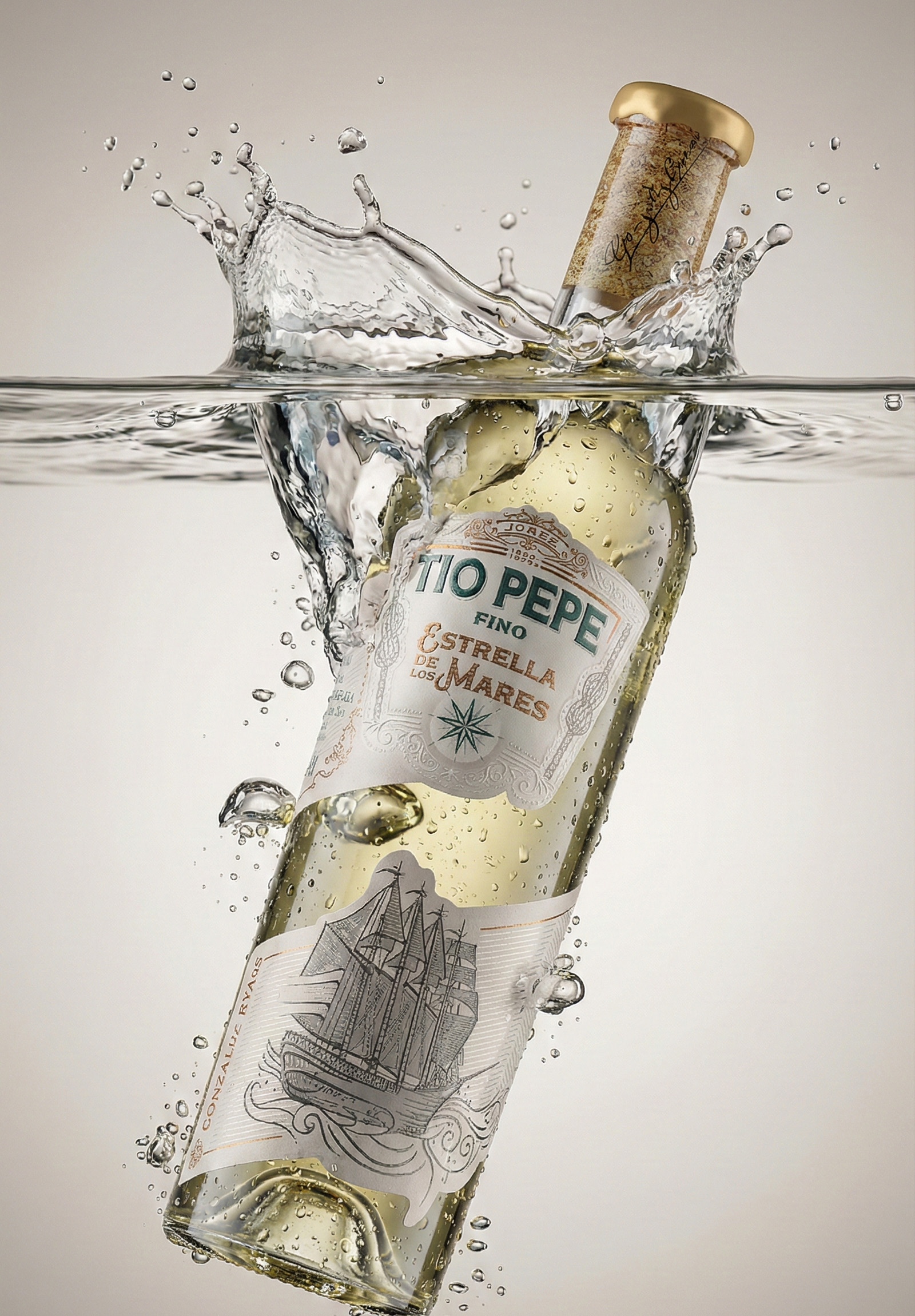
At the core of the design lies the illustration of the ship, developed with a technical, engraved-style approach. Rather than functioning as decoration, the illustration operates as a narrative device, referencing maritime trade routes and the cultural exchange that historically shaped Sherry wines. Its restrained line work reinforces authenticity and time, avoiding anecdotal or illustrative excess.
The curved label architecture plays a fundamental role in the system. Cartouches, frames and flowing contours echo traditional Jerez label construction, adapting organically to the bottle’s volume. This curvature ensures visual continuity and guides the eye naturally across the information hierarchy, reinforcing the sense of fluidity and movement inherent to the concept of “ida y vuelta”.
Typographically, the design balances brand permanence and editorial clarity. The established Tío Pepe logotype remains untouched, acting as an anchor of identity, while secondary typefaces are organised with precise hierarchy to support legibility and rhythm. Typography does not compete with the illustration; it frames and stabilises it within the system.
A defining aspect of the project lies in its revolutionary production technique. The label is produced on metallic polyethylene, enabling a level of material expression unattainable with traditional substrates. Through the use of custom-developed special varnishes and advanced relief printing, the design achieves tactile effects and depth that would otherwise be technically impossible. These finishes are not applied as embellishment, but as an extension of the conceptual narrative: light, reflection and texture interact with the illustration and curves, reinforcing the idea of movement, travel and transformation.
Material and finishing decisions are therefore integral to the design logic. Embossing, selective varnishes and controlled metallic effects create a sensory experience aligned with craftsmanship, innovation and time. The materiality amplifies the graphic structure without overpowering it, ensuring coherence between concept, form and production.
Overall, Estrella de los Mares demonstrates how contemporary wine packaging can engage with history through structure, illustration, system design and advanced production, rather than stylistic imitation. It is a project that understands design as interpretation: respectful of legacy, precise in execution and deliberately timeless.
CREDIT
- Agency/Creative: hugo zapata
- Article Title: Hugo Zapata Reinterprets Sherry Heritage Through Tío Pepe Estrella de los Mares
- Organisation/Entity: Agency
- Project Type: Packaging
- Project Status: Published
- Agency/Creative Country: Spain
- Agency/Creative City: sevilla
- Market Region: Africa, Asia, Europe, Middle East, North America, Oceania, South America, Global
- Project Deliverables: Brand Creation, Brand Design, Packaging Design, Packaging Guidelines, Product Design
- Format: Bottle
- Industry: Food/Beverage
- Keywords: wine, tiopepe, sherry, fino
-
Credits:
design and illustration: hugo zapata


