


The Farm SocietyTM (brand child of Plant Tech) is an agritech company born and bred in Trondheim, Norway. The Farm SocietyTM explores and develops solutions for urban and Controlled Environment Agriculture (CEA), and is dedicated to solving the long transportation problem in farming.
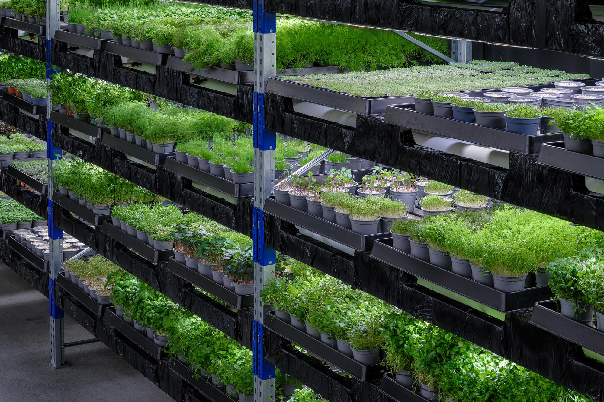
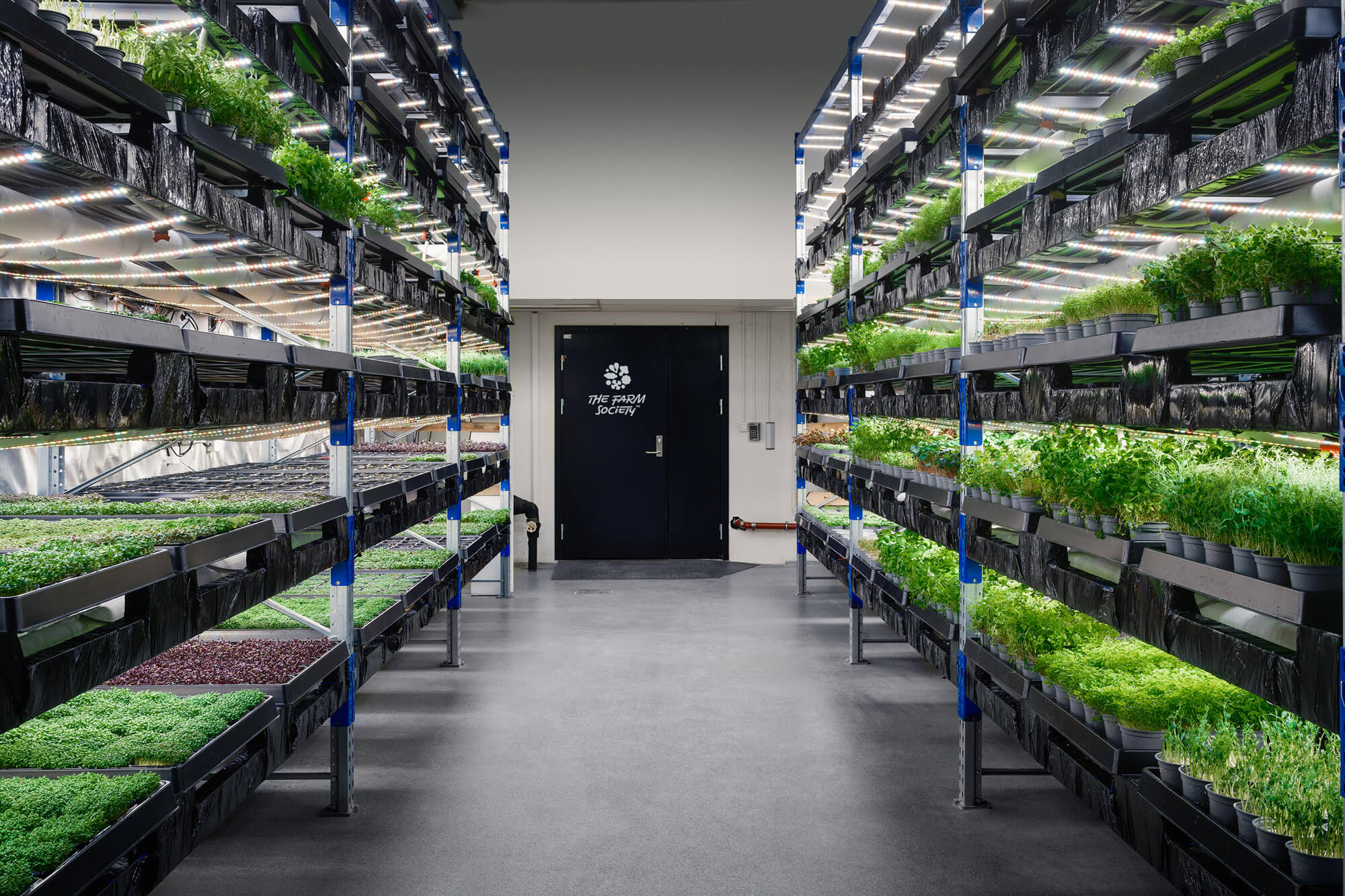
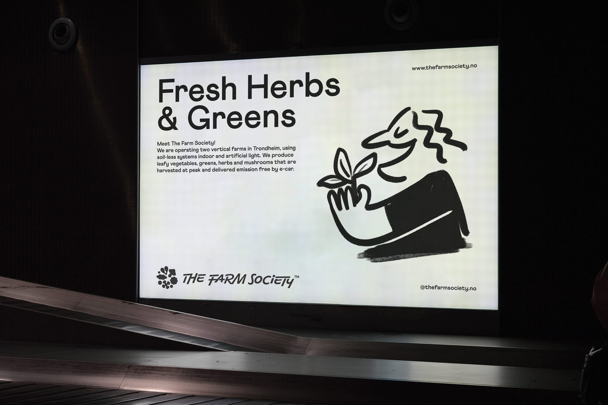
They operate two vertical farms in Trondheim, using soilless systems indoors and artificial light. They produce leafy vegetables, greens, herbs and mushrooms that are harvested at peak and delivered emission free by e-car, currently supplying a number of Trondheim restaurants and businesses. The produce comes pre-cut or in trays and pots that they collect and reuse to minimize waste.
We helped with naming, the visual identity, signage and illustrations by Hugmun founder Maria Mileńko.
We wanted a name that felt bold to match their big ideas and perspectives. It feels like a global name and is a strong hint to the community that works within the farms. The Farm SocietyTM is growing fast, and needed a name to reflect that. Whilst technology plays a huge role in their work, there is also a lot of human touch and care that goes into the growth of their beautiful veggies. Founder, Davor, and his team, have dedicated a huge amount of time into working on this in order to achieve the perfect combination. The team of farmers lovingly care for the plants and that is why the end result is so good. It therefore felt important that the people of the company are honored by the name, as much as the product.
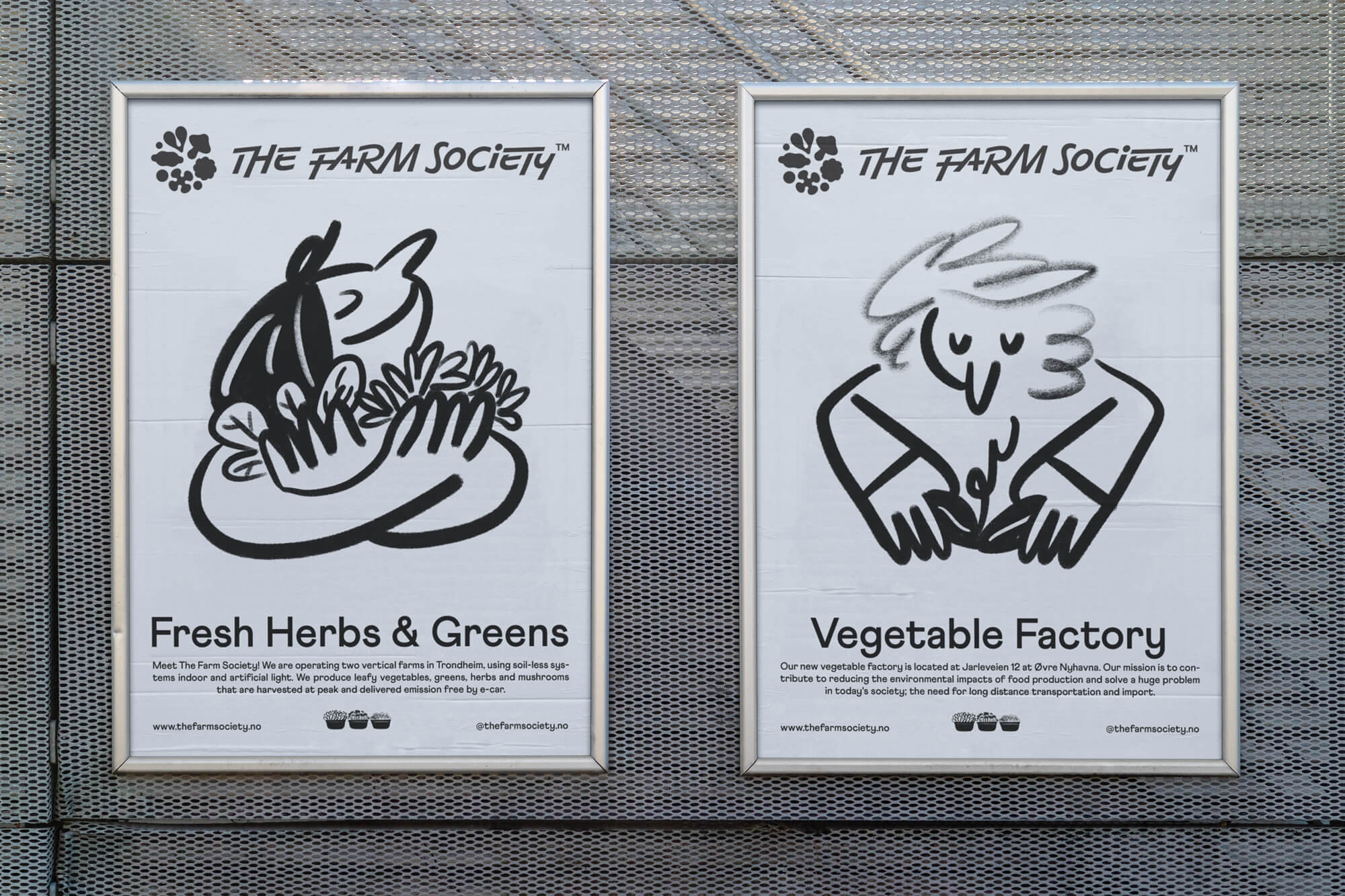
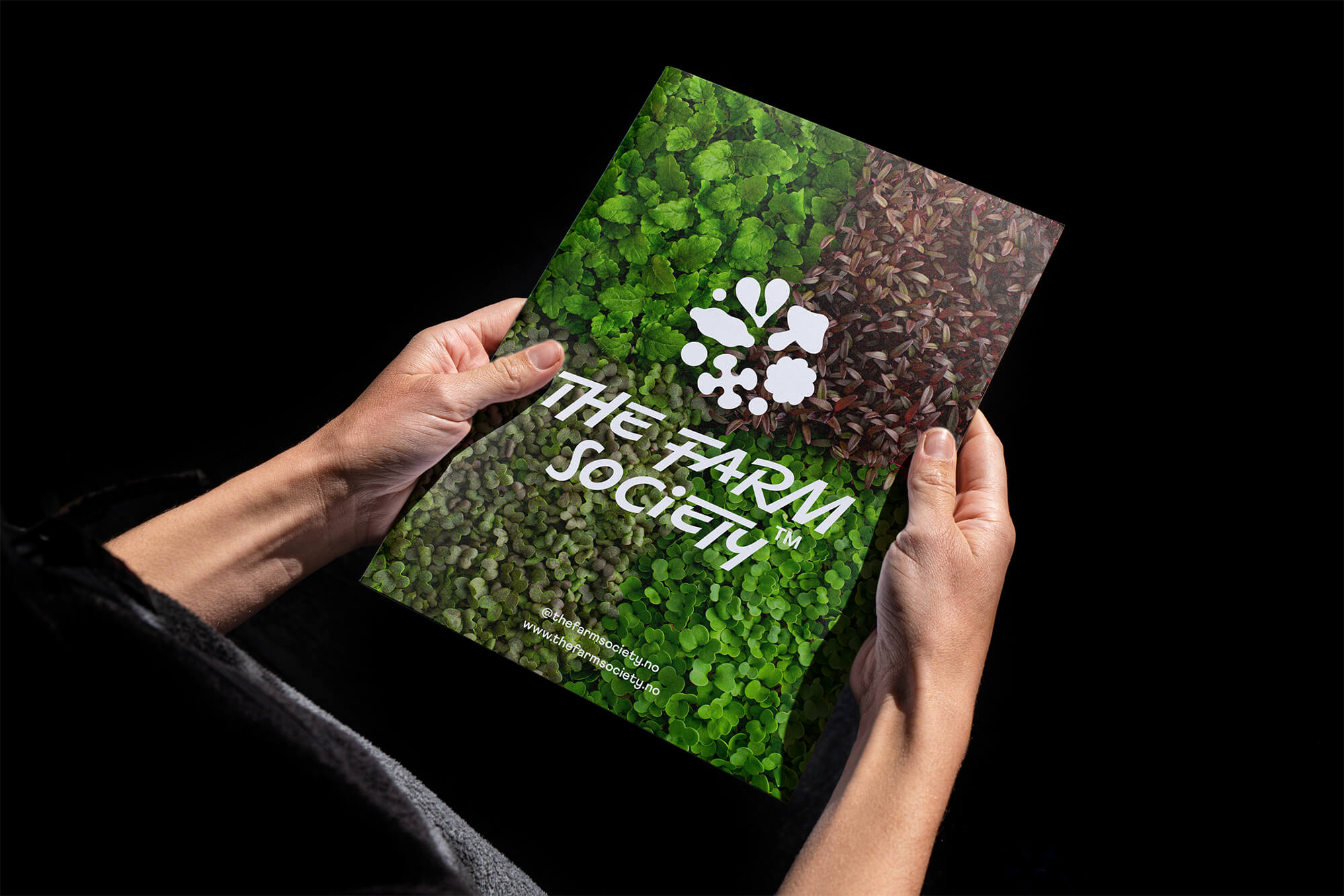
The logotype is Kass, a hand written style typeface, inspired by Hungarian illustrator János Kass. We liked the way each letter works together in a casual and friendly but meaningful way. Accompanying the handwriting is an illustrated icon inspired largely by the shapes of the beautiful veggies, leaves and mushrooms. It is streamlined and kind of geometric, as it occurs in nature.
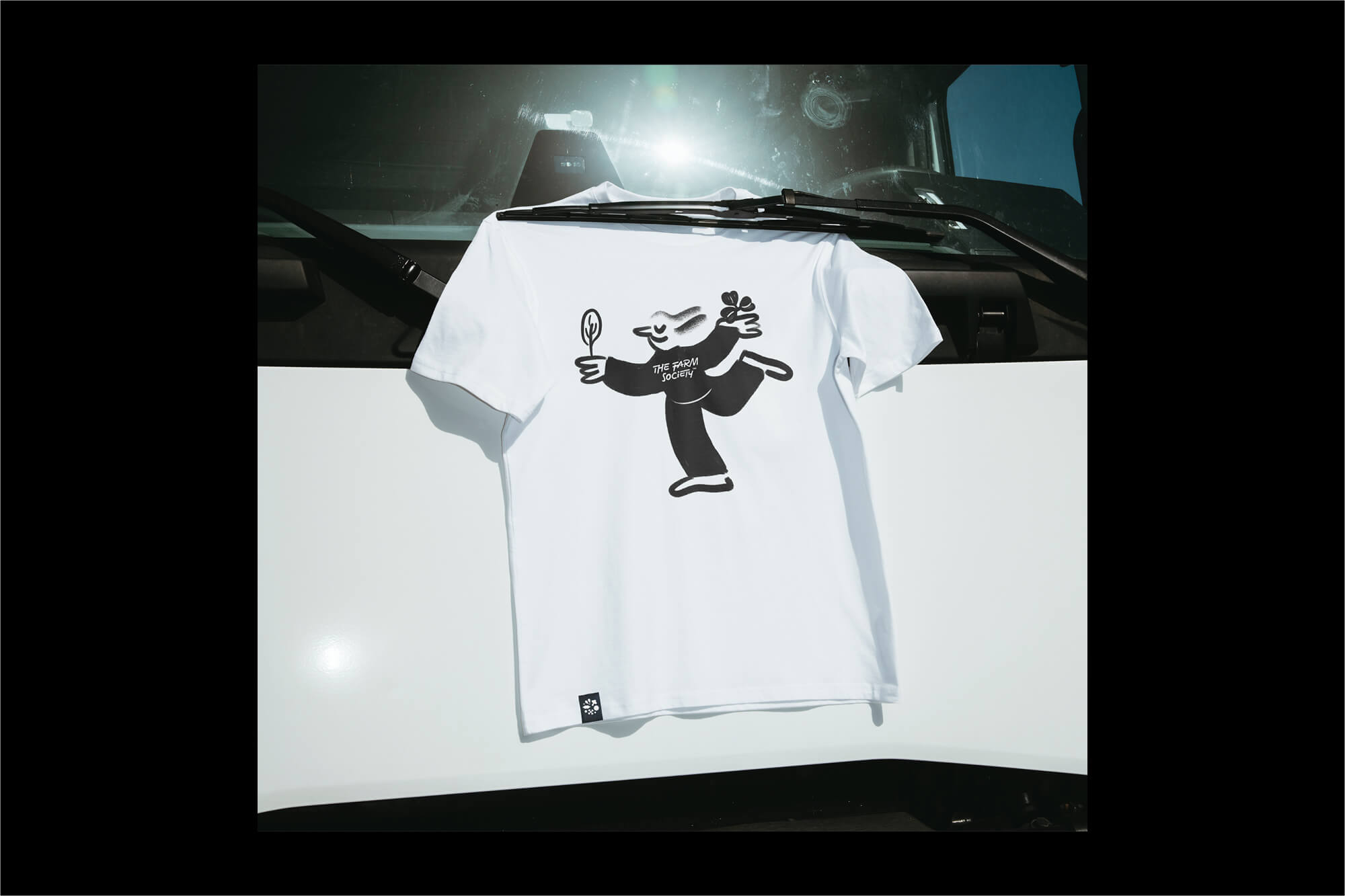
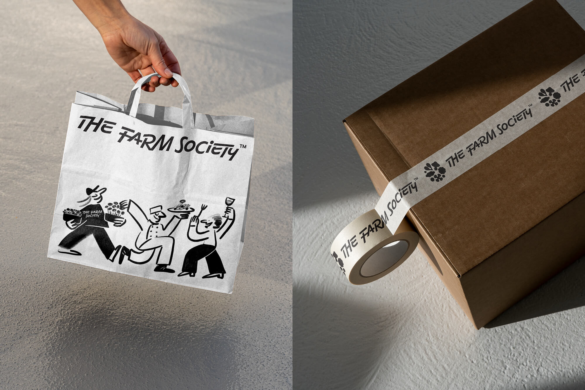
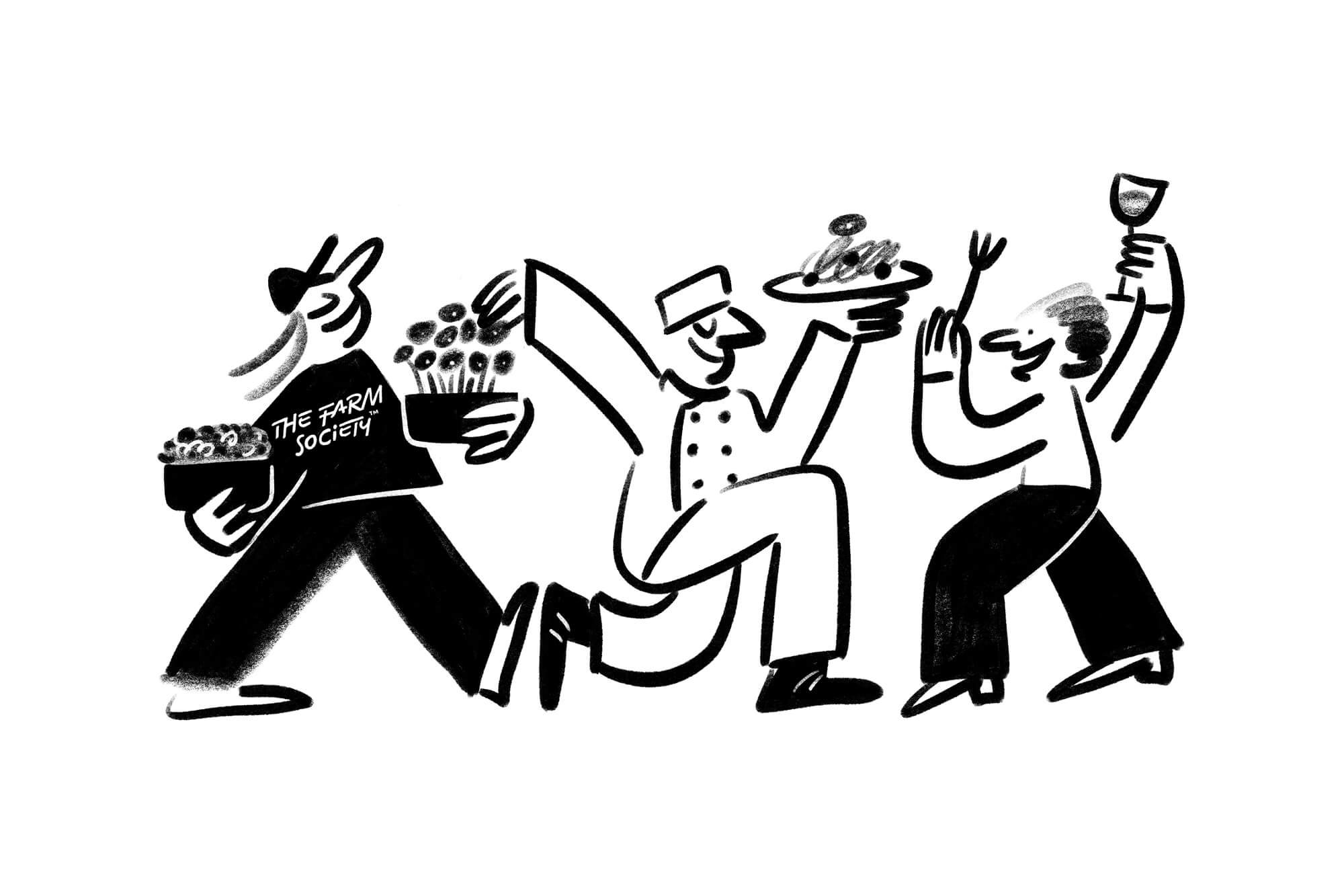
The brand illustrations help to tell the story behind the people at work and the beautiful herbs and leafy vegetables. They are a great tool for showing the journey. For example from the farm, to the restaurant, to the consumer. The hand drawn casual style feels friendly, like the society of farmers.
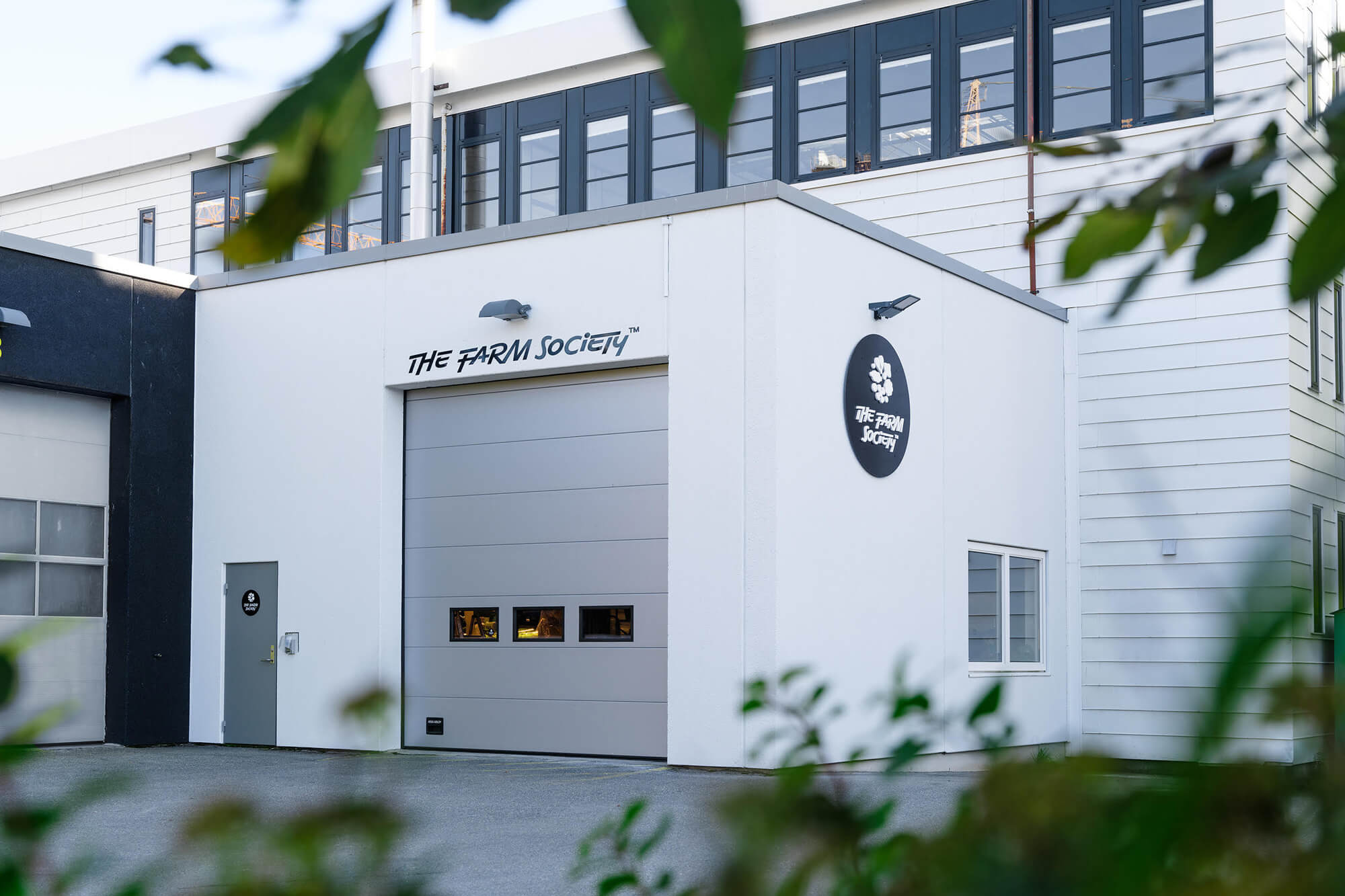
The photography by Ole Ekker is bright, lively and professional. Ranging across interiors, technical elements, the beautiful plants and genuine shots of the people and hands behind TFS.
CREDIT
- Agency/Creative: Hugmun
- Article Title: Hugmun Design for The Farm Society
- Organisation/Entity: Agency
- Project Type: Identity
- Project Status: Published
- Agency/Creative Country: Denmark
- Agency/Creative City: Copenhagen
- Market Region: Europe
- Project Deliverables: Animation, Brand Creation, Brand Design, Brand Identity, Brand Mark, Brand Naming, Copywriting, Graphic Design, Icon Design, Illustration, Photography, Poster Design
- Industry: Agriculture
- Keywords: Branding, Naming, Visual Identity, Photography, Illustration, Agriculture, Urban Farming, Scandinavia, Norway, Denmark, Brand Creation, Graphic Design, Logo, Typography
-
Credits:
Art direction & branding: Hugmun
Illustration: Maria Mileńko
Photography: Ole Ekker
Animation: Witek Pietrucha
Strategist: Cathrine Vik-Pedersen


