Neuhaus is a global premium chocolate brand. By covering bitter tasting medicines with sweet chocolate out of love for his customers, Jean Neuhaus laid out the groundwork for the DNA of the company named after him: the gift of caring. People give to show they care. So did Jean Neuhaus back in 1857. So rather than focussing on ‘what you give’ in their communication, Neuhaus aims the attention at ‘why you give it’.
For Neuhaus’ seasonal Valentine’s collection, we interpreted ‘the gift of caring’ in a more personal, amorous way. Staying clear of stereotypical love cues like hearts, teddy bears, roses, … we found our inspiration in a more intimate, slow expression of caring: the love letter. You could call us old-school and slightly cheesy at this point. You’d be totally right. But still, it’s a bold, yet relevant choice in today’s fast-paced, digital world. One that perfectly supports Neuhaus aspiration to nurture profound human connections through chocolate delicacies either gifted or savoured together.
But that wasn’t the only reason why the idea of a love letter was so relevant for Neuhaus. It allowed us to capture the true intention of Valentine’s Day in the packaging design. Being: you want to express how much you love the other person. The Love Letter Box does just that. Here’s how.
Love is in the details
When a product needs to represent your expression of affection for someone, the art is in the detail. It’s the attention that goes into the detail of the design, the textures, choice of materials, finishing, … combined, that makes you feel cared for when you receive it as a gift. That’s the case for all Neuhaus’ packaging, but for the seasonal Valentine’s collection, we expressed that emotion in a more personal, intimate way. The idea of a love letter and what it stands for was translated in the design on multiple levels.
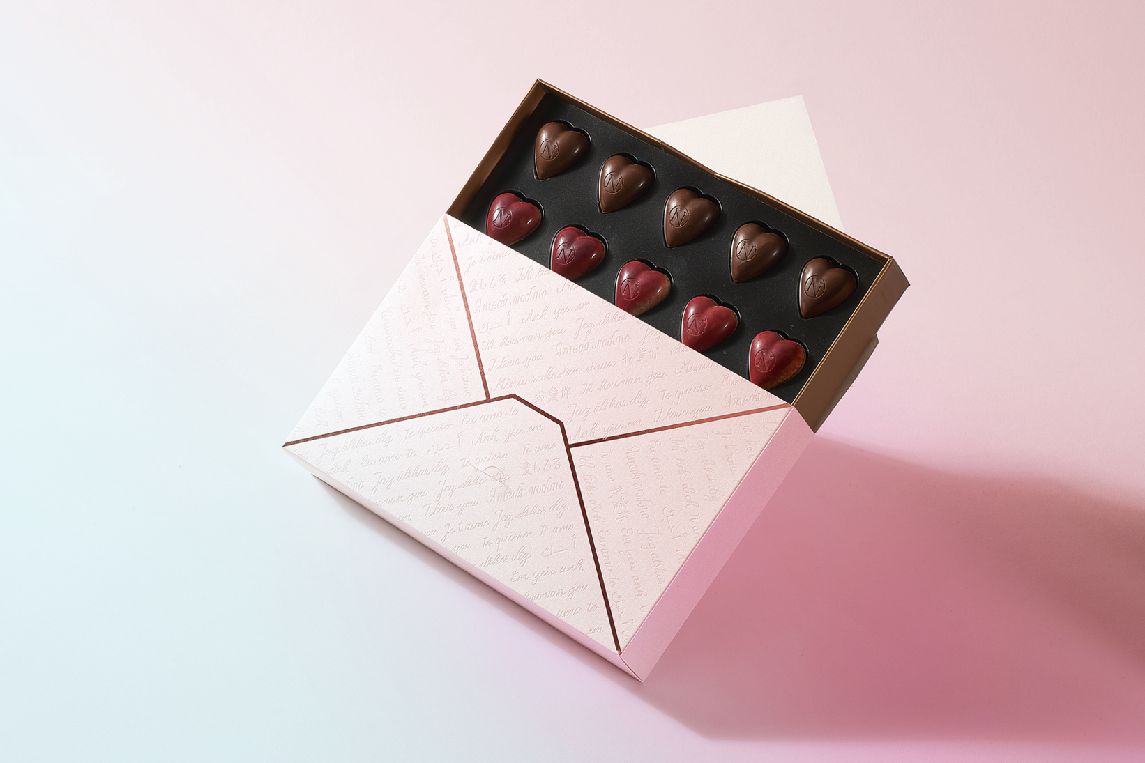
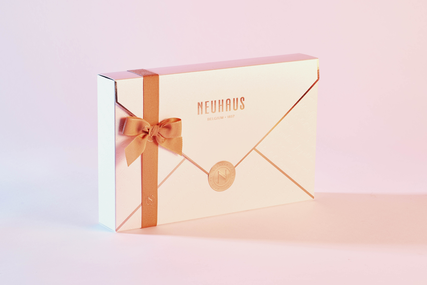
The shape of the packaging resembles that of a traditional envelope typically used for sending love letters. The copper ribbon is used to wrap it, which automatically turns it into a gift. Subconsciously it marks the beginning of an unboxing ritual which naturally evokes a feeling of excitement in people.
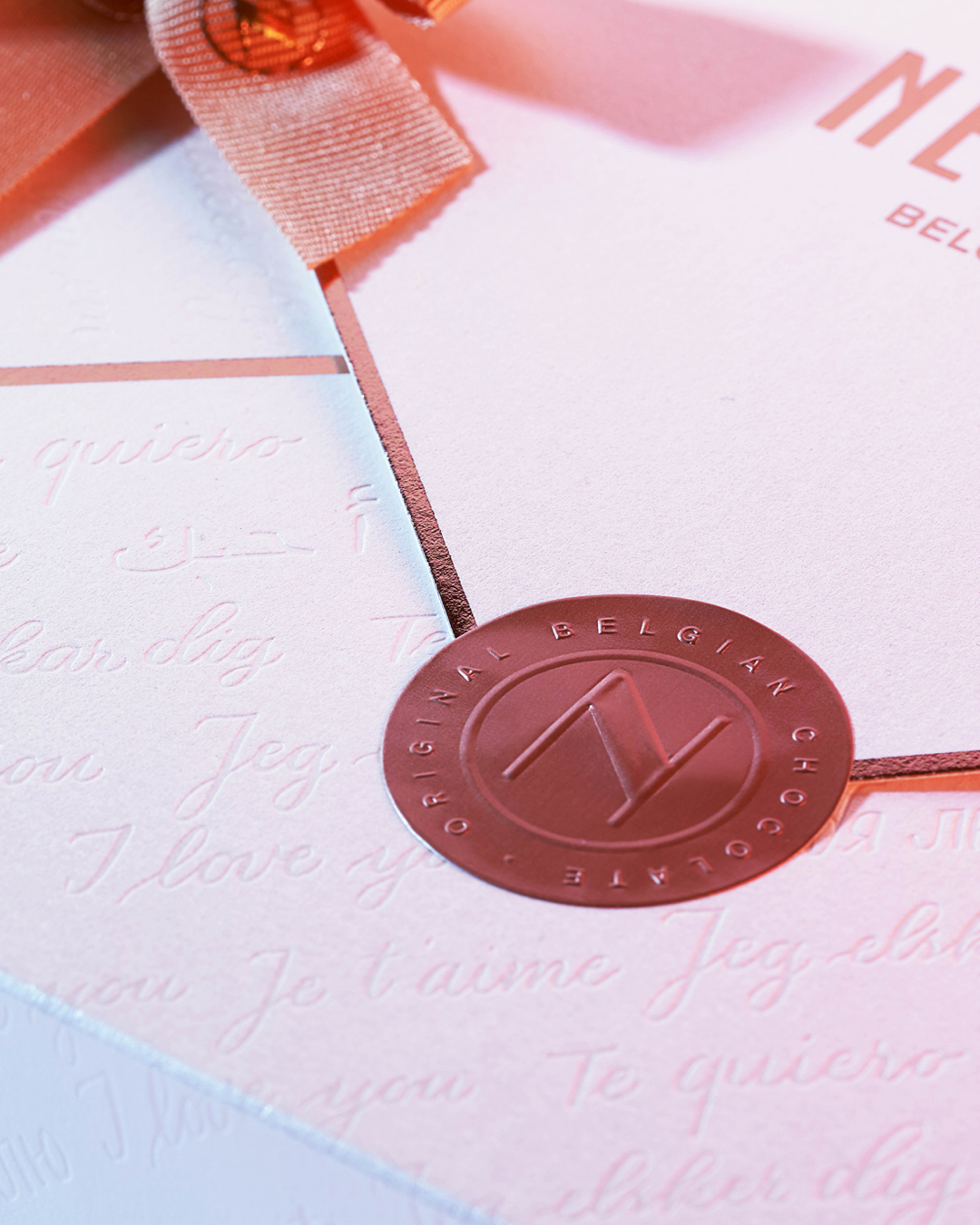
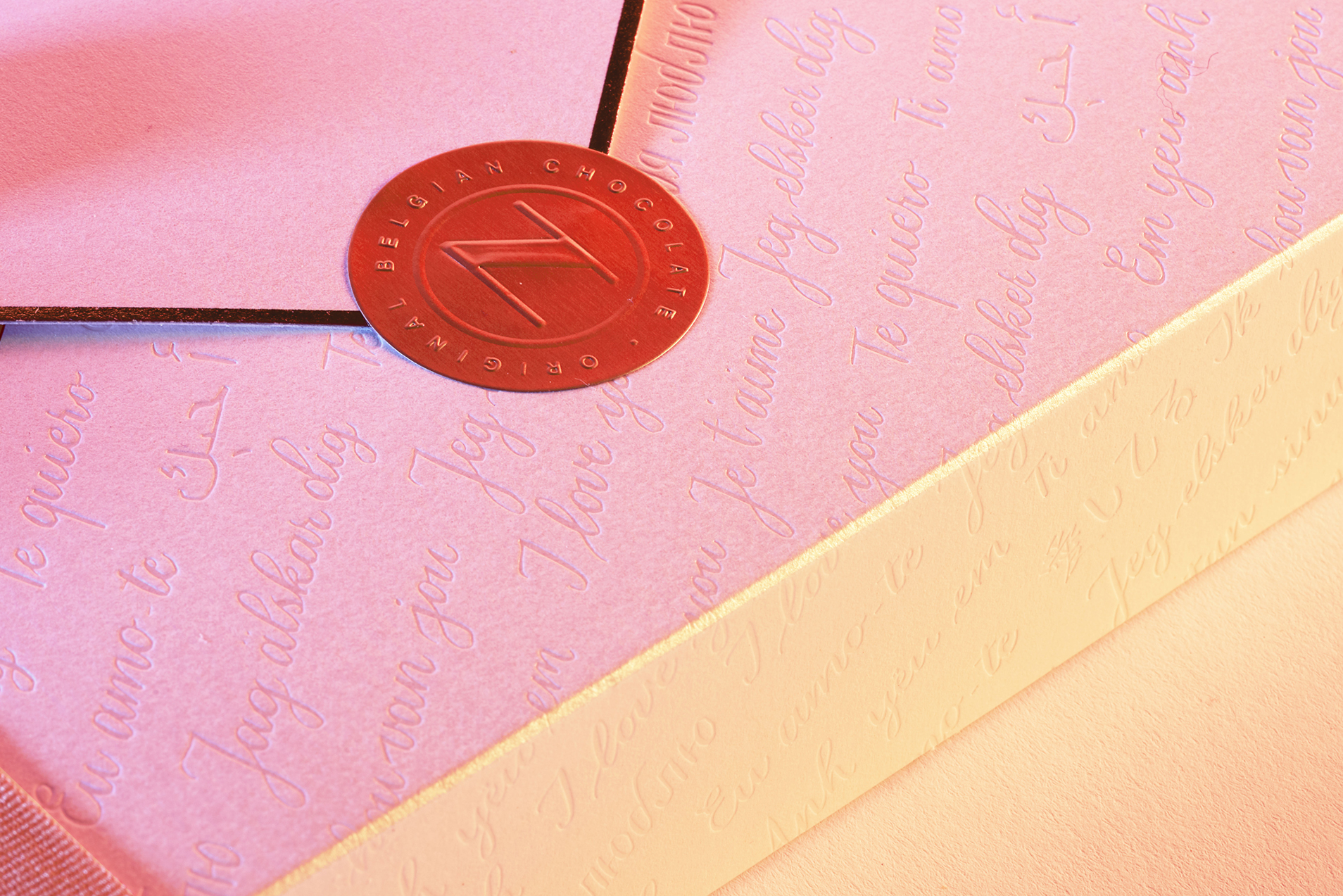
The packaging was produced in a pearlescent paper making it feel light and uplifting, like new-found love, but it also gives it an air of luxury. Neuhaus primary copper colour features on the seal that closes the lid, as well as on the hot foil trimmings.
After you’ve removed the seal, the packaging opens up just like a traditional envelope. You can pull out the tray holding the heart shaped pralines just like a letter from your valentine. It creates an unboxing ritual unmistakably linked to Valentine.
An analog statement in digital times
The unboxing ritual is interwoven with bits of storytelling, articulated in words as well as design elements. For the seasonal collections the subject of the storytelling shifts towards a reinterpretation of the season’s main sentiment through the lens of ‘the gift of caring’. It enables people to make an emotional connection to the seasonal products.
Like its traditional counterpart that was meticulously written by hand, the Love Letter box features hand lettering. The words ‘I love you’ were handwritten in multiple languages and embossed on the packaging. It adds a subtle layer of messaging addressing an international crowd, which was key for Neuhaus acting in the travel retail market.


CREDIT
- Agency/Creative: WeWantMore
- Article Title: Article: How to Capture Love in a Packaging Design By WeWantMore
- Keywords: Brand Design, Branding, Packaging, Packaging Design, Strategy, Chocolate, Hand Lettering, Premium Chocolate, Valentine, Confectionery


