


Project Overview:
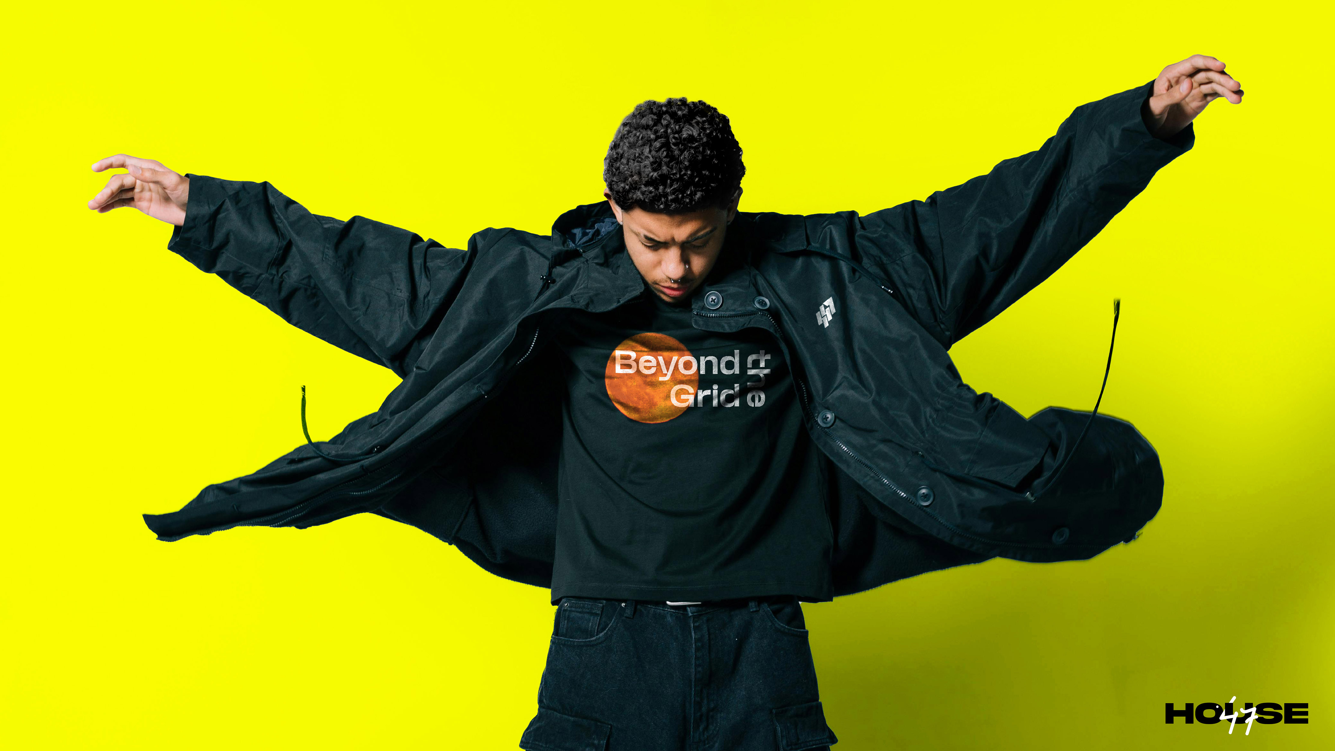
H47 is a street fashion label created for young, free-spirited individuals who challenge societal norms through their style. The brand celebrates rebellion, individuality, and forward-thinking expression, blending the rawness of urban culture with futuristic aesthetics.
The goal was to create a bold and versatile visual identity that could authentically represent the brand’s fearless attitude while standing out in a highly competitive fashion landscape.
Challenge: The client wanted a logo that reflects H47’s rebellious DNA and the modern energy of youth culture. However, the streetwear market is saturated with clichés. The challenge was to craft something timeless yet striking, a visual mark that communicates freedom, confidence, and progression without relying on trends.
Creative Strategy: We approached the design by understanding the psychological and cultural language of Gen Z, a generation driven by authenticity, movement, and visual boldness.
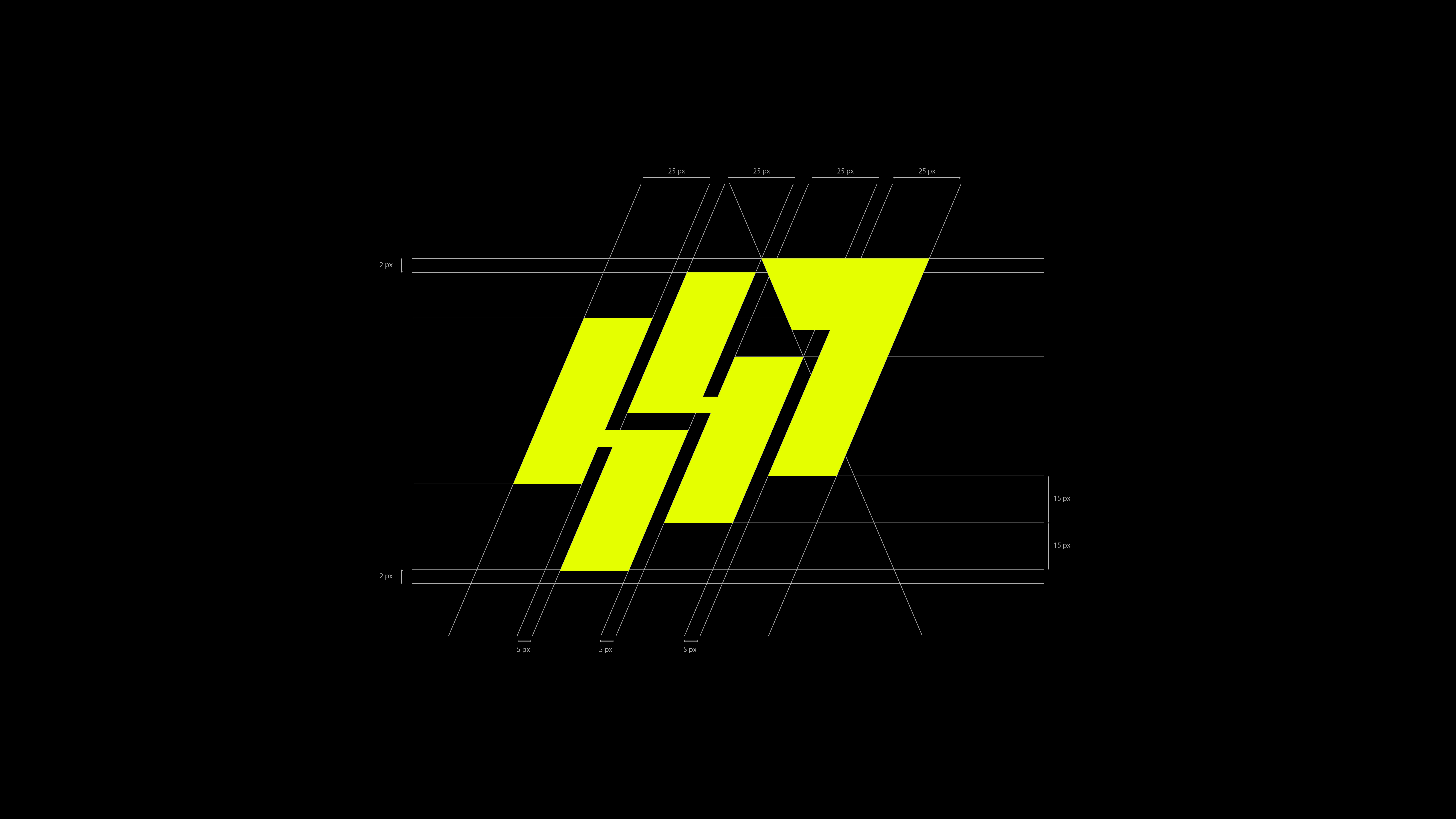
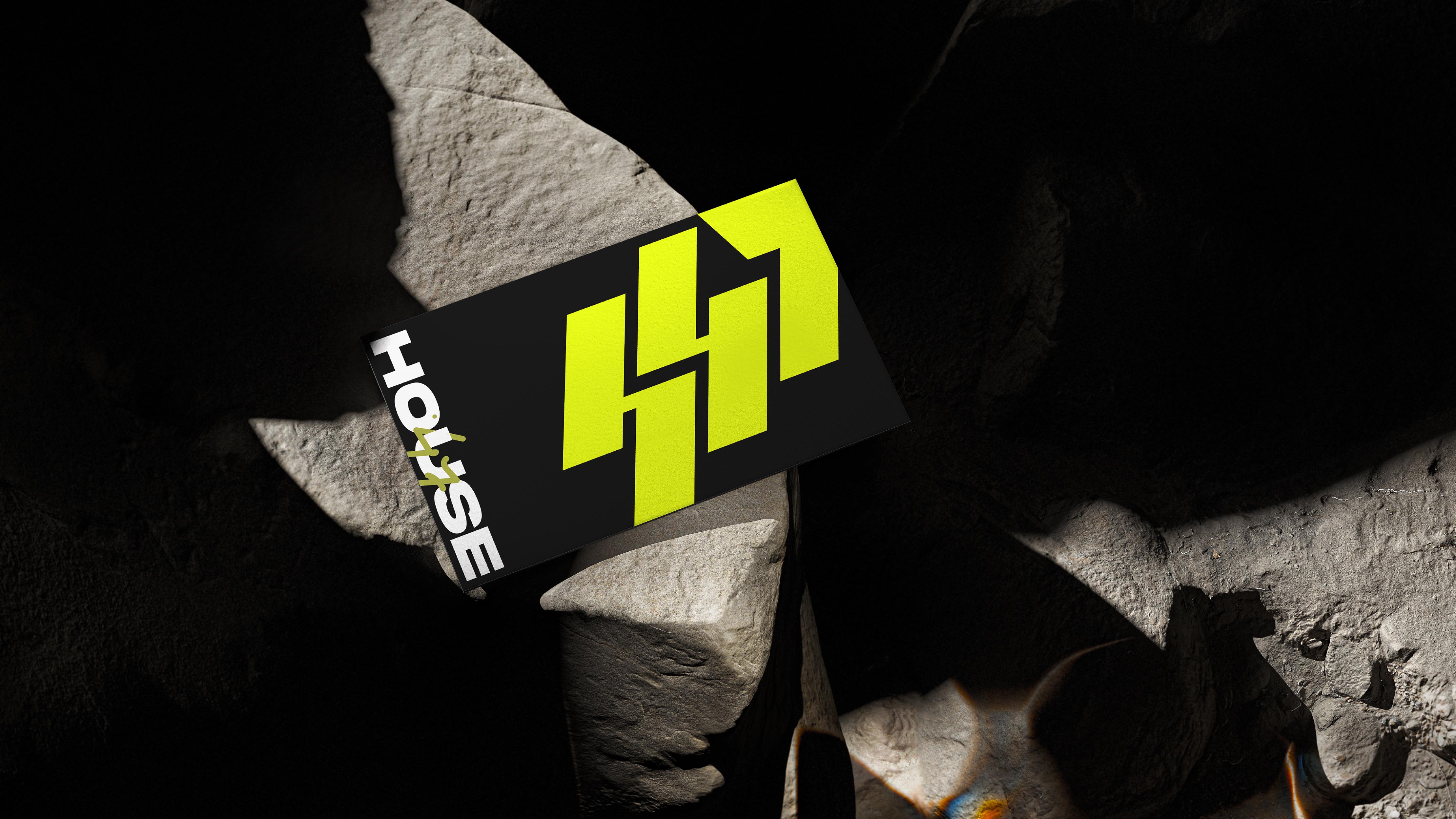
The logo concept merges three ideas:
Growth: expressed through an ascending three-step form.
Stability: built with strong geometric balance and structure.
Rebellion: reflected in its angular cuts and bold silhouette.
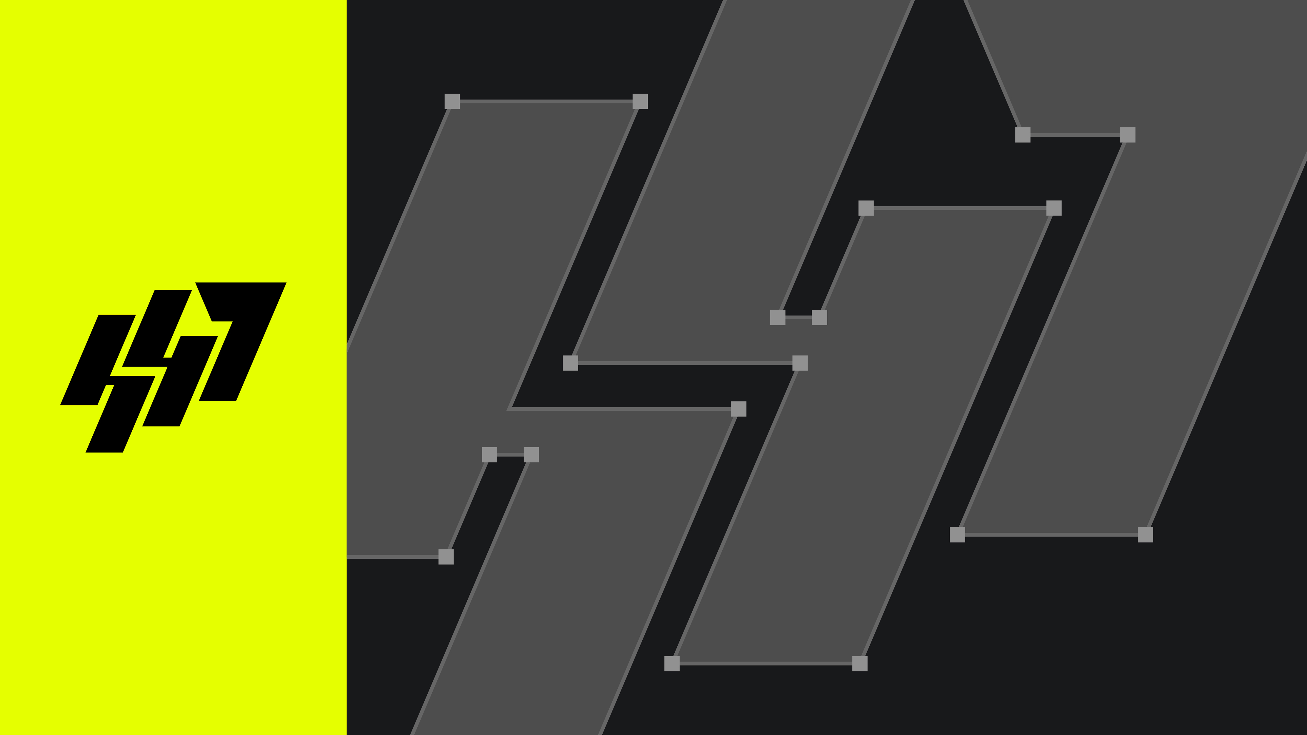
The monogram “H47” was constructed to symbolize upward momentum, a representation of how the brand uplifts individuality.
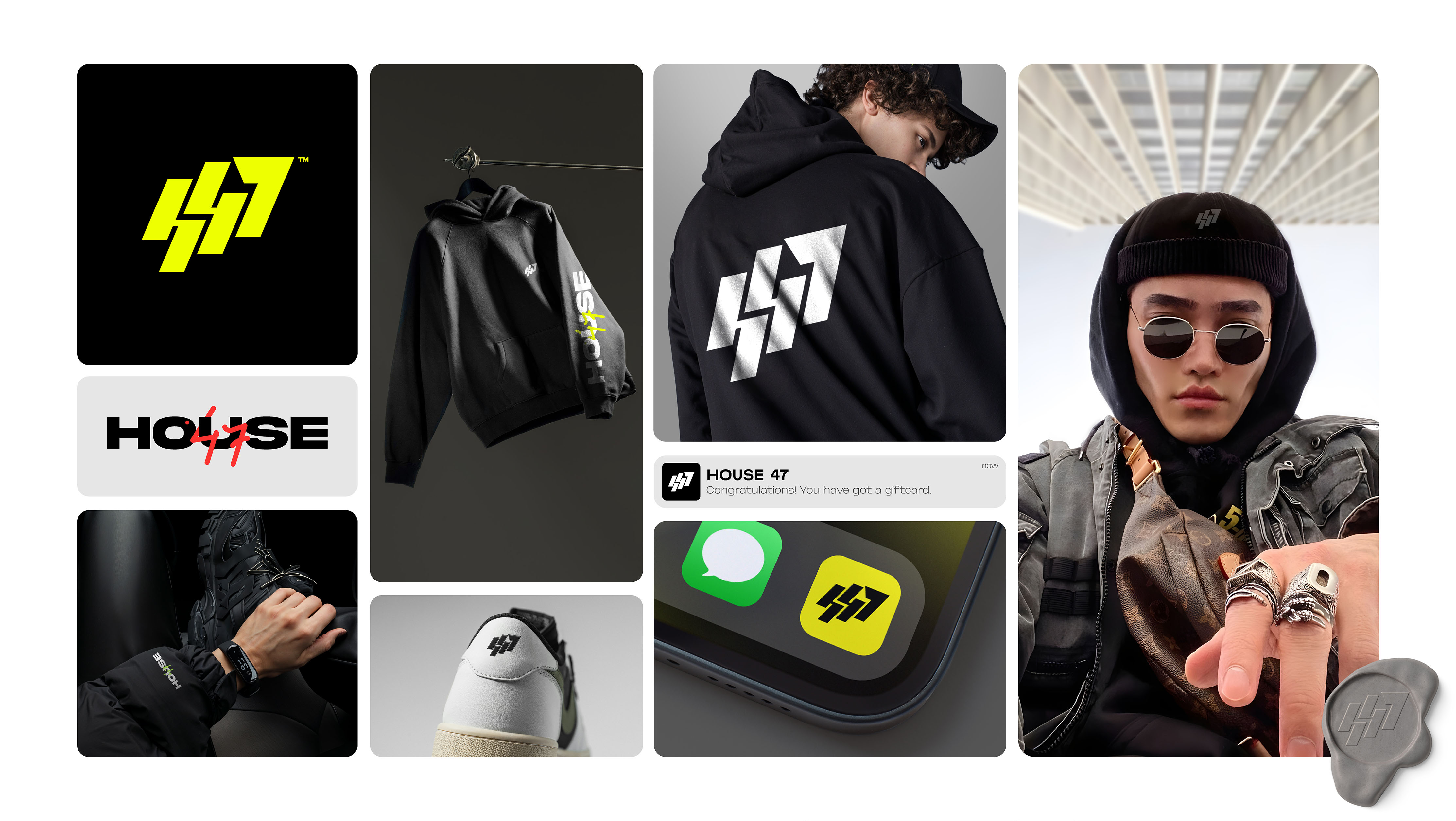
Design Solution: The final design fuses urban grit with digital minimalism. A clean, monolithic monogram acts as the brand’s anchor, symbolizing confidence, movement, and versatility.
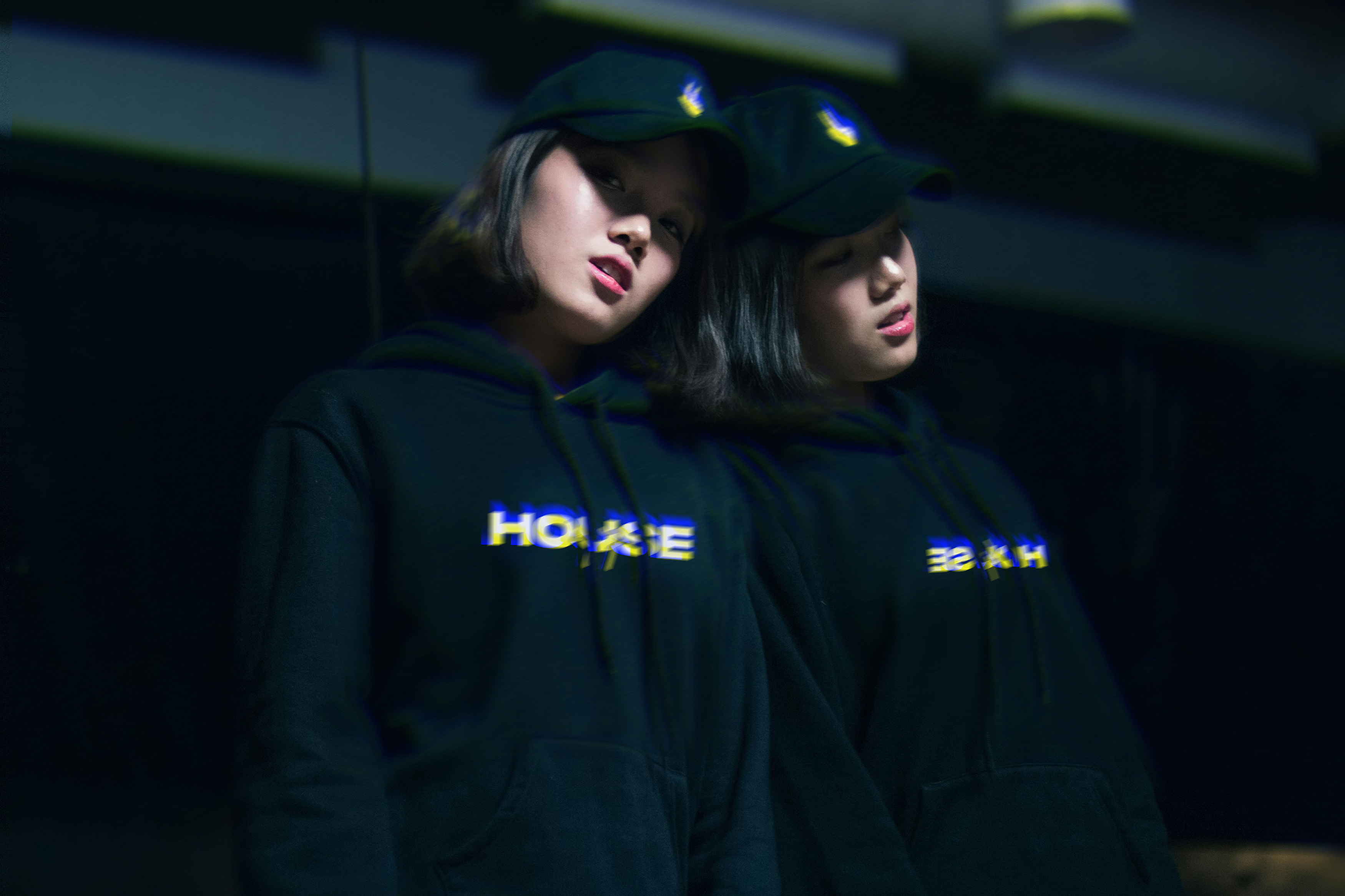
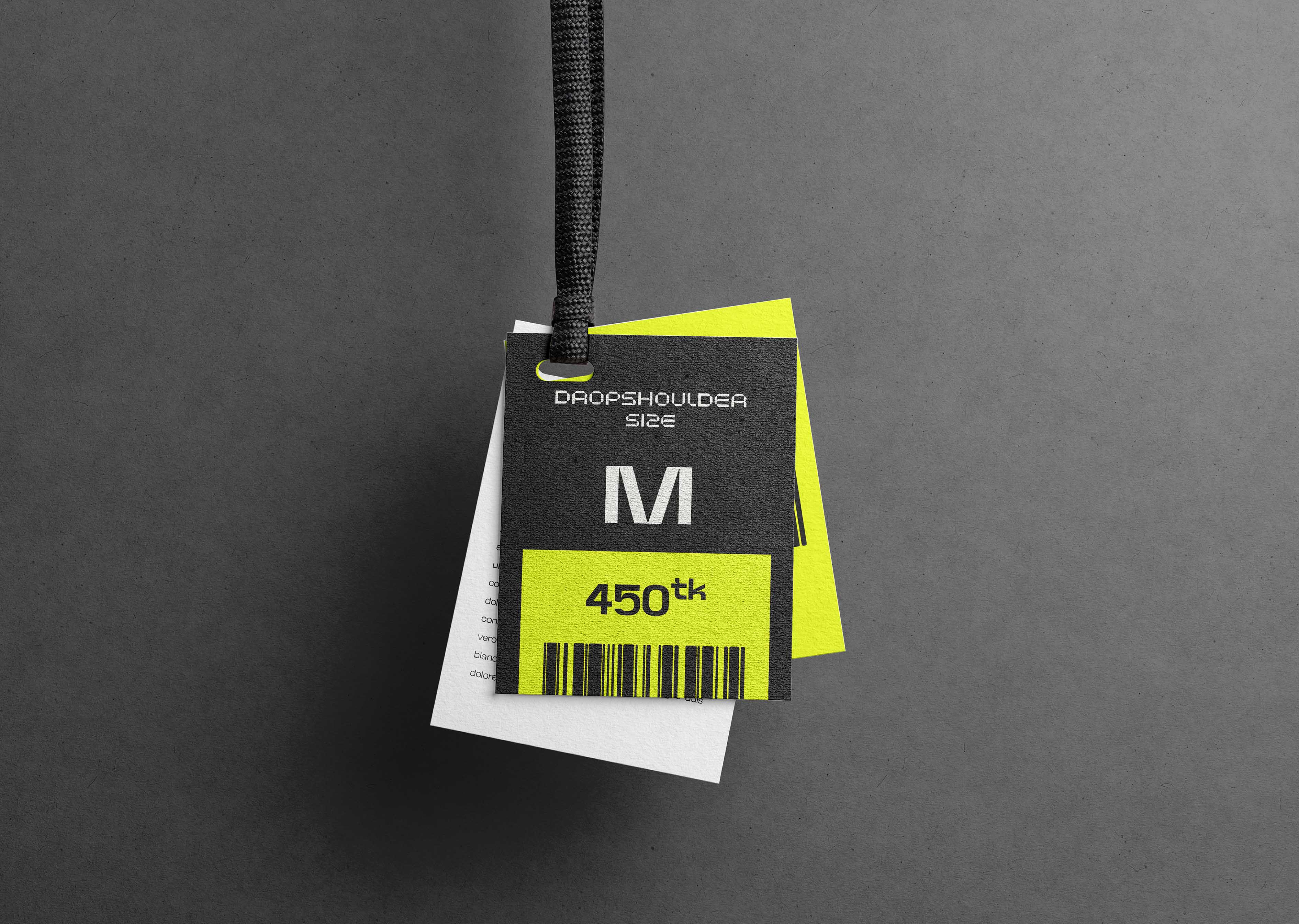
The visual system centers around a Safety Yellow primary palette, chosen for its bold visibility and psychological link to energy, rebellion, and creative intensity. Black and white serve as grounding neutrals, offering contrast and timeless strength. Together, this combination builds a sharp and modern aesthetic that stands out across apparel, packaging, and digital media, maintaining both impact and clarity in every context.
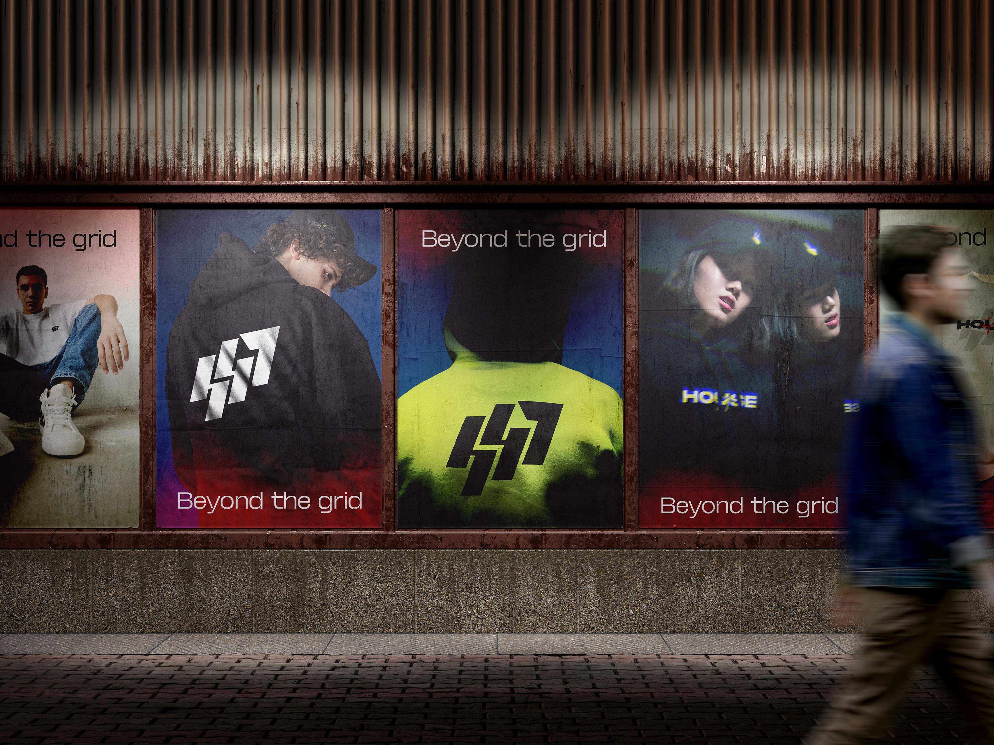
Typography follows a strong geometric sans-serif structure, maintaining visual discipline across all touchpoints, from apparel tags and street posters to digital campaigns and social content.
Outcome: The identity system successfully positions H47 as a distinctive and credible player in the streetwear market. It resonates with youth through its sense of motion, edge, and clarity, creating a visual language that feels both human and forward-looking.
H47’s new branding stands for more than apparel; it represents a culture of self-expression and defiance, crafted to evolve with its audience over time.


CREDIT
- Agency/Creative: Avolv
- Article Title: House 47 A Bold Streetwear Identity for the New Generation
- Organisation/Entity: Agency
- Project Type: Identity
- Project Status: Published
- Agency/Creative Country: Bangladesh
- Agency/Creative City: Dhaka
- Market Region: Asia
- Project Deliverables: Brand Design, Brand Guidelines, Brand Identity, Brand Mark, Brand Strategy, Brand Tone of Voice, Branding
- Industry: Fashion
- Keywords: branding, logo, monogram, streetwear, fashionbranding, identitydesign, graphicdesign, behancedesign, urbanstyle, H47, brandidentity, Avolv, visualdesign, creativebranding
-
Credits:
Art Direction: Alve Araf


