


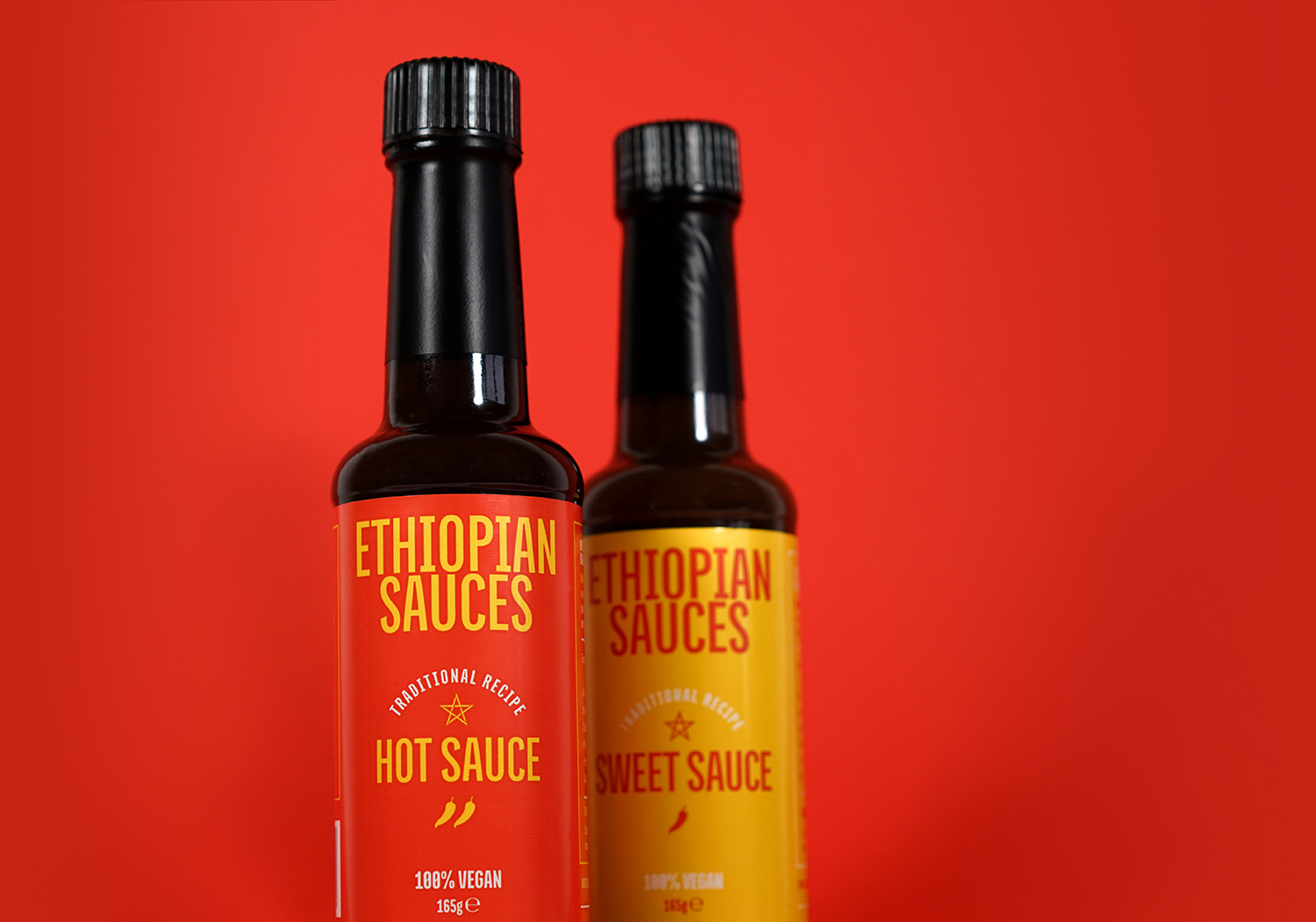
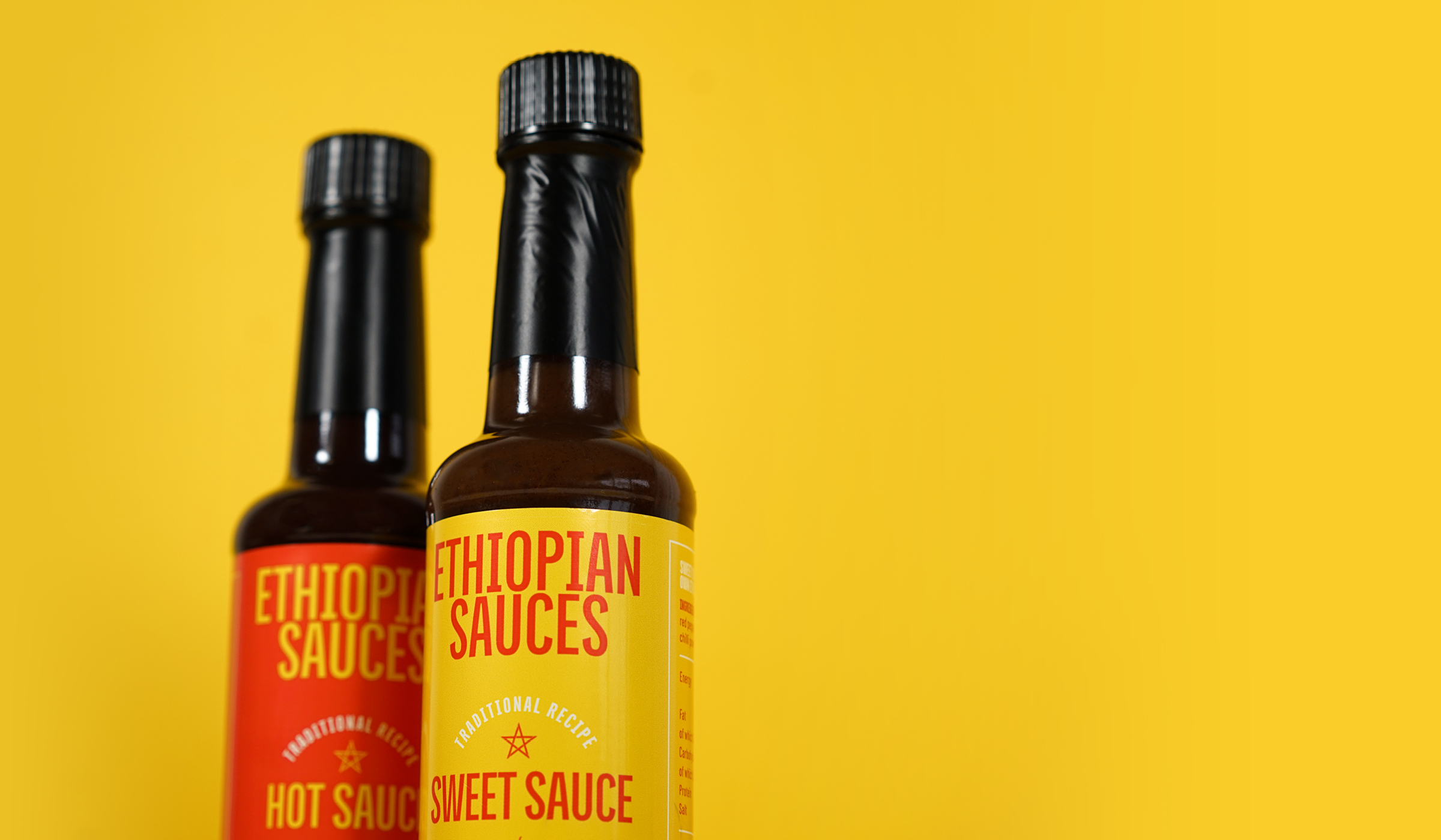
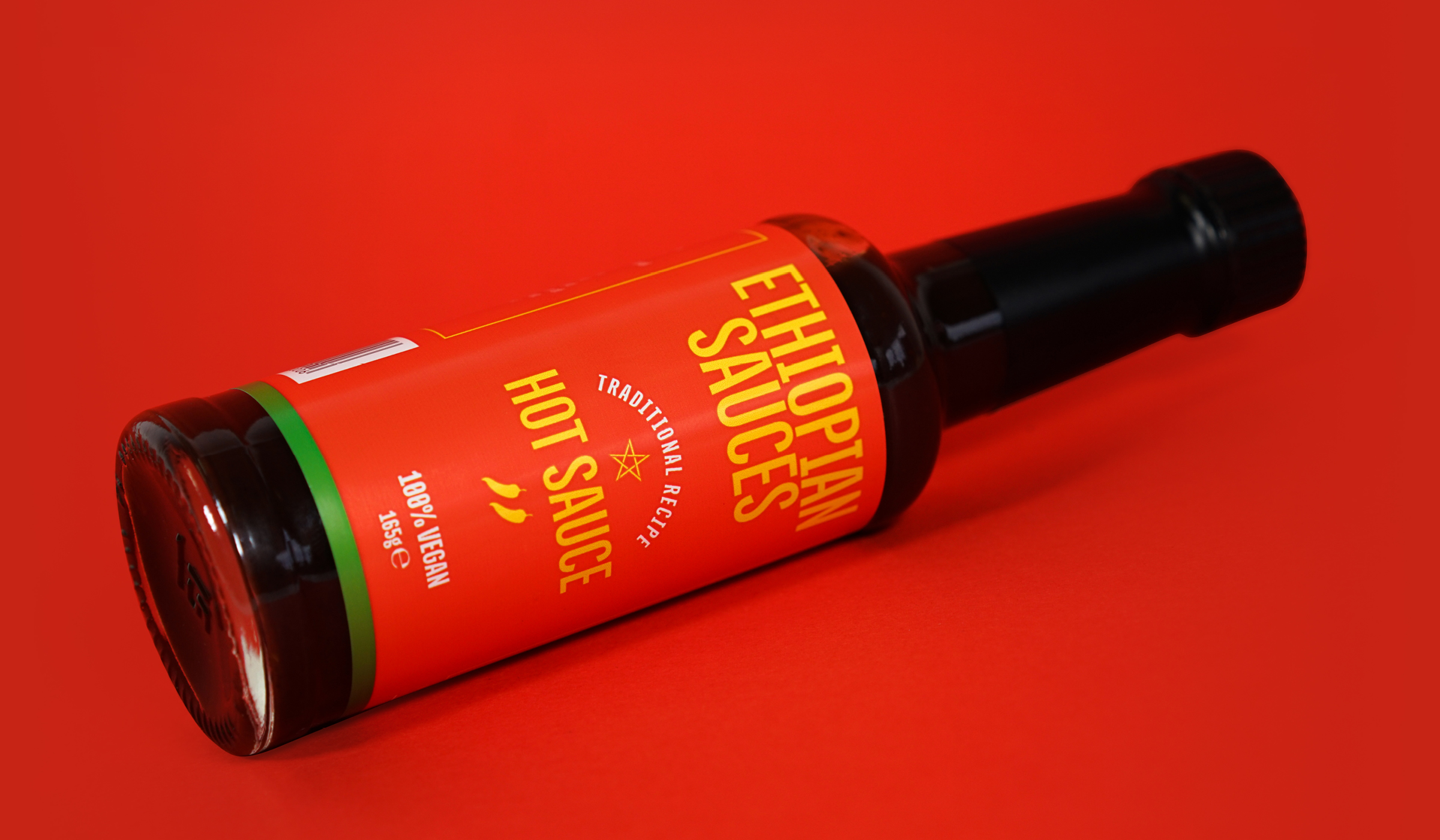
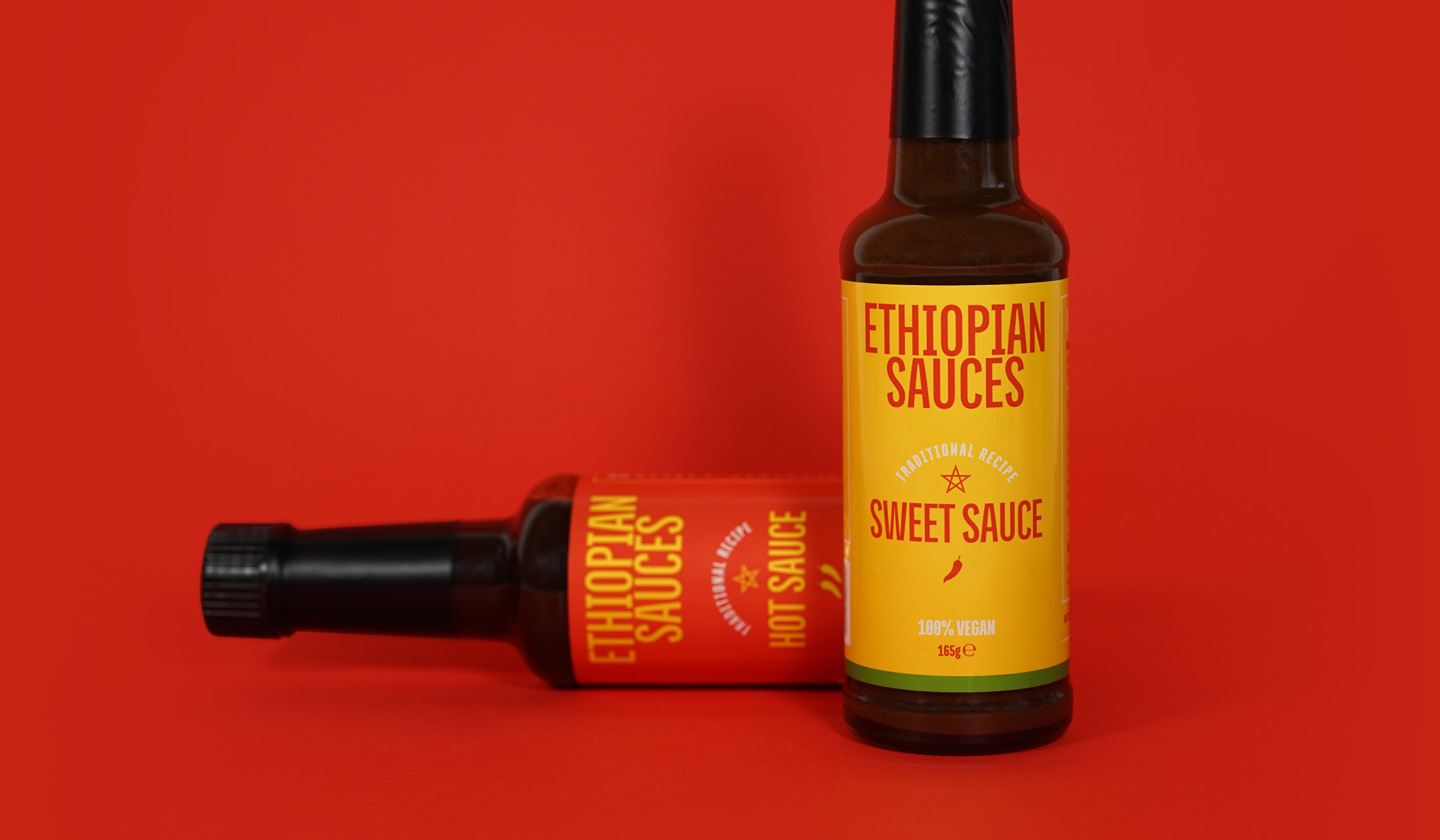
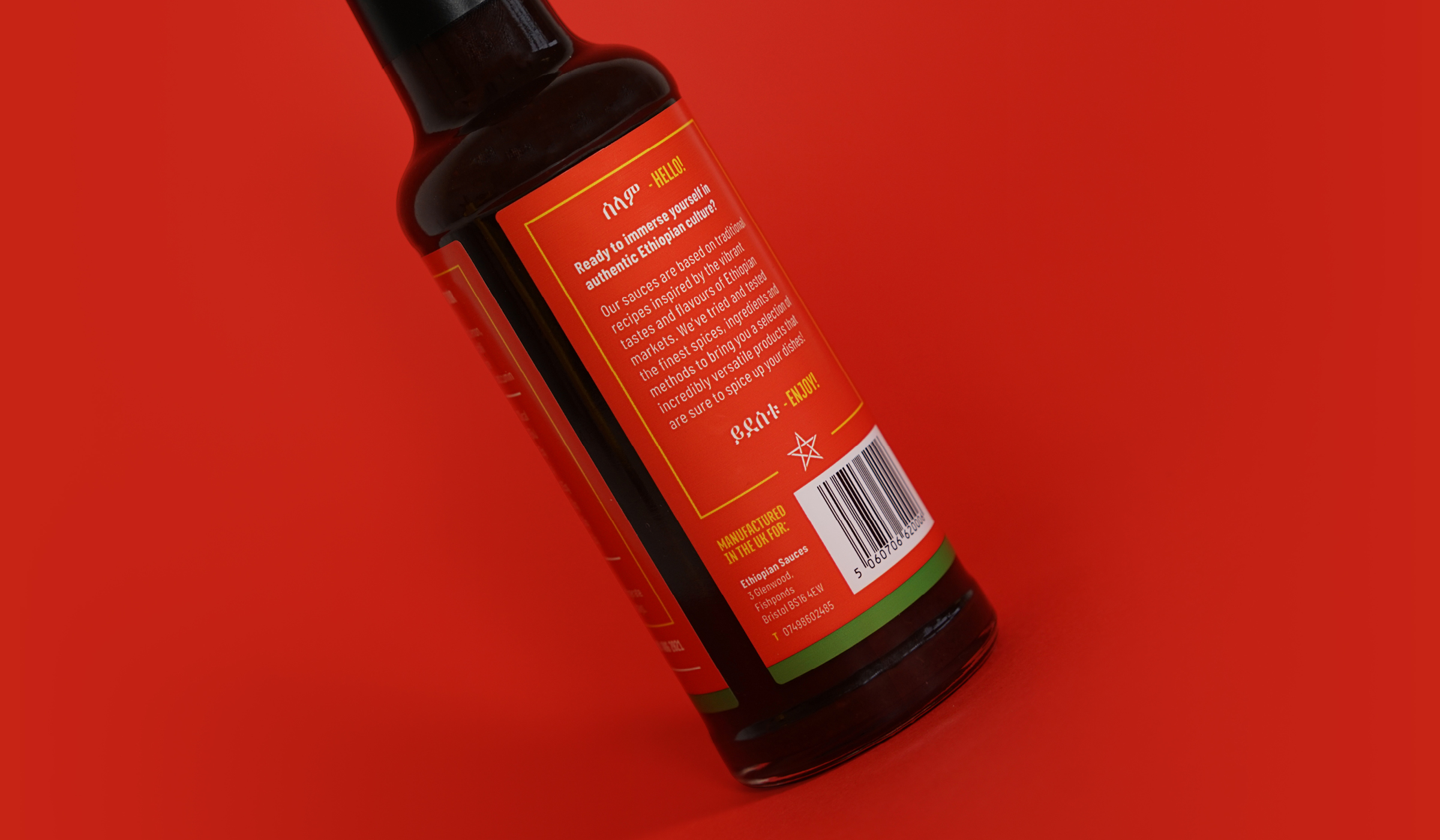
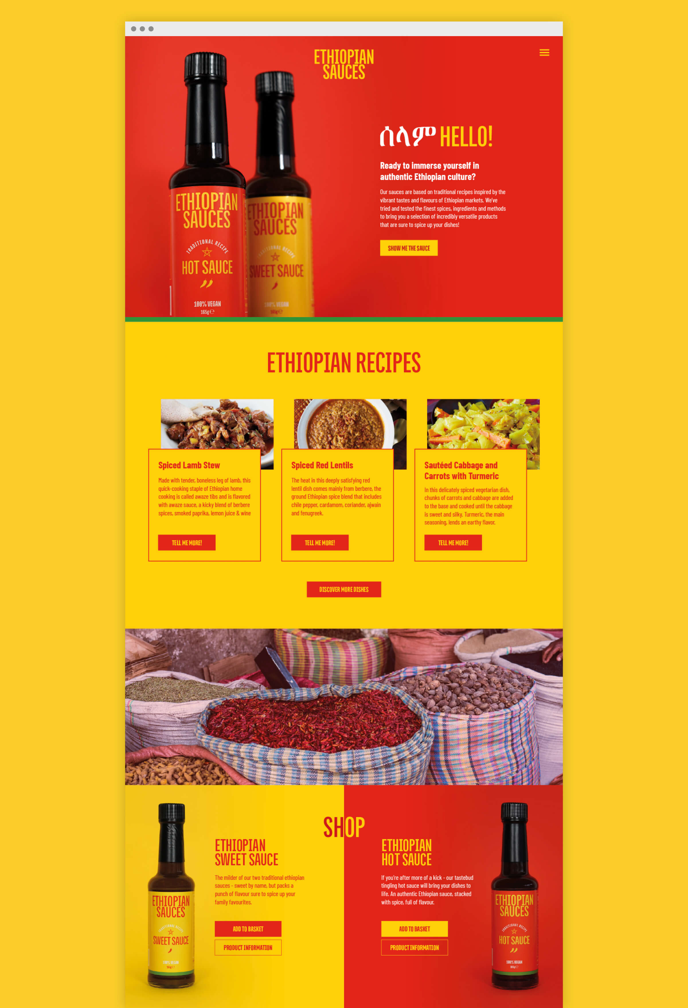
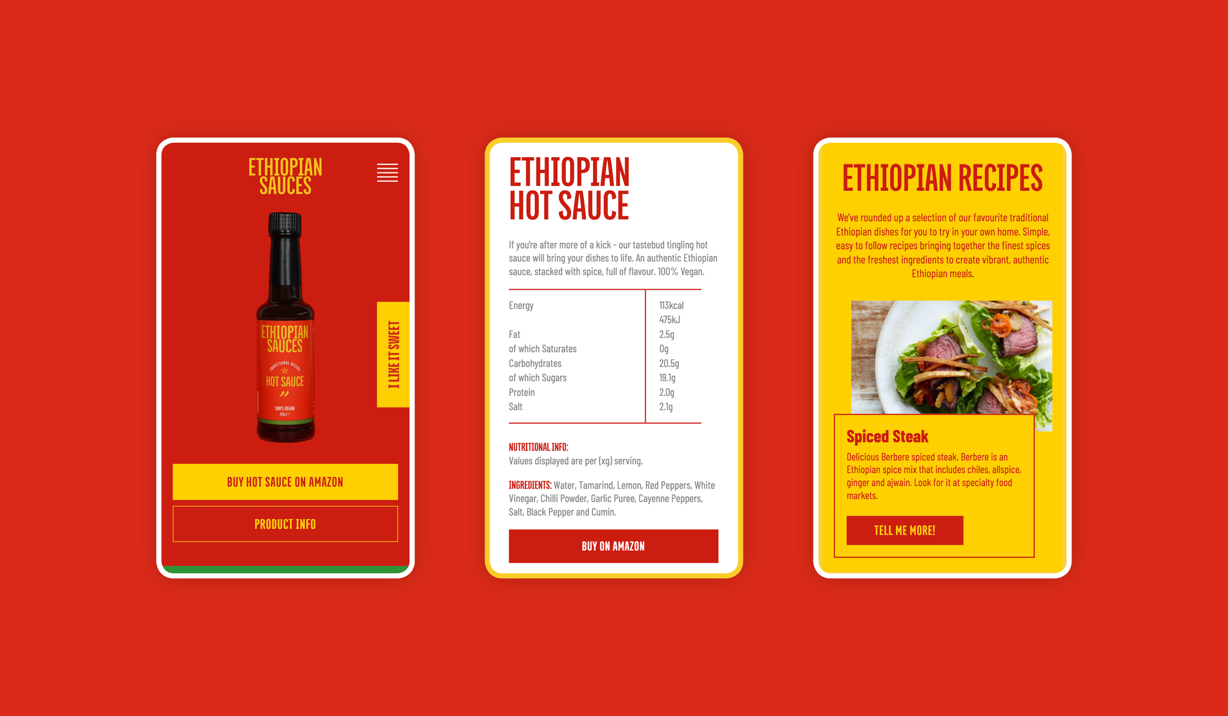
Ethiopian Sauces is a new startup that ‘does what it says on the tin’. Inspired by the national flag and the traditional Ethiopian market stalls, we created a brand as vibrant as the product inside and a label with striking simplicity. We ran with this contrasting duotone style throughout the website and product imagery to resolve a high impact, engaging brand aesthetic.

CREDIT
- Agency/Creative: Arobase Creative
- Article Title: Hot brand identity for saucy startup
- Organisation/Entity: Agency, Published Commercial Design
- Project Type: Packaging
- Agency/Creative Country: United Kingdom
- Market Region: Europe
- Project Deliverables: Brand Creation, Brand Identity, Brand World, Branding, Graphic Design, Packaging Design, Research
- Format: Bottle
- Substrate: Glass Bottle
FEEDBACK
Relevance: Solution/idea in relation to brand, product or service
Implementation: Attention, detailing and finishing of final solution
Presentation: Text, visualisation and quality of the presentation


