


About Beone
Beone is a digital bank (NEOBANK) that emphasizes personalization and individual empowerment. It partners with customers to experience their financial journey in a real, confident, friendly, transparent, and accessible way without worrying about fraud and abusive fees. Beone helps individuals manage their cash flow, aligning with the ideal of saving money and using it to achieve personal goals and dreams.
Logo Concept
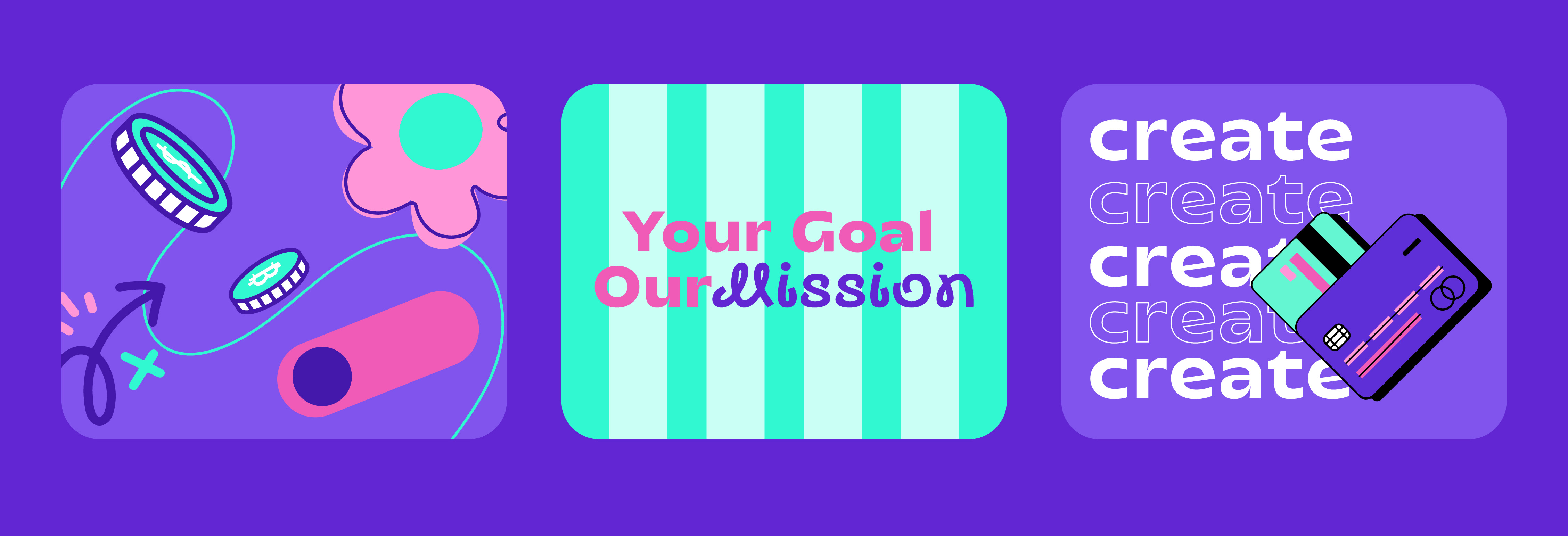
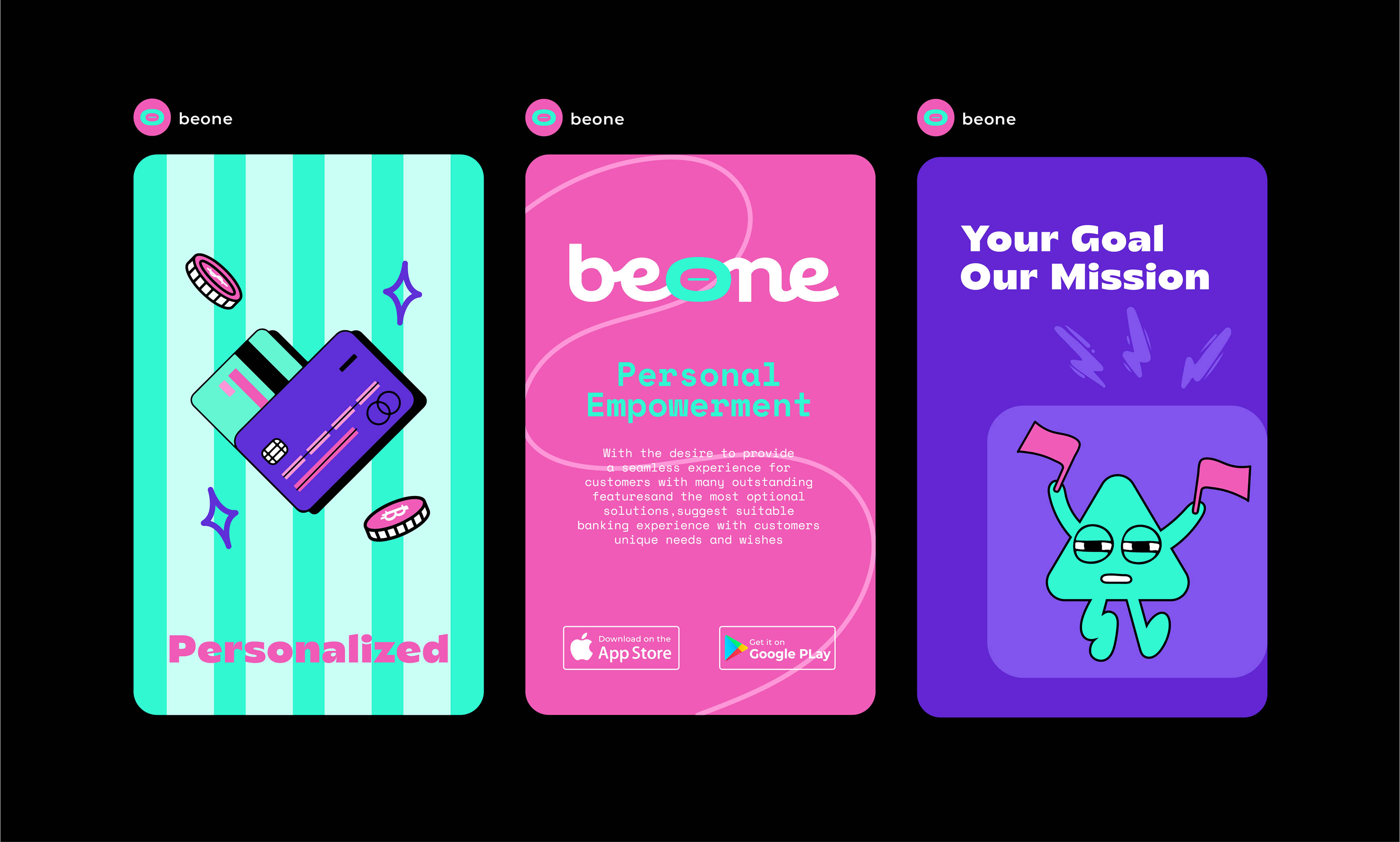
The logo for Beone is rooted in the traditional act of saving money using a piggy bank. This classic symbol of savings is reimagined with a modern twist, where the coin slot is geometrically illustrated to replace the letter “O”. The logotype features interconnected letters, symbolizing the brand’s commitment to unity and shared goals, encapsulated in the motto: “Your goal is our mission.” The choice of a thick, modern sans serif typeface ensures the logo is contemporary yet approachable, resonating with users on a personal level.
Visual Identity
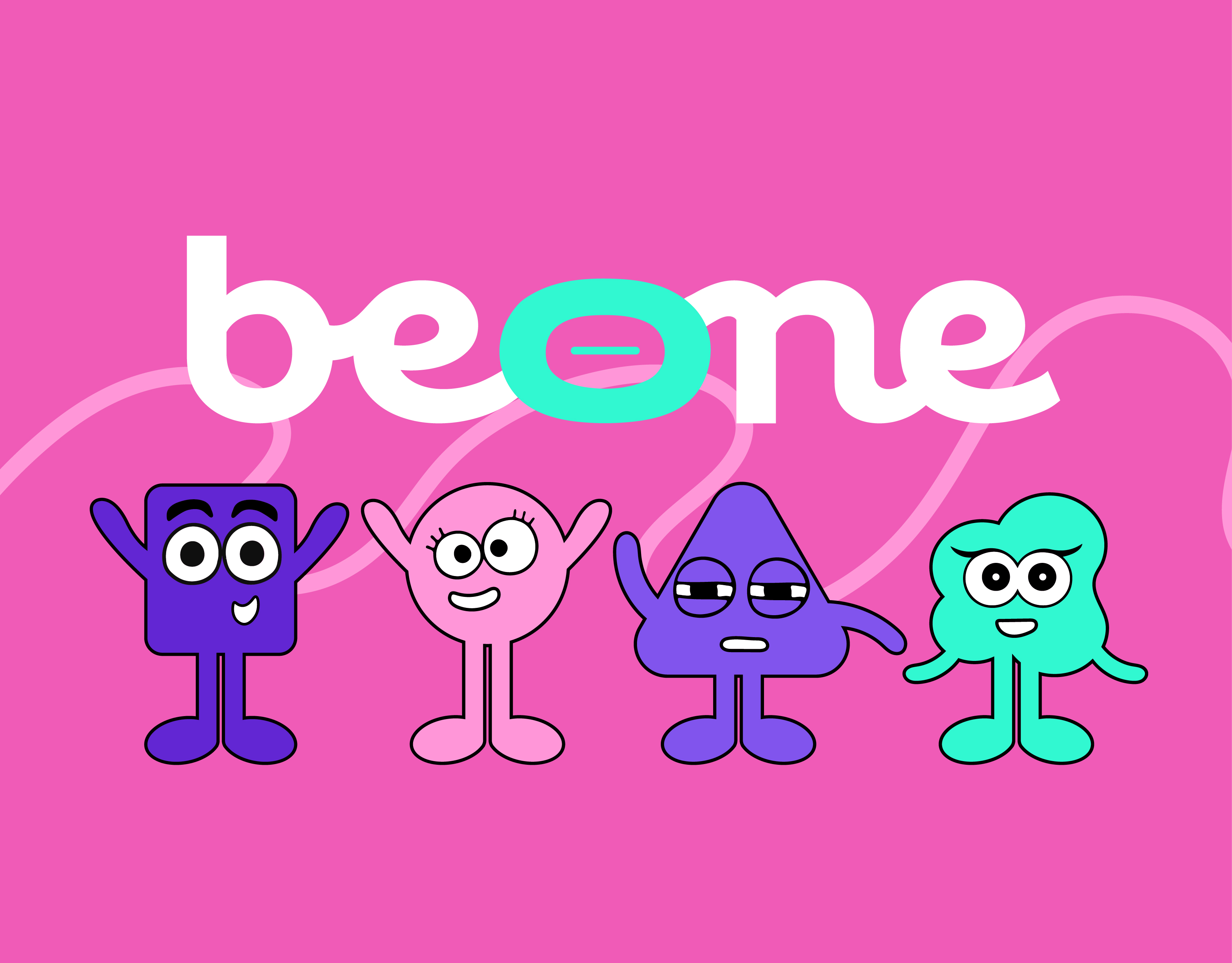
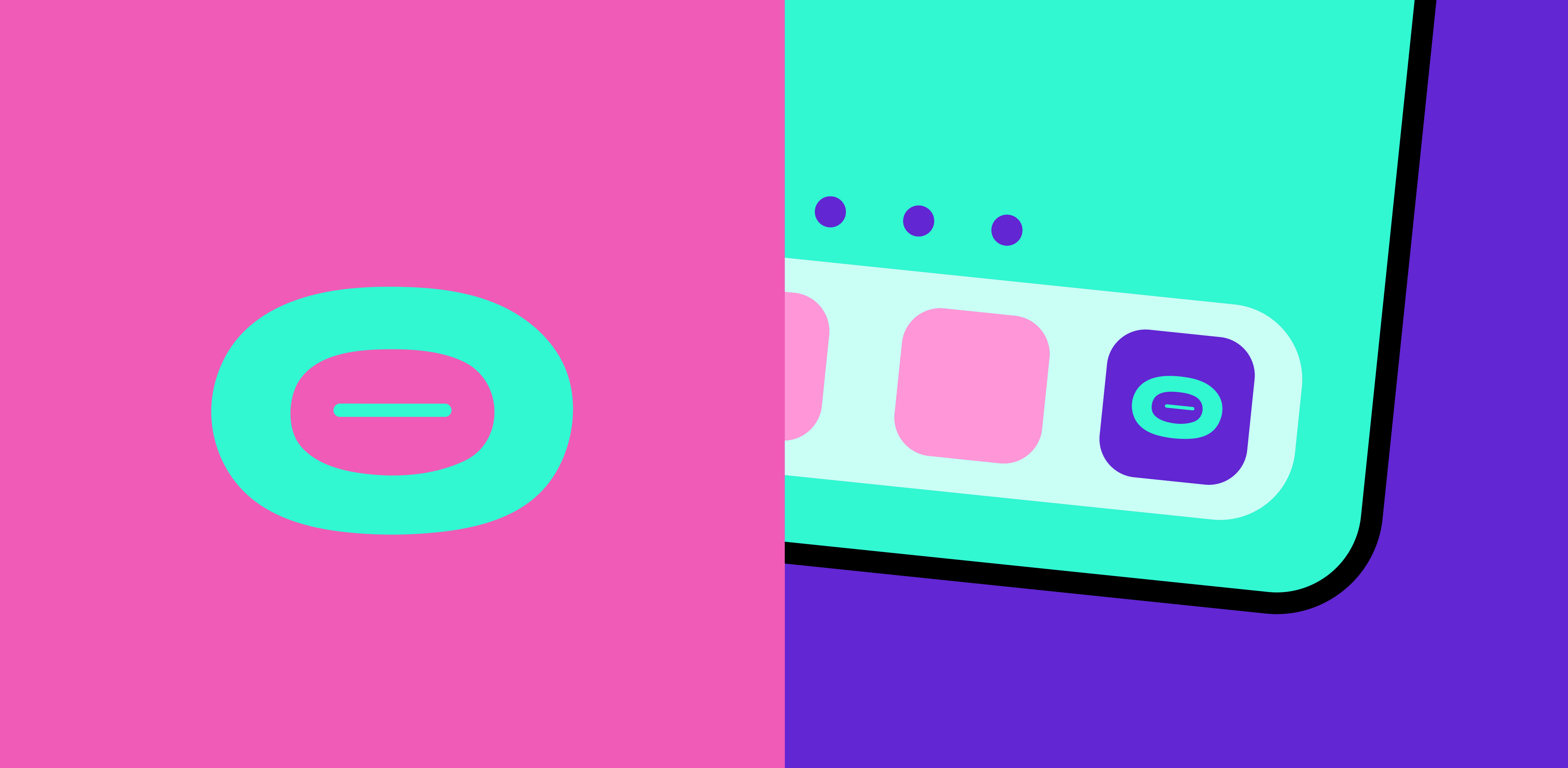
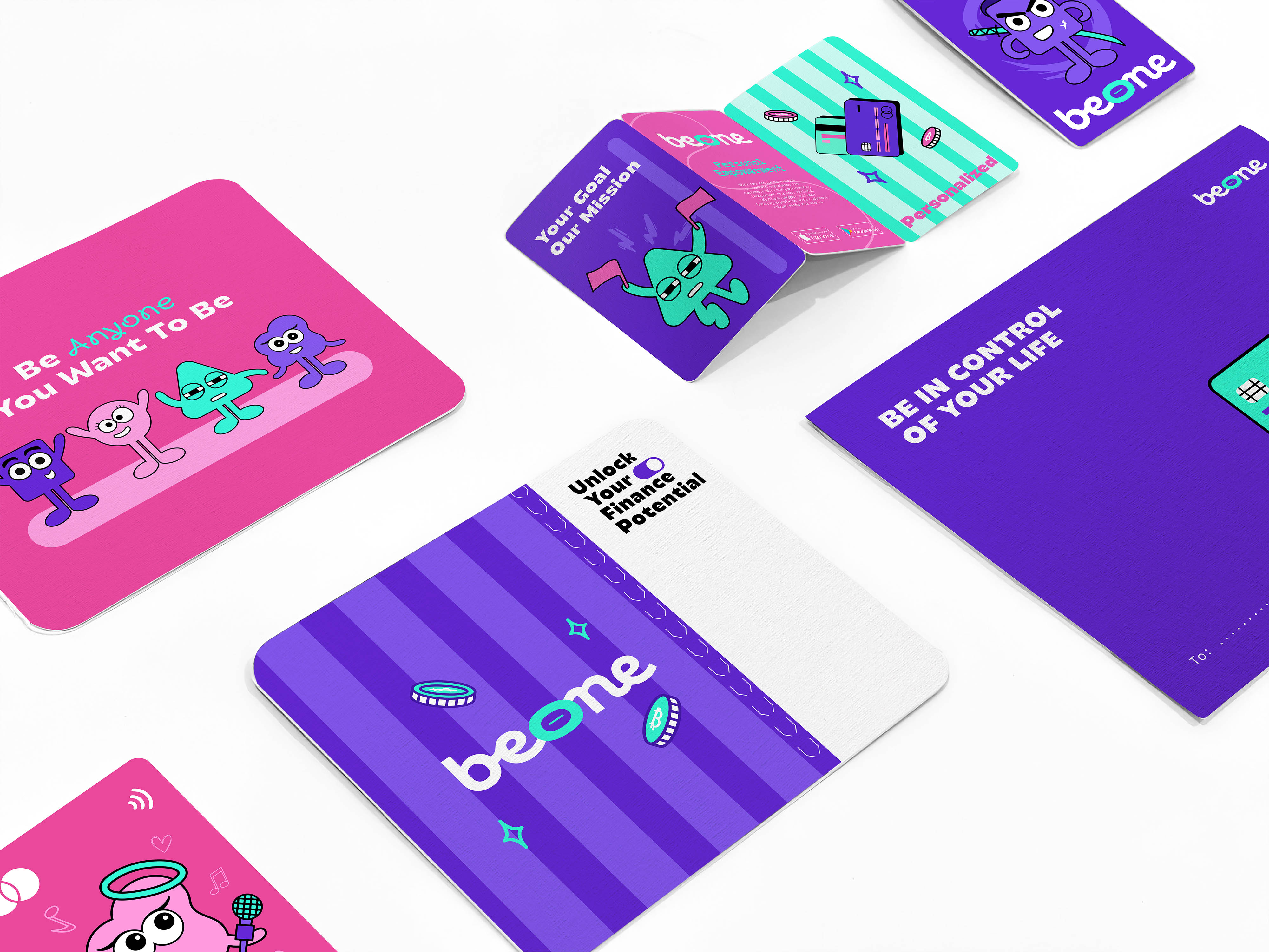
Beone’s visual identity draws from geometric lines similar to the logo, further developing brand assets like circles, squares, triangles, etc., to create effects and characters representing the brand. These characters, built from basic shapes, are easy to remember, brightly colored, and user-friendly.
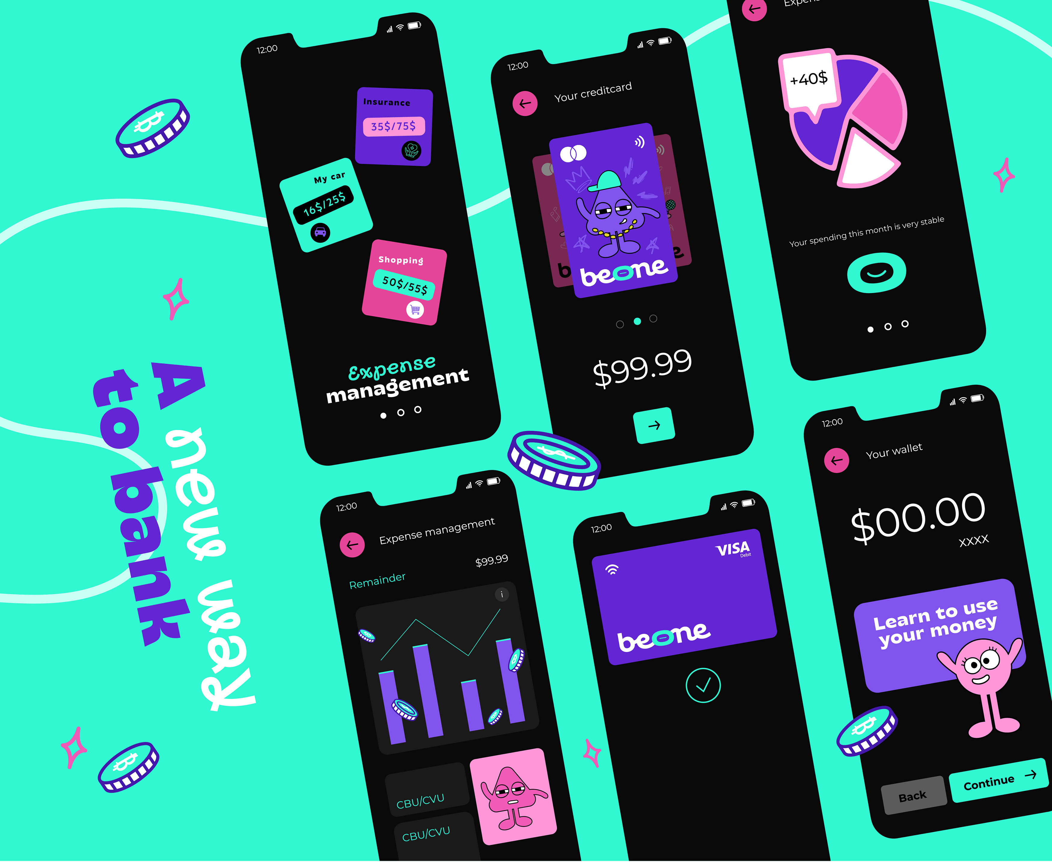
The visual identity extends into the Beone app, where the logo evolves into an icon that reflects the customer’s spending status for the month. This interactive feature provides a visual representation of whether their spending aligns with their financial goals, reinforcing Beone’s commitment to personalized and empowering financial management.
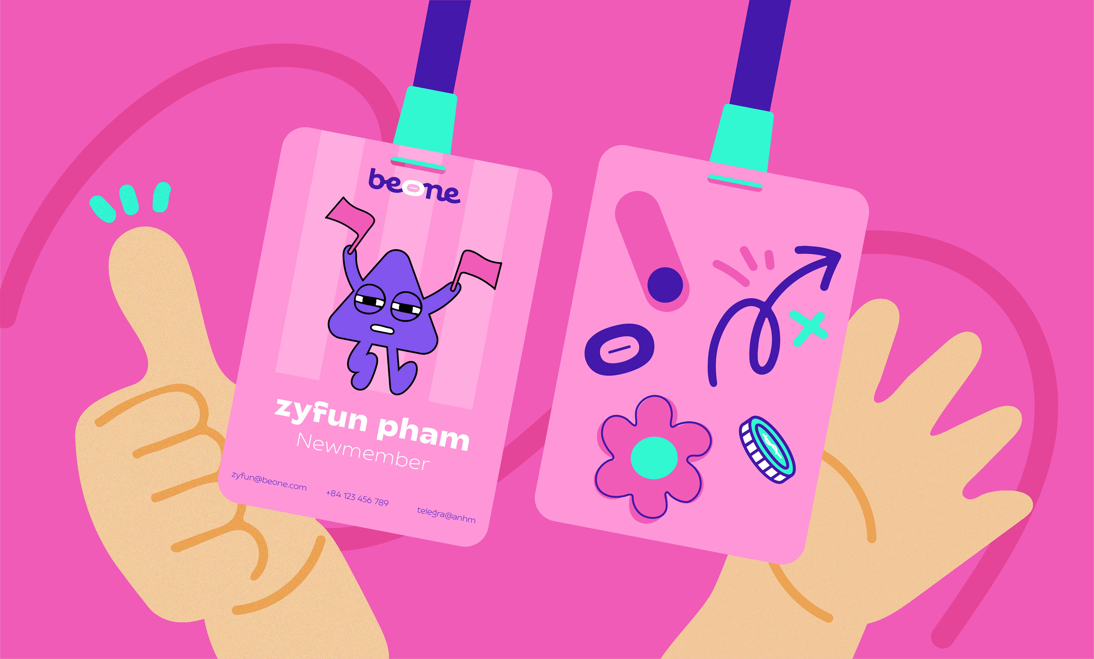
Packaging
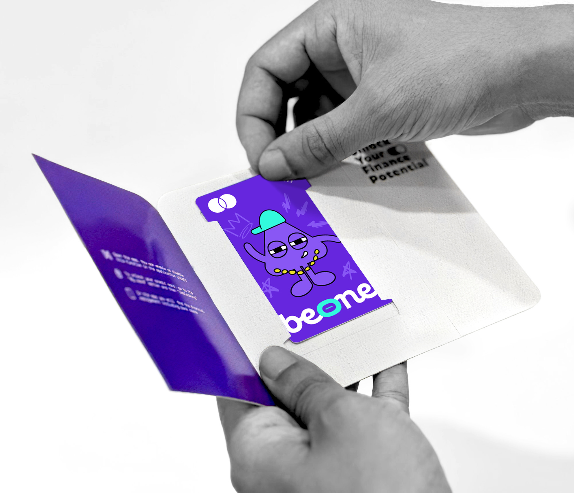
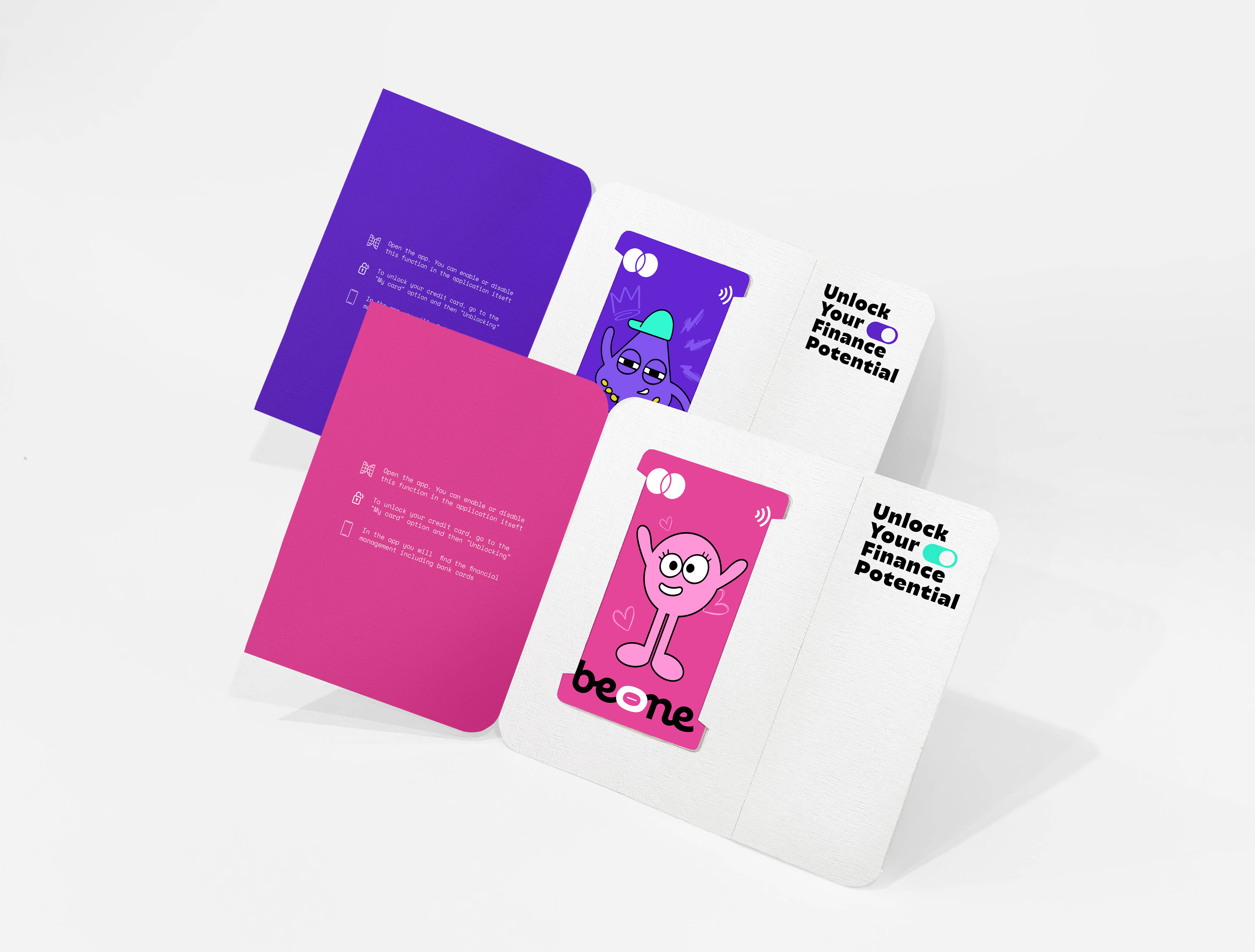
The packaging design for Beone’s cards and cardholders is an extension of the brand’s visual assets. Each card and cardholder is customizable, allowing customers to choose colors and characters that reflect their personal preferences. The compact cardholder is designed with a perforated tear line, combining aesthetics with functionality for a more convenient and stylish experience. This thoughtful design ensures that the packaging is not only visually appealing but also practical, enhancing the overall user experience.
Beone’s approach to visual identity and packaging underscores its dedication to creating a cohesive and engaging brand experience. Every element, from the logo to the app icon and packaging, is designed to reflect the brand’s mission of empowering individuals and fostering a personal connection with their financial journey.
CREDIT
- Agency/Creative: Horus Academy
- Article Title: Horus Academy Creates Brand Identity for Beone Bank
- Organisation/Entity: Student
- Project Type: Identity
- Project Status: Published
- Agency/Creative Country: Vietnam
- Agency/Creative City: Da Nang
- Market Region: Asia
- Project Deliverables: Brand Identity, Packaging Design
- Industry: Financial
- Keywords: Horus Academy, Brand Identity, Digital Bank, Beone
-
Credits:
Made at: Horus Academy
Designer: Vy Phuong
Photographer: Vy Phuong
Instructors: Phuoc Thien, Minh Tuan, To Quyen


