A brand creation concept by Intertype Studio and Officina Poligonale.
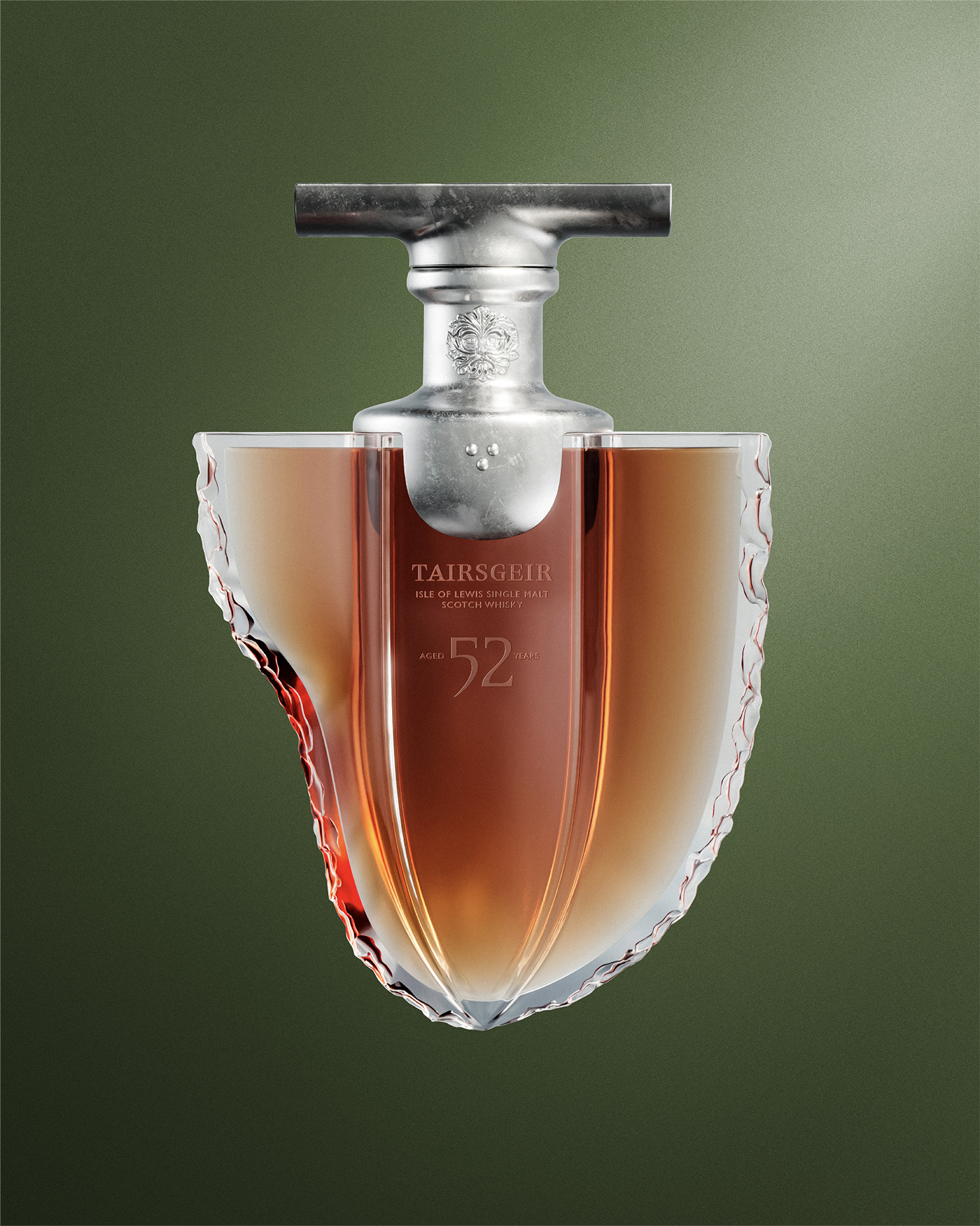
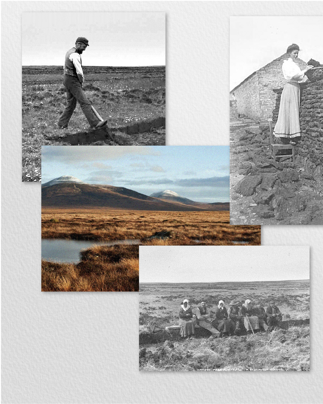
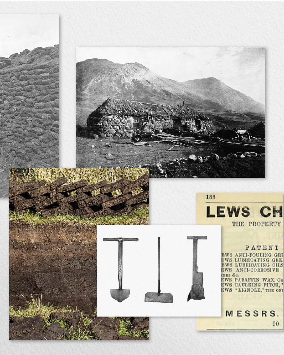
Tairsgeir – The Gaelic name for the tool traditionally used to cut peat on the moorlands of Scotland. Peat is used to dry our barley and gives our whisky its unique character; aromas of oaky spice and peach cobbler fill the nose, complemented by notes of rich malt, tobacco and earthy smoke throughout the palate.
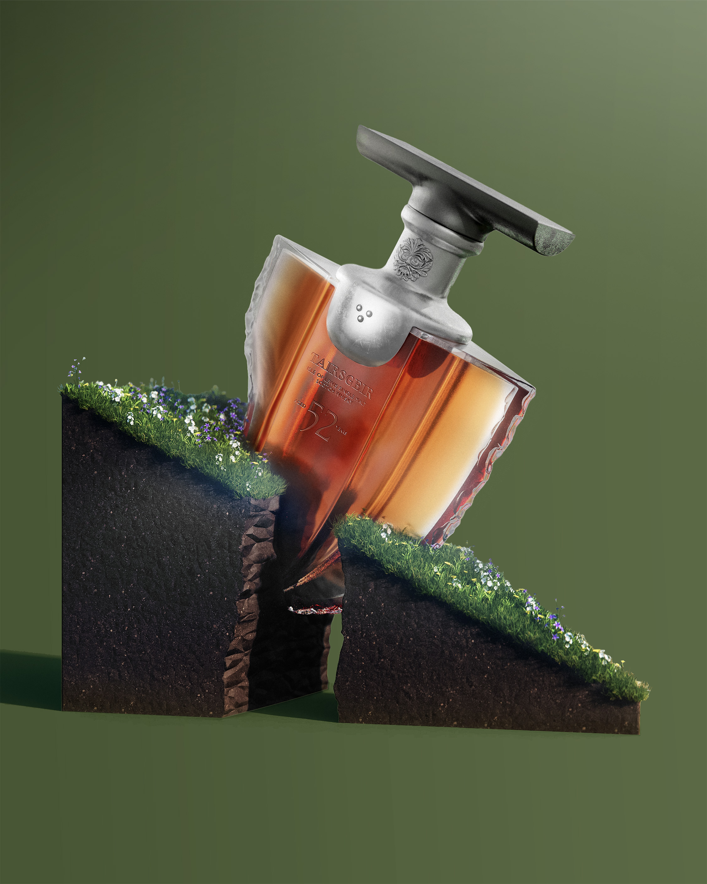
However, stripping the earth from our precious wild landscape without due care can have a negative impact on the environment for future generations if not done responsibly. Our whisky is made in service of restoring and conserving the beauty of the Scottish peatlands; indeed, the Tairsgeir can be used to reseed and plant, to restore and replenish.
We’re working with communities on the Isle of Lewis to restore eroding, damaged peatland to ensure they act as vital carbon storage. Repairing exposed peatlands allows vegetation to flourish and create the foundations for new peat to form.
By creating such a precious whisky, which can be sold for between fifty and one hundred thousand pounds at auction, we can put back fifty percent of sale proceeds into this important work, creating a brand that is not just sustainable but regenerative.
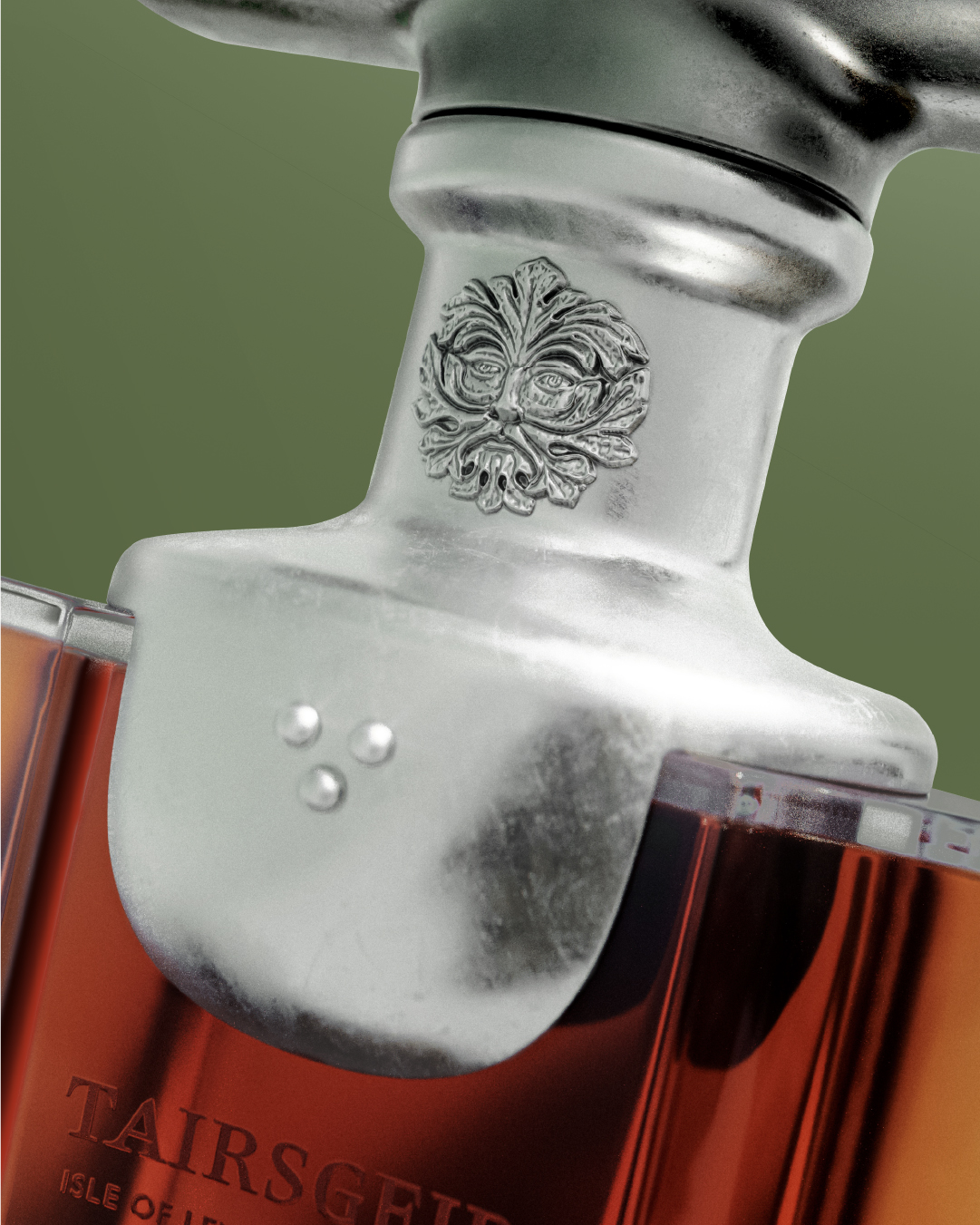
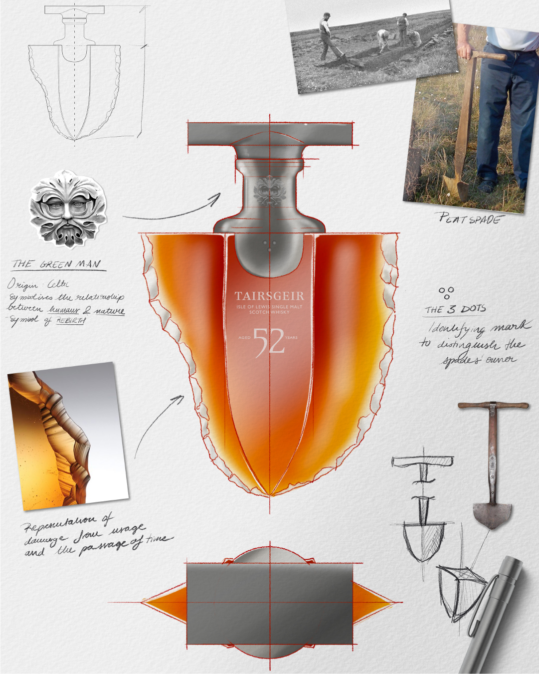
Our bottle design is inspired by the Tairsgeir tool that the crofters are familiar with. The neck collar is inspired by the hand of the tool and features the ‘green man’; a Celtic symbol representing the relationship between man and nature, also used as a symbol of rebirth. He represents the bounty of nature, the colourfulness of spring, and the lushness of vegetation.
At one time, all Scottish blacksmiths made small identifying marks that would allow a Tairsgeir from, say, Ness, to be distinguished from one forged in Stornaway. Stellag’s was three dots on the top of the blade, a mark that his son Calum also hammered into his Tairsgeir until sadly passing away in 2019. He is remembered as An Gobha – The Last Blacksmith.
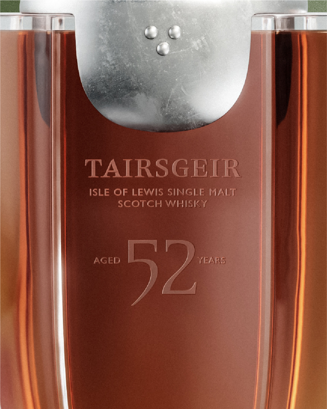
Our typographic detailing is inspired by the tool, its elegant curves and the forms of its chiselling cuts.
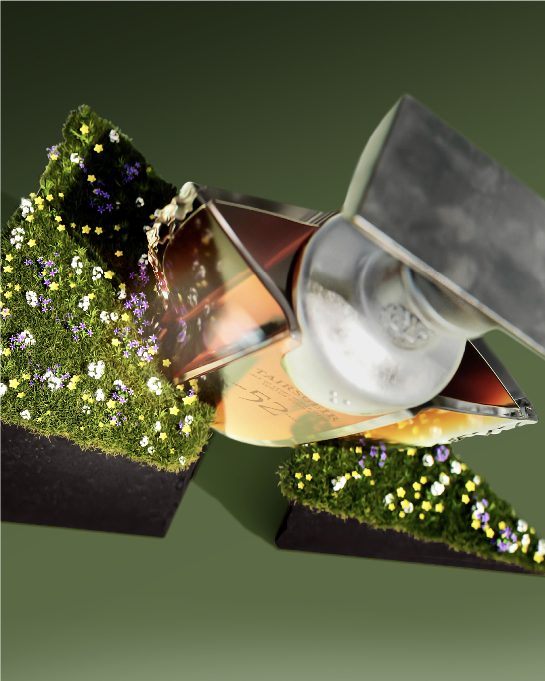
We designed a glorifier to display the bottle, crafted from organic materials embedded with seeds. Over time, it transforms and grows, mirroring the regeneration of the Scottish peatlands that occurs as a result of the brand´s support.
CREDIT
- Agency/Creative: Intertype Studio
- Article Title: Honouring Ancestral Tools and Nature: Tairsgeir Whisky’s Regenerative Bottle Design Concept by Intertype Studio and Officina Poligonale
- Organisation/Entity: Agency
- Project Type: Packaging
- Project Status: Non Published
- Agency/Creative Country: United Kingdom
- Agency/Creative City: London
- Market Region: Global
- Project Deliverables: Brand Identity, Packaging Design
- Format: Bottle
- Industry: Food/Beverage
- Keywords: Packaging, Design, Whisky, Spirits
-
Credits:
Design Agency: Intertype Studio
Concept Visualisation: Officina Poligonale


