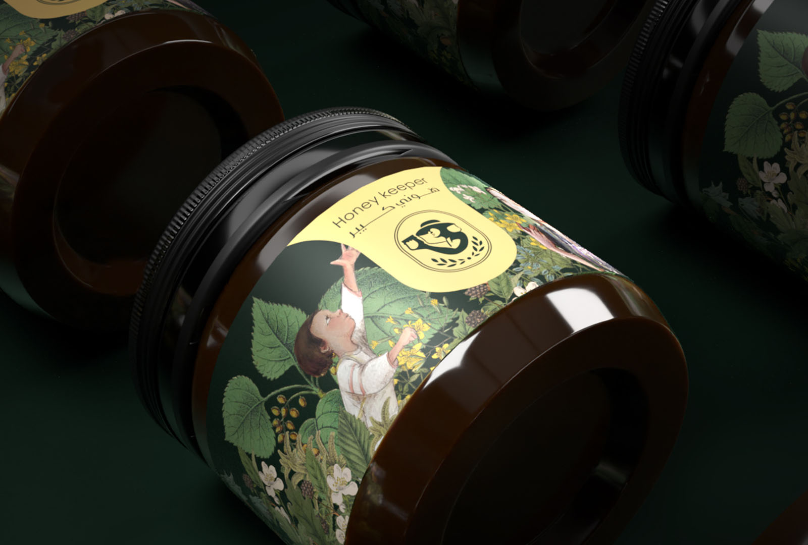
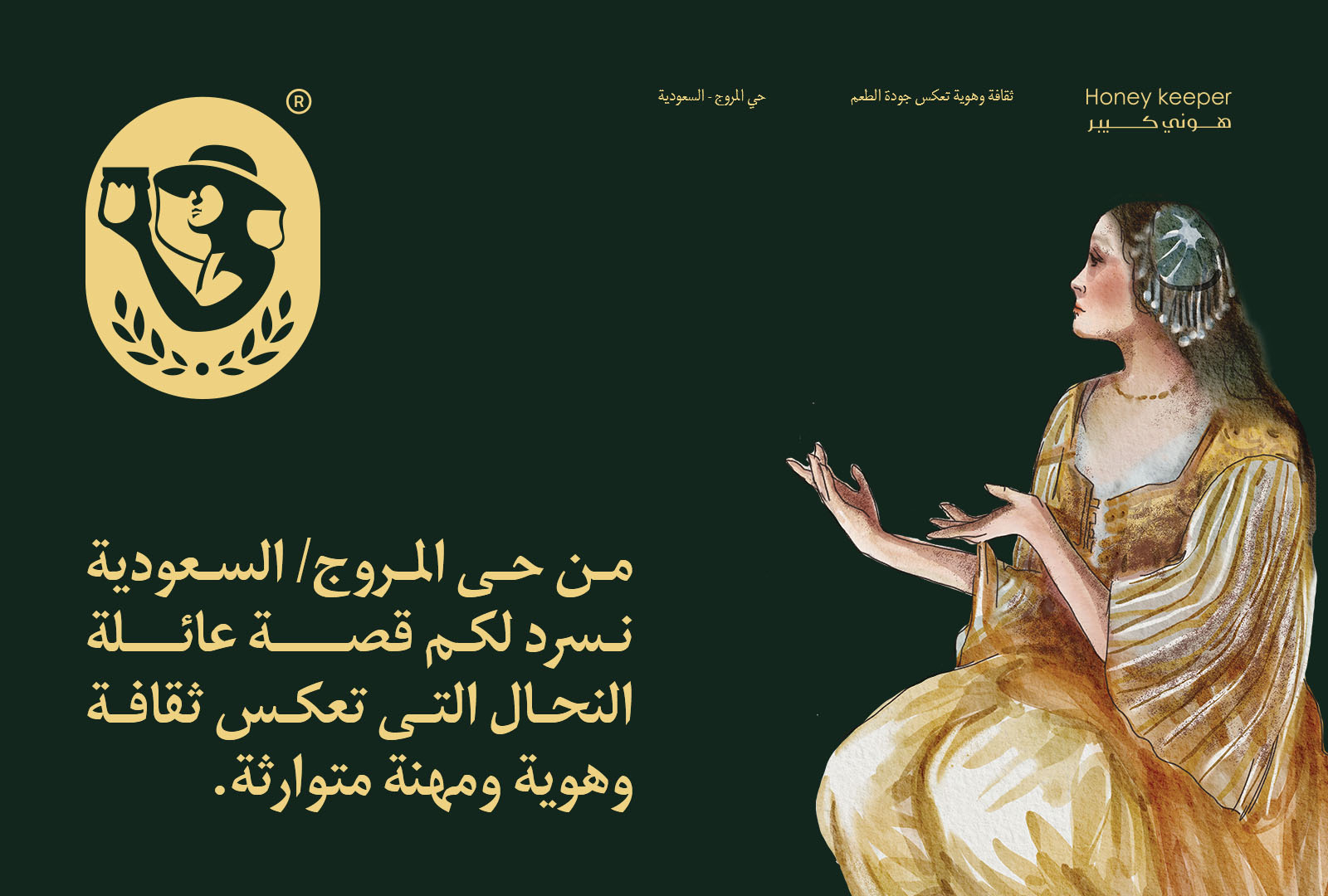
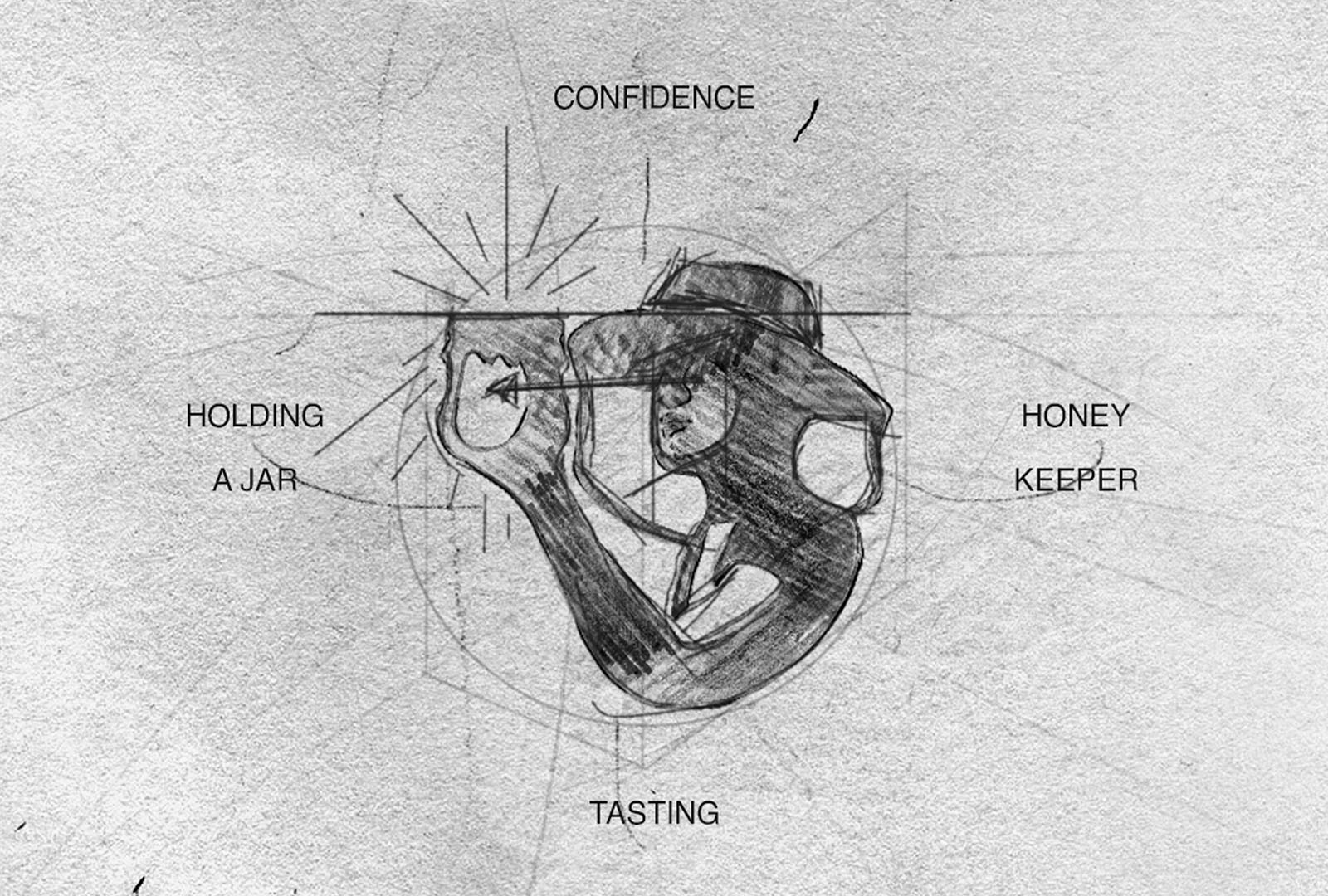
From District Al-Morouj / Kingdom of Saudi Arabia, we tell you the story of the Honey Keeper family, which reflects an inherited culture, identity and profession- Beginning in 2020, the family had a different approach to expanding and exporting outside the borders of the Kingdom, and it required creating a flexible visual identity that reflects originality and modernity and suits the new market. We made different sketches that reflect the costume and shape of the (bee keeper) honey keeper during his work and we chose the colors of the identity based on the color of honey produced within the family walls, and we created different graphics to support the visual identity that reflect the culture and forms of family members.
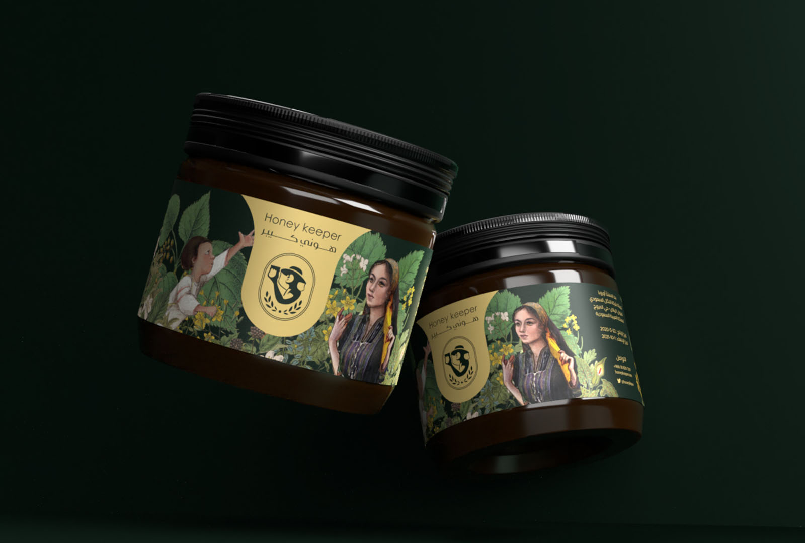
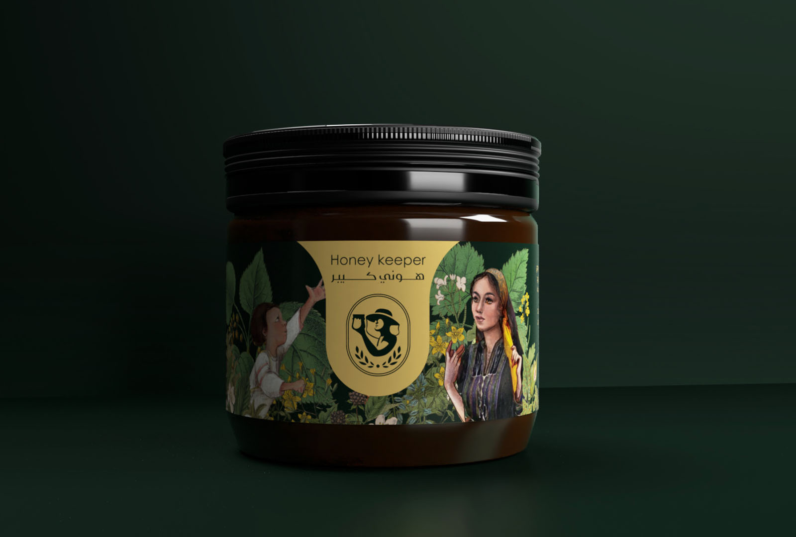
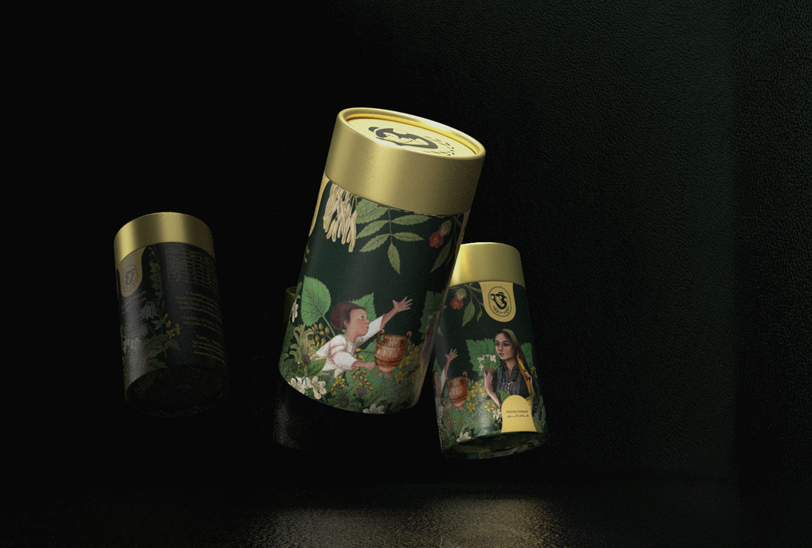
The family of the Honey keeper consists of a man, his sister, his wife and a single son, and this is what we tried to draw and show in the form of the package to create a real touch and emotions on the product.
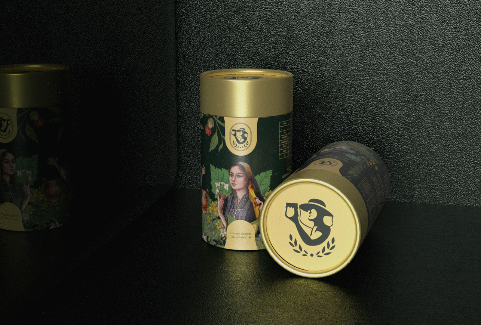
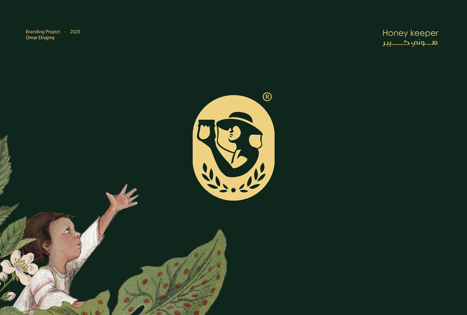
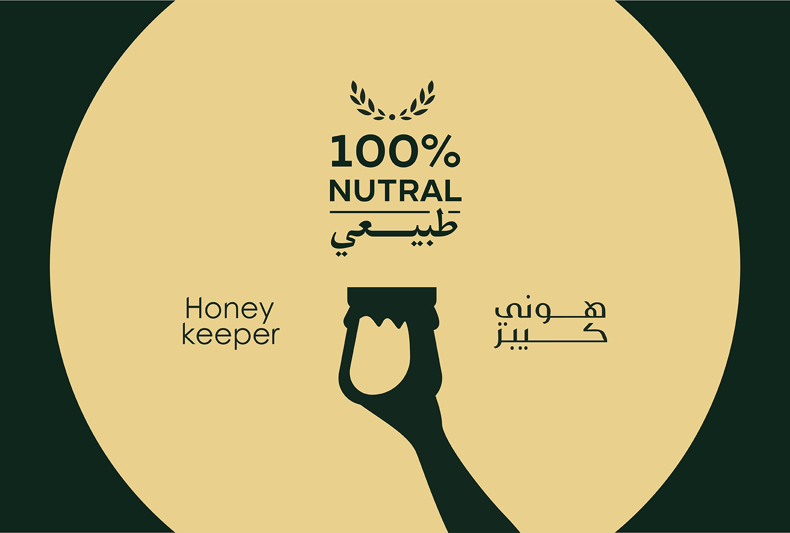
I drew several angles and shapes for the icon and they were implemented in more than one technical way in order to finally settle on this shape, and with the help of the painter Sama and determining Art Direction, we made the drawings and chose their colors together.
The normal shape of the jar was chosen for ease of implementation and export outside the borders of the Kingdom of Saudi Arabia with different sizes for each jar and container.. We made re-sizes for all drawings to suit the different packages
CREDIT
- Agency/Creative: Omar Elnajmy
- Article Title: Honey Keeper Packaging Design
- Organisation/Entity: Freelance
- Project Type: Illustration
- Project Status: Published
- Agency/Creative Country: Egypt
- Agency/Creative City: Cairo
- Market Region: Middle East, Global
- Project Deliverables: Art Direction, Brand Identity, Branding, Identity System, Illustration, Logo Design, Packaging Design
- Industry: Food/Beverage
- Keywords: Honey, Keeper,jar
-
Credits:
Art Director: Omar Elnajmy
illustrator: Sama Medhat
Project Made For: Heel-Design


