Honey Belinda is a brand dedicated to showcasing the refined world of honey through the expertise of a professional honey sommelier. Belinda’s vision is to offer unique and memorable honey-tasting experiences that combine education with sensory pleasure, introducing people to the diverse flavors and textures of honey. The branding challenge lay in reflecting her sophisticated approach, while also highlighting the luxurious, natural, and artisanal qualities of honey, positioning her services as both premium and approachable.
The project involved creating a comprehensive branding solution that would appeal to honey enthusiasts and the broader market. The brand needed to convey elegance and refinement, aligning with the high-end nature of Belinda’s honey-tasting events, while still emphasizing the connection to nature and the artisanal process of honey production. The identity had to communicate expertise and professionalism while maintaining a warmth that would invite audiences to engage with the experience of honey tasting as something both educational and enjoyable.
The process began with in-depth research into honey culture, luxury branding, and target audience behavior. This initial phase helped to identify the visual and conceptual elements that would best capture the essence of the brand. Drawing inspiration from the natural beauty of honey and high-end food experiences, the team developed concepts that focused on elegance, nature, and exclusivity. The result was a visual identity that perfectly balanced these elements, ensuring that the brand would stand out in a competitive market while remaining true to Belinda’s vision.
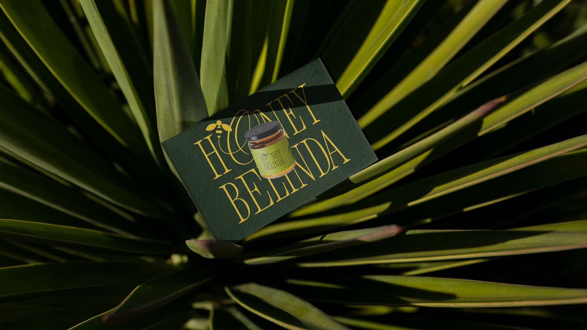
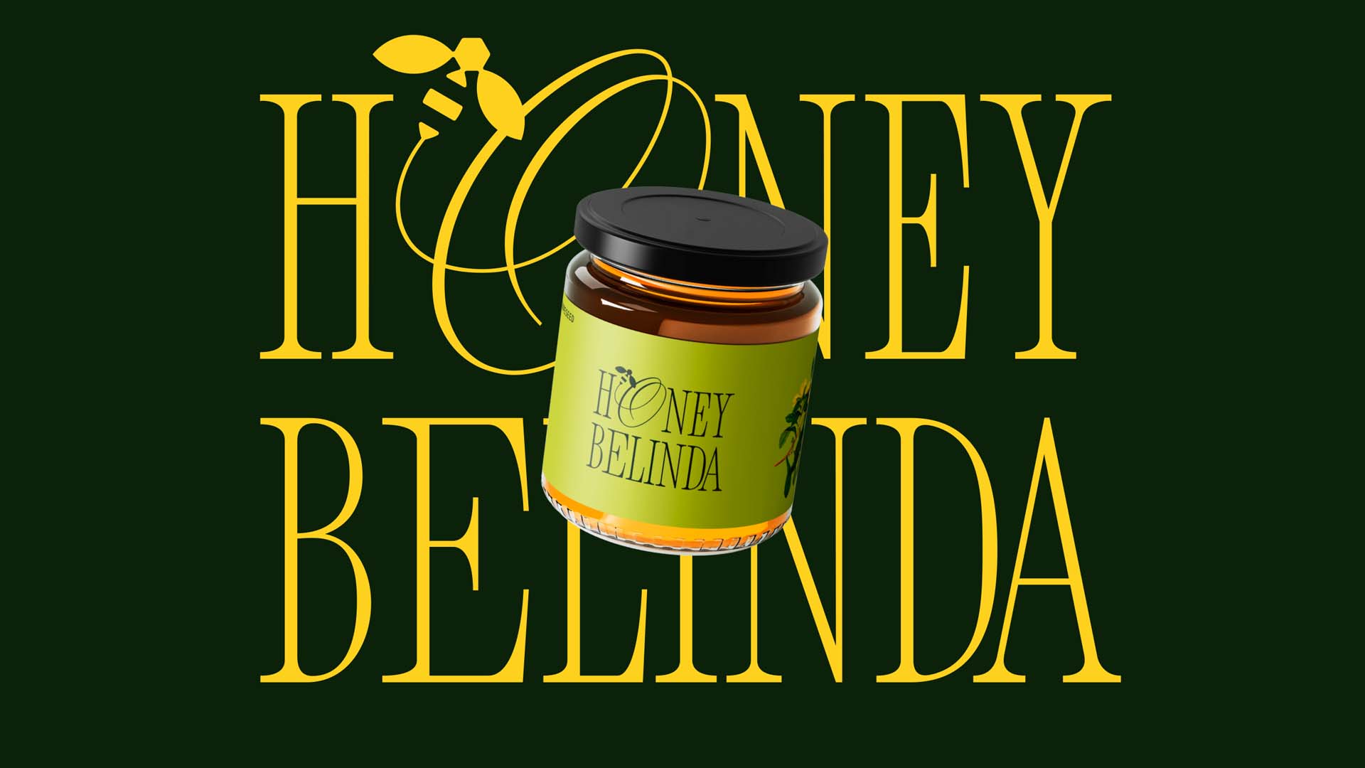
The logo became the centerpiece of the brand’s visual identity. A stylized honeycomb was chosen as the primary symbol, representing honey’s purity and richness. The geometric simplicity of the honeycomb shape was softened with elegant lines, giving the logo a sense of sophistication while staying true to the natural origins of the product. The color palette featured warm amber tones to reflect honey’s rich hues, paired with accents of gold and white to evoke luxury and purity. This combination created a visual language that was both inviting and upscale, perfectly capturing the essence of Belinda’s honey-tasting events.
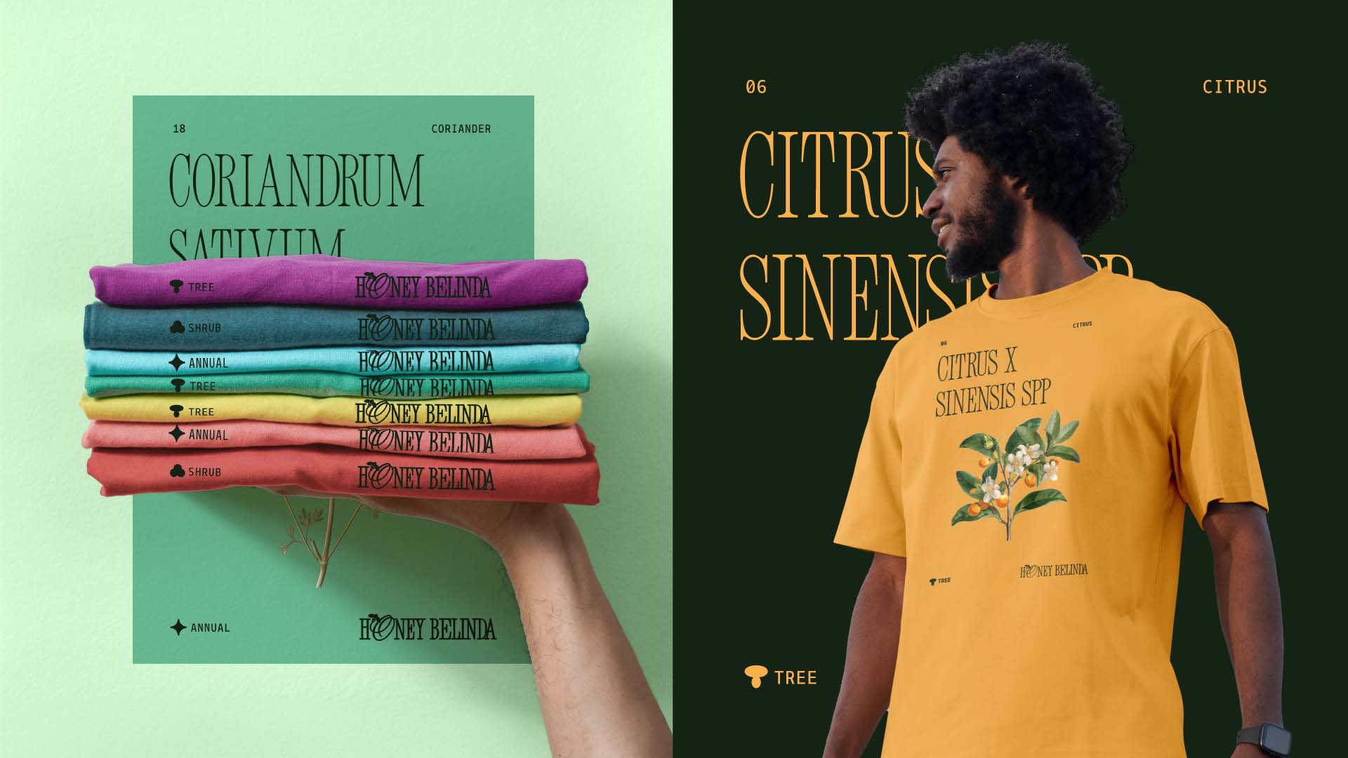
Typography played a key role in reinforcing the brand’s identity. A clean, modern serif typeface was selected to add an element of professionalism and refinement to the visual design. The serif font conveyed a sense of tradition and expertise, while the modern styling kept it approachable and contemporary. This balance was essential to ensuring that the brand would appeal to a wide audience, from honey enthusiasts to individuals looking for unique and luxurious tasting experiences.
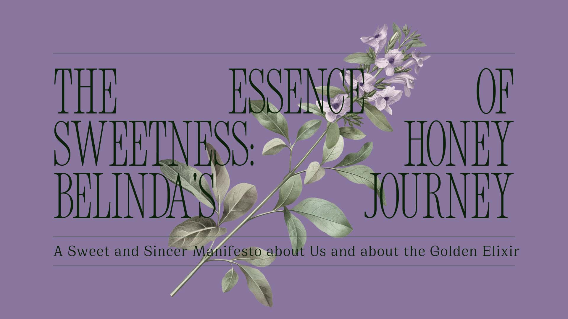
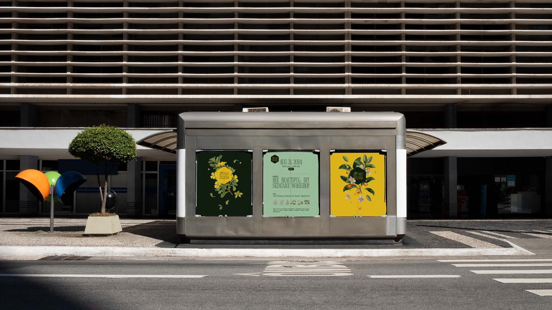
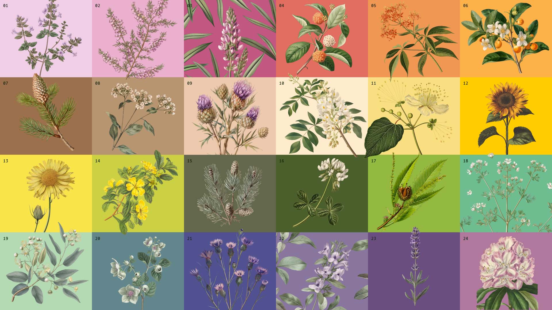
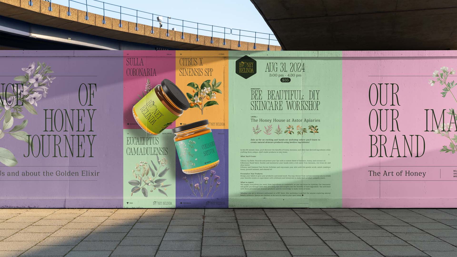
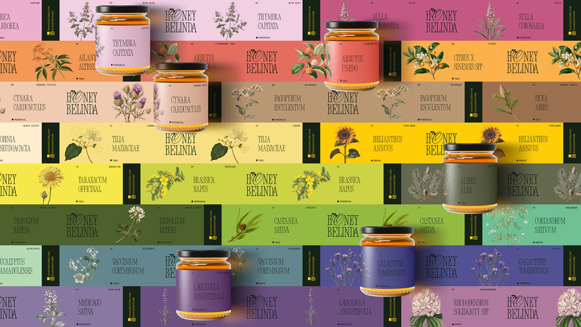
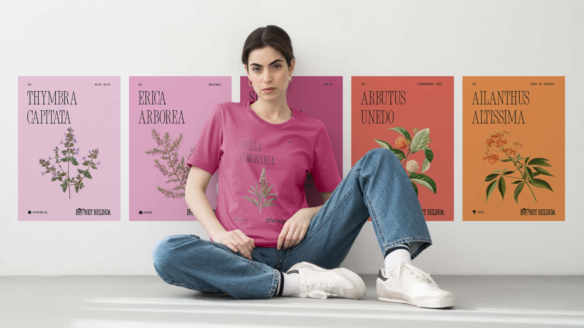
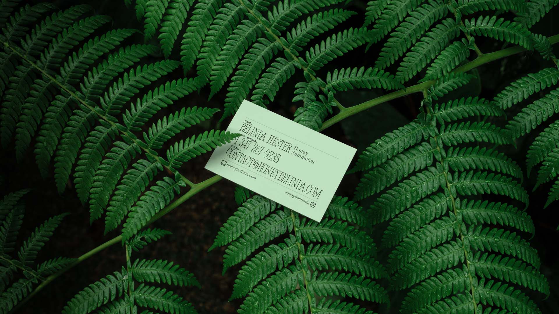
The brand’s visual identity extended into the design of packaging and event collateral. Packaging for honey jars was developed with a focus on elegance and simplicity, using the amber and gold color palette to create a premium look. The jars featured clean, minimalist labels with the stylized honeycomb logo, reinforcing the brand’s connection to nature and luxury. Event materials, such as invitations and tasting notes, were also designed with the same attention to detail, ensuring that every aspect of the brand experience was cohesive and refined. The flowing graphics used throughout these materials were inspired by the natural movement of honey, adding a dynamic yet organic feel to the brand’s presentation.
The outcome of this branding project was a cohesive and sophisticated visual identity that reflected the passion and expertise of Honey Belinda. The refined brand positioning successfully elevated Honey Belinda in the market, positioning it as a premium, educational experience in the world of honey tasting. Through its luxurious design and consistent application across all touchpoints, Honey Belinda now stands as a distinguished brand that enhances the perception of honey tasting as an exclusive, sensory journey.
This case study underscores the power of strategic branding in transforming a niche service into a premium offering with broad appeal. By understanding the client’s vision and translating it into a compelling visual language, the brand became a symbol of quality, luxury, and expertise in the honey-tasting industry. Honey Belinda’s identity is now not only synonymous with honey expertise but also with a sophisticated, high-end experience that sets it apart in the growing market for artisanal products and unique gastronomic and beauty experiences.
CREDIT
- Agency/Creative: Rexmachina
- Article Title: Honey Belinda’s Journey by Igor Sá Fortes
- Organisation/Entity: Freelance
- Project Type: Identity
- Project Status: Published
- Agency/Creative Country: Brazil
- Agency/Creative City: São Paulo
- Market Region: South America
- Project Deliverables: Brand Identity, Design, Graphic Design, Identity System, Illustration, Logo Design, Packaging Design, Retail Design
- Industry: Beauty/Cosmetics
- Keywords: honey bee branding Event conference brand identity ILLUSTRATION botanical Flowers apiculture
-
Credits:
Head of Design: Igor Sá Fortes


