ihapstudio – Kati’s
“Kati’s
Homemade ice cream from Chang Island Thailand. We’re the brand image in vintage mood and tone.
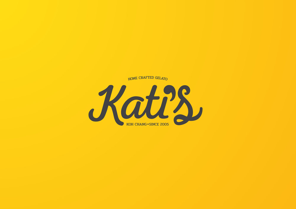
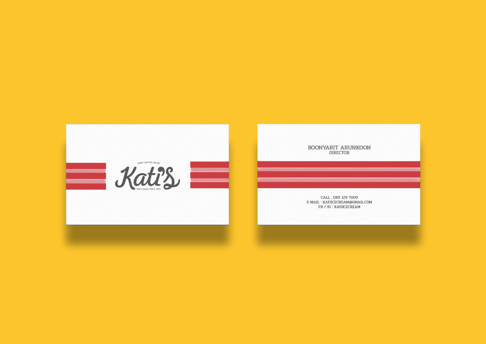
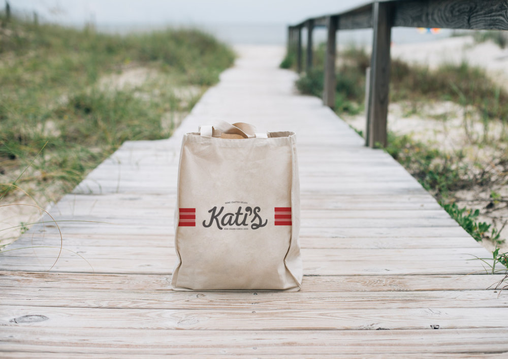
We create a logotype and combination between ( i ) and ( ‘ ) to one piece that makes the detail simple. And design the ” S ” for making a balance of ” K ” that make the overall design symmetry.
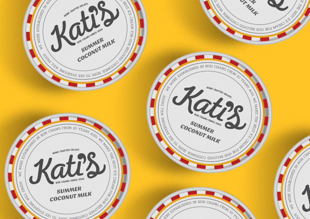
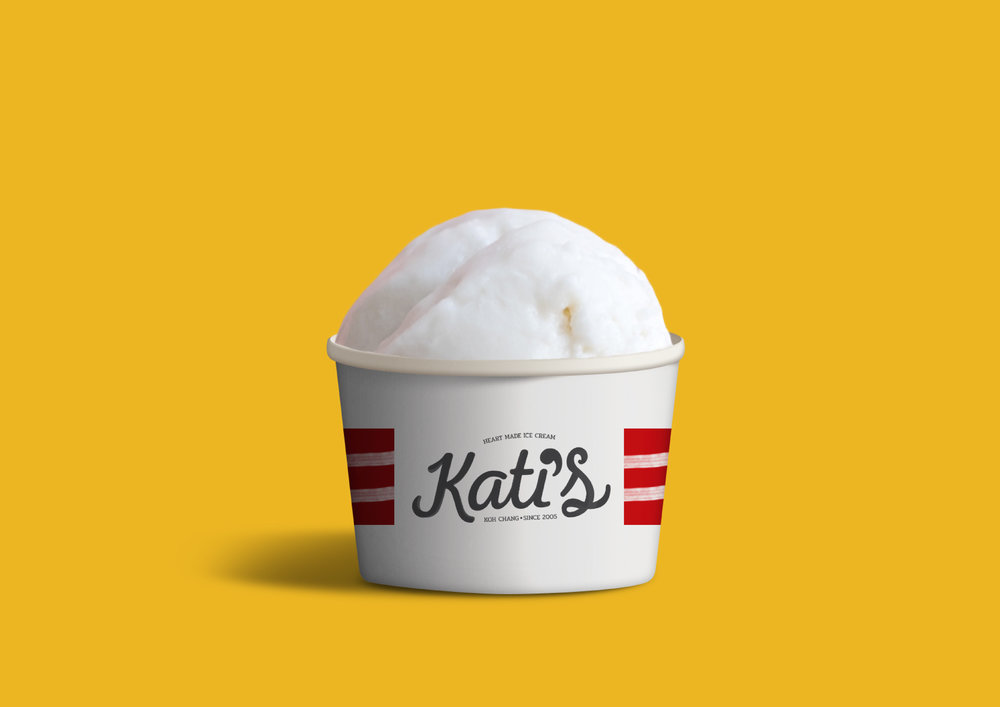
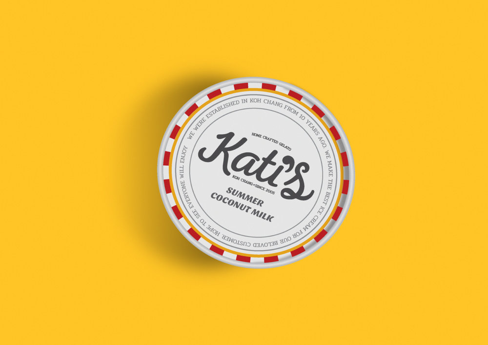
For packaging, we create a stroke for use on the cup. And design a lid in vintage style with the story of the brand.”

CREDIT
- Agency/Creative: ihapstudio
- Article Title: Homemade Ice Cream from Chang Island Thailand
- Organisation/Entity: Agency Commercial / Published
- Project Type: Packaging
- Agency/Creative Country: Thailand
- Market Region: Asia
- Format: Cup
- Substrate: Pulp Paper
FEEDBACK
Relevance: Solution/idea in relation to brand, product or service
Implementation: Attention, detailing and finishing of final solution
Presentation: Text, visualisation and quality of the presentation


