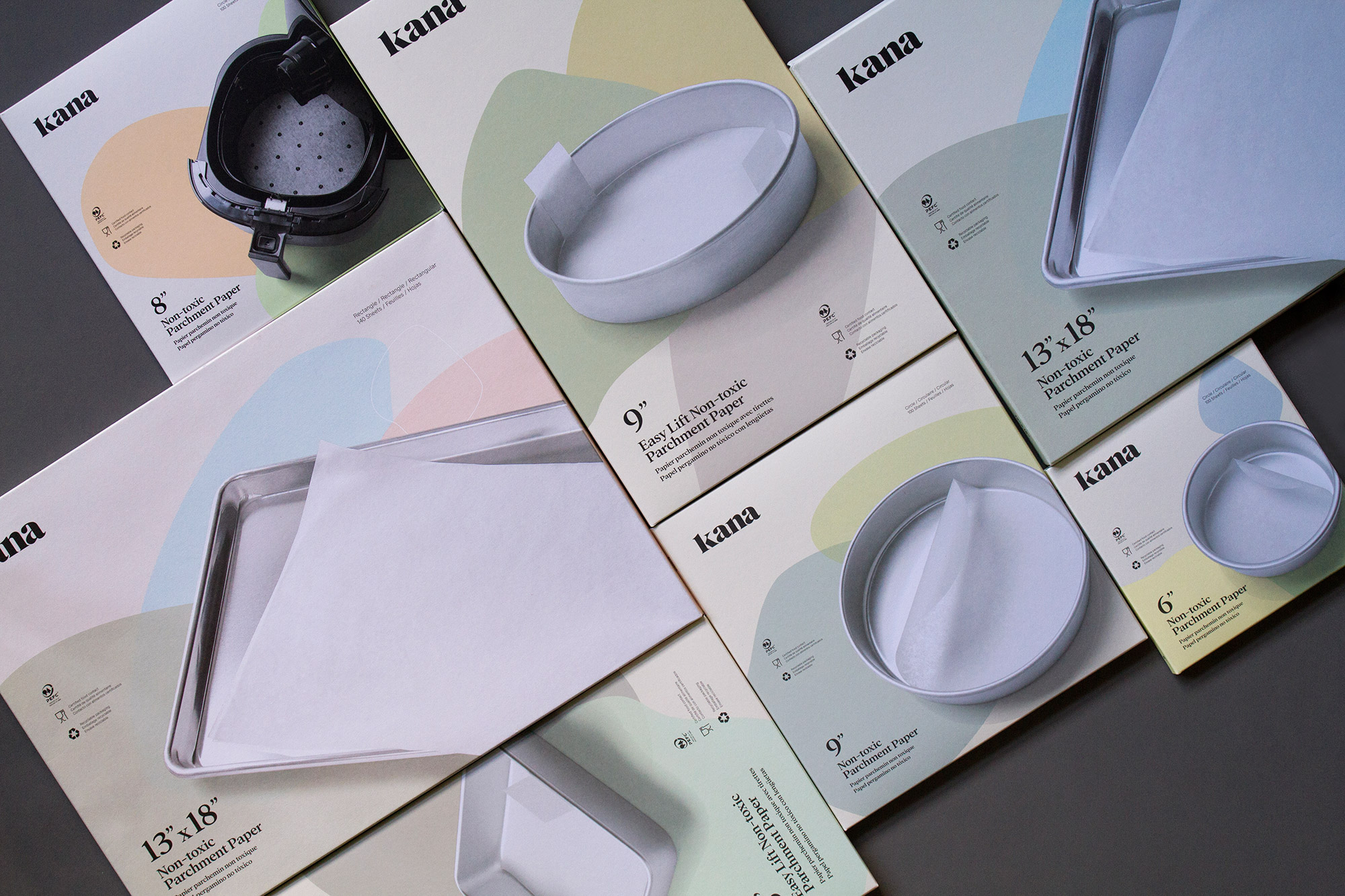
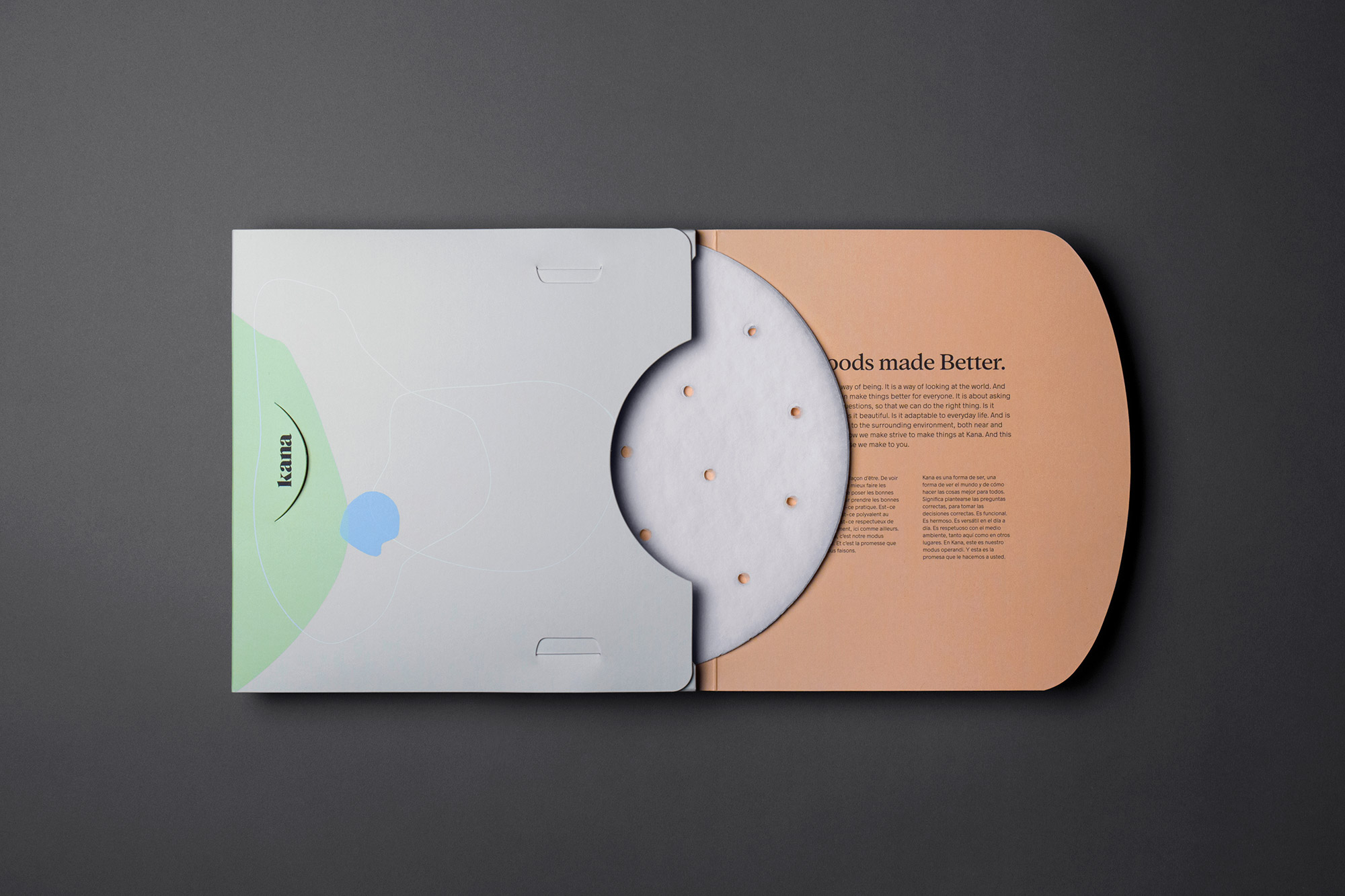
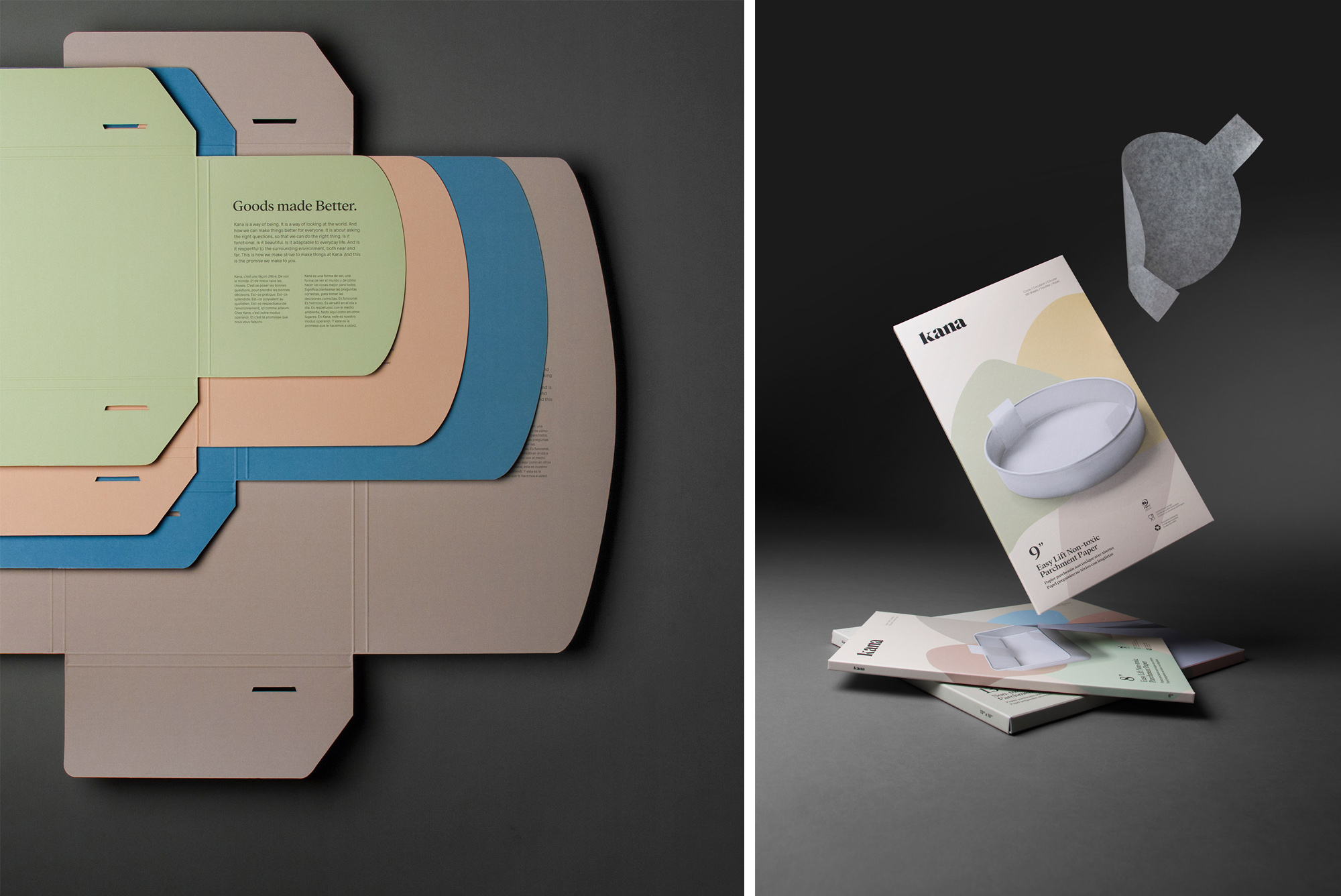
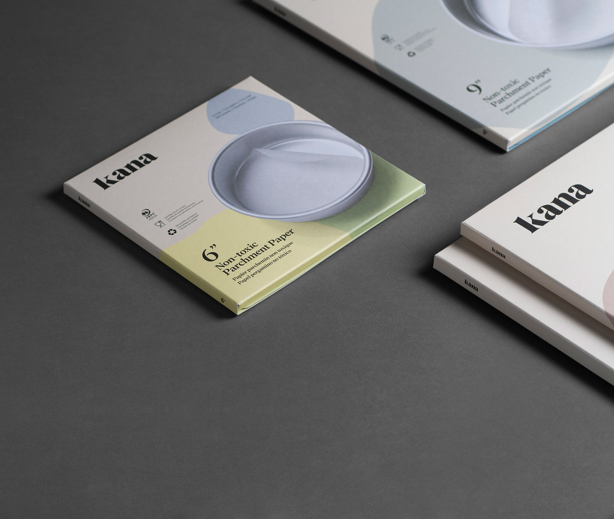
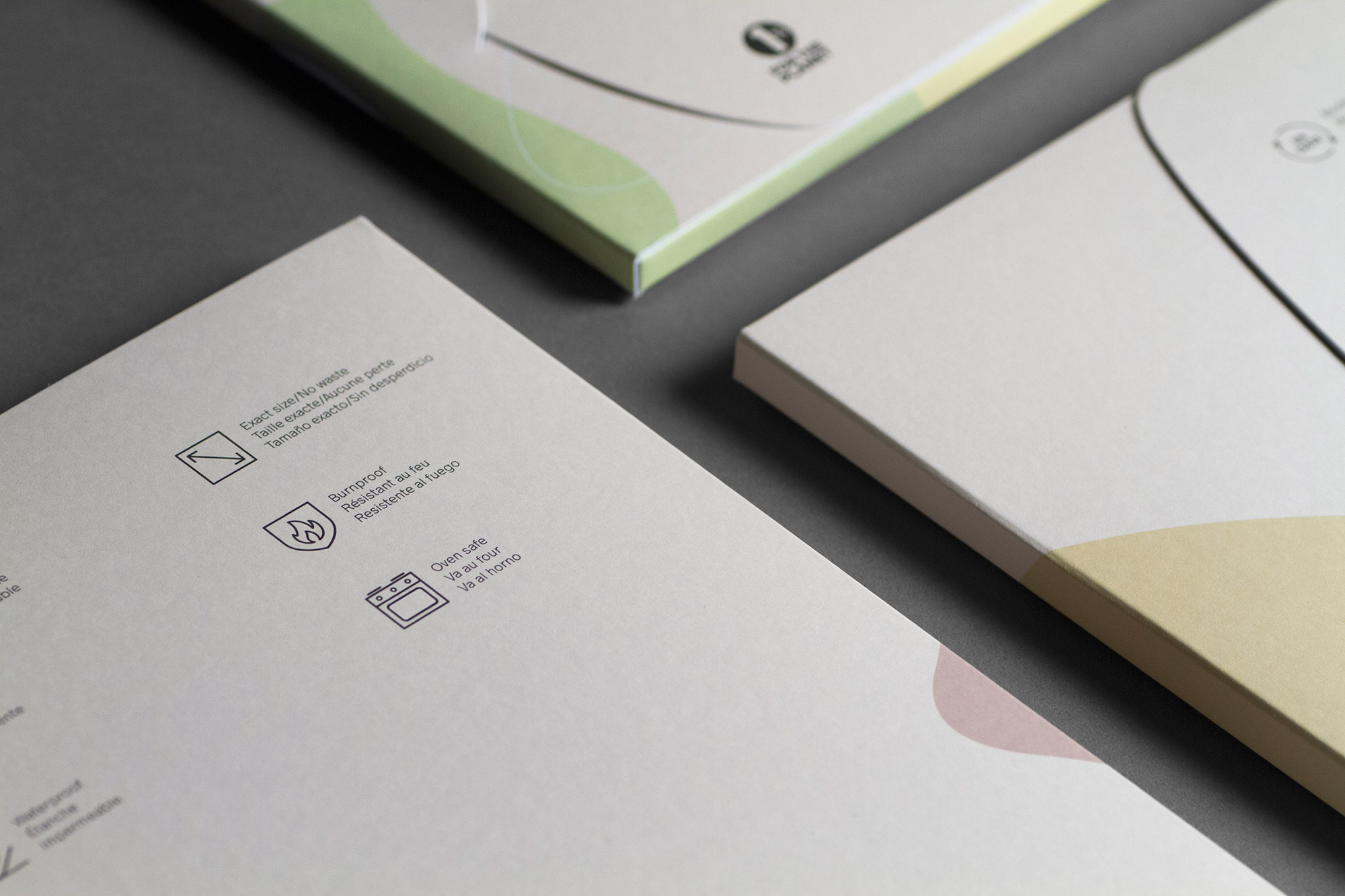
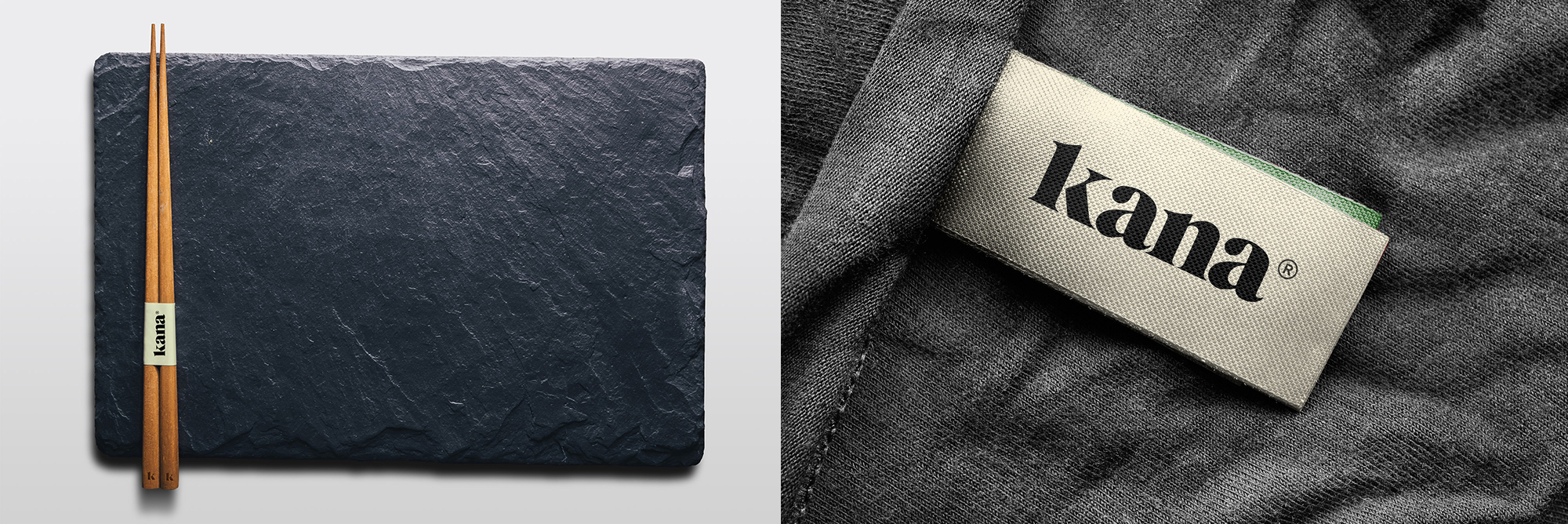
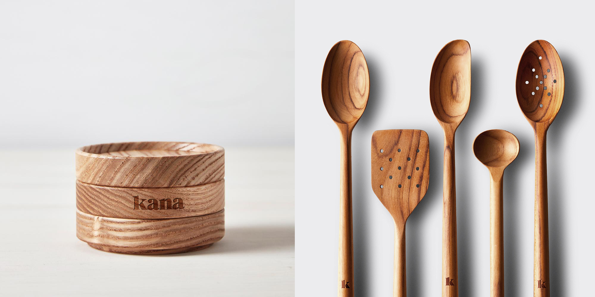
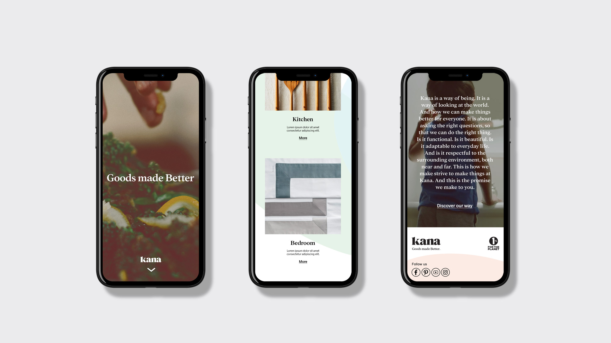
Visual identity for Kana, a brand of home products that facilitates the adoption of healthy and eco-responsible behaviours. Wishing to contribute to our individual and collective well-being, the brand aims to offer a wide range of useful, simple and beautiful products. This promise is visually embodied through the sinuosity of the typography and the earth/pastel colors, all backed by a play of abstract forms. This combination gives an organic look to the whole, exuding a general emotion of serenity. First attacking the market with a range of non-toxic, pre-cut parchment paper, we packaged the product in a large set of boxes that required no glue but rather interlocked like origami. Goods made better.
CREDIT
- Agency/Creative: byHAUS
- Article Title: Home Products That Facilitates the Adoption of Healthy and Eco-responsible Behaviours
- Organisation/Entity: Agency, Published Commercial Design
- Project Type: Identity
- Agency/Creative Country: Canada
- Market Region: Global
- Project Deliverables: Brand Identity, Brand Strategy, Identity System, Packaging Design
- Industry: Hospitality
- Keywords: Packaging, Identity, House, Products
FEEDBACK
Relevance: Solution/idea in relation to brand, product or service
Implementation: Attention, detailing and finishing of final solution
Presentation: Text, visualisation and quality of the presentation


