


Hollow State is an American whiskey brand inspired by the forgotten geographies of the United States: remote hollows, interior routes, surveyed land, and the fragments of place preserved in old maps and archival records. Rather than building the project around a conventional distillery story, we chose to ground it in the visual language of cartography, preservation, and time.
From the beginning, we wanted the brand to feel unearthed rather than introduced. More than a bottle of whiskey, we imagined it as an object shaped by age, handling, and memory, something discovered, preserved, and carried forward from another era.
For this project, we were interested in an America that exists outside its most familiar symbols. Instead of looking at the frontier through a polished or overly romantic lens, we focused on the quieter geography found in historical records: hollows, borderlands, trade routes, surveyed parcels, and rural territories that once held significance but later faded into the background.
That gave us a more distinctive foundation for the brand. Rather than borrowing from generic heritage cues, we built Hollow State around the idea of America preserved in fragments, through map edges, land documents, archival markings, and surfaces altered by time. This allowed us to create a whiskey identity that feels rooted in place without depending on cliché.
The name Hollow State was chosen for its double meaning.
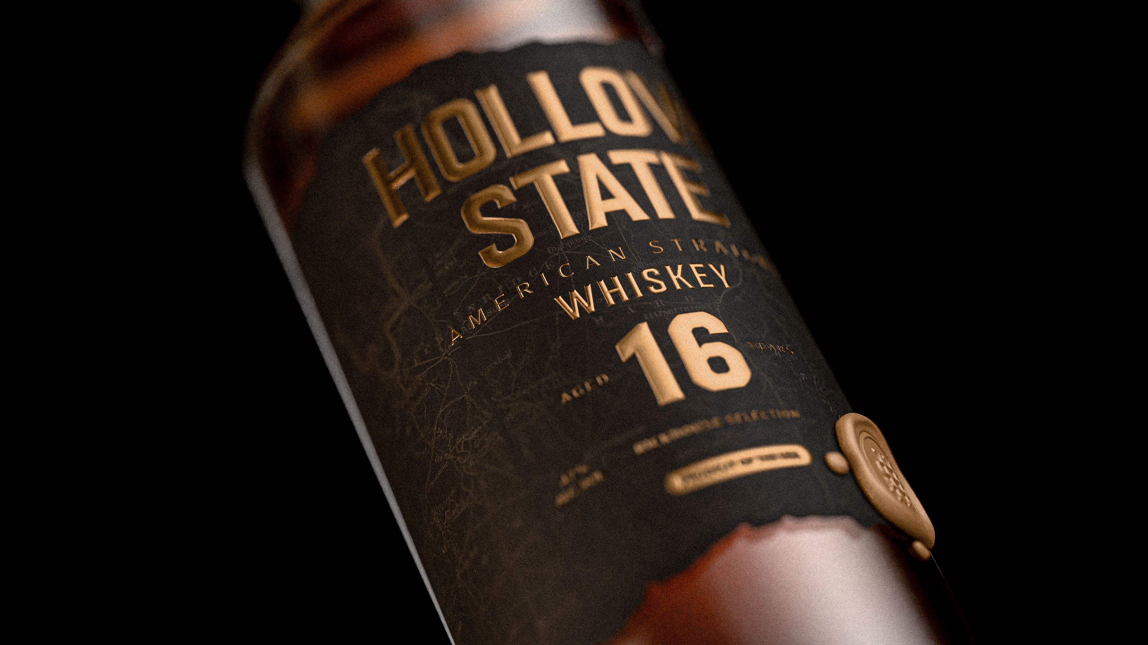
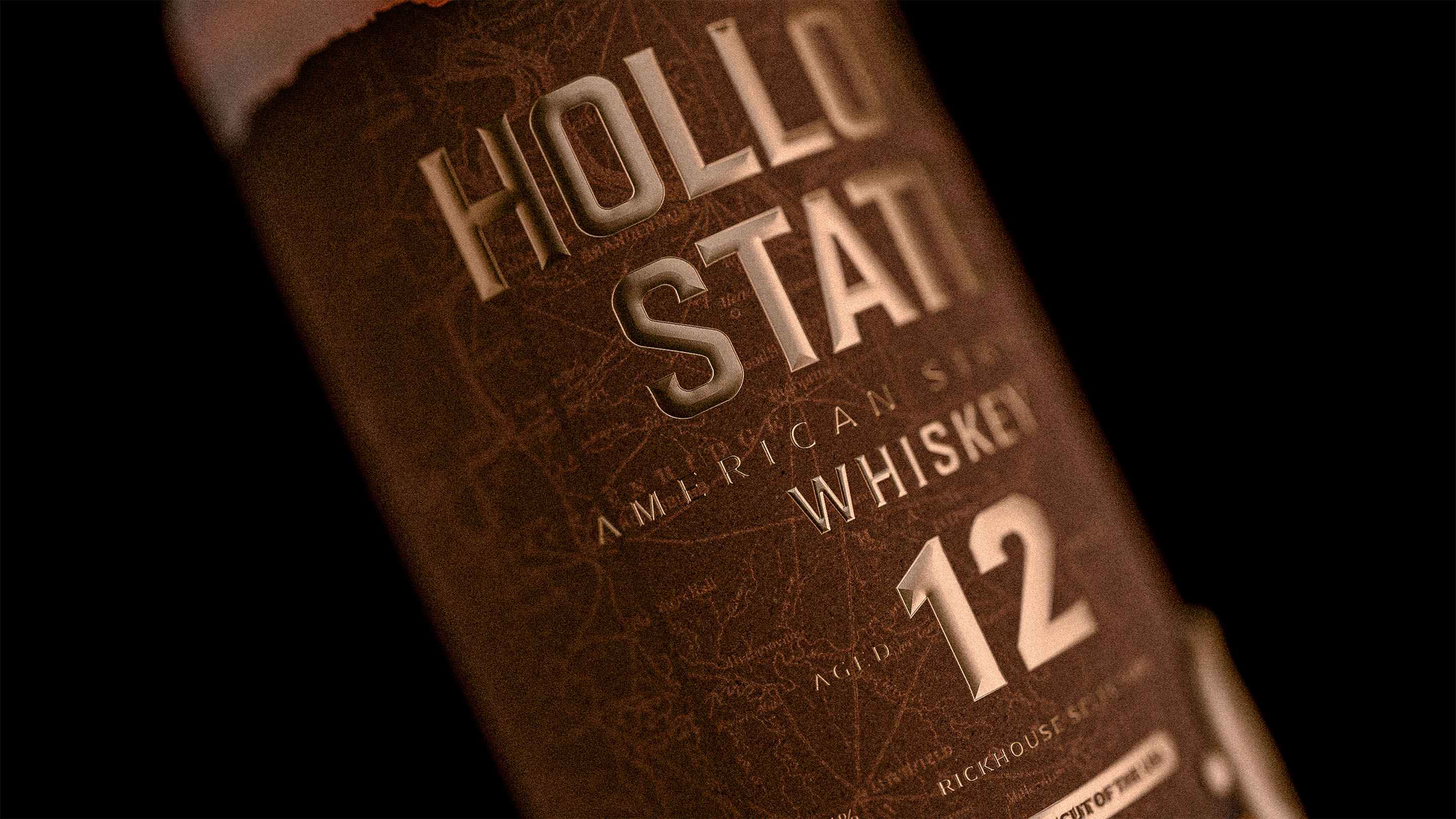
The word “hollow” refers to a real geographical condition, especially in parts of rural America, where the term is used to describe enclosed valleys, hidden lowlands, and places shaped by isolation and terrain. It suggests remoteness, depth, and a landscape slightly removed from the main route.
The word “state” introduces a second layer. It can be read as territory, jurisdiction, and mapped land, but also as condition: a state of preservation, a state of ageing, a state altered by time. Together, the two words create a name that feels geographic and atmospheric at once. It speaks both to place and to transformation, which made it especially appropriate for a whiskey project, where time is not only part of the story but part of the substance itself.
We liked that it felt American without being obvious. It carries a sense of place, but also a sense of atmosphere.
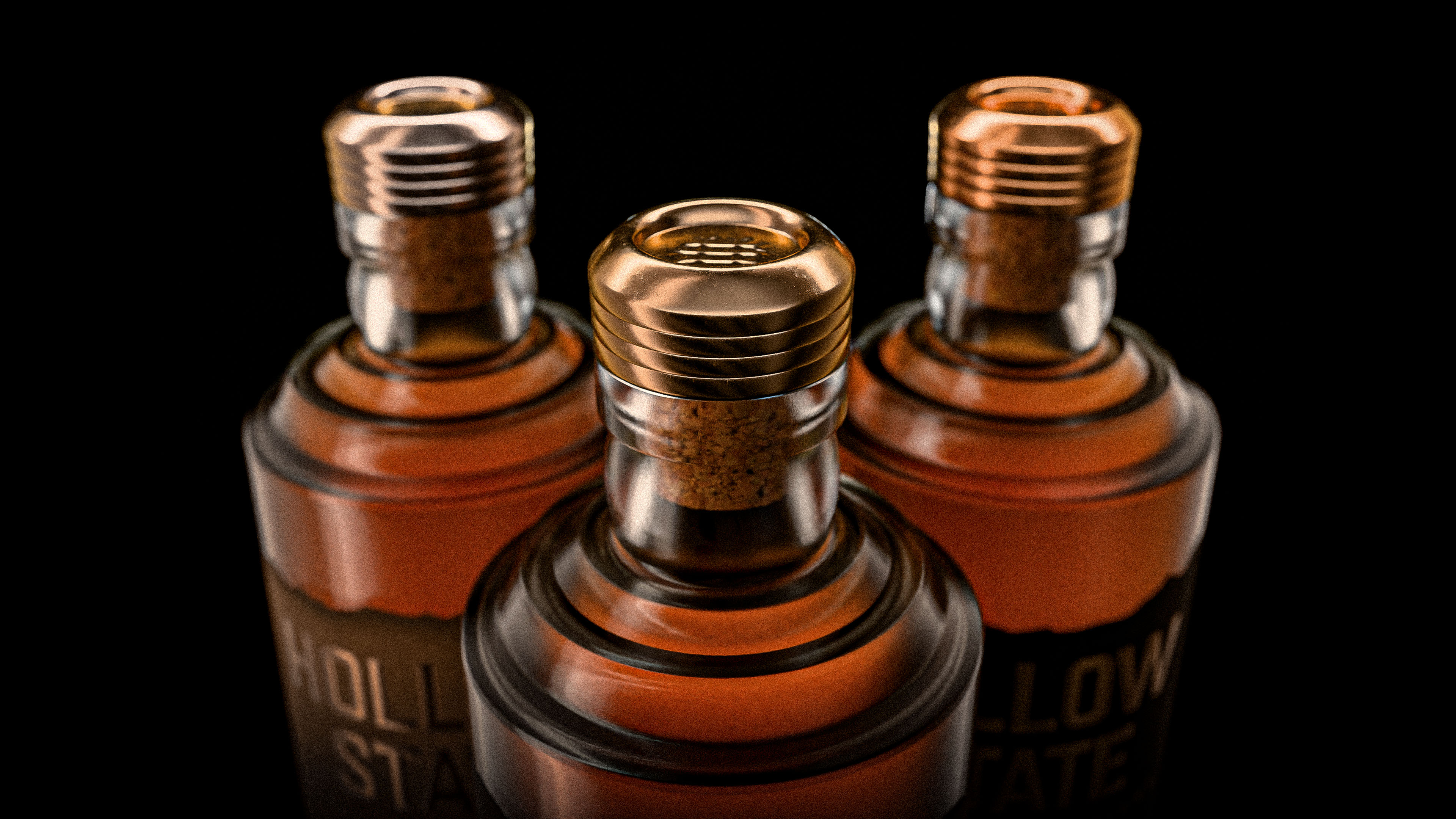
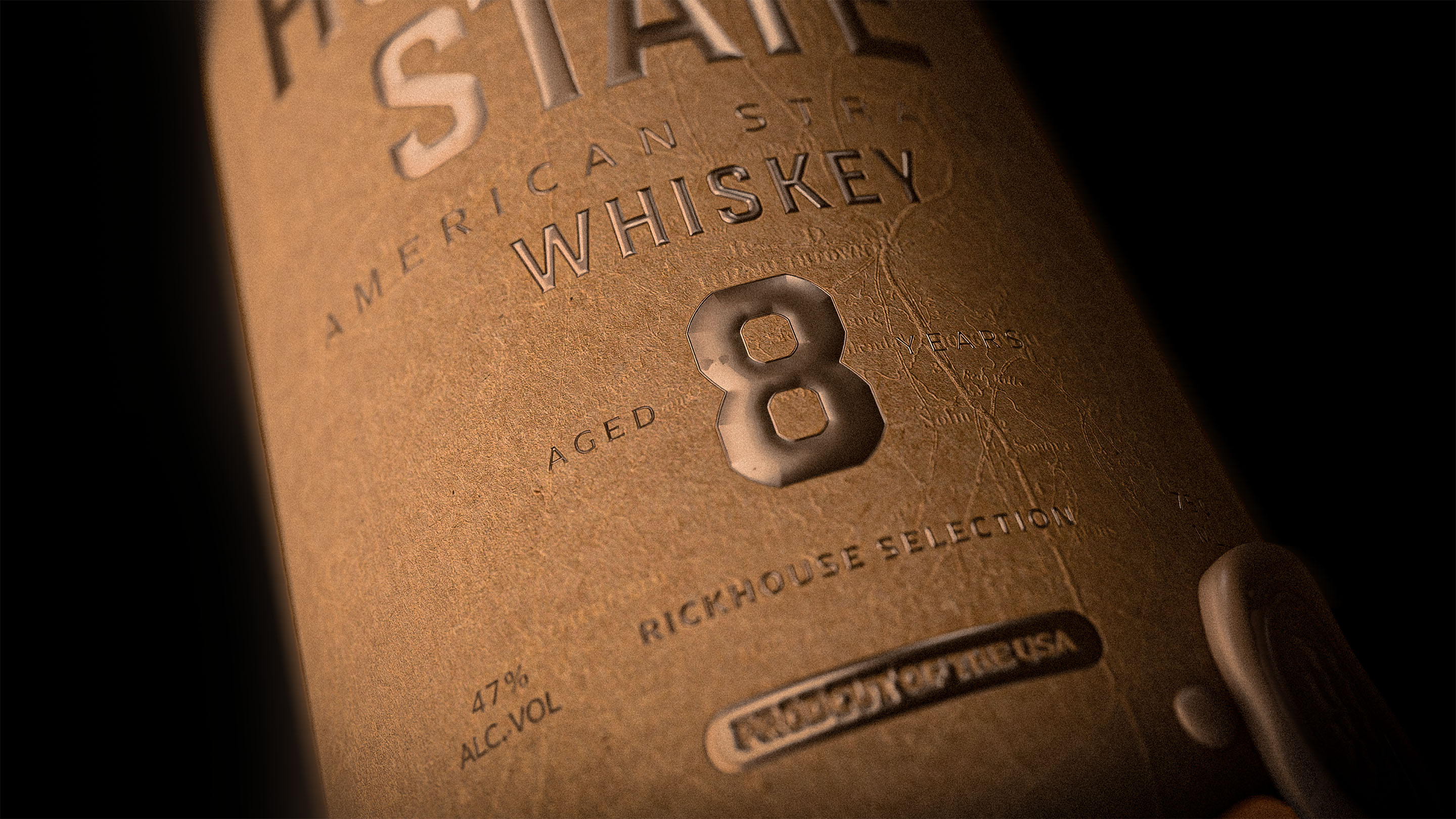
The project draws from the visual culture of American cartography and record-making. In the nineteenth and early twentieth centuries, maps, survey drawings, land registries, and county archives played a central role in how territory was measured, claimed, and remembered. Over time, these documents developed a strong material character: softened edges, darkened paper, worn folds, faded ink, metallic stamps, and traces of repeated handling.
We used that world as the historical backbone of the project. Rather than imitating a specific vintage label style, we wanted to borrow from the broader language of archival documents and aged records. That gave the brand a more credible and layered reference point.
What interested us most was the parallel between whiskey and record. Both are shaped by time, both carry provenance, and both gain meaning through preservation, trace, and age.
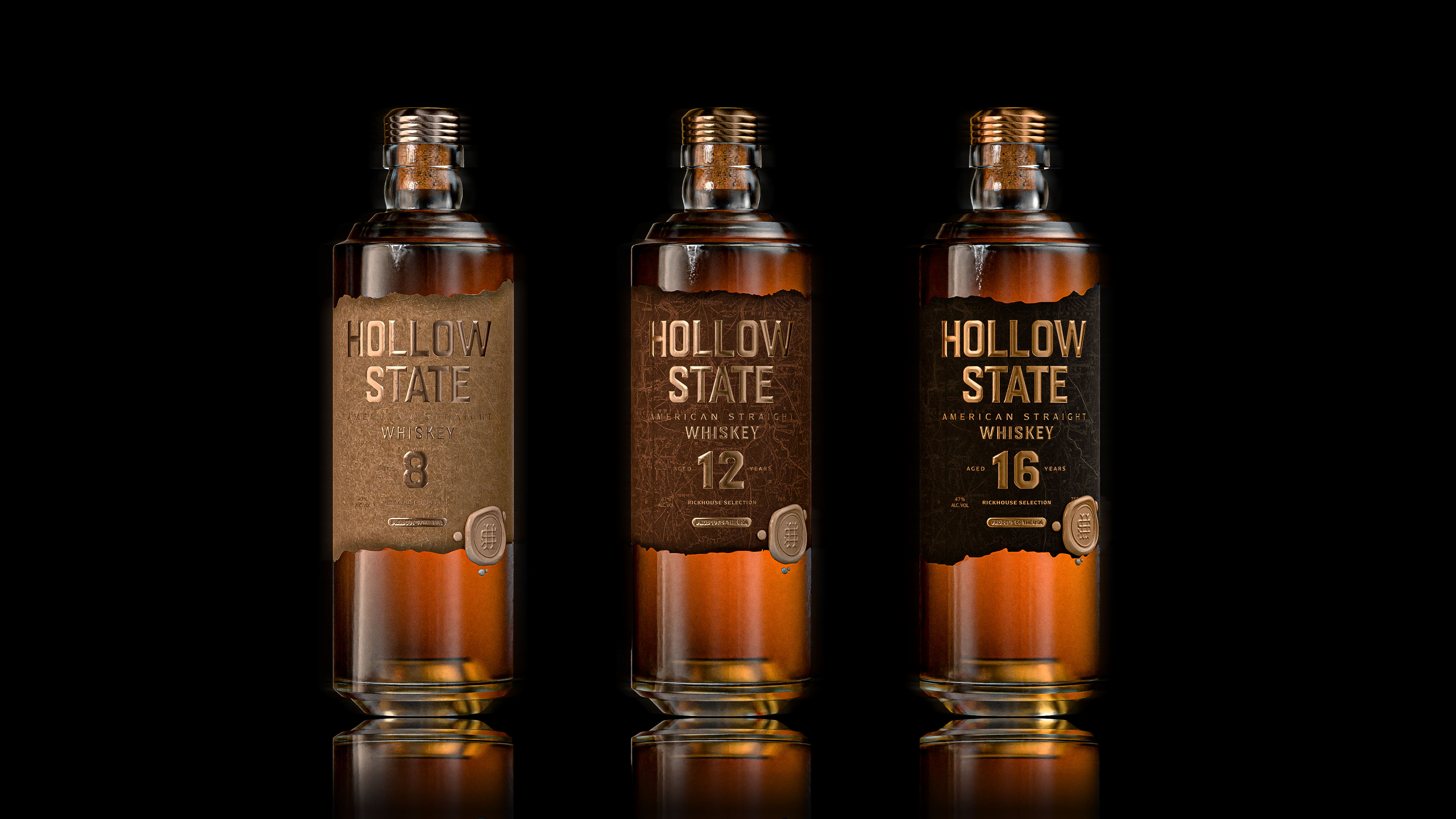
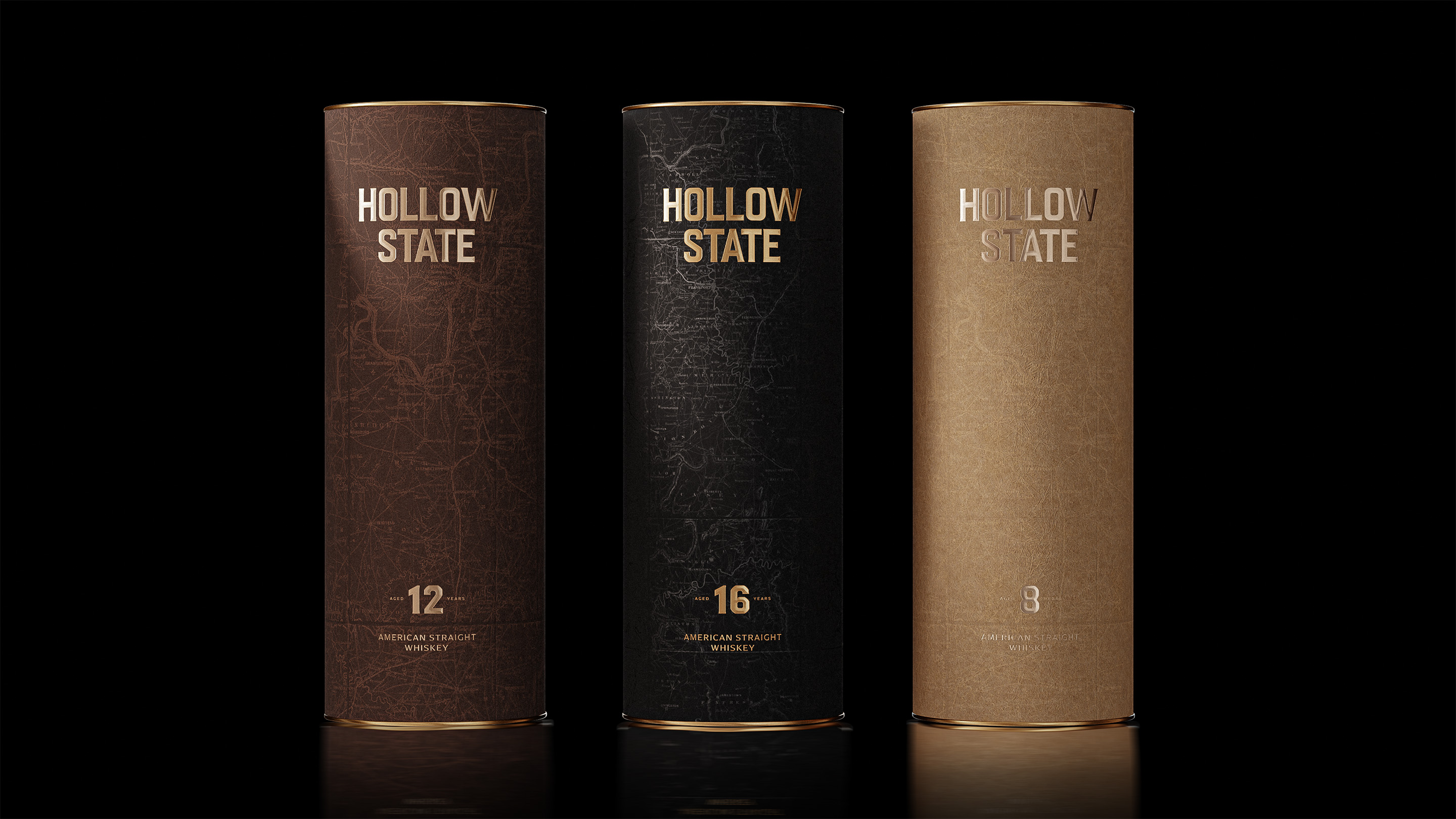
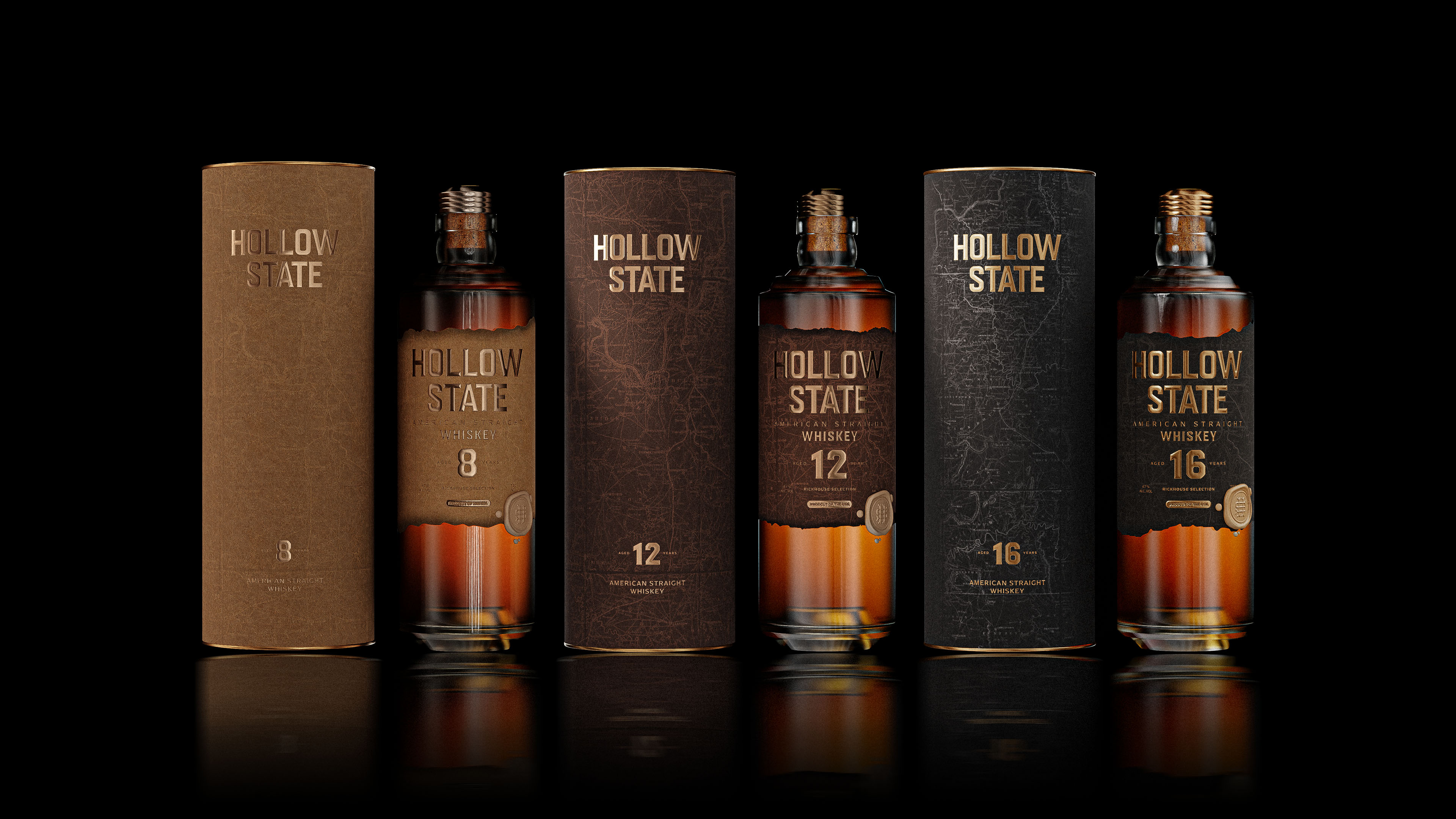
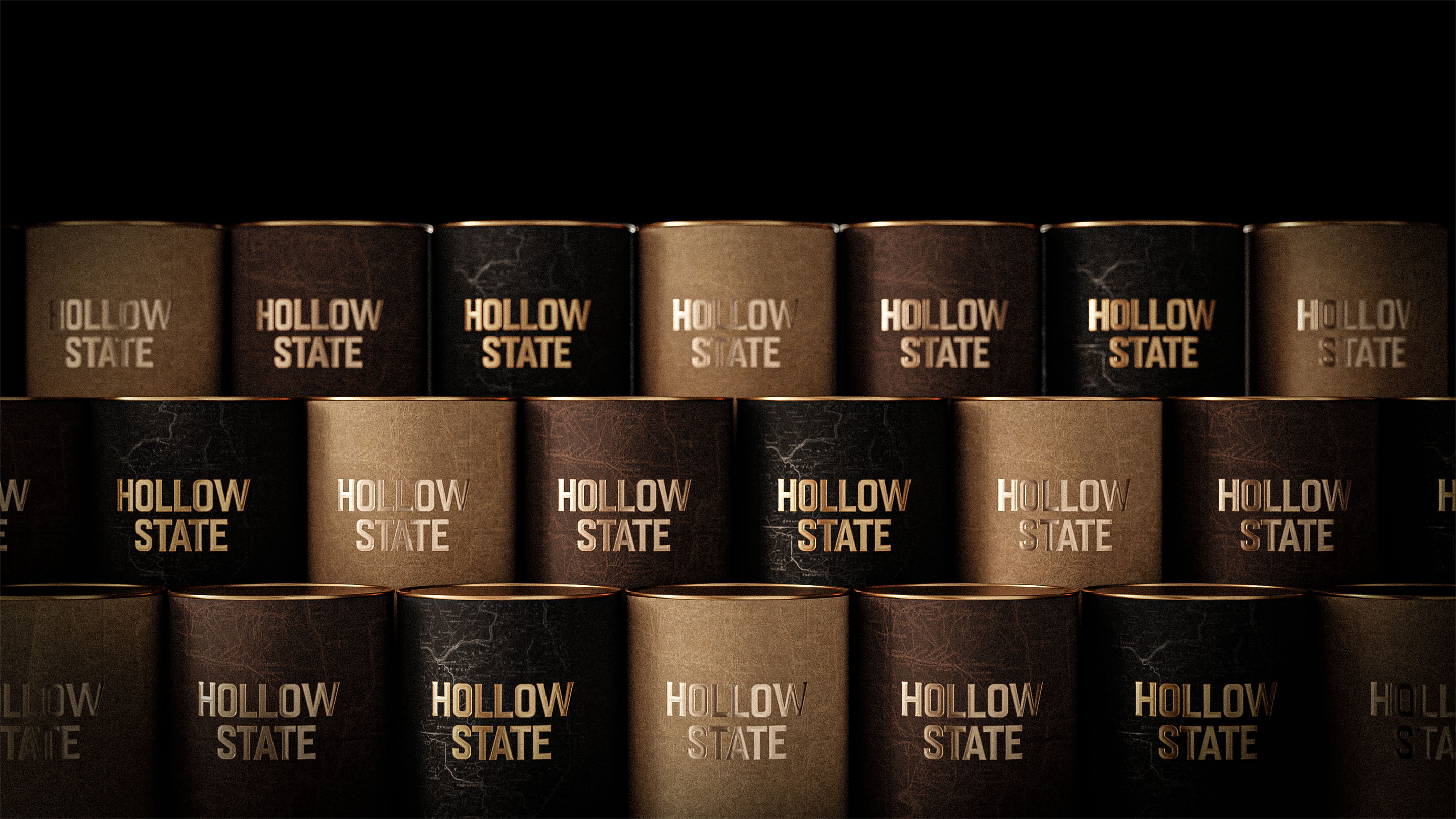
We also approached Hollow State as a scalable family rather than a single bottle.
Instead of differentiating expressions only through colour, we imagined variation through density, exposure, and surface treatment. Some expressions could feel lighter and more parchment-like, while others could move toward deeper, more charred finishes. This allows the range to stay cohesive while giving each bottle its own degree of age, depth, and character.
That was important to us from the start. If the brand is built on archival logic, then each expression should feel like a different fragment from the same world: connected, but not identical.
CREDIT
- Agency/Creative: Alliron Studio
- Article Title: Hollow State – An American Whiskey Drawn from the Margins of the Map
- Organisation/Entity: Agency
- Project Type: Packaging
- Project Status: Published
- Agency/Creative Country: Spain
- Agency/Creative City: Bilbao
- Market Region: North America
- Project Deliverables: Art Direction, Brand Creation, Brand Naming, CGI, Creative Direction, Label Design, Packaging Design
- Format: Bottle, Box
- Industry: Food/Beverage
- Keywords: American whiskey, whiskey packaging, conceptual branding, premium spirits, archival design, cartographic references, historical narrative, old map aesthetic, burnt edges, tactile packaging, dark glass bottle, metallic typography, vintage document texture, heritage-inspired design, contemporary packaging, material-driven branding, atmospheric branding, rustic luxury, Americana, visual storytelling
-
Credits:
Creative Director: Alex Winterbottom


