


Holla is a local design studio curated by Eko Widarto who is also the founder of Widarto Impact. Holla was designed as a design studio that develops local resources and packages them better so as to provide value to goods through the Holla brand.
Holla has several brand architectures namely, Holla Studio, Holla Store, Holla Bamboo, and Holla Coffee.
Considering that the area where Holla Studio was founded has abundant natural resources. This makes us see an opportunity to empower local wisdom as a product that has value. For example, bamboo, which can be maximized as sustainable packaging to support the sustainability of nature, which is currently dominated by plastic packaging. Therefore, it needs to be studied specifically, and developed to meet the needs of the market, era, and sustainability.
One of the reasons for the establishment of Holla Studio is to elevate the role of design practitioners which so far have not received appreciation from local business people, not only in the city of Trenggalek, but also in Indonesia as a whole. Holla wants to elevate design to a valuable profession like other professions such as doctors, etc.
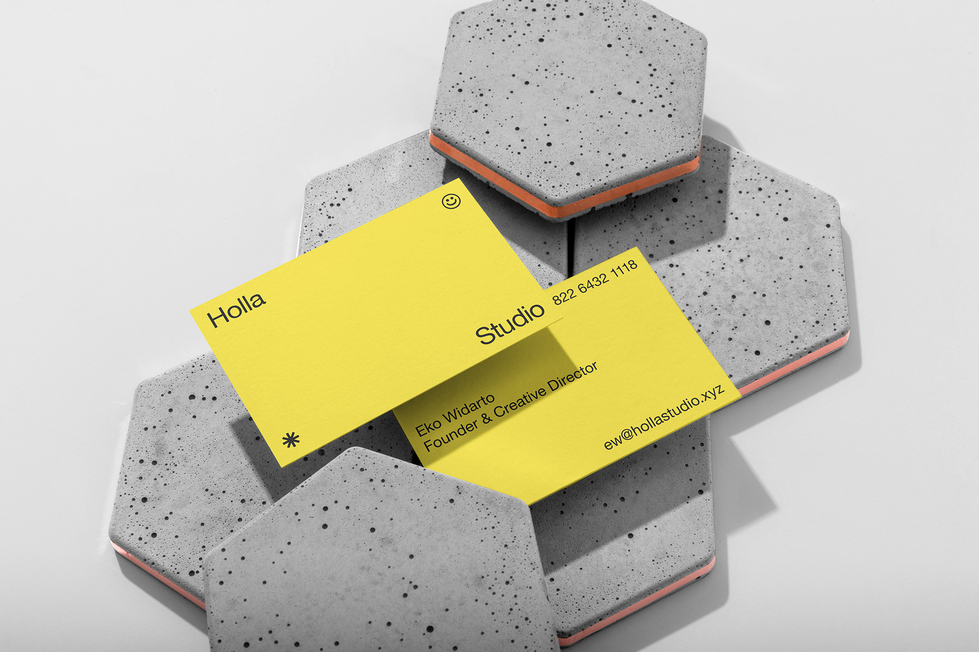
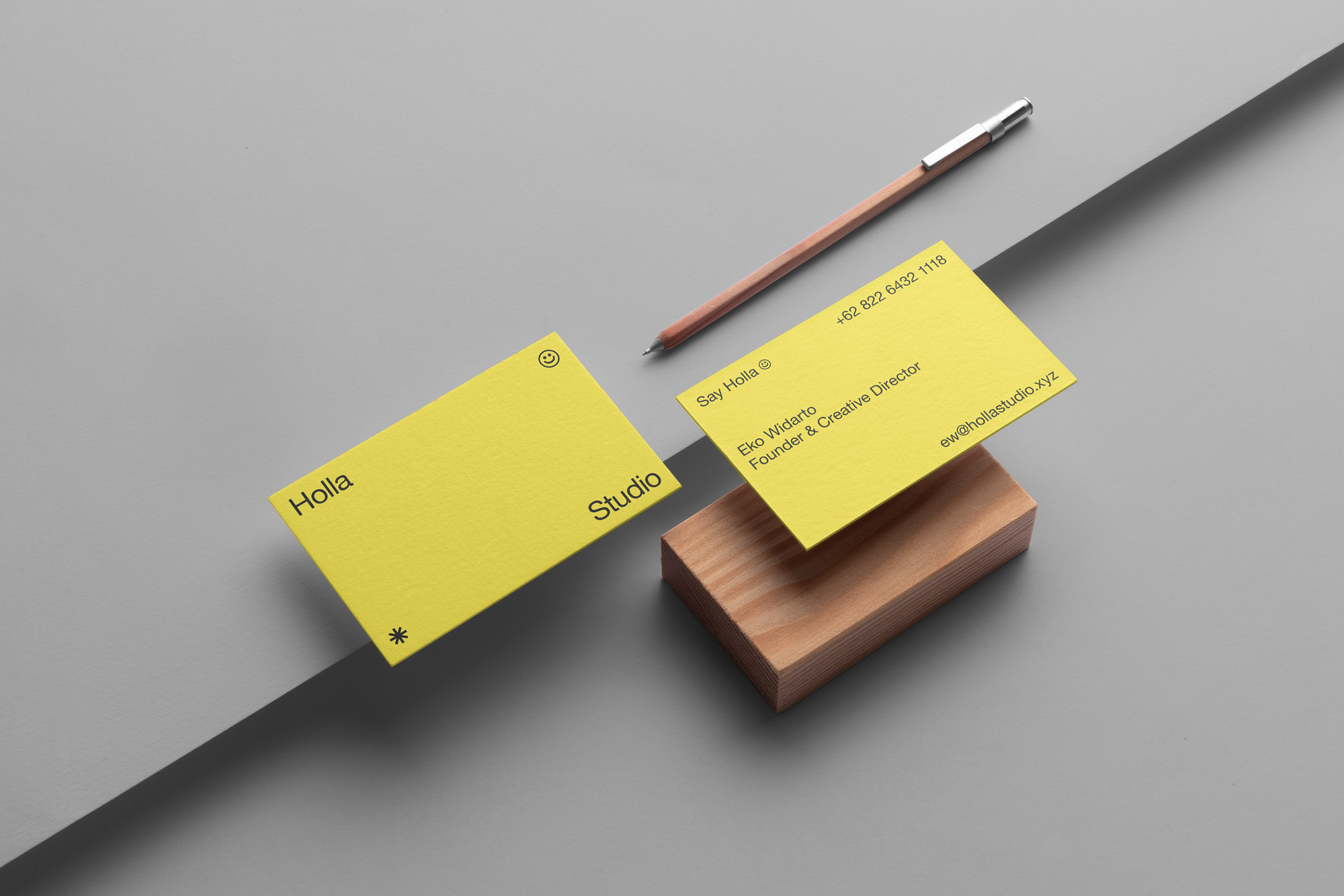
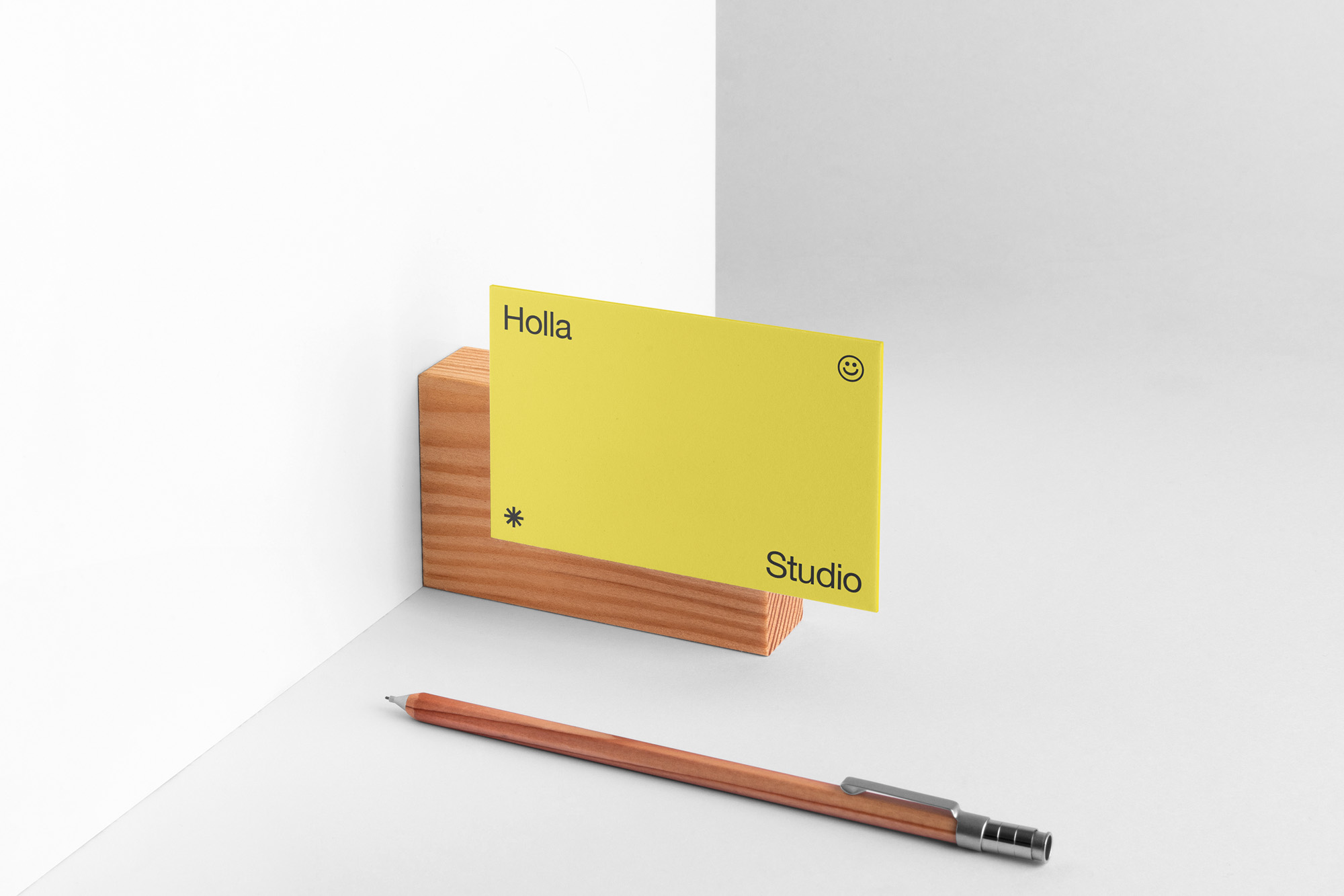
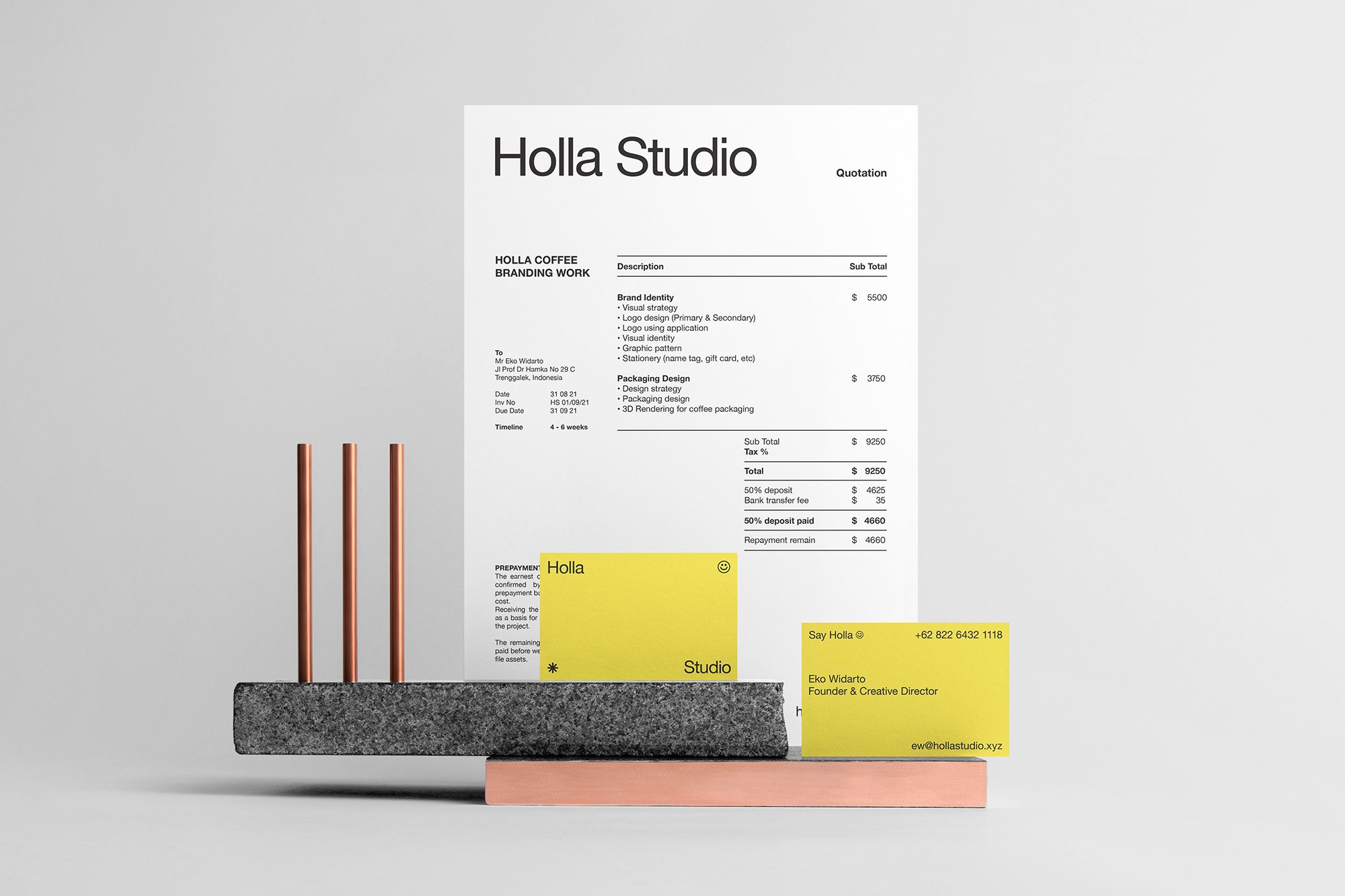
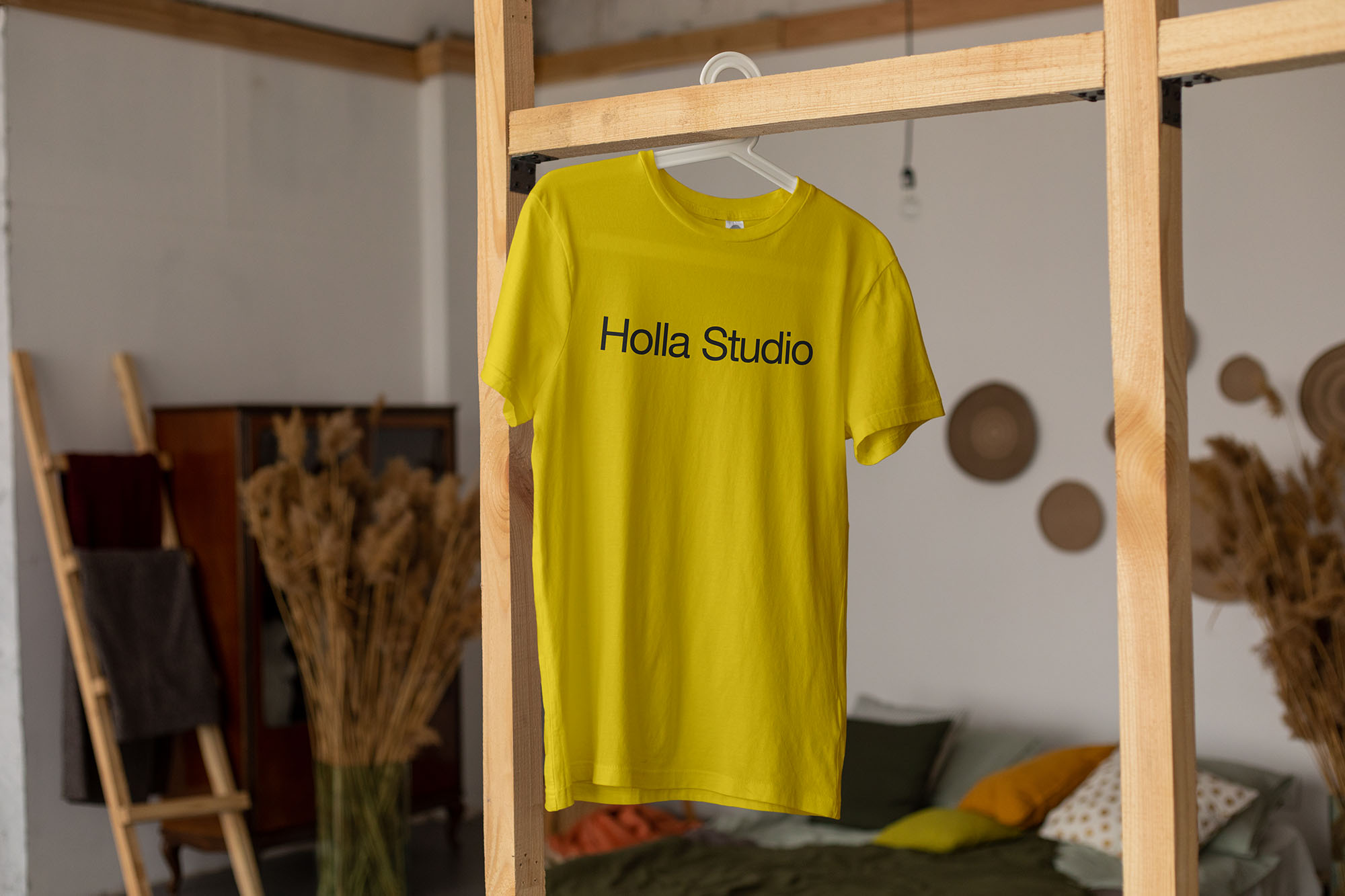
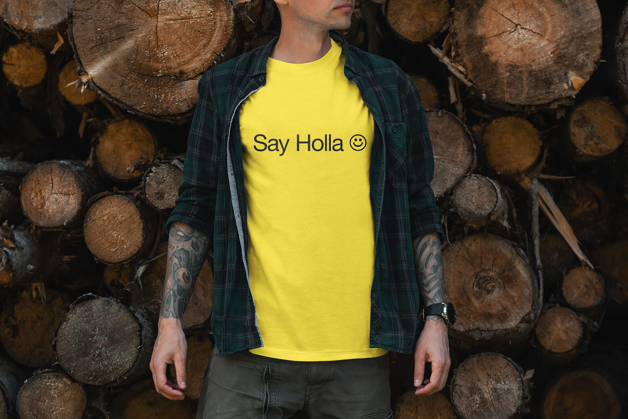
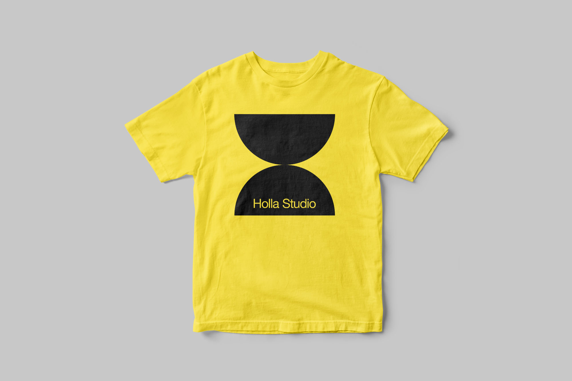
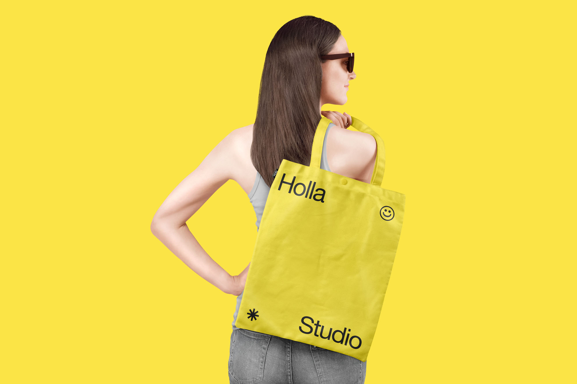
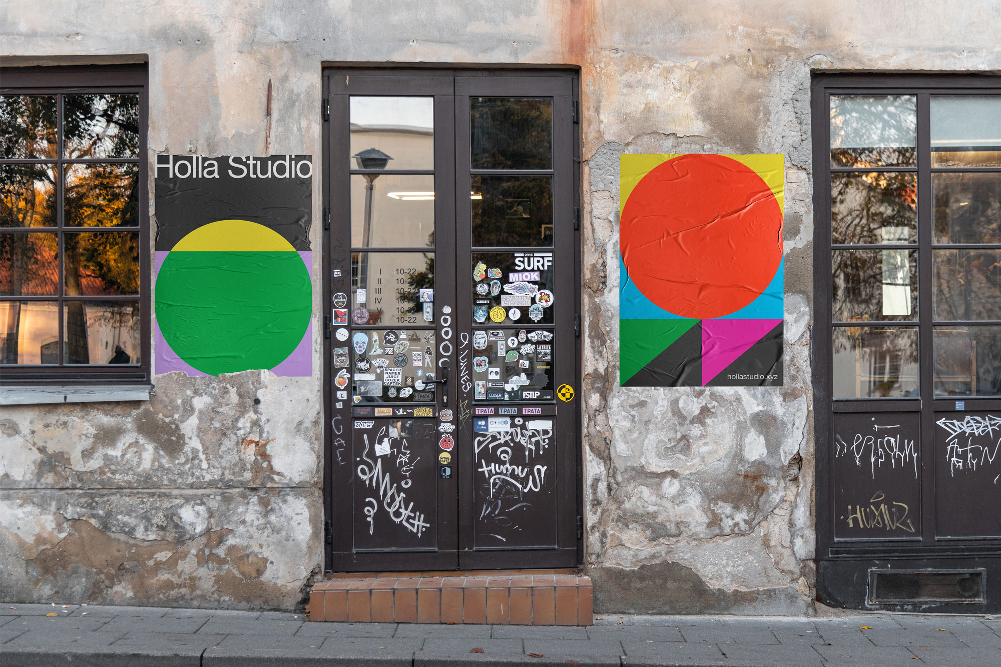
Holla wanted to present something that was inspiring, and full of energy. It is conveyed in yellow as a means of conveying this emotion. Pantone 106 C is a bright, cheerful yellow that shimmers with vivacity, a warm, solar-inspired yellow. While Pantone Neutral Black is a symbol of the natural elements as a solid foundation in life. This two-tone mix accentuates the ability to stand the test of time, act calmly reassuringly, encourage feelings of calm, stability, and resilience.
For the logotype and typeface we chose Helvetica Neue to represent Holla. Helvetica Neue has a firm character, but is flexible, clear, simple, and timeless.
Eko Widarto as the main designer who designed Holla Studio, wanted to present Holla according to it’s personality. Maximize the brand message through colors and fonts. This is the simplest basis of how humans easily see and remember things.

CREDIT
- Agency/Creative: Widarto Impact
- Article Title: Holla Studio Identity Designed by Widarto Impact
- Organisation/Entity: Agency
- Project Type: Identity
- Project Status: Published
- Agency/Creative Country: Indonesia
- Agency/Creative City: Trenggalek
- Market Region: Asia
- Project Deliverables: Art Direction, Brand Guidelines, Brand Identity, Brand Naming
- Industry: Entertainment
- Keywords: Brand Identity, Visual Identity, Branding Agency Jeddah, Branding Agency Riyadh, Branding Agency Surabaya, Branding Agency Jakarta, Branding Agency Indonesia, Branding Agency Asia, GCC Branding Agency, Brand Identity Design
-
Credits:
Creative Director: Eko Widarto


