


Sloop- Many Stories, One Home
About the brand:
Sloop is a contemporary lifestyle and fashion brand rooted in simplicity, purpose, and self-expression. Built on the philosophy of creating thoughtful essentials for everyday life, Sloop bridges the gap between Japanese minimalism and Indian craftsmanship, crafting garments that are fluid, timeless, and deeply personal.
The brand draws inspiration from the Japanese idiom Oubaitori, which celebrates the individuality of four different trees blooming in their own time. This metaphor forms the soul of Sloop: each individual has their own journey, rhythm, and expression.
Our role:
HMLC was entrusted with building Sloop’s brand from the ground up, transforming the founders’ vision into a compelling identity that felt fluid, personal, and culturally resonant. The goal was to carve a distinctive space in the saturated lifestyle and slow fashion market by seamlessly blending Japanese minimalism with Indian craftsmanship. From strategic positioning to visual storytelling, every element was designed to reflect timeless elegance, individuality, and a sense of quiet confidence.
We translated this beautiful philosophy into a compelling, differentiated, and scalable brand identity- building not just a logo or colour palette, but a living visual and verbal system that could evolve with the brand, speak to its audience, and leave a lasting impact.
Design process:
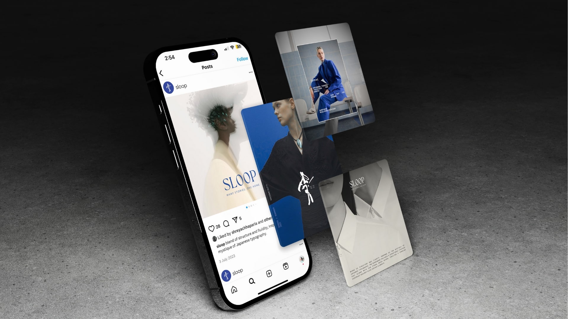
The design process for Sloop was anchored in strategic clarity and deep cultural immersion. We began with comprehensive research to understand the brand’s values, audience, and positioning. Insights were translated into a clear brand strategy that defined Sloop’s purpose, voice, and unique stance in the slow fashion space. Concept development involved visual explorations rooted in nature, wabi-sabi aesthetics, and handcrafted traditions. This evolved into a visual identity system that expressed quiet individuality through fluid forms, a calm colour palette, and human imperfection. The identity was then extended across all key applications—from packaging to social media—ensuring a cohesive and emotive brand experience. Final brand guidelines equipped the team for consistent and scalable implementation.
Brand Strategy:
The strategic approach centred around positioning Sloop as a brand that doesn’t define you, but allows you to define it. Unlike competitors rooted in seasonal storytelling or bold experimentation, Sloop would be a constant companion, designed to move with the wearer, like a second skin.
This was supported by five key brand values:
Celebration of individuality
Fluidity and freedom
Harmony with nature
Cultural synergy between Japan and India
Artisanal craft and heritage
By blending Japanese restraint with Indian soul, Sloop would own a unique cultural and emotional space in the market: “effortless wear with meaning.”
Visual Identity:
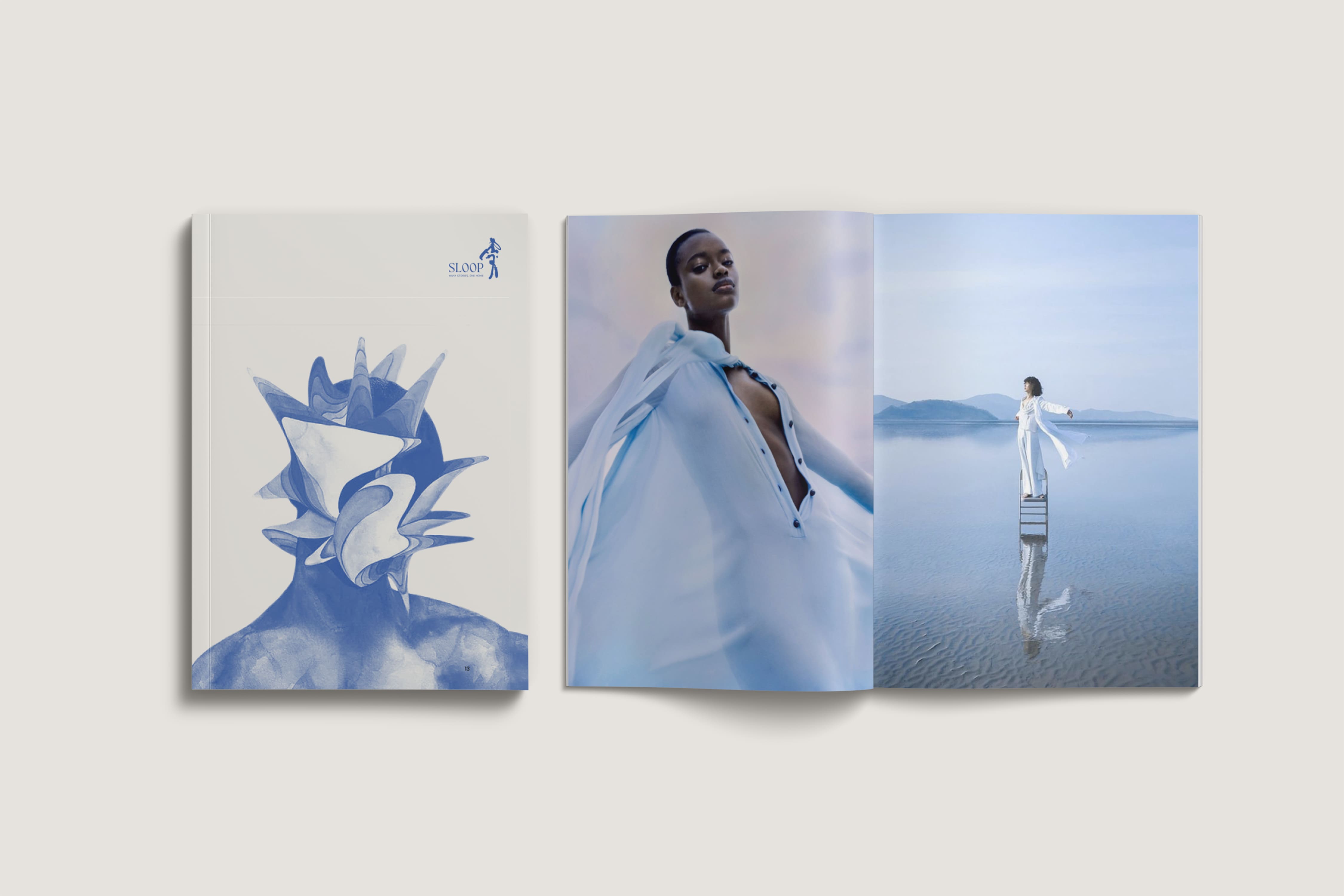
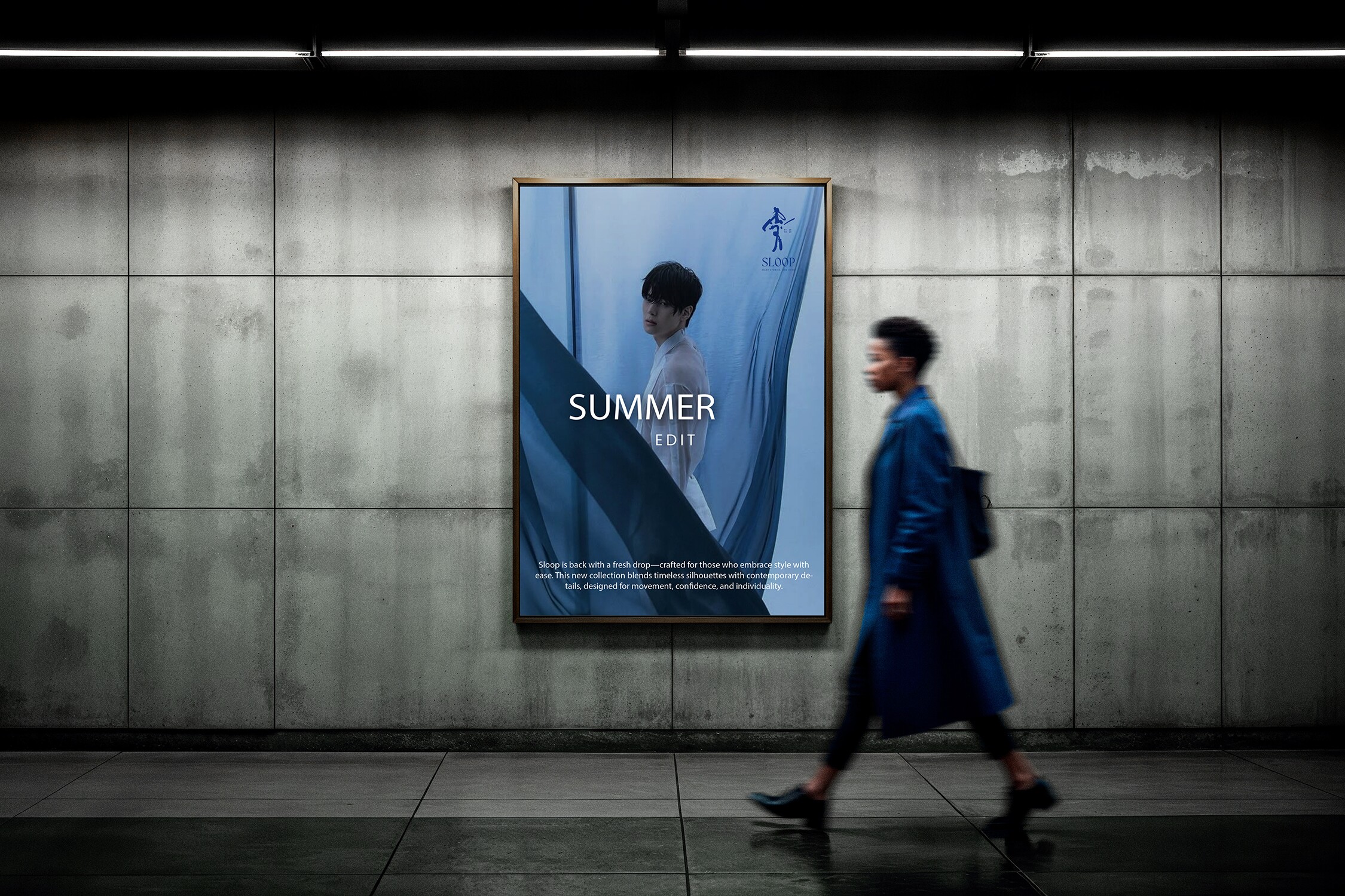
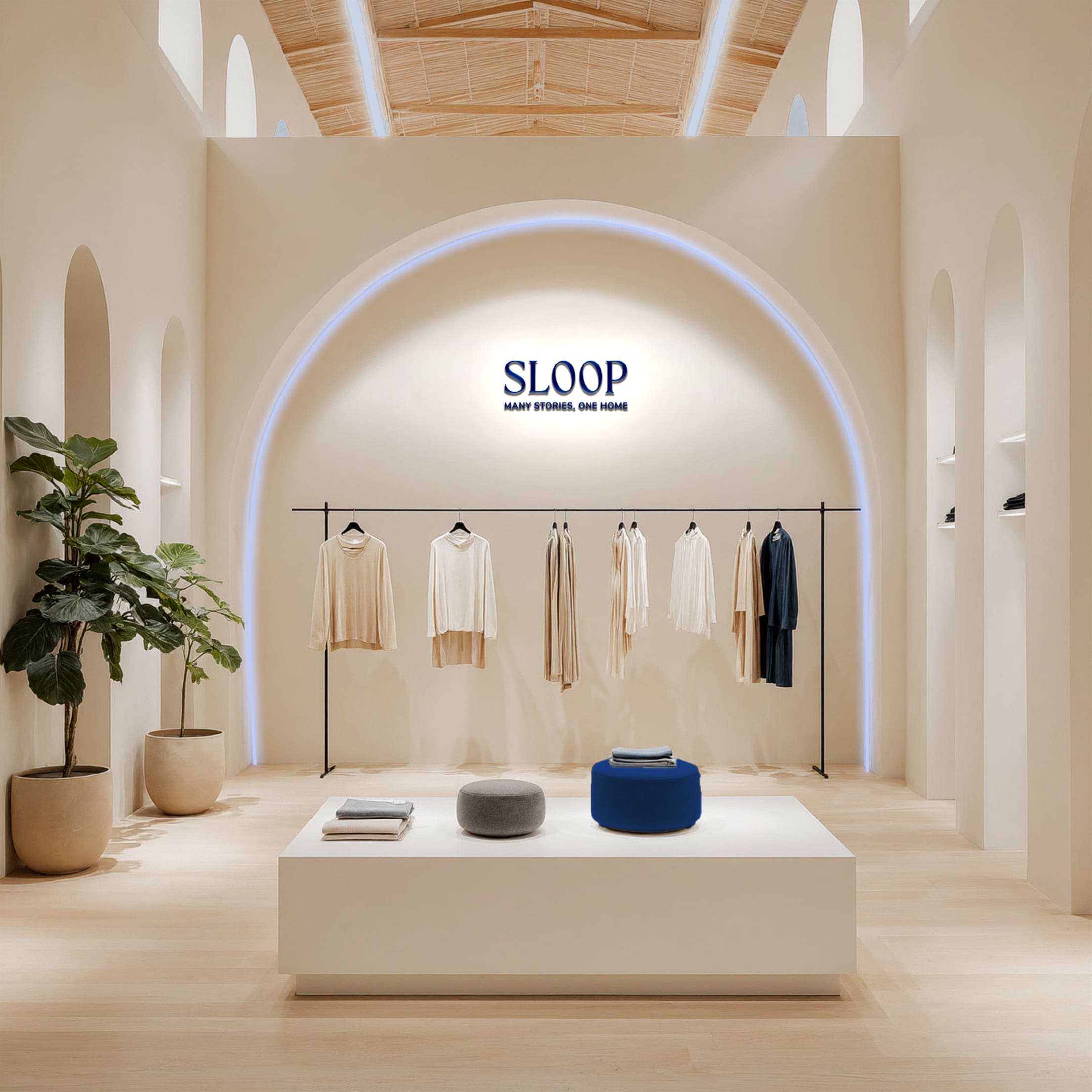
The foundational moodboard carried tones of earth, sky, and water, alluding to natural rhythm, introspection, and fluidity. The visuals featured soft textures, slow light, and imagery that felt more like memory than marketing, setting the tone for a brand that feels like home.
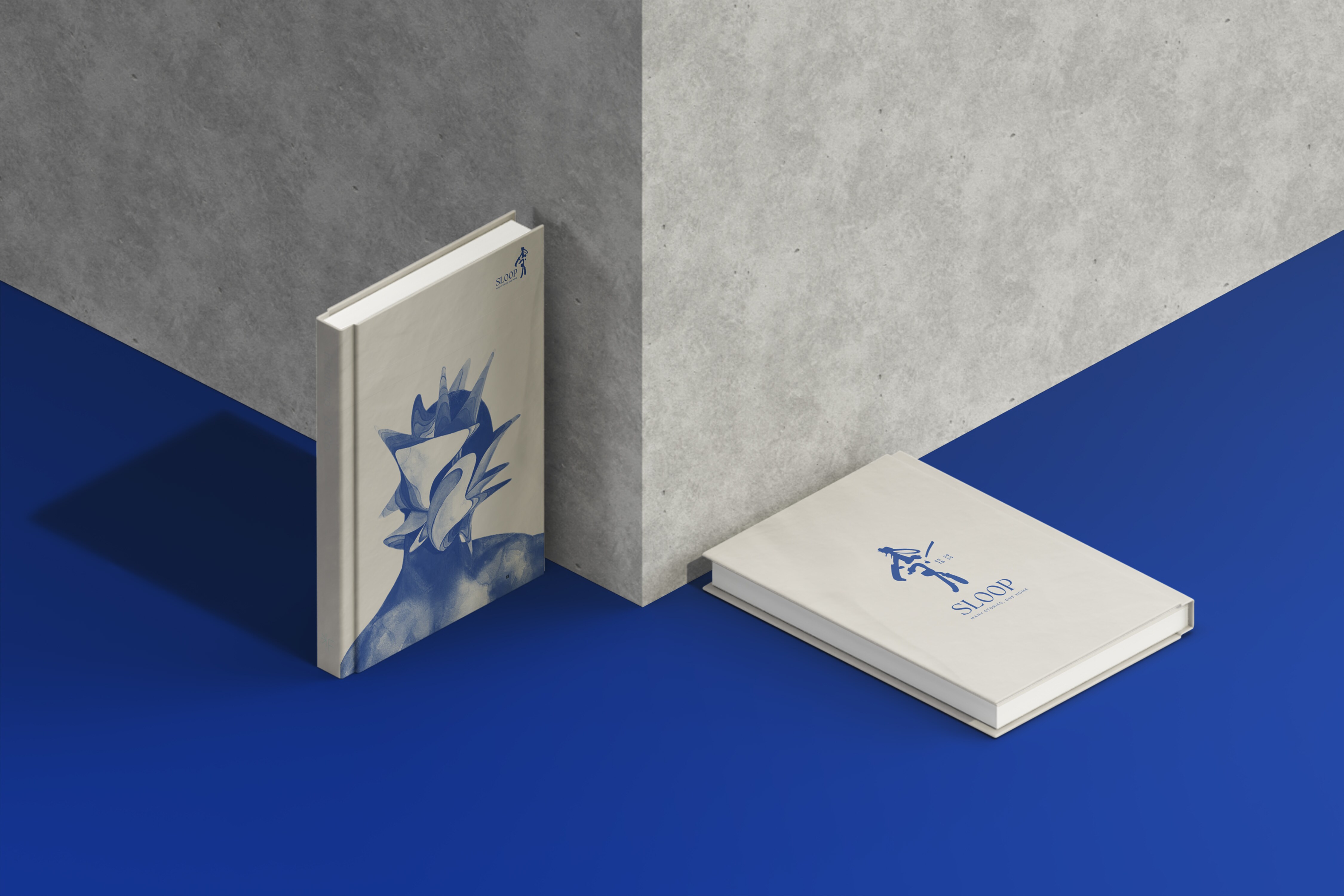
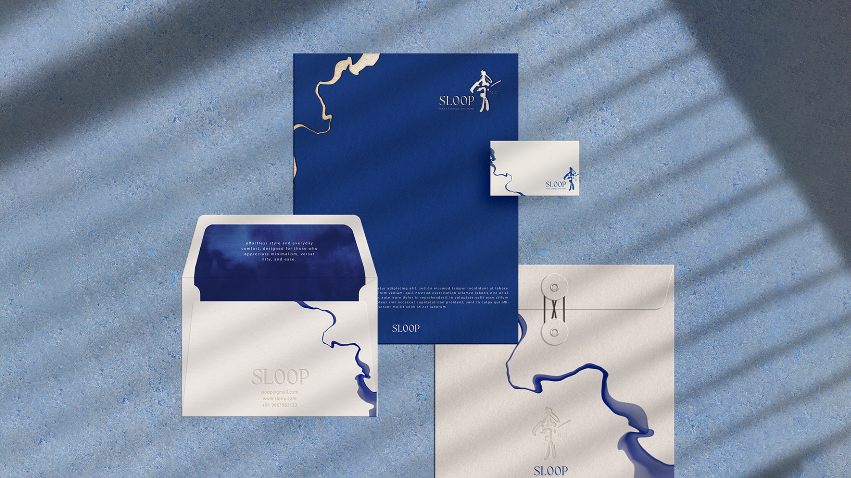
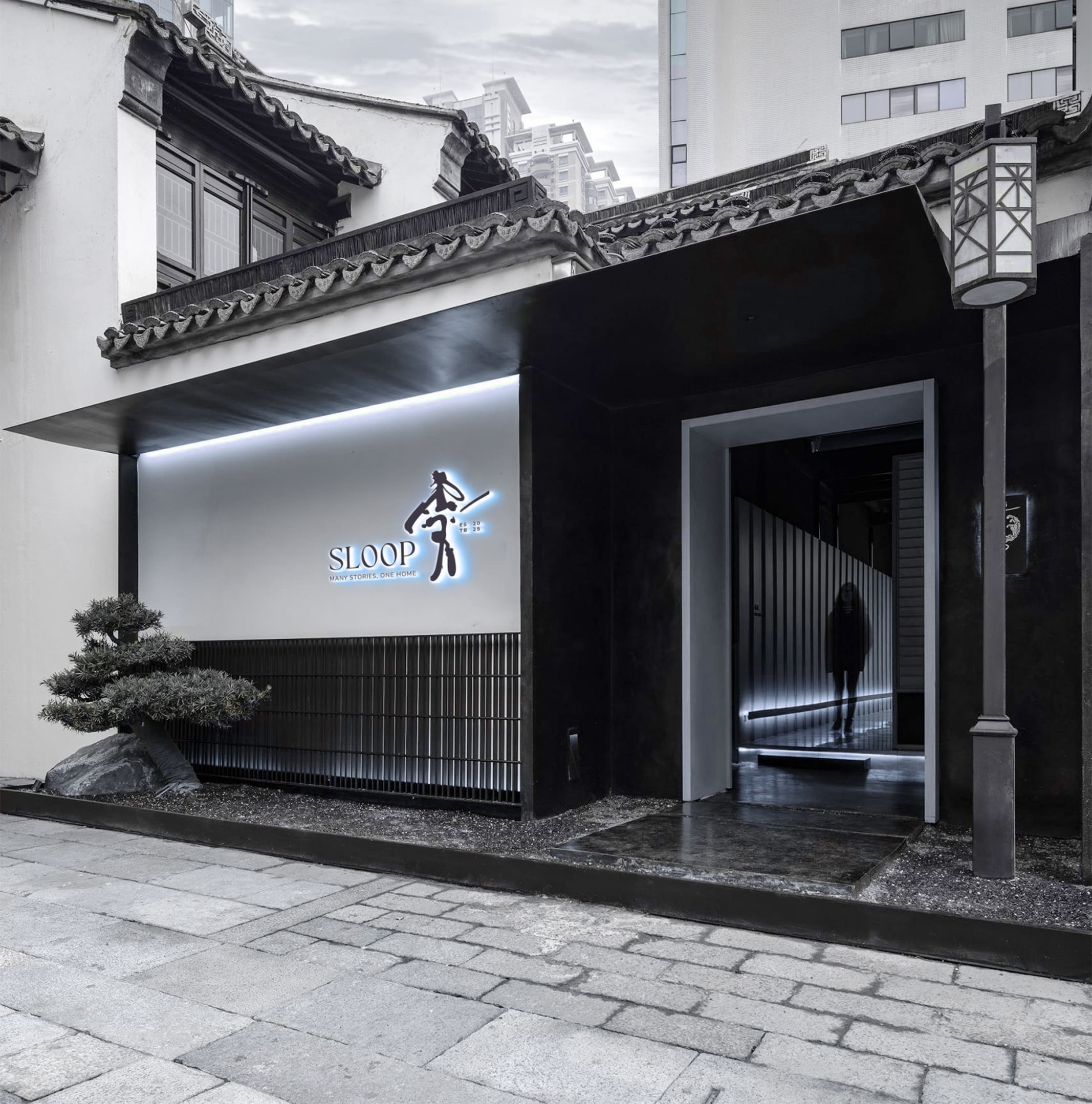
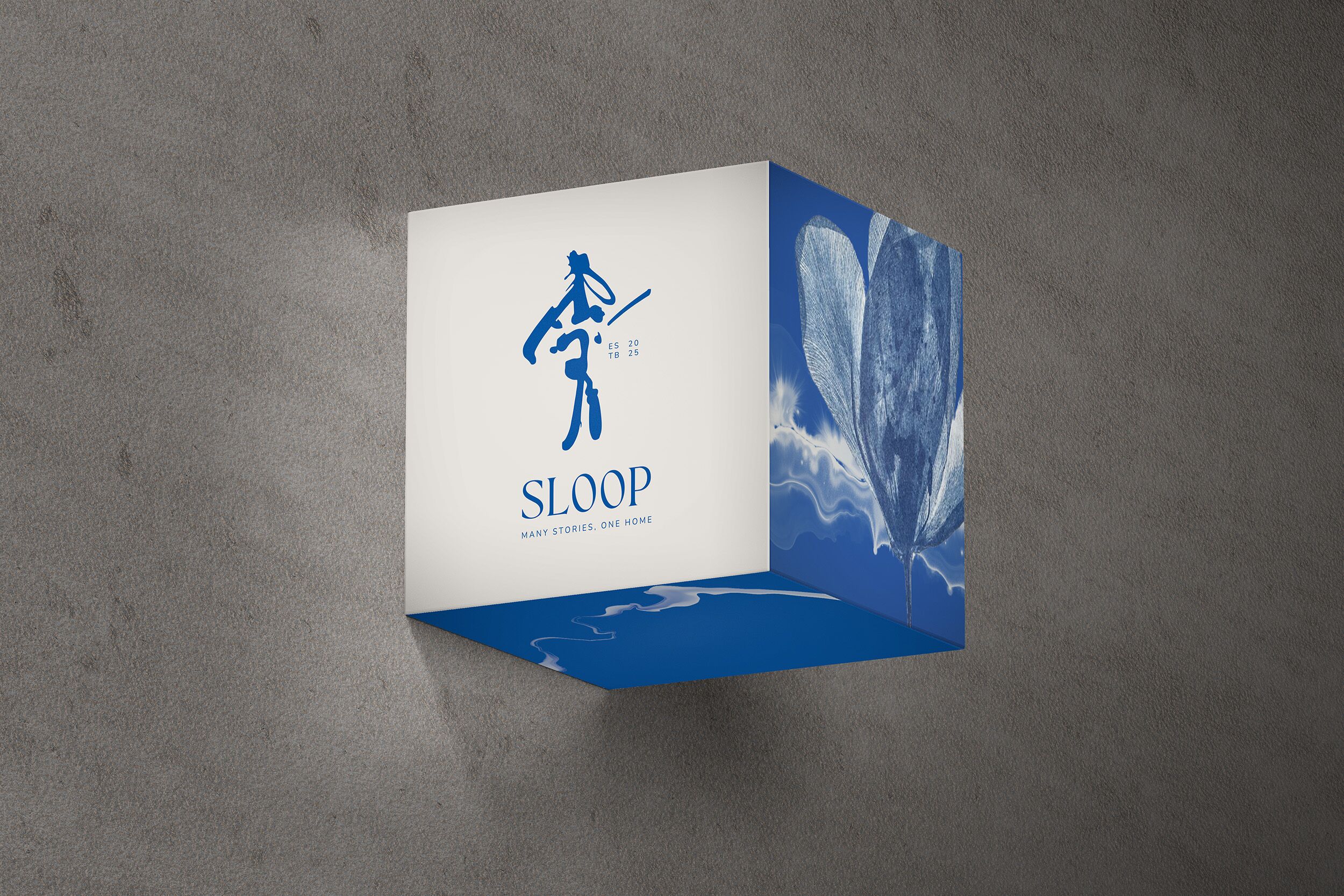
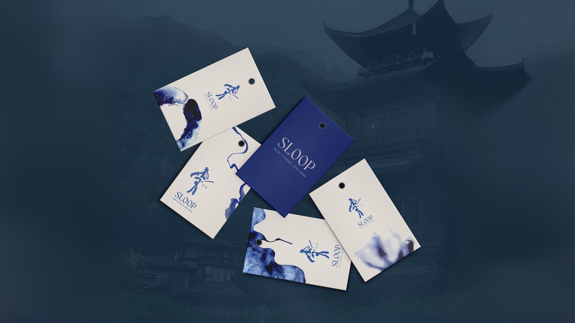
The identity design began with the idea of fluid individuality. The logo is an abstract form, like a brushstroke or splash of ink, evoking both water and movement, symbolising the coming together of gender spectrums and the confluence of Indian and Japanese cultures. It portrays a human figure without definition- open to interpretation, personal, and full of energy.
The visual language follows suit: organic lines, hand-drawn elements, and a minimal-yet-warm design system that feels thoughtful and personal. This balance allows the brand to feel gender-functional, non-binary, and inclusive—something missing in the contemporary lifestyle fashion space.
The custom typography draws inspiration from Japanese and Devanagari calligraphy, featuring elongated forms with soft, tapered endings. These gestures offer a visual echo of brush calligraphy- merging structure with fluidity, and tradition with modernity.
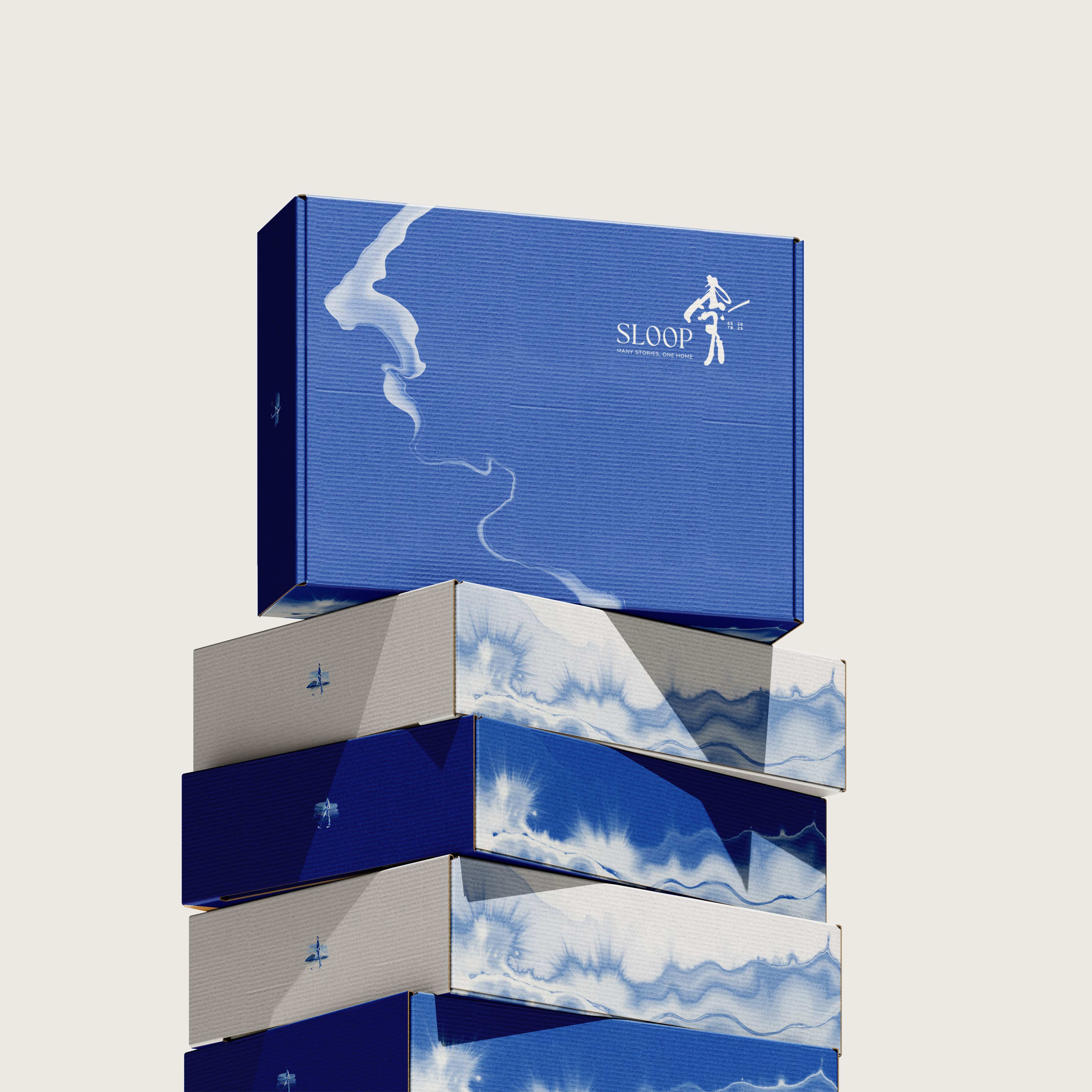
The palette blends minimal blacks and whites (a nod to Japanese simplicity) with a rich, calming blue rooted in Indian visual culture. The blue is more than just a pop- it adds poise, depth, and emotional calm, tying together tradition and modern elegance.
Sloop’s prints and patterns are like a blob of ink and water- quiet expressions of warmth and togetherness- designed to feel intentional yet effortless. Inspired by community crafts, folk simplicity, and natural textures, they blend playfulness with calm, evoking slow joy and shared moments. Rooted in Indian sensibilities, the designs favour emotional storytelling over literal motifs, adding a subtle, soulful charm to everyday wear by being abstract and fluid.
Sloop’s visual tone is personal, grounded, and emotionally resonant. It rejects fashion’s often elitist, distant visuals in favour of inviting warmth and quiet strength. The brand is a space for authentic self-expression, where community and comfort take precedence over trend and performance. This tone aims to create a community of diverse individuals, united by shared values of fluidity, individuality, and self-acceptance.
The outcome:
The strategic foundation of Sloop ensured long-term relevance by anchoring the brand in individuality and cultural depth. Its cohesive visual identity created strong brand recall and a seamless experience across platforms. By weaving in themes of self-expression and slow living, the brand fostered genuine emotional connections with conscious consumers. Sloop’s thoughtful, timeless aesthetic sets it apart from trend-led competitors, establishing a distinct presence in the market. With a modular design system in place, the brand is well-equipped to scale across future collections, campaigns, and collaborative ventures.
Sloop’s branding is not just a design project- it’s a cultural statement. It represents a shift toward purposeful, emotion-led fashion branding that values craft, fluidity, and identity over noise, trend, or mass appeal.
By using strategic creativity to distil deep cultural philosophies into accessible fashion experiences, HMLC helped build not just a brand, but the beginnings of a movement. A movement that encourages authenticity and embraces every person’s unique story.
This case reflects the potential of branding as a tool for cultural storytelling and human connection, moving beyond design into the realm of meaning-making.
CREDIT
- Agency/Creative: HMLC
- Article Title: HMLC Translates Japanese Minimalism and Indian Heritage into a Fluid Identity for Sloop
- Organisation/Entity: Agency
- Project Type: Identity
- Project Status: Published
- Agency/Creative Country: India
- Agency/Creative City: Gurgaon
- Market Region: Asia
- Project Deliverables: Brand Creation, Brand Design, Brand Experience, Brand Guidelines, Brand Identity, Brand Strategy, Brand Tone of Voice, Brand World, Branding, Logo Design, Tone of Voice
- Industry: Fashion
- Keywords: WBDS Agency Design Awards 2025/26 , branding, luxurybranding, fashionbranding, japanesdesign, fashionbrand, brandidentity, identitydesign, brandstrategy, strategy, logodesign, brandvoice, brandguidelines, indianfashion,
-
Credits:
Ceo & Founder: Harsh Mann


