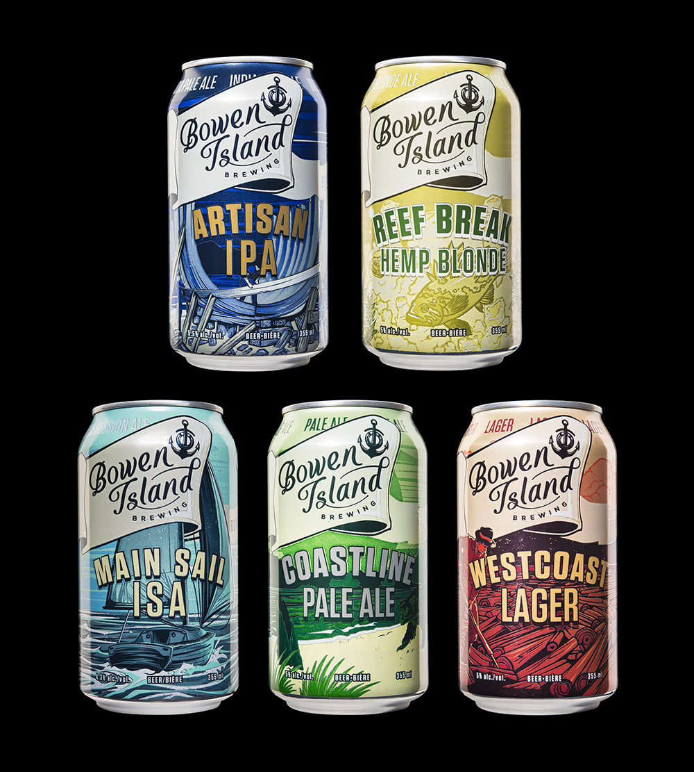
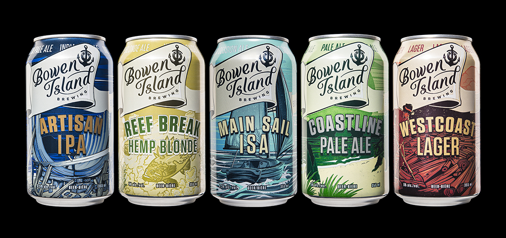
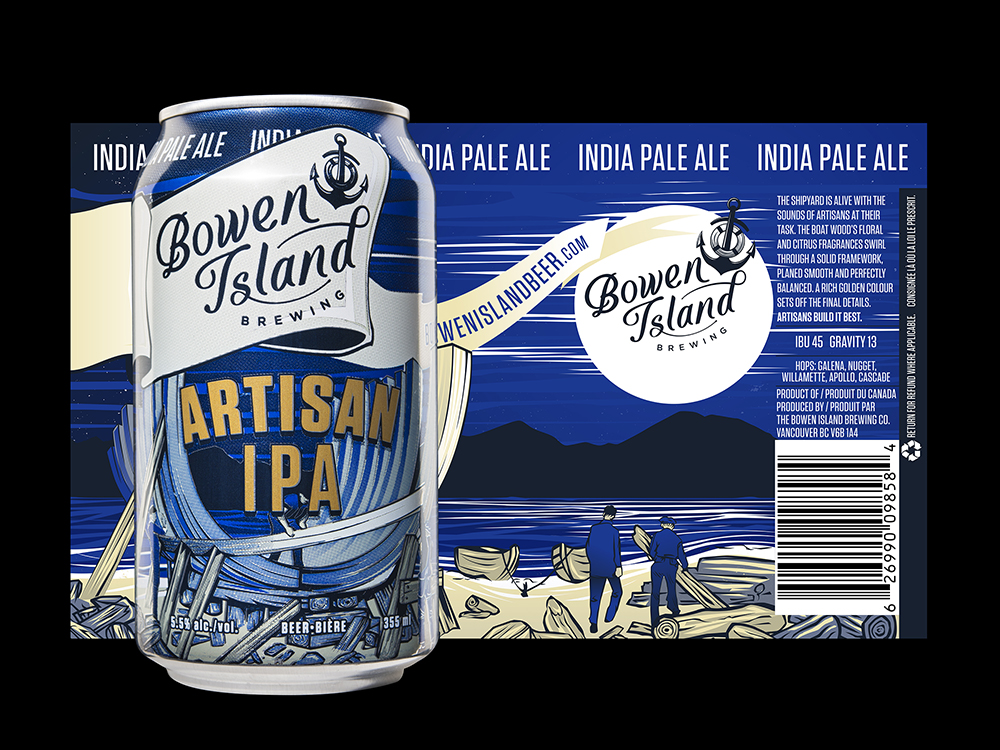
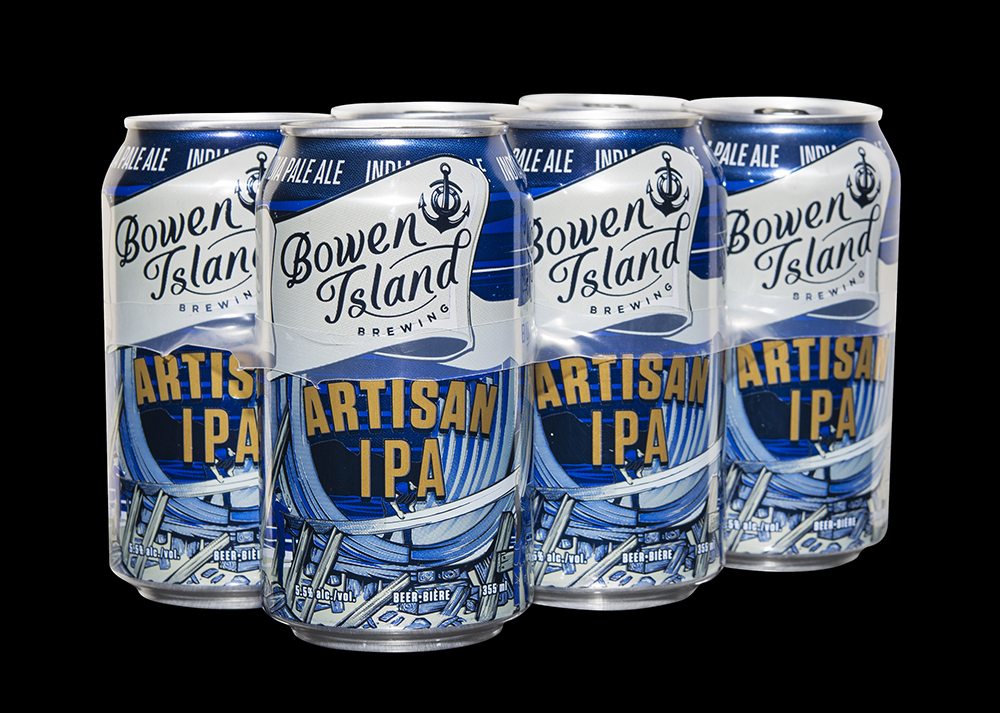
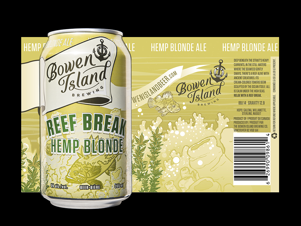
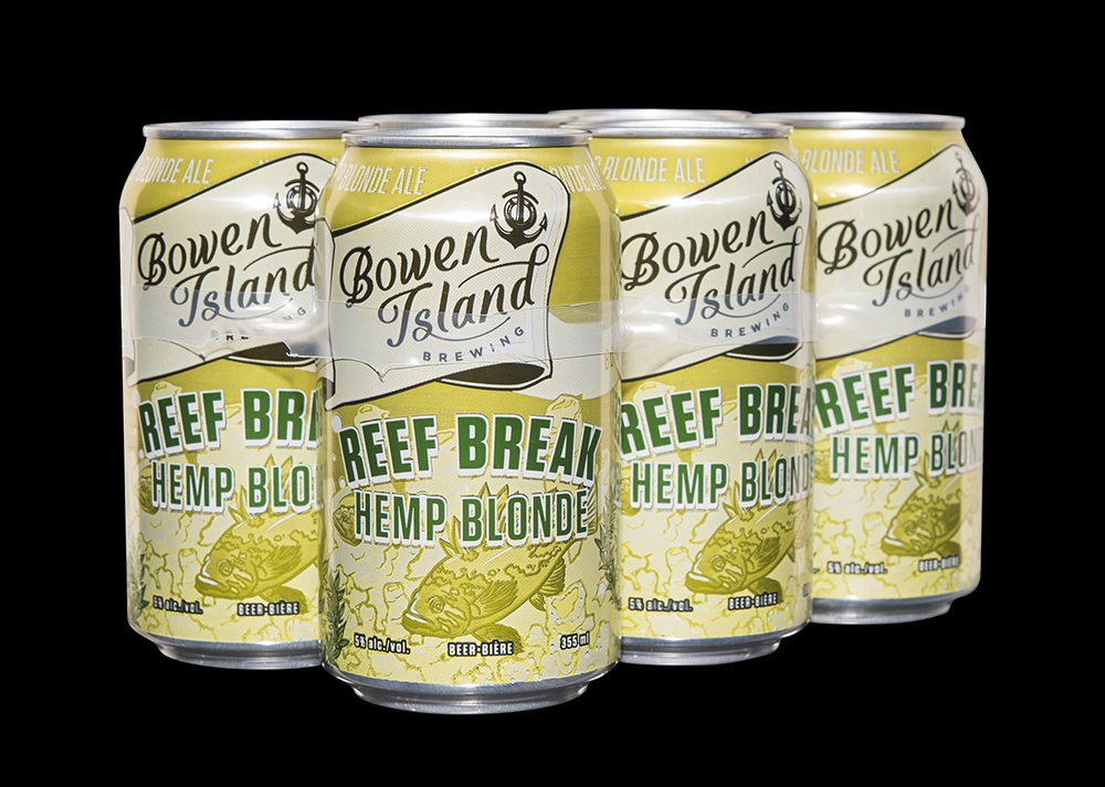
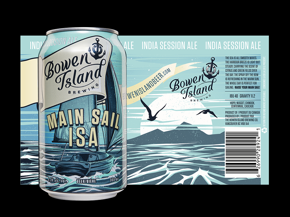
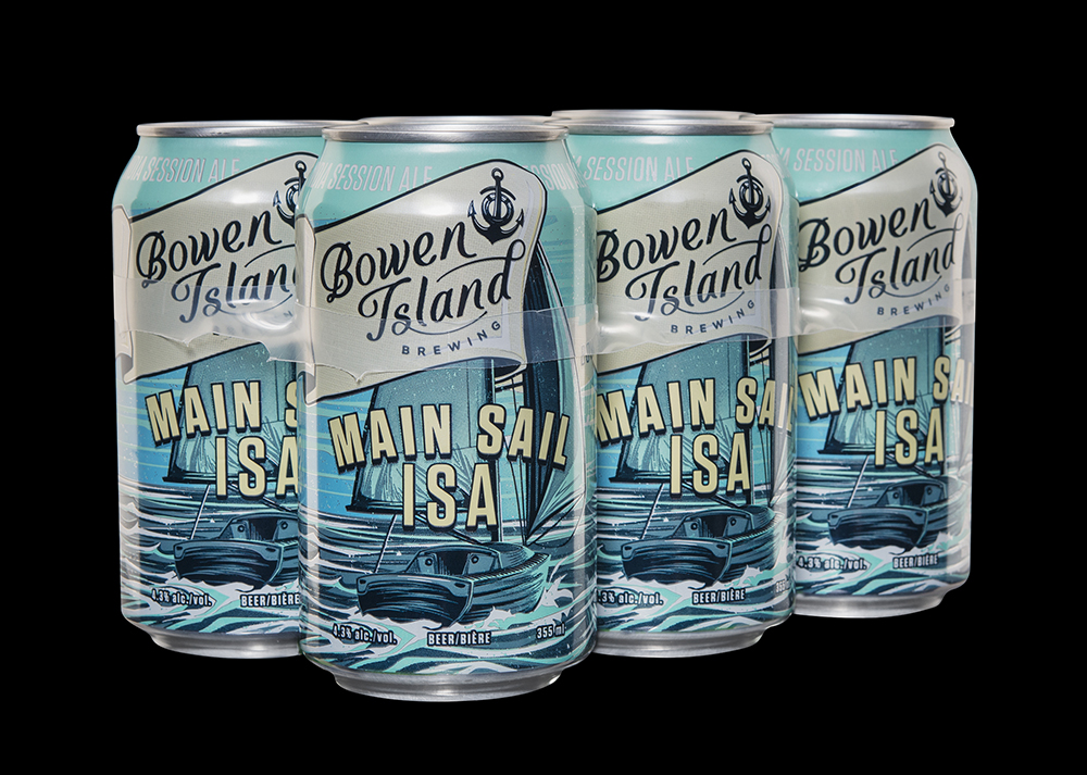
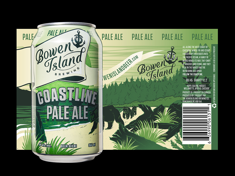
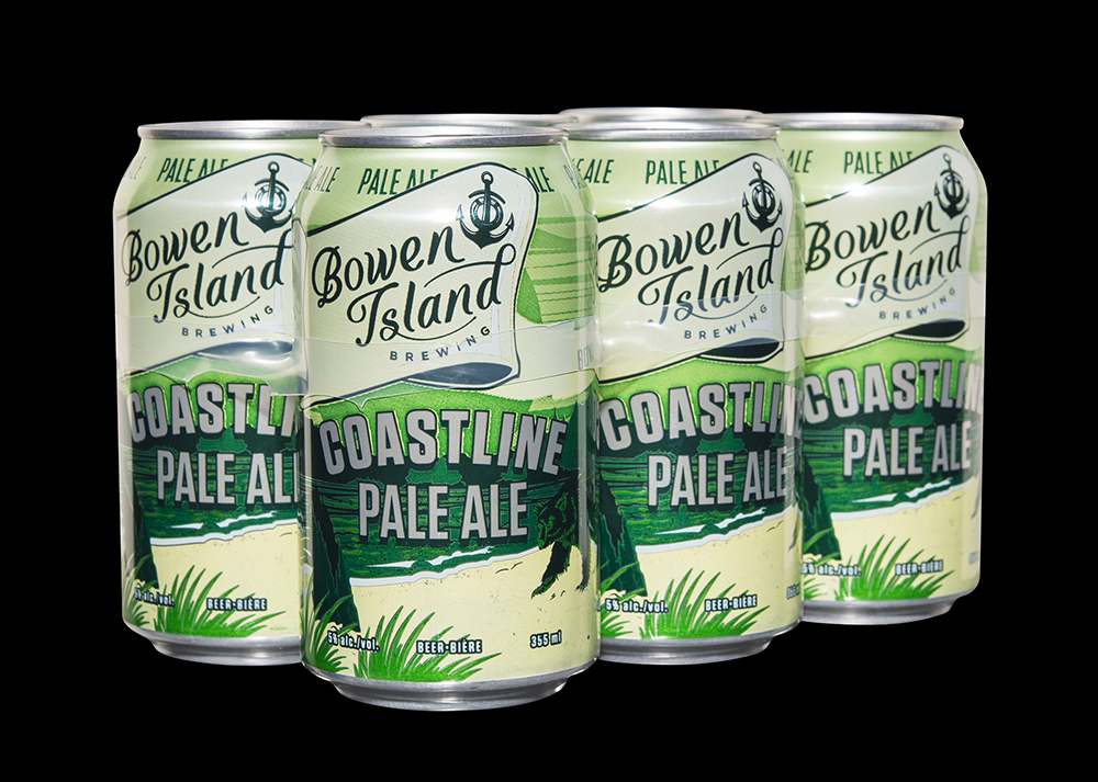
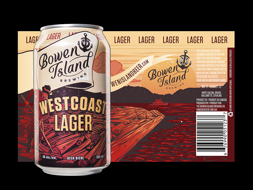
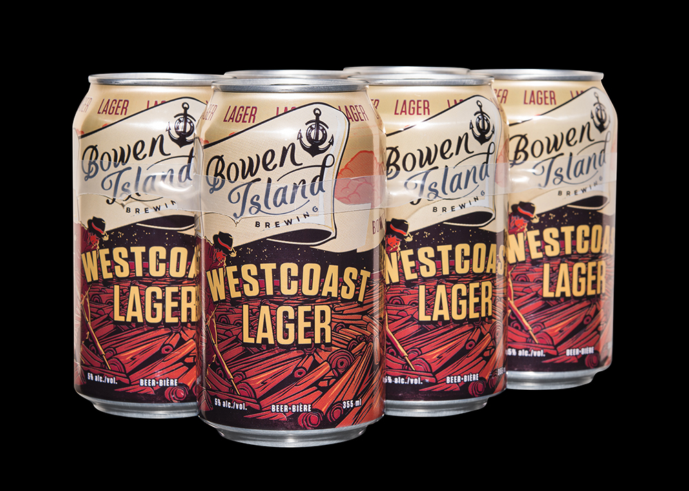
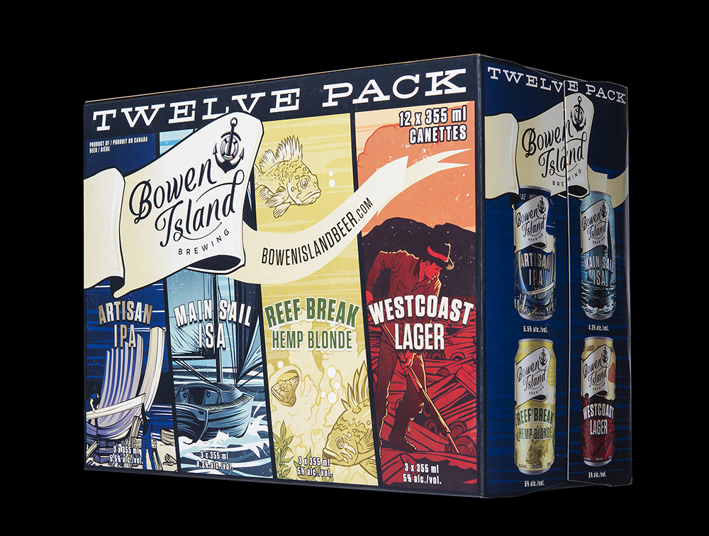
” For Bowen Island’s full rebrand and redesign, we were tasked with creating a look that speaks to new craft drinkers, while retaining the essence of the brand’s history. Their existing customers should think: “it’s a new look, but that’s still my Bowen.”During our initial brand audit, we came to understand that, more than the specific island itself, it was most important to convey the general West Coast island feeling that a wider base understands and identifies with.Islands on the West Coast are, of course, complex and multifaceted, so we decided to develop a system in which each beer reflects a different aspect of island life, from a timber raft to a shipyard to the high seas – from a family of coastal black bears to a community of fish in BC’s incredible glass sponge reef. All these individual scenes come together to create a bigger picture: the world of Bowen Island.To unite these various viewpoints, we designed a brandmark focusing on the simple, iconic anchor, encircling it with a life preserver, the anchor’s floating counterpoint. Binding these is our rope-like script, lettered by hand to convey the Pacific Maritime character of the brand.We created a design container to unite the product lineup, flying a banner through the artwork to pop the brand forward, while making use of the full canvas for luscious illustration. The main colour of each product’s previous incarnation was carried forward, providing an anchoring element for the existing customers, while we developed the rest of the palette with fresh, friendly colours, inviting you into vibrant scenes of life surrounding Bowen Island. ”
CREDIT
- Agency/Creative: Hired Guns Creative
- Article Title: Hired Guns Creative – Bowen Island Brewing Co.
- Project Type: Packaging
- Format: Can
- Substrate: Metal


