


Hioa is not just a flower shop; it is a vibrant interruption to the traditional florist industry, this branding concept merges three distinct disciplines: Logo Design, Packaging, and Layout – into a single, cohesive brand identity system. The goal was to create a digital-first flower brand that resonates with the electric energy of Gen Z.
The name “Hioa” is deeply rooted in Vietnamese culture. It is a play on the word “Hi vọng,” meaning Hope. In a market often saturated with solemn or overly romanticized floral imagery, Hioa stands for something different: pure, unadulterated joy. The brand promise is that every delivery carries not just blooms, but a box of hope and positivity. It transforms the act of gifting flowers from a formal obligation into a spontaneous “box of love.”
Research into the Vietnamese market revealed a shift in consumer behavior. With the flower market projected to reach significant heights by 2028 and over 50% of young consumers preferring online shopping, Hioa was positioned strategically as a fast, accessible, and digital-native brand. The target audience is the youth – people who want to celebrate life’s moments without the stiffness of traditional bouquets.
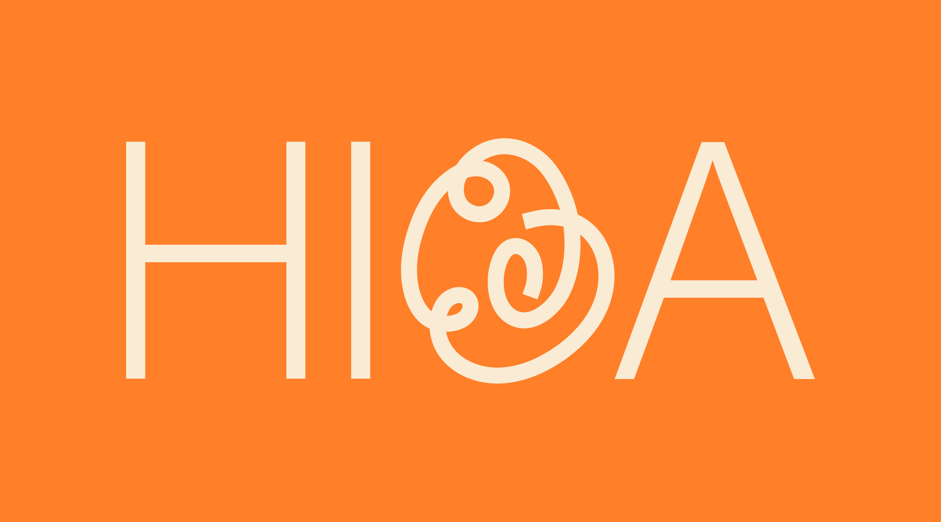
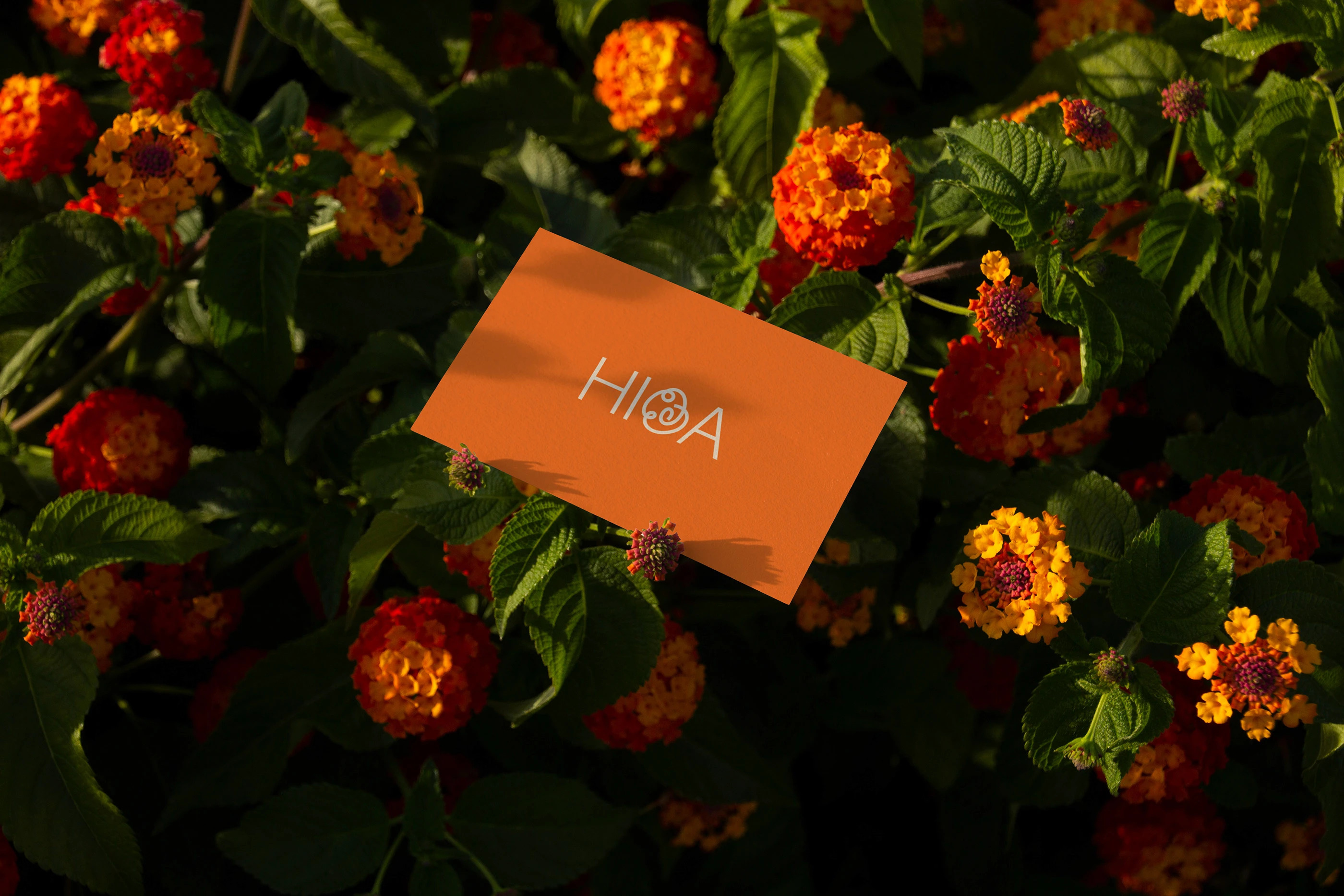
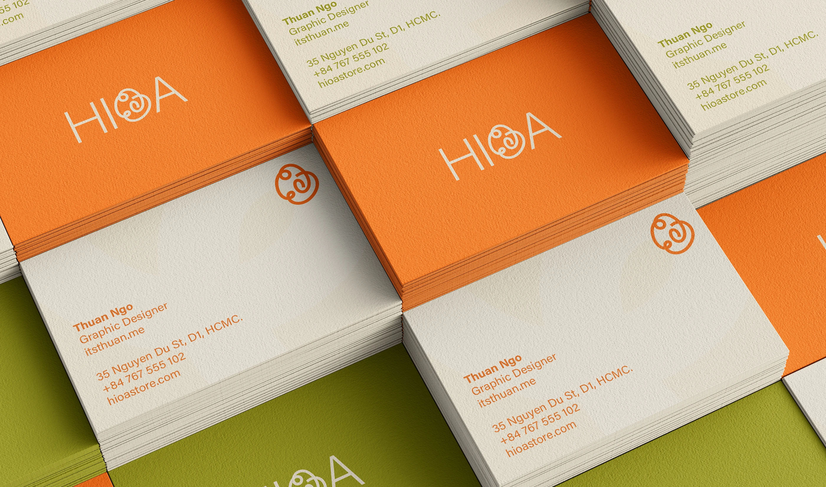
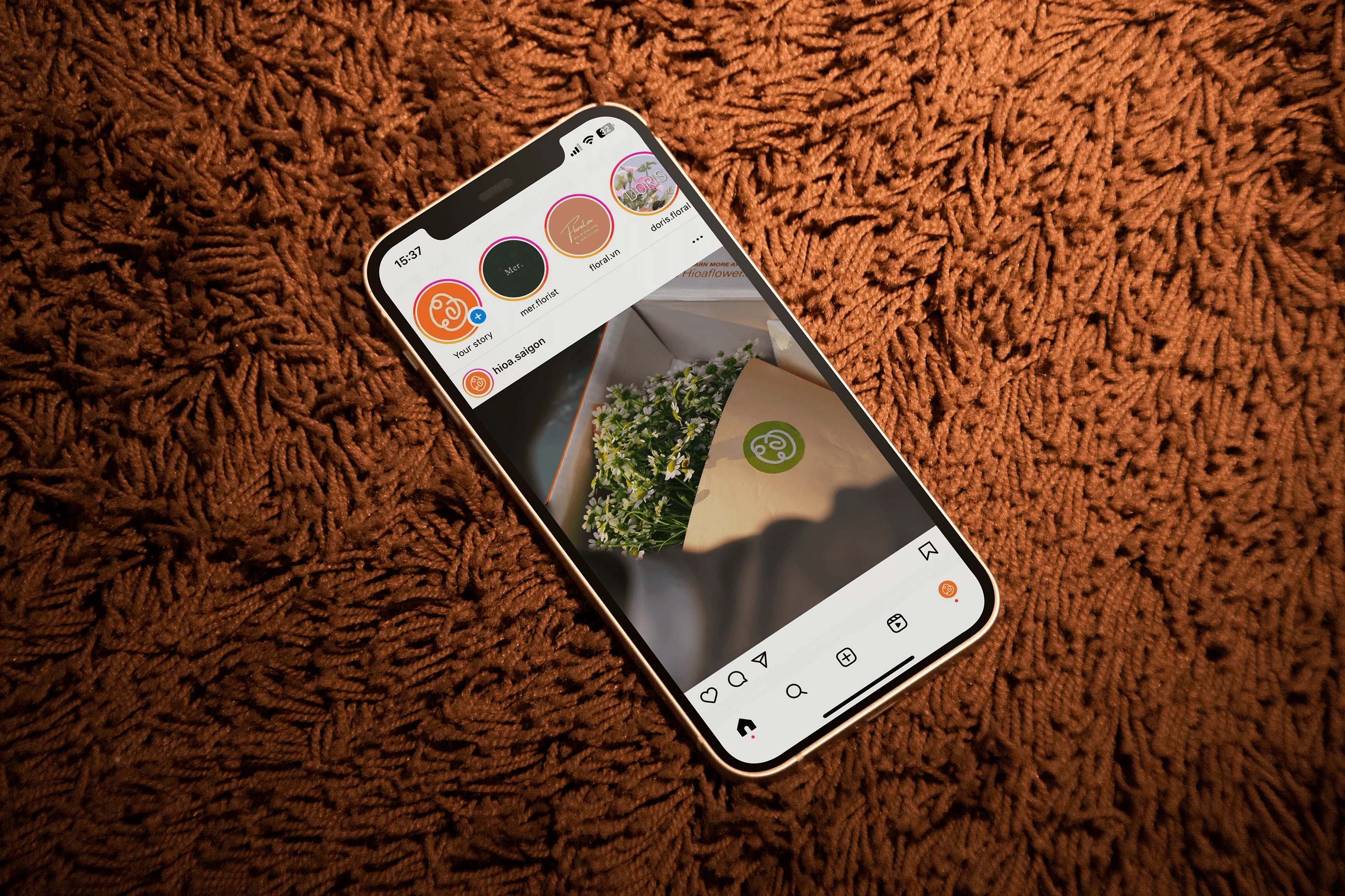
The visual identity is anchored by a logo crafted from a single, dynamic continuous line. This design was inspired by the free-flowing flower doodles of childhood, symbolizing fluidity, creativity, and the seamless journey from sender to receiver. This “infinite line” motif extends across all brand touchpoints, creating a sense of motion.
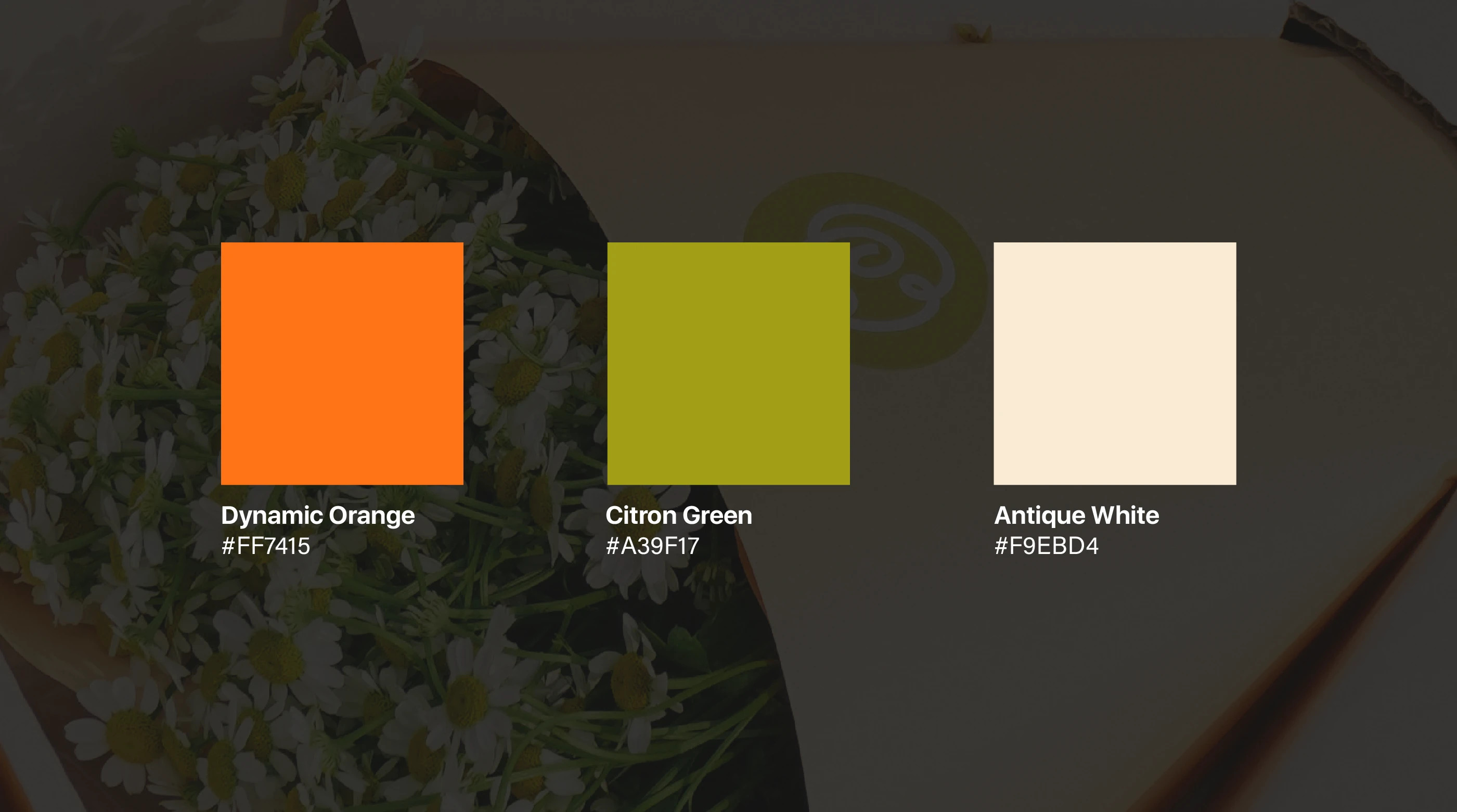
To match the lively spirit of the brand, Vibrant Orange was selected as the primary color. It is energetic, bold, and impossible to ignore. This is paired with Acumin, a modern sans-serif typeface that balances the playfulness of the graphics with structured, contemporary legibility.
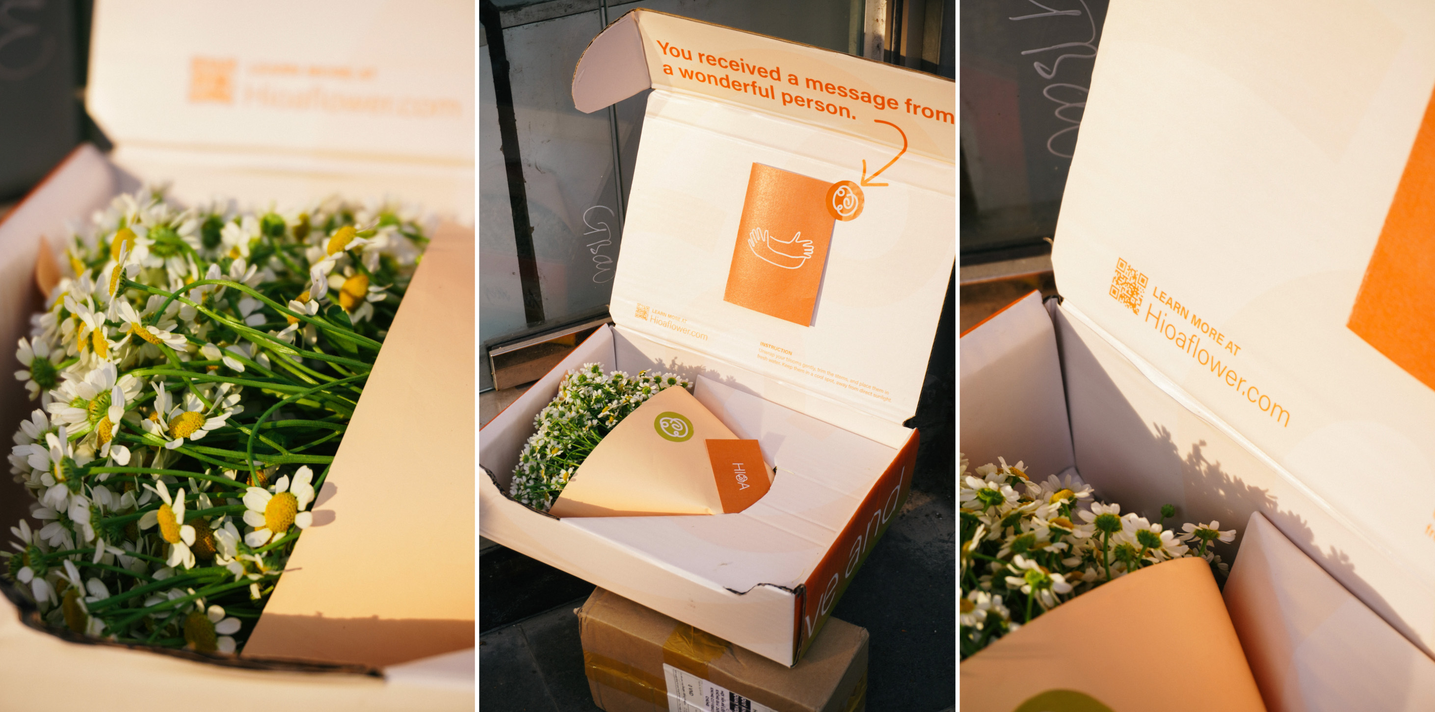
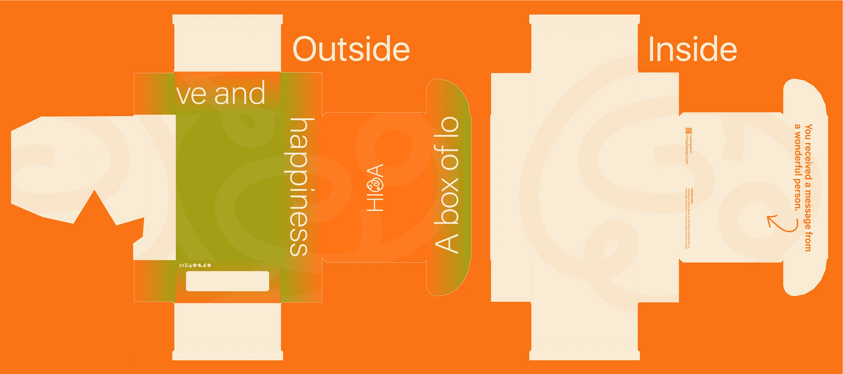
The packaging experience was designed to be the antithesis of a standard bouquet. I envisioned Hioa as a “Gen Z dance party of flowers” – bursting with energy the moment the lid is lifted. Instead of soft wraps, the flowers are housed in structured, vibrant boxes that serve as a stage for the arrangement.
Creating the physical prototype was a labor of love and craftsmanship. Eschewing outsourcing, I handcrafted the packaging using heavy cardboard and custom prints. This hands-on process: folding, gluing, and structuring the box allowed for a tangible exploration of how the user physically interacts with the brand. The prototype was filled with Tanacetum flowers, chosen for their wild, simple beauty, and photographed to highlight the contrast between the organic blooms and the structured, modern branding.
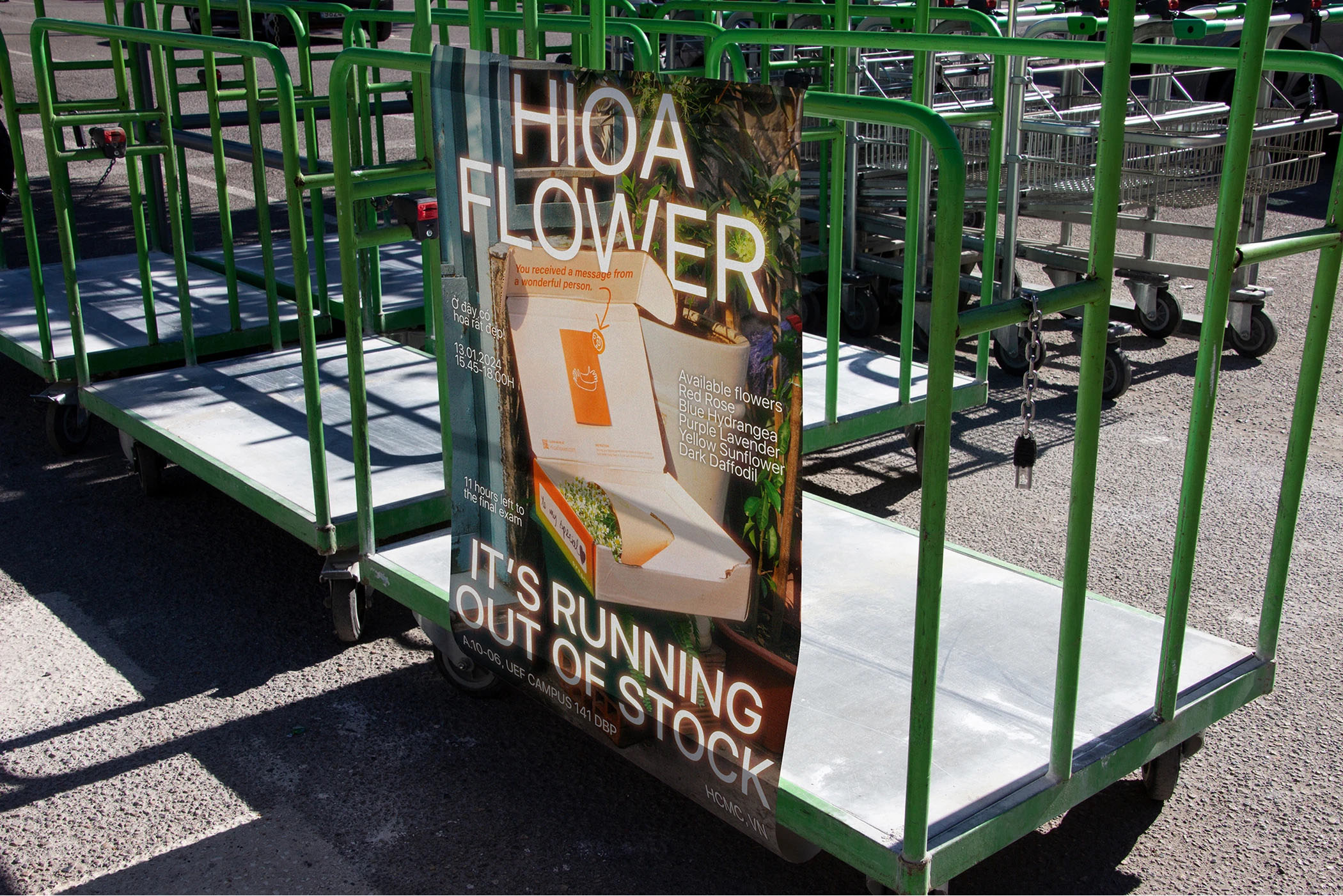
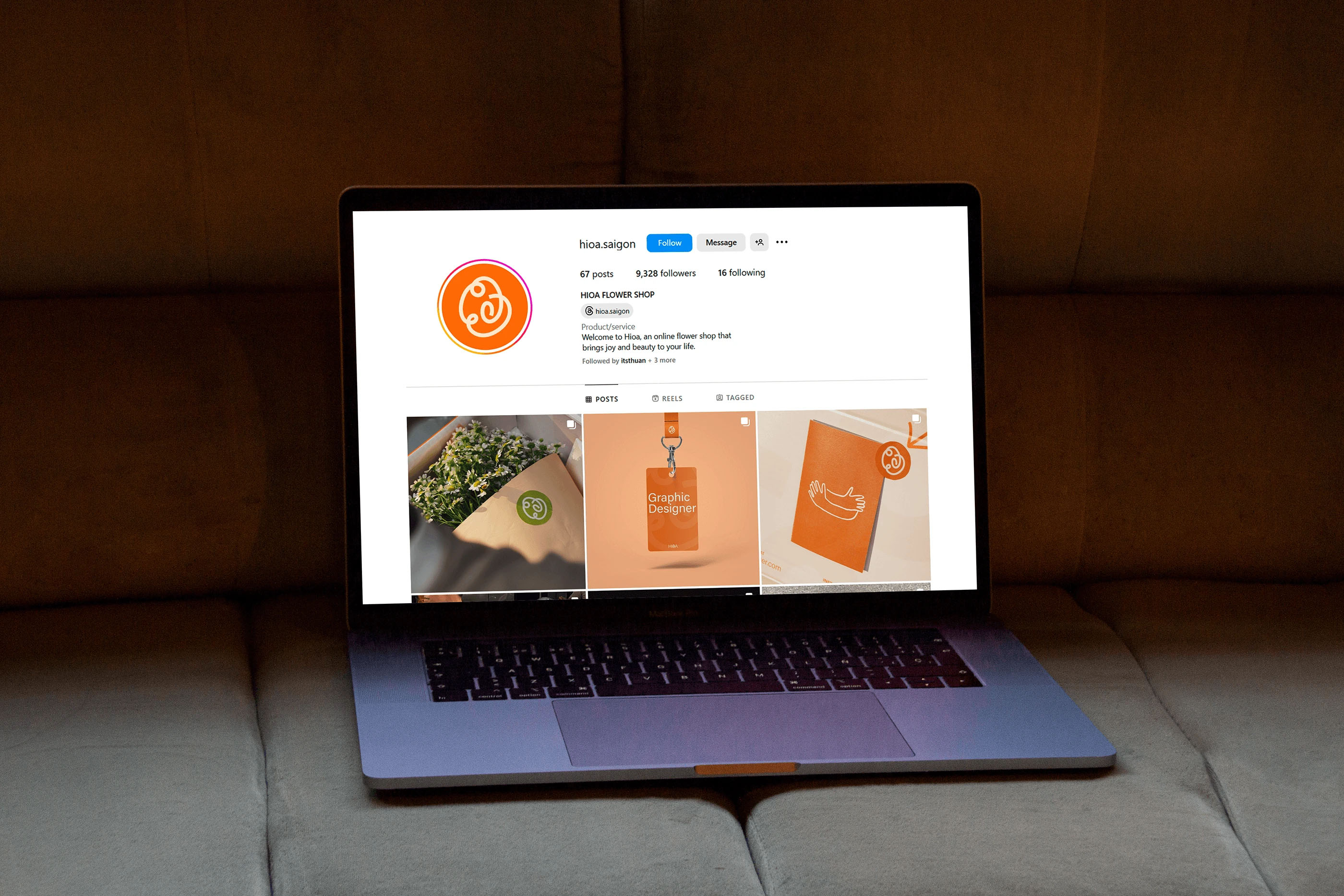
The final result is a robust brand system including guidelines, a motion graphic showcase, employee ID cards, and a promotional campaign. Hioa represents a shift in how we perceive floral gifting: less about tradition, and more about the instant, vibrant connection between people.
CREDIT
- Agency/Creative: Thuan Ngo
- Article Title: Hioa by Thuan Ngo Brings a Bold New Energy to Floral Branding
- Organisation/Entity: Student
- Project Type: Identity
- Project Status: Published
- Agency/Creative Country: Vietnam
- Agency/Creative City: Ho Chi Minh City
- Market Region: Asia
- Project Deliverables: Brand Guidelines, Brand Identity, Logo Design, Motion Graphics, Packaging Design
- Industry: Retail
- Keywords: hioa flower shop
-
Credits:
Graphic Designer: Ngô Đăng Thuận


