Hinge is an architecture firm located in Paraná, founded by Giovana Slota and Leonardo Mazur. The name, inspired by the English word “hinge,” symbolizes articulation, connection, and the fluid transition between architectural spaces. A hinge represents precision, facilitating the movement between different parts, just as Hinge’s projects create dynamic, integrated environments tailored to the unique needs of each client. The firm’s approach emphasizes adaptability, ensuring that each space is both functional and aesthetically aligned with its purpose.
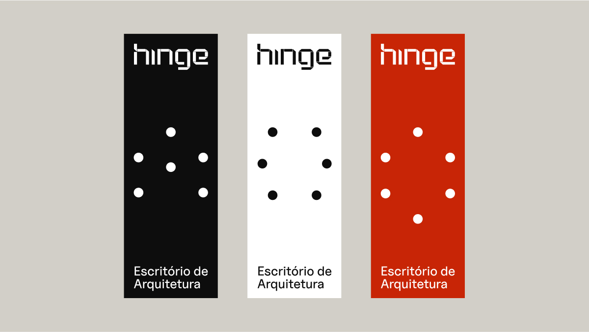
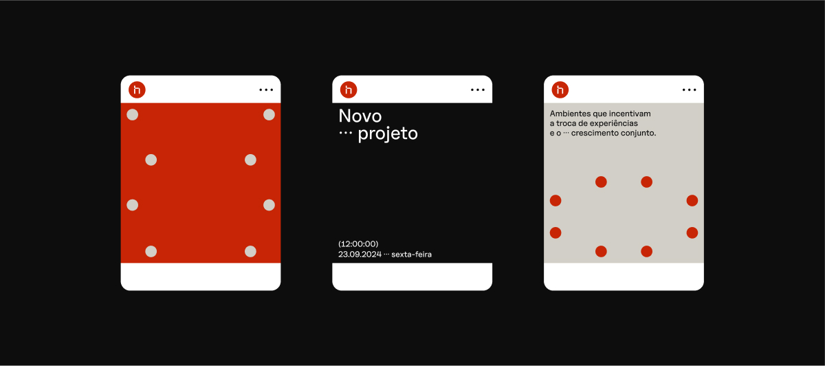
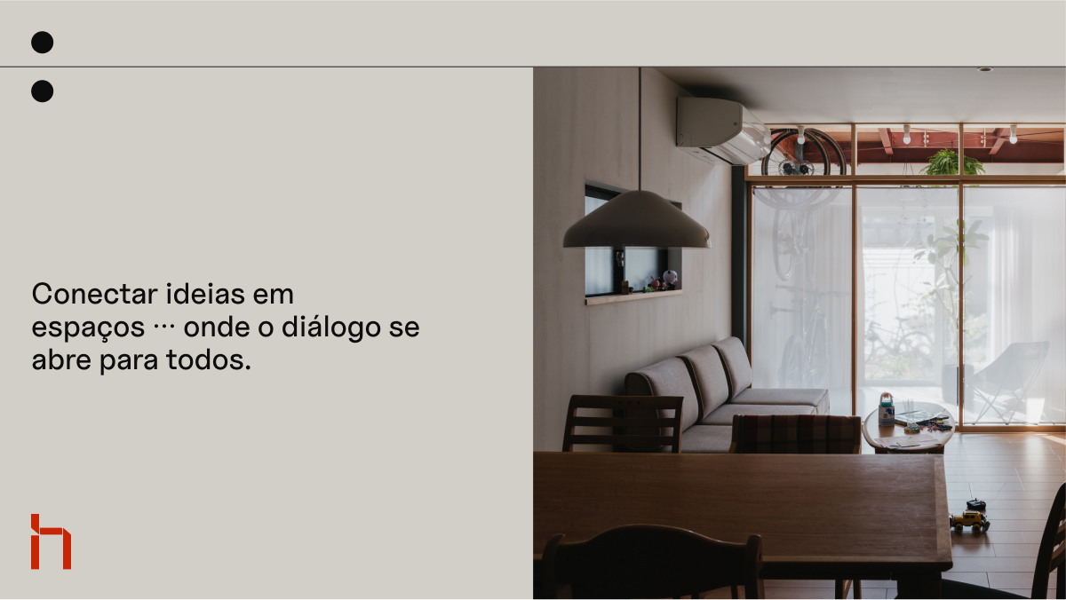
At the core of Hinge’s visual identity is the brand’s symbol. It was carefully designed to translate the essence of a hinge, both in its literal meaning and in a broader, conceptual sense. The symbol captures the idea of seamless articulation, connecting different elements with fluidity and accuracy. Just as a hinge allows for smooth transitions between two pieces, the symbol reflects Hinge’s ability to connect spaces and foster continuous movement and transformation within environments. This makes Hinge’s designs not only innovative but also adaptable to the shifting needs of clients over time.
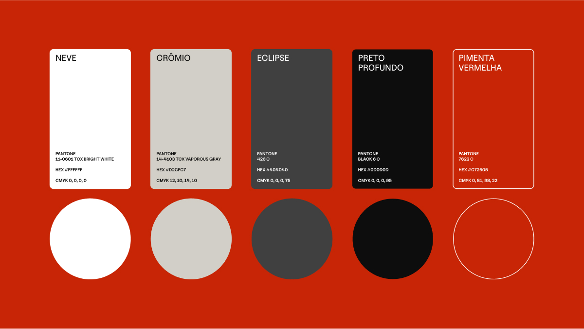
The choice of metallic colors highlights the materiality and resilience of hinges, giving a nod to their structural importance. The addition of vibrant red introduces an element of energy, movement, and transformation—qualities that are central to Hinge’s vision of architecture. The interplay between these colors encapsulates both the strength and fluidity present in every project the firm undertakes.

CREDIT
- Agency/Creative: Studio Gomesrosa
- Article Title: Hinge Architecture Branding by Studio Gomesrosa
- Organisation/Entity: Agency
- Project Type: Identity
- Project Status: Published
- Agency/Creative Country: Brazil
- Agency/Creative City: Araranguá
- Market Region: South America
- Project Deliverables: Brand Identity
- Industry: Construction
- Keywords: architecture, hinge, brand
-
Credits:
Designer: Willian Gomes da Rosa
Designer: Pedro Zanarchi


