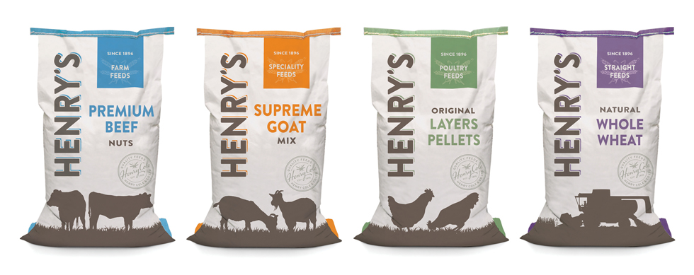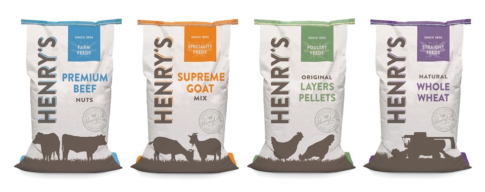
“Livestock farmers aside, you may not have come into contact with our latest design work for Henry’s Farm Feeds. Established in 1986, Henry Cole & Co Ltd has become one of the major manufactures and distributors of animal feed in the UK.
With a rich heritage and quality products, the company needed to ensure it maintained its position as a market leader, continuing to appeal to existing customers and driving new sales.”
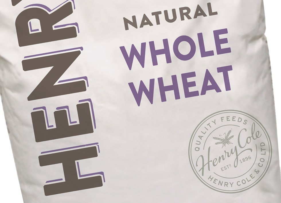
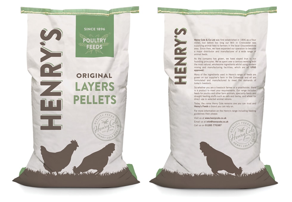
“Our brief was to review and then redesign the Henry’s brand, which included the core identity, full range of packaging and marketing materials.An overview of their product range led to us placing their products into four clear categories, each identifiable by a colour coding system and an array of silhouetted animals worked into the pack’s design.
We wanted the logo we created to be both striking and relevant, blending in to the natural look and feel of the packaging. By running it vertically down the bags we ensured the brand name would have maximum stand out.”
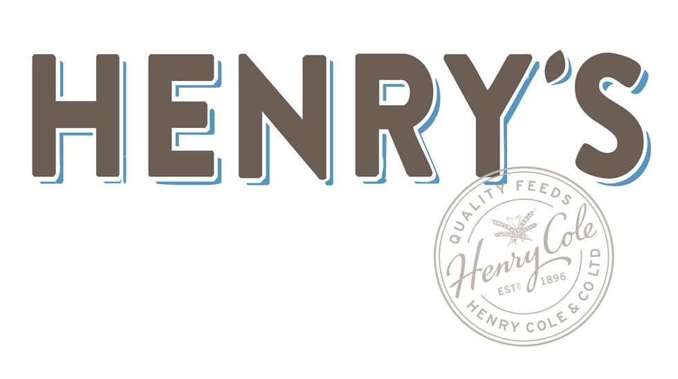
“Ensuring that we stayed true to the company’s fantastic history and to give the range authenticity, the new design also features a unique heritage stamp, retaining the ears of wheat from the previous logo and combining it with the a hand-drawn script.”
CREDIT
- Agency/Creative: Hills Design
- Article Title: Hills Design – Henry’s Feeds
- Project Type: Packaging


