


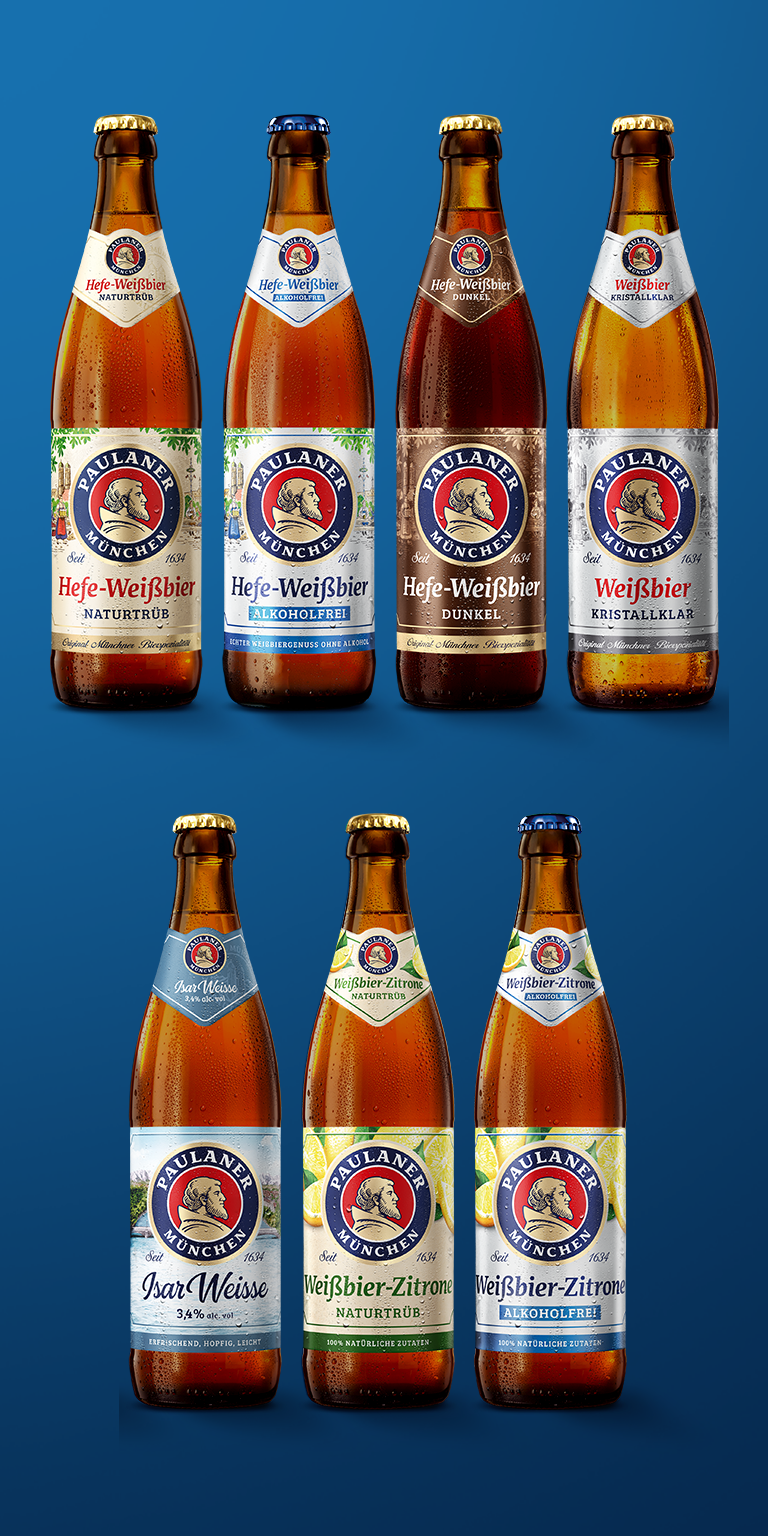
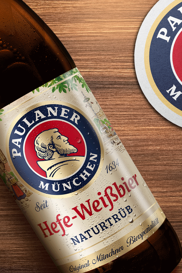
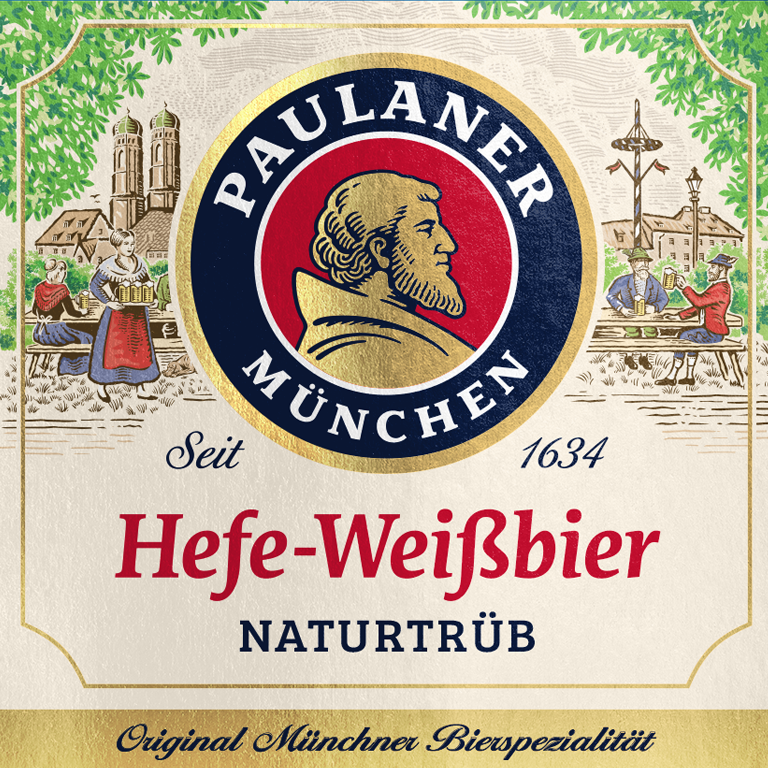
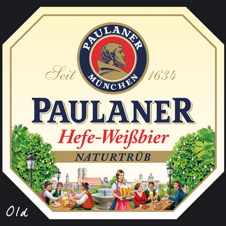
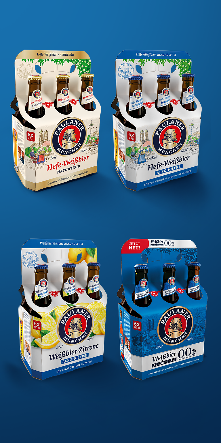
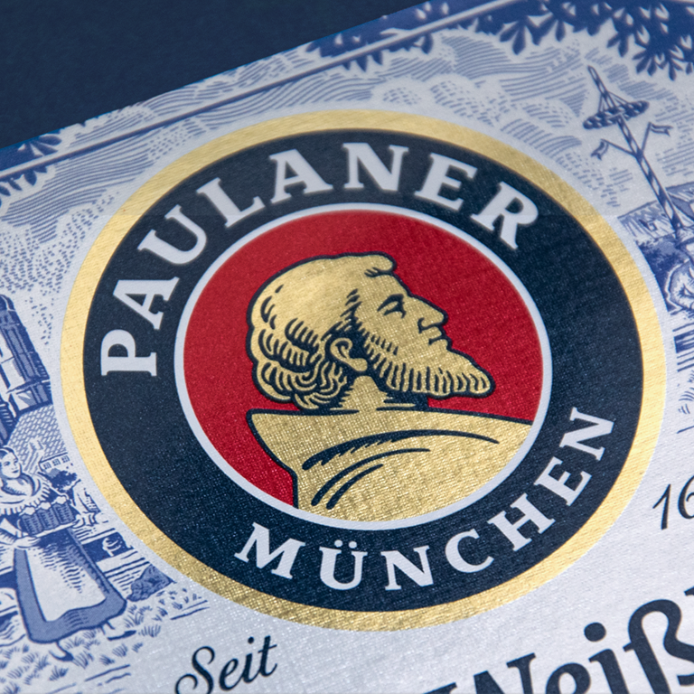
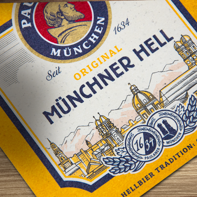
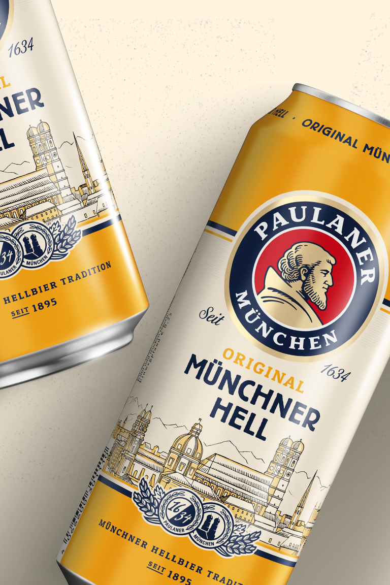
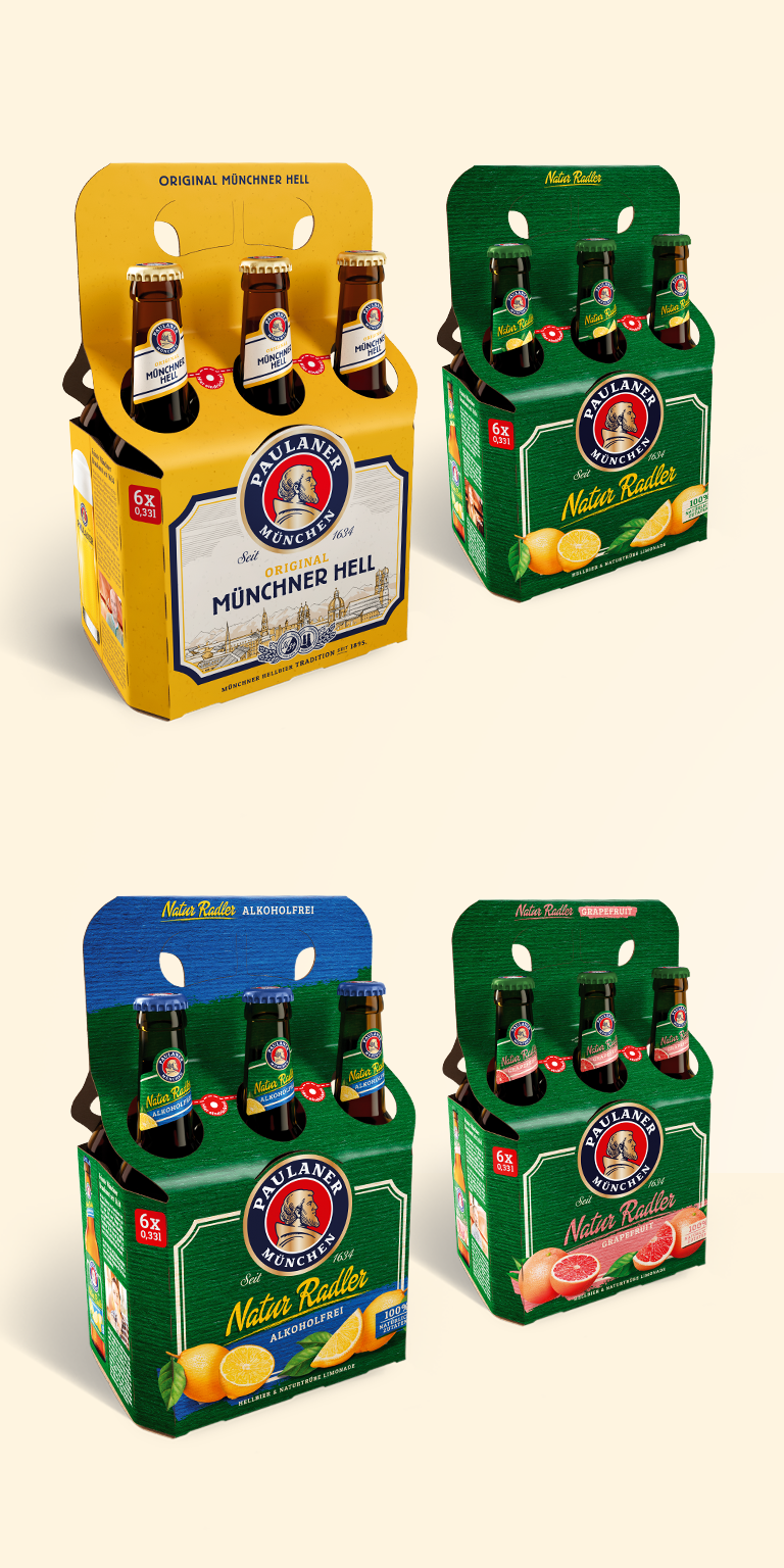
For Paulaner, the Primeval rock of Bavarian Braukunst, we were able to develop a completely new and fresh design strategy. In addition to the Paulaner logo, the labels of all varieties were revised. Greater differentiation between the different types has become necessary due to the large range of different beer specialities. The new brand image is now more modern, fresher and clearer in perception. The entire packaging has been given a new look – from label design to the cans and the refresh of all secondary packaging. Here, traditional values were combined with modern design elements to create a fresh breeze on the shelves. From the old, meaningless octagon, a new individual brand shape was developed, inspired by the omnipresent typical Munich street signs. Another example, the traditional but popular and well-known beer garden illustration, which was fallen out of time, time, was carefully updated without being unfaithful to the beer garden tradition.
CREDIT
- Agency/Creative: Higgins Design GmbH
- Article Title: Higgins Packaging Design Helps Paulaner Brewery Relaunch
- Organisation/Entity: Agency, Published Commercial Design
- Project Type: Packaging
- Agency/Creative Country: Germany
- Market Region: Global
- Project Deliverables: Brand Architecture, Brand Creation, Brand Guidelines, Brand Identity, Brand Strategy, Brand World, Branding, Packaging Design, Photography, Rebranding
- Format: Bottle, Can, Wrap
- Substrate: Glass Bottle


