


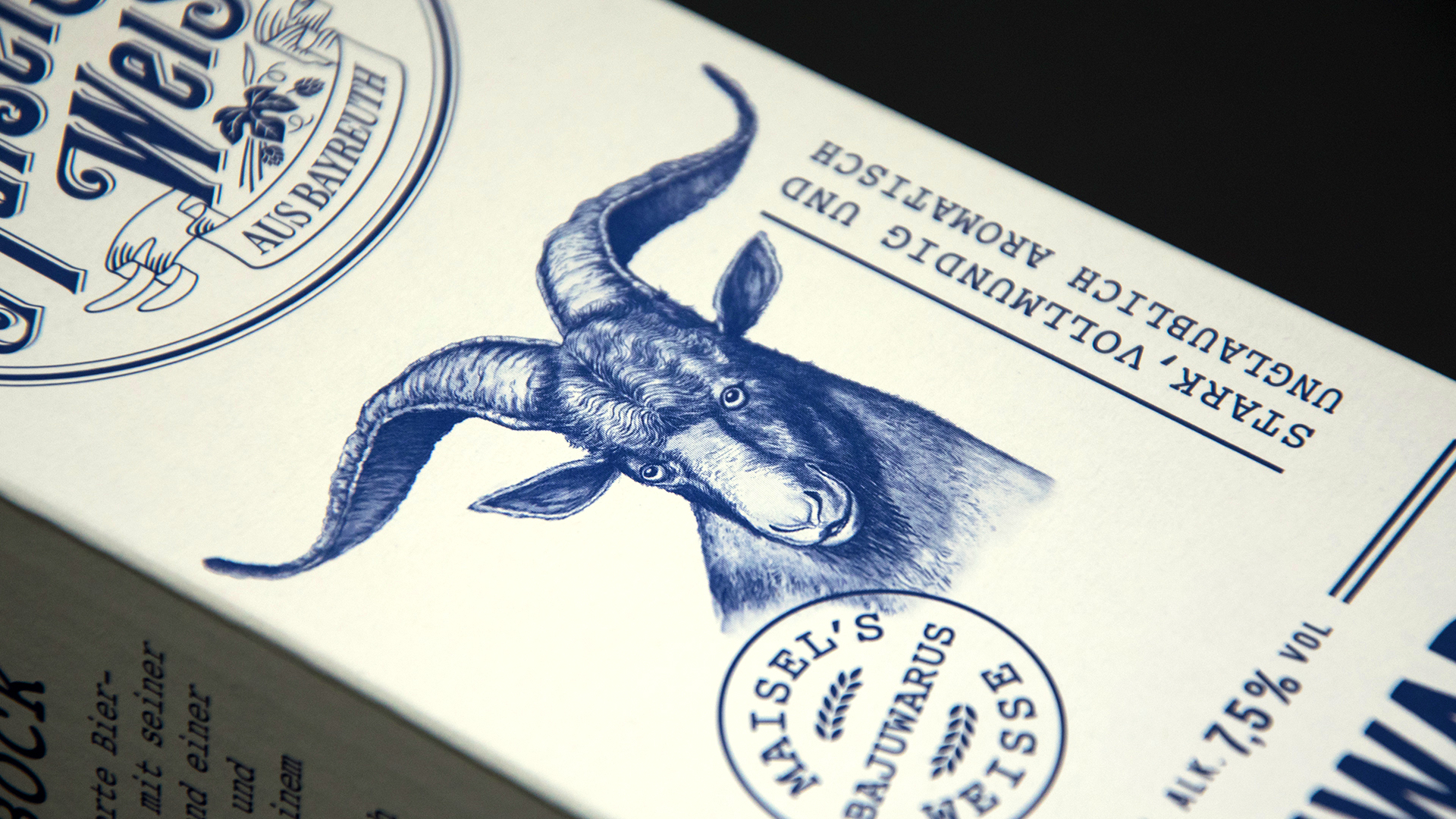
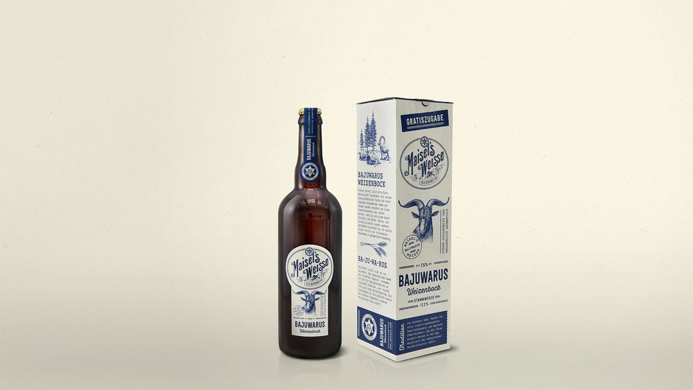
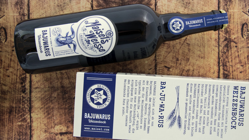
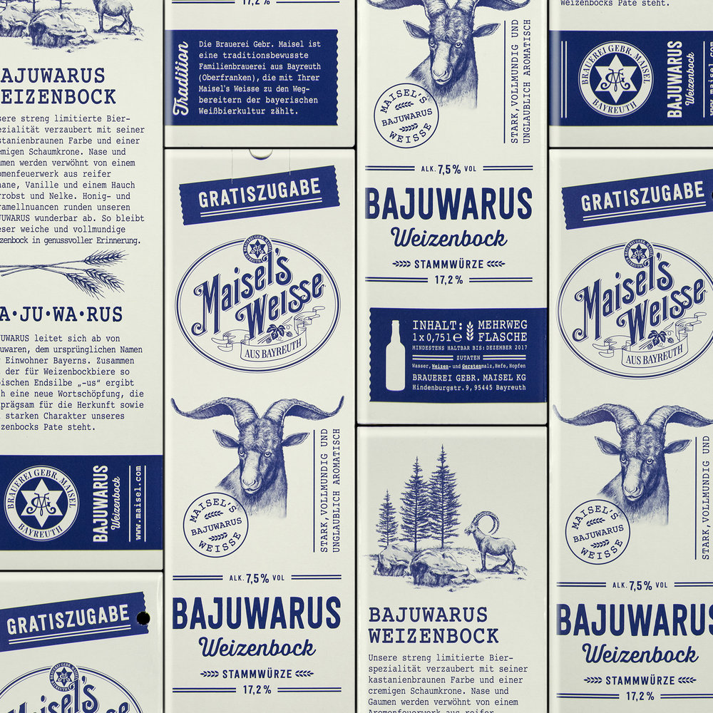
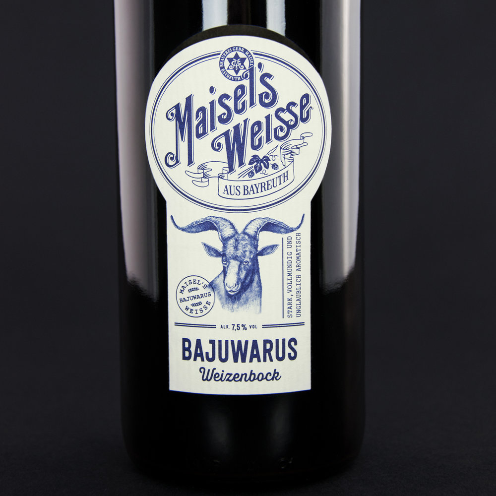
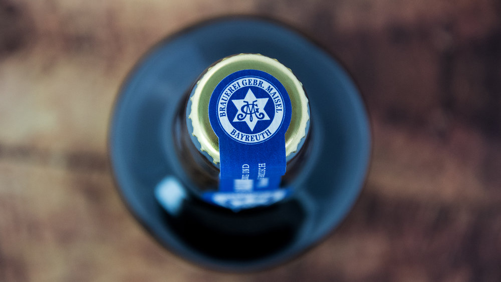
” What is the best way to tell a wonderful, authentic beer story? With just two words: “Bajuwarus Weizenbock”.Apart from a love of Bavarian bock beer, we also took our inspiration for the beverage packaging and the label design for the limited edition of Maisel’s Weisse from the fantasy word “Bajuwarus”, made up of the original name for the inhabitants of Bavaria, and from the final syllable of classic Bock-beers. The result was a highly emotive packaging design. The Maisel’s Weisse limited edition in a presentation box was given away with every crate of Maisel’s Weisse. 100% authenticity with 17.2% beer wort!Overview of projectClient: Brauerei Gebr. MaiselAssignment: Beverage packaging for the Weizenbock limited edition of Maisel’s WeisseCore competence: Beer design, beverage packaging, naming developmentProject components: Label design, packaging design, illustration, POS presence, naming development.”

CREDIT
- Agency/Creative: Higgins Design GmbH
- Article Title: Higgins Design GmbH – Maisel’s Bajuwarus Weizenbock
- Project Type: Packaging
- Format: Bottle
- Substrate: Pulp Paper


