Hidden Honey – Working with nature to forage the purest Manuka Honey
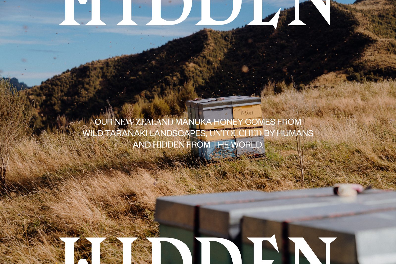
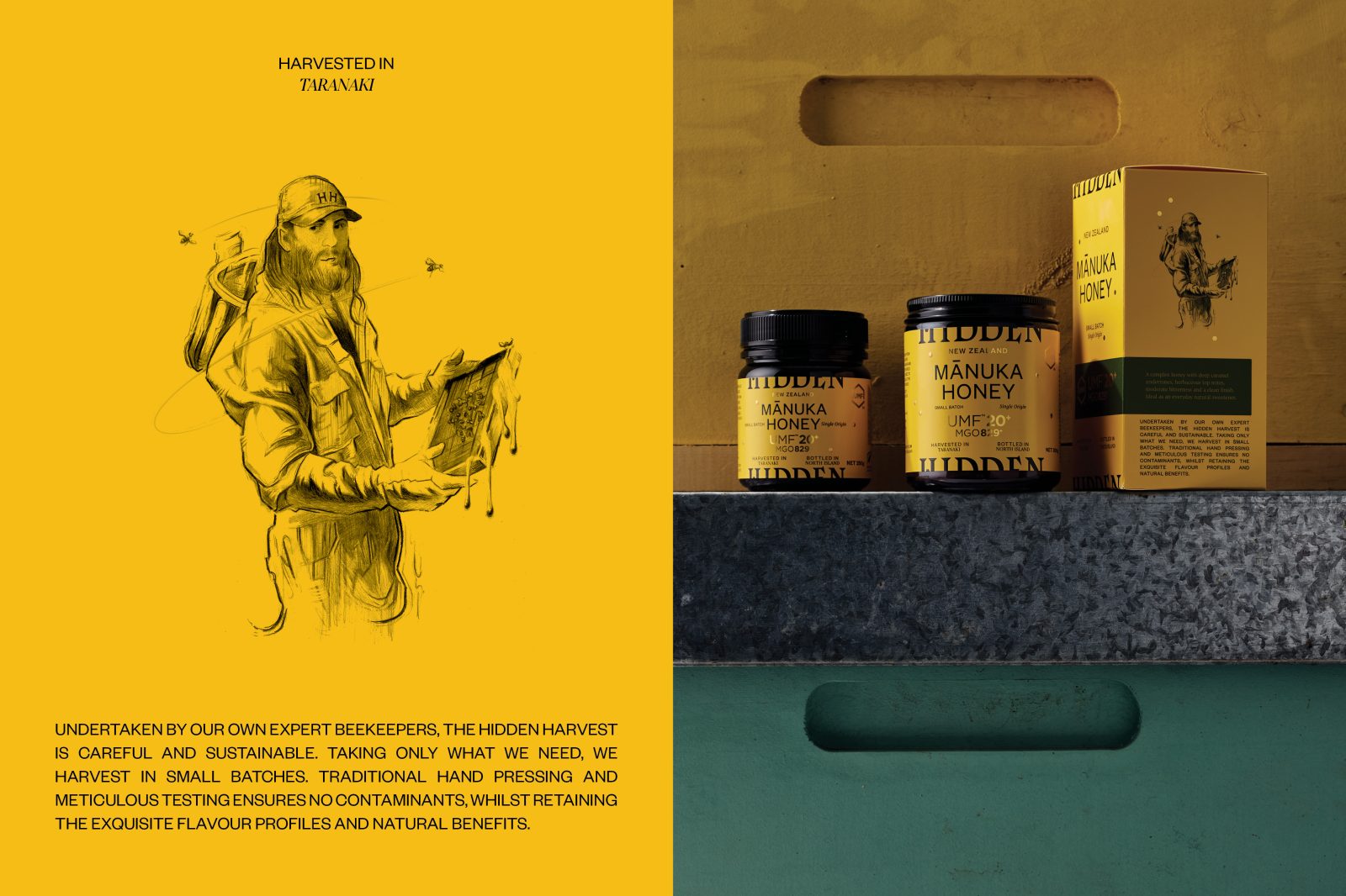
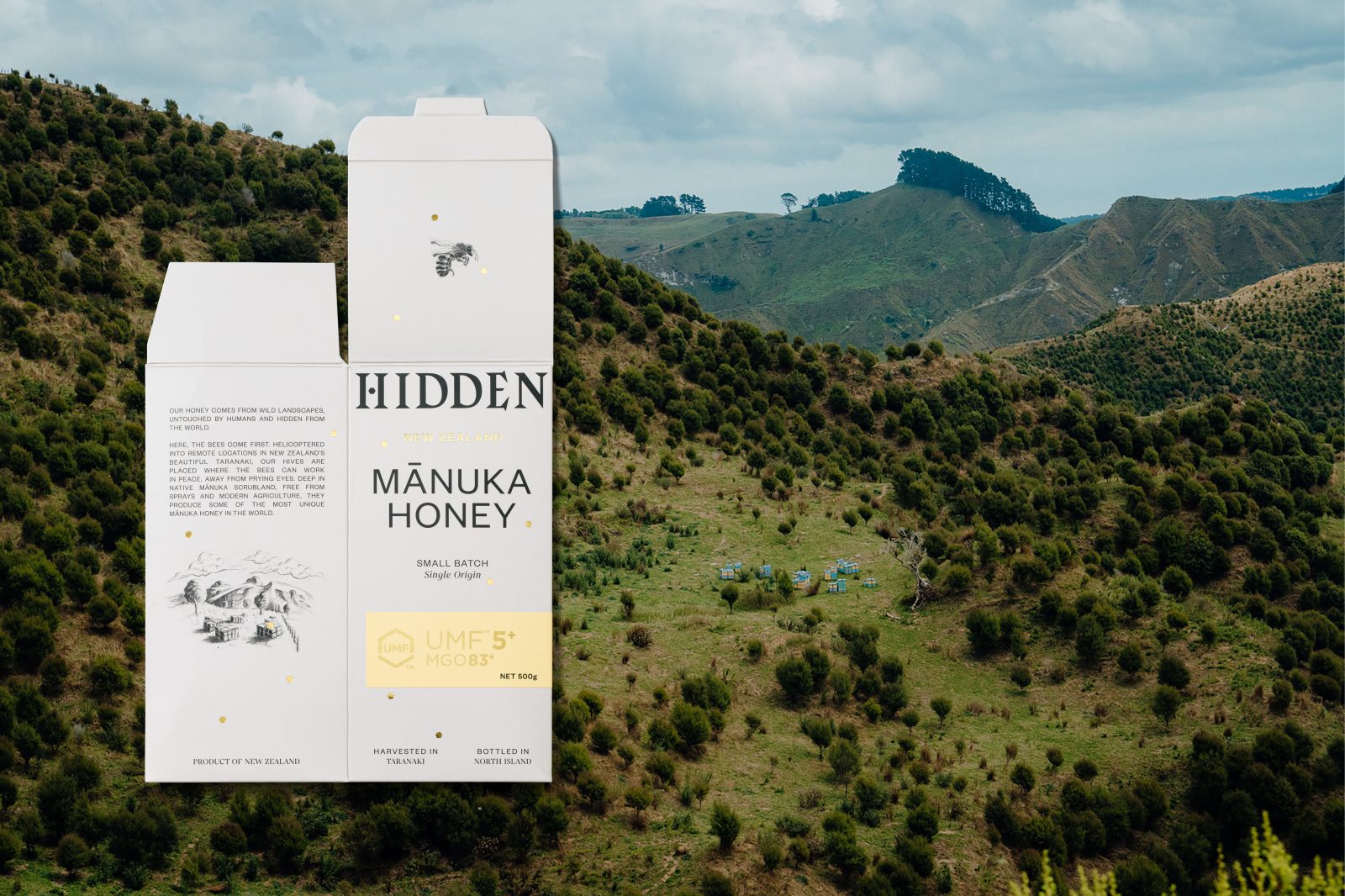
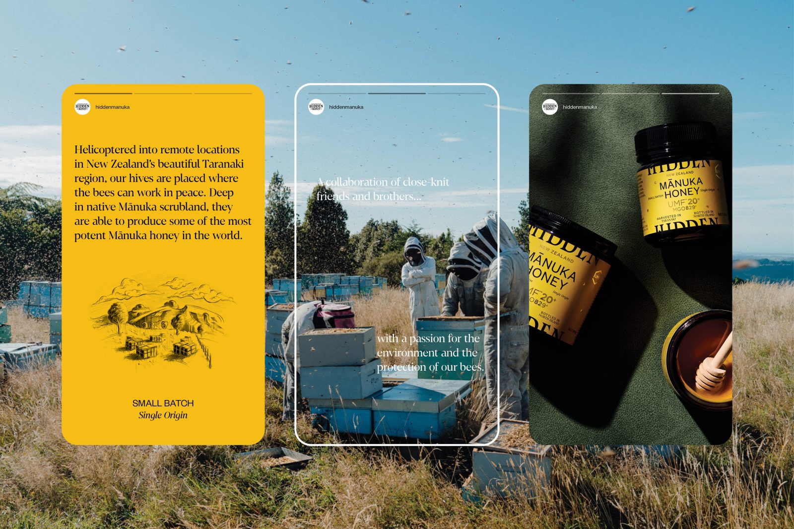
In a remote location of New Zealand’s North Island – away from the pesticides and modern agriculture – beekeepers work in harmony with their bees. As a collaboration of close-knit friends and brothers, Hidden is about family and sustainability. In a few precious hot summer weeks, the purest raw Mānuka honey in the world is harvested in small batches.
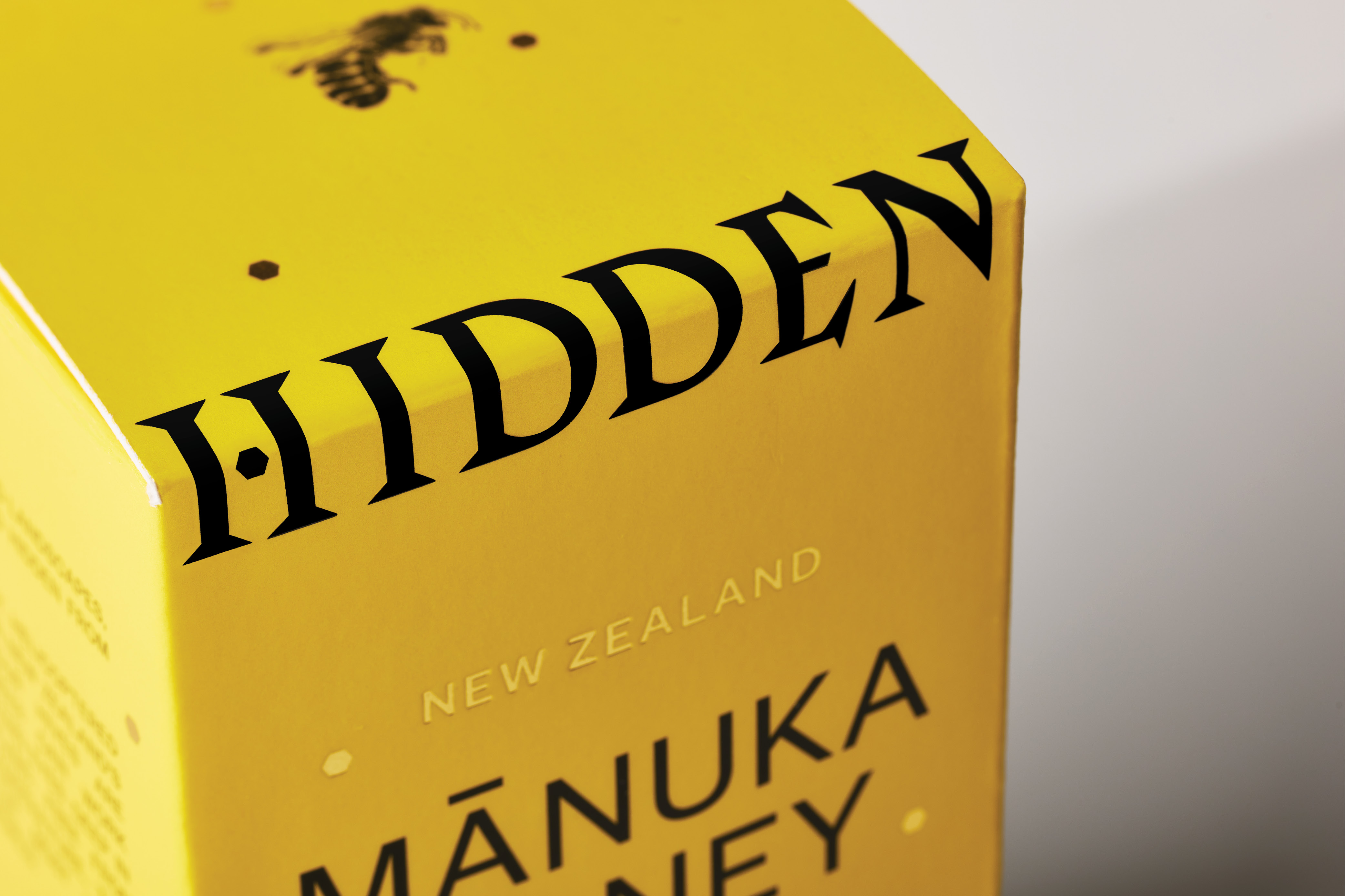
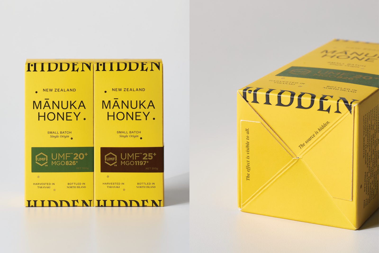
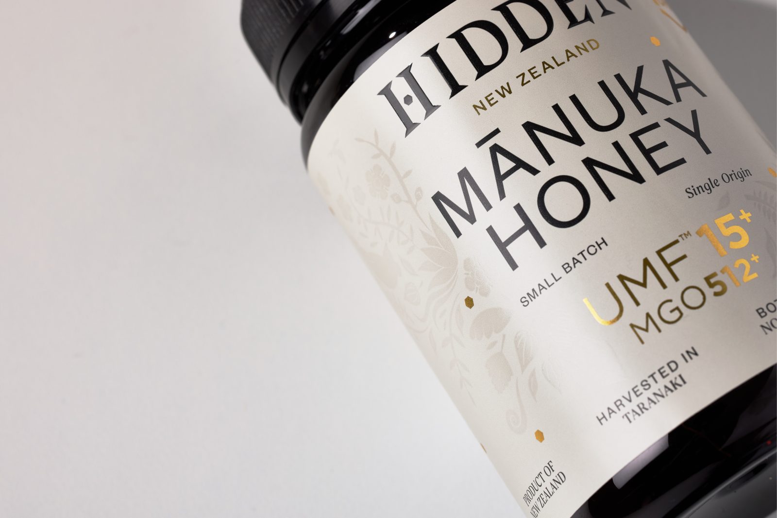
Our naming for the brand was inspired by the teams insistence on doing things right and going the extra-mile to find and forage what was previously Hidden. Typographically traditional yet edgy with oversized serifs, the wordmark reflects the young family doing the work and the age-old methods they use to care for the bees and extract the honey.
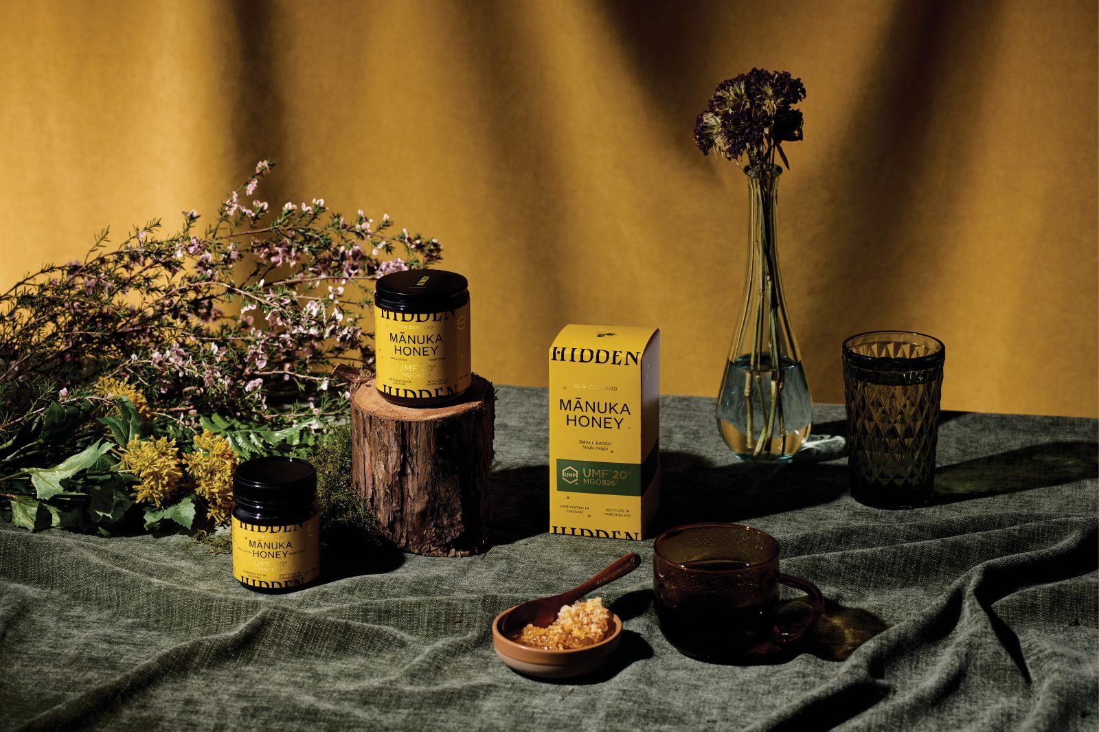
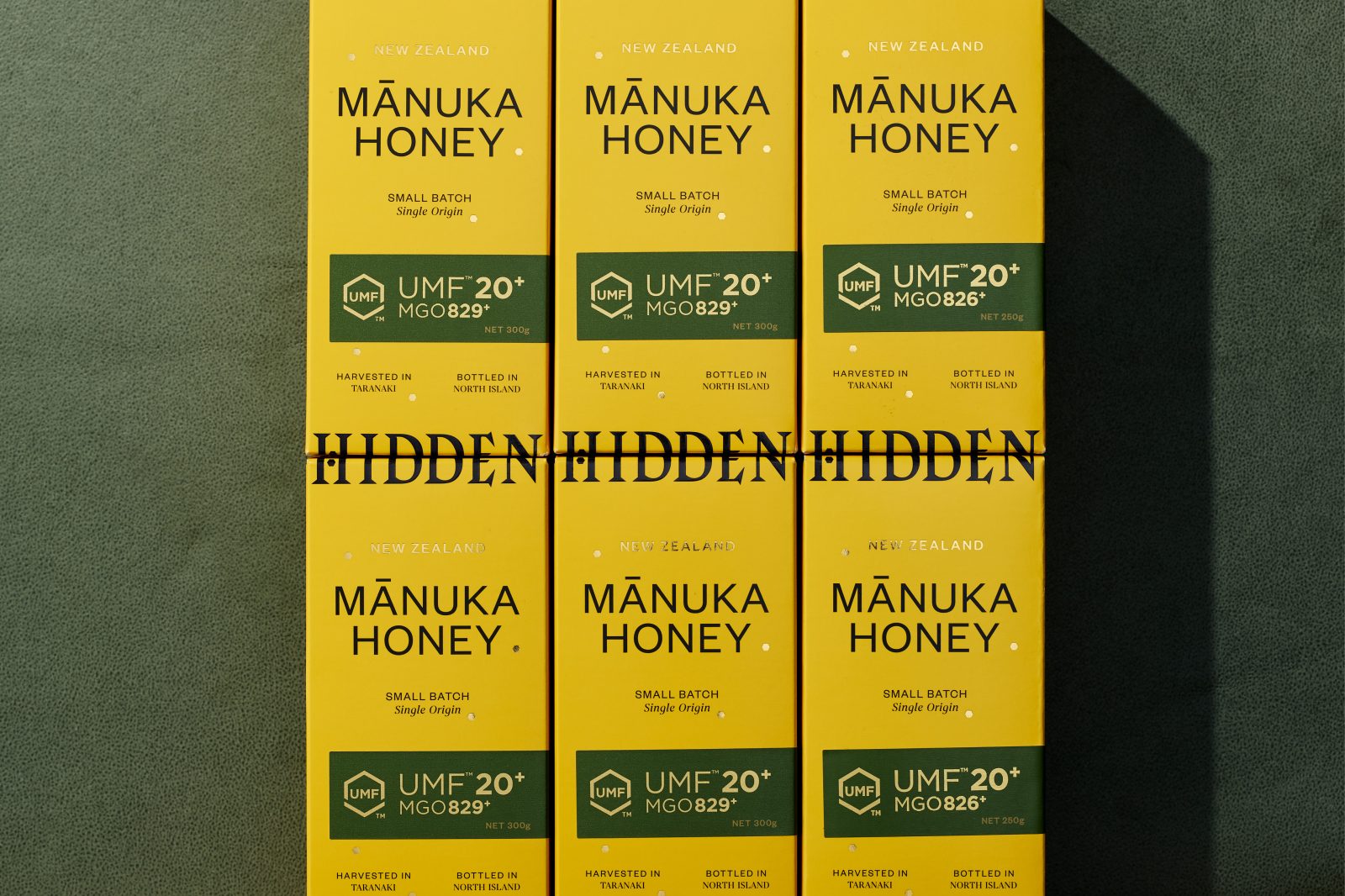
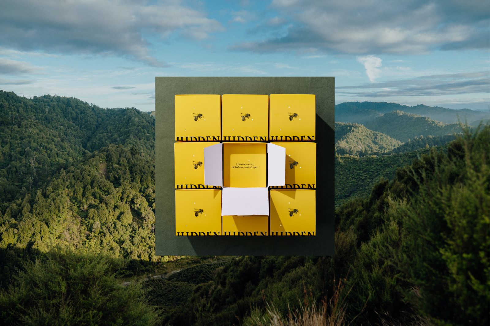
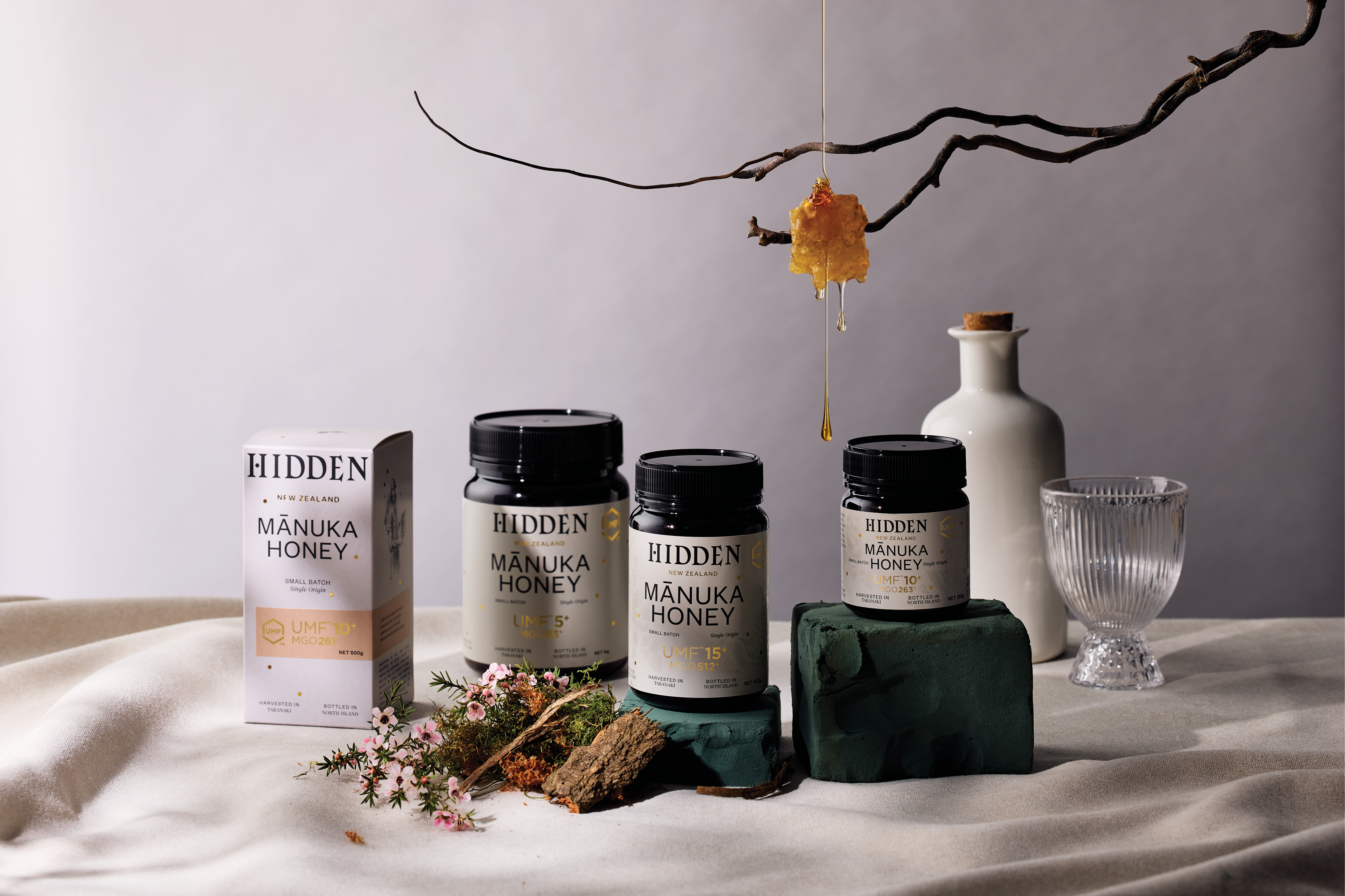
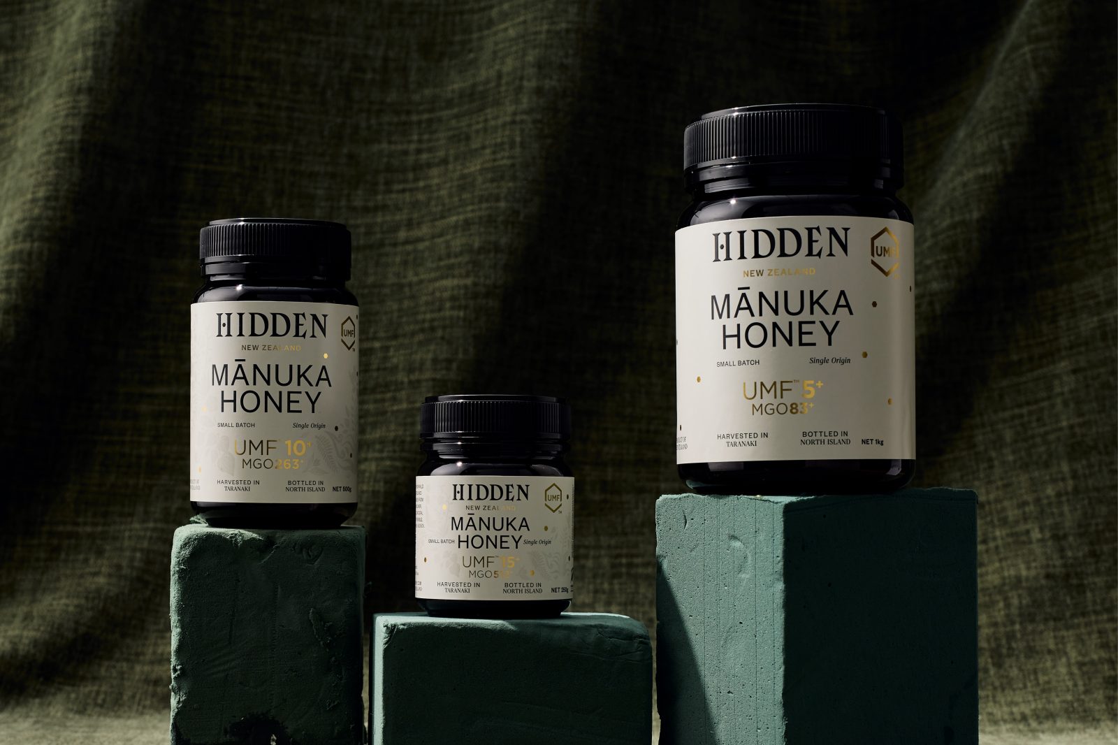
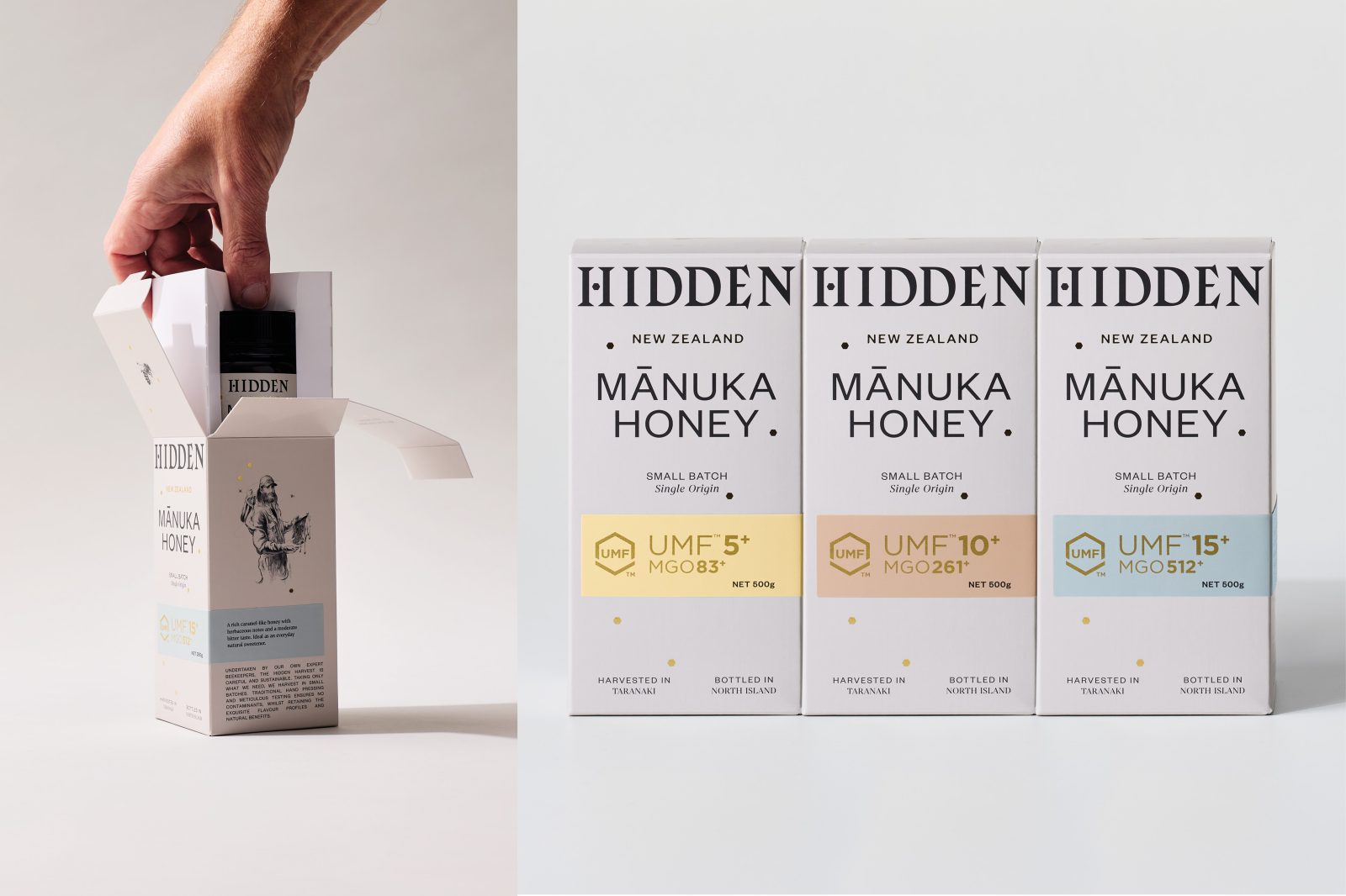
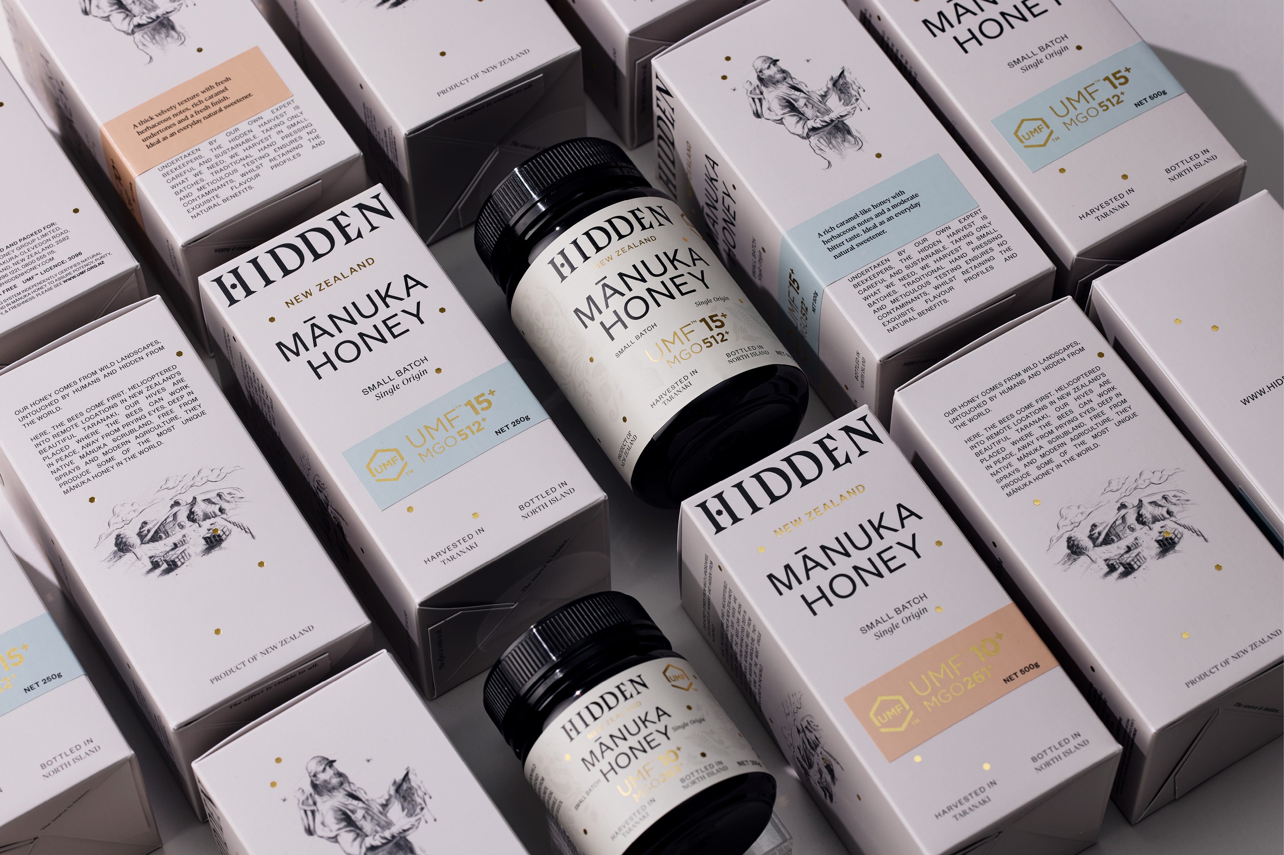
The range is split into two price points and purchasing occasions. The Brothers’ super premium range exudes warmth with a warm yellow colour palette. The wordmark is cropped on packaging, waiting to be discovered when boxes are stacked. The premium discovery range utilises the same design language with an easily identifiable wordmark. The wider typographic layout uses a common grid for continuity, this is mechanical in nature to reference the agrarian nature of the business. Soft pencil sketches are used to add visual context to the story and contrast to the stark typography. MGO factors are shown with a simplistic stickering system, colour coded to denote flavour profiles.
Designed for export, Hidden has launched its first harvest in department stores and boutiques in Europe, the Middle East and America.
CREDIT
- Agency/Creative: Onfire Design
- Article Title: Hidden Honey Packaging Design by Onfire Design
- Organisation/Entity: Agency
- Project Type: Packaging
- Project Status: Published
- Agency/Creative Country: New Zealand
- Agency/Creative City: Auckland
- Project Deliverables: Art Direction, Brand Creation, Brand Mark, Brand Naming, Brand Strategy, Brand Tone of Voice, Copywriting, Design, Illustration, Packaging Design, Typography
- Industry: Food/Beverage
- Keywords: WBDS Agency Design Awards 2022/23
-
Credits:
Creative Director: Matt Grantham
Illustrator: Jalal Asgher
Design: Alice Morgan
Account Director: Lisa Capel
Design: Kendal Dunlop
Design : Vijay Patel


