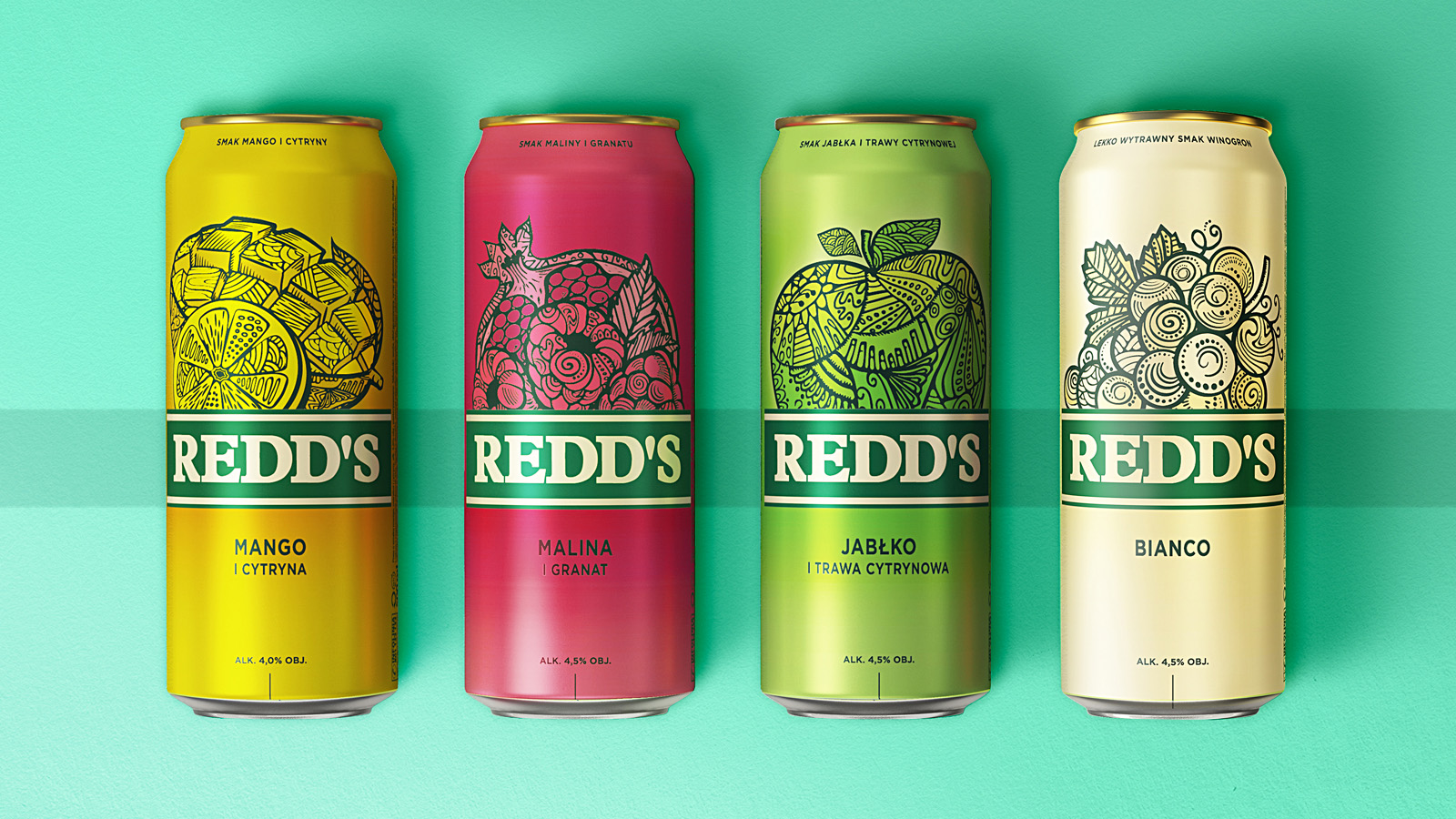
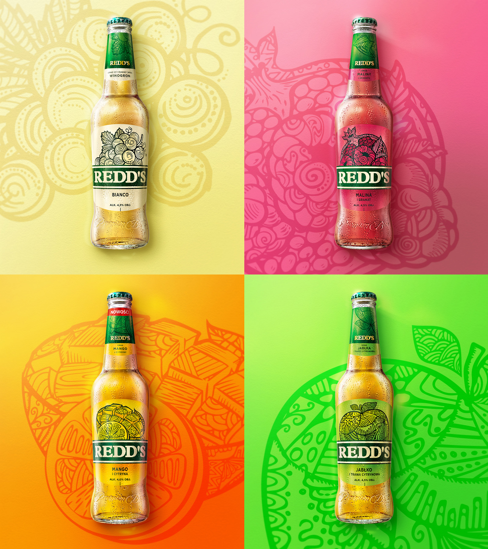
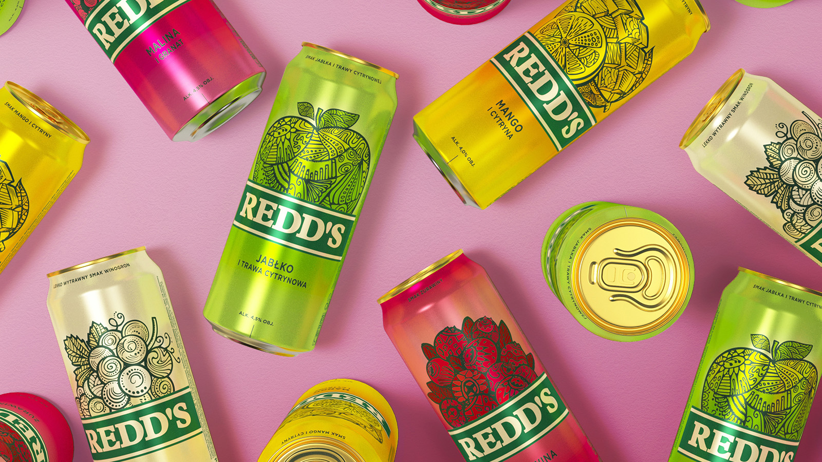
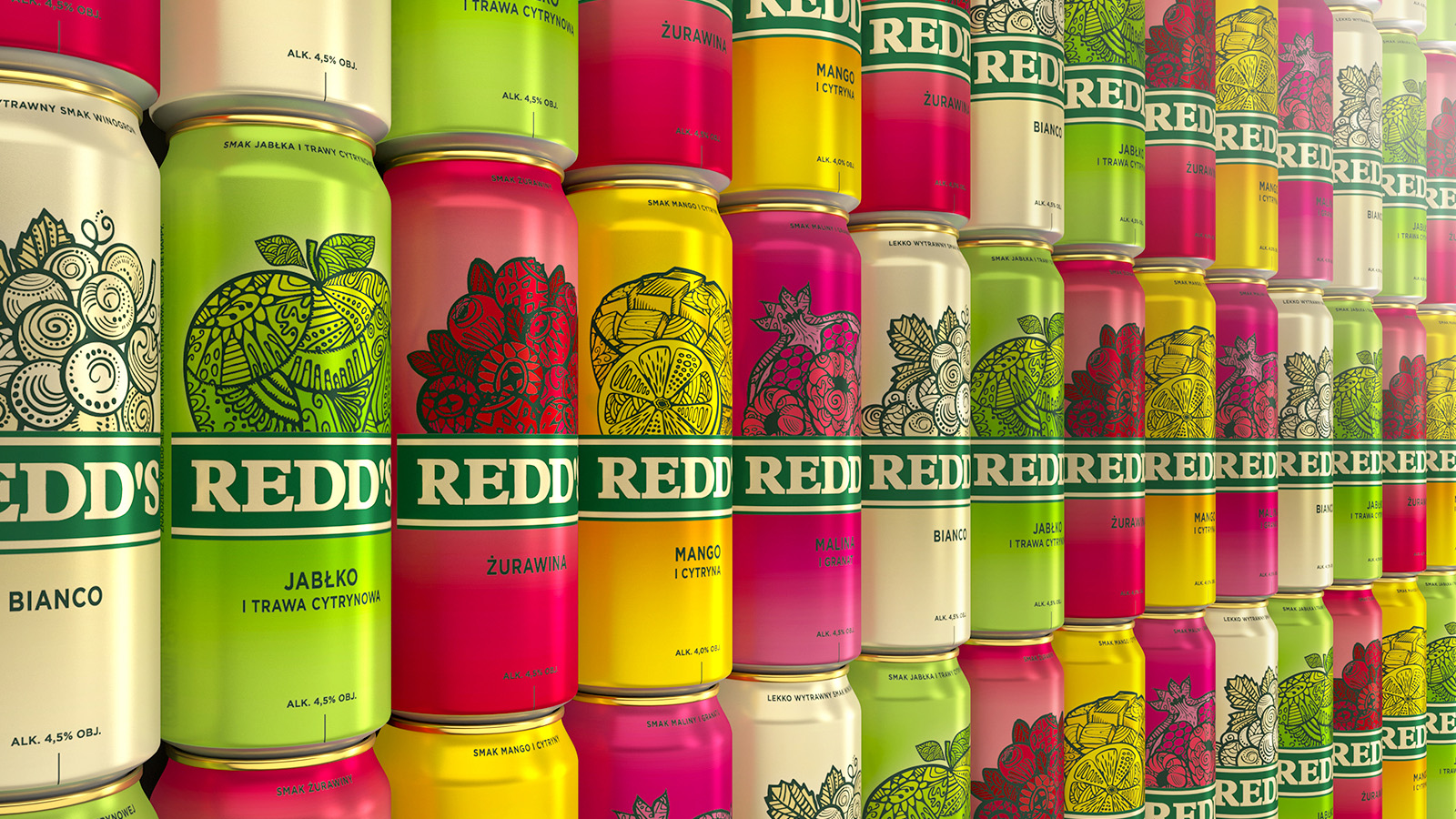
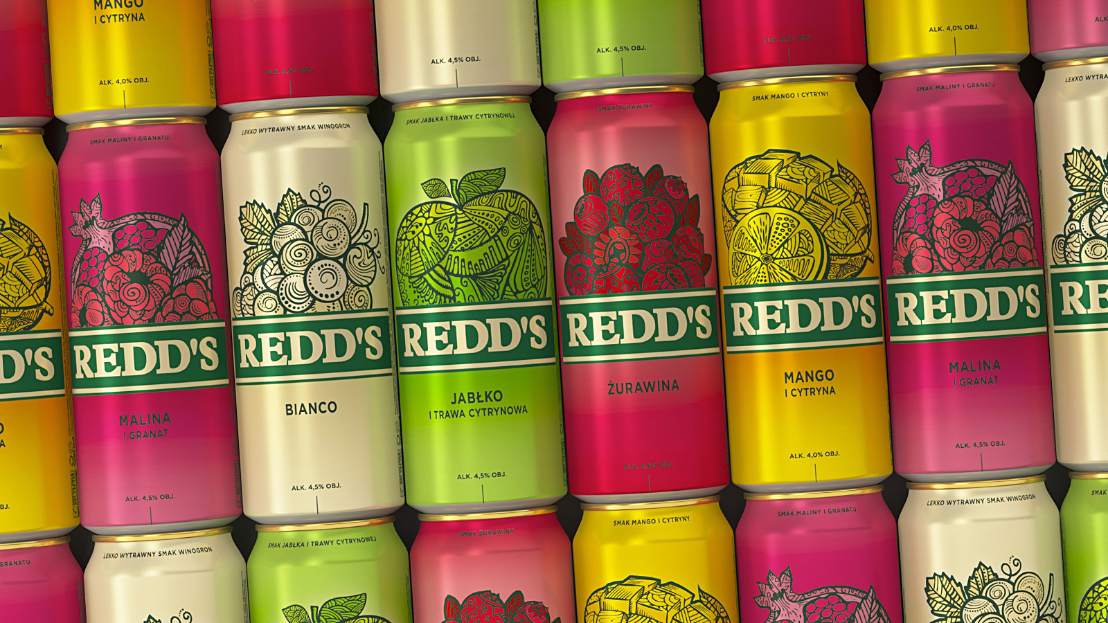
The new Redd’s stands for minimalistic design, a transparent message and strong color coding with unique, craft-beer illustrations. The horizontal green branding strap makes the product to stand out on the shop shelves and it brings the other brand colors to play and sends out invitations to the world of Redd’s lovers.
The packaging has been thoroughly redesigned. The typically “masculine” symbols of coats of arms, shields and seals have been replaced with a clear invitation to an intriguing world of tempting new flavors.
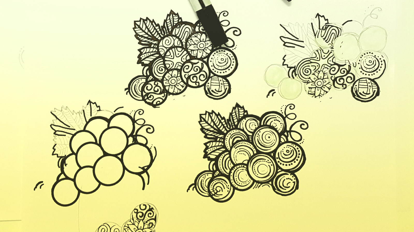
The brand’s DNA is dominated by fruity, unusual flavor combinations. Now these take center stage. When it comes to illustrations nothing is too obvious, everything is filled with symbols. This is the new, promising creative platform of the visually strikingworld of Redd’s.
CREDIT
- Agency/Creative: HiBrands
- Article Title: HiBrands – Redd’s Redesign
- Organisation/Entity: Agency, Published Commercial Design
- Project Type: Packaging
- Agency/Creative Country: Poland
- Market Region: Europe
- Project Deliverables: Illustration, Packaging Design, Research
- Format: Bottle, Can
- Substrate: Glass Bottle, Metal


