


For lovers of rompope or when the Christmas season approaches, the Licor De Rompope Santa Clara Nuez 1 cannot be missing in the pantry.
Regardless of whether it is your first time or if you already knew it, the Nut Rompope 1 Liquor from Santa Clara is a classic that will undoubtedly delight everyone who tries it. This slightly thick drink is ideal to drink with ice, that is, with ice, and accompany one or more dishes. You can even try this burnt golden-looking liquid as a dessert digestif. It is made with egg yolks, almonds, milk, sugar, vanilla, cinnamon and a touch of liquor.
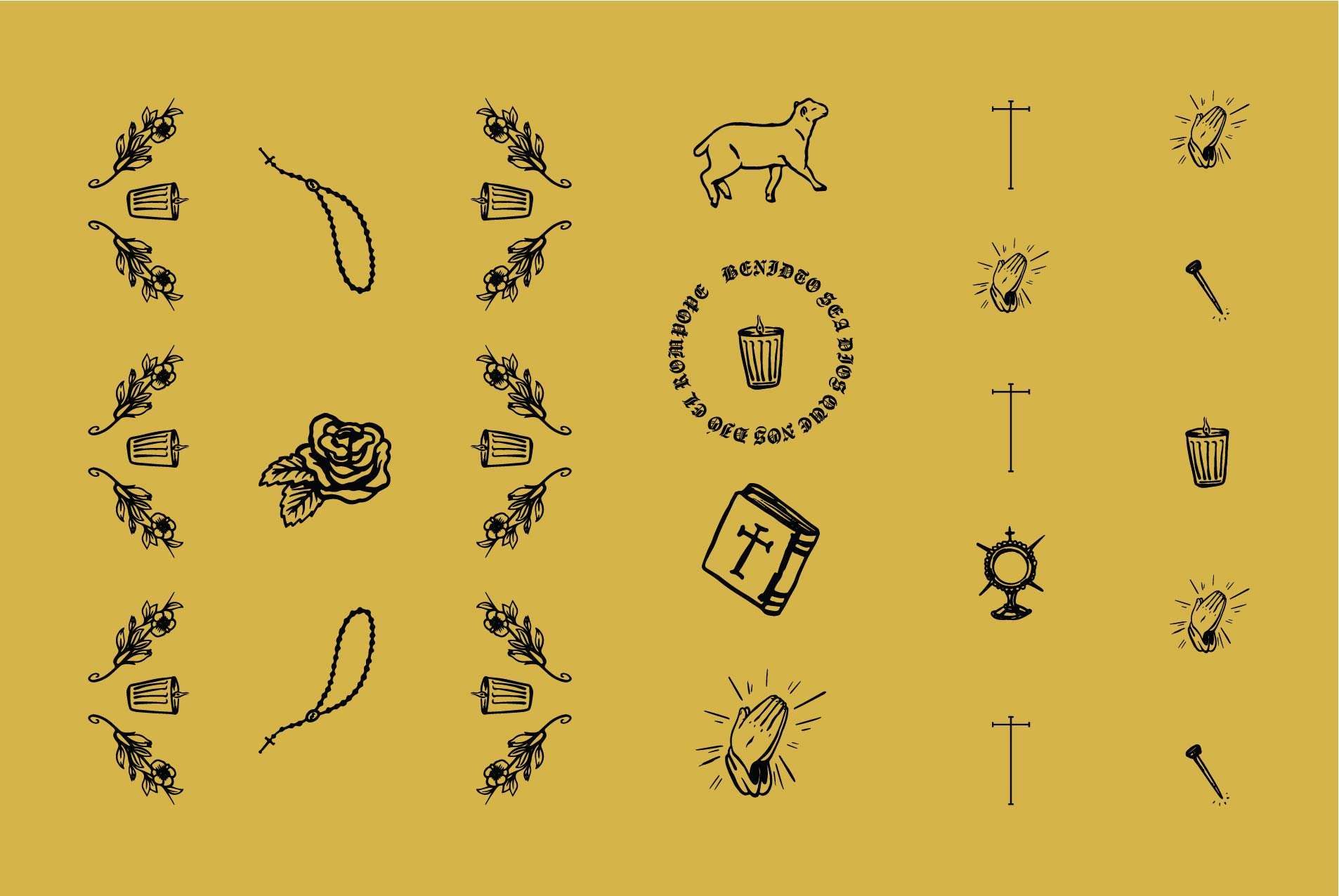
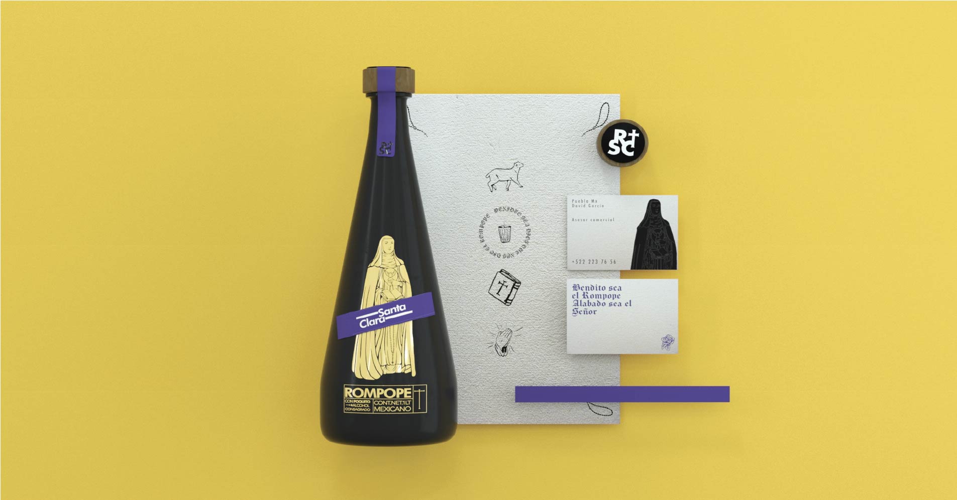
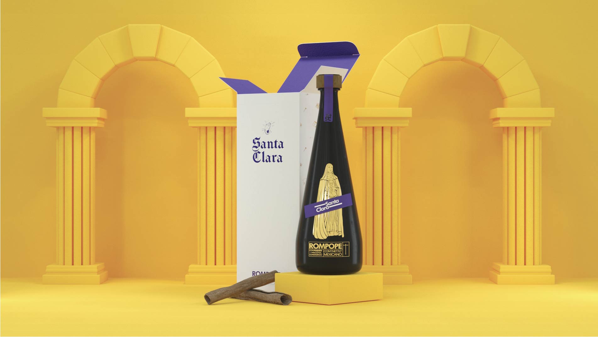
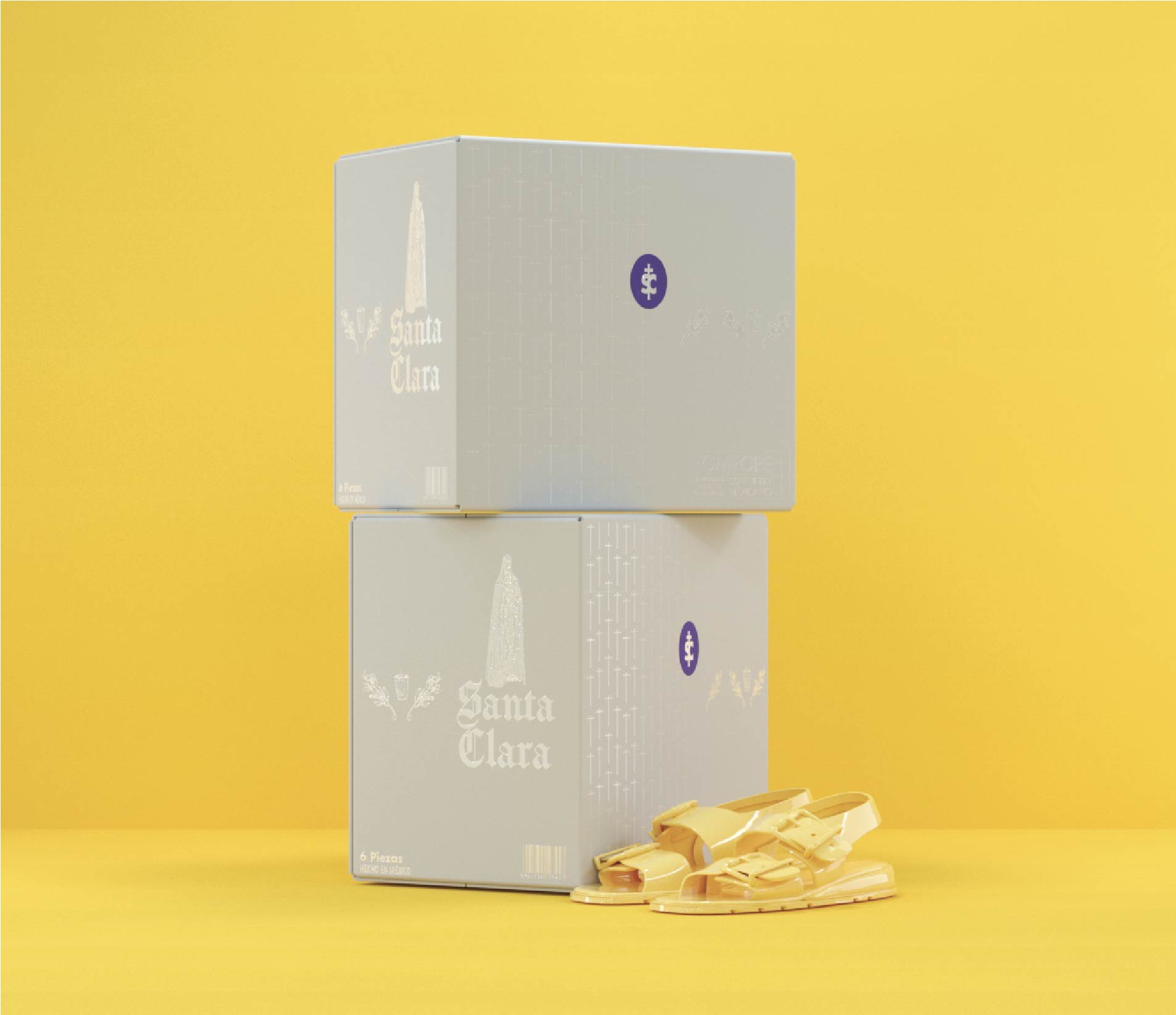
We redesigned the current graphic identity of rompope Santa Clara in order to generate an image that adheres to the needs of the current market, we made a synthesis of existing elements and we generated a new language for the brand in order to reach new markets.
Rompope Santa Clara is originally from the city of Puebla de los Ángeles. Created by the Poor Clare nuns of the Santa Clara convent (initially as a dessert called “Papa”) to which cane alcohol is then added for better preservation, evolving to become the current eggnog.
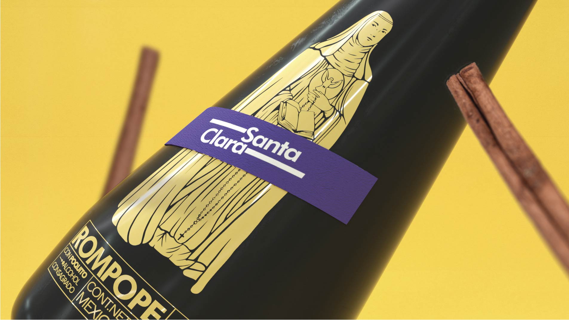
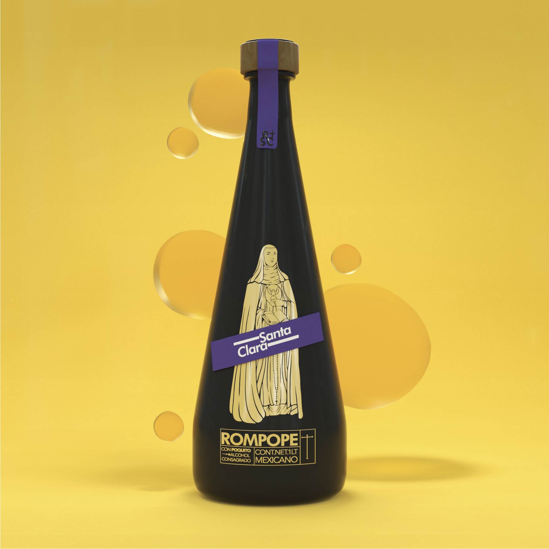
The bottle currently allows us to see the yellow color of the rompope and has a label that shows the corporate identity with metallic red tones, we made a radical change for the proposal, achieving a balance between the traditional identity and the previous one.
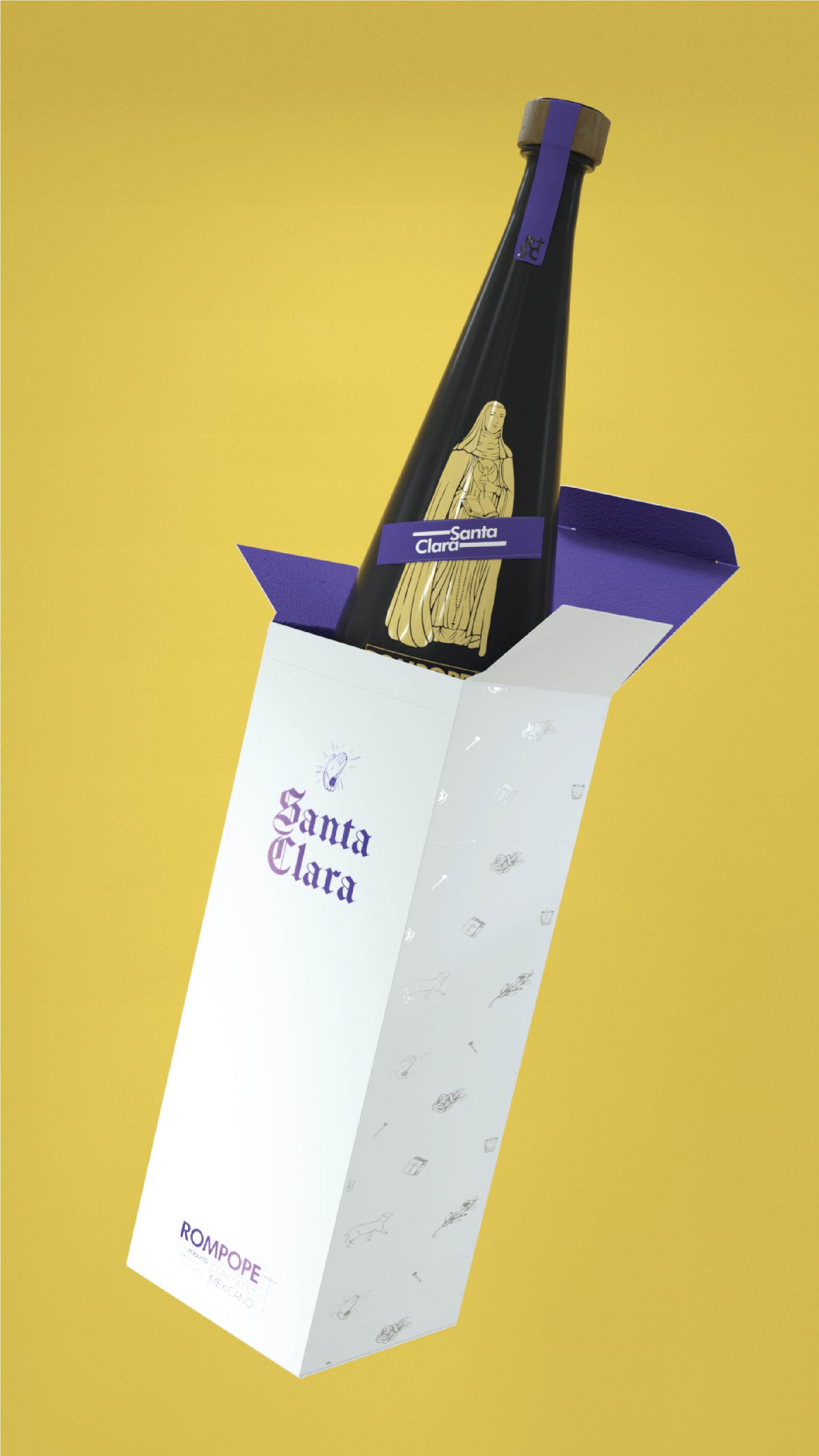
We cover the bottle in black and add purple, giving the project a bit of mysticism. On the other hand, we take some gothic fonts and do a mix of classic and contemporary fonts.
Drink prepared with egg yolks, vanilla, cinnamon, ground almonds, milk, sugar and liquor with a delicious sugary taste and creamy consistency.
Because it is considered a sweet drink, it is customary to take it after a meal.
Eggnog is also considered a good digestif or dessert for after a snack. On some occasions, jellies can also be made with this liquor.
The chosen substrate was black glass where a negative space was worked that allows the product to be shown through the logo.
A classic Mexican eggnog.


CREDIT
- Agency/Creative: Hi! estudio
- Article Title: Hi! Estudio Redesign Concept of Rompope Santa Clara
- Organisation/Entity: Agency, Non Published Concept Design
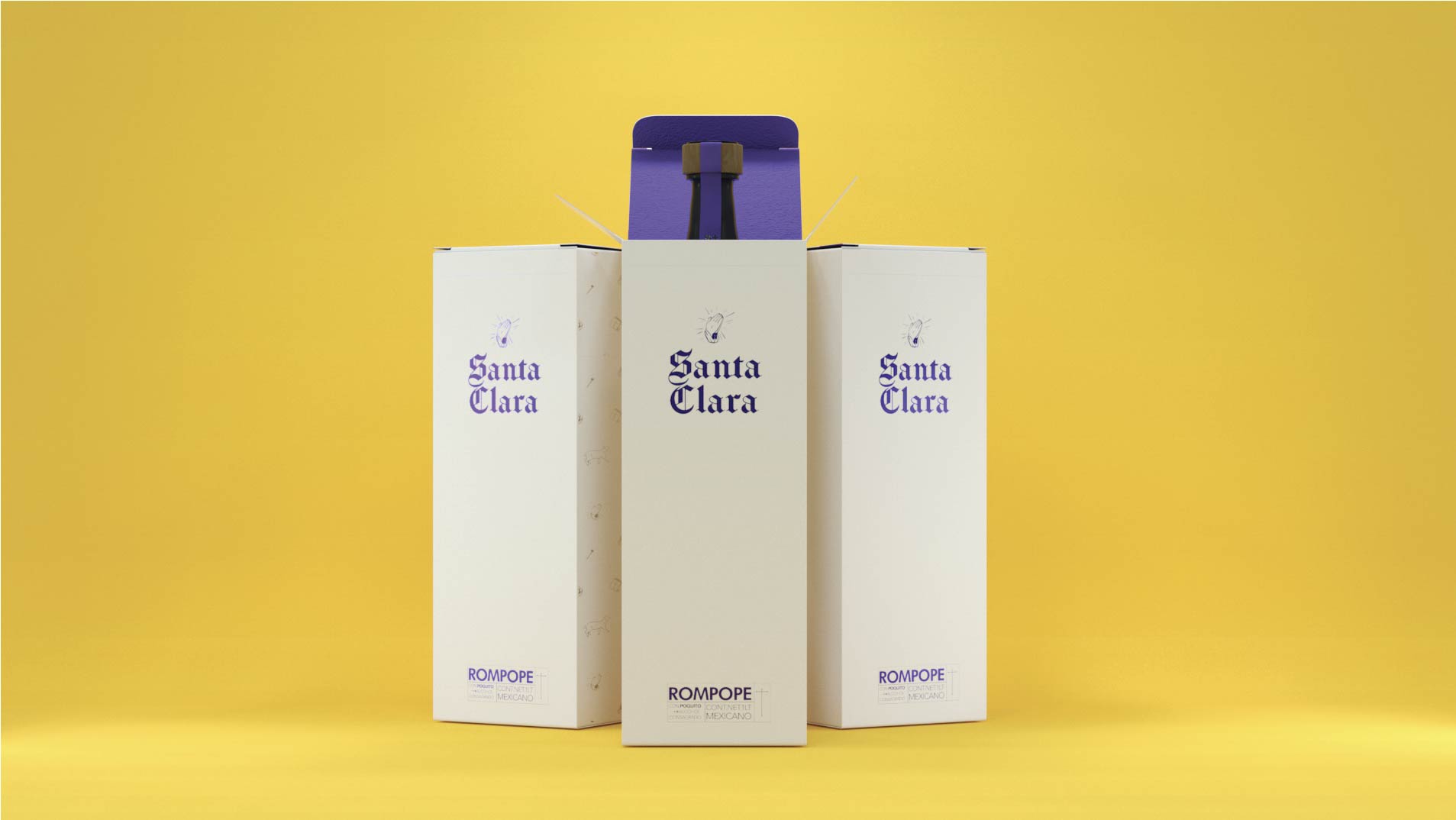
- Project Type: Packaging
- Agency/Creative Country: Mexico
- Market Region: Multiple Regions
- Project Deliverables: Brand Strategy, Rebranding, Tone of Voice
- Format: Bottle, Box
- Substrate: Glass Bottle


