


We conceived and designed this sotol brand as a living metaphor for time itself: a vessel that transforms while honoring what endures , a bottle that tells a story through its presence and evolution. From the very beginning, our intention was to build a narrative that feels both timeless and immediate. To achieve this, we structured the entire identity around three core conceptual pillars: time, thought, and desert. Each of these elements plays a distinct role in shaping the character of the brand. Time represents continuity and change; thought reflects the human hand, craft, and reflection behind every detail; and desert grounds the project in the rugged, poetic landscape of northern Mexico, where sotol has its roots.
This brand is not static it stays, leaves, returns, converses, and lingers in memory. Its spirit can be summarized in two words: Hasta Siempre, a phrase that expresses both permanence and the inevitable passage of time.
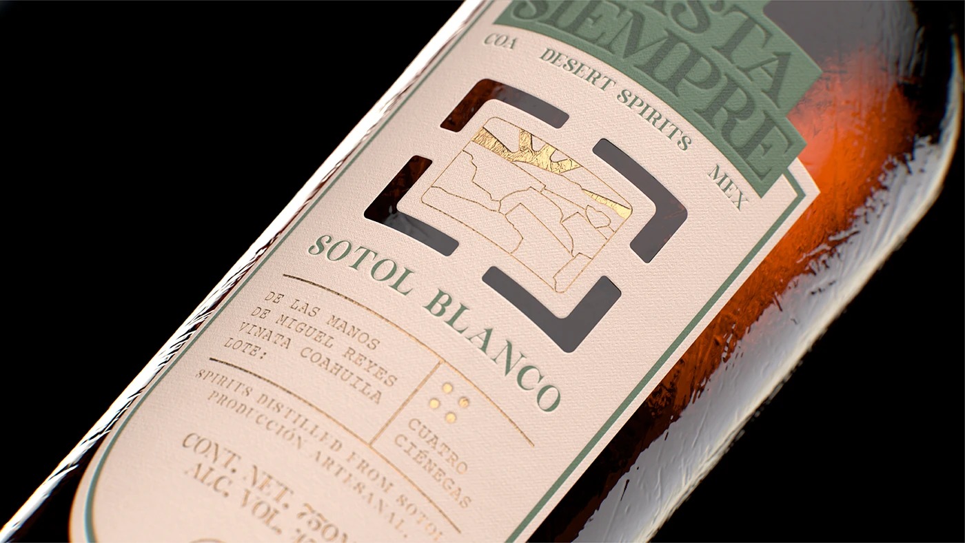
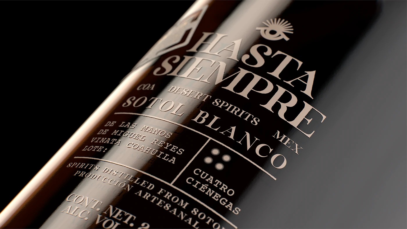
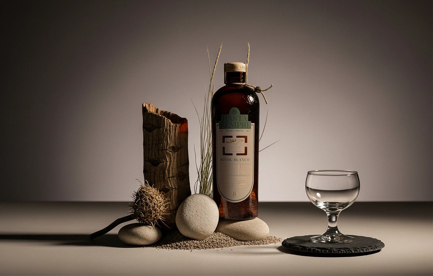
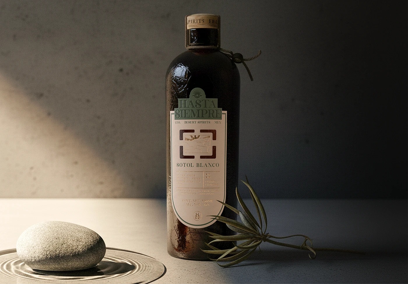
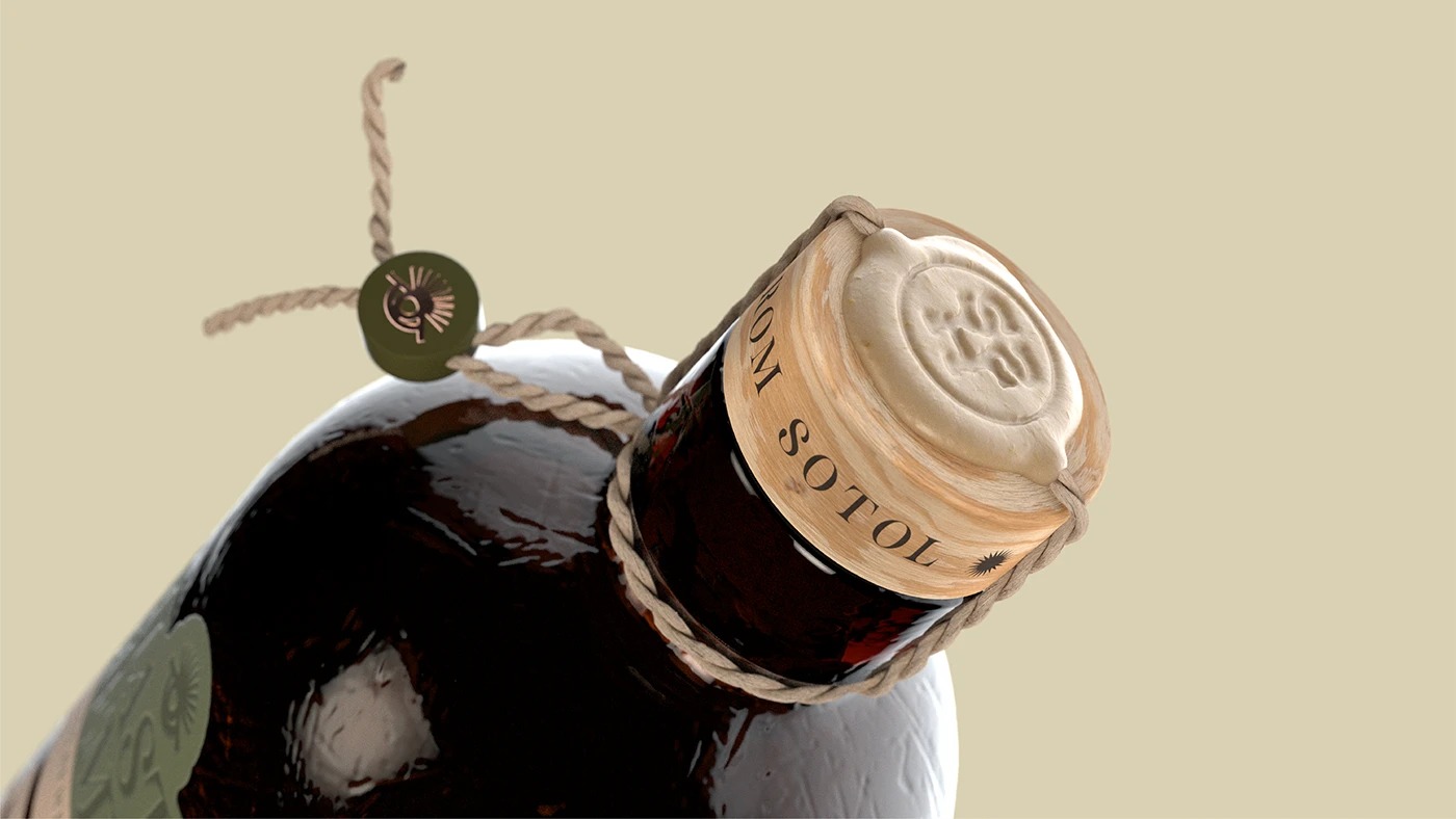
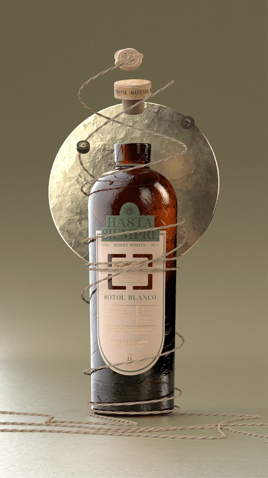
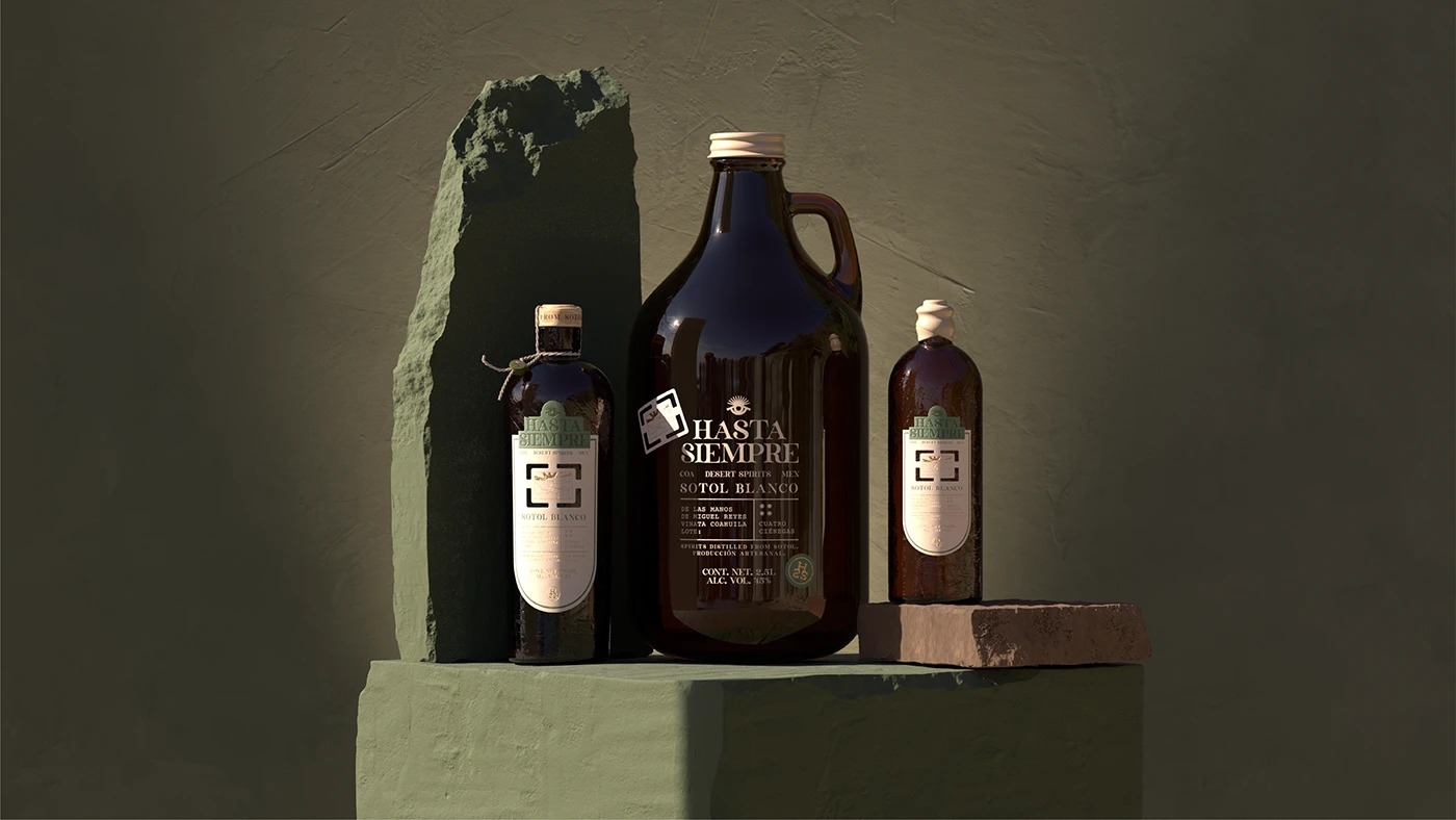
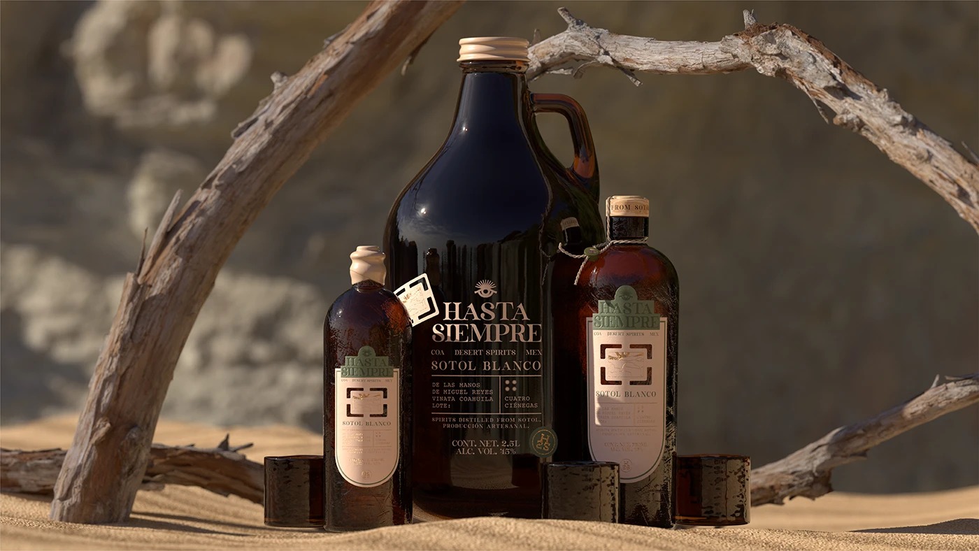
The visual language draws directly from the Mexican desert: austere yet profound, defined by earth tones and the memory of native plants that have witnessed centuries pass. We designed an identity that fuses artisanal sensibility with contemporary clarity. The typography is straightforward and elegant, while a carefully designed system of marks provides rhythm and structure. Textures are honest and tactile, evoking materials shaped by nature and time. The hierarchy of information is clean and intentional, designed to be read before it’s sipped, inviting the viewer to pause and reflect.
Ultimately, this is more than packaging it’s a dialogue between past and present, craft and landscape, fleeting moments and lasting impressions.

CREDIT
- Agency/Creative: Hi Estudio Multidisciplinario
- Article Title: Hi Estudio Multidisciplinario Designs Hasta Siempre Sotol as a Tribute to Continuity and Change
- Organisation/Entity: Agency
- Project Type: Packaging
- Project Status: Published
- Agency/Creative Country: Mexico
- Agency/Creative City: TEPATITLAN, JALISCO
- Market Region: Global
- Project Deliverables: 3D Design, 3D Modelling, Art Direction, Brand Creation, Brand Design, Brand Naming, Label Design, Packaging Design, Photography
- Format: Bottle
- Industry: Food/Beverage
- Keywords: hiestudio, hi, branding, designstudio, tepatitlan, spirits
-
Credits:
Designer: Hi Estudio Multidisciplinario


