


Bendita Vida: A Celebration of Life and Heritage
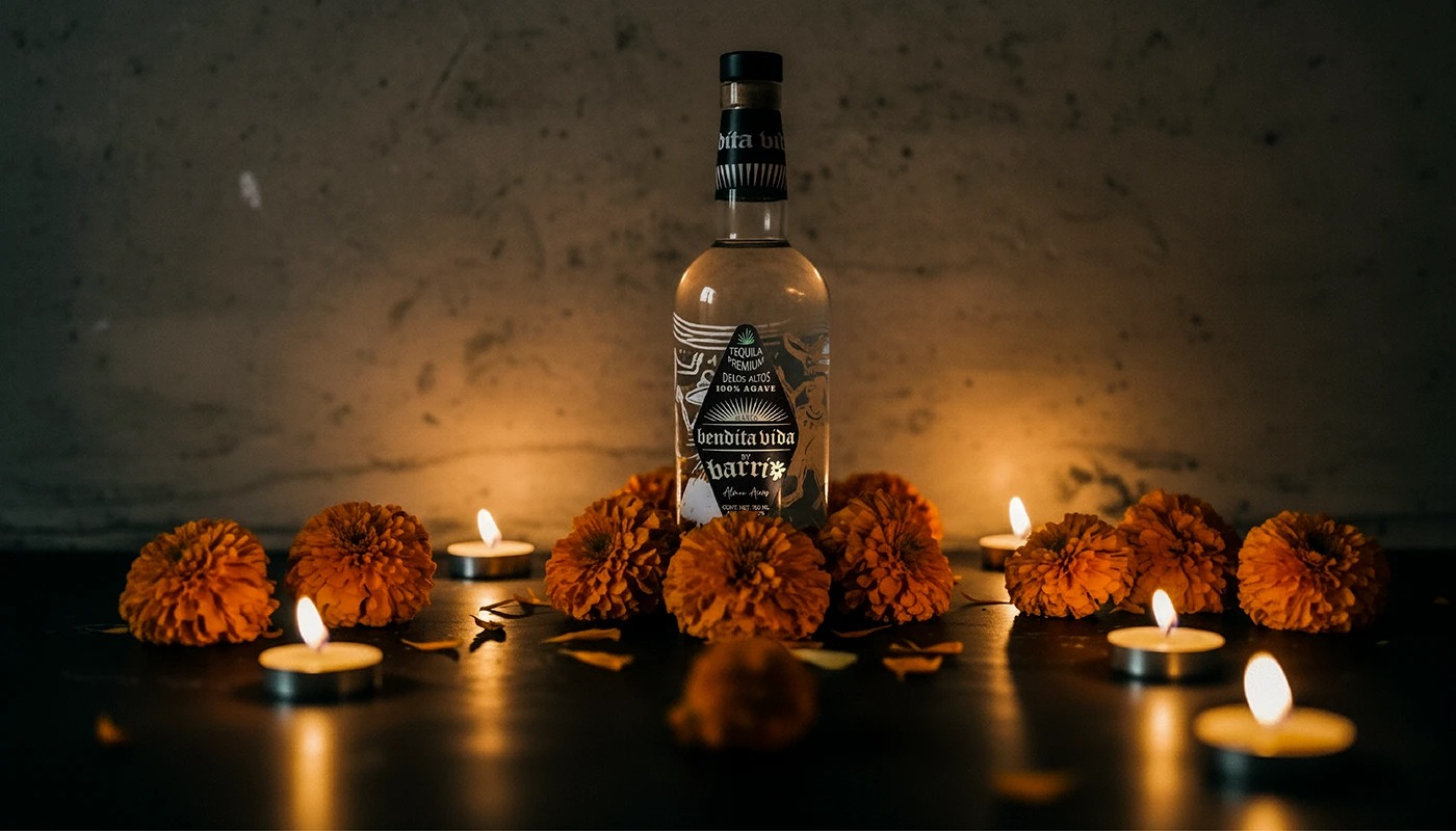
Bendita Vida is not merely a spirit; it is a meticulously crafted tequila that stands as a liquid homage to life, authentic origin, and sophisticated Mexican design. Hailing from the sun-drenched, fertile lands of Los Altos de Jalisco, this exceptional tequila embodies the rich agricultural legacy and deeply rooted traditions of Mexico’s premier tequila-producing region. It was brought to a wider audience in the United States by Barrio Taco, establishing Bendita Vida as a potent symbol of identity, profound gratitude, and cultural pride.
More than just an alcoholic beverage, Bendita Vida serves as an elegant bridge, honoring centuries-old Mexican traditions while passionately celebrating the universal joy of sharing these customs, tastes, and narratives across international borders. Every aspect of the brand—from the agave fields to the bottle’s stopper tells a story of fusion and reverence.
The Art of the Bottle: Crafting Dualities
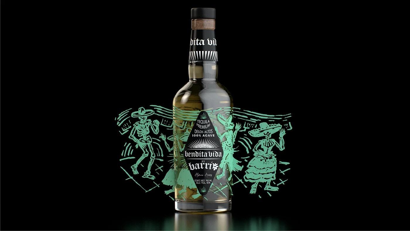
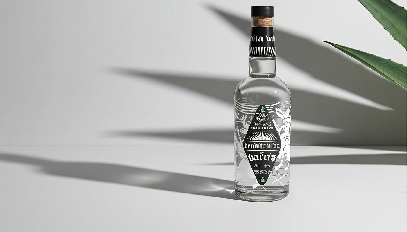
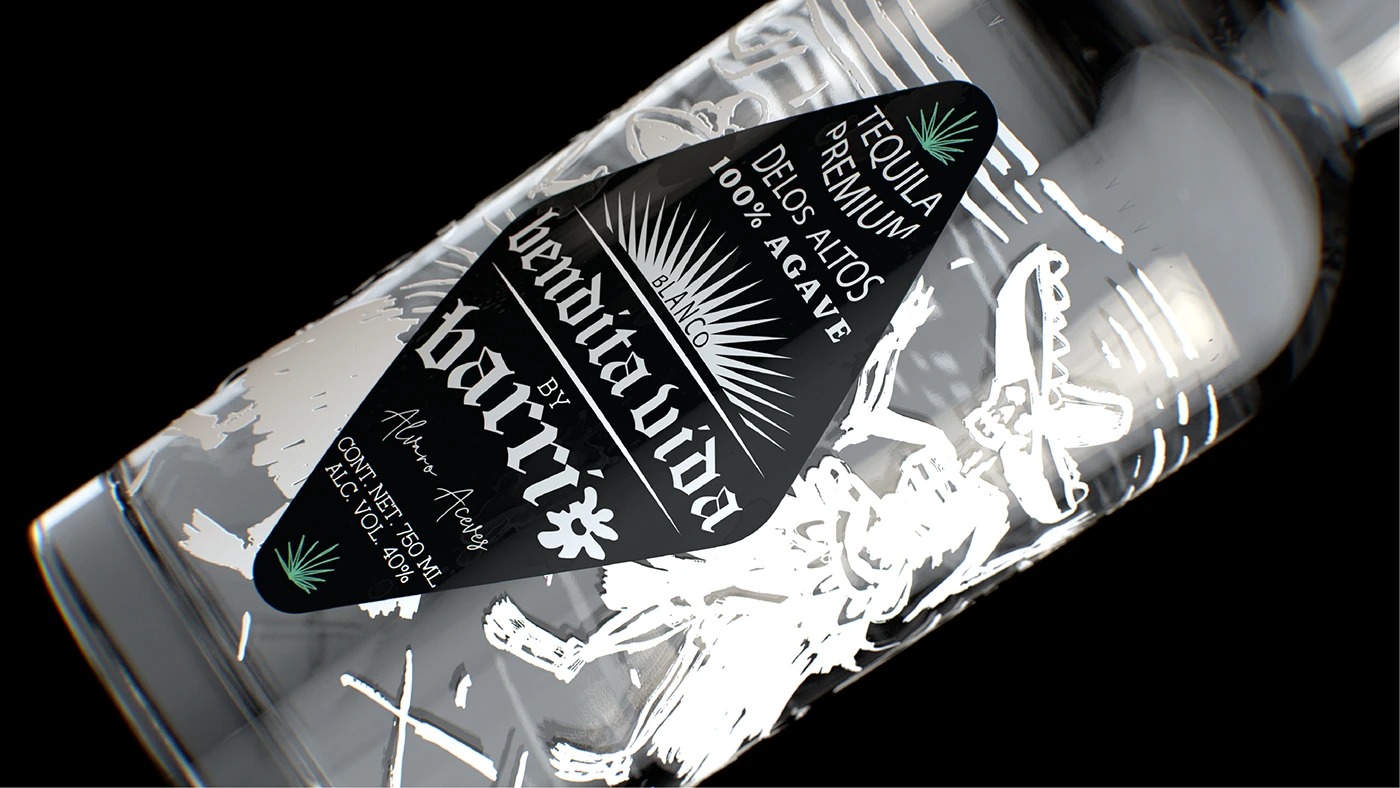
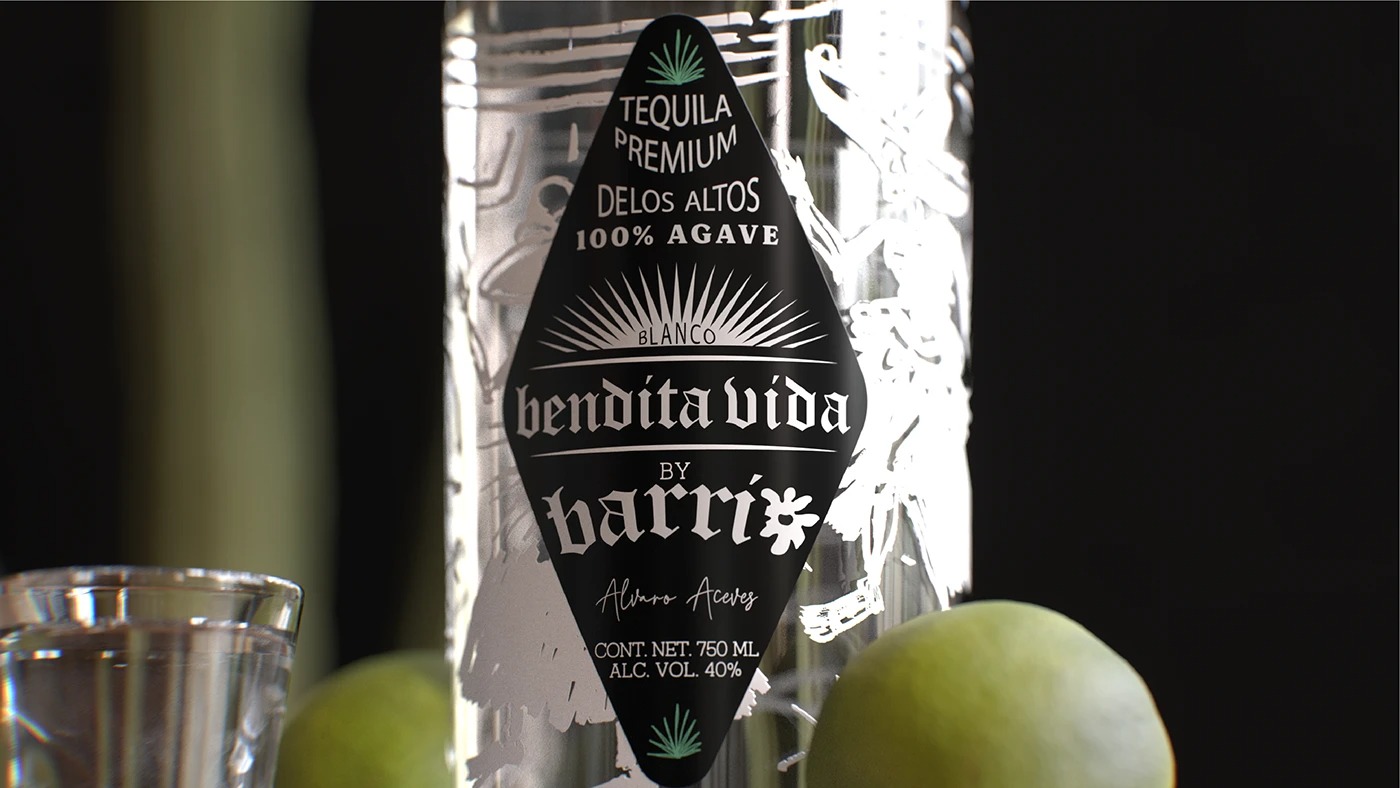
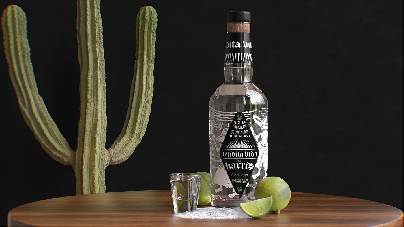
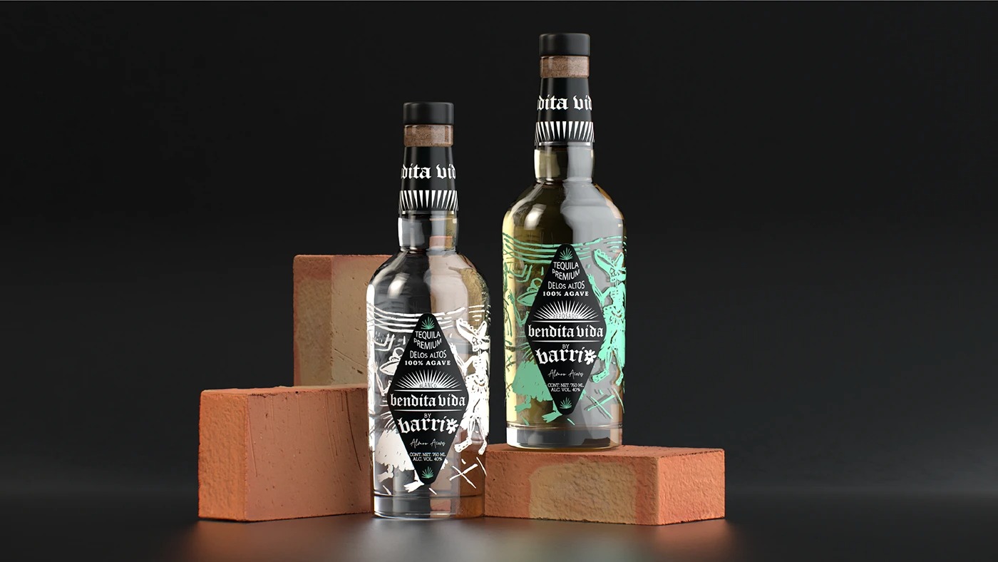
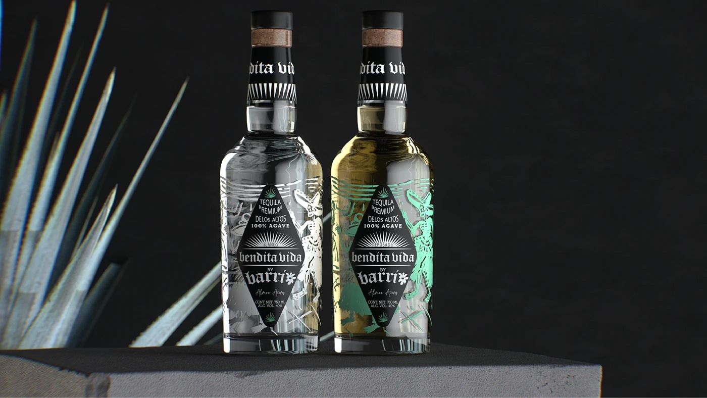
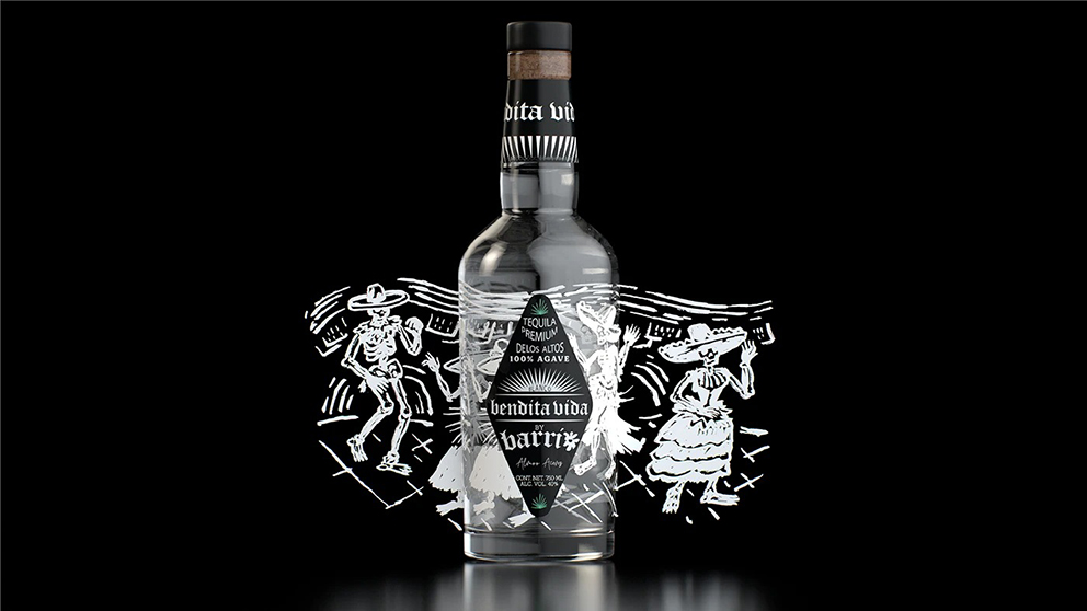
The design of Bendita Vida is a masterclass in bridging time-honored craft and sleek modernity. The container itself is a clear, carefully selected bottle, purposefully chosen to reveal the liquid’s purity, brilliant clarity, and intrinsic quality a testament to the meticulous distillation process it undergoes.
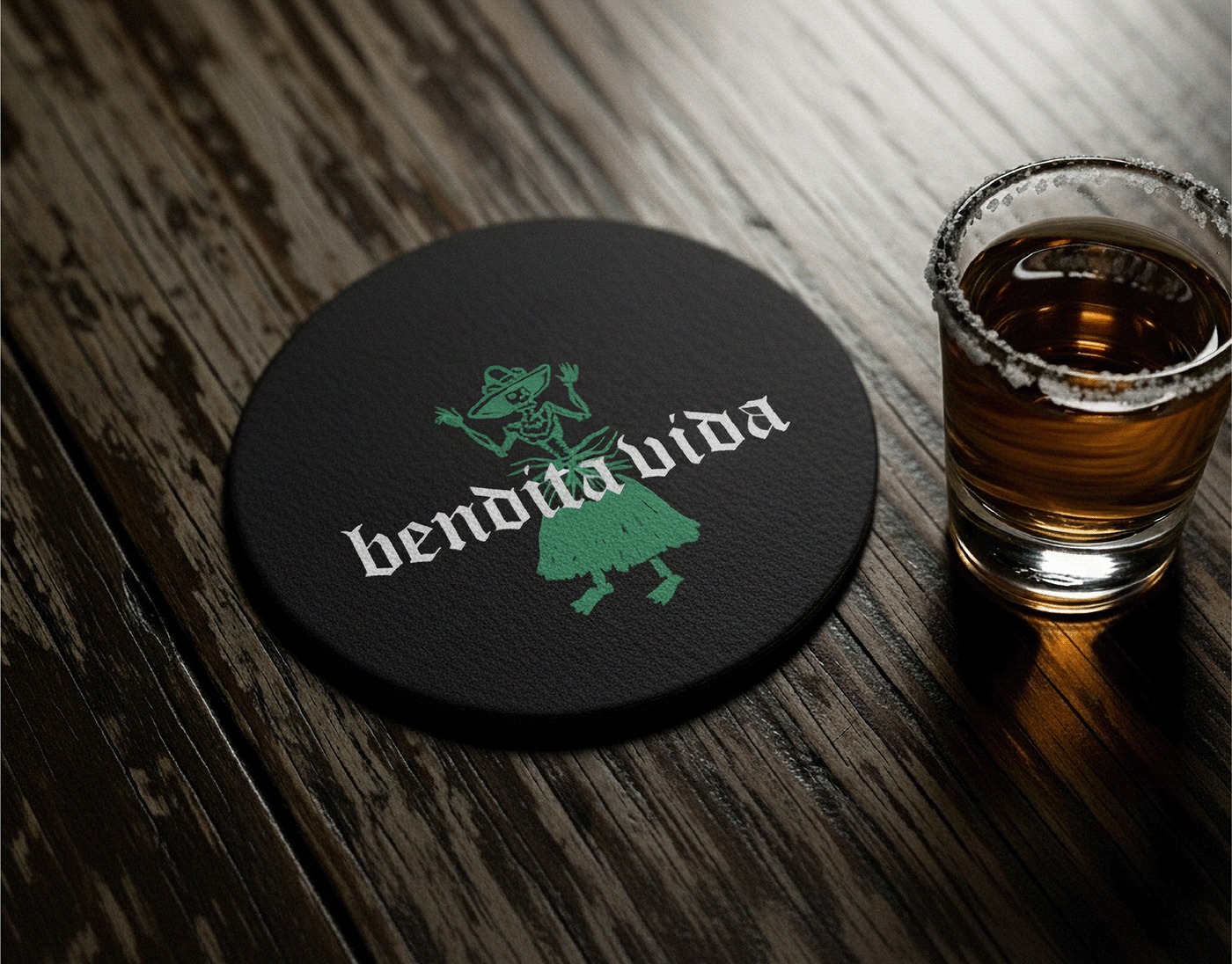
The exterior is graced by intricate, etched illustrations deeply inspired by the vibrant, whimsical aesthetics of Mexican folk art and alebrijes. These detailed line drawings anchor the brand firmly in the nation’s artistic soul. Contrastingly, the bold, geometric label is a tribute to ancient solar symbols and pre-Hispanic iconography, reflecting the spiritual weight and long history of the land from which the agave is harvested.
A key conceptual element of the visual identity is the striking interplay of black and white, shadow and light. This deliberate, graphic duality visually mirrors the emotional and existential reality of living between two dynamic worlds: Mexico and the U.S., tradition and modernity, quiet devotion and exuberant celebration. This contrast speaks directly to a sense of belonging that transcends geography.
Bendita Vida is a visual and emotional statement—an expressive and refined entity that celebrates belonging, articulates profound gratitude, and ultimately, honors the enduring beauty of our shared roots and intertwined cultural tapestry. It invites consumers to not just drink, but to partake in a tradition and toast the blessed life we share.
CREDIT
- Agency/Creative: HI Estudio Multidisciplinario
- Article Title: Hi Estudio Multidisciplinario Delivers a Symbolic, Heritage Led Vision for Bendita Vida Tequila
- Organisation/Entity: Agency
- Project Type: Packaging
- Project Status: Published
- Agency/Creative Country: Mexico
- Agency/Creative City: TEPATITLAN, JALISCO
- Market Region: Global
- Project Deliverables: 3D Design, 3D Modelling, Art Direction, Brand Creation, Brand Design, Brand Naming, Illustration, Label Design, Logo Design, Set Design
- Format: Bottle
- Industry: Food/Beverage
- Keywords: hiestudio, hi, branding, designstudio, tepatitlan, tequila, spirits


