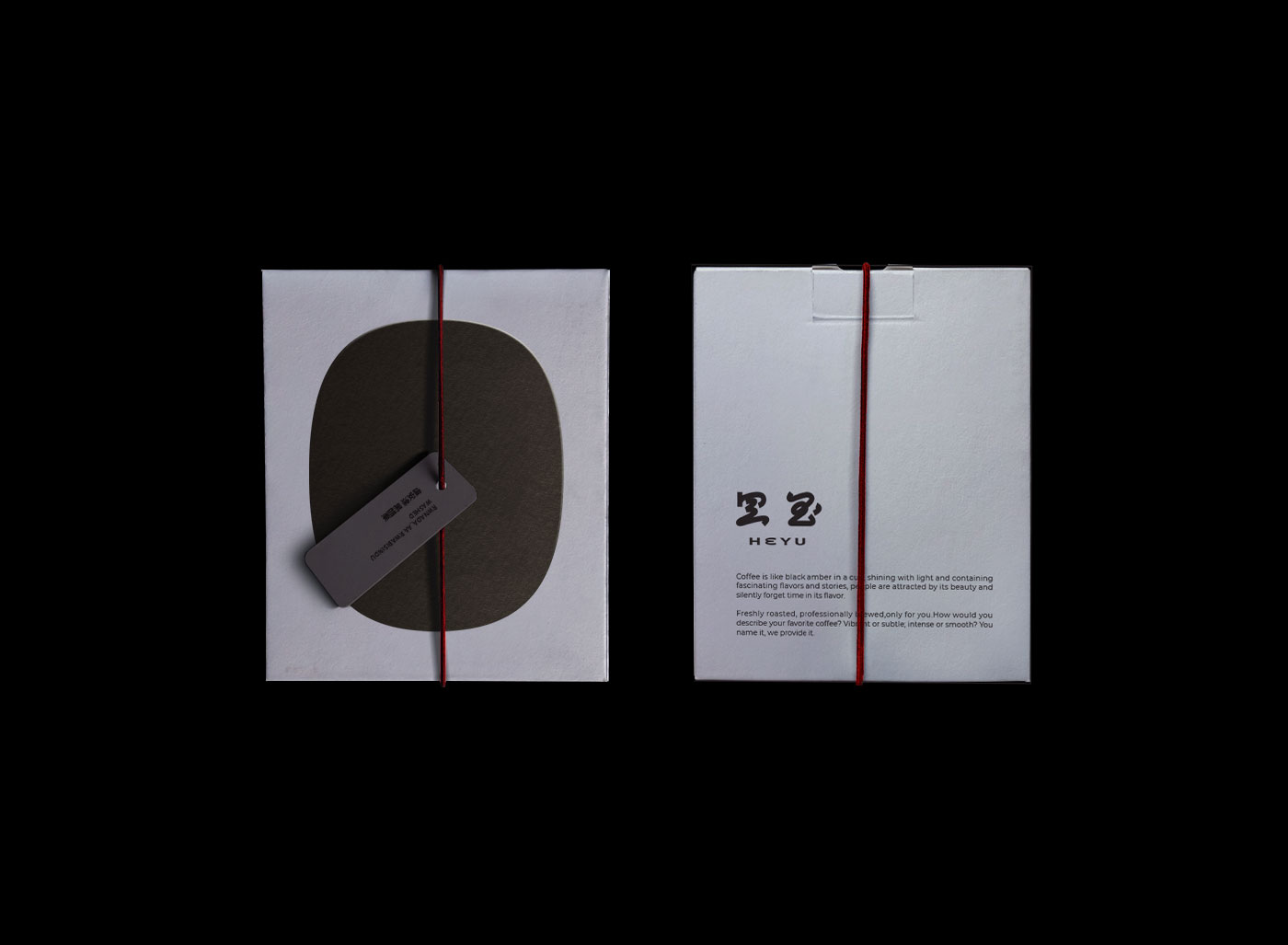
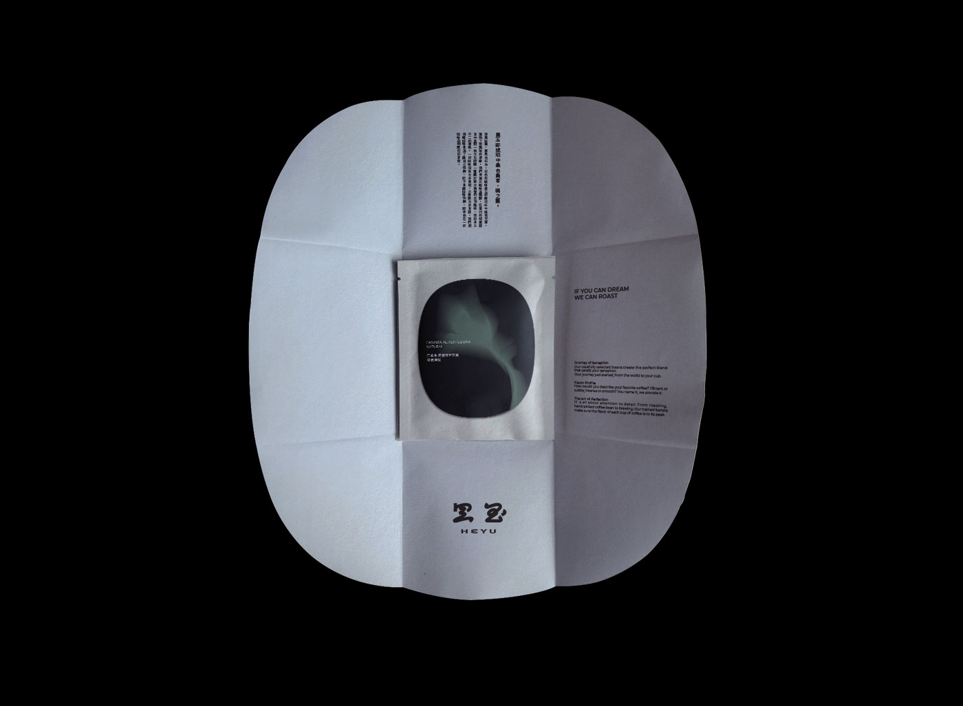
The visual concept of “He-Yu” is inspired by gemstones such as jade and amber. As a drink from the West, people in the past associate coffee berries with the hairpins worn by women, and the Chinese characters of coffee in the image of gemstones. Writing, which also brings inspiration and inspiration to the brand of “He-Yu”, “He-Yu” means black jade in Chinese, and is also the name for the highest quality amber in amber. The light shines through the gem and reveals a dark red light, just like the fruit of coffee, like dark red jewelry in the cup with the coffee liquid swaying and shining.
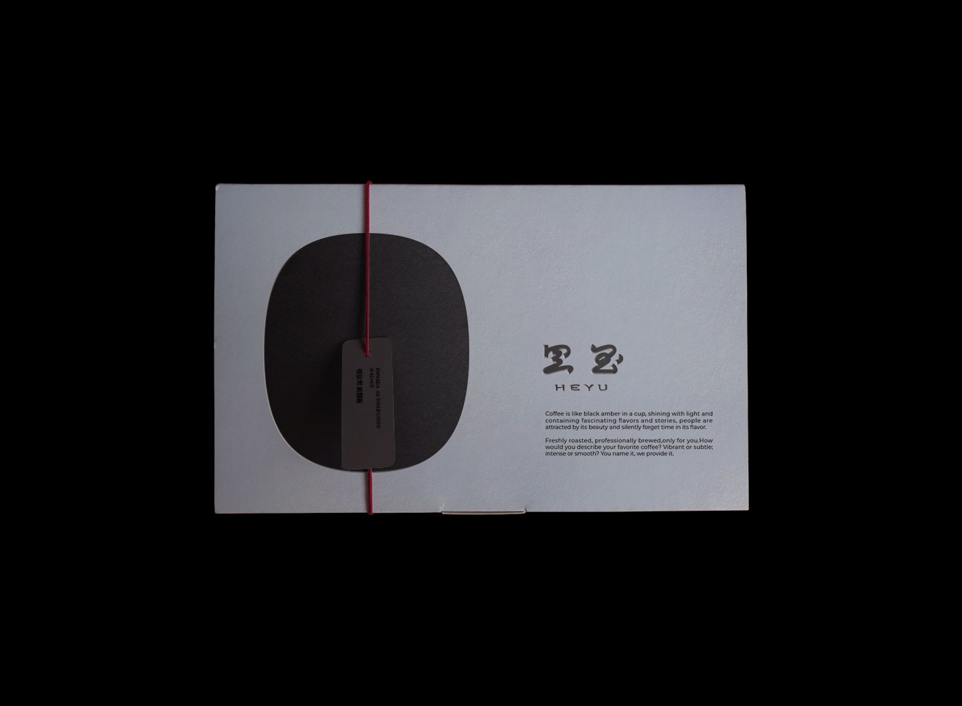
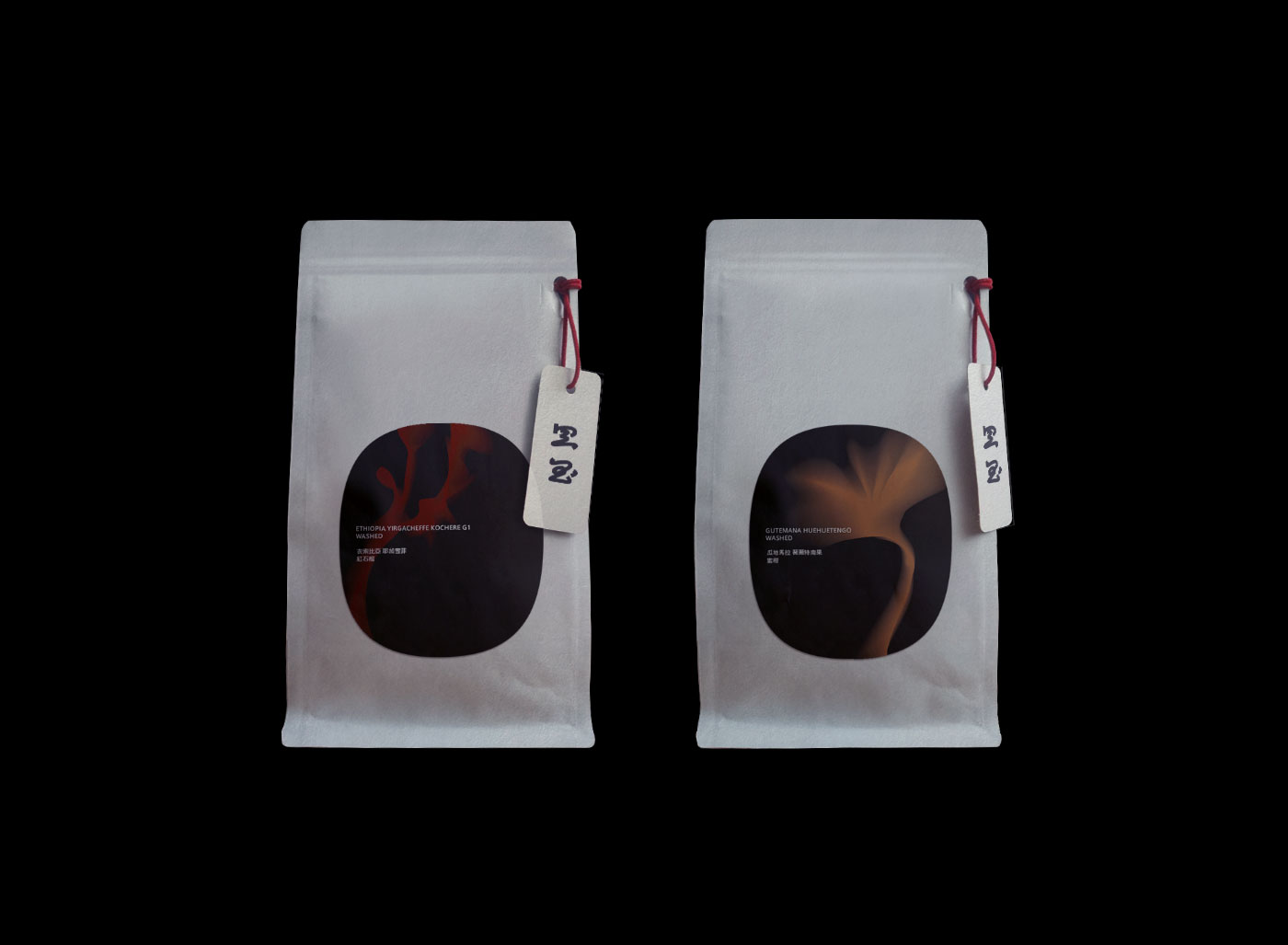
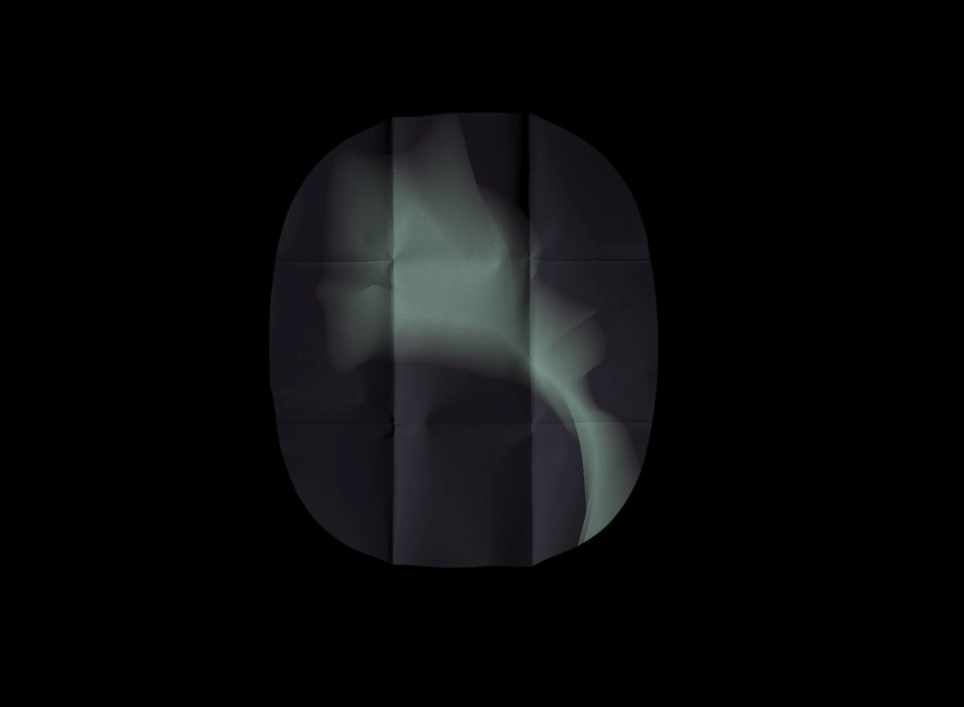
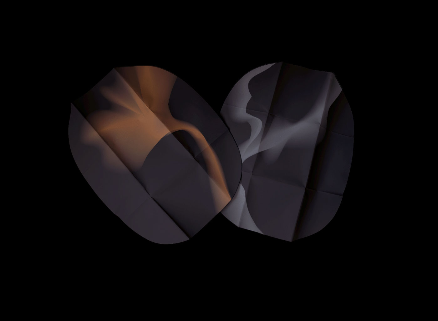
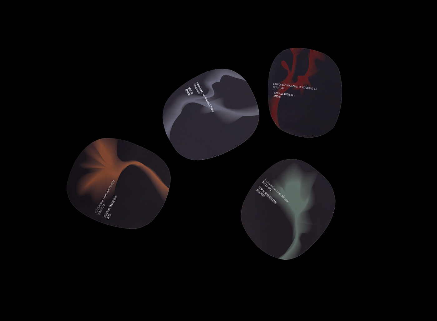
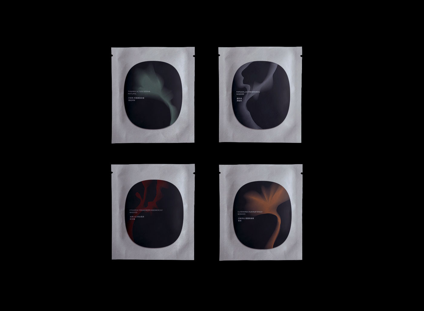
The visual concept is inspired by the rough stone of jade, and the geometric shape similar to coffee beans and gemstones is used as the main visual to extend the design of the entire brand. The simple and clean design symbols can give the vision more imagination space and accommodate more us. For the imagination of coffee flavor, coffee is like a gem that has not been polished. After grinding and extraction, it shows different luster and temperament. Through this concept, “He-Yu” is used for packaging identification in the way of gemstone texture, abstract It shows different coffee flavors, suggesting to consumers that this is a coffee gem that may have floral and fruity aromas.
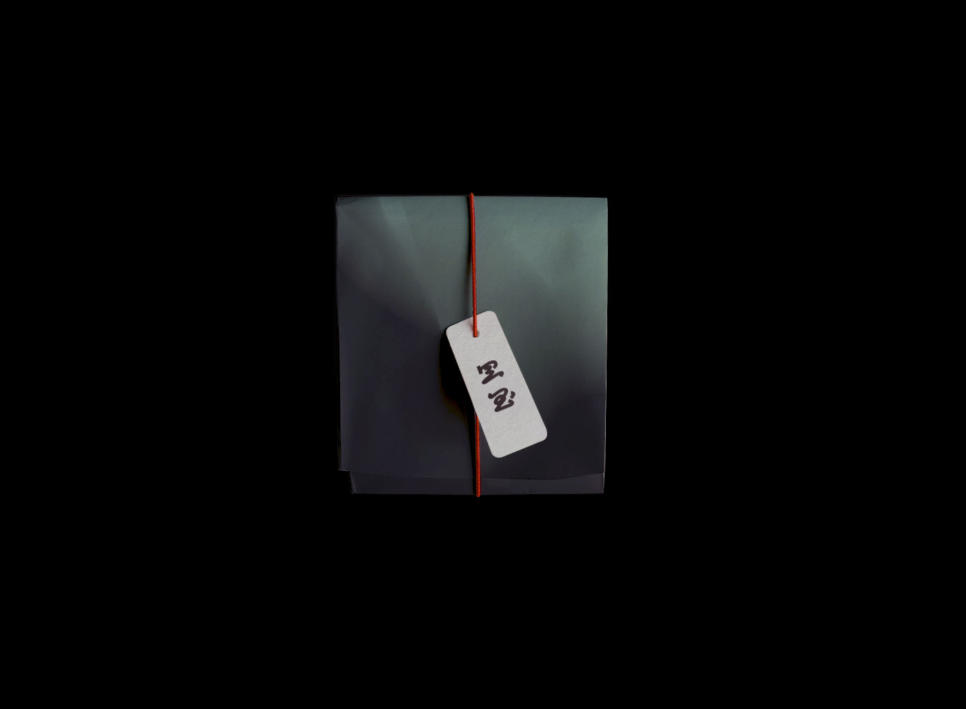
We hope that through the brand of “He-Yu”, we can bring more oriental aesthetic concepts into modern consumer products, interpret Asian culture through a cup of coffee, and have a short time to enjoy coffee in the fast-paced and busy life. The “Zen” meaning of oriental aesthetics uses contemporary design expressions to package and design ancient aesthetic concepts, cultures and stories.
Now that the coffee market has become more and more mature, we no longer emphasize the origin, preciousness and rarity of coffee products, but hope to obtain more fun and freshness in life through coffee, and consumers hope to obtain more specialties through coffee. Consumer experience or the time to enjoy alone, “He-Yu” on the packaging design does not deliberately emphasize the coffee flavor, but like a blank canvas, giving consumers time to imagine a cup of coffee, and taste a cup of coffee to imagine the flavor with mood.
CREDIT
- Agency/Creative: Lung-Hao Chiang
- Article Title: Heyu Coffee Visual Identity Design Concept Created by Lung-Hao Chiang
- Organisation/Entity: Agency
- Project Type: Packaging
- Project Status: Non Published
- Agency/Creative Country: Taiwan
- Agency/Creative City: Taipei/Taiwan
- Market Region: Asia
- Project Deliverables: Brand Creation, Graphic Design, Packaging Design, Packaging Guidelines
- Format: Box, Flow-Pack
- Substrate: Plastic, Pulp Board
- Industry: Food/Beverage
- Keywords: #BEVERAGE #BRAND #BRANDING #COFFEE #IDENTITY #ILLUSTRATION #PACKAGING #LOGO
-
Credits:
Art Director: Lung-Hao Chiang


