Miss Millie’s story begins in 1965, when its founders opened the UK’s first KFC in Preston. Fast forward to 1988, and the Miss Millie’s brand was born, opening its first store in Bristol. Over the decades, Miss Millie’s became a local icon — whether it was a family lunch by the beach, a pre-cinema snack with friends, or a 2am fix for late-night revellers, the brand was woven into the lives of its customers.
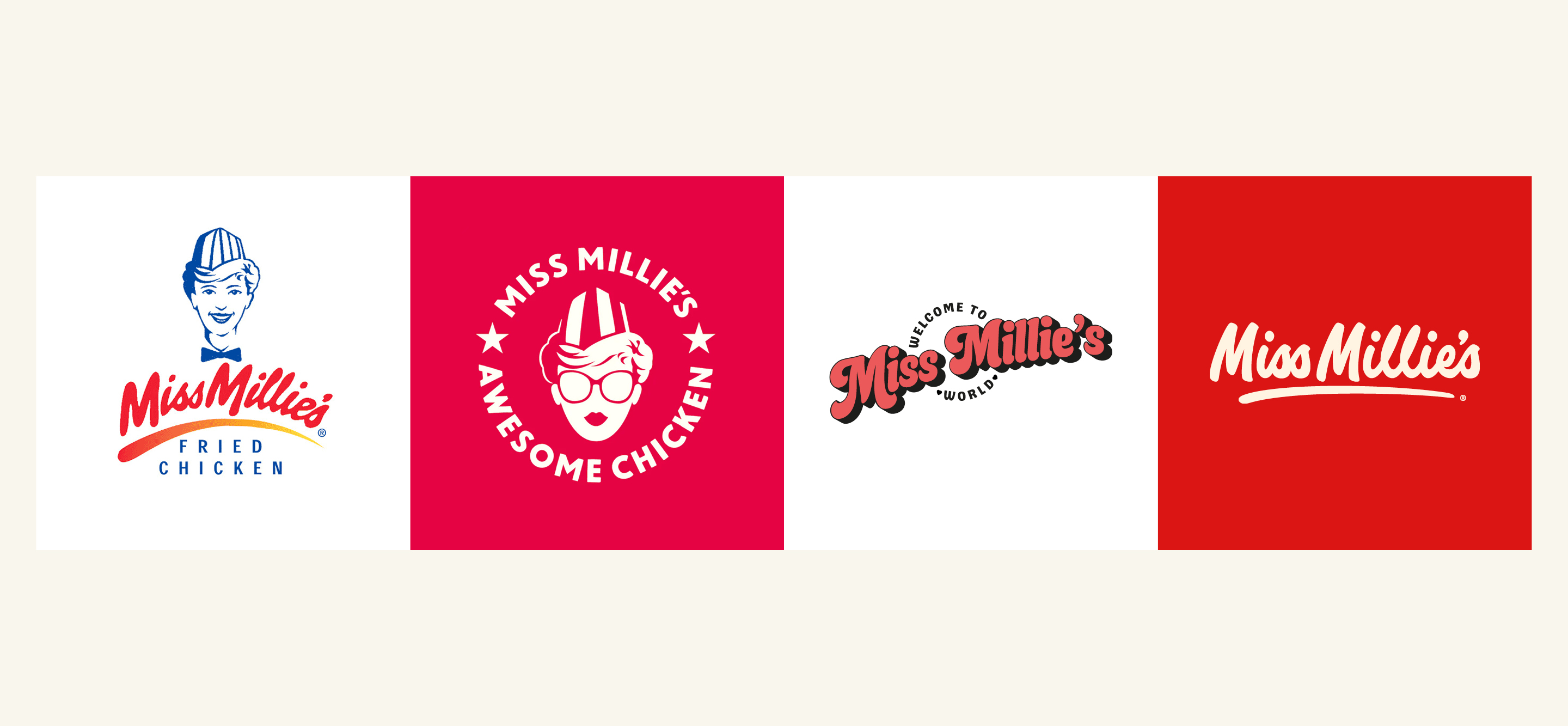
However, despite its cherished legacy, Miss Millie’s had lost its way. After already undergoing two rebrands in recent years, the brand faced an identity crisis, struggling to stay culturally relevant. This time, the rebrand needed to do more than refresh the look — it had to reposition Miss Millie’s as a modern fried chicken brand, bridging the gap between its loyal, long-standing customers and a younger, more savvy audience.
Reigniting the soul of Miss Millie’s.
Taking the brand back to its roots, we travelled into the Miss Millie’s archives to reflect on the original identity which featured the Mildred mascot (based on Colonel Sander’s daughter). Perhaps controversially, we decided that it no longer felt current to have a mascot, so instead concentrated our efforts in crafting a hand-drawn and timeless typographic marque.
Our research showed that the original script logo held a lot of brand equity. By reimagining the classic brand identity, we avoided alienating their existing loyal customer base, whilst paying homage to their heritage.
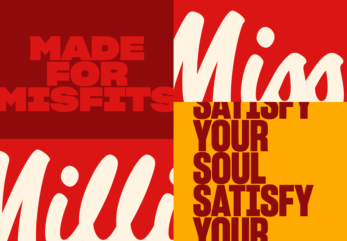
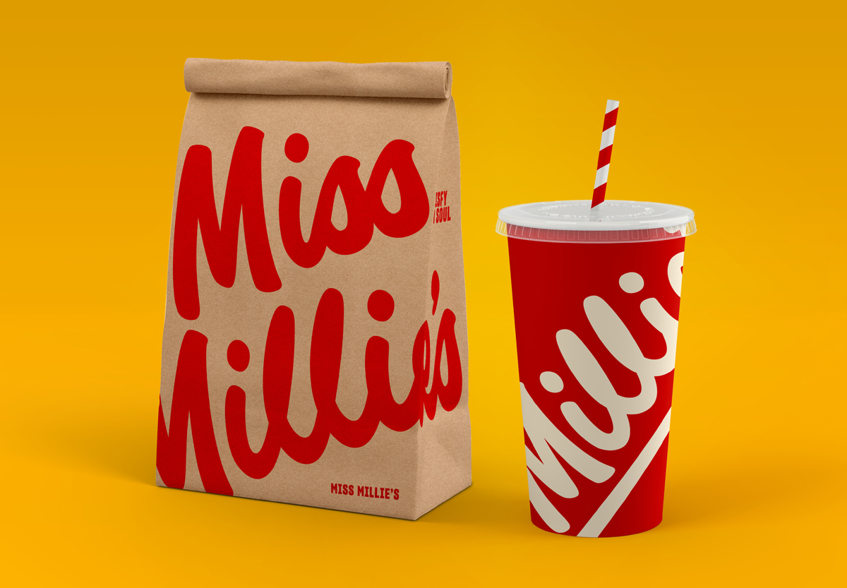
Each letter was meticulously redrawn to ensure ultimate legibility and consistency, making it better suited for the digital age. The refreshed signature successfully bridges the gap between nostalgia and modernity, reinvigorating the brand and enhancing its appeal across different demographics.
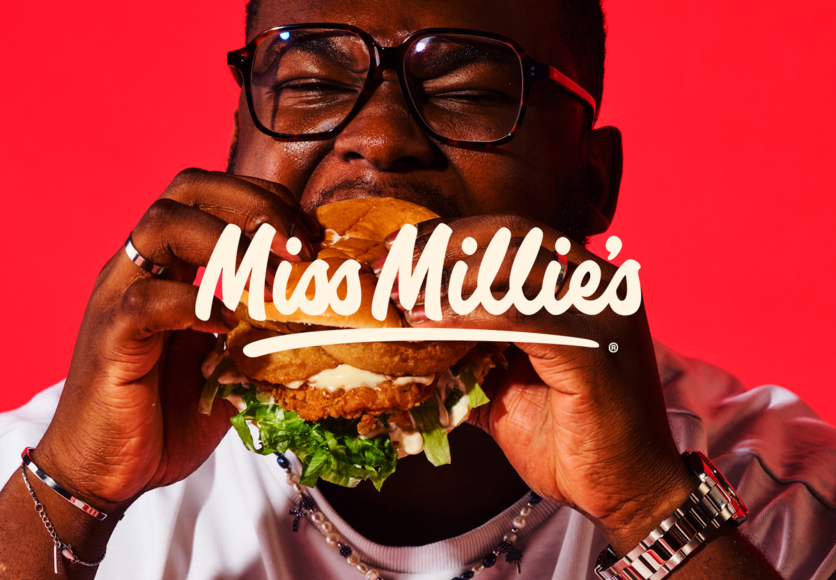
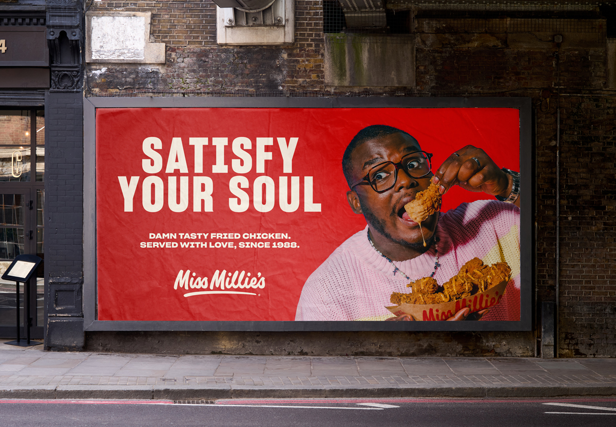
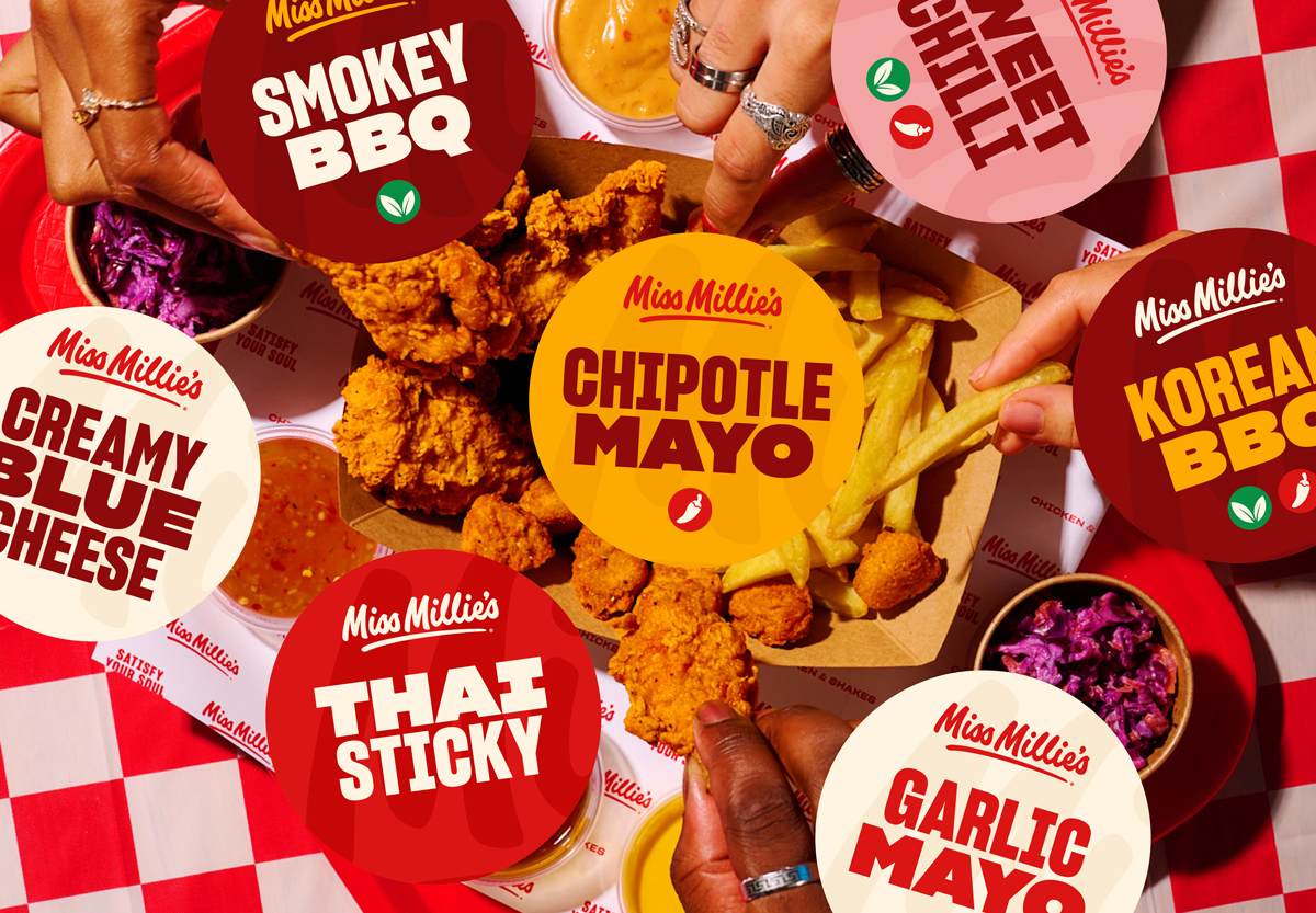
With the help of the variable font Sharp Grotesk, the brand is able to dial up and down playful vs. functional messaging. Combining the new graphic system, strapline and photography style, the transformed visual identity feels fitting for modern day fried chicken lovers as well as loyal Miss Millie’s day ones.

CREDIT
- Agency/Creative: Hey! What?
- Article Title: Hey! What? Help Repositioning an Iconic Fast Food Brand, Miss Millie’s
- Organisation/Entity: Agency
- Project Type: Graphic
- Project Status: Published
- Agency/Creative Country: United Kingdom
- Agency/Creative City: Bristol
- Market Region: Europe
- Project Deliverables: Advertising, Animation, Brand Design, Brand Redesign, Brand Rejuvenation, Brand Tone of Voice, Branding, Logo Design, Packaging Design, Rebranding, Typography
- Industry: Food/Beverage
- Keywords: Branding, Strategy, Fast Food, Campaign
-
Credits:
Managing Director: Amy Gettings


