Cranleigh School, one of the UK’s leading independent co-educational day and boarding schools set in the Surrey Hills, recognised the need for a revitalised brand identity. One that honoured its heritage while authentically reflecting the School’s vibrant academic and c0-curricular community.
To bring this ambition to life, Cranleigh partnered with independent brand elevation agency, Free The Birds, who were tasked with creating a clear, cohesive brand system that could carry the school confidently into the future.
With the appointment of Sam Price as Head of Cranleigh School and Will Newman as Head of Cranleigh Preparatory School, the timing was right to establish a new direction, uniting all Cranleigh schools under a renewed proposition and visual identity that signals the beginning of a new era.
To date, there existed a disparity between Cranleigh’s schools and organisations, with variations not only in imagery but also in communication strategies. Complexities in the use of multiple colours within the crest, photography and overall identities across Cranleigh’s sub-brands sparked a need for evolution. One which created a singular, authentic and memorable strategy for the Cranleigh master brand, and which championed the legacy and iconography of the previous, primary crest to create a refined logo system.
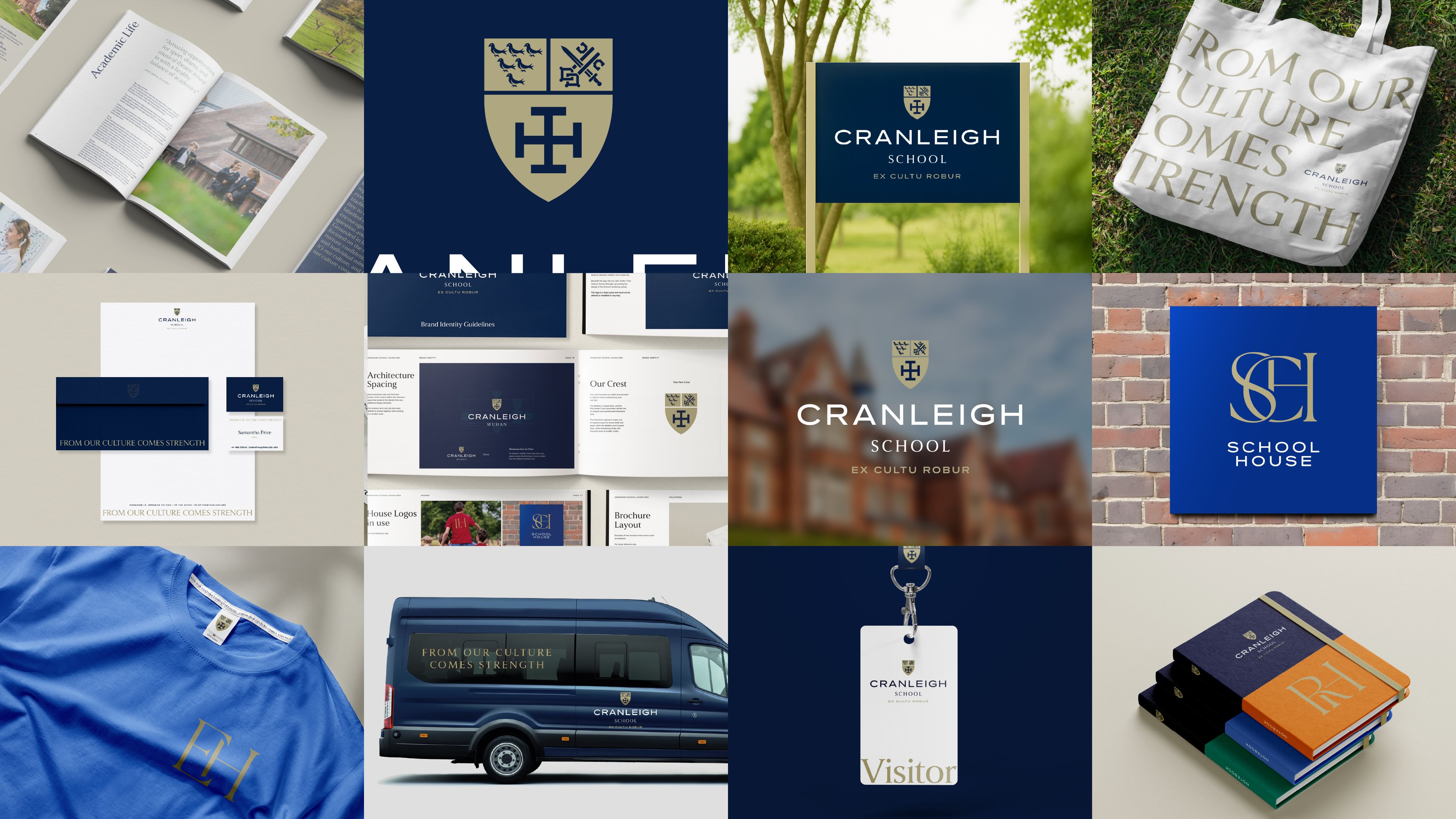
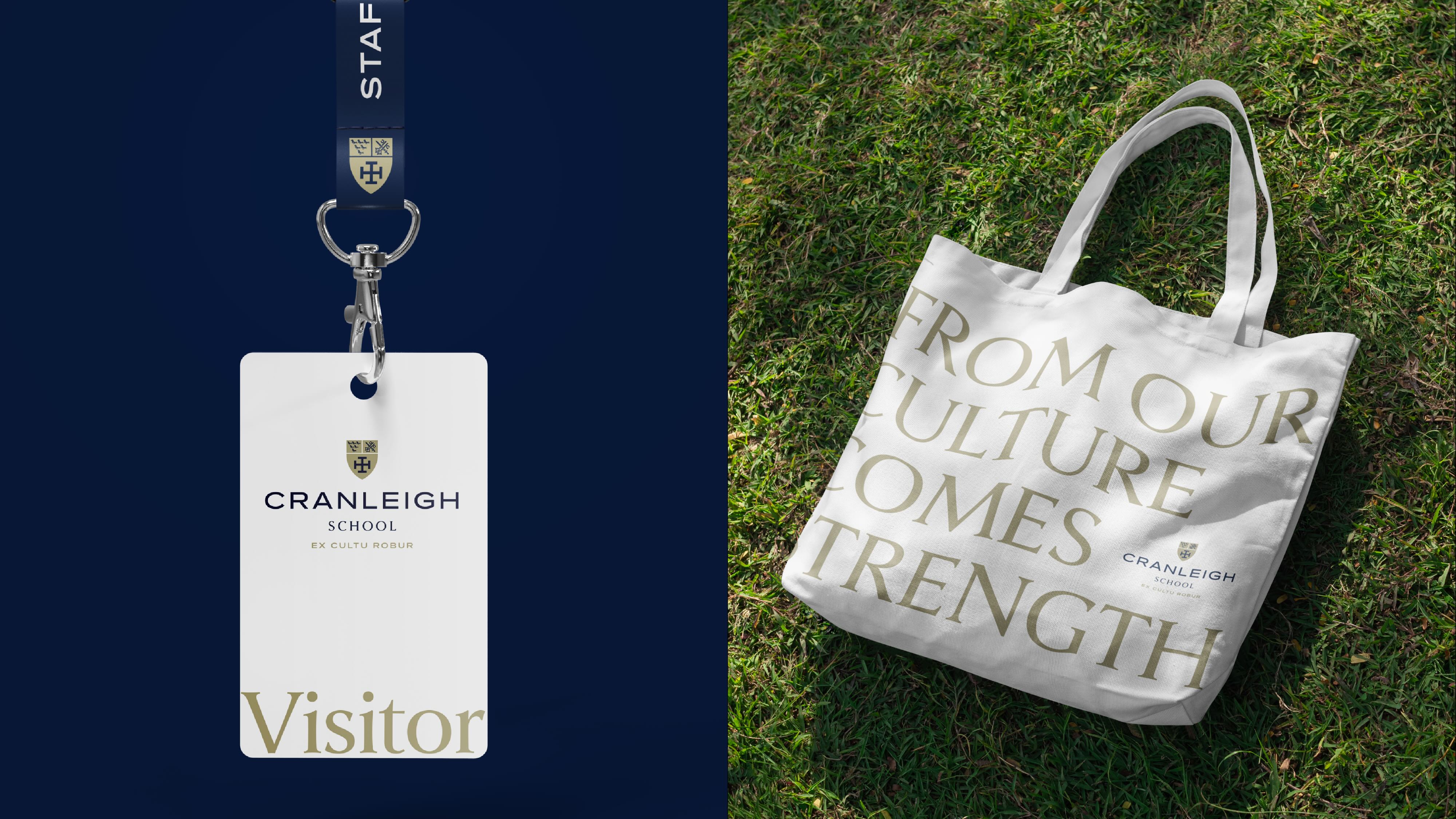
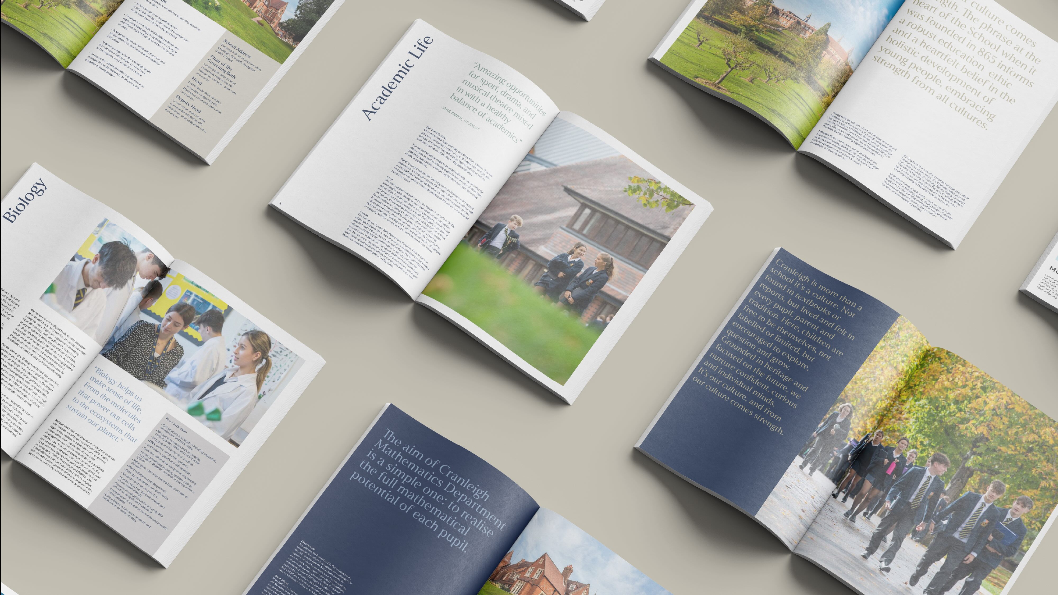
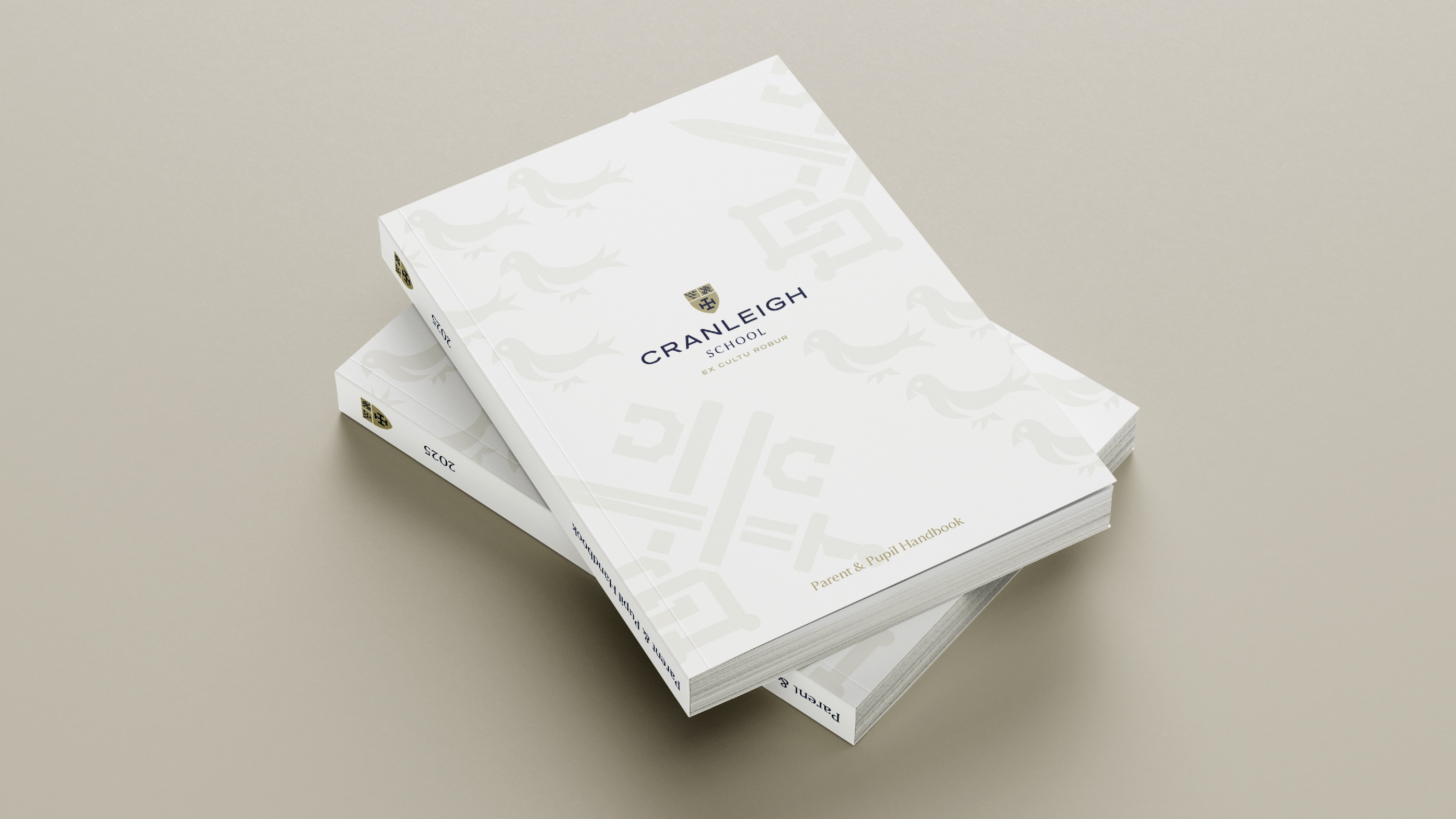
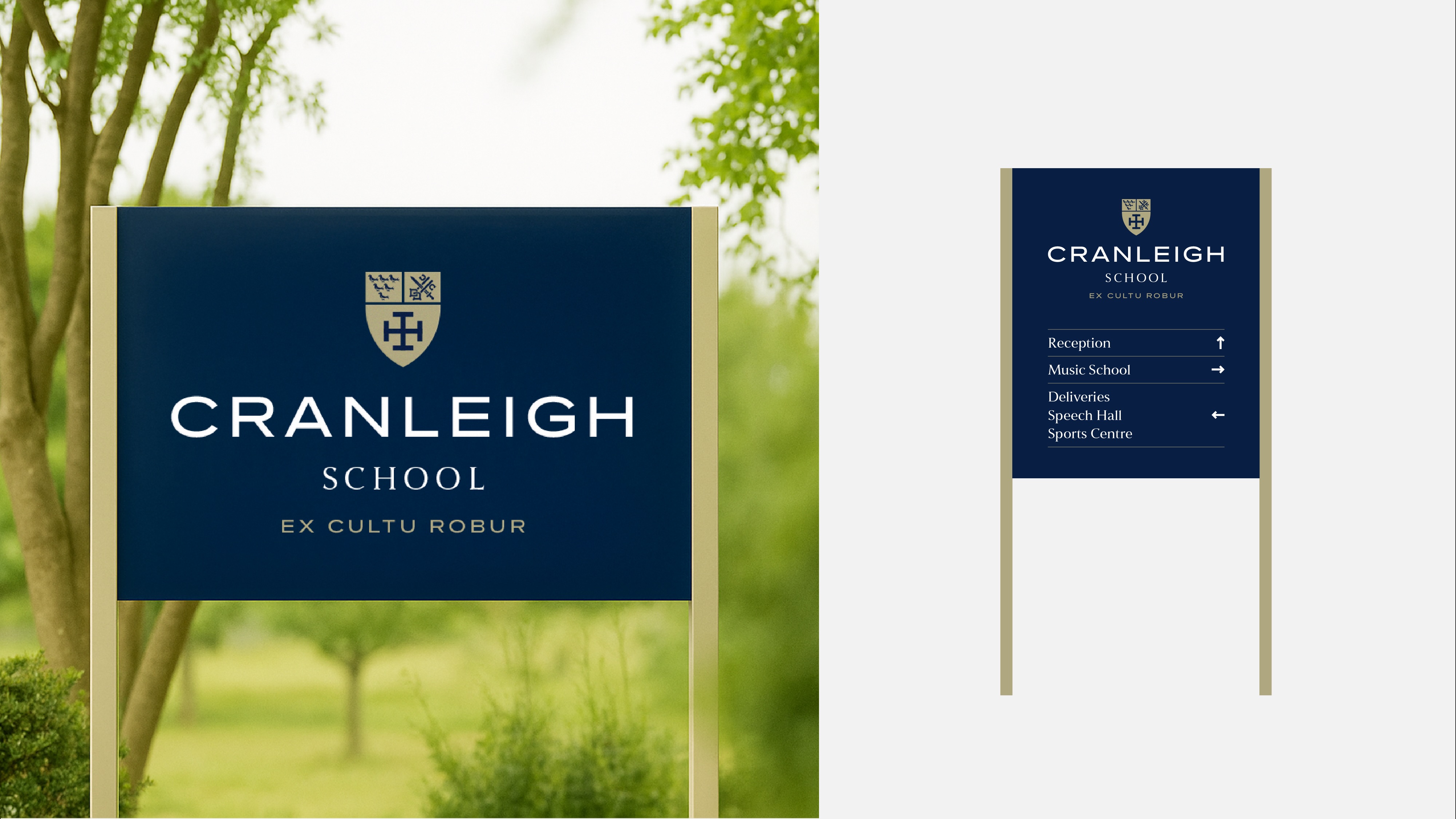
This new identity provides a strong foundation for a 360-degree brand suite spanning brand architecture, guidelines and manifesto. This also included design templates for printed materials, all of which came together to support a robust baseline for marketing and communications materials, signage and digital touchpoints. In doing so, it unites tradition and innovation in a way that reflects the evolving spirit of the school.
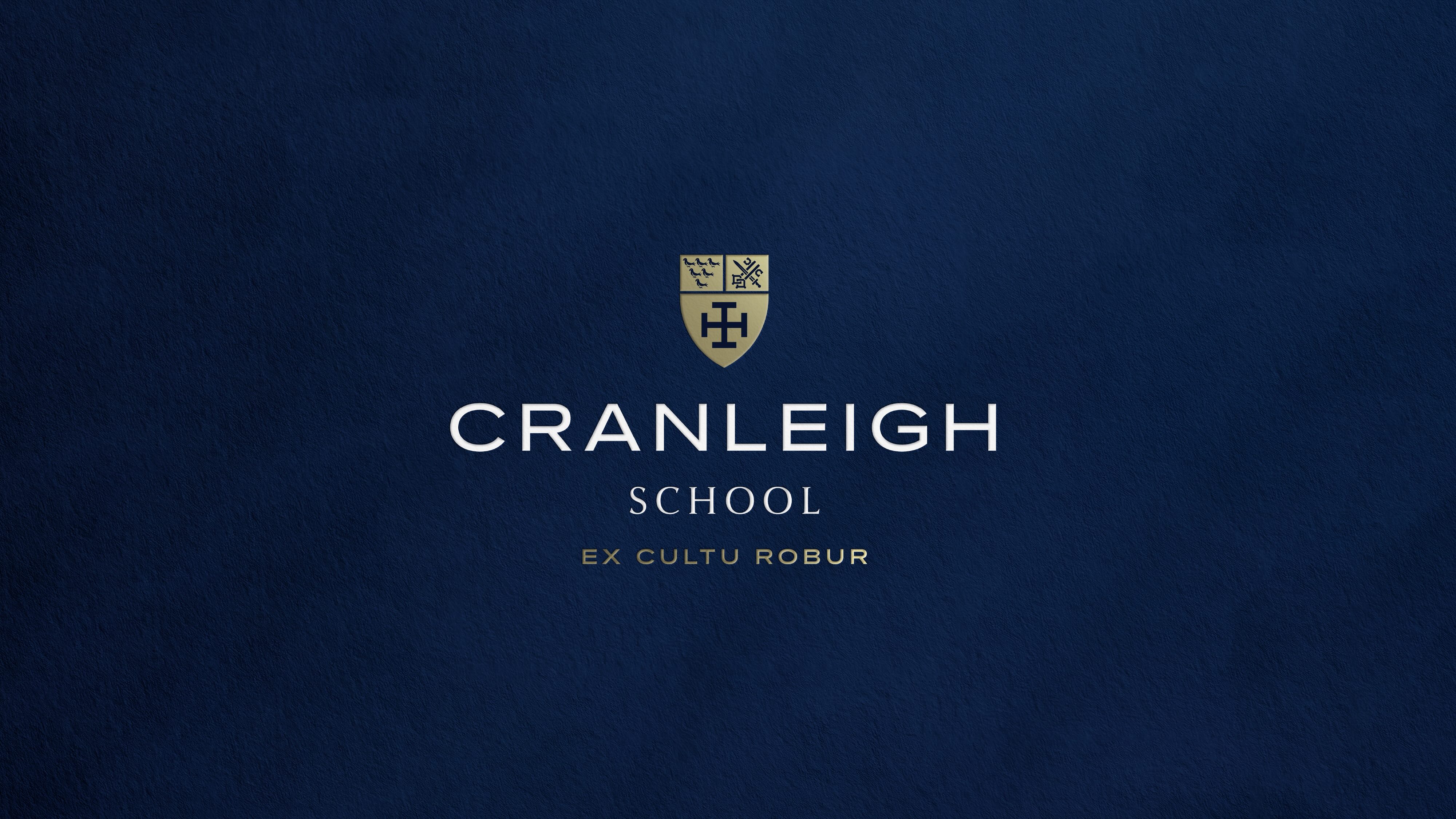
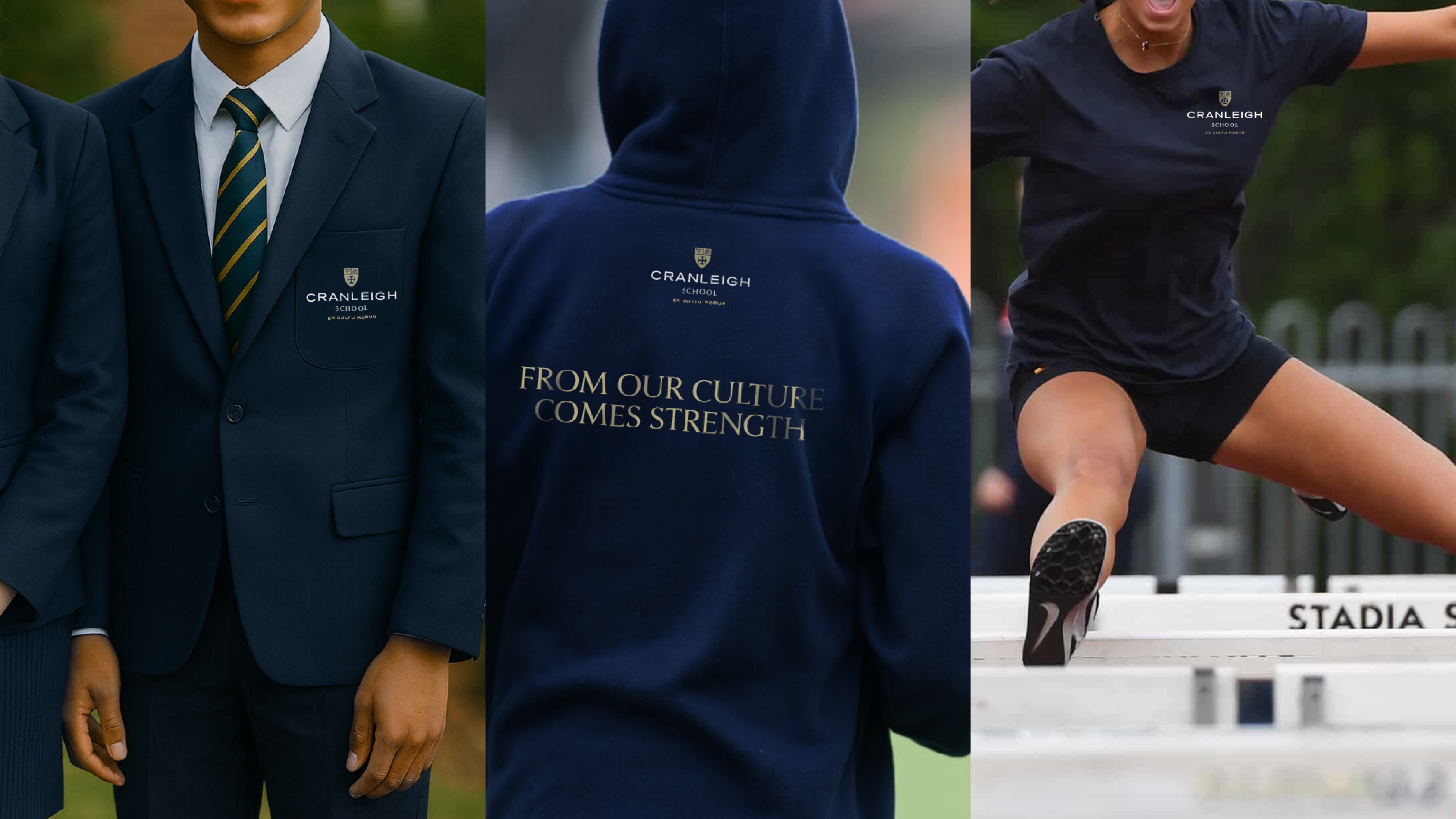
The Cranleigh School crest is a key asset which lies at the centre of the updated brand identity. Featuring a number of cherished details which represent the rich heritage of the school, Free the Birds created an updated crest which could be used consistently and with confidence across all manner of applications, from school signage to uniforms.
Free The Birds therefore set out to craft a new crest which maintained the historical and valued details but in a modern, clear and confident way. The intricate components of the crest, including the crossed keys, the martlet bird and the Winchester cross, had previously made it very difficult for the crest to be scaled in various applications, as heavy outlines collapsed when scaled down, causing the features to lose legibility and impact.
To provide a more elevated and premium quality which matched the ethos and spirit of the school, Free The Birds developed graphics which were stripped back and ultimately more distinctive. Negative space was employed to cleverly create definition in subtle shadow and depth, and which would support retention of character when scaled down. Functional yet elegant, timeless yet contemporary.
Alongside the crest, the school’s motto, Ex Cultu Robur – traditionally translated as “From culture comes strength” – was also revisited. Free The Birds introduced a subtle but powerful shift in translation: “From our culture comes strength.” This small addition anchors the motto in the lived experience of the school community – the students, teachers and wider Cranleigh family – making the historic phrase feel owned and relevant in 2025.
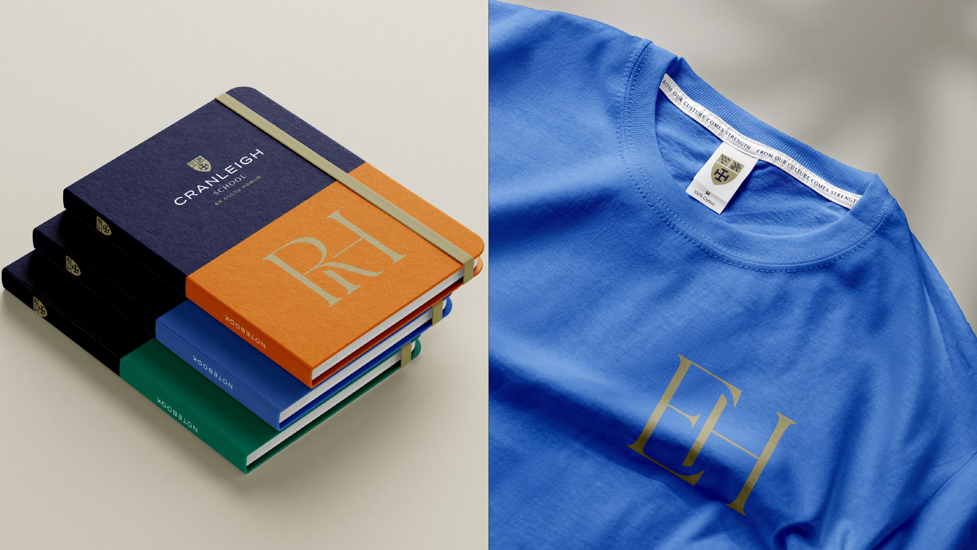
Free The Birds also defined cohesive identities for the eight school houses, each celebrating individuality while reinforcing Cranleigh’s collective spirit. This was achieved through the creation of bespoke monogram logos, designed as a unified family suite, yet each with its own distinct personality. These aim to give students a symbol to rally behind and foster a sense of belonging within their house.
Lucy Griffiths, Director of Marketing at Cranleigh School shares, “We are immensely pleased with the way Free The Birds have guided us through this journey with such creativity and care. They have helped us to honour our heritage while shaping a brand identity that truly captures the character of Cranleigh today – uniting our schools and community with a renewed sense of pride and purpose.”
Nick Vaus, Co-Founder & Managing Partner at Free The Birds adds, “This project was about more than creating a visual identity; it was about distilling the essence of Cranleigh into a brand that feels timeless, authentic and ready for the future. The scale of the work – from crest refinement to the overarching brand system – reflects our belief in building identities that connect deeply with both heritage and community.”
CREDIT
- Agency/Creative: Free The Birds
- Article Title: Heritage Meets Modernity in Cranleigh School’s New Visual Identity by Free the Birds
- Organisation/Entity: Agency
- Project Type: Identity
- Project Status: Published
- Agency/Creative Country: United Kingdom
- Agency/Creative City: London
- Market Region: Europe
- Project Deliverables: Advertising, Art Direction, Brand Guidelines, Brand Mark, Brand Redesign, Brand Rejuvenation, Brand Tone of Voice, Brand World, Creative Direction, Icon Design, Logo Design, Photography Styling
- Industry: Education
- Keywords: Brand rejuvenation; Brand revitalisation; Visual identity, Heritage branding
-
Credits:
Co-founder & Managing Partner, Free The Birds: Nick Vaus
Partner & Creative Strategy Director: Paul Domenet
Client Services Director: Emily Mills
Design Director: Matthew Taylor


