Here Design – Grant’s Whisky
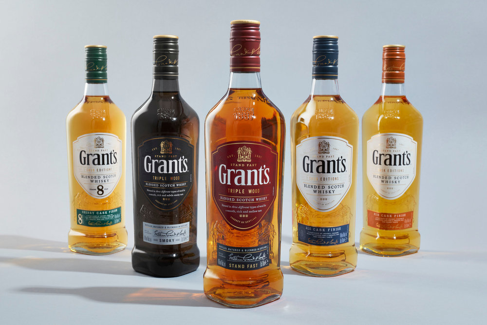
The world’s third largest Scotch whisky brand, Grant’s, has unveiled a new identity and packaging with design by London-based agency Here Design.
Here Design has been working in partnership with parent company William Grant & Sons for the past ten years across the wider product portfolio, including strategic and creative design for Hendrick’s, Glenfiddich, The Balvenie and Monkey Shoulder.
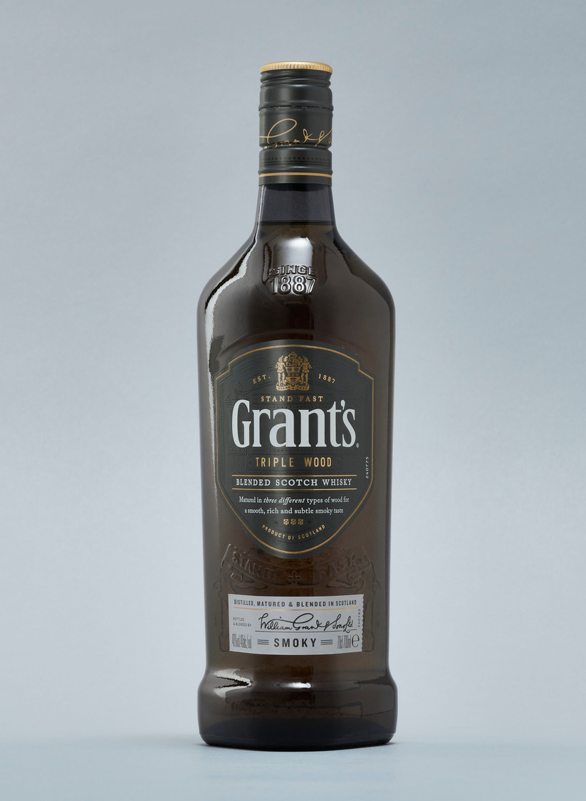
Triple Wood
Enjoyed in over 180 countries and one of the biggest brands in the portfolio of William Grant & Sons’, Grant’s is a flagship product, however an increasingly commercialised identity had seen the heritage of the brand overshadowed.
Here Design was tasked to bring the soul back to William Grant & Sons’ heartland offer by crafting a redesigned identity for Grant’s that instilled pride in the legacy of this renowned family-owned brand.
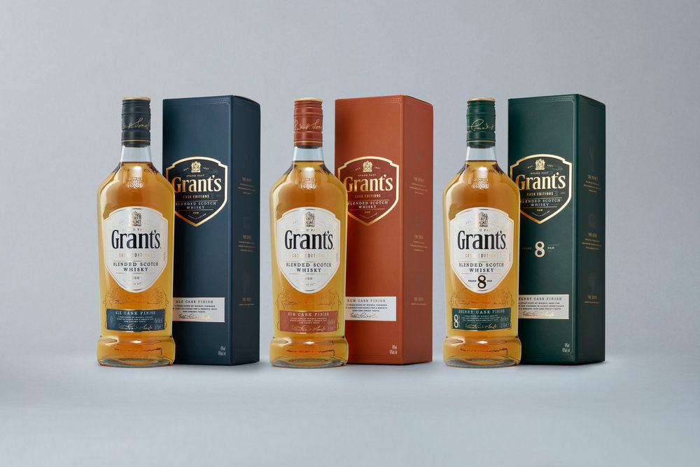
This comprehensive project included brand repositioning, with a focus on establishing the superiority of the liquid and its distinctive TripleWood process, the redesign of the core Grant’s range, restructuring of the complete product range, and creation of an engaging brand world that celebrates the authenticity and quality of Grant’s whisky.
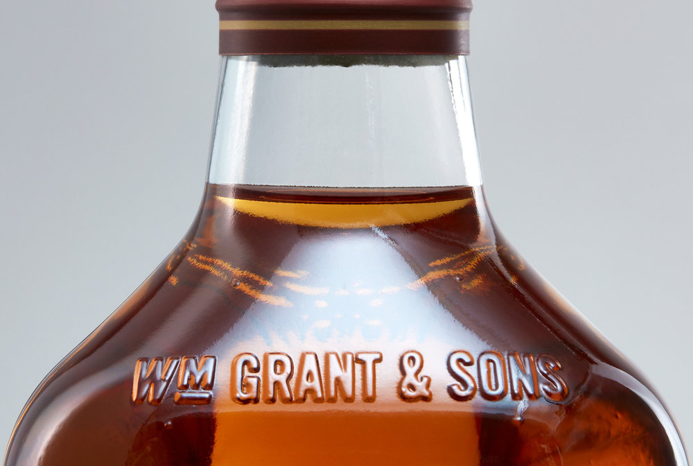
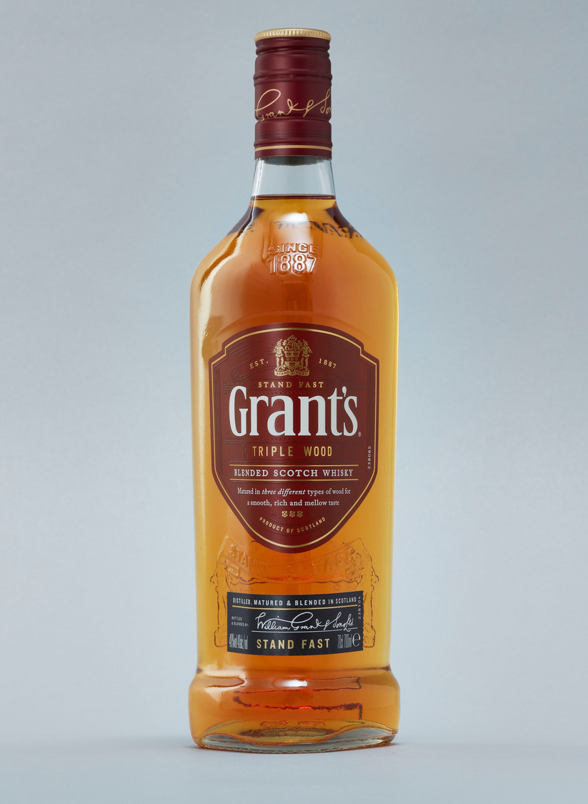
Here Design retained the triangular footprint synonymous with the Grant’s bottle and introduced a more assertive, masculine silhouette, reducing the bottle height and broadening the shoulders for a prouder look and feel.
The new bottle shape also embodies the longstanding brand motto ‘Stand Fast’, newly reinstated by Here Design. They then took these equities into the brand world, establishing a distinctive and recognisable form of brand behaviour.
The Maker, The Muscle and The Master
Every bottle of Grant’s whisky is the product of collective process, skill and achievement, from the three different types of wood that make up the aging barrels to the collaborative, experienced team behind each cask of liquid.
Grant’s remains the only blended whisky producer to have its own Stillman, Cooper and Master Blender working together under one roof, sharing specialist skills and expertise from one generation to the next. Here Design has celebrated these three pillars of the distilling process by telling the individual and collective stories of The Maker, The Muscle and The Master.
The process of Collective Achievement is also seen in Grant’s TripleWood maturation process, with barrels composed of three different types of wood working together to create a unique flavour profile.
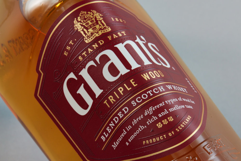
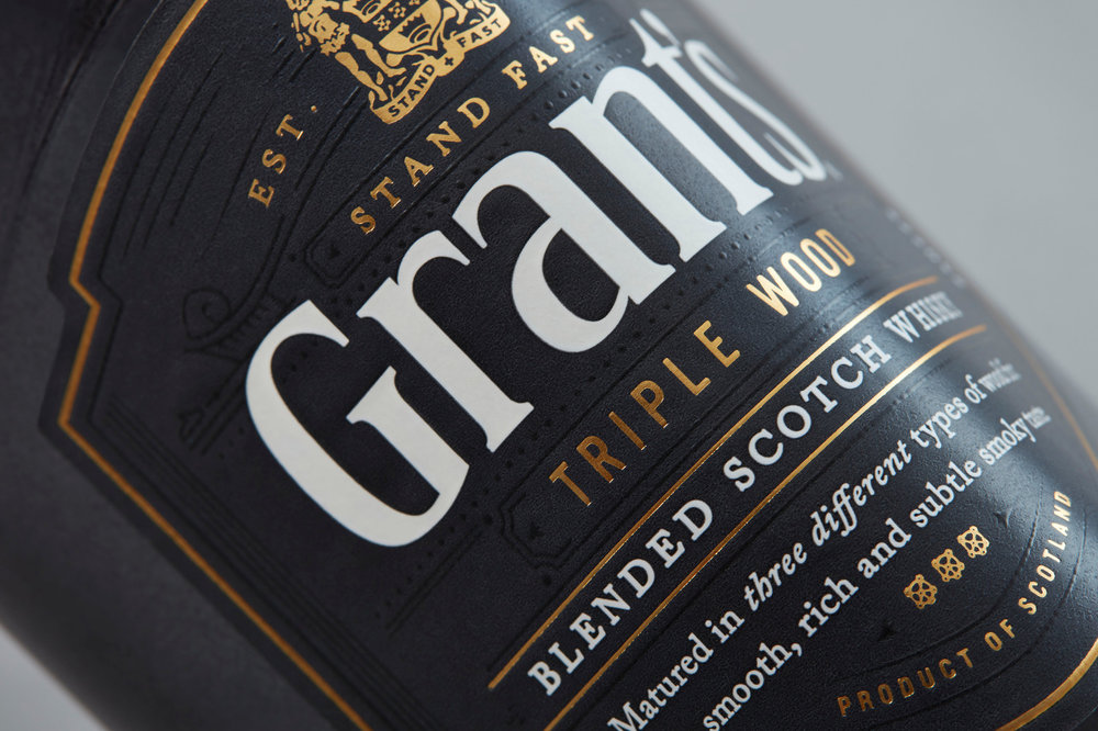
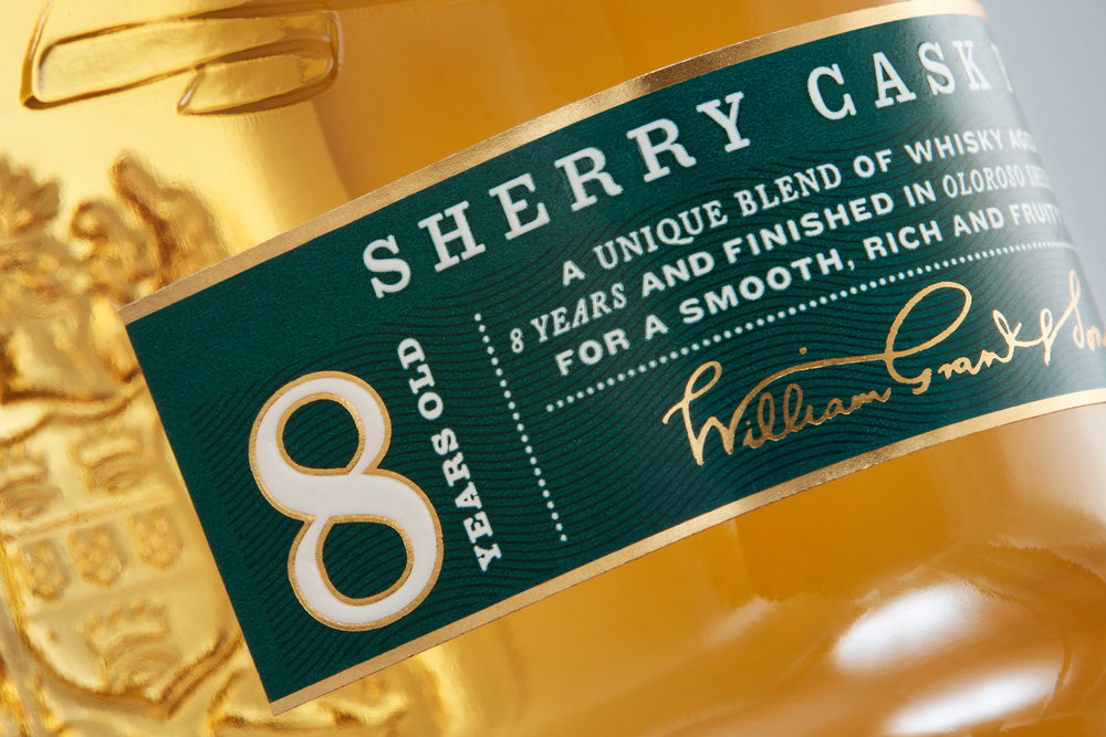
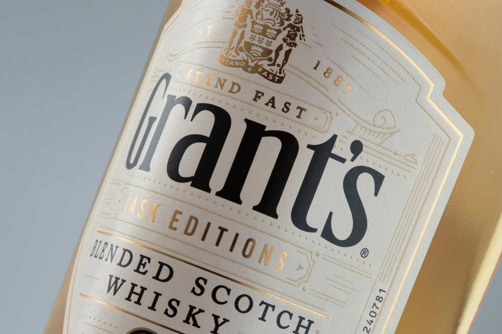
This commitment to an authentic process is reflected in the design details of the new Grant’s identity, with Here Design introducing a new brand equity in the shape of a shield used across each bottle and in the wider brand world as a shorthand.
Both the main shield label and foot label have been given more detailed textural qualities, crafted with foiling, embossing and spot varnishes on textured stock which enable consumers to discover new elements of the brand over time.
A story of family pride
Tess Wicksteed, Strategy Partner, Here Design says: “Grant’s is a treasured family-owned brand and a household name, but over time the craftsmanship and skill behind each bottle of whisky had been lost from its identity. From the beginning our mission was to make the Grant’s family proud again.
“Grant’s positioning to ‘reward moments of collective achievement’ is an important acknowledgement of the importance of working together in a world of rampant individualism and its consolidated portfolio focusing on more accessible price points supports this democratic approach.
“Our redesign introduced a cleaner, more authentic identity, instilled pride back into the family brand and managed to increase production output with the redesign of the bottle, which was a win-win.”
Philip Gladman, Grant’s Chief Marketing Officer says: “We pride ourselves on crafting whisky that can be enjoyed by all, not just the privileged few, and whilst our liquid has always led in taste testing, the depth of our expertise and commitment to craft was not always communicated effectively. Grant’s remains the world’s number three Scotch whisky and now our identity reflects this prestigious position.”
CREDIT
- Agency/Creative: Here Design
- Article Title: Here Design Brings Soul back to Grant’s Whisky With Brand Refresh
- Organisation/Entity: Agency Commercial, Published
- Project Type: Packaging
- Agency/Creative Country: United Kingdom
- Market Region: Europe
- Format: Bottle
- Substrate: Glass


