The Hercules training program is dedicated to achieving excellence and high-quality performance. It offers customizable training programs designed to enhance the physical capabilities of Functional Fitness practitioners. By incorporating a variety of training methods and staying up-to-date with the latest trends in sports training and organization, the program strives to deliver efficient and effective results.
In order to emphasize the team’s strength and the significance of representing Brazil in competitions, we focused on reinforcing these qualities throughout the visual identity, encompassing various aspects such as supporting elements and language.
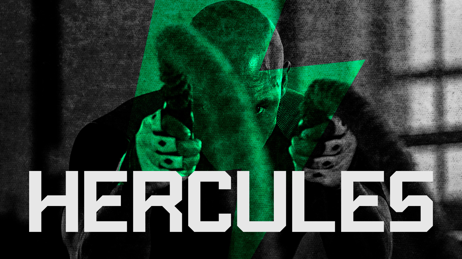
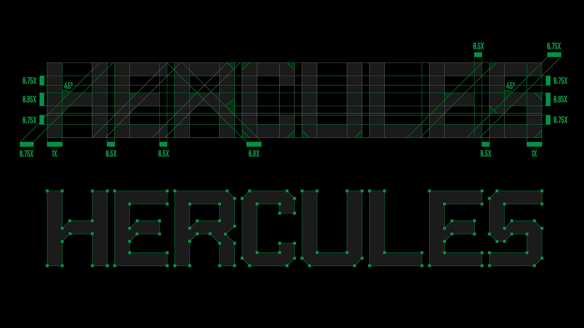
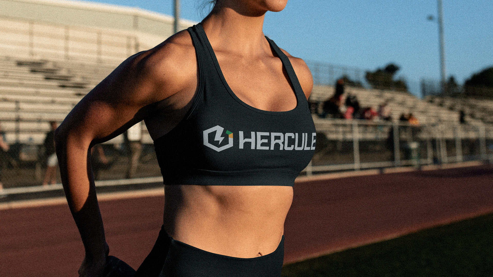
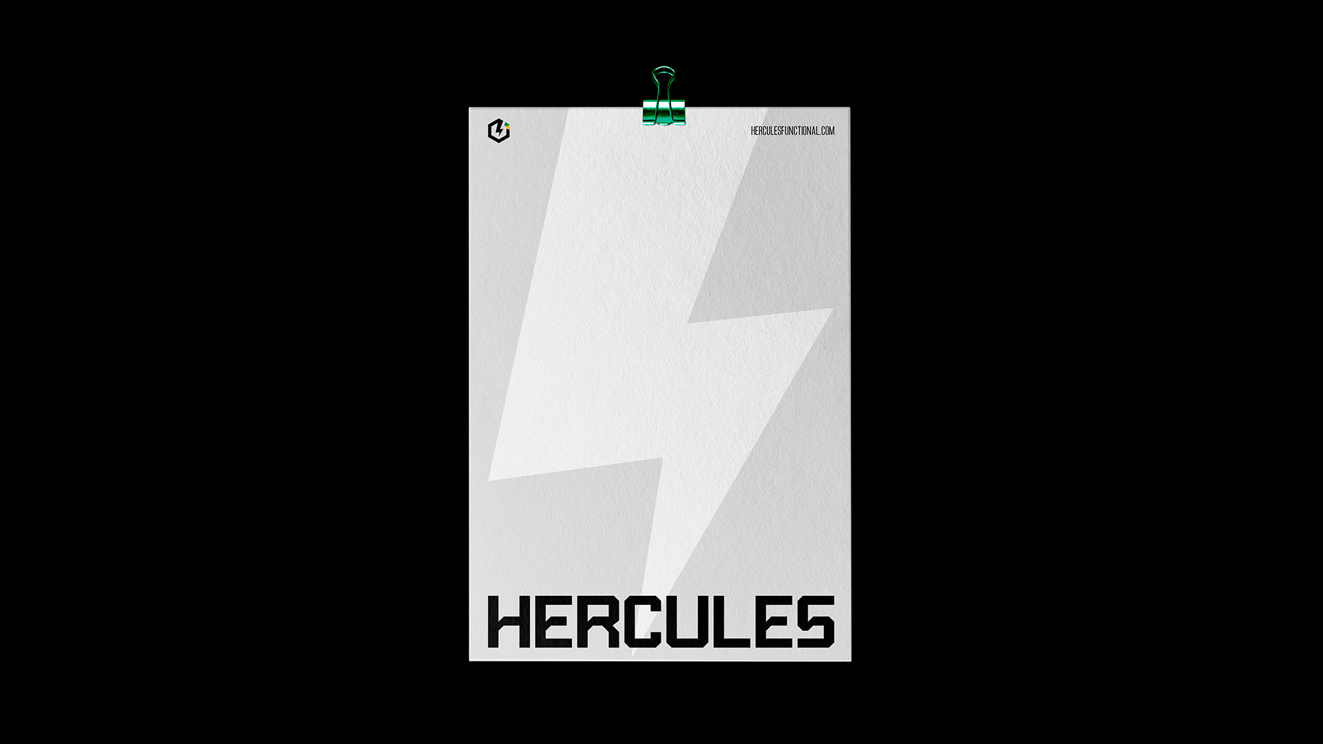
One notable change we made to establish a new visual identity was the typography of the logo. The new font exudes more personality and seamlessly harmonizes with the brand icon, enhancing the brand’s memorability among the target audience.
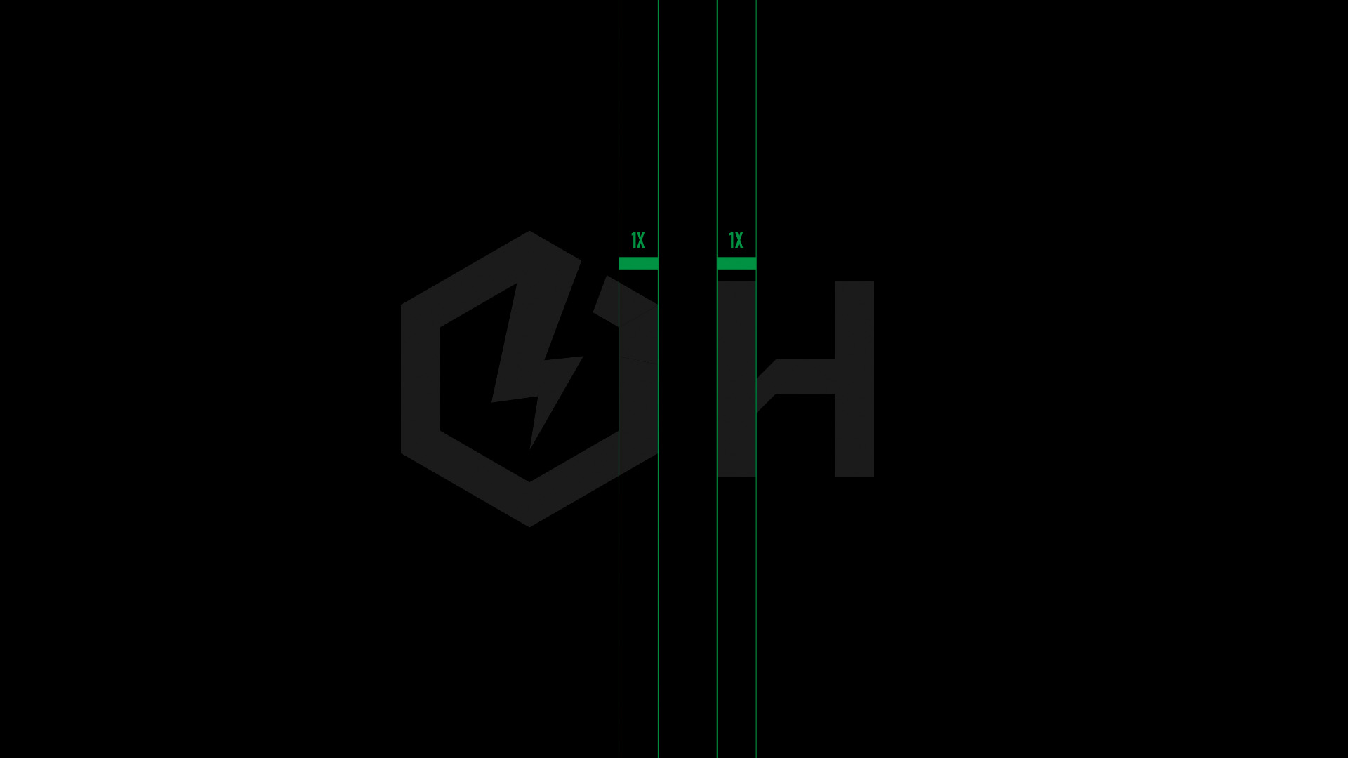
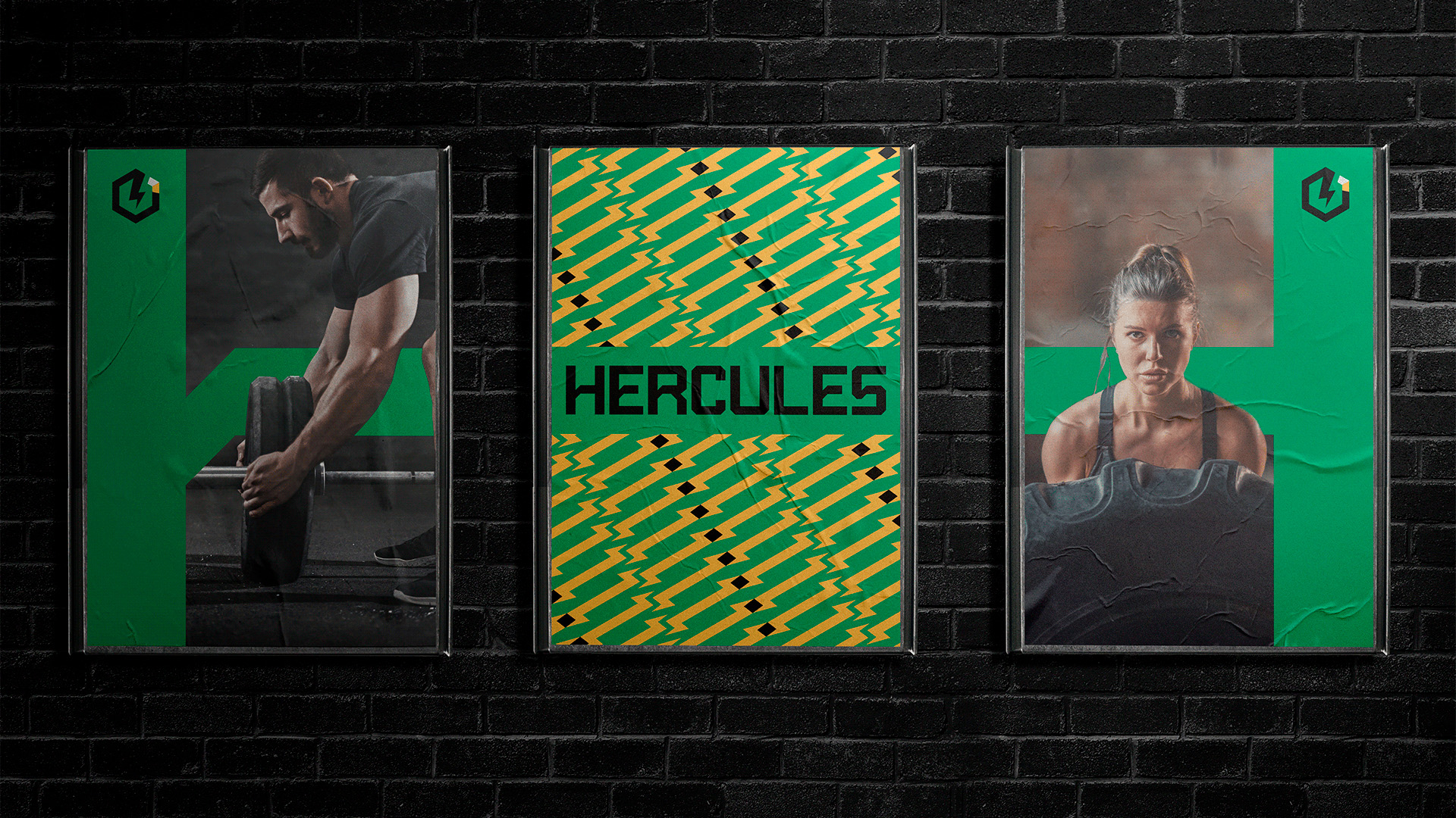
The typography was meticulously developed on a graphic grid inspired by the icon, ensuring greater symmetry and coherence within the overall visual universe. The bolder strokes and inclined lines convey a sense of strength and progress, perfectly aligning with the team’s identity.
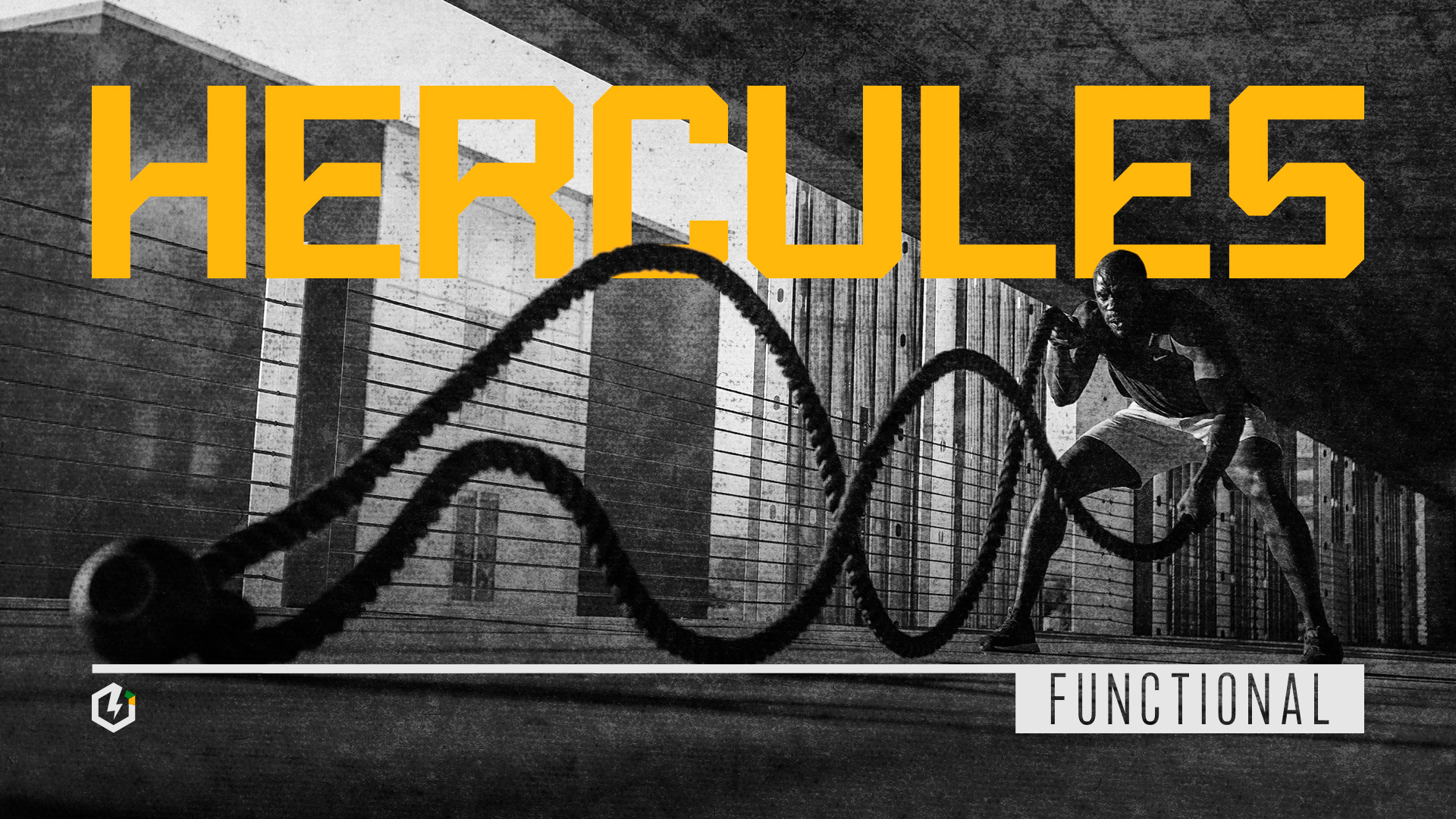
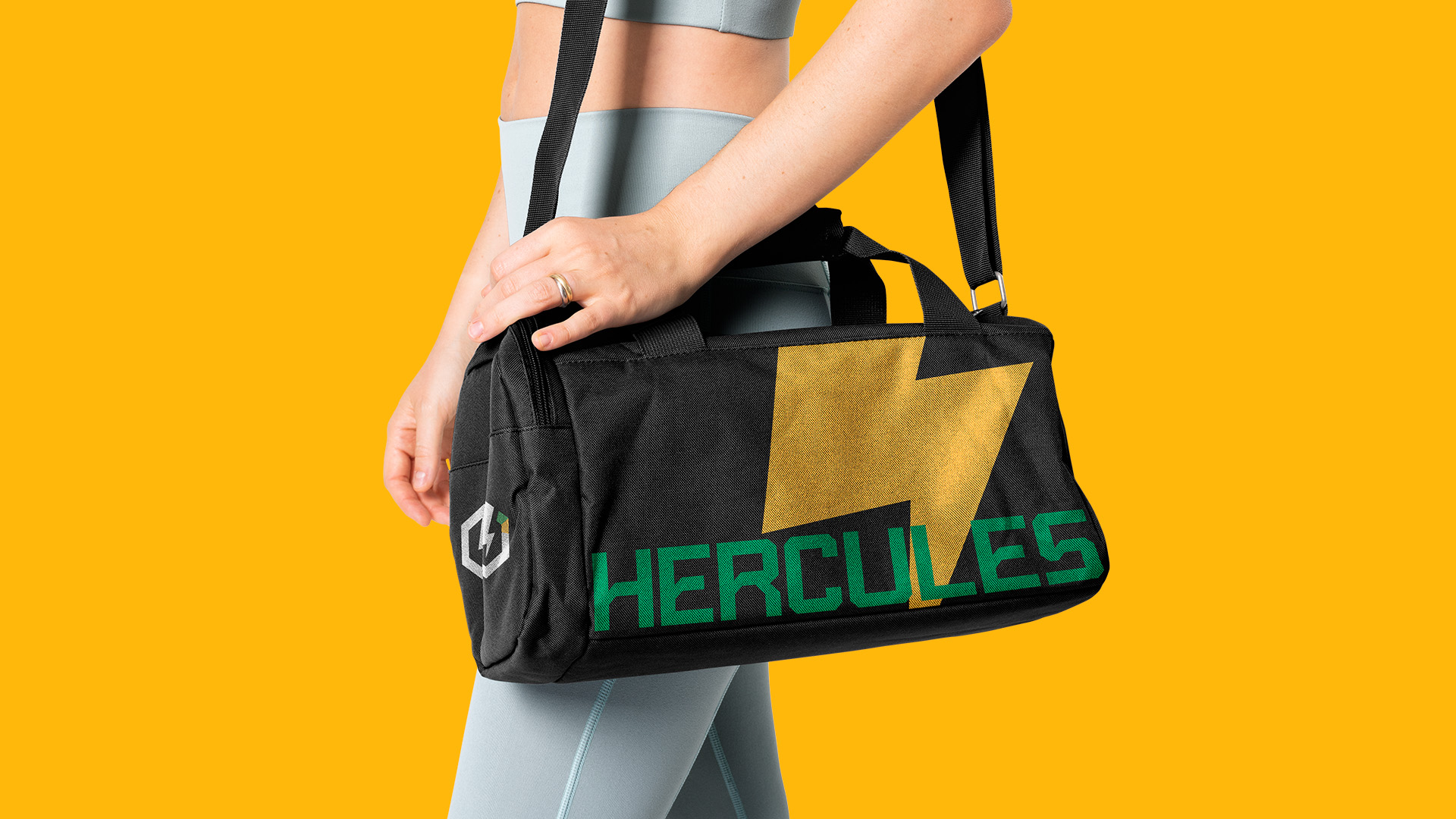
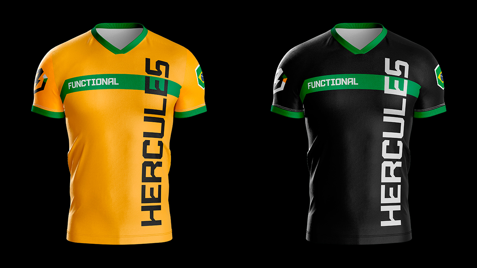
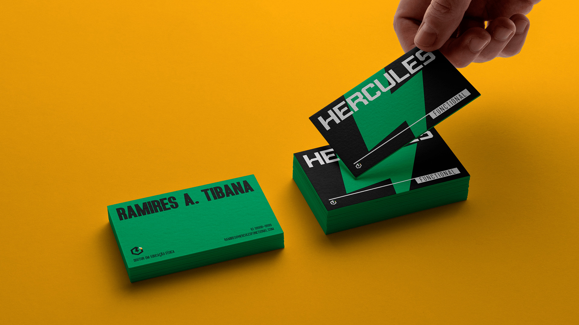
The color palette chosen for Hercules truly represents Brazil, as the team proudly represents the nation both domestically and internationally. The carefully selected colors effectively capture the essence of Brazil. Black conveys elegance and strength, yellow symbolizes energy and vitality, and green represents the rich cultural heritage and natural beauty of the country.
These colors were chosen to evoke specific emotions and associations. The elegant and powerful black signifies the team’s determination and resilience. The vibrant yellow embodies the dynamic energy and enthusiasm the team brings to competitions, while the green hue reflects the team’s deep-rooted connection to Brazil’s cultural identity and lush landscapes.
Consistency in the application of these colors across various visual elements, including the logo, promotional materials, and team uniforms, creates a cohesive and impactful visual identity. The combination of black, yellow, and green not only catches the eye but also reinforces the team’s message of representing Brazil with pride and excellence.
Moreover, the team’s language and communication style were refined to align with the brand’s identity. The tone of voice used in marketing materials and public announcements reflects the team’s values of professionalism, passion, and unwavering dedication. By delivering clear and concise messaging, the team effectively communicates its mission and accomplishments to competitors, sponsors, and fans alike.
In conclusion, the team’s visual identity has been strategically developed to communicate its strength, significance, and unwavering commitment to representing Brazil. Through a thoughtful color palette, a redesigned logo, and a consistent language style, the team effectively conveys its message to both domestic and international audiences. Equipped with these elements, the team is poised to make a powerful statement in competitions and proudly represent Brazil on the global stage.
CREDIT
- Agency/Creative: Weper Design
- Article Title: Hercules Training Program Redesign
- Organisation/Entity: Agency
- Project Type: Identity
- Project Status: Published
- Agency/Creative Country: Brazil
- Market Region: South America, Global
- Project Deliverables: Brand Design
- Industry: Education
- Keywords: workout, logo, brand, personal trainer, gym
-
Credits:
Creative Director and Designer: JP Oliveira
Designer: Igor Martins
Motion Designer: Filipe Silva


