Spinach is a new marketing agency. Their business is built upon delivering organic growth and strength to their clients.
We were tasked with creating their visual identity and tone of voice. As strength and growth is what underpins everything they do it was clear that this needs to be the hook to their graphic assets, and as a brand new company their brand needed to work as hard as possible to demonstrate their offering.
Spinach by name and nature; a highly nutritious leafy green vegetable that offers several health benefits. Here are some ways in which spinach can be beneficial for your health. We wanted the visual to be able to adapt somehow and visually show strength and growth both when in a static form on traditional activities such as print and also when animated. The brand needed to have a sense of growth and movement at its very core.
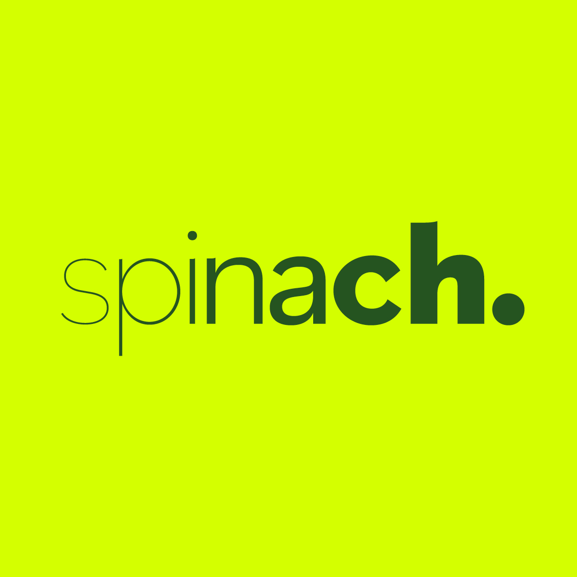
We played around with ways in which we could deliver this movement and growth and finally settled with a font approach that allowed the identity to grow through the weights of the font through the letters of the word.
This also allows a really playful way to deliver the whole identity, whether that’s a name on a business card, intro on the website or a social media icon, it was all about starting lean with a super lightweight font and then growing through the stages into the stronger, bold and heavier weight of the font. So whether static or moving the brand would always be able to demonstrate growth,
Colour palette was kept nice and simple and punchy using a neon green to reflect the health and vibrancy of the agency and a much earthier and darker tone to reflect an organic feel.
The detail then comes through the type, there are eight weights used in the core word mark… so when creating headings or intro copy if possible the rule is to use eight words, each word growing as the logo. But when this isn’t possible to can just grow from Light to Bold picking up the inner weights as you see fit allowing a staged process of growth, which is exactly what Spinach offer.

CREDIT
- Agency/Creative: Pencil Studio
- Article Title: Helping Marketing Agency Deliver Strength and Growth
- Organisation/Entity: Agency
- Project Type: Identity
- Project Status: Published
- Agency/Creative Country: United Kingdom
- Agency/Creative City: Frome
- Market Region: Europe
- Project Deliverables: Brand Design
- Industry: Professional Services
- Keywords: WBDS Agency Design Awards 2023/24
- Keywords: marketing agency, visual identity. branding
-
Credits:
Creative Director: Luke Manning
Chris Osment: Design Director


