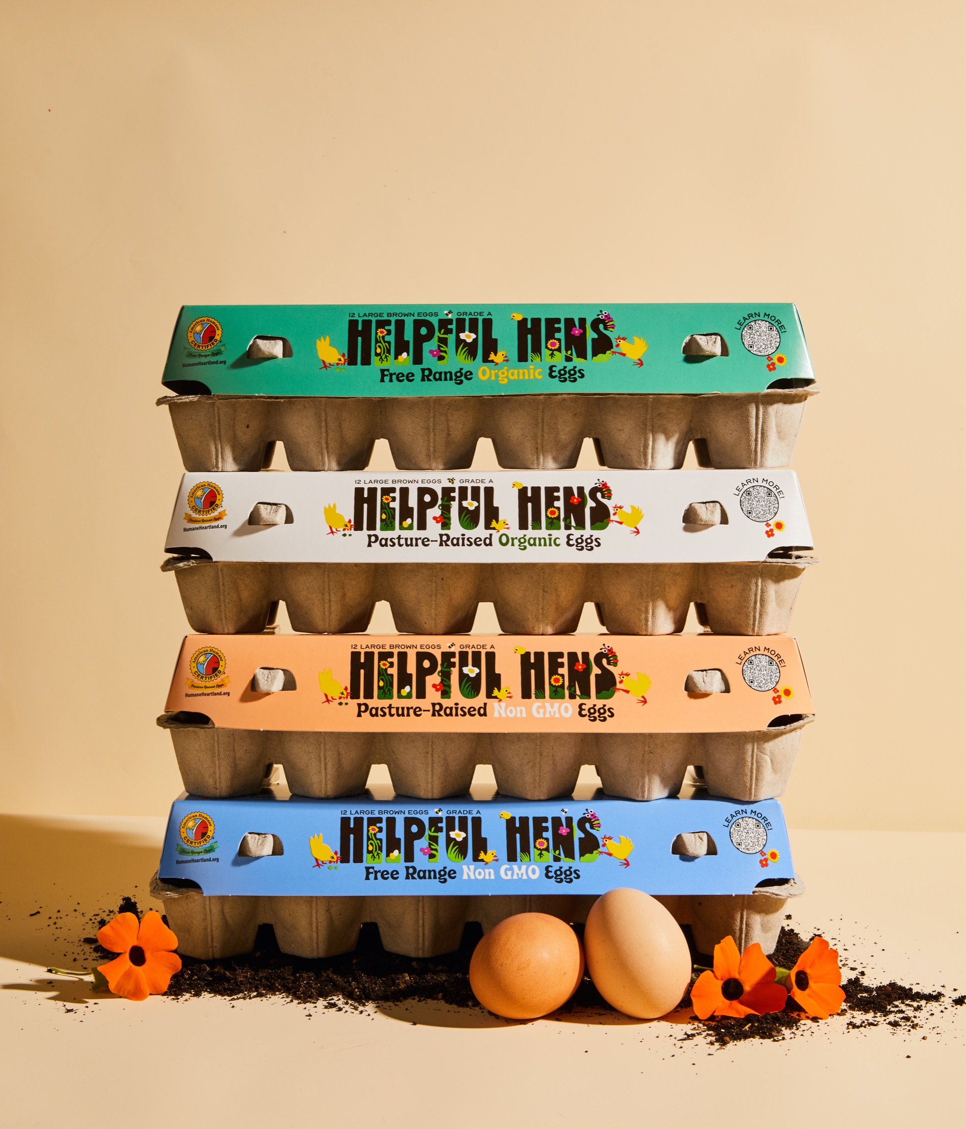
The Blue Sky Family Farms team hired us to develop a new brand for their newest offering: delicious eggs from regenerative farms. The project scope included everything from naming, brand strategy and positioning, packaging, and digital and web creative, so we got a chance to get our hands dirty on all things eggs.
As we do with any new project, we began with researching the market, educating ourselves on regenerative farming practices (great resources here), and interviewing Blue Sky Family Farm team members to understand the legacy of the company (their company has roots back to 1913!) and how that would shape the foundational elements of this new brand.
We discovered most egg brands center their narrative on the farmers behind their operation to deliver that local, farm fresh experience, and understandably so. Also, we learned pasture-raised and free range eggs are the fastest growing segments in the market which tells you consumers are purchasing eggs from farms committed to animal welfare. What stood out to us though was Blue Sky’s longstanding commitment to humane practices, and with regenerative farming asking hens to play their vital role, we saw an opportunity to focus on the hen that felt fresh and fun. As expert grazers, natural fertilizers and steadfast soil scratchers, hens play an important role supporting the farm’s natural ecosystem, and that’s how we landed on the brand name, Helpful Hens.
We also loved that the Helpful Hens story goes beyond eggs and beyond the farm, specifically to the topic of restoring American topsoil — the rich, plant-nourishing, carbon-balancing material that a healthy planet and food system is built on. We learned in our research that it’s eroding quickly across the country, and regenerative agriculture practices actually help preserve and restore soil health. We loved that by encouraging and harnessing natural hen behaviors, farmers win across the board: hens lay nutritious and great tasting eggs, the soil gets richer and more capable of capturing excess carbon, the food system is more sustainable and farms become more resilient. Regenerative agriculture benefits every part of the farm and the land. So overall this was a very juicy brand with lots to unpack and work with.
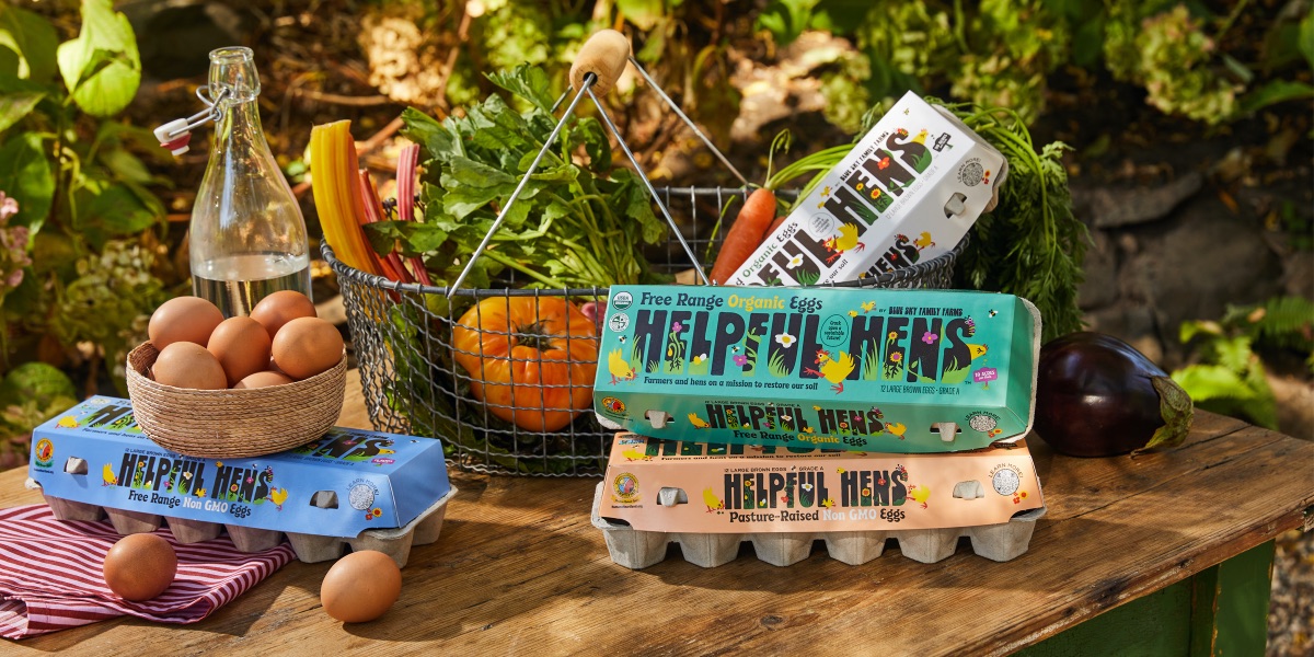
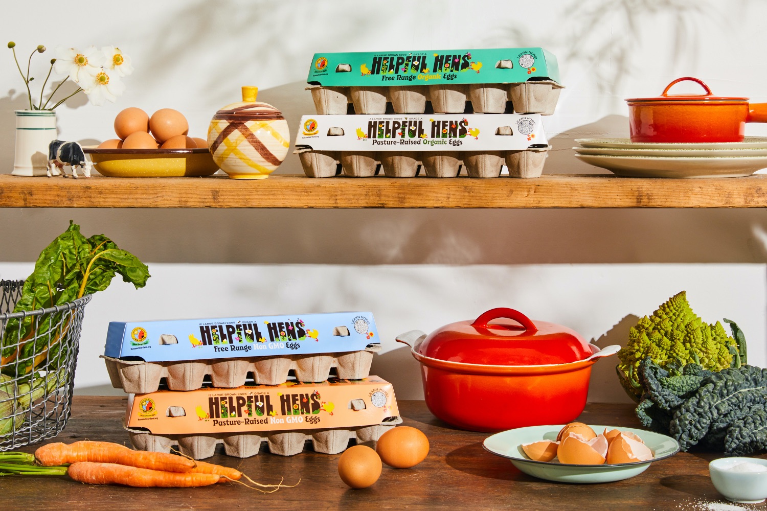
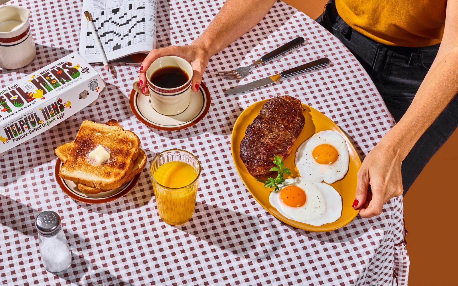
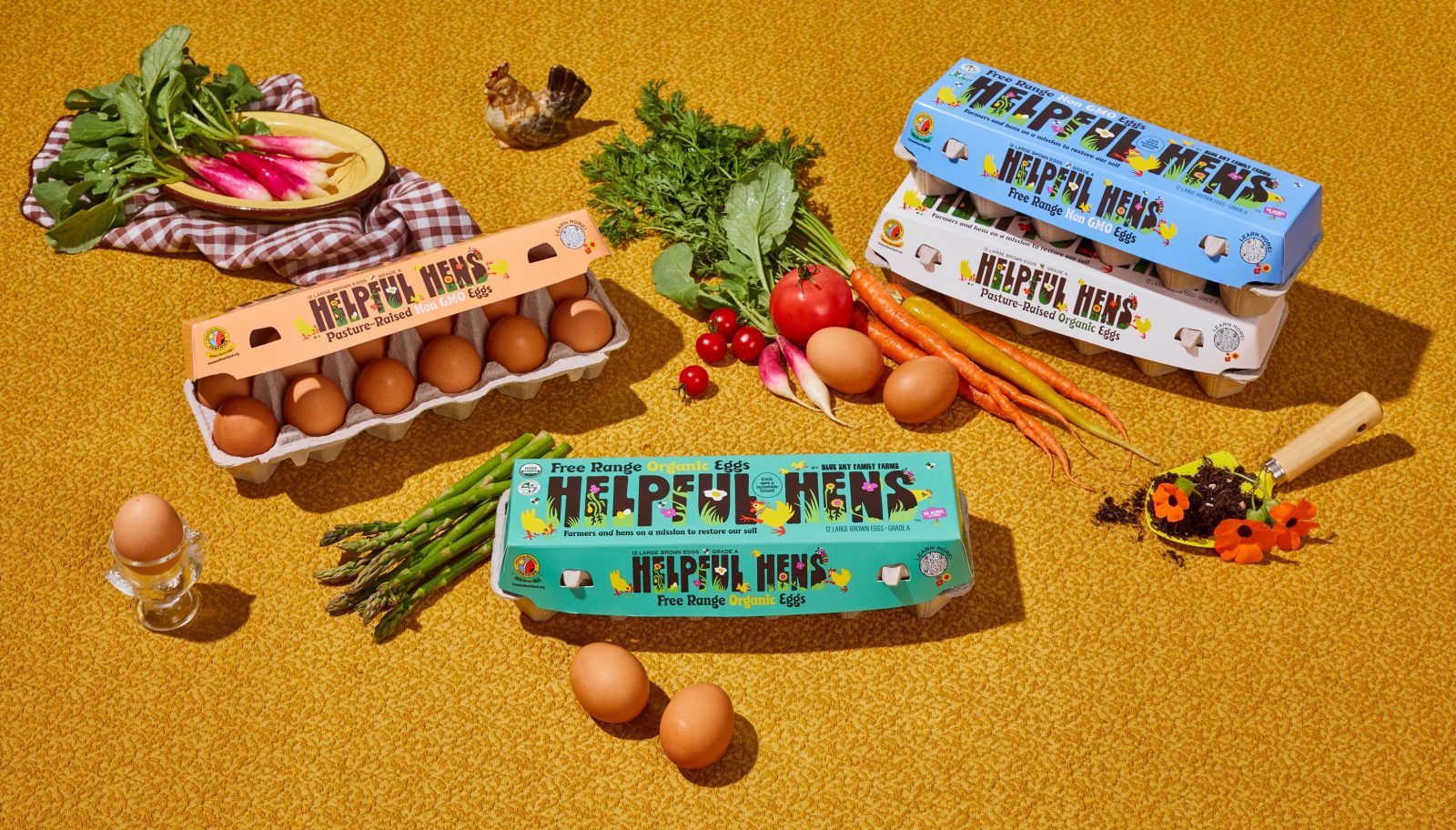
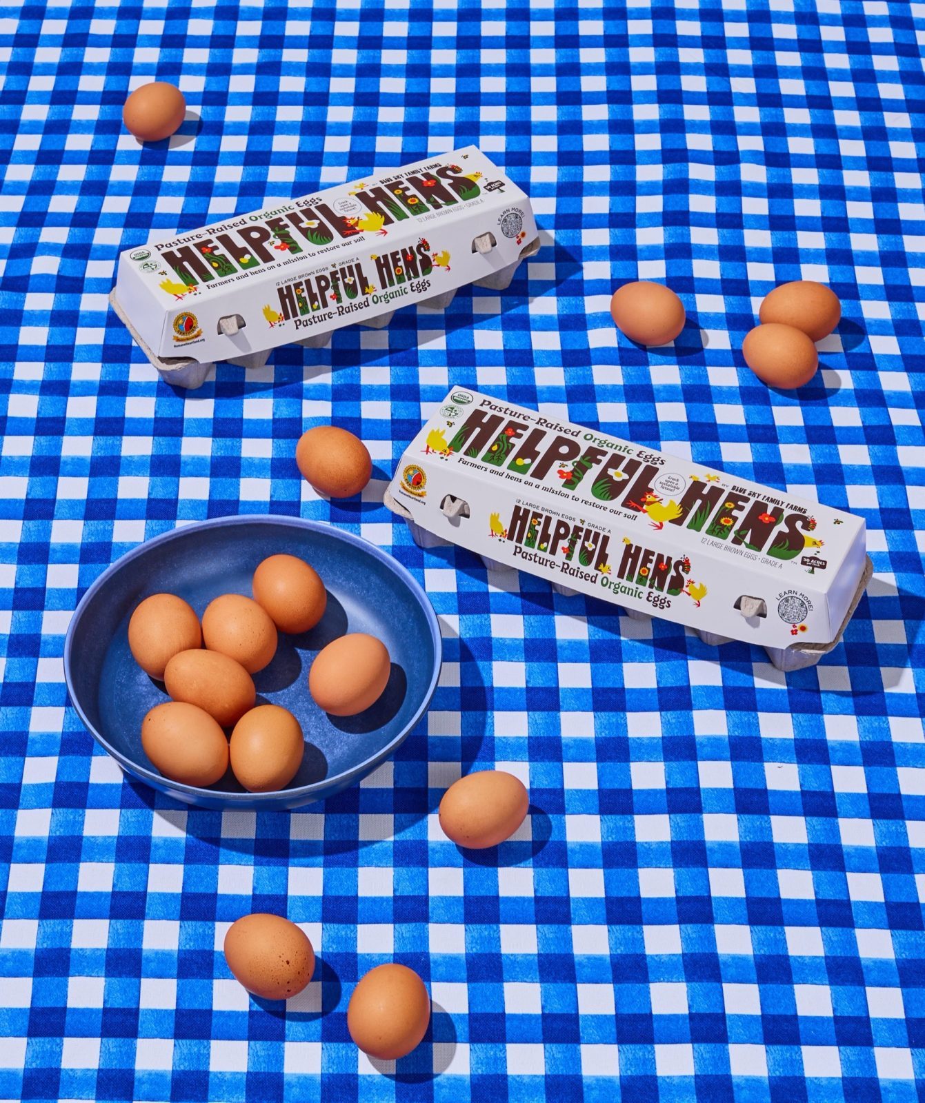
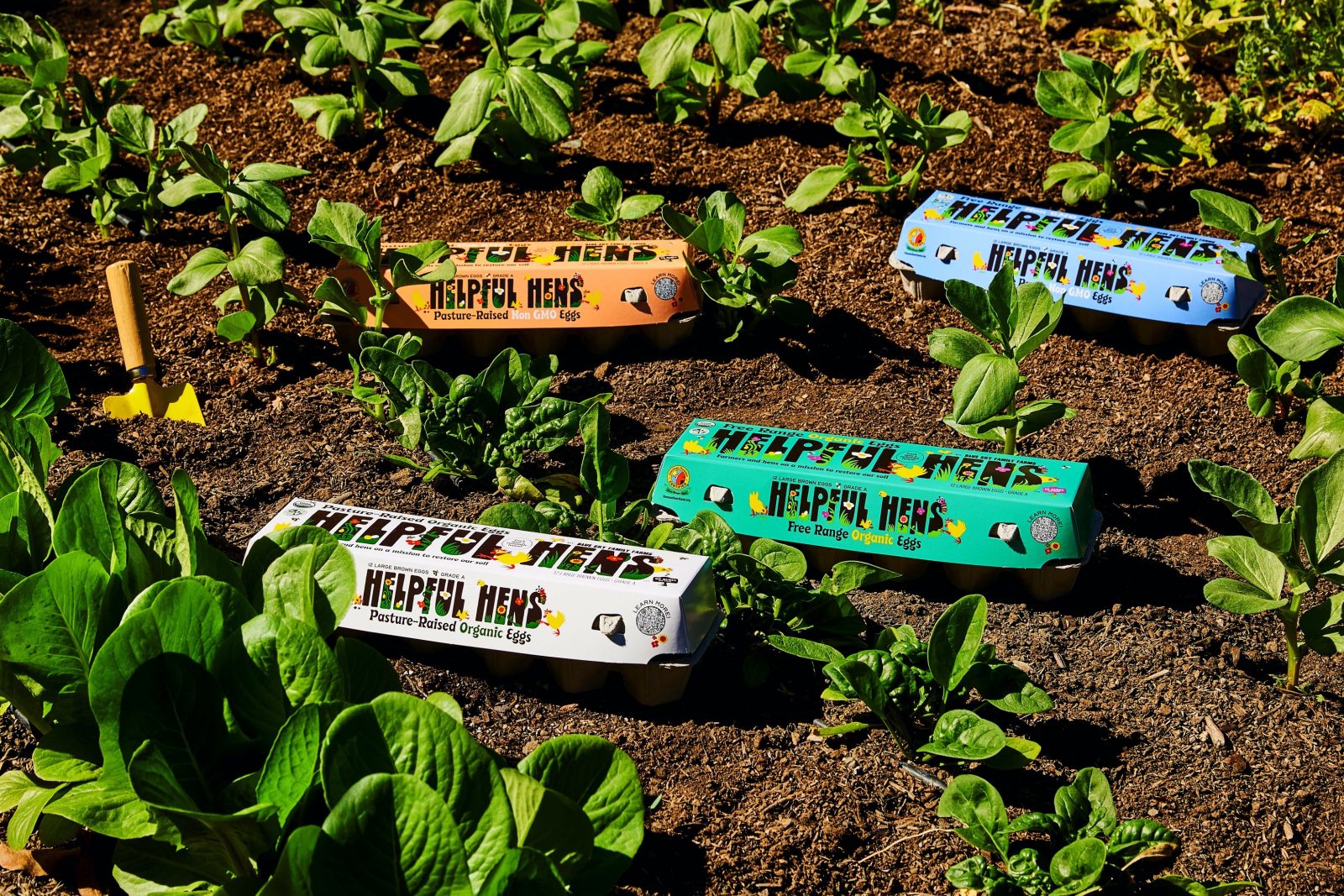
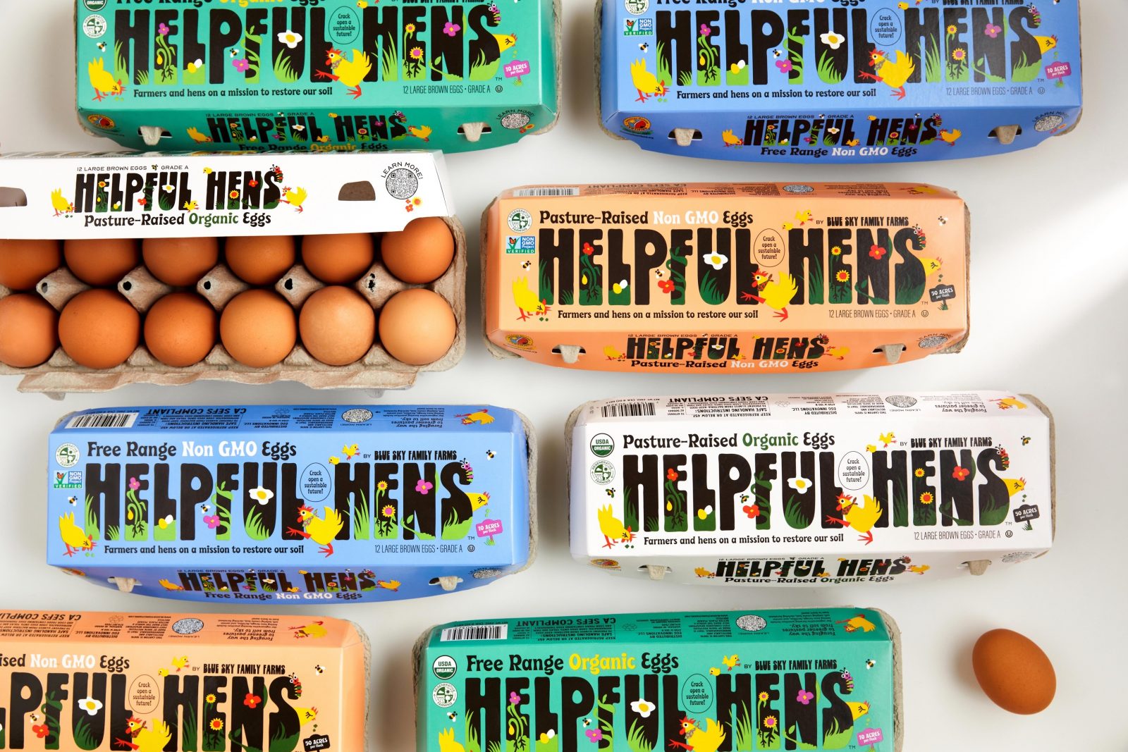
We knew pasture raised and free range eggs were the fastest growing SKUs and that regenerative farming was becoming more well known, and that these are things people connect to on an emotional level and are willing to pay a premium for. But the packaging landscape left a lot on the table in terms of telling those stories in ways that felt emotional and fresh. With Helpful Hens being such an optimistic brand, we were inspired to bring more joy and vibrance to the packaging experience that would tell the story of the vital role hens play on regenerative farms and the benefits of supporting regenerative brands. And we wanted that to come through on the front of pack to attract people to the brand, but we also paid specific attention to the inside carton — the area people see most as they go through their eggs — where we extended our illustration set into an educational moment and opportunity for further brand connection.
The illustrative details embedded in the logo’s letterforms allowed us to marry the name and mission into one scene. We needed to explain the benefits of restoring soil, how healthy soil leads to healthy plants which supports a healthier carbon balance and planet. Green cover crops (a key element of regenerative farming) ground each letter with new plants sprouting up from the roots, buzzing bees pollinate nearby sunflowers nodding to the biodiversity & native species principles of regen agriculture, and hens are shown exhibiting their natural behaviors like grazing and scratching that help nurture the soil. All together you get a beautiful illustration celebrating the complexity of a vibrant farm ecosystem. And that’s what this brand is all about.
We partnered with the incredibly talented illustrator Amrita Marino. We felt her style, balanced compositions, and use of bold color aligned with our art direction. We discovered her while working on the Continuum, a monthly resource calendar that our studio publishes, and fell in love with her work immediately. When I presented the project to her, she was so excited to work on packaging and to draw chickens, I knew she was a great match. The partnership was very collaborative, and we went through a few rounds of sketches before we landed on the type-centric direction. Our studio explored type and found Frito Vandito and knew it had the warmth, approachability, and retro feel to perfectly compliment Amrita’s illustrations. We then paired Frito with the funky display serif Beale. We scaled up the letters and played with putting the illustrations in the letterforms and it just clicked. We loved how it all came together — complex, vibrant and joyous.
Our biggest challenge was striking the right balance between the cheery optimism that’s inherent to the brand and the anxiety and overwhelm many people feel when confronting carbon balance and climate change. We know the topic is very divisive sadly, but in my opinion, there is a levity when engaging on the matter over a carton of eggs. I hope people purchase these delicious eggs and take to heart that the choices they make at the grocery store — and anywhere! — can make a difference.

CREDIT
- Agency/Creative: Designsake Studio
- Article Title: Helpful Hens Branding and Packaging Design by Designsake Studio
- Organisation/Entity: Agency
- Project Type: Packaging
- Project Status: Published
- Agency/Creative Country: United States
- Agency/Creative City: San Anselmo
- Market Region: North America
- Project Deliverables: Packaging Design
- Format: Box
- Substrate: Pulp Carton
- Industry: Food/Beverage
- Keywords: WBDS Agency Design Awards 2021/22
-
Credits:
Designer: Emma Gindy
Illustrator: Amrita Marino
Creative Director: Danielle McWaters
Photographer: Aubrie Pick


