


The Simply Delish dip brand, based in Melbourne, Australia, was started back in 1999 by two Greek brothers and has produced a wide ranging portfolio of dips over the years, gradually establishing itself as a trusted presence in the dips category. A quarter of a century later they finally decided to launch a Greek dip range – an idea that felt both natural and long overdue, given the founders’ heritage and the enduring popularity of Greek flavours in Australia.
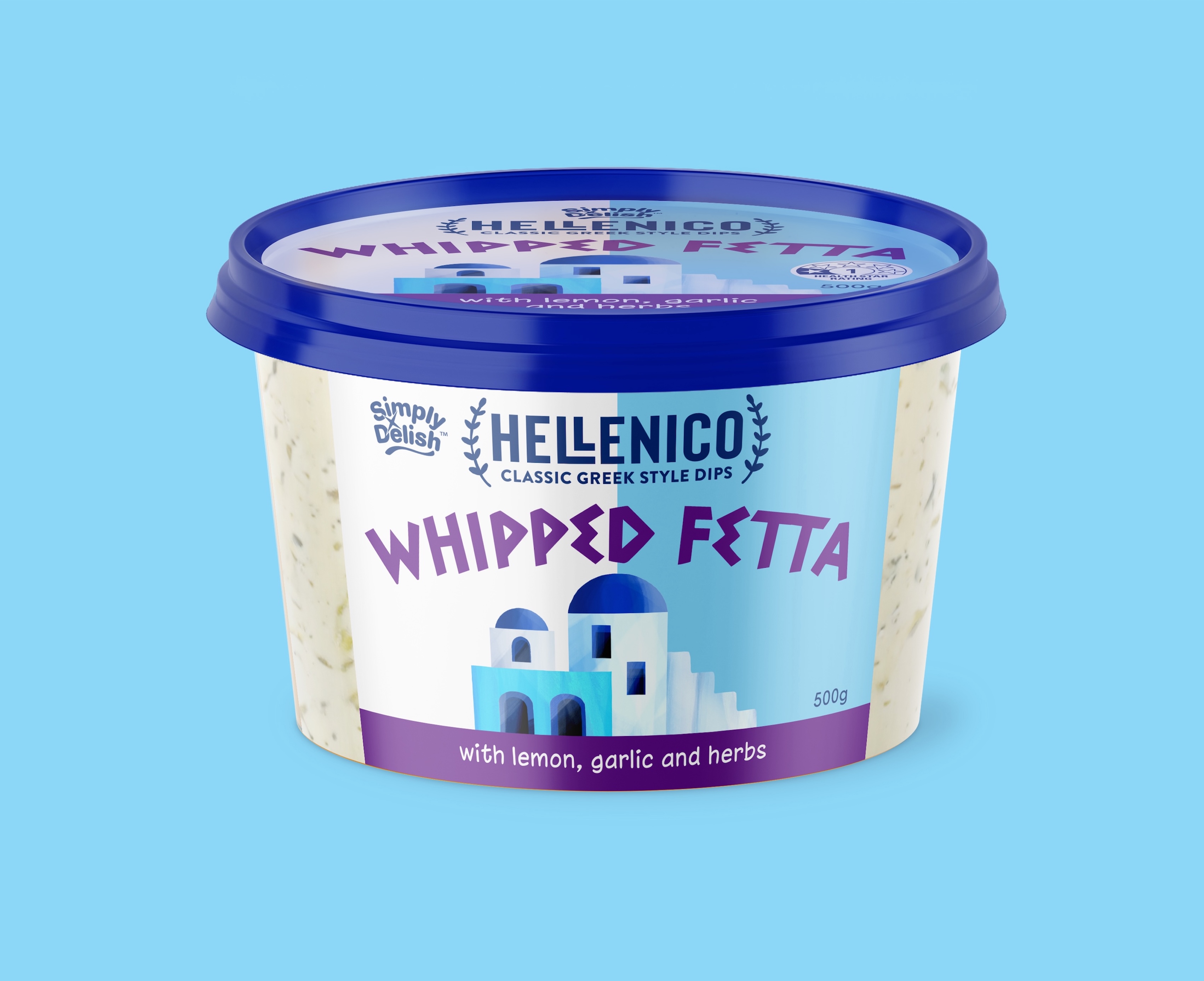
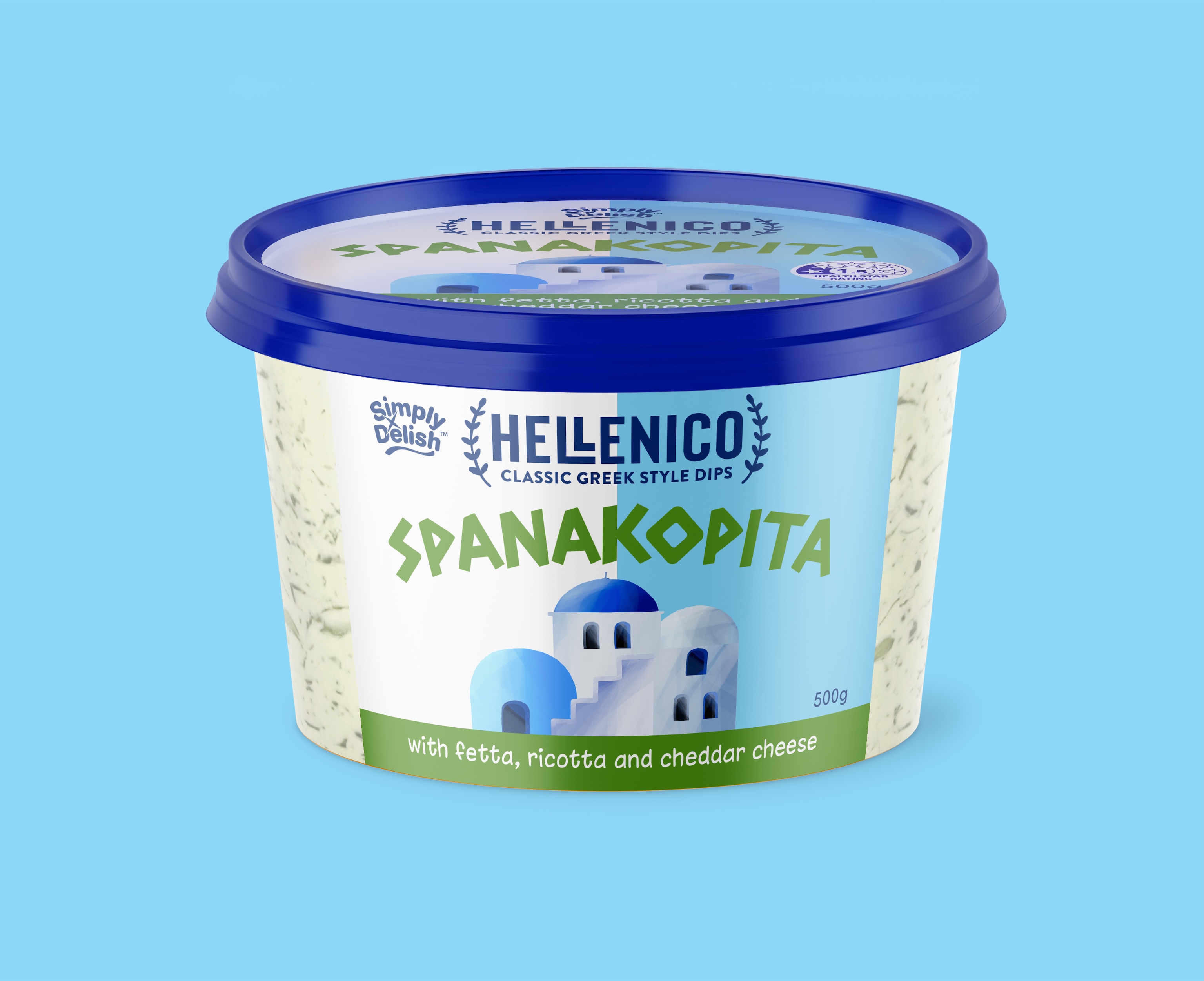
Our challenge with the Hellenico brand, as with all ethnic or regional flavour-based product ranges, was to speak to authenticity without over-promising or becoming clichéd. Rather than leaning on obvious visual stereotypes, we aimed to capture the spirit of Greece in a way that felt modern and confident. The brand mark we designed is therefore neoclassical in style, using a bold and contemporary sans serif font, bracketed by two laurel wreath–inspired fronds. This framing device subtly references classical Greek symbolism while giving the logo a sense of structure and authority. The result is a mark that feels contemporary, yet rooted in tradition.
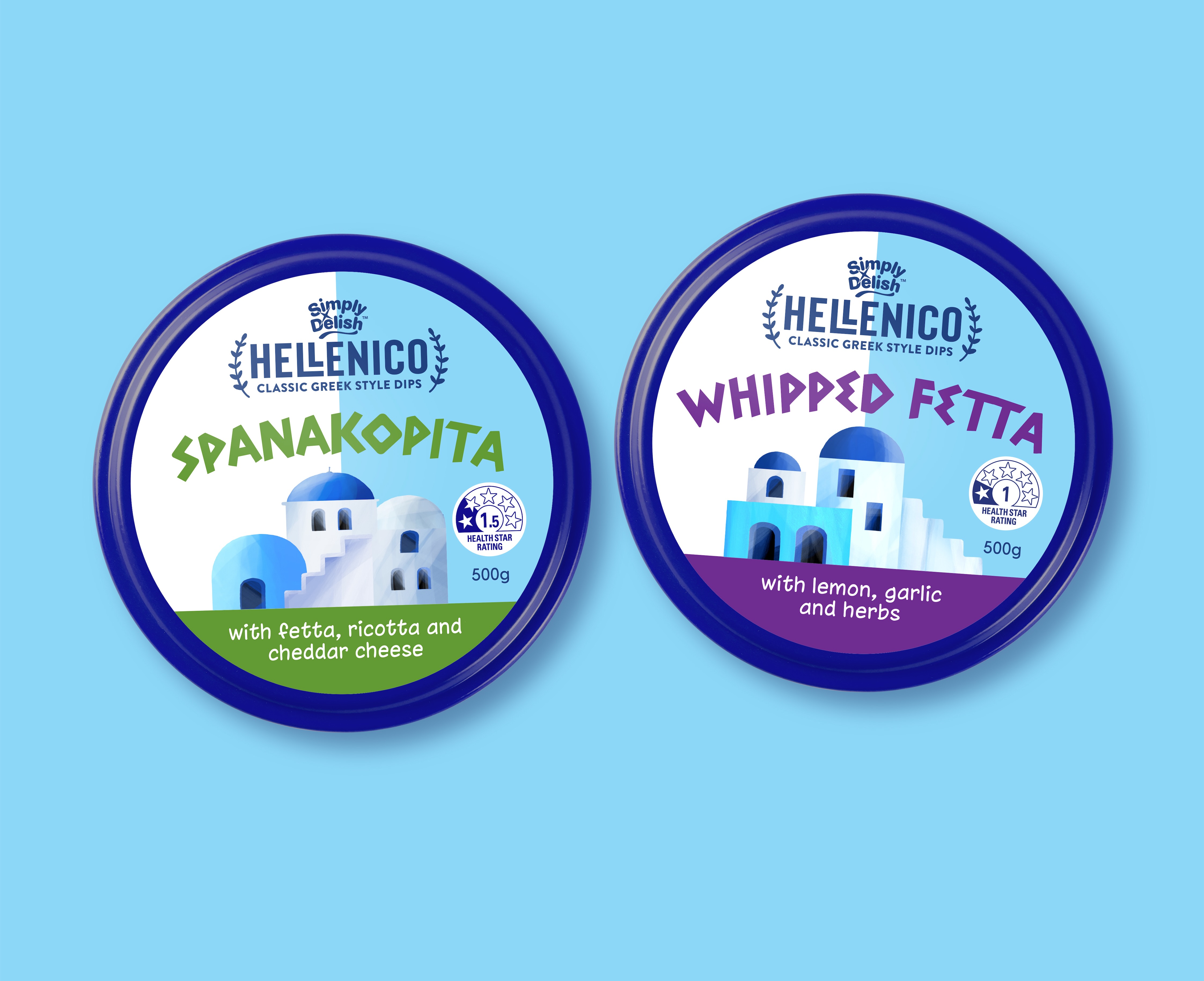
The labelling uses a simple two-tone background, drawing on two iconic colours instantly associated with Greece by most people – the blue and white seen everywhere from the national flag to the whitewashed houses of the islands. By dividing these colours vertically, we used this familiar palette in a very contemporary and uniquely ownable way, creating strong shelf presence while avoiding a predictable or ‘touristy’ aesthetic.
To emphasise the heritage of the range further, we incorporated simple illustrations of unmistakably Greek architecture, rendered in a clean, modern style. The font used for the variant names also also supports the cause by subtly borrowing characteristics from the traditional Greek alphabet while remaining clear and highly legible for contemporary shoppers.
Together these elements create a packaging system that feels authentic yet fresh, balancing cultural cues with the clarity, restraint and visual confidence expected in a modern supermarket environment.
CREDIT
- Agency/Creative: Asprey Creative
- Article Title: Hellenico Greek Dips Packaging Design by Asprey Creative Brings Modern Authenticity to Simply Delish
- Organisation/Entity: Agency
- Project Type: Packaging
- Project Status: Published
- Agency/Creative Country: Australia
- Agency/Creative City: Melbourne
- Market Region: Oceania
- Project Deliverables: Brand Creation, Brand Design, Brand Identity, Brand Mark, Brand Naming, Illustration, Packaging Design, Typography
- Format: Cup, Pot
- Industry: Food/Beverage
- Keywords: Packaging Design, Brand Identity, FMCG Branding, Food Packaging, Dip Packaging
-
Credits:
Creative Director: Peter Asprey


