


Heliora is a bold and conceptually driven brand identity project that explores how design can give tangible form to transparency, traceability, and equitable value in a decentralized world. It envisions a future where design systems are not just aesthetic frameworks but also visual infrastructures that communicate trust and empower communities. At its core, Heliora is a study of how visual identity can express complex technological ideas with clarity, cultural grounding, and emotional depth.
The conceptual foundation of Heliora is built on two intertwined metaphors: light and data flow. Light symbolizes transparency, the ability to see through systems, to illuminate what was once hidden. Data flow represents how information and value move across decentralized networks. Together, these metaphors informed the entire creative direction. Every typographic choice, every geometric shape, every color decision reflects a world where open systems foster accountability, visibility, and connection.
Design Direction and Visual Language
The typographic system is clean, assertive, and structured. It was chosen to embody the precision of technological systems while remaining approachable and human. The geometric language is modular, flexible, and network-inspired, mirroring how decentralized technologies operate—interconnected, layered, and adaptive. The color palette blends cool, technological tones with organic, warm neutrals. This fusion reinforces Heliora’s duality: advanced technology and human impact.
This visual balance is deliberate. Blockchain, decentralization, and resource traceability are often perceived as overly complex and inaccessible. Heliora’s design language bridges that gap. It simplifies without diluting, making transparency not just an abstract concept but a tangible visual and emotional experience.
Logomark and Core Symbolism
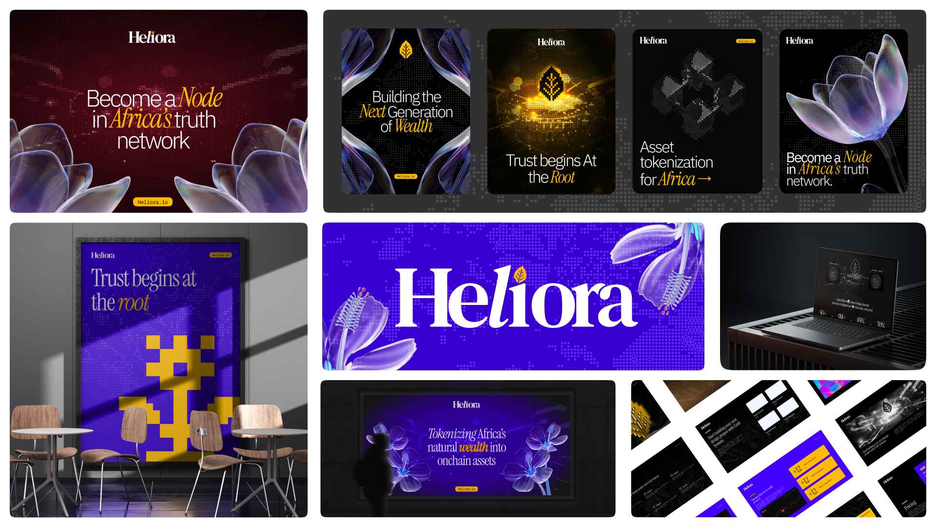
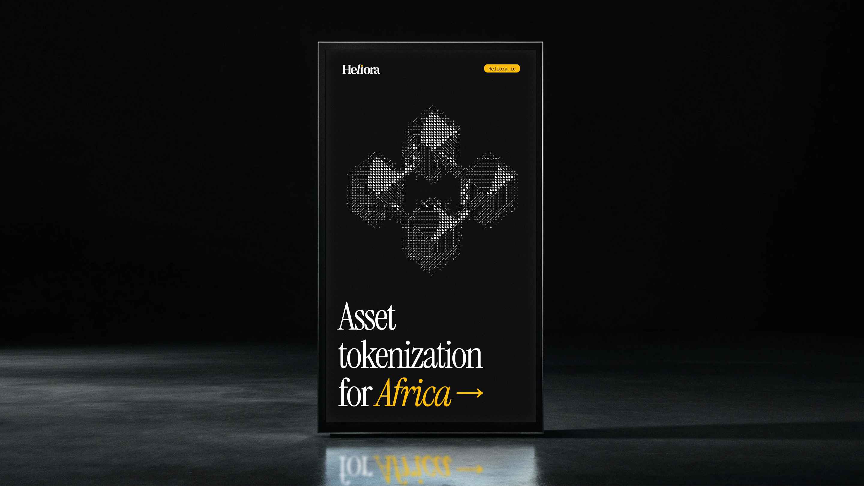
The logomark is minimal yet conceptually rich. It draws on ideas of interconnection, traceable pathways, and transparent layers. Its form can expand and contract, mirroring the scalability of decentralized systems. In its simplest state, it is iconic—clear enough to stand on its own. In more complex compositions, it becomes a node within a larger network, suggesting collective participation and shared ownership.
The supporting graphic system emphasizes fluidity and modularity. Elements are designed to work seamlessly across different formats: landing pages, editorial spreads, campaign visuals, and motion storytelling. The structure is grid-based, ensuring consistency, while the compositions maintain a sense of openness and flow.
Cultural and Contextual Grounding
A defining narrative layer of Heliora’s identity is its grounding in African natural resources. For centuries, Africa’s lands have been rich with gold, cocoa, oil, lithium, and other valuable resources. Yet, the people connected to these lands have rarely been the beneficiaries of that value. This history of extraction without transparency is at the heart of the conceptual story.
Heliora repositions this narrative through design. Textural details, subtle cultural motifs, and compositional framing evoke a sense of place and origin. Instead of hiding the resource story, the brand identity foregrounds it. It presents a future where transparency isn’t optional but integral—where the origin of every asset can be traced, and communities can claim visibility and ownership.
Application and System Design
The Heliora identity system is built to be modular and scalable. It includes:
Token asset design concepts** inspired by natural resources and premium export goods (e.g., cocoa, gold, lithium).
Grid-based layouts** that allow for flexible application across digital and physical touchpoints.
Motion and interaction guidelines** that visualize the flow of information and transparency in dynamic ways.
Pattern and texture libraries** rooted in African visual language, used to ground the futuristic system in cultural context.
Iconography and symbol systems** that emphasize clarity and traceability.
Each component of the identity is designed not just for aesthetic coherence but for narrative strength. The goal is to show how a decentralized resource platform might communicate trust, credibility, and cultural respect through design.
Narrative and Storytelling
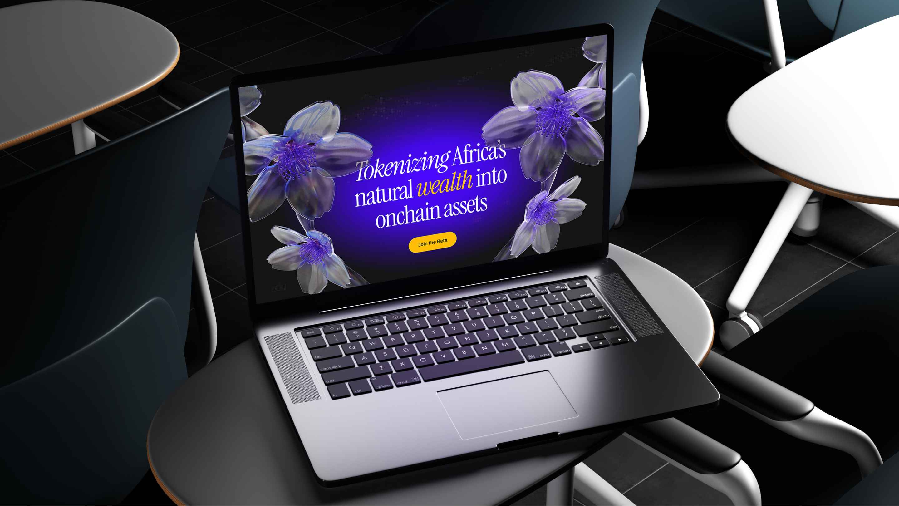
One of Heliora’s key strengths is its ability to tell a story through visual language. It doesn’t present blockchain or decentralization as abstract jargon but as a human-centered idea. Through its design, Heliora imagines how a farmer in Ghana, a miner in Congo, or a community in Uganda could trace the value of their resources and be recognized for their contribution to the global supply chain.
The storytelling strategy is rooted in visibility. If someone anywhere in the world consumes a product—be it chocolate, gold jewelry, or technology powered by lithium—they should be able to trace its origin. Heliora positions this traceability as something beautiful and dignified. The design speaks to that dignity.
Motion and Digital Experience
The motion language of Heliora further amplifies this concept. Fluid animations mimic data flows and the movement of light through networks. Micro-interactions reinforce the sense of traceability—each transition revealing more, never less. The identity is designed to feel alive, to reflect a system that grows and adapts.
Landing page layouts use structured grids combined with flowing lines to guide users through narratives of resource origin, tokenization, and global connection. The interaction design emphasizes transparency as an experience: nothing feels hidden, everything is intentionally revealed.
Color, Typography, and Composition
The **color palette** uses shades of deep blue and neutral earth tones. Blue signifies trust, technology, and clarity. Earth tones reflect resource origin, human labor, and cultural grounding. Accent colors are used sparingly to highlight interaction points or important narratives.
The **typography** relies on a modern sans-serif family that is both sharp and approachable. Its versatility allows for strong headlines and clear body text, ensuring legibility across both digital and print applications. Layout compositions follow a grid but leave generous white space, symbolizing openness and breathing room within the system.
Conceptual Goals
Heliora was built as a design exploration to push the boundaries of how identity systems can carry weight beyond logos and colors. It aims to make transparency feel structured and beautiful. It envisions a future where design isn’t just about brand recognition but about building trust in shared systems.
This is particularly relevant when dealing with natural resources. For too long, resource value chains have been opaque, designed to benefit only a few. Heliora uses design to imagine a world where that opacity is replaced with visible, traceable, human-centered narratives.
Positioning and Vision
Heliora positions itself as a forward-looking identity system designed for decentralized infrastructure. It speaks to a new era where resource ownership, data flow, and cultural narratives intersect. Its aesthetic is minimal but layered, structured but fluid, futuristic but culturally grounded.
This is not a fictional exercise. It is a visioning project that explores how identity design can serve as a bridge between complex technology and everyday human experience. It demonstrates how clear storytelling and strong visual systems can give meaning to innovation.
Final Statement
Heliora is more than a logo or a set of visuals. It’s a complete narrative identity that embodies transparency, cultural identity, and systemic change. It shows how design can be used as a tool to rewrite narratives of resource ownership, to amplify invisible stories, and to give a voice to communities that have been overlooked for generations.
Through its thoughtful combination of typography, structure, cultural cues, and motion language, Heliora creates a compelling vision of a transparent, traceable future. It is a blueprint for how branding and identity can be used not only to represent technology but to shape its meaning in the world.
This project stands as an example of design as infrastructure—a system built to hold weight, tell stories, and imagine a better world. Heliora takes complex, decentralized systems and makes them feel human, visible, and beautifully structured.

CREDIT
- Agency/Creative: Adewale Aloba
- Article Title: Heliora by Adewale Aloba Translates Light and Data Flow into a Powerful Design Narrative
- Organisation/Entity: Freelance
- Project Type: Identity
- Project Status: Published
- Agency/Creative Country: Nigeria
- Agency/Creative City: Lagos
- Market Region: Africa
- Project Deliverables: 3D Design, Brand Guidelines, Brand Identity, Creative Direction, Logo Design, Motion Graphics
- Industry: Technology
- Keywords: Branding, Brand Identity, Visual Identity, Creative Direction, Web3, Decentralized Science, Technology, Innovation, Futuristic Design, Modular System, Motion Identity, Systems Thinking, Human-Centered, Brand Strategy, Digital Transformation, Visual Storytelling, Experimental Design
-
Credits:
Art Director: Adewale Aloba


