


Let’s Reset – Safeguarding a child’s innocence
For over 10 years, SafeToNet has been an advocate for online safety, pioneering technology with a vision to help create a healthy digital world. Their flagship Al-powered tool, HarmBlock, protects children online by preventing the creation, consumption, and distribution of harmful content.
SafeToNet asked us to evolve and refresh their brand identity to reflect their future-facing mission, pioneering spirit and the need after 10 years of developing an amazing product to ensure the business brand, that was bringing this to market, would have the necessary credibility and visual story amongst the all stakeholders (including investors and government).
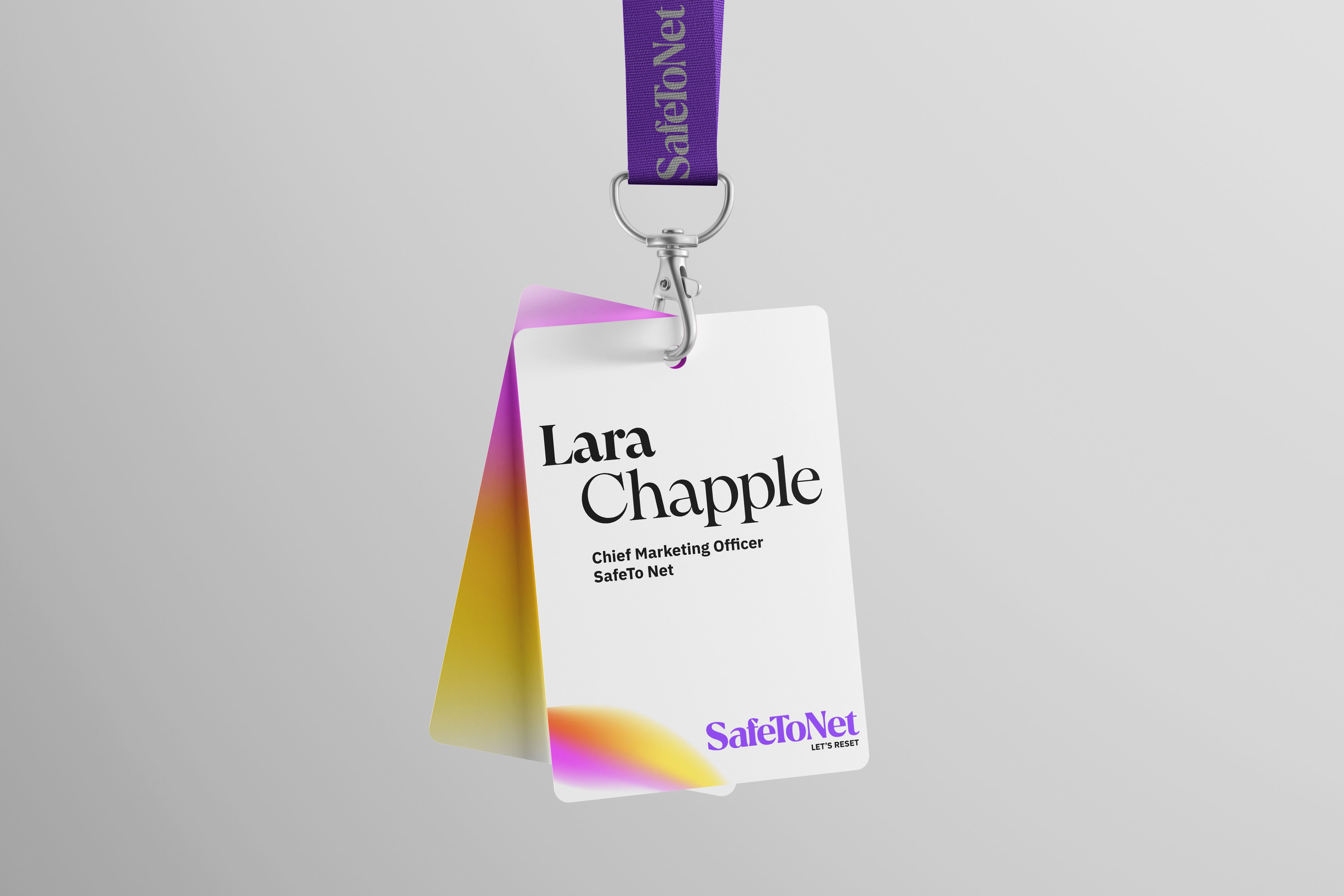
As a creative collective, Anna Wanczyk and I, at Helen Hartley Consulting and ANNA& respectively, along with Anthony Jocelyn, created the brand and website for SafeToNet, in true partnership and collaboration with the SafeToNet team with SafeToNet’s CMO Lara Chapple developing the strategic vision and leading the project alongside the team. Sharon Pursey OBE, Richard Pursey, Sarah Castro, Jack Pursey and JohnJohn Brandis-Arntzen.
The Brand Challenge
The brand needed to represent all three pillars of SafeToNet’s work:
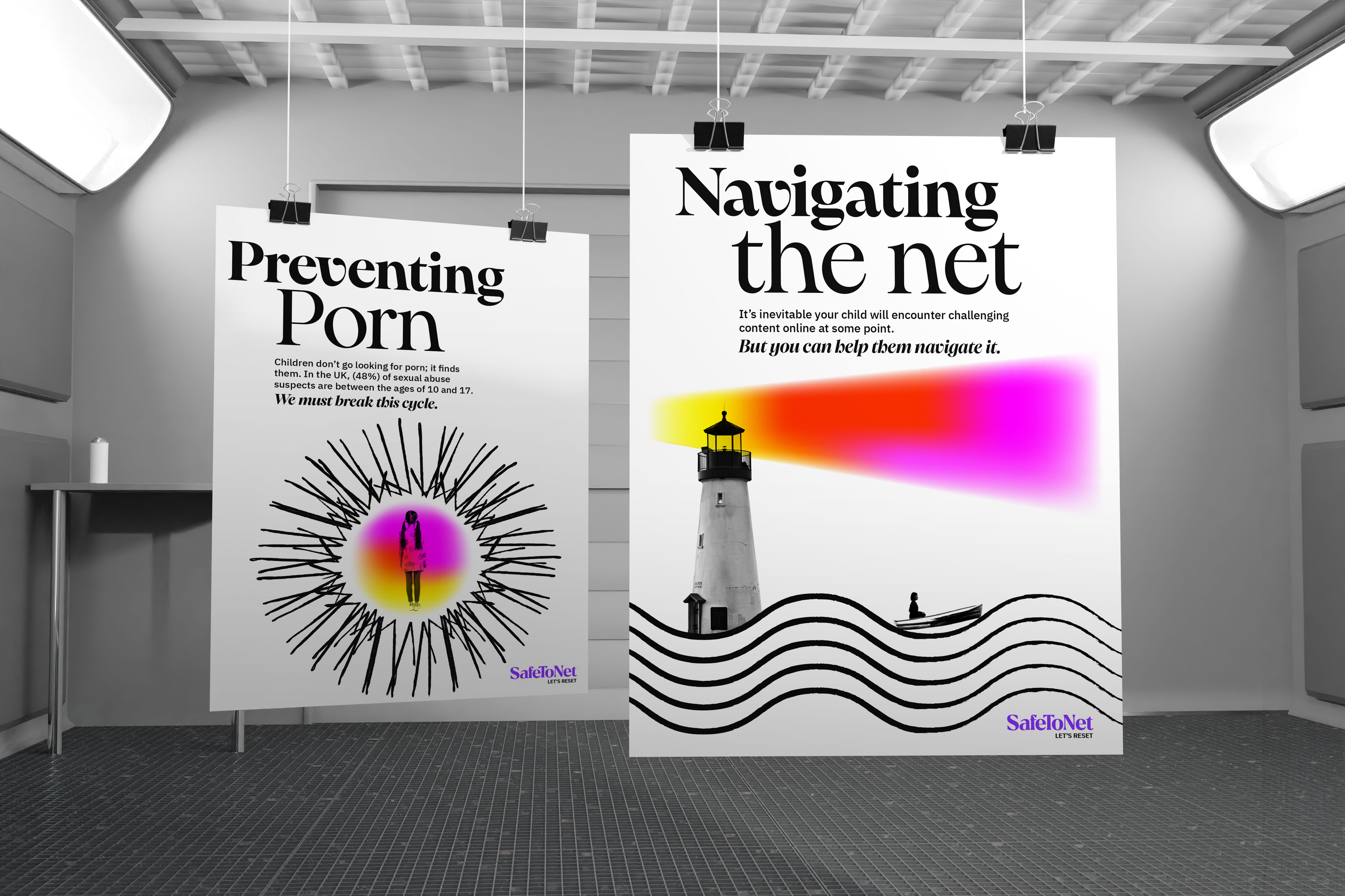
1. Protect – The development of the product brand HarmB/ock, the algorithm that enables patented camera-blocking code embedded into the operating systems of any device – a powerful proof of SafeToNet’s ability to stop the creation, distribution, and consumption of harmful content.
2. Liberate – Healthy Phone: minimal devices for those seeking freedom from addictive technology.
3. Educate – Sharing accurate, research-based knowledge to foster debate and inform global governments, communities, and individuals. Empowering people to make informed choices.
The Opportunity
Online safety requires clear boundaries – but it must also enable the limitless potential of humanity. SafeToNet needed to reflect this in the brand world and the assets we created.
How do you create a brand in a sector dominated by doom and gloom – and instead, turn the narrative on its head? We spotted the opportunity to send a positive message, offering solutions, support, and hope – encouraging people to feel involved and engaged. This could be achieved through changing the perception of the brand and not being defined by a category focus on security and tech first and human beings second. Putting humanity in the branding and by expressing the end emotional benefit for the consumer. Working backwards developing the necessary paradigm shift from product benefit to emotional benefit to create the maximum impact to create change.
Creative Thinking
The brand was built around the idea of humans and technology in partnership, working hand-in-hand to create a positive and optimistic future. Through a co-creative brand definition session with the SafeToNet team, we shaped a visual and verbal direction that became the foundation of the creative brief. We developed creative territories and visual concepts — each of which resonated differently with the core strategy.
Feedback was critical: after 10 years with the existing brand, change can feel daunting. The default is often to play it safe. But we didn’t. The client was brave. Taking the internal team with us, showing them where they needed to go visually to support their ultimate vision and creating a brand that has growing room. Being brave is often comfortable for clients, but sometimes a significant leap is needed to make the vision a reality. That’s why you’ll see that the before-and-after transformation is radical — and the assets we have built are being used to engage stakeholders.
The Design Solution
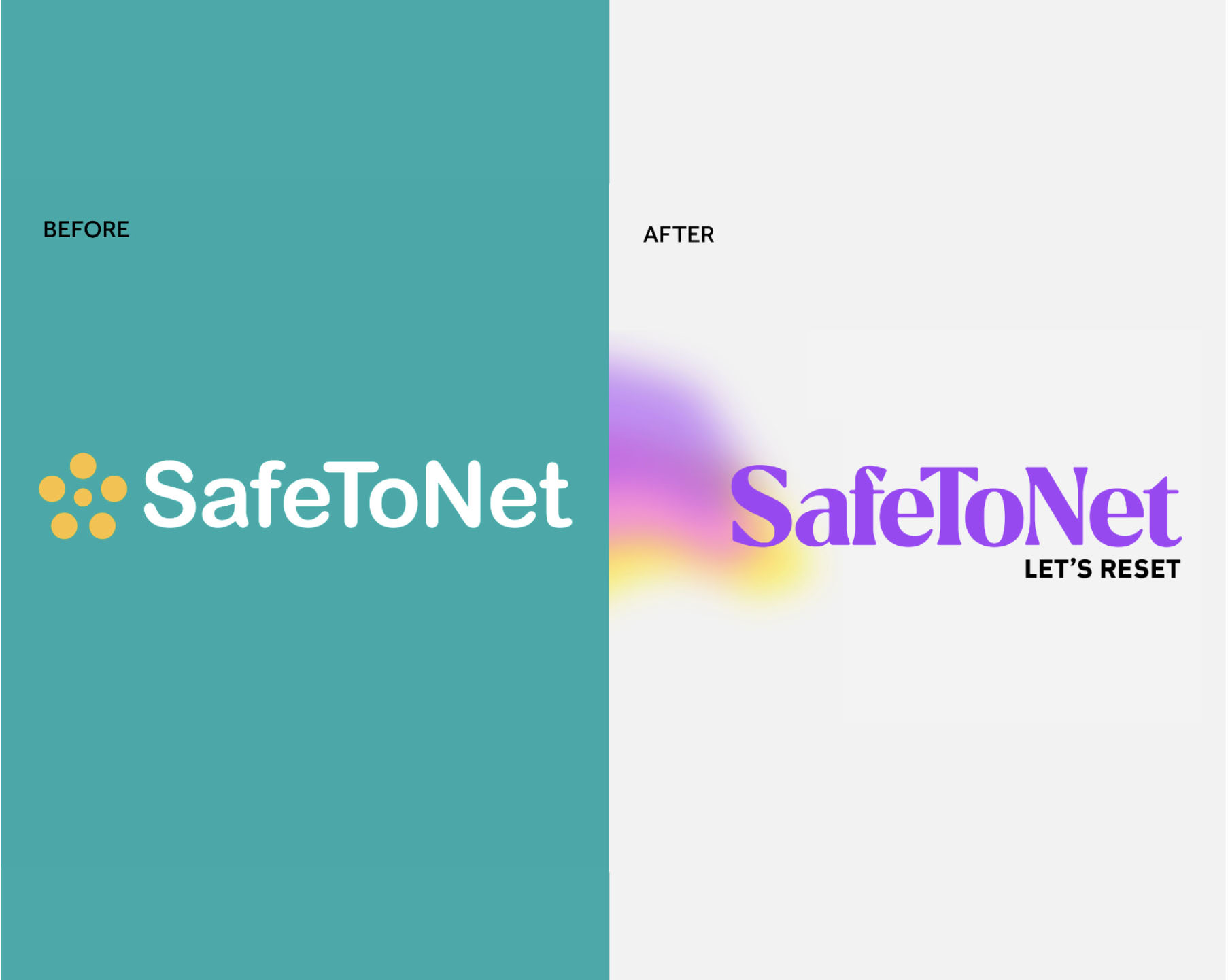
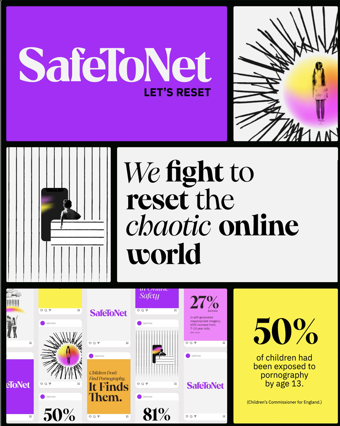
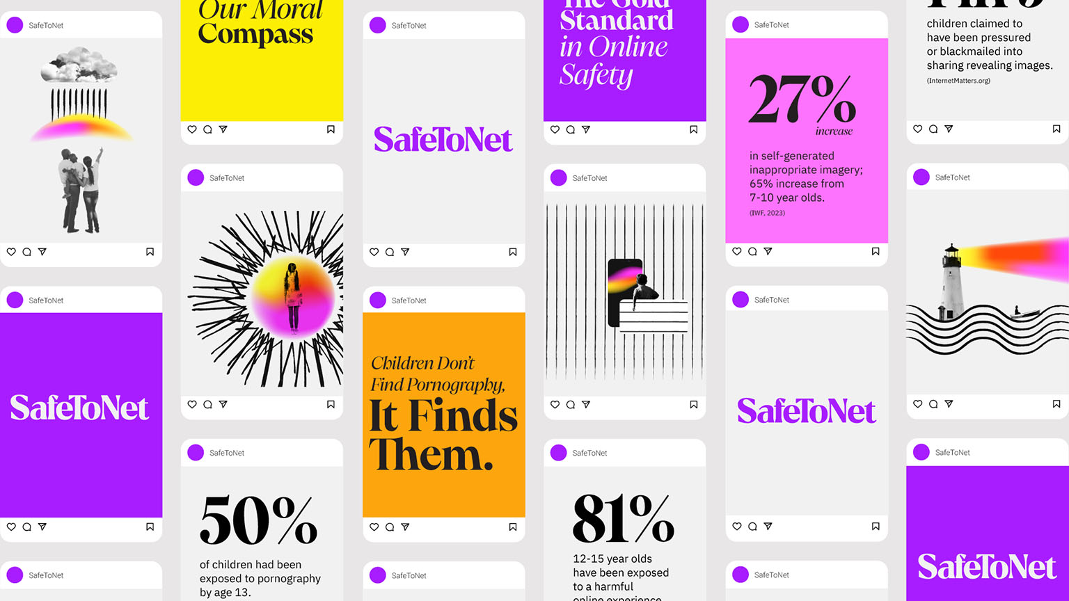
We transformed the brand mark into a confident, punchy, and personable logotype. With a more human, editorial and knowledgeable feel, keeping the uniqueness of “SafeToNet” as a single word.
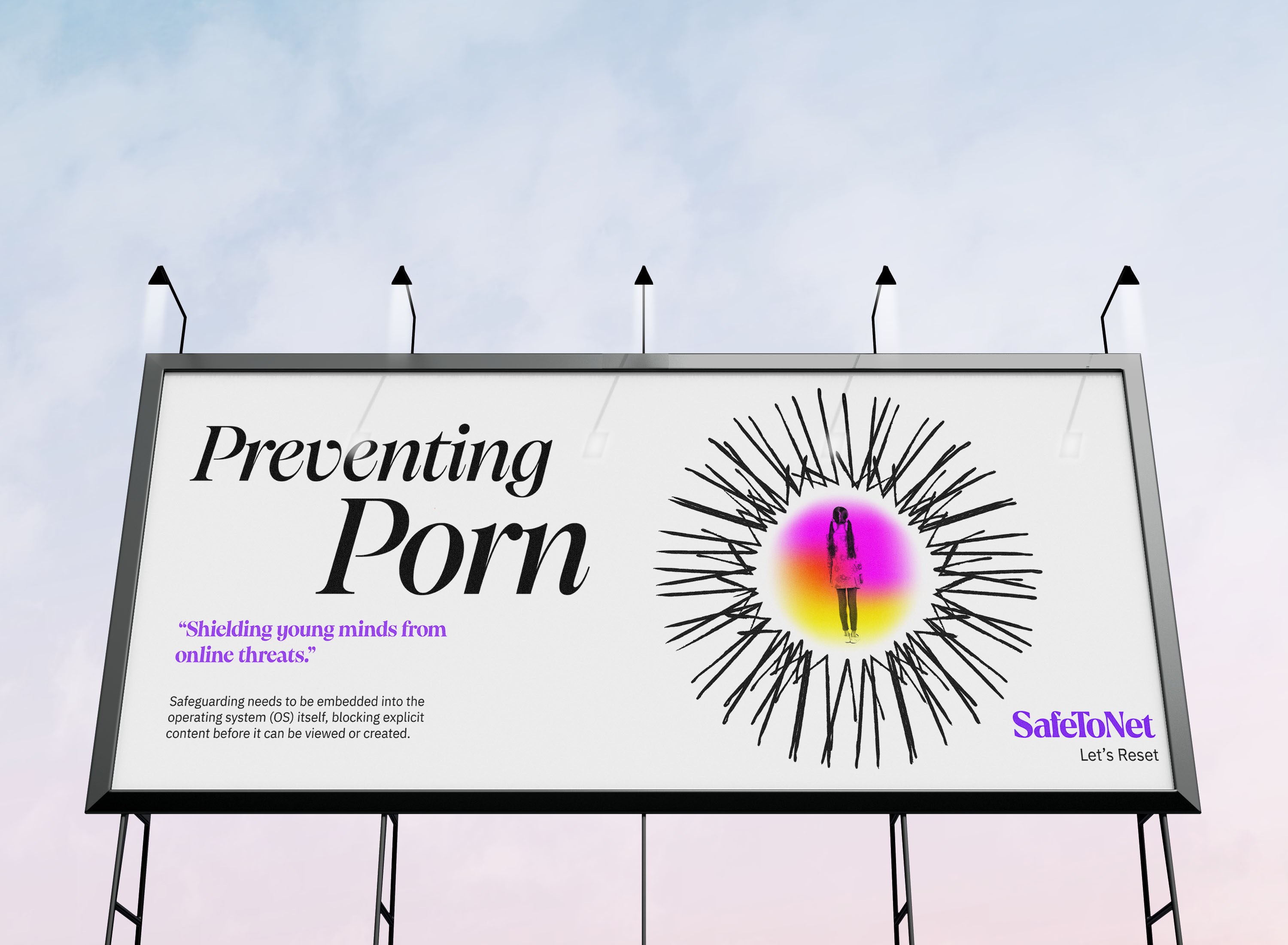
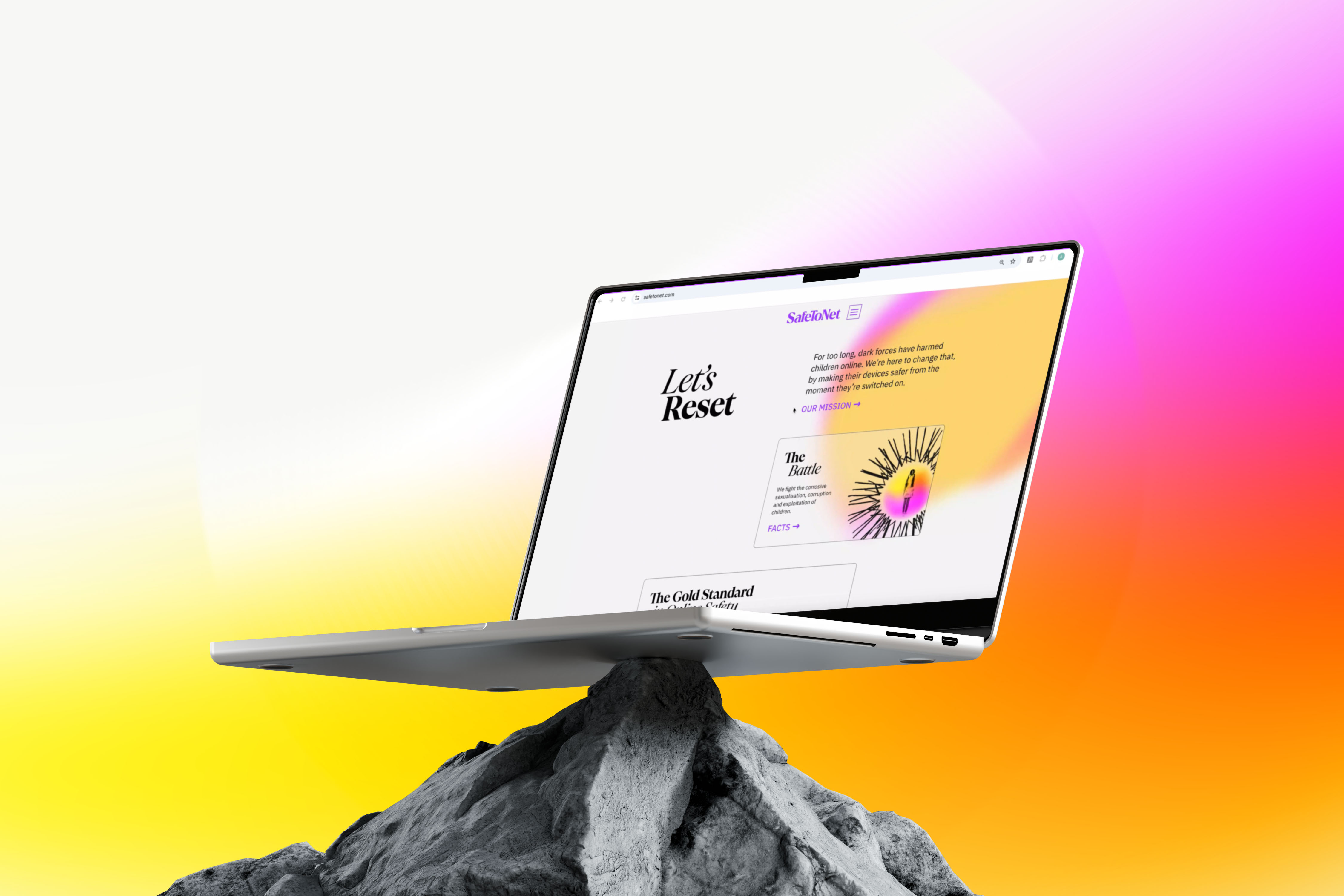
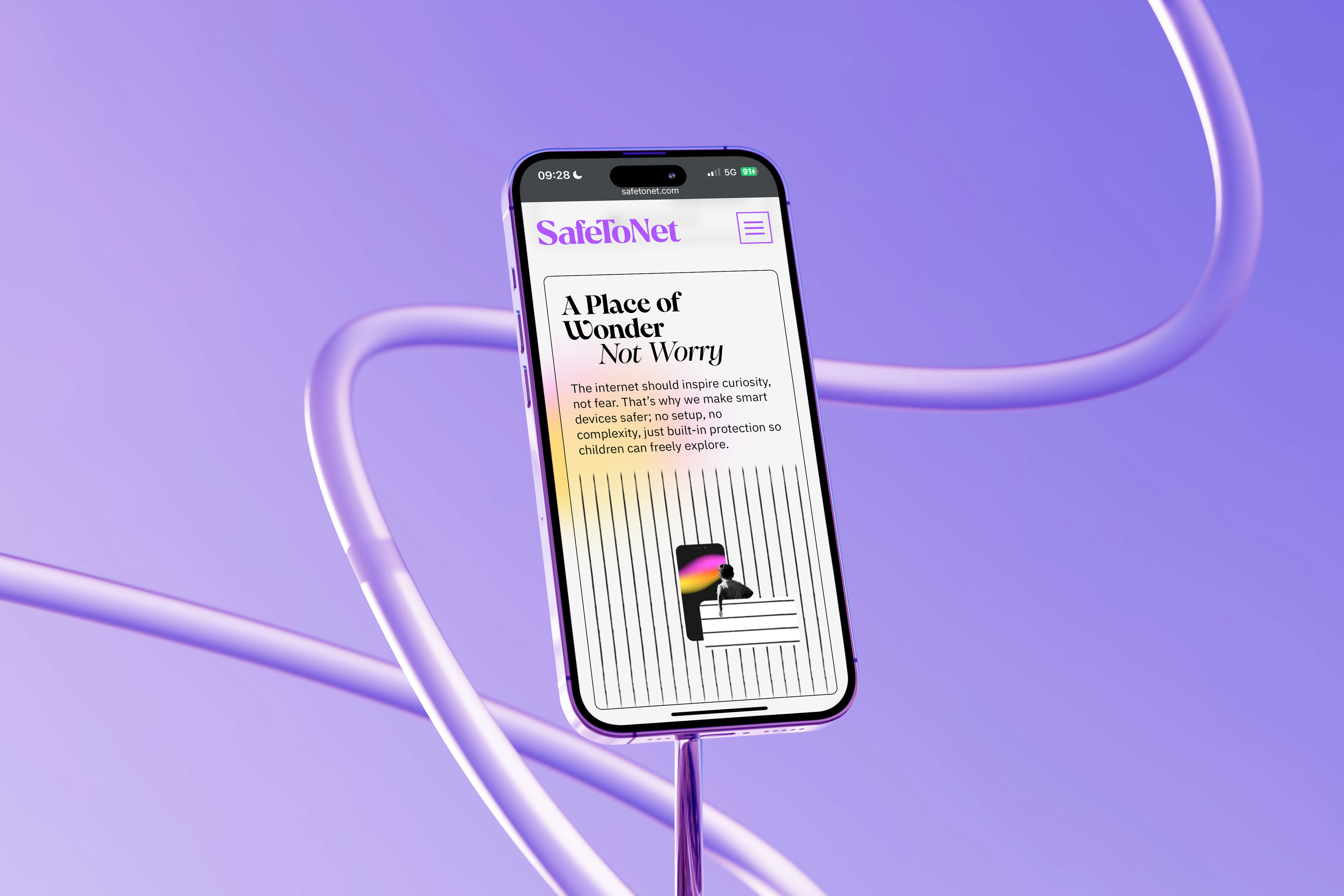
The emanating aura in the visual design system symbolises each new day — a dawn of limitless possibilities. Safe ToNet is a reset of the online world.
Brand Assets – We created a flexible visual system to bring clarity and warmth to sensitive, complex subjects:
Typography – The editorial-style typeface speaks to Safe ToNet’s established credibility in government and NGO spaces — while remaining fresh and relevant. It retains the brand’s uniqueness and integrity while stepping confidently into the future.
Colour – Purple is the core master brand colour — calm yet vibrant, striking the balance between safety and energy. Use of white in the brand gives breathing space, a sense of calming the chaos, while vibrant secondary colours pop to add dynamism, energy, and optimism.
The SafeToNet Aura evokes sunrise — symbolising freedom, clarity, and the ongoing presence of protection.
Key visuals – Each visual needed to be conceptually strong to convey the core message clearly and thoughtfully, serious but with optimism.Gone are the sector’s typical grim and fear-inducing visuals. Instead, we use black and white imagery with metaphorical and stylised content, layered with line illustrations and the Safe ToNet Aura to bring a hopeful tone to even the most difficult topics.
Impact – This rebrand allowed the product brand to shine and was a springboard to launch solutions to deliver the vision. We were able to change the industry conventions with a tone of optimism and action, not fear. Not only that, the SafeToNet brand raised investment and engaged global partnerships. The long-term social impact of resetting the internet will be measured over the coming year.
Client Quote
“Creating the SafeToNet and HarmBlock brand was a journey, and we couldn’t have done it without Helen, Anna and the team. They went beyond the typical client-agency relationship, becoming true partners who poured everything into this project.”
Lara Chapple, CMO, SafeToNet
CREDIT
- Agency/Creative: Helen Hartley Consulting
- Article Title: Helen Hartley Consulting Builds a Future-Facing Identity for SafeToNet’s HarmBlock Technology
- Organisation/Entity: Agency
- Project Type: Identity
- Project Status: Published
- Agency/Creative Country: United Kingdom
- Agency/Creative City: Leeds
- Market Region: Global
- Project Deliverables: Brand Architecture, Brand Creation, Brand Design, Brand Guidelines, Brand Identity, Brand Mark, Brand Redesign, Brand World, Graphic Design, Logo Design, Motion Graphics
- Industry: Technology
- Keywords: safeguarding, brand refresh, tech for good, disrupting the status quo, cyber security, brand revolution,
-
Credits:
Creative Director: Helen Hartley
CMO SafeToNet: Lara Chapple
Digital Director: Anna Wancyzk
Web developer and build: Anthony Jocelyn


