Milk Brand Agency – Up&Go Blends
Context
UP&GO wanted to introduce a new product aimed at the adult market. A healthier, premium liquid breakfast made with real ingredients that talked to the anti-sugar trends – something that had never really existed before.
Our brief was to design this new brand, positioning it as a healthy breakfast option without denigrating the core UP&GO range.
Approach
We treated the new drink like a premium smoothie – a natural liquid breakfast.
Execution
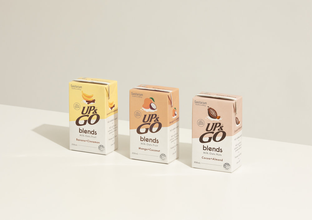
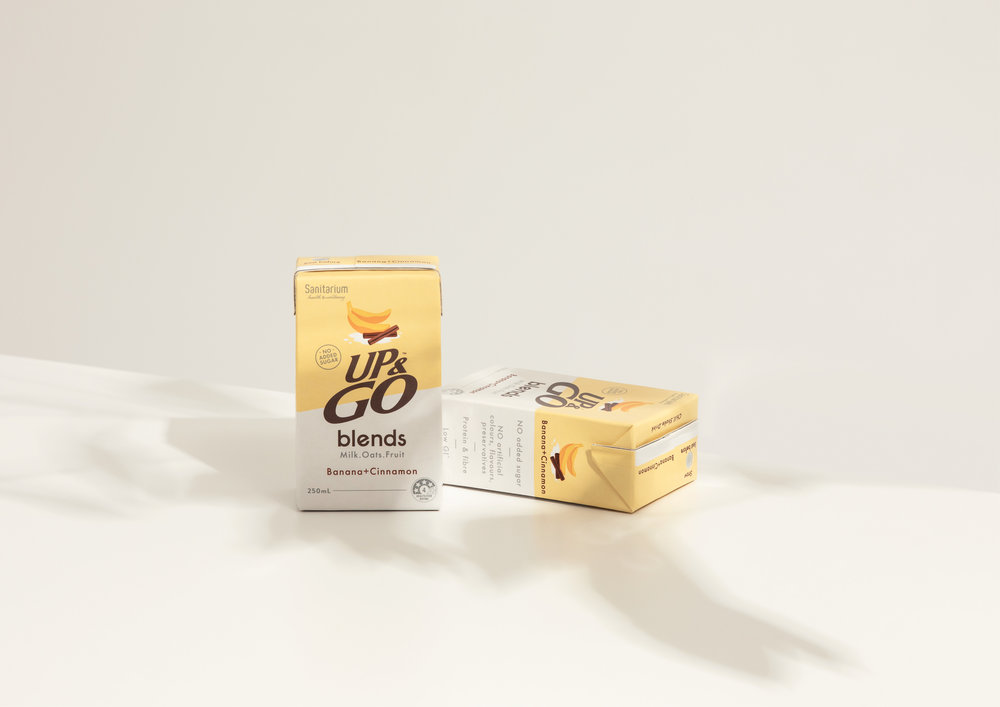
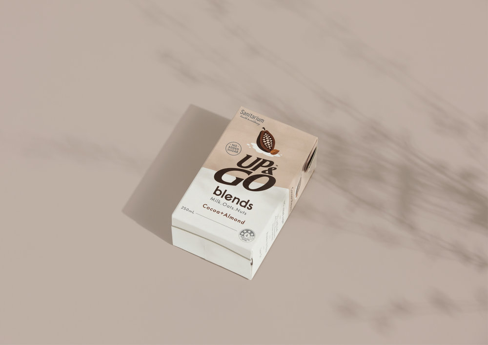
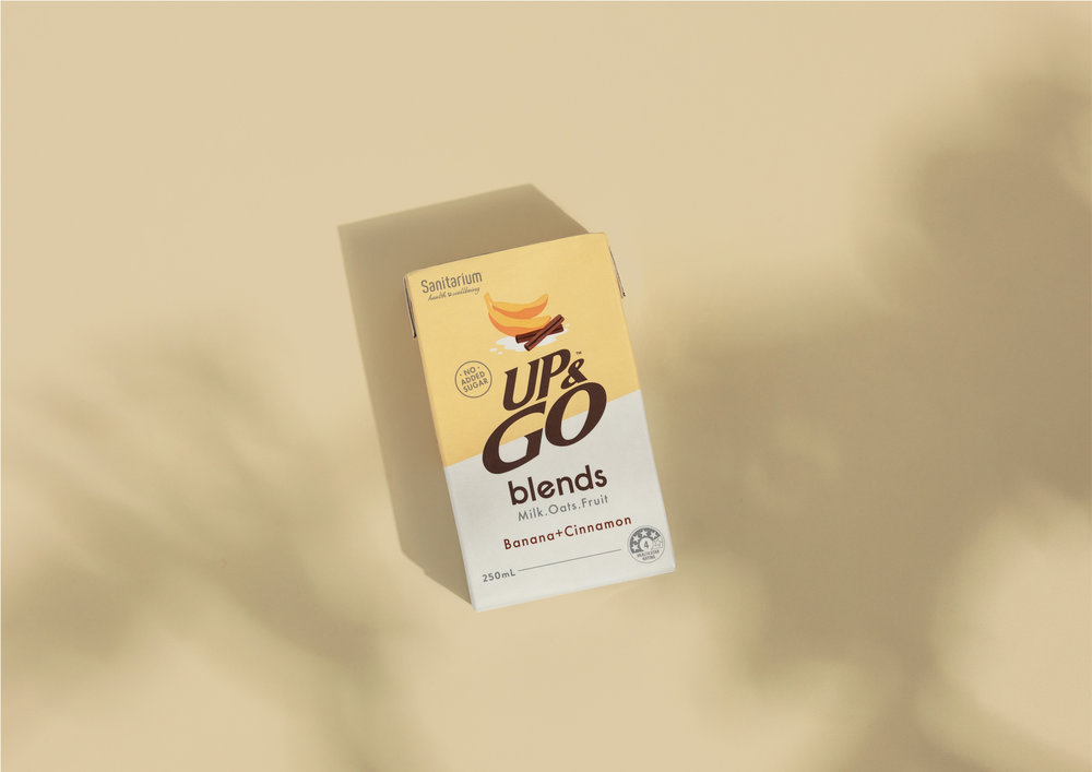
We called the new product UP& GO Blends – an honest name that reflected the sophisticated new flavour combinations such as Banana & Cinnamon and Cocoa & Almond.
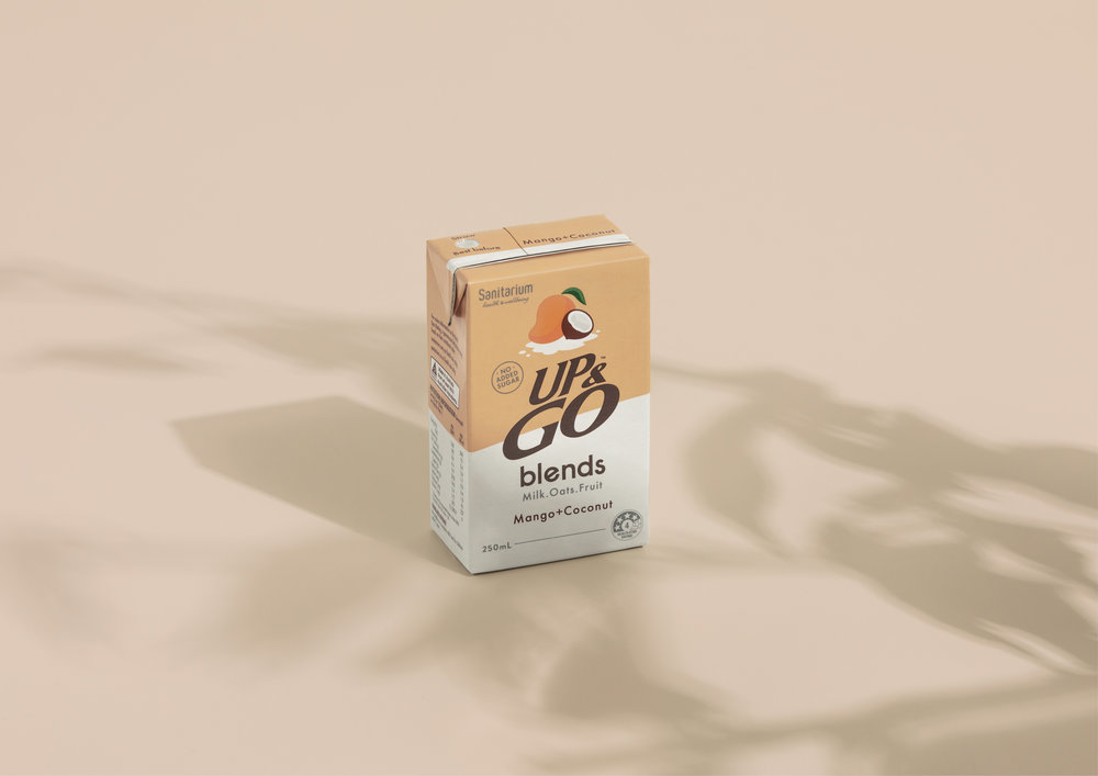
The packaging also reflected the premium nature of the drink, without shouting:
– Confident, simple design to convey natural ingredients
– A subtle, ‘scientific’ feel – pale grey typography on a clean white background
– Naïve typeface to convey a sense of honesty
– Logo reduced to base typeface for a more contemporary, less mainstream impression
– Earthy, natural colour palette
– The diagonal line dividing the pack talks to the blend of natural ingredients and milk, and also gives a slightly medicinal feel
– Brand block colour for shelf standout
– Clean and simple design – a sense of calm amid a loud and cluttered environment
In short, a sophisticated, restrained and premium solution that conveys a new generation of UP&GO.

CREDIT
- Agency/Creative: Milk Brand Agency
- Article Title: Healthy Breakfast “Up&Go” Blends Range Packaging Design
- Organisation/Entity: Agency Commercial, Published
- Project Type: Packaging
- Agency/Creative Country: New Zealand
- Market Region: Multiple Regions
- Format: Box
- Substrate: Plastic


