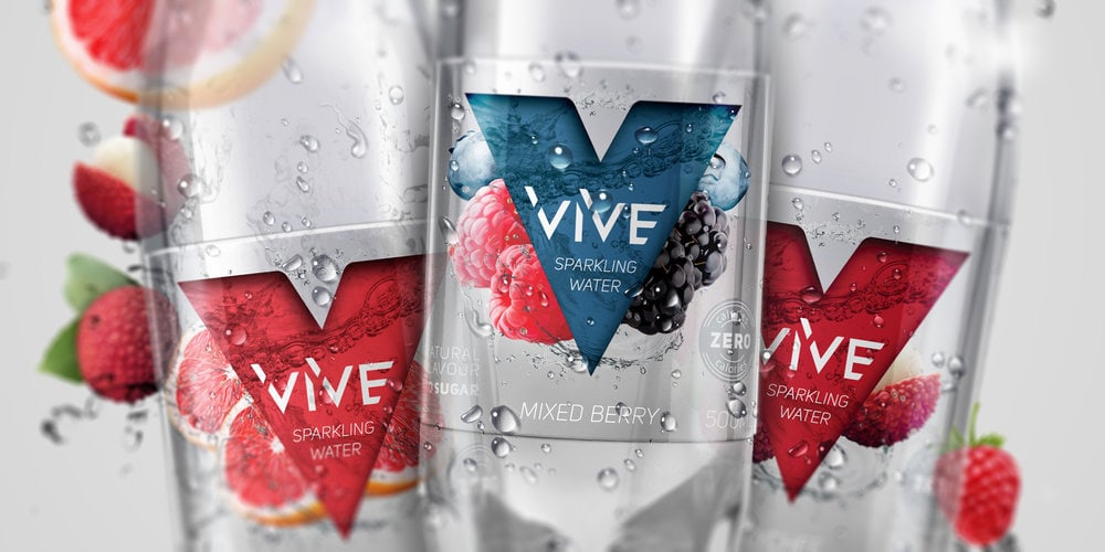
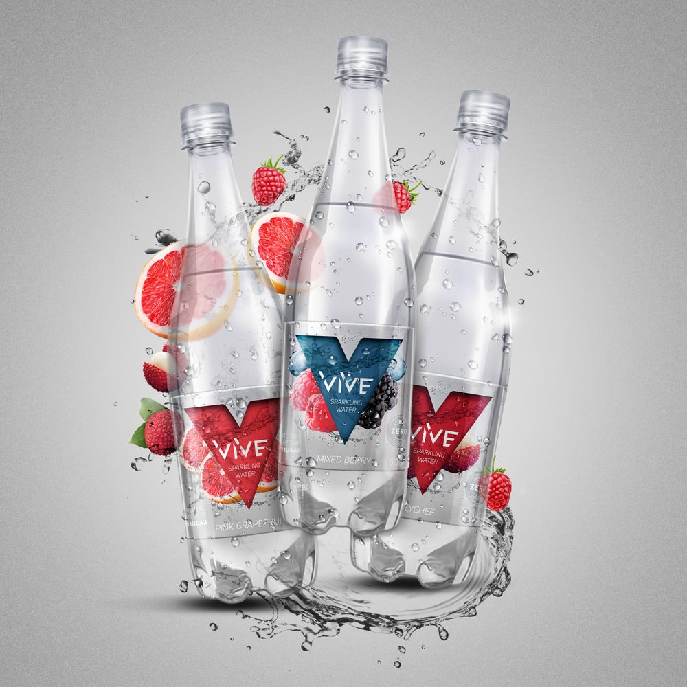
” Developed for All4Water from Alberta, CANADA, the logo redesign and labels for the VIVE Sparkling Water line were realized in view of a modern look and highlight the product on the shelves of the POS.
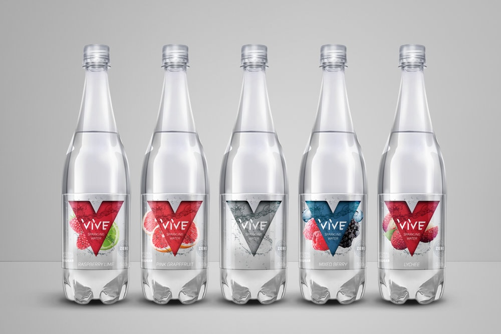
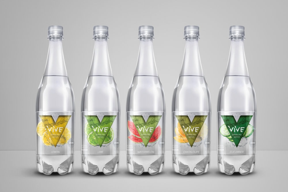
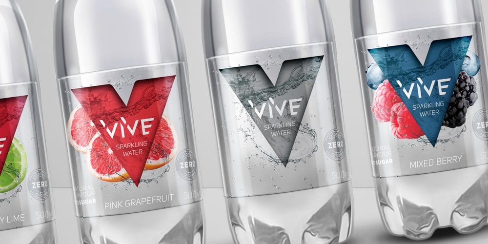
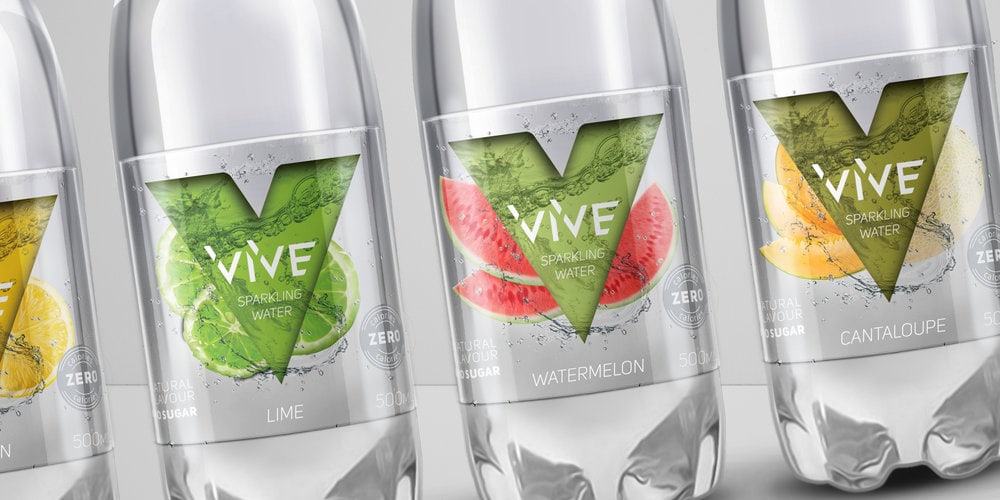
For that, the initial V was used as a symbol. Strong and remarkable, it helps to capture the consumer’s attention to the product, while helping to make clear the flavor variations.
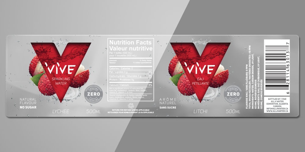
The image of the fruit gives the sensation of being immersed in the water due to the transparency in the label, that allows the visualization of the product that will be consumed.
The label also provides information in two languages, French and English, both widely used in the country.
The result of the project is a modern and attractive positioning in the eyes of the consumer, conveying quality and adding value to the product.”
CREDIT
- Agency/Creative: HeadMade Design & Co.
- Article Title: HeadMade Design & Co. – VIVE Sparkling Water
- Project Type: Packaging
- Format: Bottle
- Substrate: Plastic


