


Starting from a passion for cosmetics and improving people’s beauty, while increasing the value of life for the community, Ms. Diep Huyen – Founder of HBY has always wondered about her core mission and what she aims for is the improvement from within people, health, and things that come from nature. Carrying a mission, Huyen went to Tree to rebuild her pharmaceutical brand with a project called “Tam Phuc” accompanied by a familiar appearance of meaningful images of humans.
Challenges
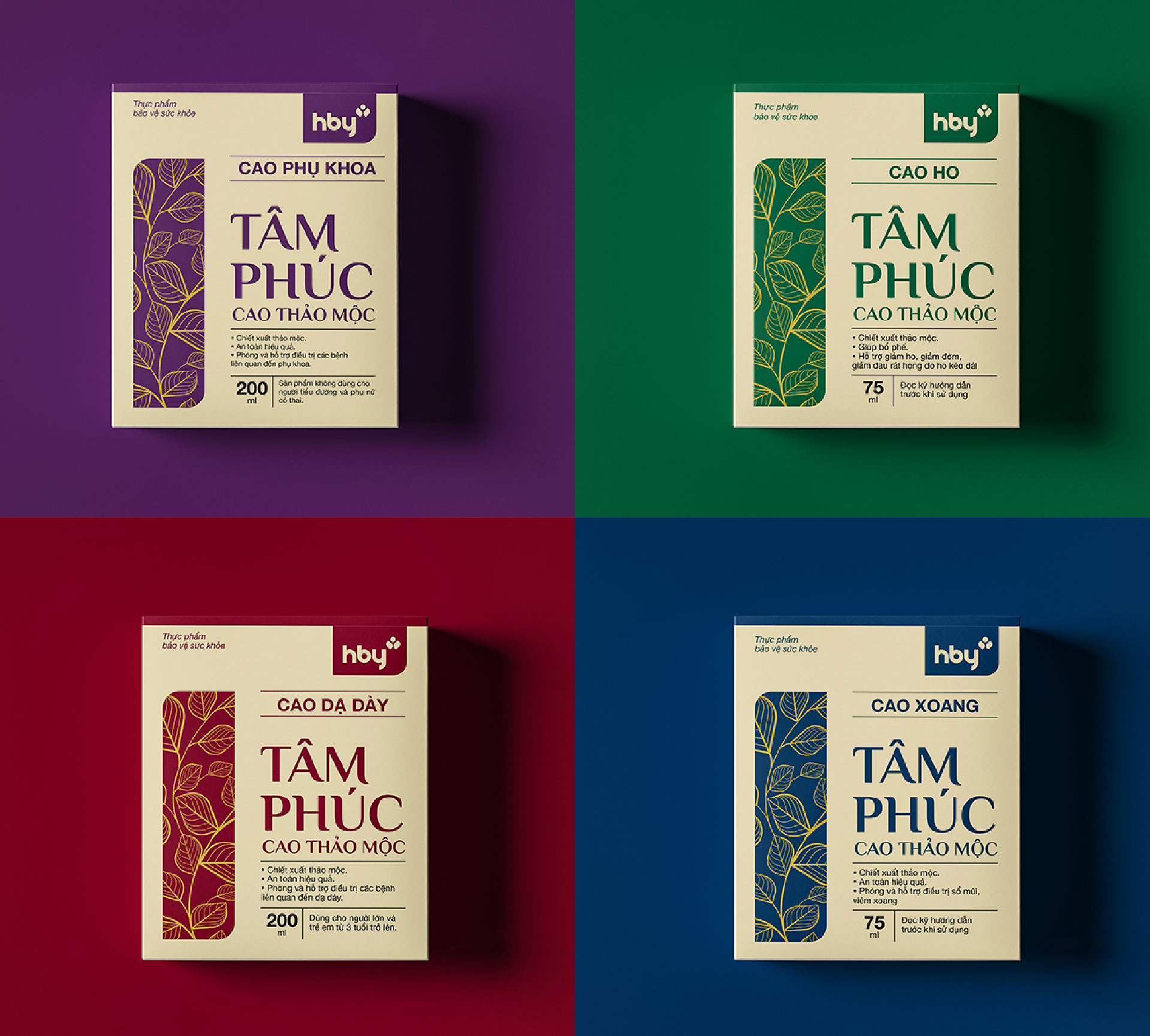
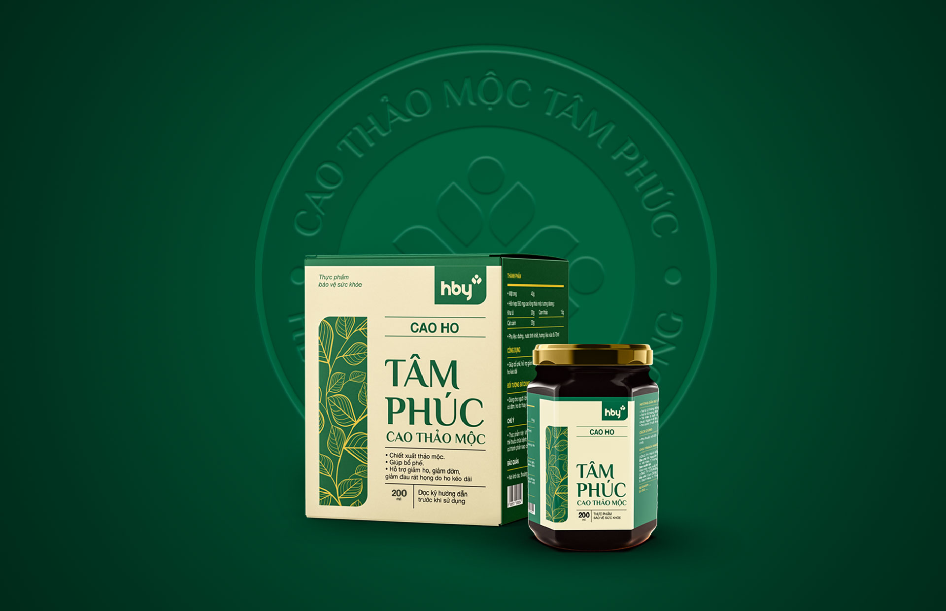
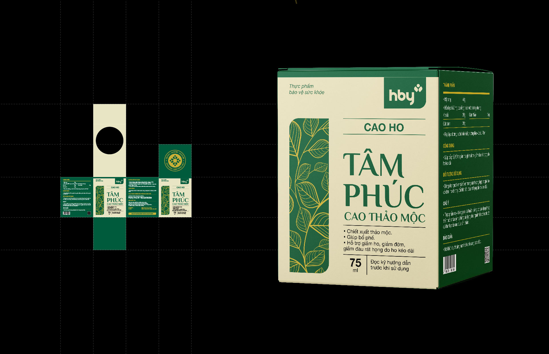
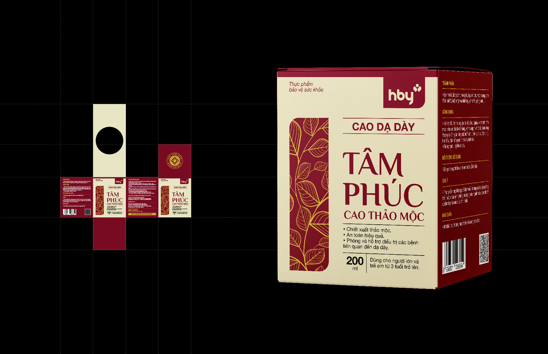
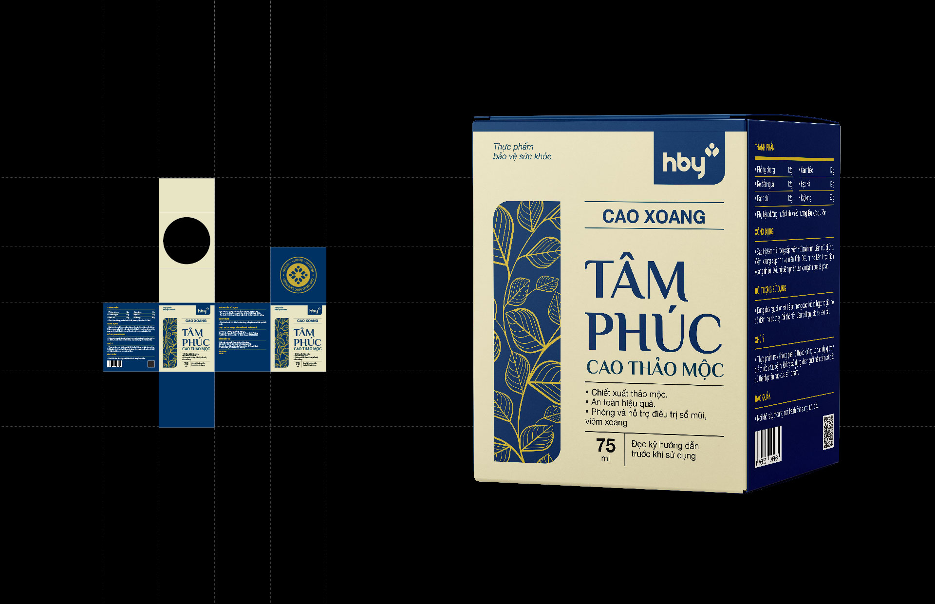
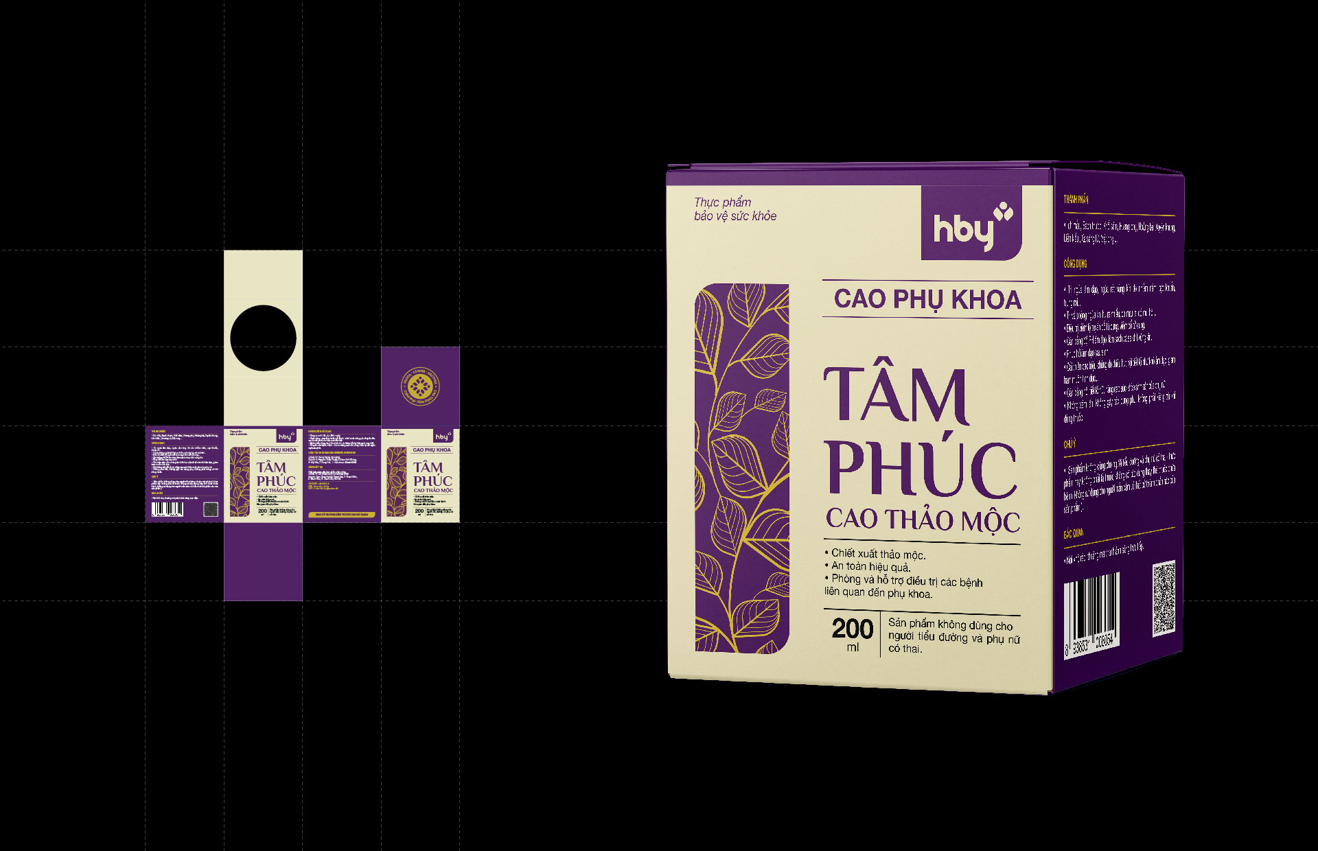
Operating in the medical industry, the HBY pharmaceutical brand uses completely natural ingredients and mainly supports user health improvement. The identity image needs to show imagery that shares a closeness to nature and isn’t too heavy on the illness aspects of the industry.
Solutions
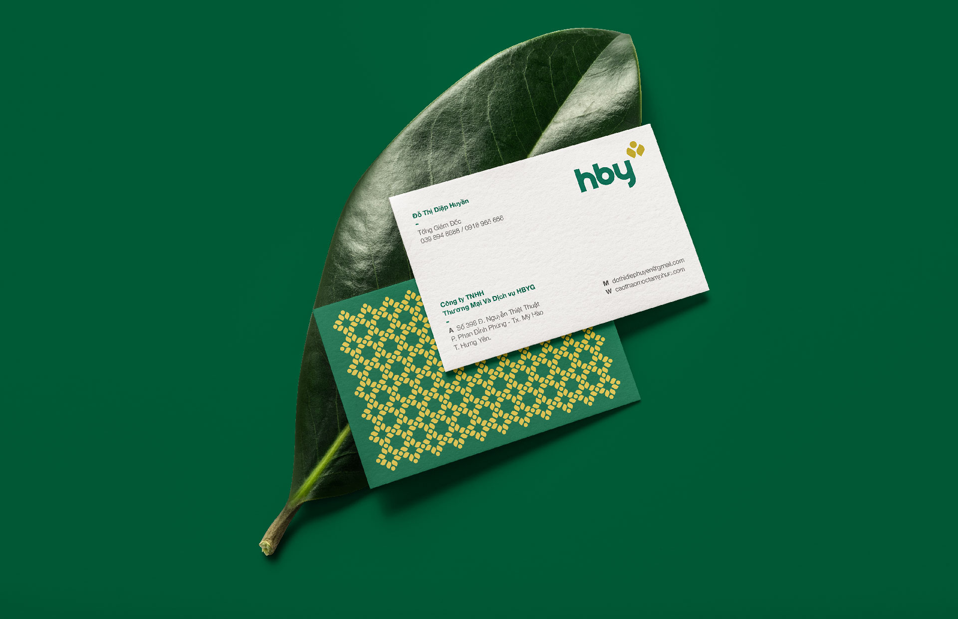
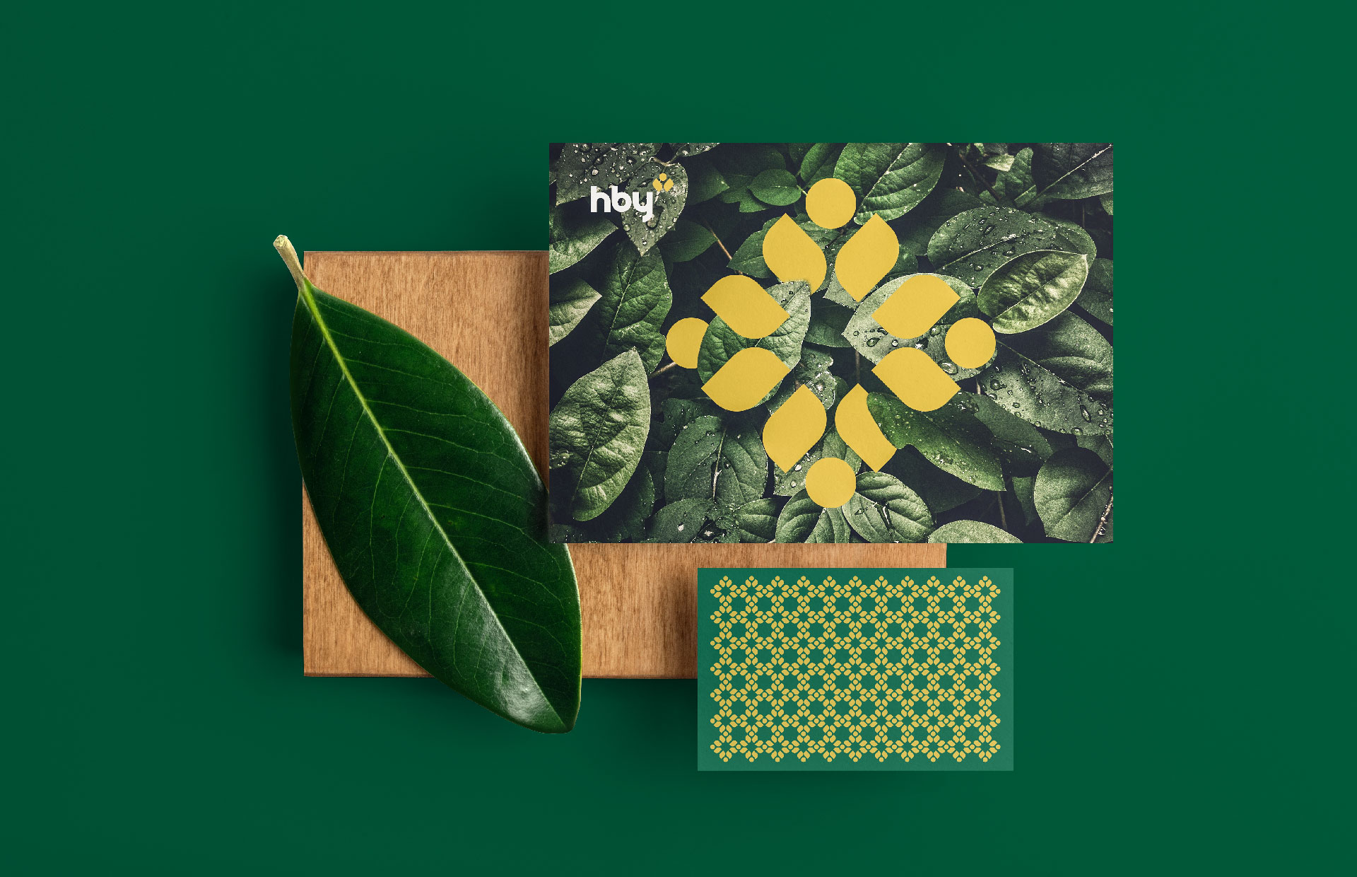
A strong source of inspiration for Tree came from the brand story, which shows the value of human life by focusing on and protecting health. Impressed with a set of products extracted entirely from nature, Tree has included the image of a “leaf” in the logo to promote the brand’s humanitarian nature and affirm the quality of the product. Tree chose “leaf” instead of other symbols because of its high recognizability when it comes to visual contact. At the same time, it can contain many different meanings. The image of two “leaves” symbolizes the proliferation of life, the values created from the roots, and the brand’s mission to care for human health. On the other hand, the logo with two leaves forms a humanoid symbol, representing all of Hby’s customers in a state of stretching when accepting the values that the brand brings. Heading toward a life full of happiness.
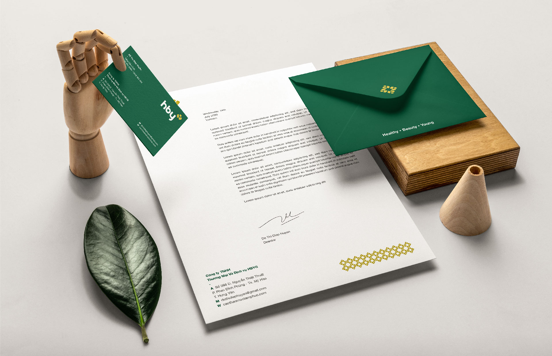
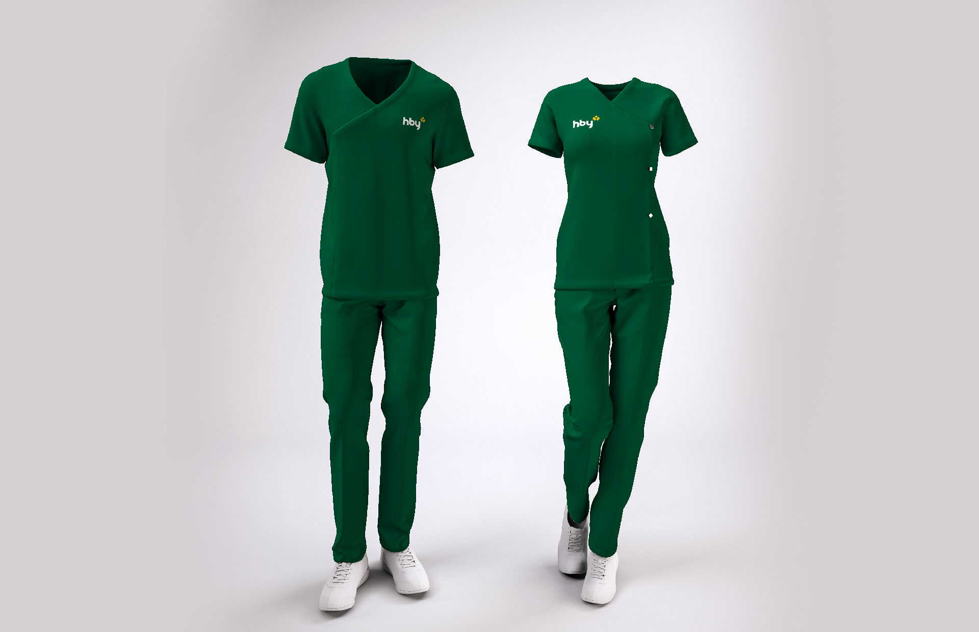
When it comes to nature, people always think of the green color of new leaves. This is also the primary color used in the brand identity.
Results
The special packaging system in the product chain of the “Tam Phuc” project is the success seen in this cooperation between Tree and HBY. With the identity imagery, the brand can easily develop many different products, increasing both synchronization and creating a mark within the media in each project.
CREDIT
- Agency/Creative: Tree Creative Agency
- Article Title: HBY Brand Design By Tree Creative
- Organisation/Entity: Agency
- Project Type: Identity
- Project Status: Published
- Agency/Creative Country: Vietnam
- Agency/Creative City: Hanoi
- Market Region: Asia
- Project Deliverables: 2D Design, Brand Design
- Industry: Health Care
- Keywords: Health Care, Pharma
-
Credits:
Agency: Tree Creative


