Lee Haze contacted me while he was in the process of finalising his UK Athletics coaching qualifications. He was about to embark on his first venture into self-employment, and was in need of a logo and visual branding to set his London-based business apart. Lee specialises in the coaching of long-distance track and cross-country running, and while there were many existing running coaches in and around London, Lee trusted me to craft an identity that would reinforce the quality and professionalism he’d bring to market.
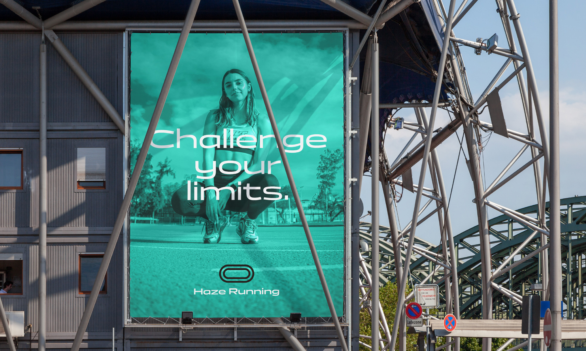
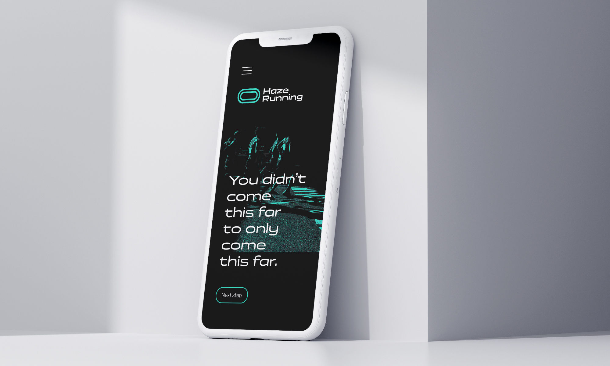
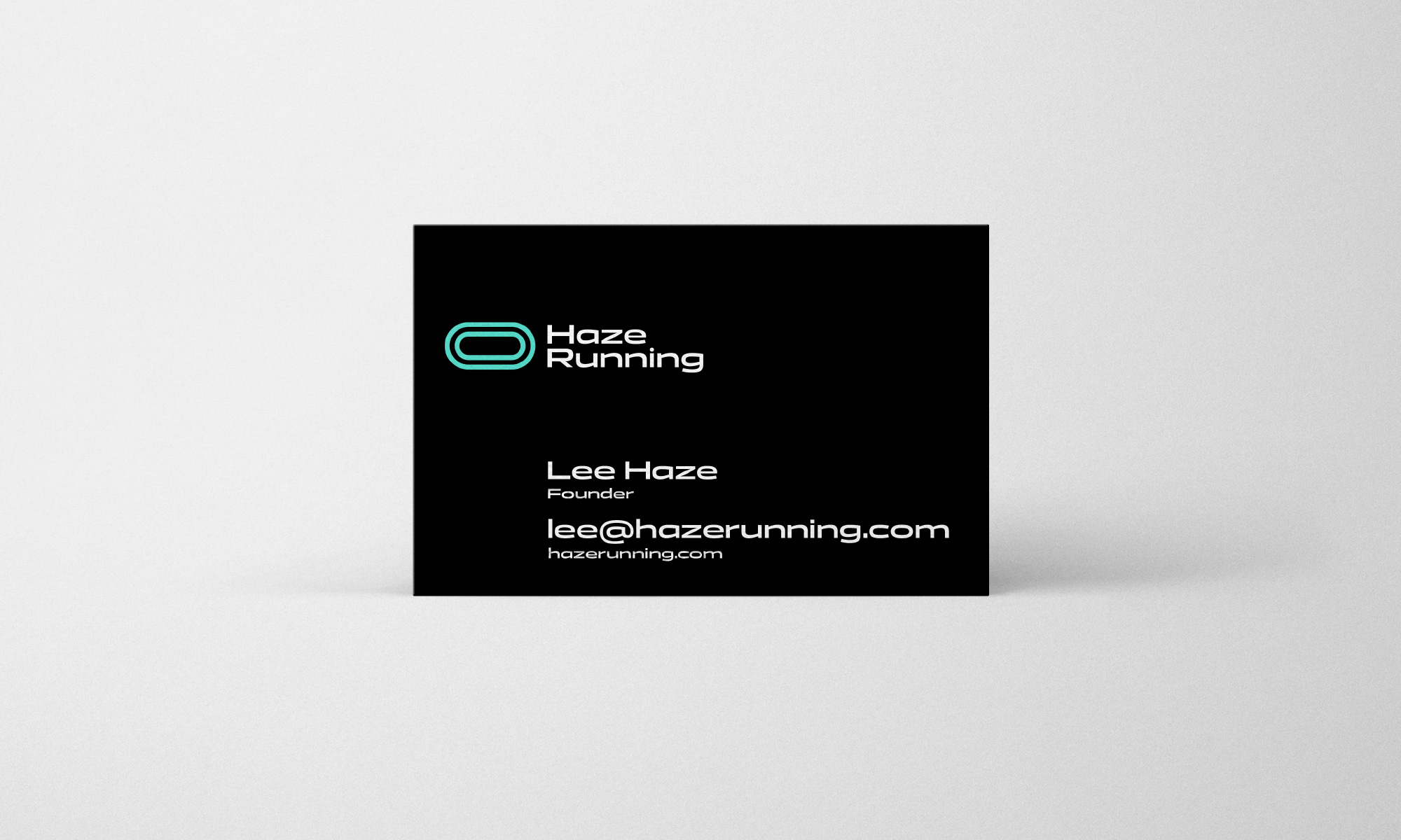
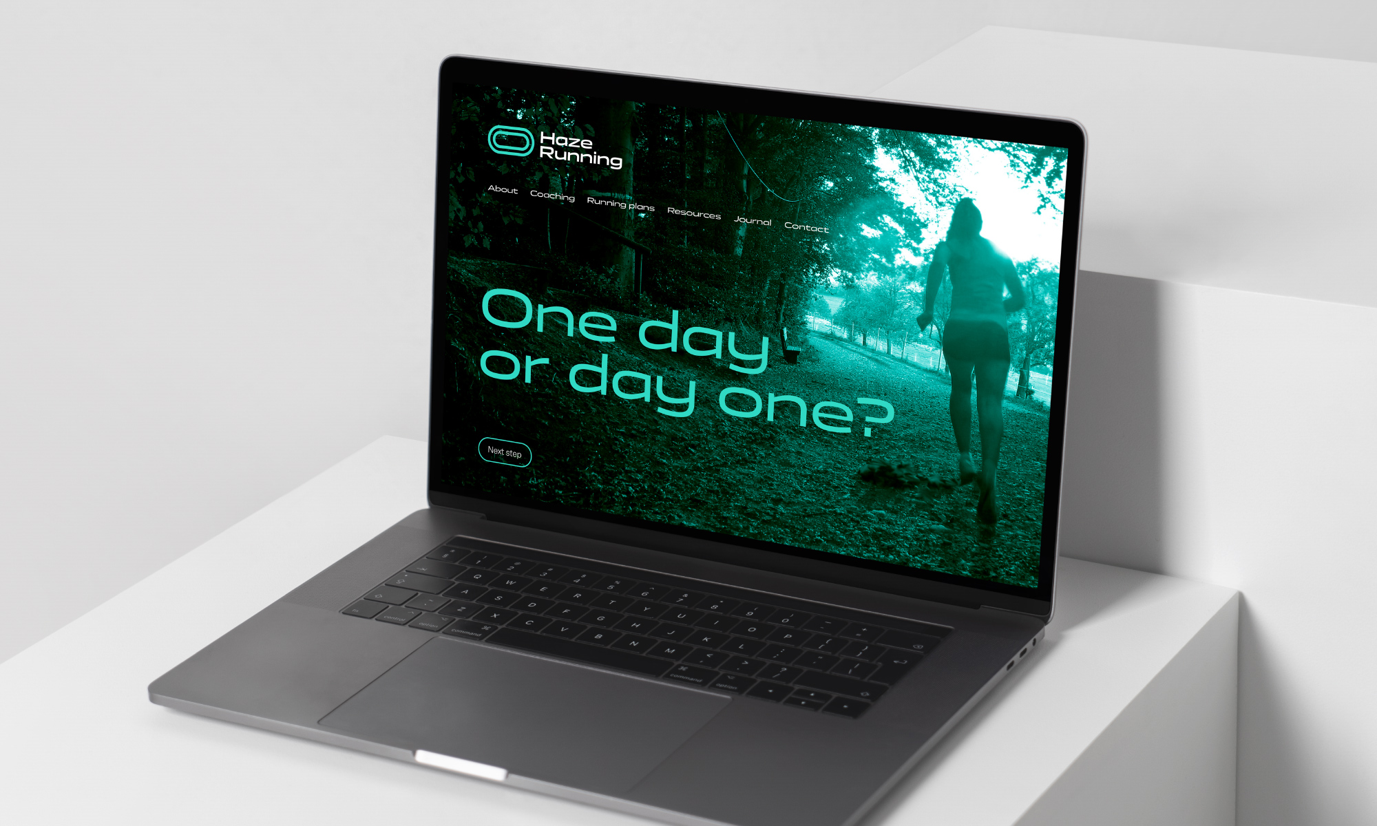
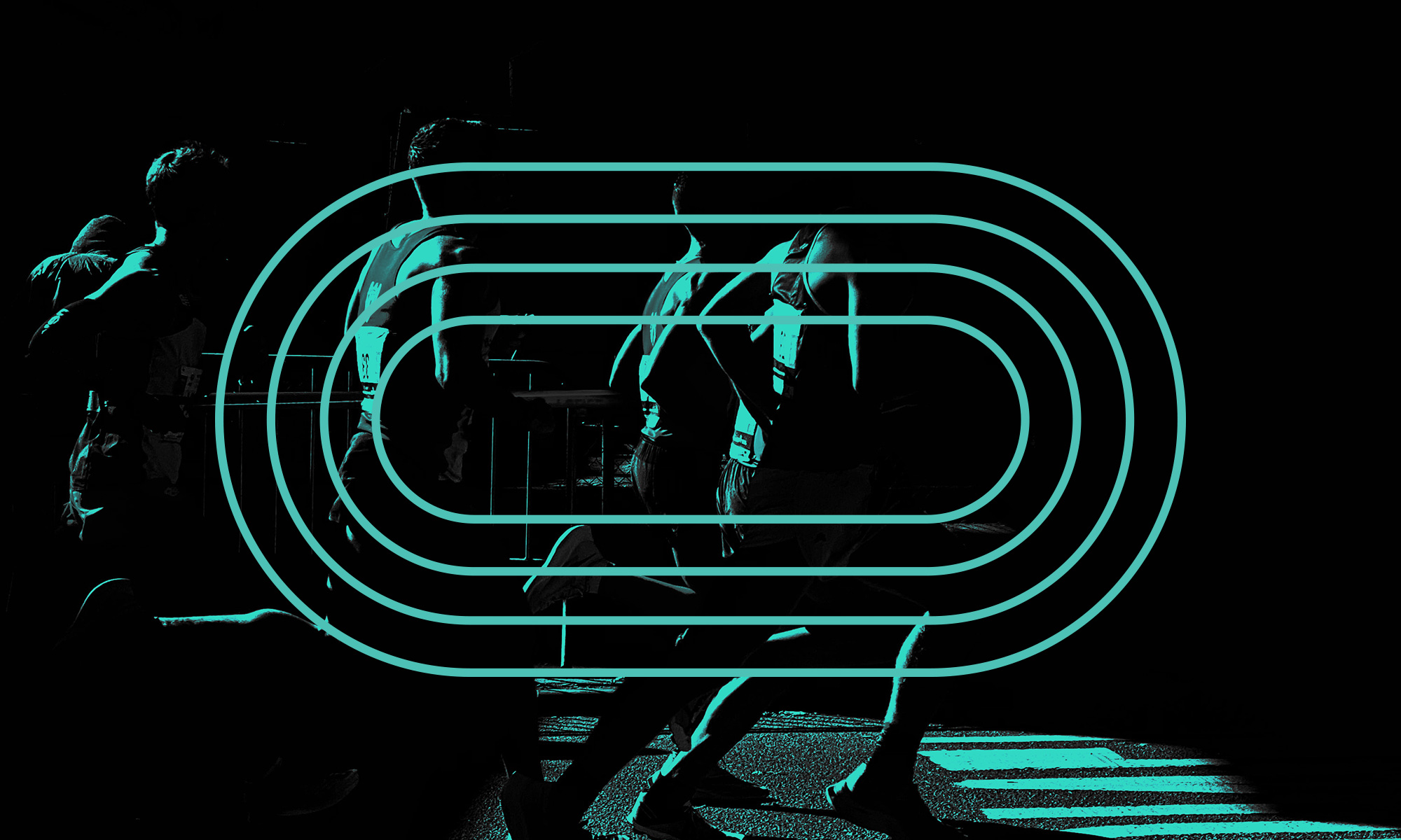
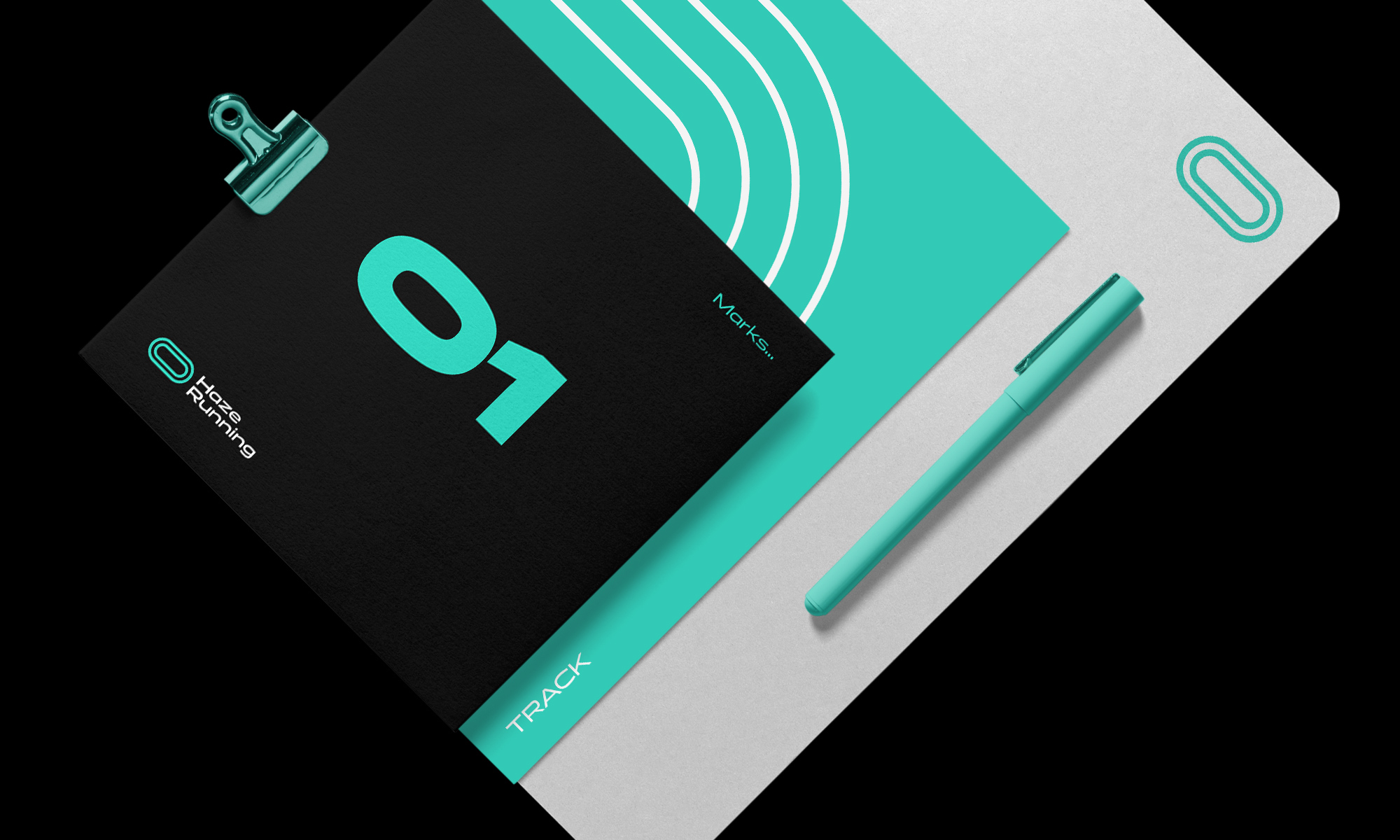
After the research and creative strategy phases of my design process, many ideas were sketched for consideration, with simplicity, relevance, and distinction always being key attributes in logo design. The resulting symbol replicates the outline of a 400 metre running track, with an additional internal ring to represent the relationship between coach and student, as if Lee was standing on the side-lines monitoring his student’s progression. The design was paired with a bespoke wordmark with broad characters to hint at stretch and flow, rather than tightness and constriction.
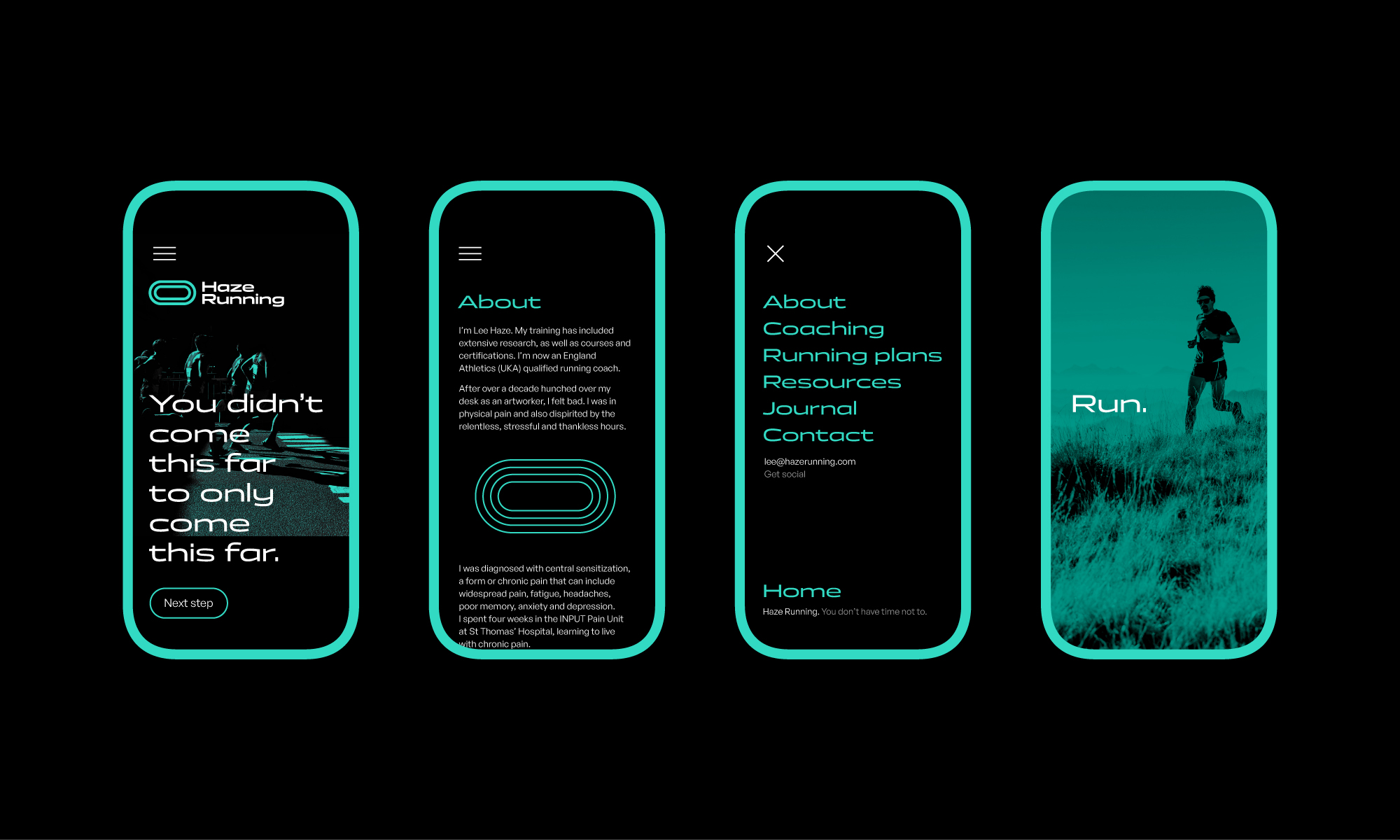
For colour, a distinctive green helps separate Lee’s brand from competitors in the coaching sector who predominantly use reds and blues.
A brand gallery was sourced as part of the deliverables. In order to bring various marketing elements together a green colour mask was applied to the relevant photography, adding cohesion, visual interest, and memorability.
Identity guidelines were delivered to help Lee keep a consistent but fresh visual identity as his business grows.


CREDIT
- Agency/Creative: David Airey
- Article Title: Haze Running Coaching Branding Created by David Airey
- Organisation/Entity: Freelance
- Project Type: Identity
- Project Status: Published
- Agency/Creative Country: United Kingdom
- Agency/Creative City: Bangor
- Market Region: Europe
- Project Deliverables: Art Direction, Brand Identity, Copywriting, Logo Design
- Industry: Health Care
- Keywords: logo, identity
-
Credits:
Designer: David Airey


