


I am thrilled to unveil my latest brand identity system for Lemon Berry, a premium chocolate brand that crafts deliciously unique truffles, blending refreshing lemon and berry flavors with rich, velvety chocolate. This project has been a journey through color, taste, storytelling, and emotion — merging visual communication with sensory indulgence.
Lemon Berry stands out not only for its distinct flavor combinations but also for the joyful experience it offers to chocolate lovers. The brand has built a reputation for its vibrant, indulgent treats that deliver a perfect balance of sweet and tangy. Each truffle is handcrafted with love, making every bite a memorable one. These are not just chocolates; they are tiny moments of happiness wrapped in playful elegance.
The Challenge
In today’s saturated market of confectionery and sweets, many brands lean into sterile minimalism or ride the wave of AI-generated visual trends. But with Lemon Berry, we wanted to break that pattern. The challenge was to build an identity that could rise above templated aesthetics and become genuinely unforgettable — an identity that felt personal, sincere, and joyful.
We asked ourselves, what if a chocolate brand could feel like a friend? What if the packaging and visuals told a story even before the chocolate was unwrapped?
Our Approach: Story First, Always
For Lemon Berry, we chose heart over hype. We embraced a story-driven branding approach that puts emotion and connection front and center. While many brands chase automation and generative tools, we returned to something more grounded: a human touch.
Our concept for Lemon Berry focused on a bold yet minimal, friendly, and playfully personal tone. We combined handcrafted visuals, warm typography, and quirky illustrations that speak directly to the customer. The goal was to design a brand that feels as joyful as biting into a piece of your favorite chocolate.
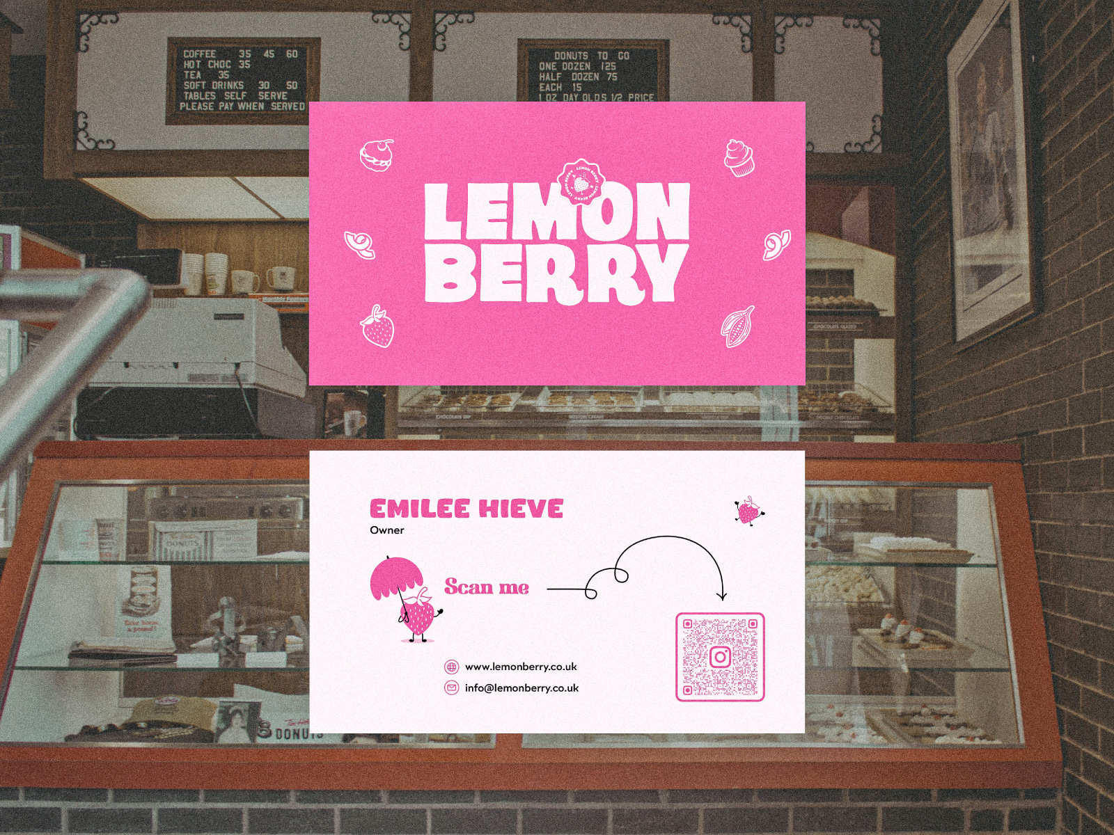
Visual Identity: Bold Minimalism
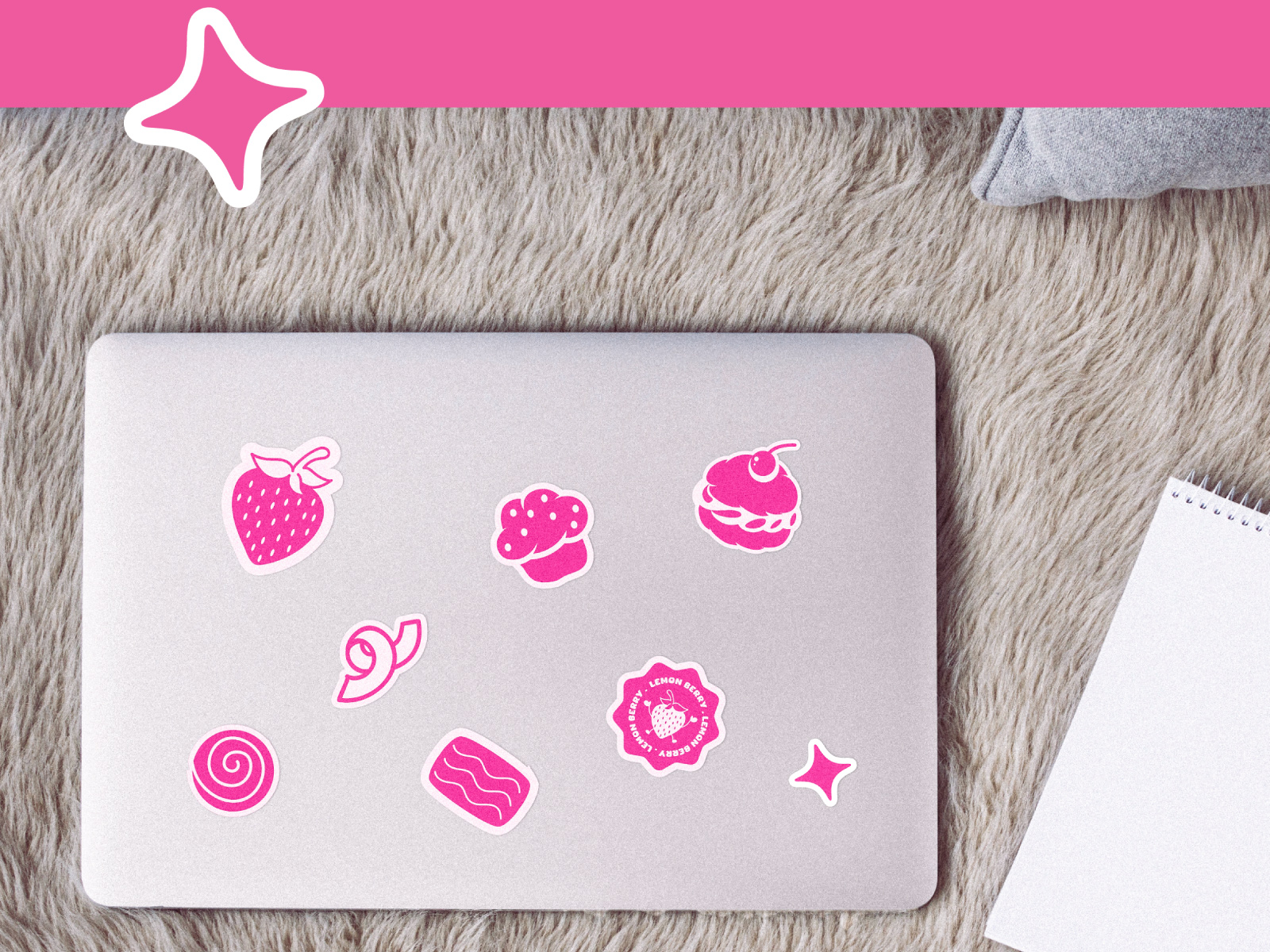
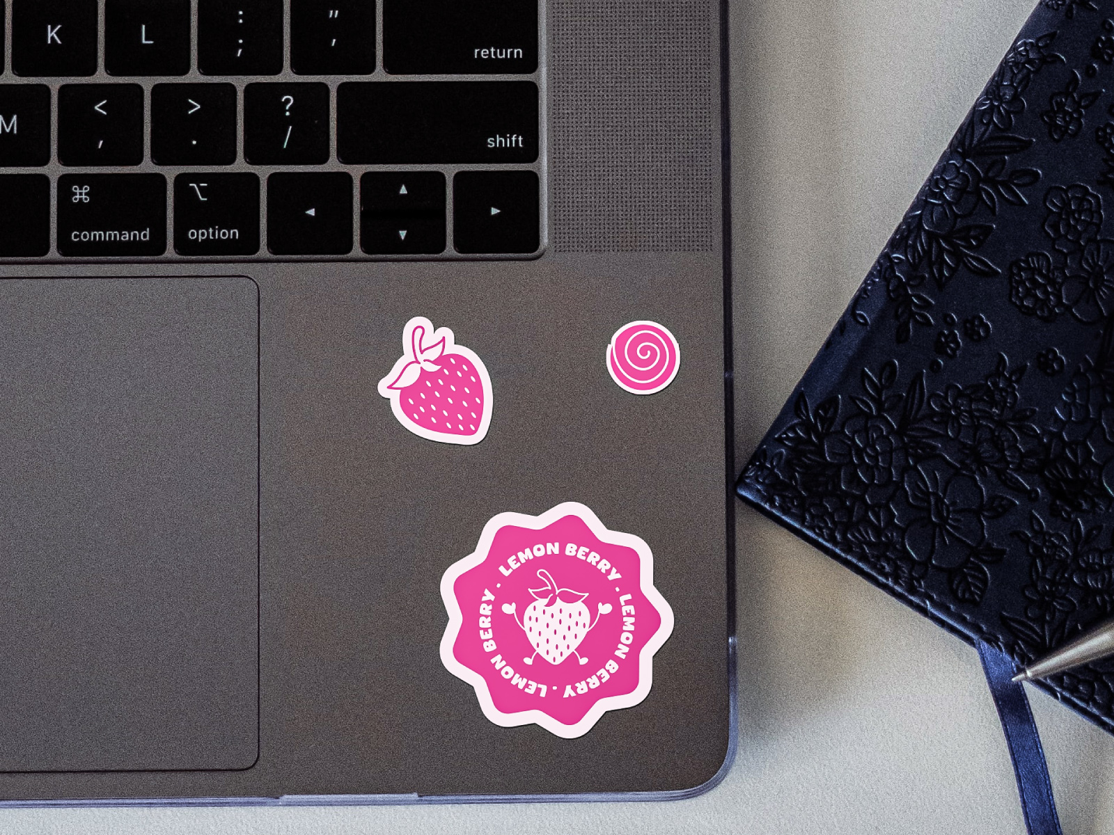
The Lemon Berry visual language was built around bold minimalism. But make no mistake — minimal doesn’t mean cold. We introduced strong, punchy colors that reflect the vibrancy of the brand’s flavors: rich berry pinks, zesty yellows, and deep cocoa browns. These are complemented with a series of hand-drawn elements that bring in a touch of charm and spontaneity.
The typography is custom and bold, with rounded edges that feel inviting rather than stark. We incorporated playful quirks in letterforms to maintain a casual yet confident vibe. Everything, from the logo to the smallest pattern, was designed to be simple yet distinctive.
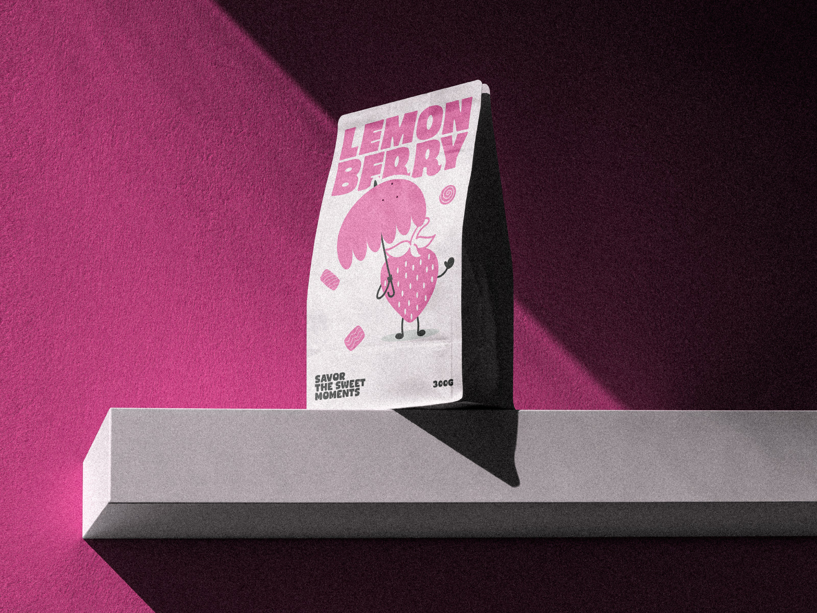
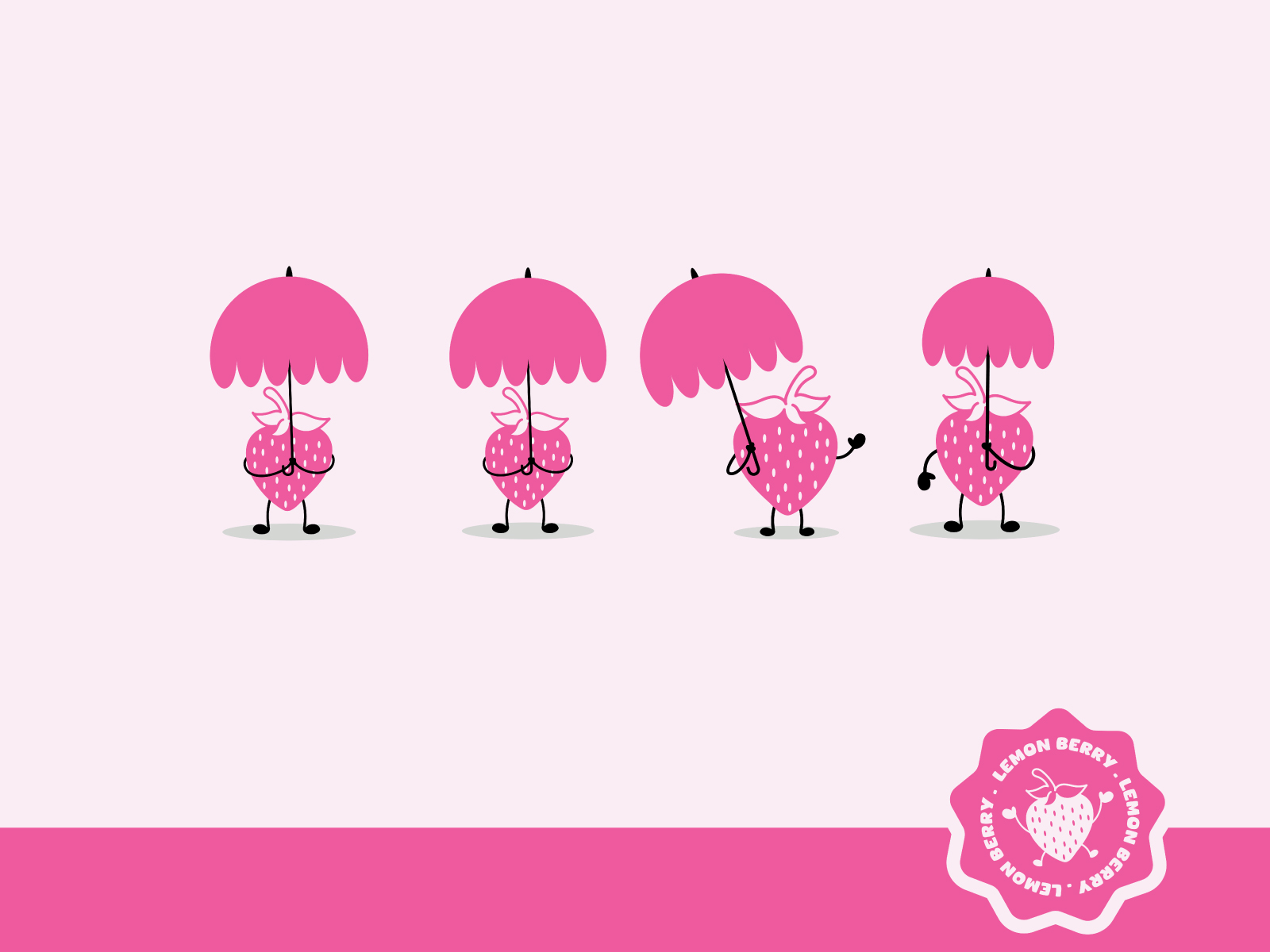
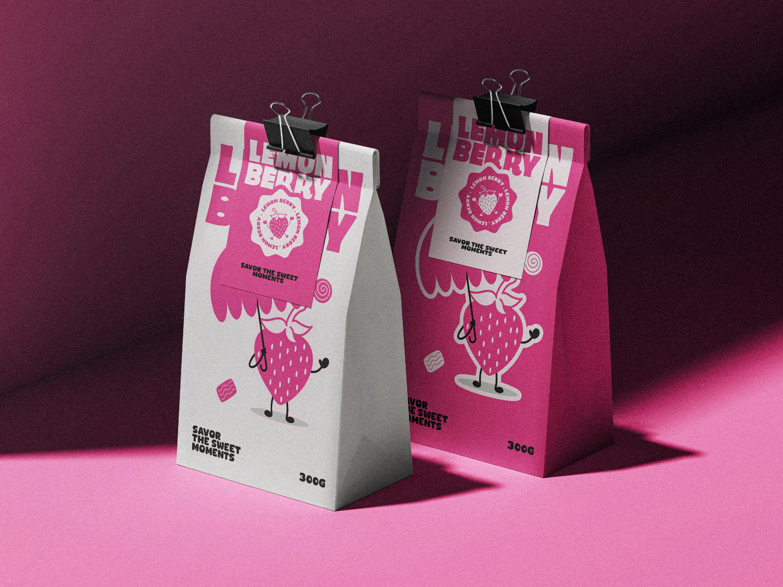
The mascot — a cheeky, lovable strawberry character — adds life to the brand, acting as a visual storyteller across touchpoints. Whether it’s announcing that the store is open or inviting you to “Savor the Sweet Moments,” this character reinforces the warmth and whimsy of Lemon Berry.
Packaging That Tells a Story
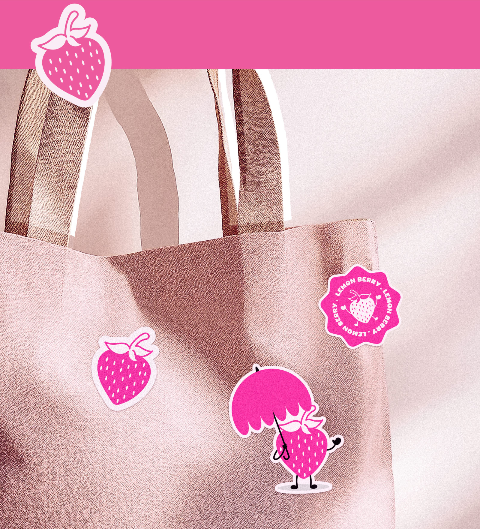
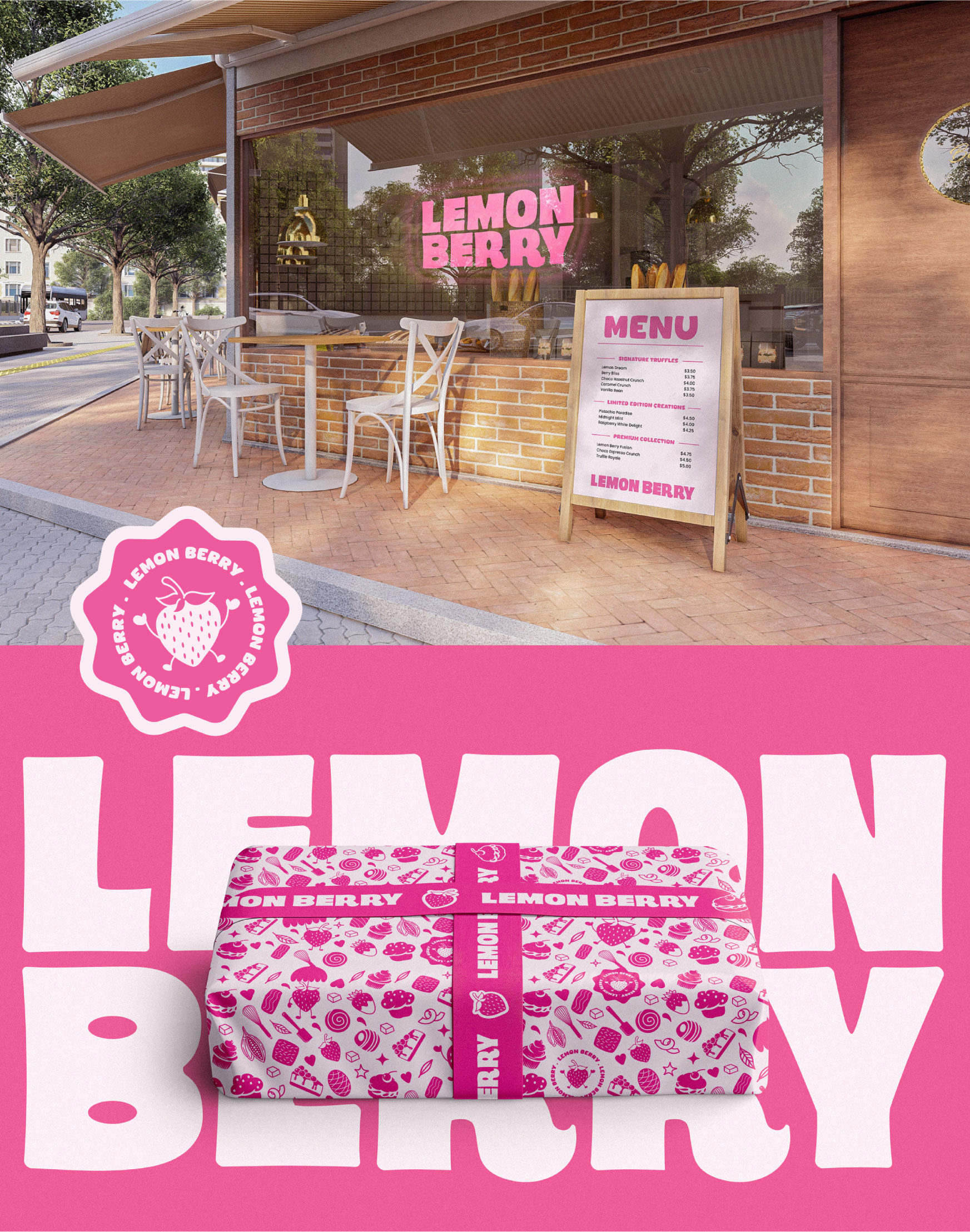
Packaging was a central part of this identity. Each box of truffles isn’t just a product; it’s a miniature storybook of flavor. We wanted every visual element — from icons and tags to background patterns — to add to the experience. We designed over 21 brand assets around a single motif to ensure consistency and depth. Every item, from the box to the wrapper to the display card, is cohesive and engaging.
The unboxing experience is intended to be just as delightful as the product itself. With cheeky messaging, layered illustrations, and tactile design elements, the packaging is both Instagram-worthy and emotionally resonant.
Social Media & Touchpoints
In today’s digital-first world, a brand has to live beautifully across platforms. For Lemon Berry, we extended the brand identity to Instagram posts, Behance showcases, posters, and store signage. The visual style remains consistent — bold, happy, and minimal — while each piece brings new flavor to the brand’s story.
We created mockups of storefront displays and point-of-sale materials using the same character-driven approach. The goal was to make Lemon Berry instantly recognizable, whether you’re scrolling on your phone or walking past the shop.
Emotional Connection
Good branding is more than aesthetics; it’s about emotion. For Lemon Berry, we focused on creating a brand that doesn’t just look good but feels good. The blend of playful visuals and warm storytelling forms a connection that customers can remember and cherish.
Instead of relying on generative tools or trendy aesthetics, we rooted the design in personality and purpose. From handwritten fonts to analog-inspired illustrations, everything was carefully crafted to evoke joy, comfort, and familiarity.
This identity system is a reminder that branding is about relationships. It’s about how people feel when they see, touch, or taste your product. And in this case, we wanted them to feel like they’ve just received a hug from a strawberry in sunglasses.
Beyond the Chocolate
While Lemon Berry is a chocolate brand, the identity goes far beyond just sweets. It stands for joy, for celebration, for the small moments that make life sweet. Whether you’re gifting a box to a friend or treating yourself after a long day, the brand is designed to be a part of those cherished moments.
It’s bold, it’s fun, and it’s fresh — but most importantly, it’s authentic. In a time when brands often speak in curated tones and generic visuals, Lemon Berry speaks like a friend. It smiles at you. It invites you in.
Final Thoughts
Designing for Lemon Berry has been a rewarding experience, not just as a creative challenge, but as a reminder of what truly makes a brand unan unforgettableoul.
In a world chasing shortcuts and trends, Lemon Berry chooses the long way — the real way — where every line, every curve, every color, and every word is infused with thought and love.
CREDIT
- Agency/Creative: Atelio
- Article Title: Have a Taste of Flavorful Visual Identity for Lemon Berry
- Organisation/Entity: Agency
- Project Type: Identity
- Project Status: Published
- Agency/Creative Country: United States
- Agency/Creative City: California
- Market Region: North America
- Project Deliverables: Brand Identity
- Industry: Food/Beverage
- Keywords: Chocolate, pastry, food, logo, typography, packaging, branding, brand identity
-
Credits:
Creative & Art Direction: Md. Asif Zaman


