


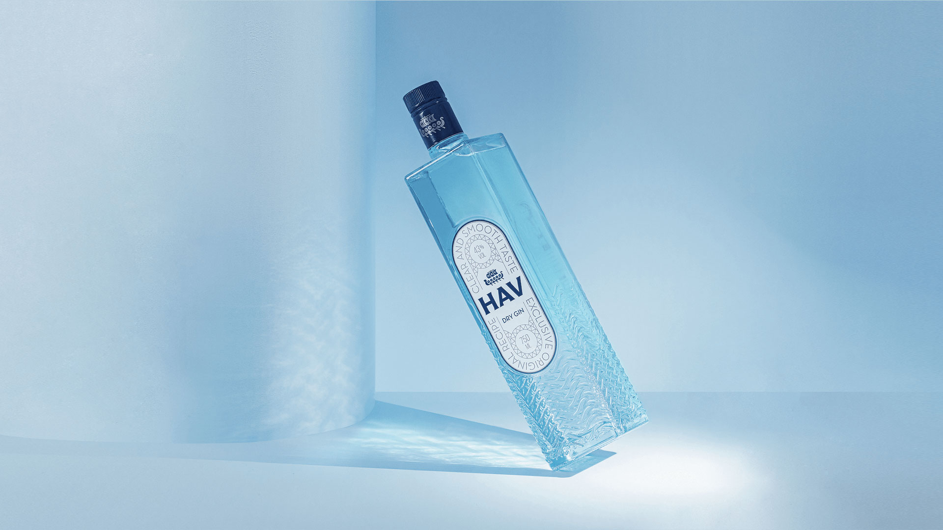
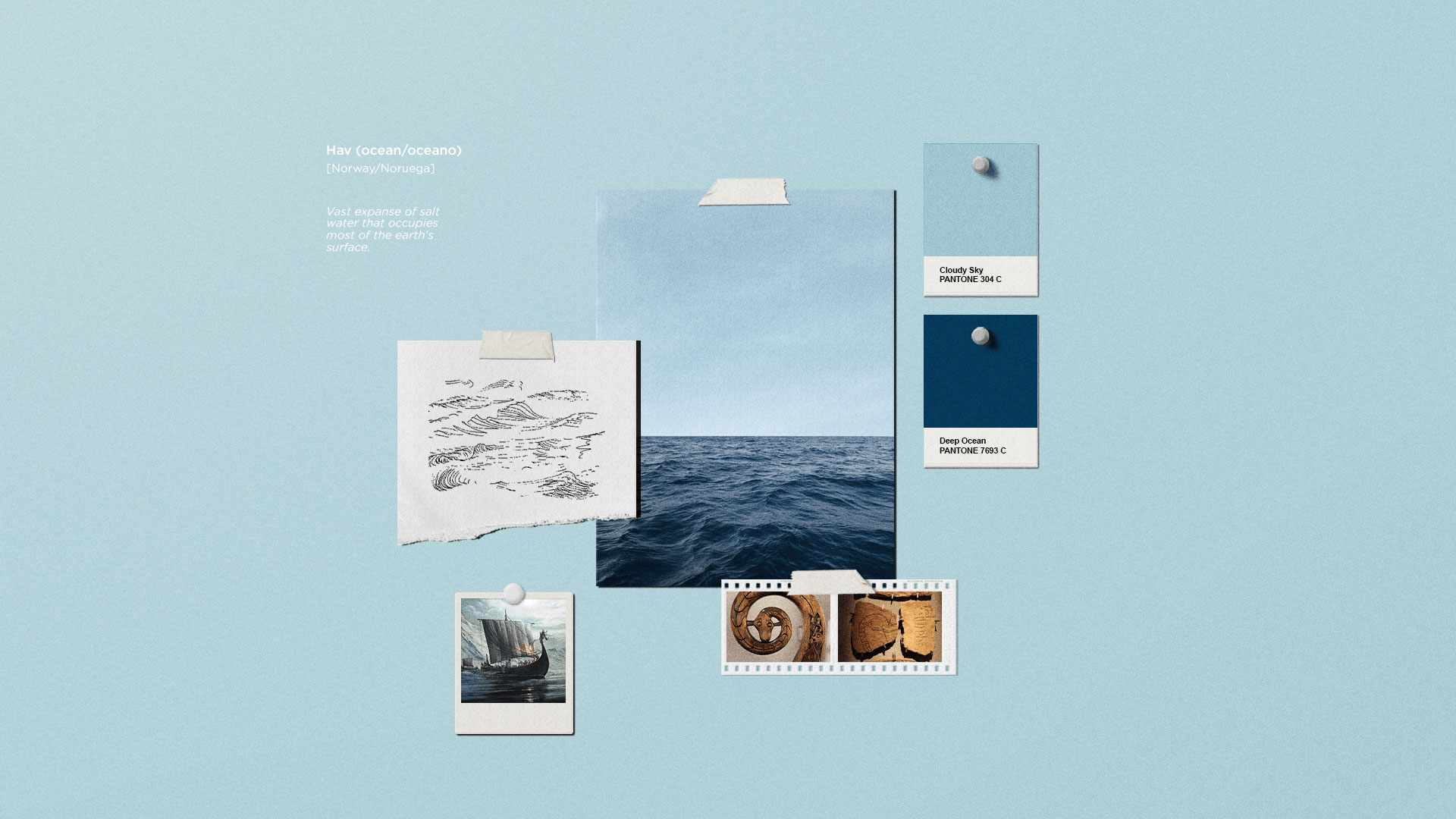
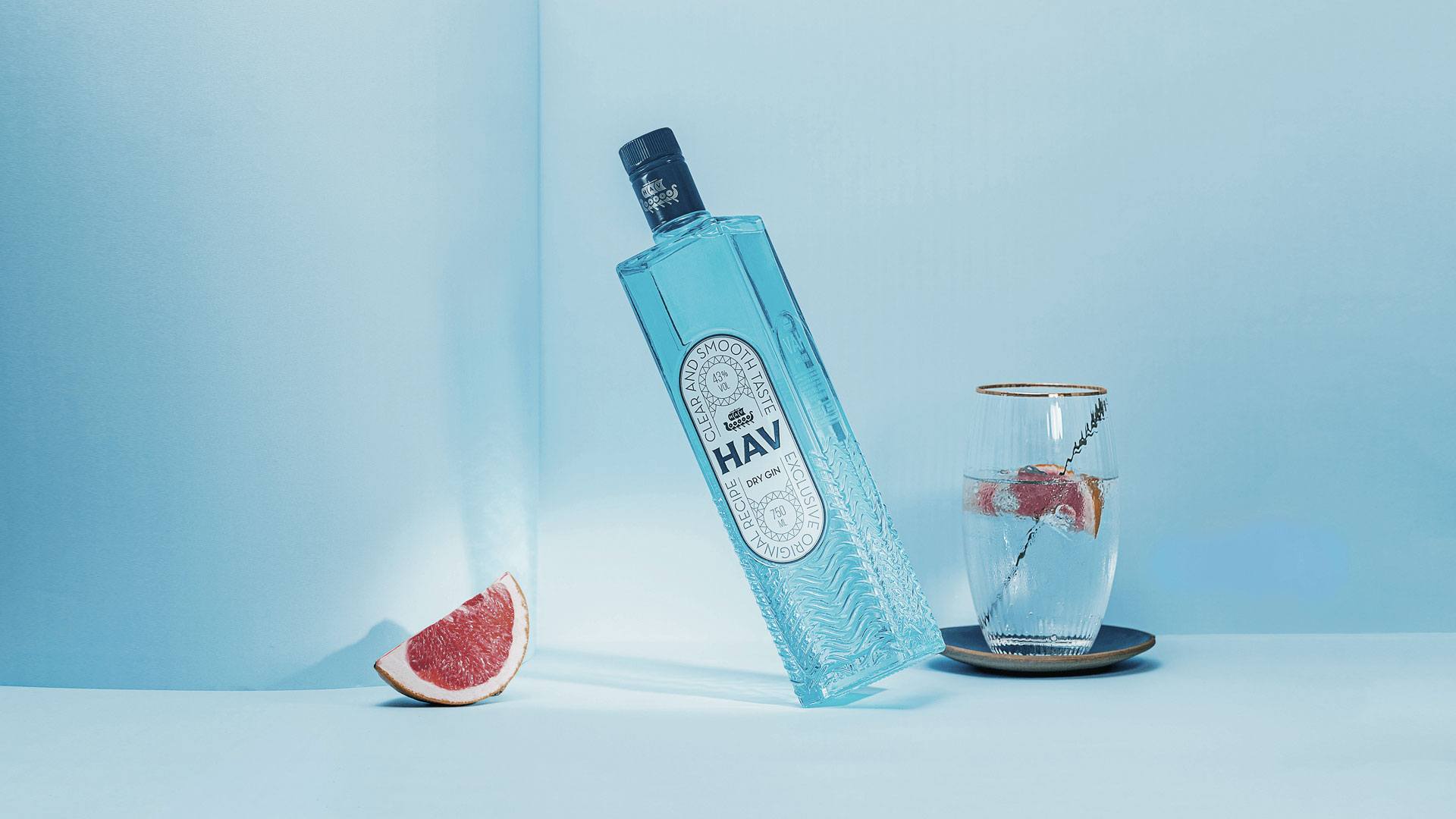
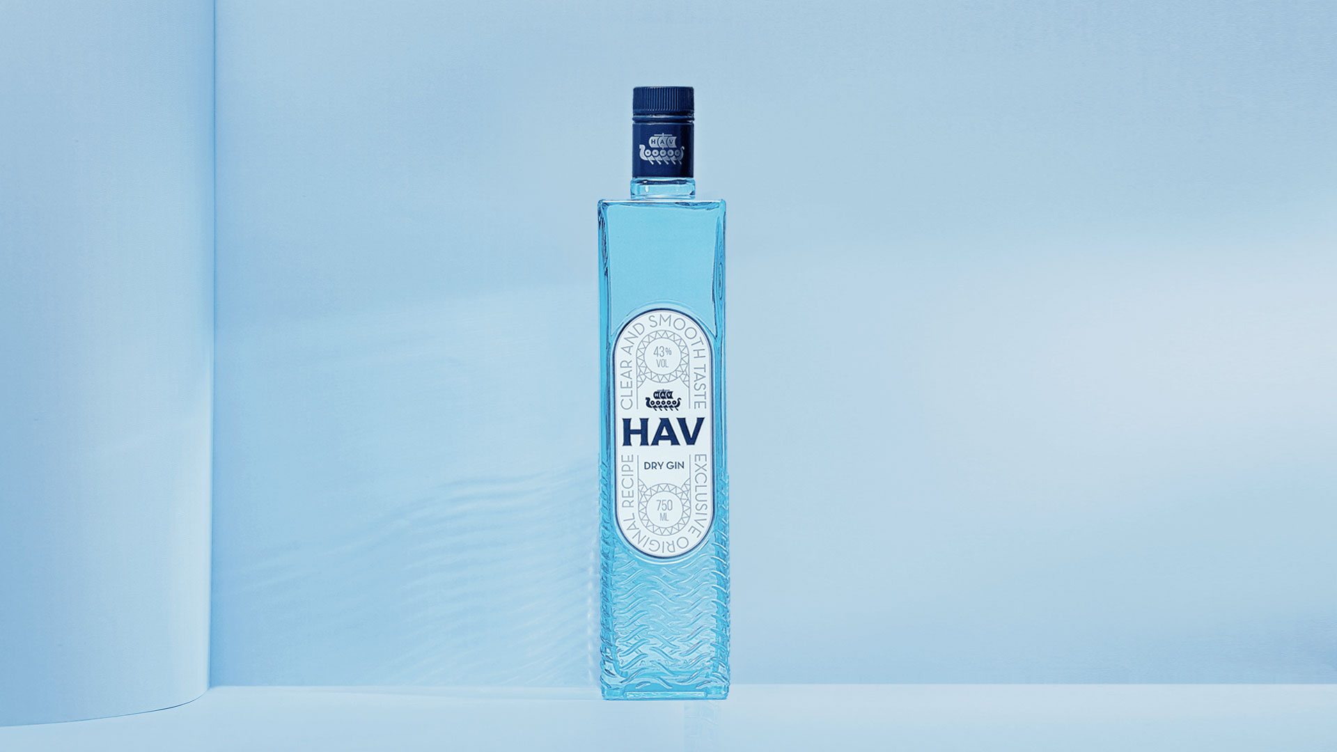
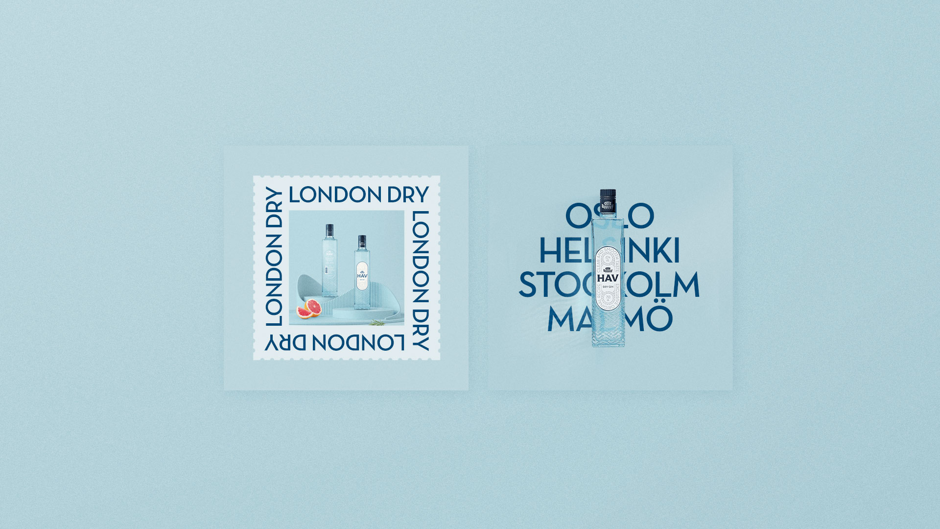
HAV, Norwegian translation for sea/ocean. This was the name chosen for this clean and smooth-tasting gin, created to please demanding palates and lovers of the classic London Dry style.
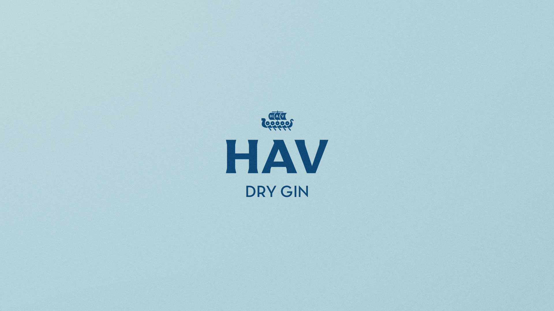
We created a brand that strengthens and prioritizes the product name, with the letters HAV in a robust and striking typography, accompanied by a symbol inspired by Scandinavian ships, the region where the name and concept of the product were inspired.
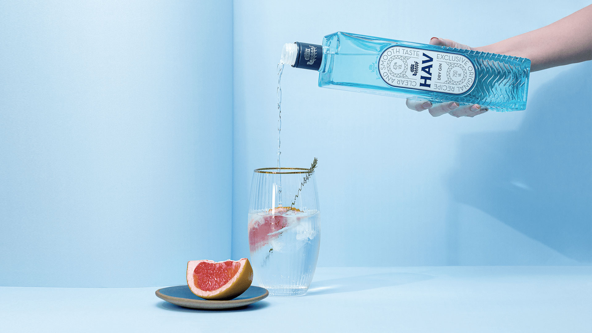
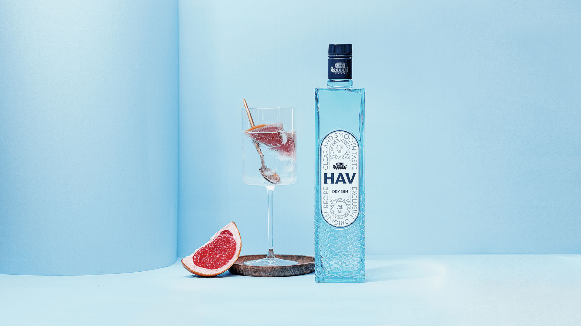
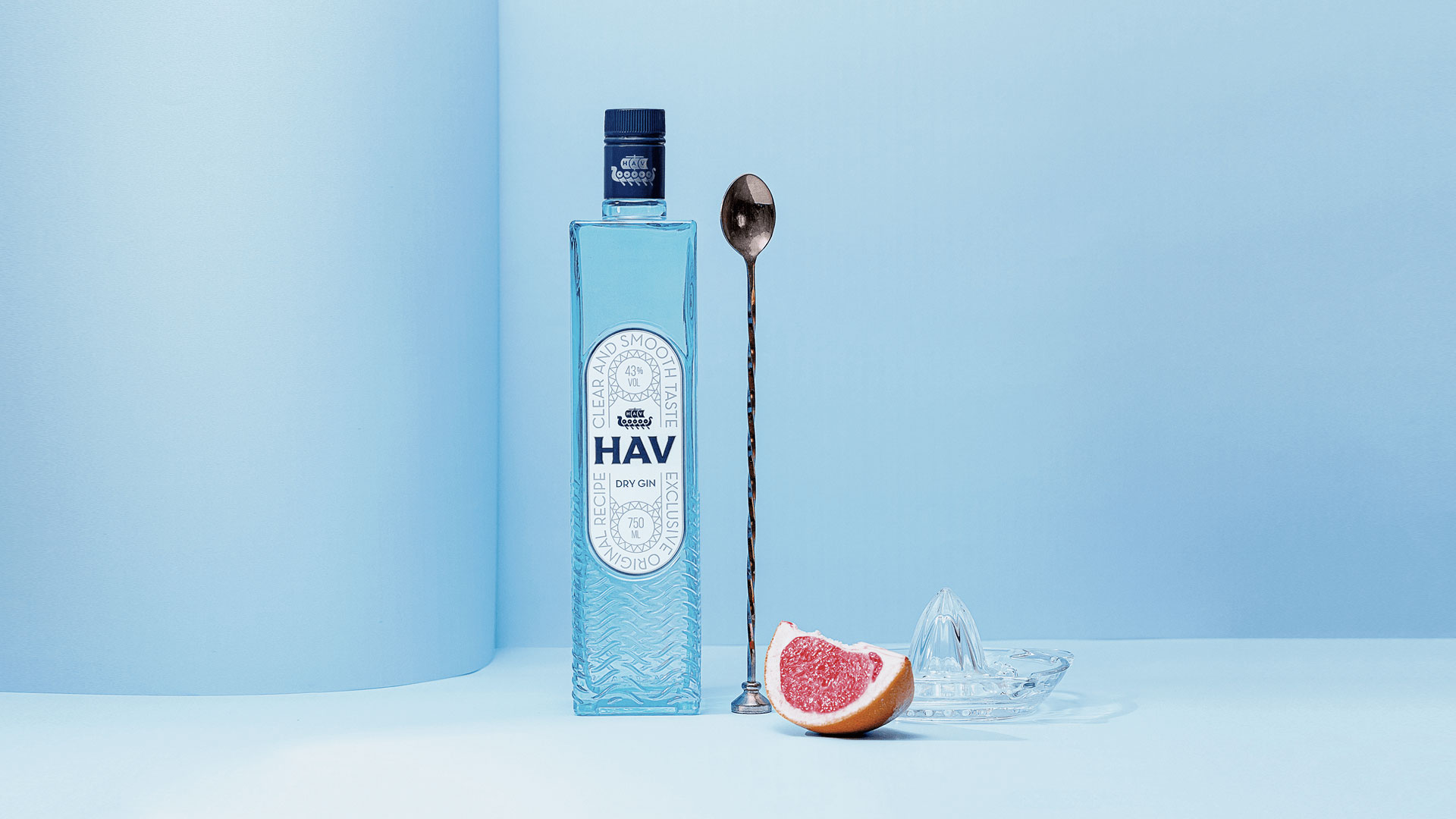
The bottle was designed to convey the entire concept and perceptions that we wanted to convey from the name to the gin recipe. First, the use of robust glass and a translucent painting in a light blue tone, bringing an idea of pure, crystalline and smooth water. Afterwards, we worked with a texture of waves, made in relief at the bottom of the bottle, to symbolize the concept of the name itself: the sea.
In addition to being a point of attention and differentiation, it was thought to bring an effect of refraction of light, simulating the idea of ocean waves in the environment or surface where it is.
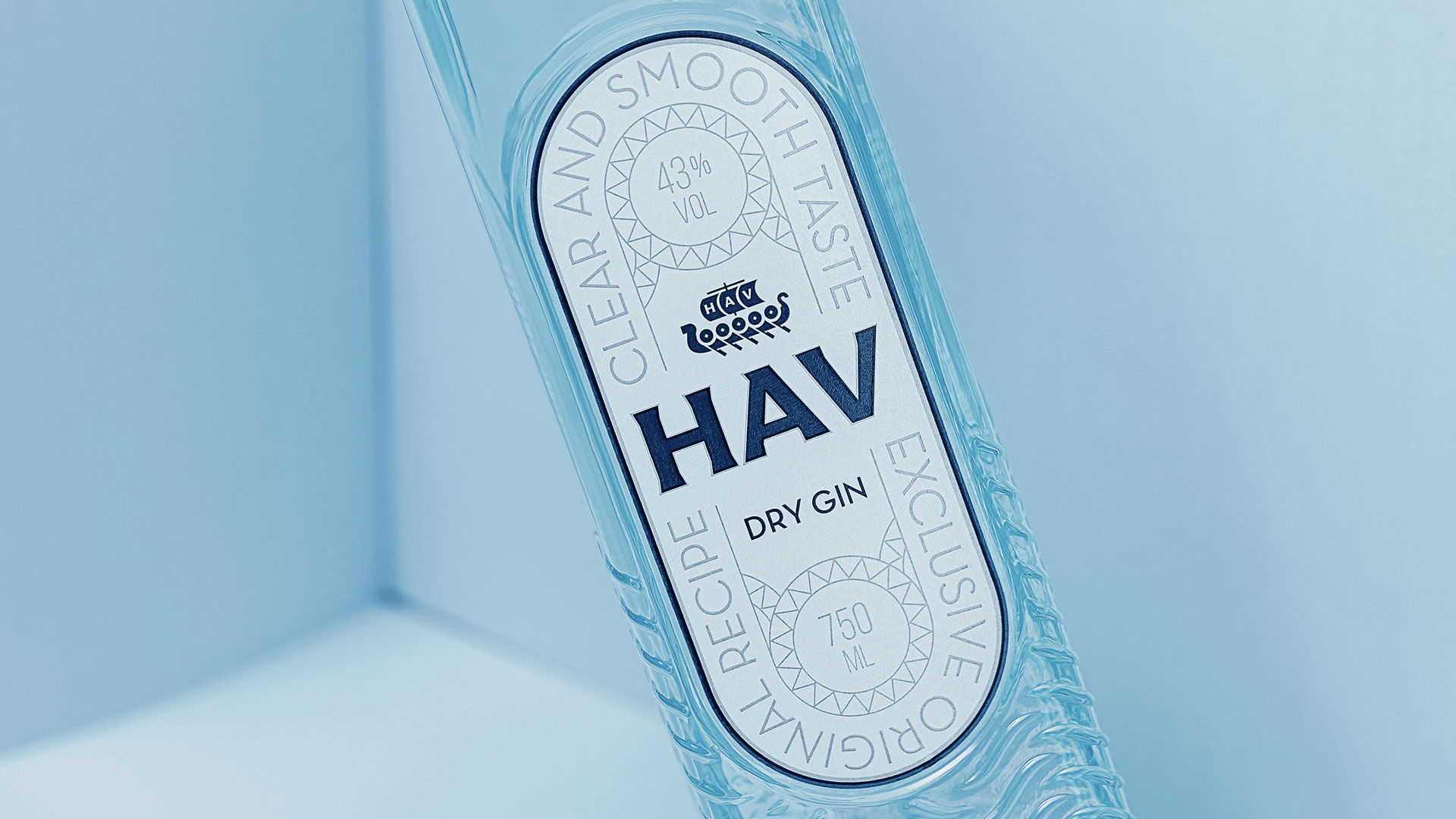
On the label, attention was directed to the HAV brand/name centered on the label, which is highlighted in dark blue. To complement, we created graphics inspired by Nordic arts, demarcating the content areas and highlighting the emotional appeals of the product. For these elements, the color silver was used, bringing an air of modernity and visual cleanliness, while still making the main content stand out.
The final result was a clean but at the same time striking bottle. That manages to convey the sensations of the clean and smooth flavor of the drink and also the concept of waves, the sea and the Nordic inspiration coming from the name itself: HAV.
CREDIT
- Agency/Creative: vbiasi
- Article Title: HAV Dry Gin Designed by vbiasi
- Organisation/Entity: Agency
- Project Type: Packaging
- Project Status: Published
- Agency/Creative Country: Brazil
- Agency/Creative City: Uberlândia
- Market Region: South America
- Project Deliverables: 3D Art, Art Direction, Brand Design, Brand Naming, Packaging Design
- Format: Bottle
- Substrate: Glass Bottle
- Industry: Food/Beverage
- Keywords: london dry, dry gin, gin, brazil, mar, oceano, ocean, sea, nord, nordic, drink, packaging, branding
-
Credits:
Photographer: João Paulo Garcia
Photographer: Brunno Rogger


