


This wine reflects a harmonious partnership with nature, from our sustainable vineyards to our cellar. This is my craft; this is my Atelier.
Tradition meets with progress, to create a synergy between art and science that transcends the drinker to the coastal knolls that map the Russian River Valley situated in Sonoma County. On savouring each sip, you’ll feel the cool breeze on your face whilst the sun warms your back, the grounds’ musk fills your senses and at that moment, you feel at peace.
Our winemaker Ondine has harmonised with the seasons to meticulously craft each fine detail in order to realise the fullest potential of this year’s vintage. Adapting a more flexible approach of winemaking, Ondine’s connection with the season; waxing and waning with natures nuances rather than forcing anything upon what is a very natural process, has created something truly special and personal to our vineyards.
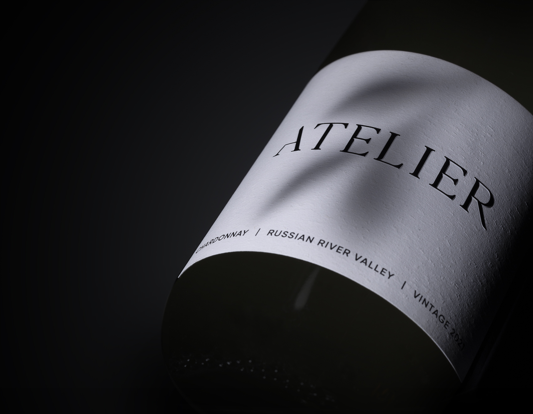
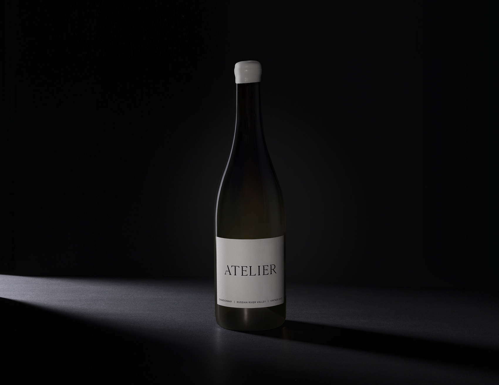
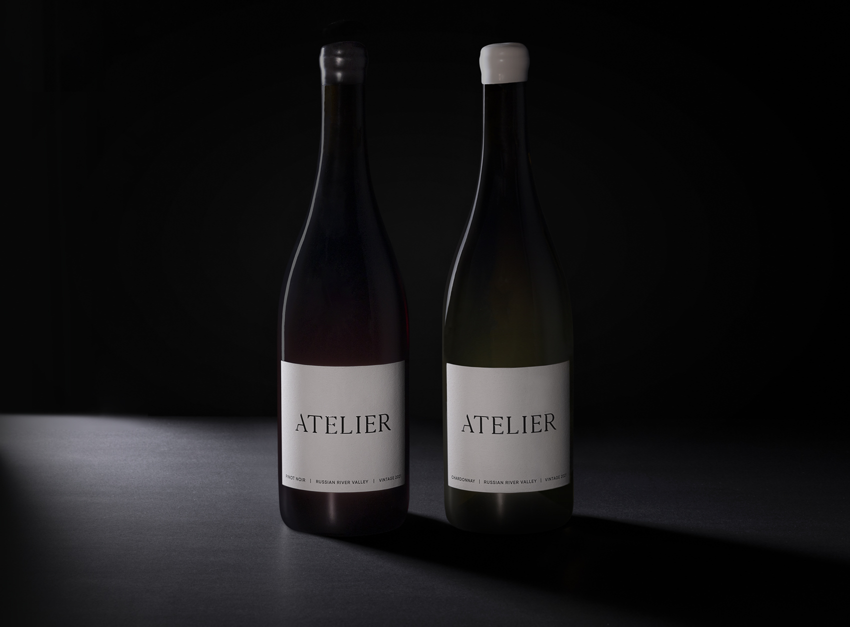
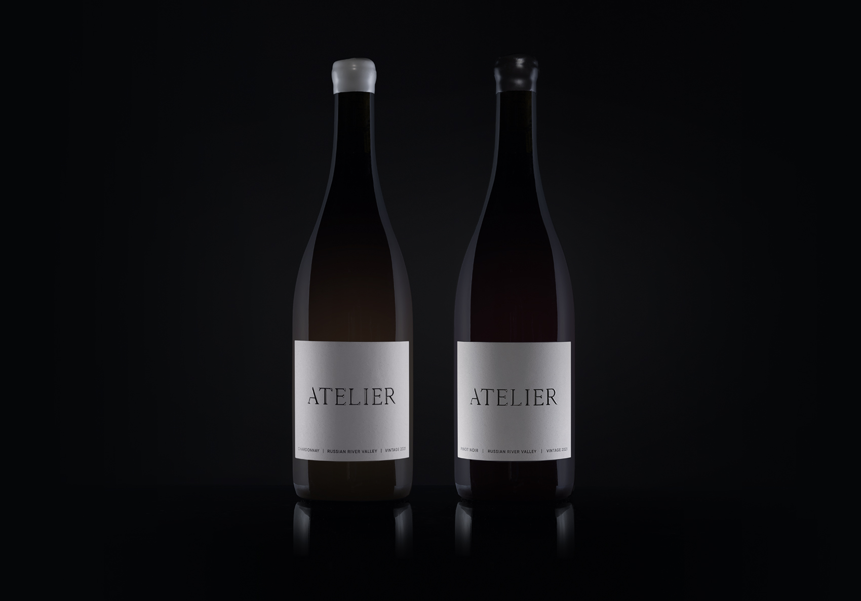
Whilst having an unyielding stance on quality, our process is a conscious one, so that every detail of this wines journey is as harmonious with nature as it can be, to ensure this wine remains a partner with the natural earth. From the contents, to the packaging, we’ve kept sustainability at the heart – without having to compromise on the design. Our labels are beautifully elegant, yet strikingly simple, with all focus directed to the brand name itself. This word mark has been crafted using custom lettering, with little cuts made to each letterform to reference the brands icon, the secateurs. This has been elevated with a spot UV as well as an emboss – making it also pleasing to the touch.
Our wax seals add a premium element, as well as keeping the environment in mind, as wax melts and evaporates in the recycling process of the glass bottle. Our process and indeed all those involved in the crafting of this wine, are visualised by our mark on top of our cork, the secateurs. This man-made implement is balanced by natures leaf, showing that mankind can interact with nature, complimenting rather than dominating to create something unique and beautiful.
CREDIT
- Agency/Creative: Masters of Brands
- Article Title: Harmonious Wine Label Design for Atelier Wine
- Organisation/Entity: Agency
- Project Type: Packaging
- Project Status: Published
- Agency/Creative Country: United Kingdom
- Agency/Creative City: Chester
- Market Region: North America
- Project Deliverables: Art Direction, Brand Creation, Brand Design, Branding, Label Design, Packaging Design, Typography
- Format: Bottle
- Substrate: Glass
- Industry: Food/Beverage
- Keywords: sustainable, branding, packaging, design, wine, drink, typography
-
Credits:
Lead Creative: John Arends


