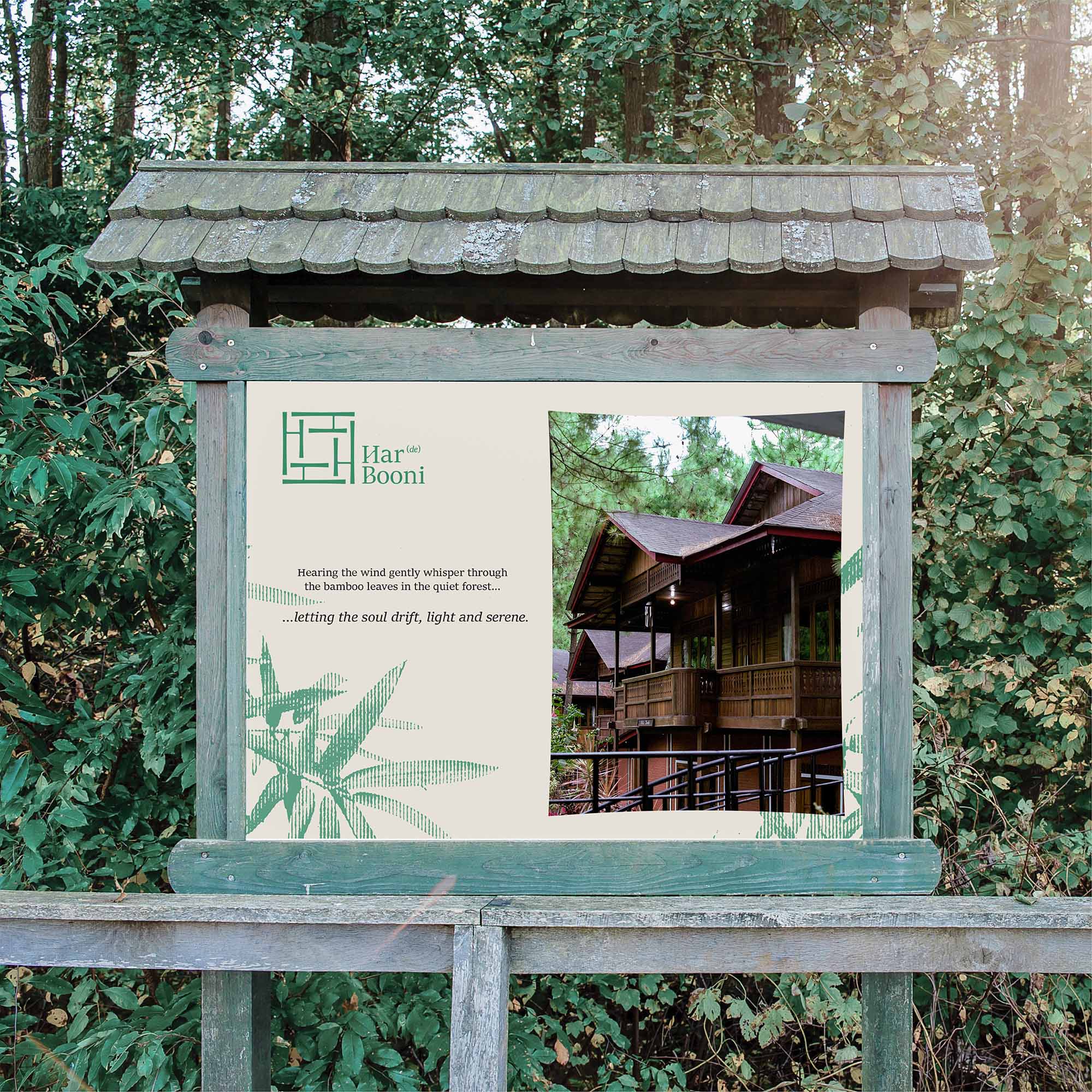
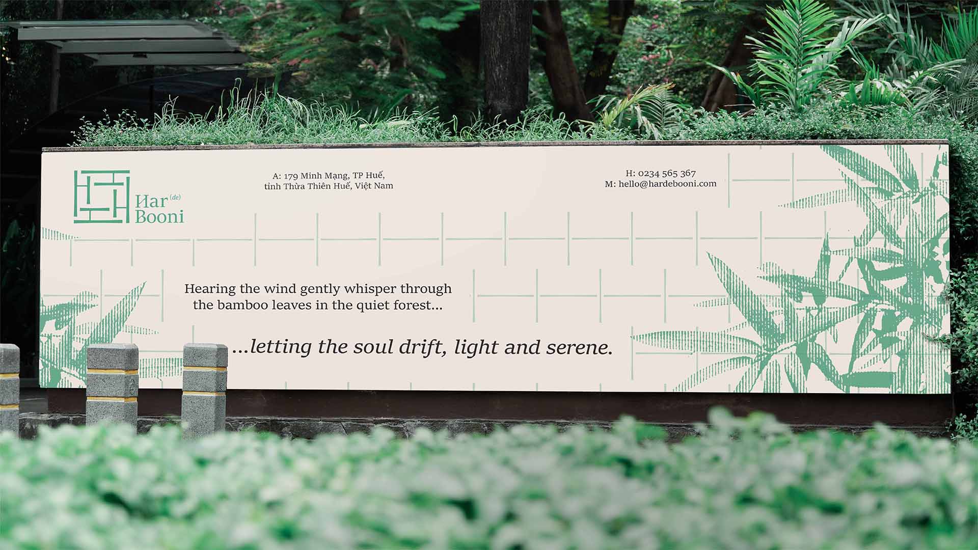
Listening to the soft whispers of the wind through bamboo leaves in the serene forest, one’s spirit feels light and free. Har(de)Booni Village rests on a tranquil hillside where each bamboo grove has been carefully tended over generations by the local community, offering guests a peaceful escape deeply intertwined with nature. This connection inspired a brand identity that embodies the form of bamboo—a cherished symbol in Vietnamese life, closely tied to natural landscapes and cultural traditions.
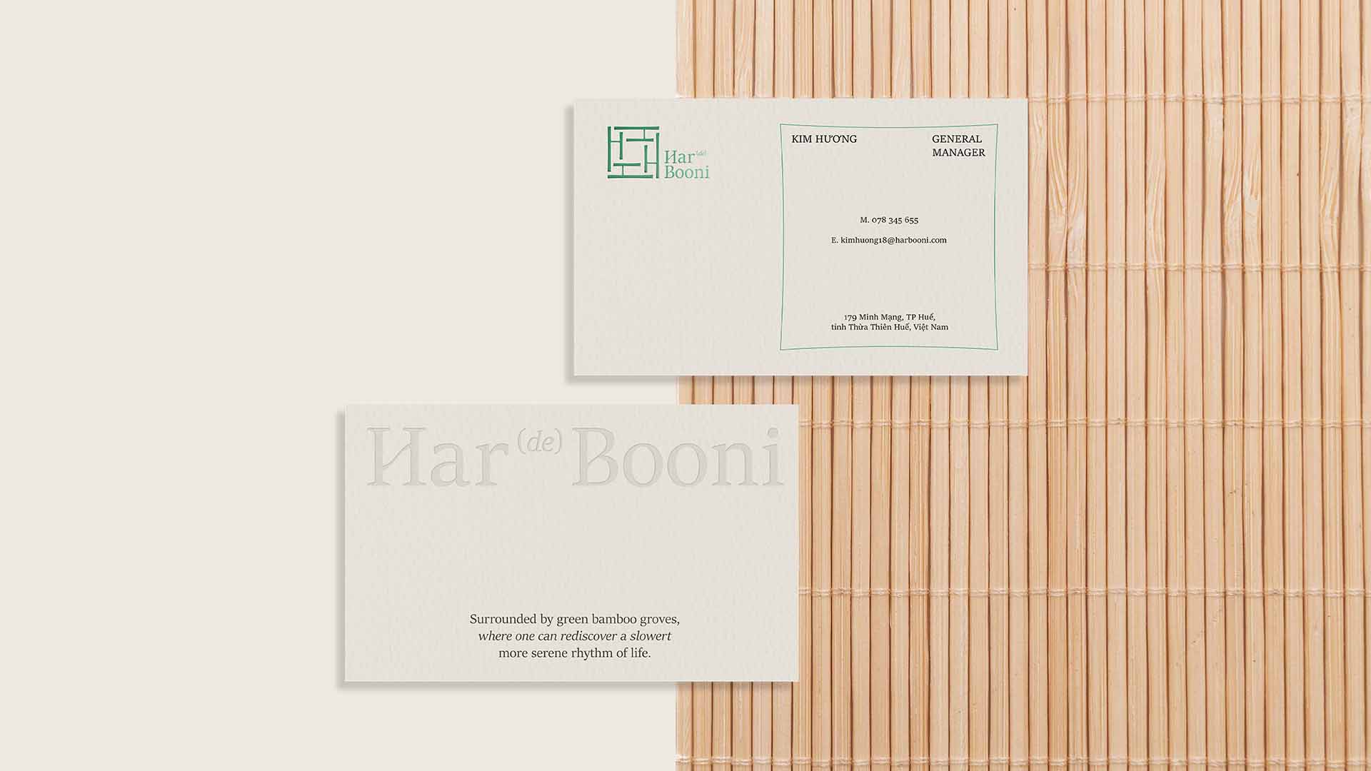
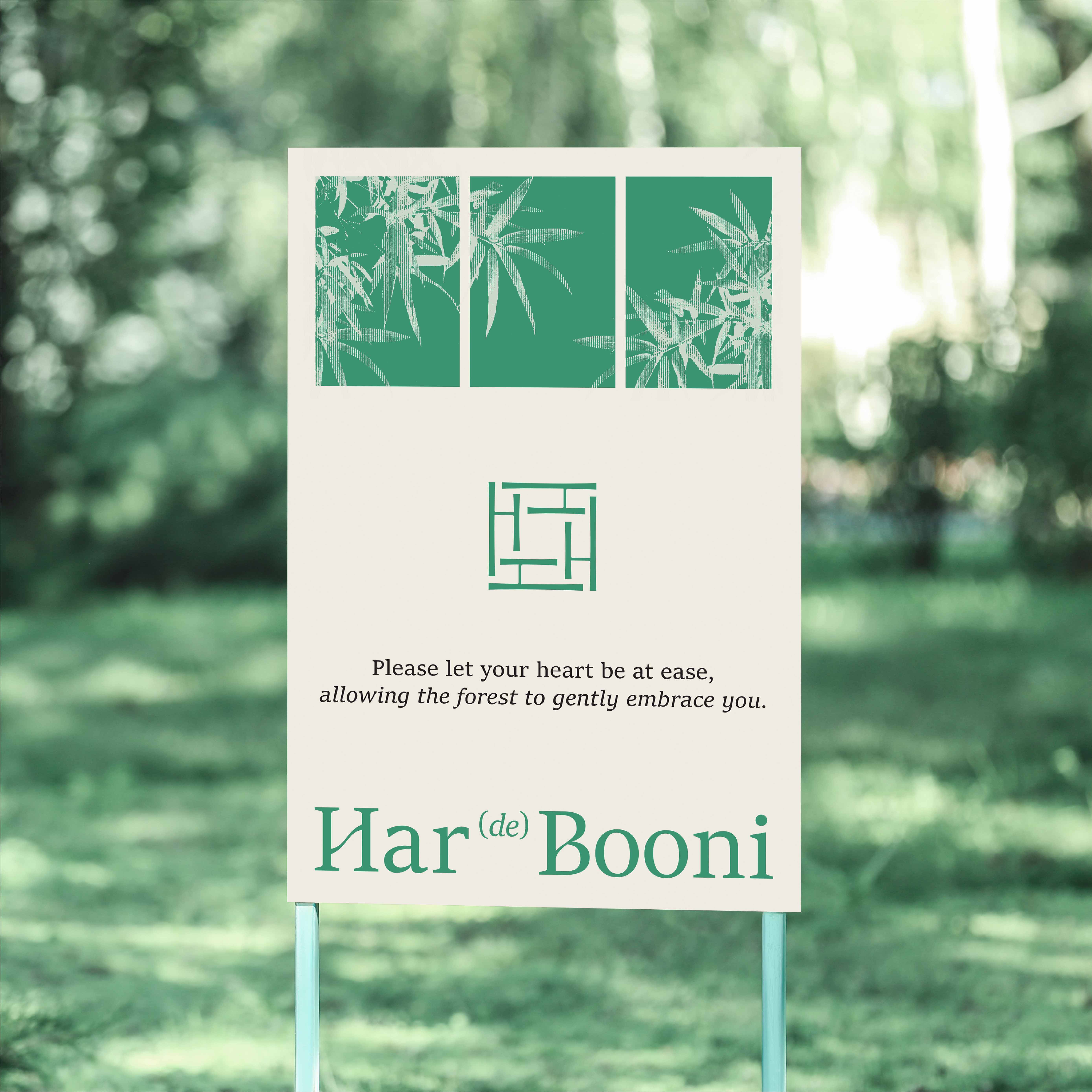
The name “Har(de)Booni” is imbued with symbolic meaning: “Har” stands for Harmony, echoing the gentle sound of the bamboo groves that surround the resort, bringing calm to each guest’s stay. “Booni” signifies Bamboo, representing the lush green environment. The letter “H” reflects both Harmony and the location, Huế—a quiet, culturally rich city where this eco-resort resides.
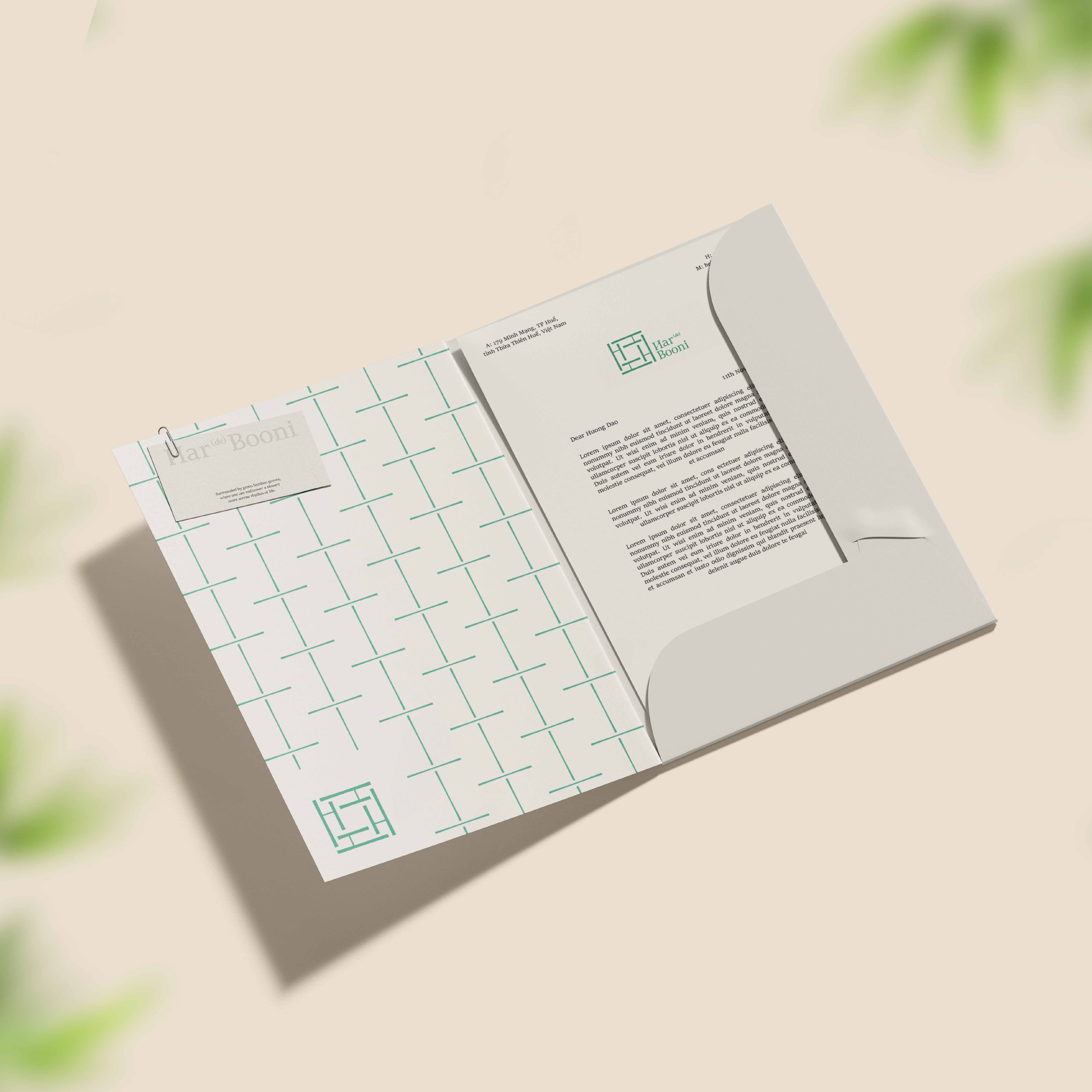
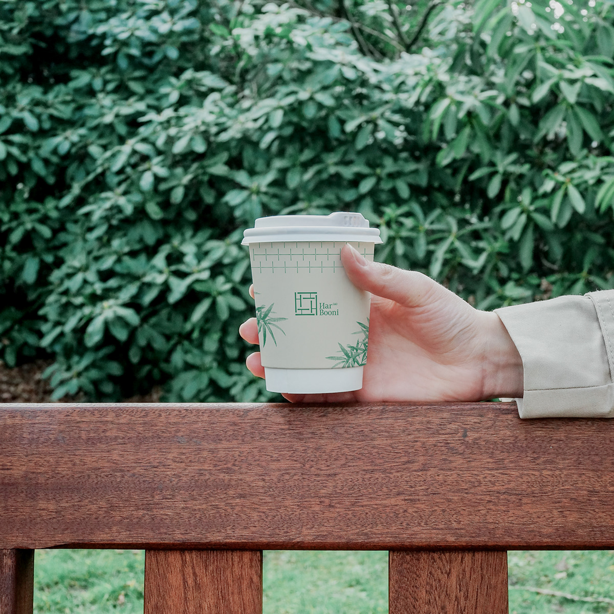
The brand’s color palette features soft greens and warm yellows, inspired by bamboo’s natural journey—from the vibrant green of its youth to the golden hues of maturity. This palette conveys elegance and reflects the brand’s deep connection to Vietnamese culture and spirit.
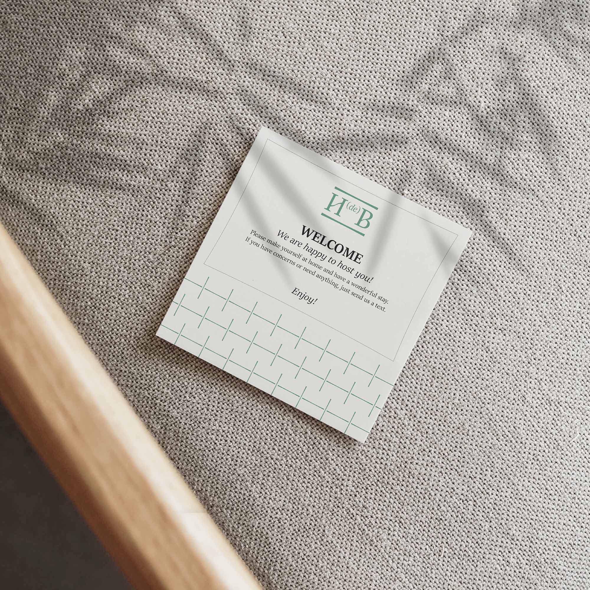
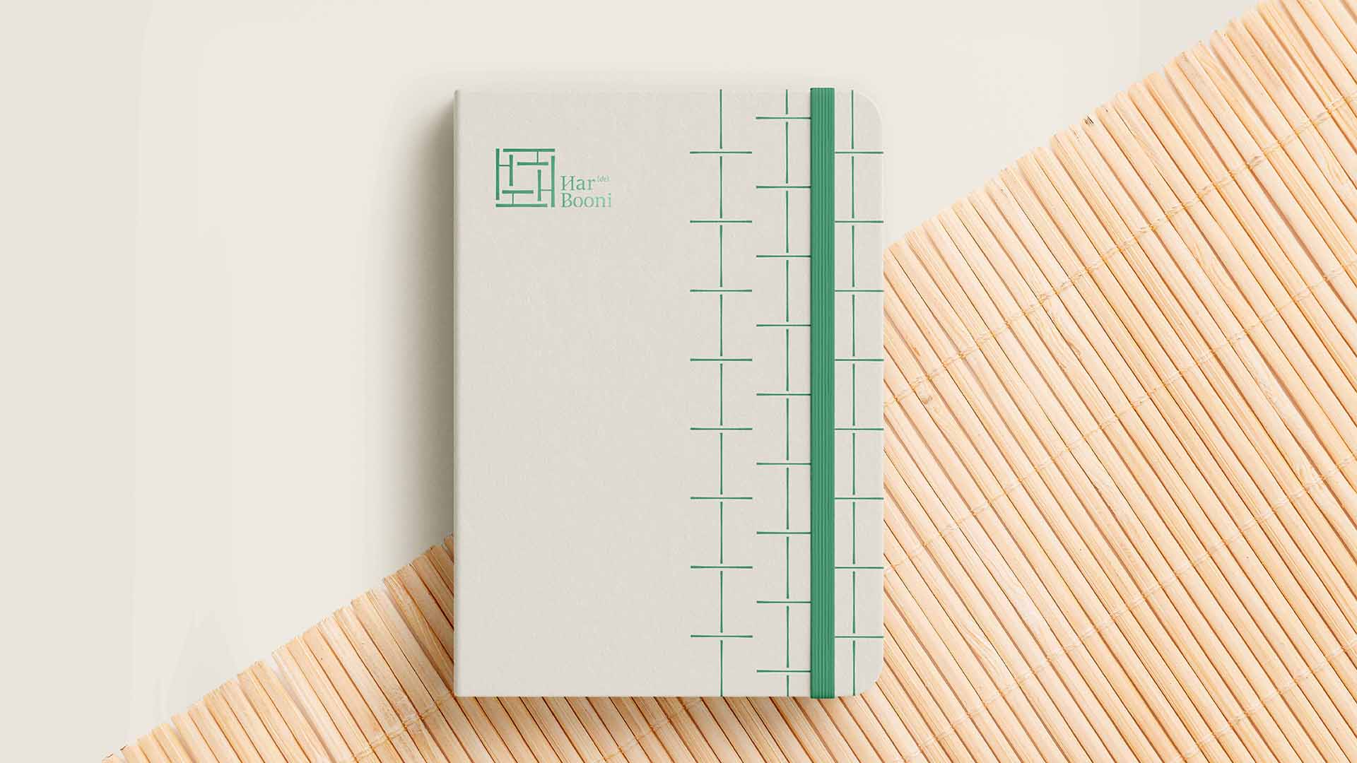
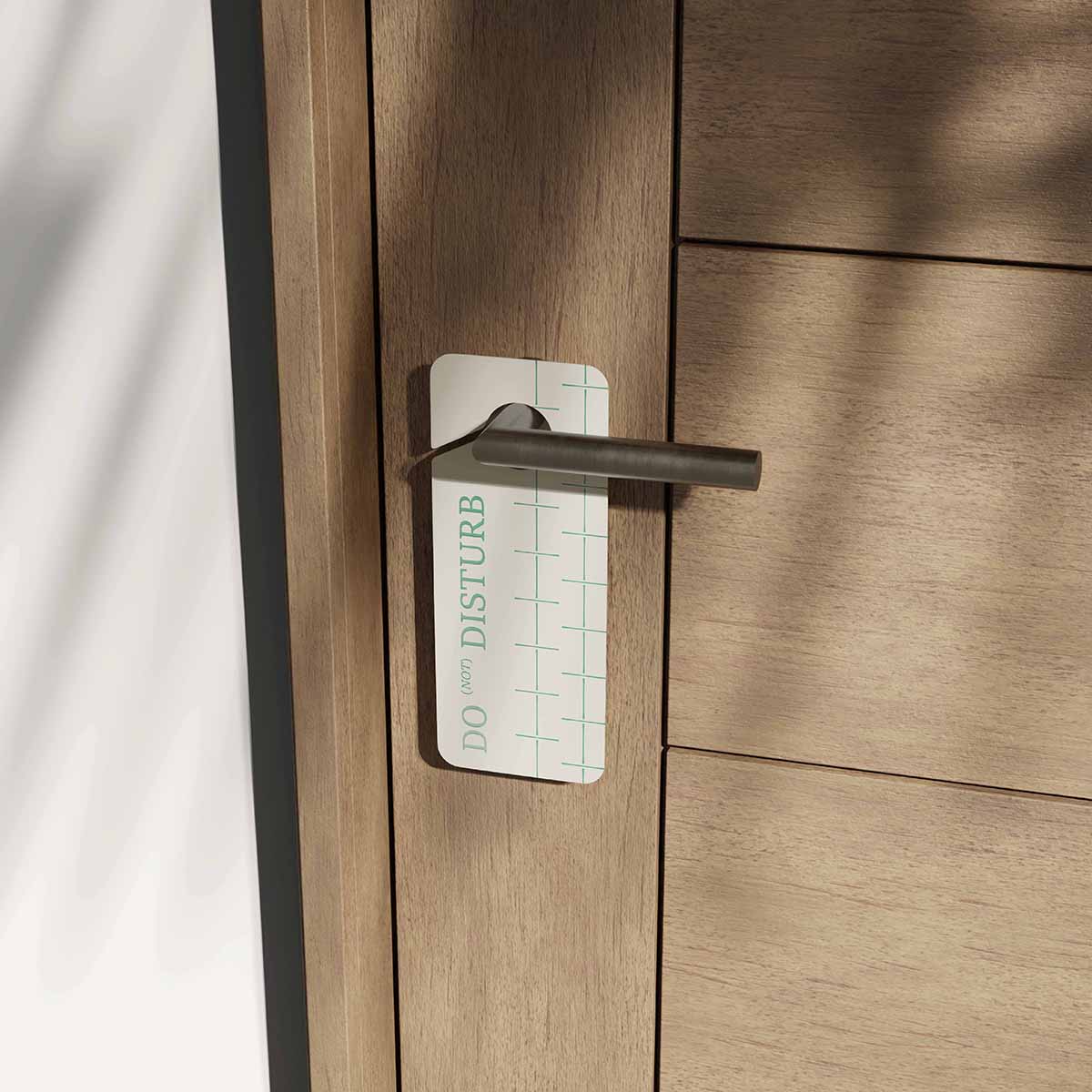
Drawing inspiration from bamboo nodes, geometric shapes such as squares and rectangles were used to design a versatile layout system. This interconnected pattern resembles a bamboo fence, symbolizing unity and resilience. Together, these elements create a minimalist aesthetic that adapts effortlessly across various brand applications, embodying a harmony of nature and simplicity that defines Har(de)Booni.

CREDIT
- Agency/Creative: Hung Le
- Article Title: HardeBooni Village Brand Identity by Hung Le
- Organisation/Entity: Freelance
- Project Type: Identity
- Project Status: Published
- Agency/Creative Country: Vietnam
- Agency/Creative City: Hue City
- Market Region: Asia
- Project Deliverables: Brand Identity
- Industry: Hospitality
- Keywords: Branding, Logo, Brand Identity, Village
-
Credits:
Art direction: Le Ngoc Hung


