


Albertson’s Reserve offers a thoughtfully curated selection of wines, conveniently packaged in generous 4-litre casks. These wines are carefully crafted to provide an ideal balance between quality and everyday practicality, making them perfect for casual enjoyment at home or on the go. Whether you’re planning a relaxed evening with friends, a weekend picnic, or simply want an easy-pouring option for your daily glass, Albertson’s Reserve has something to offer for every occasion.
Sourced from the renowned wine-growing region of South Eastern Australia, these wines benefit from the area’s warm climate, fertile soils, and long-established winemaking traditions. South Eastern Australia is known for producing approachable, fruit-forward wines that are both enjoyable and easy to drink. This makes it the perfect origin for Albertson’s Reserve—wines that are designed to be accessible, consistent, and pleasing to a wide range of palates.
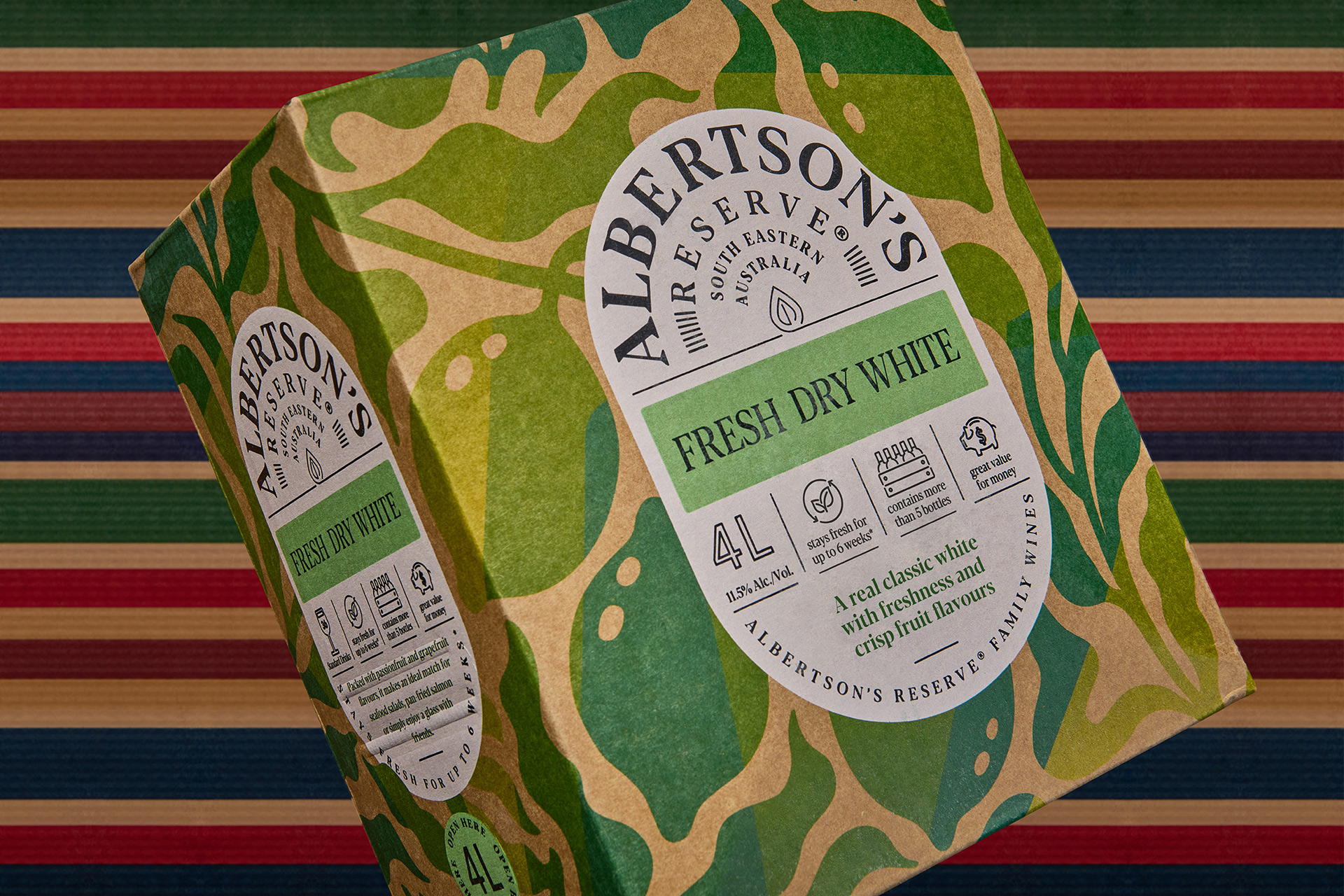
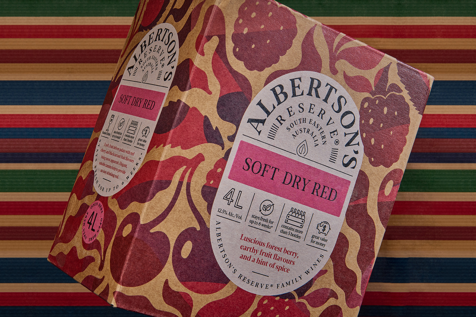
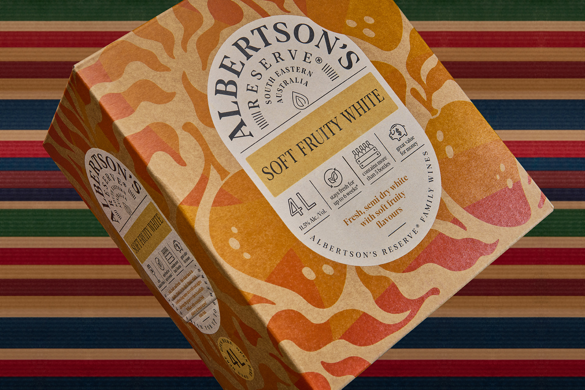
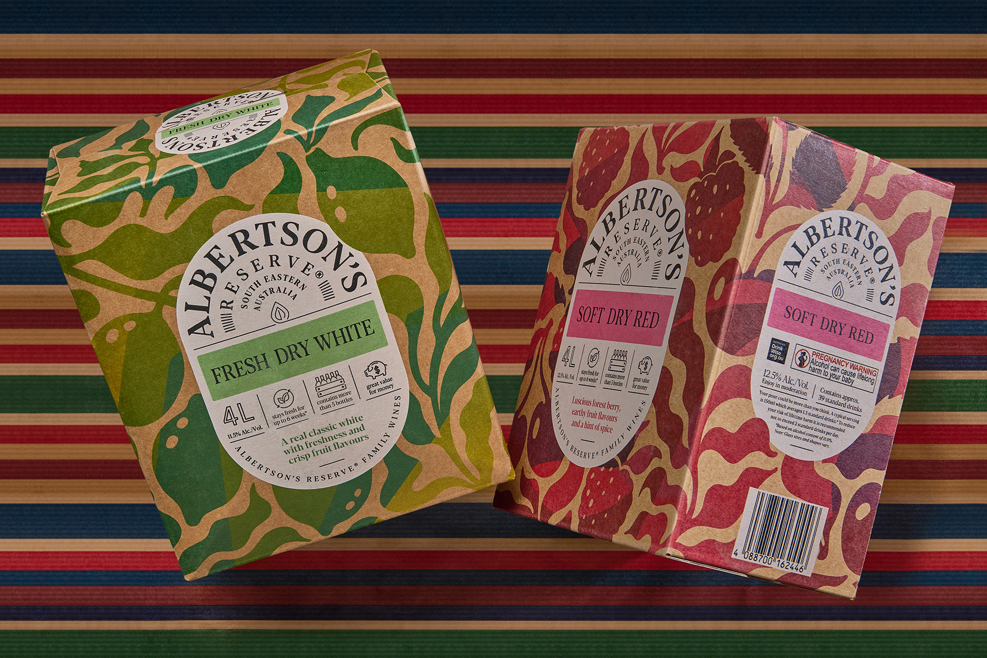
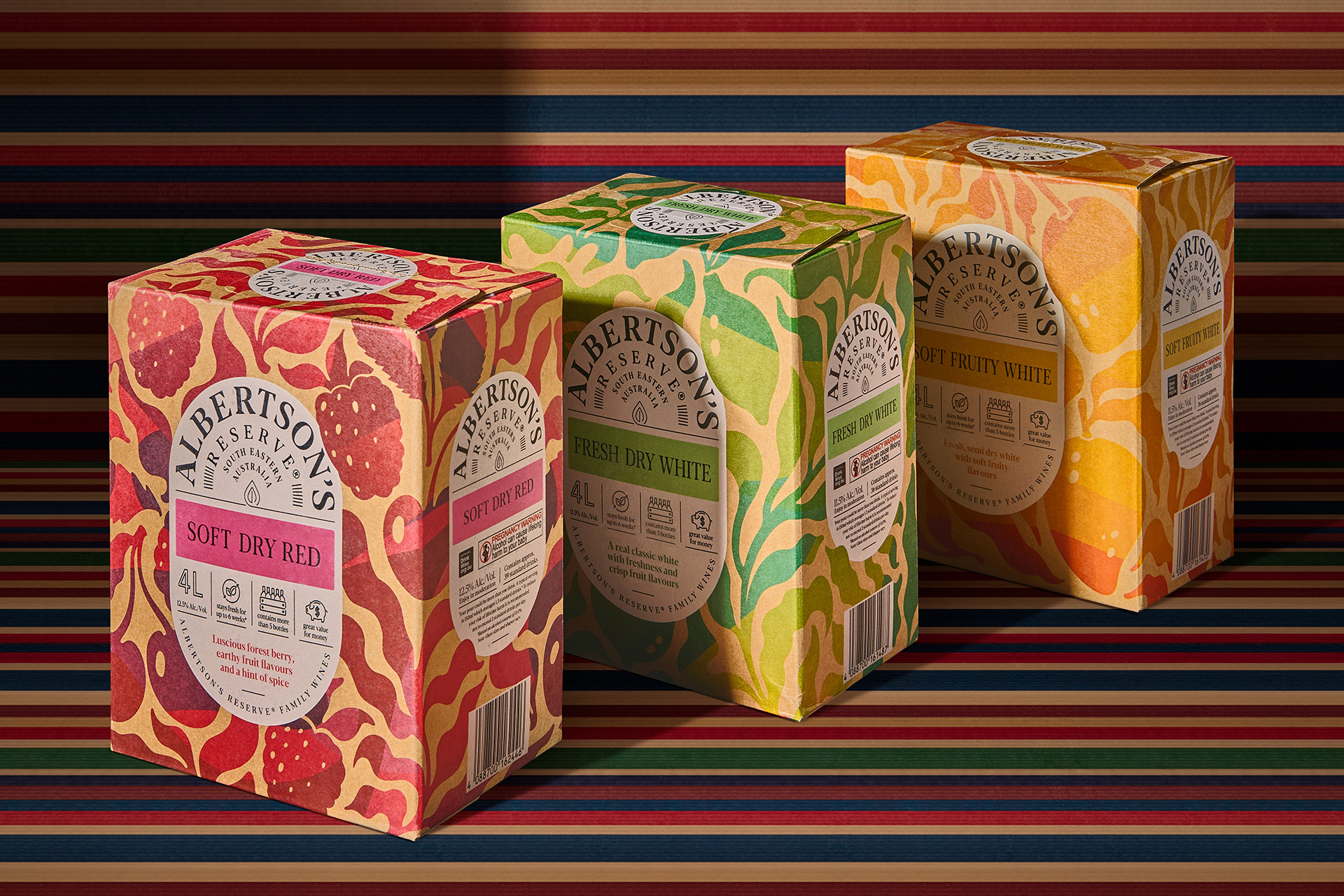
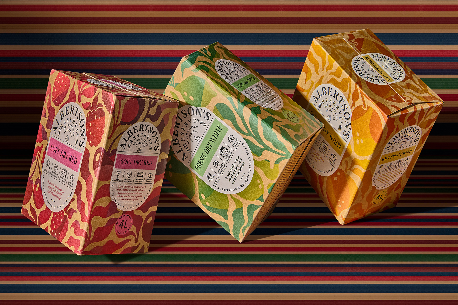
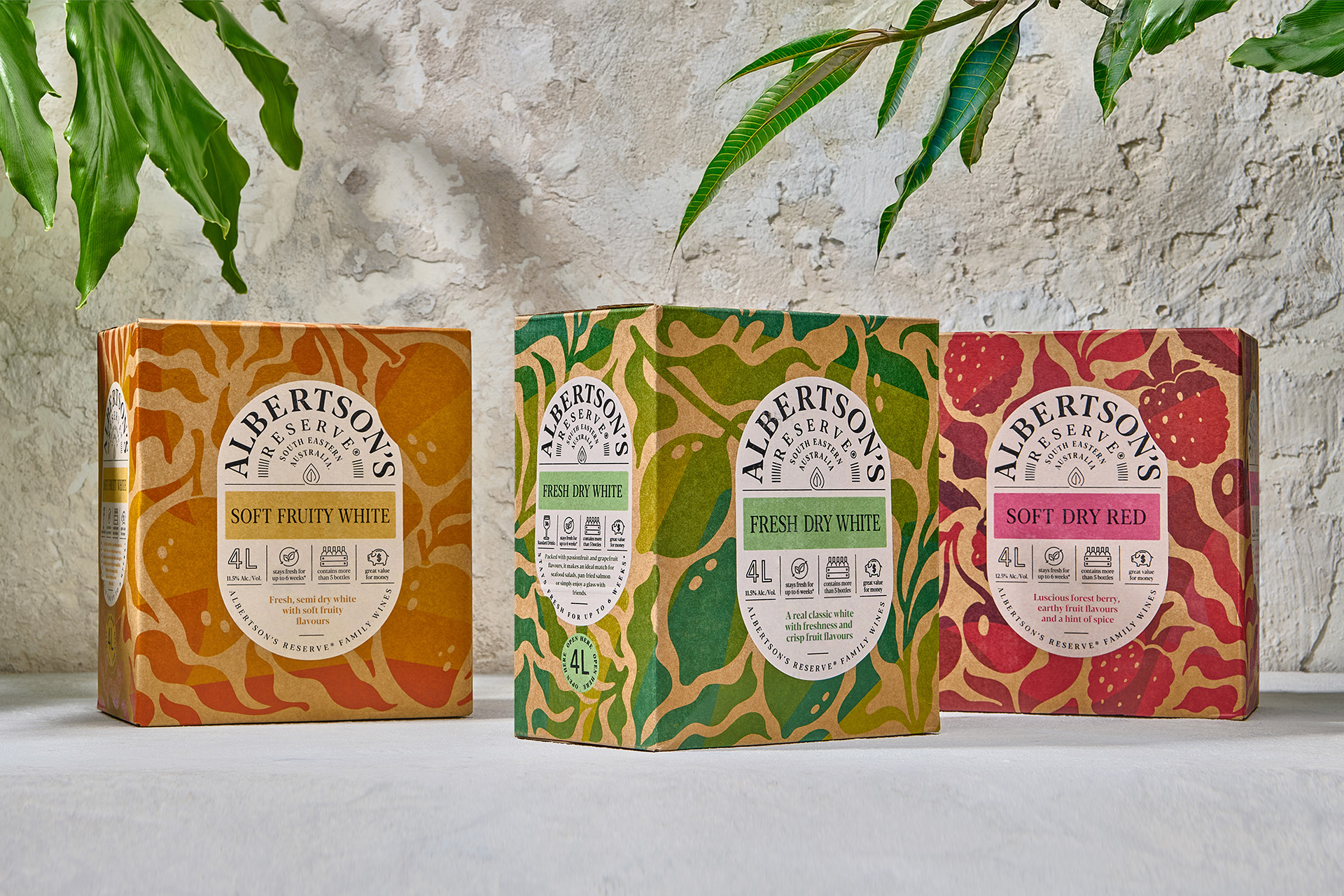
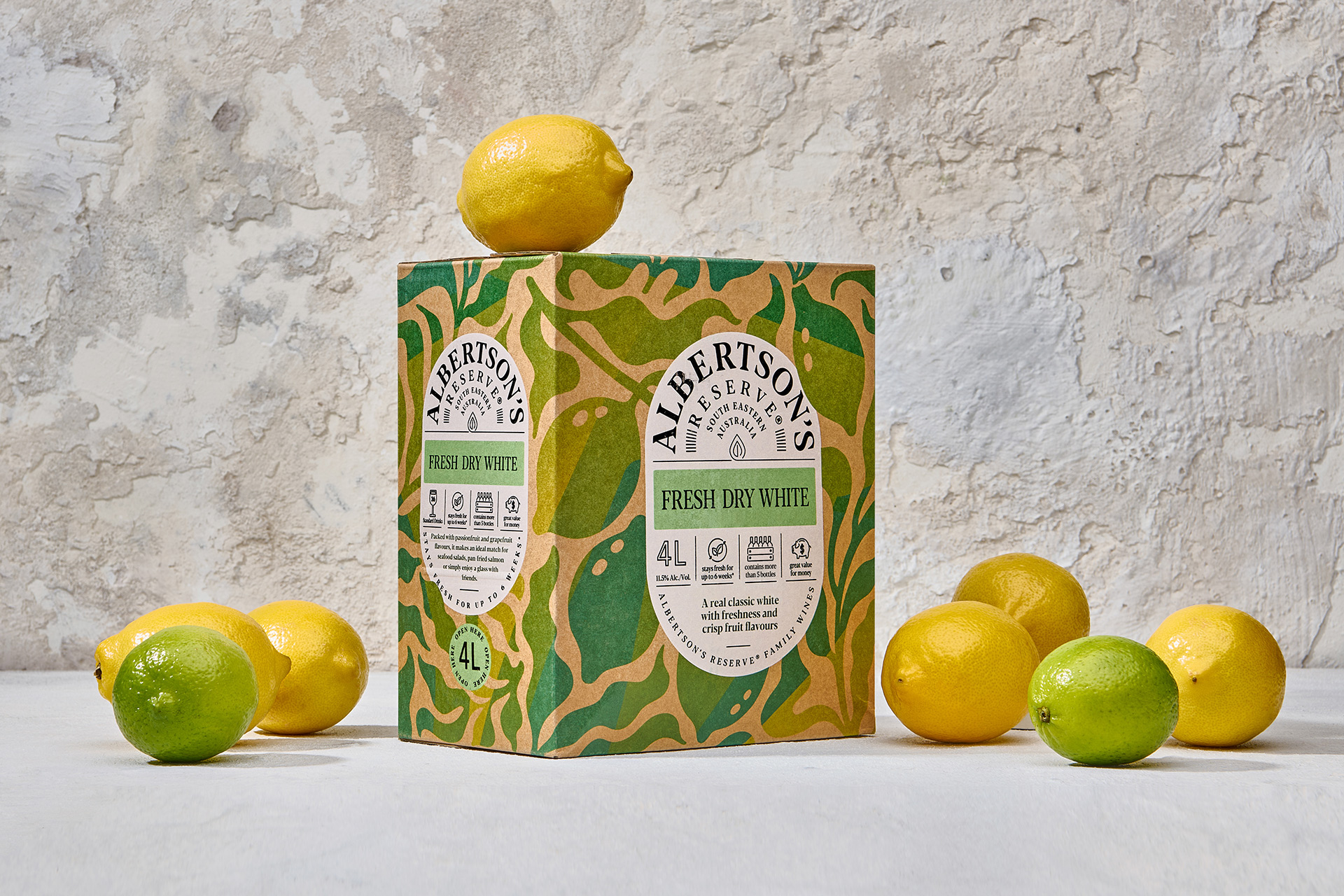
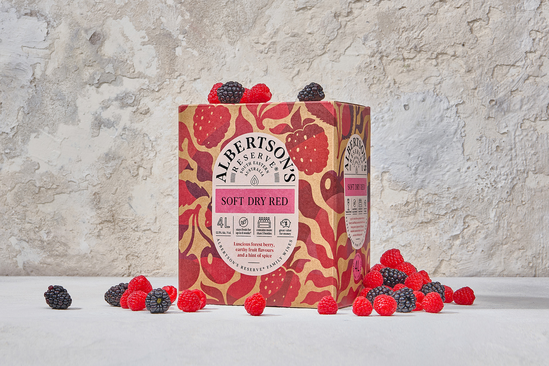
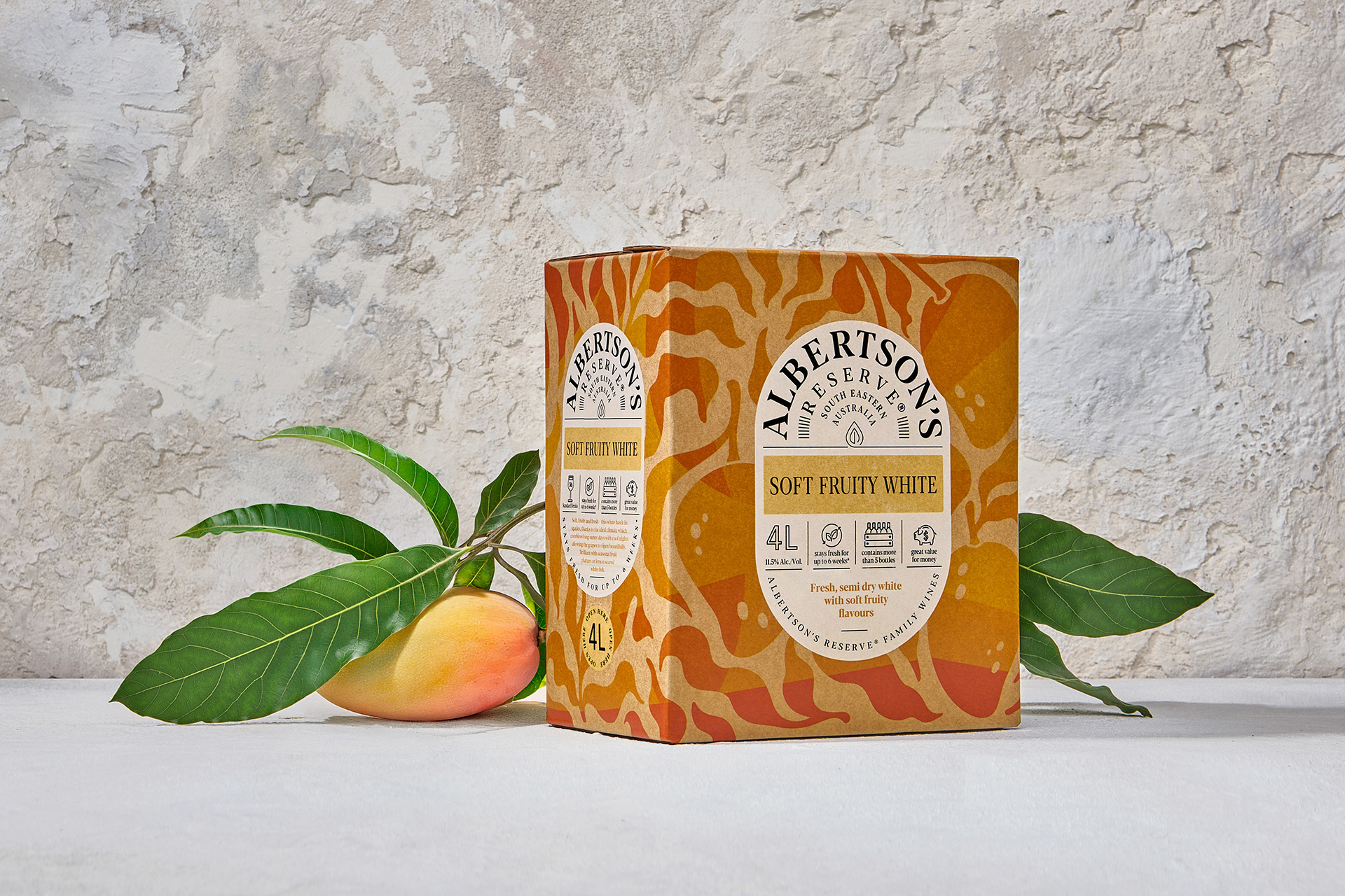
The range includes a variety of palate-friendly varietal blends, each selected to appeal to different tastes and moods. The Soft Fruity White offers gentle sweetness and light floral notes, with a refreshing finish that makes it an ideal companion to salads, seafood, or a sunny afternoon. The Fresh Dry White is a crisper alternative, with bright citrus and green apple notes that shine when served chilled. For those who prefer red wine, the Soft Dry Red delivers smooth berry flavours, balanced tannins, and a soft finish—perfect for pairing with grilled foods, pasta, or casual conversations.
Beyond the wine itself, Albertson’s Reserve stands out for its thoughtfully designed packaging. Each 4-litre cask stays fresh for more than six weeks after opening, thanks to an airtight tap system that preserves flavour and quality with every pour. The cask is made from eco-friendly Kraft board, decorated with a visually appealing blend of translucent and opaque inks. Vivid, appetising fruit illustrations highlight the juicy character of the wines and make the cask an attractive addition to any picnic setup or social gathering.
Perfect for laid-back entertaining or stocking up your kitchen with a reliable go-to wine, Albertson’s Reserve combines taste, sustainability, and convenience in one stylish package.
CREDIT
- Agency/Creative: Harcus Design
- Article Title: Harcus Design Creates a Fresh Visual Language for Albertson’s Reserve
- Organisation/Entity: Agency
- Project Type: Packaging
- Project Status: Published
- Agency/Creative Country: Australia
- Agency/Creative City: Sydney
- Market Region: Oceania
- Project Deliverables: Brand Mark, Packaging Design
- Format: Case
- Industry: Food/Beverage
- Keywords: albertsons cask, albbertsons reserve, wine, australian wine
-
Credits:
Creative Director: Annette Harcus
Designer: Galima Akhmetzyanova
Designer: Annette Harcus
Photographer: Stephen Clarke


