


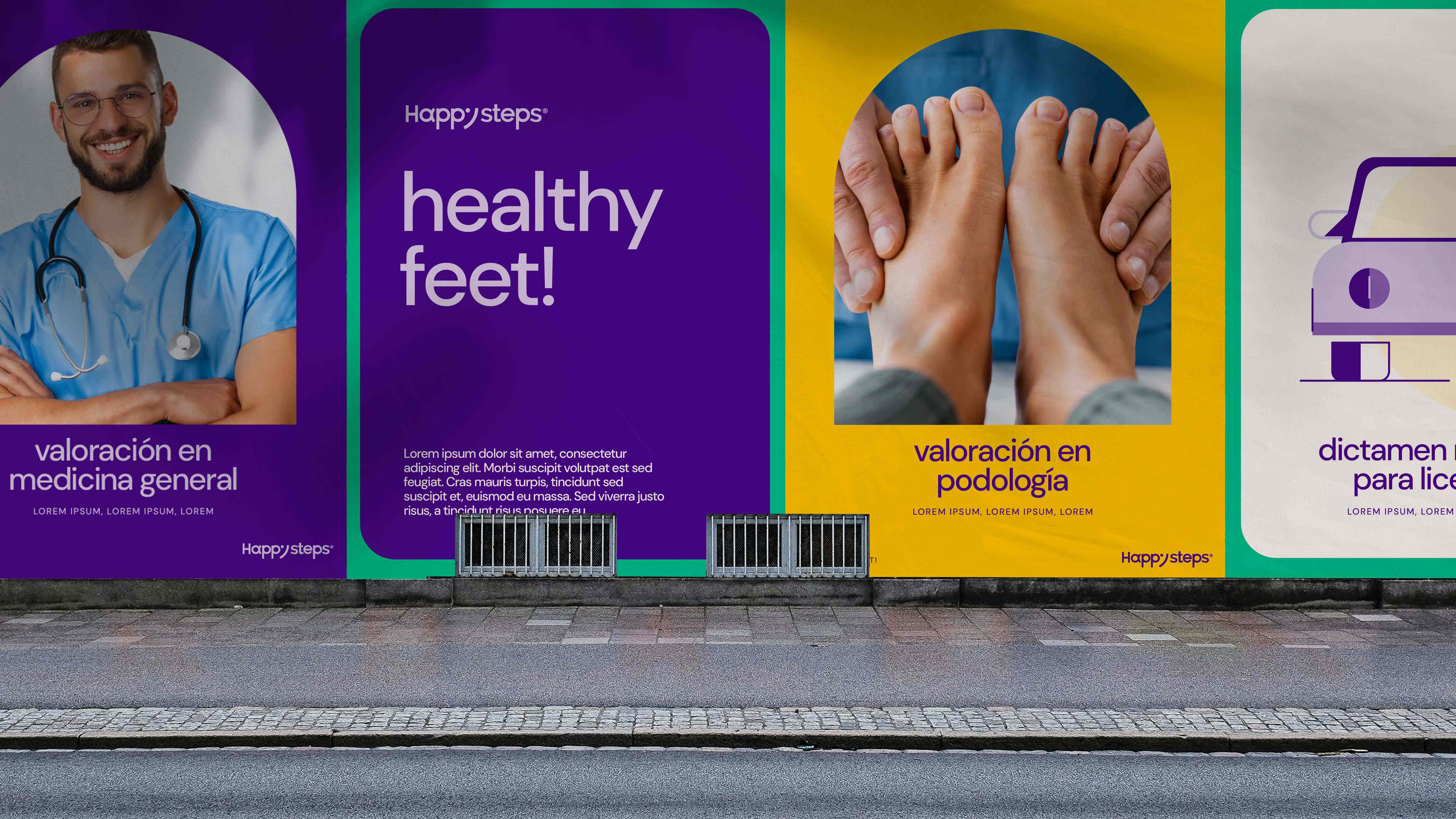
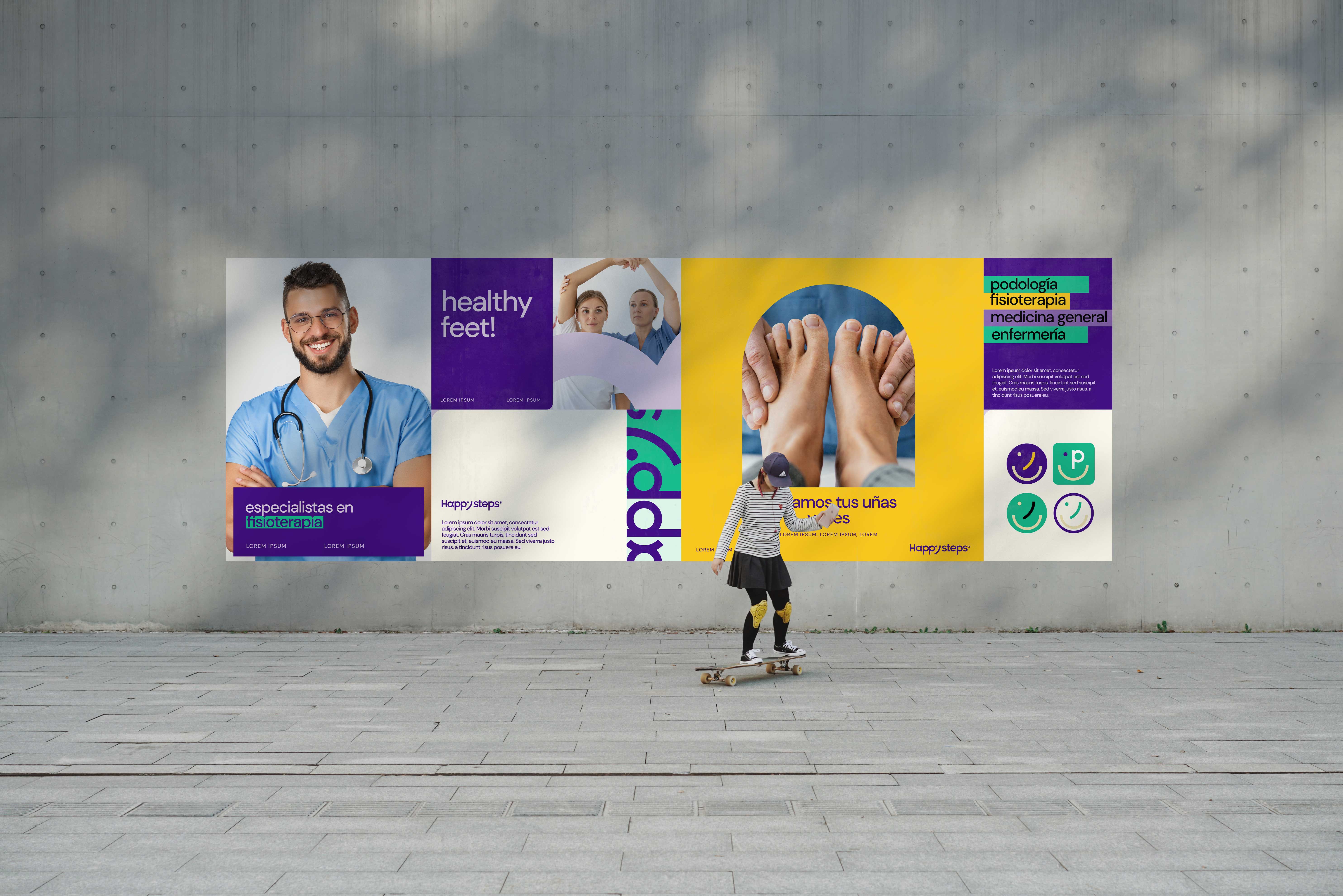
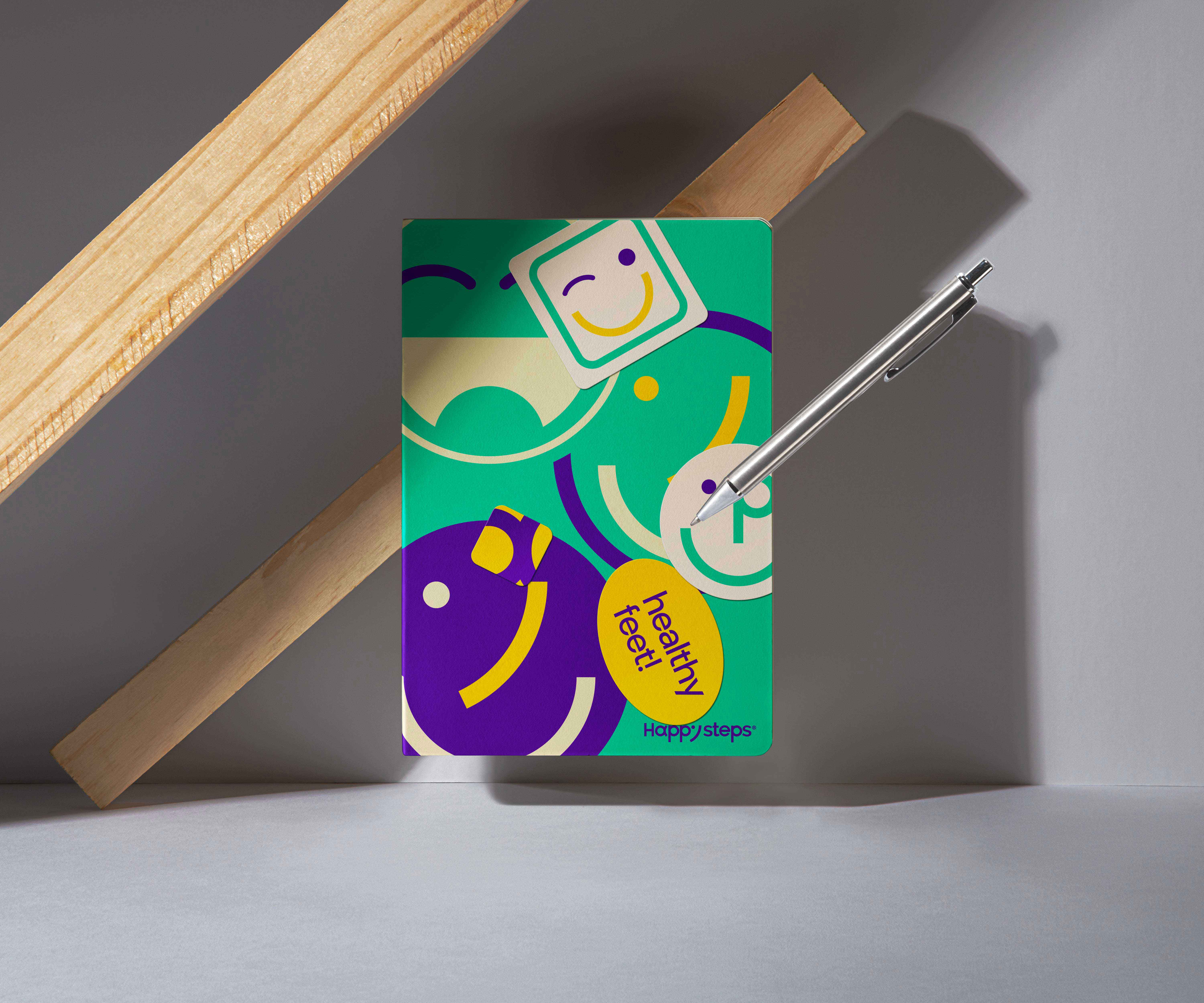
Healthy Feet.
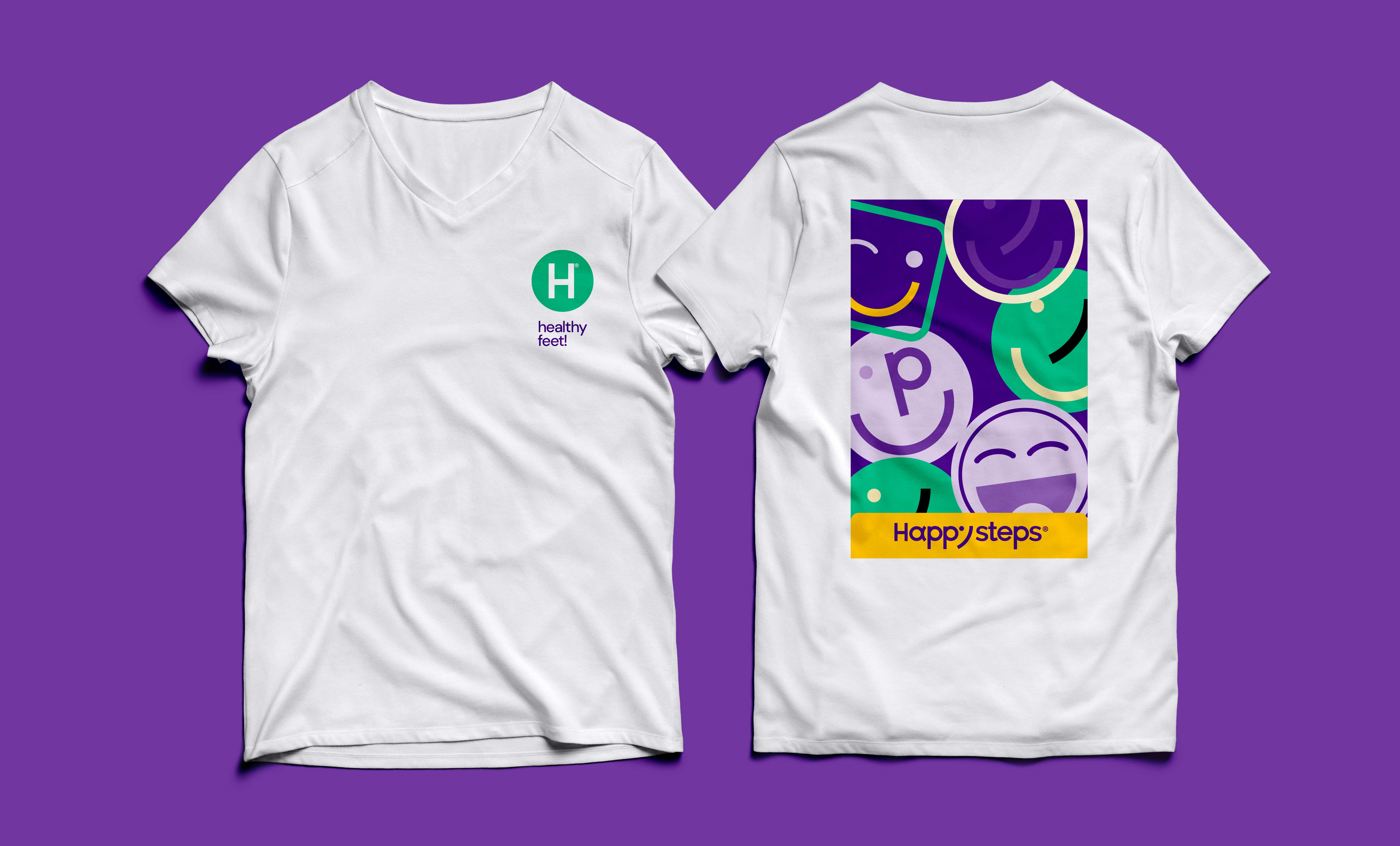
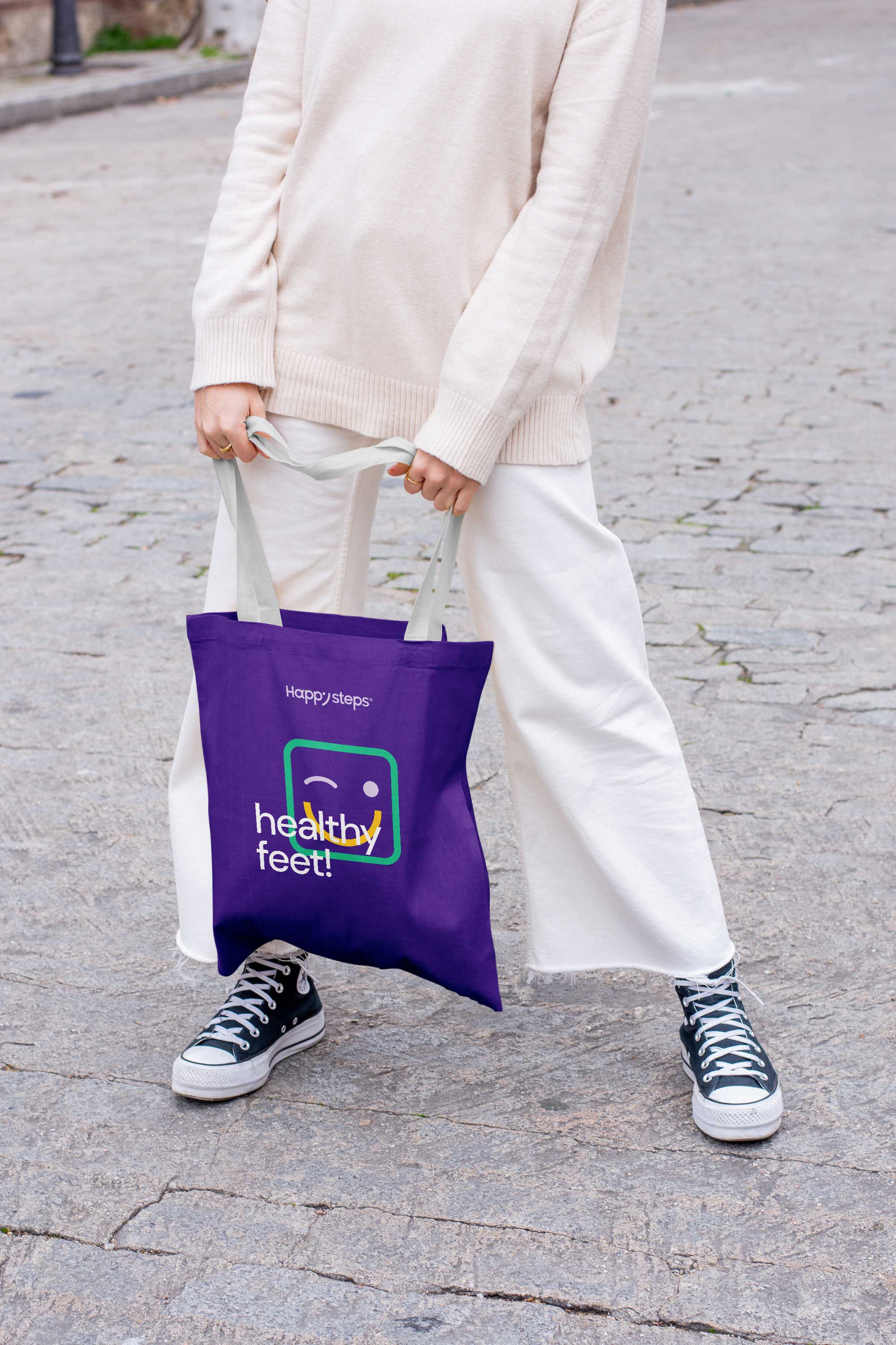
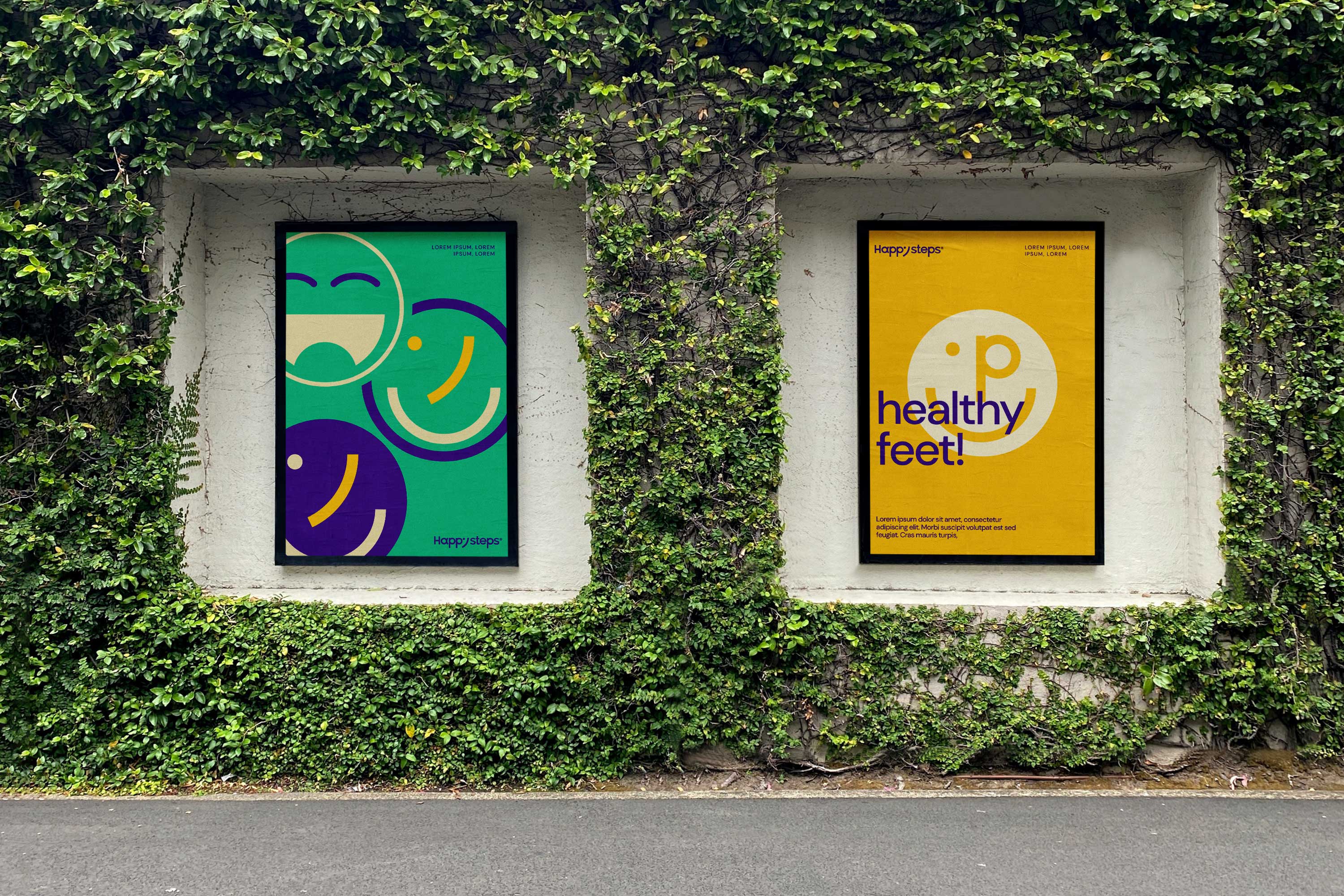
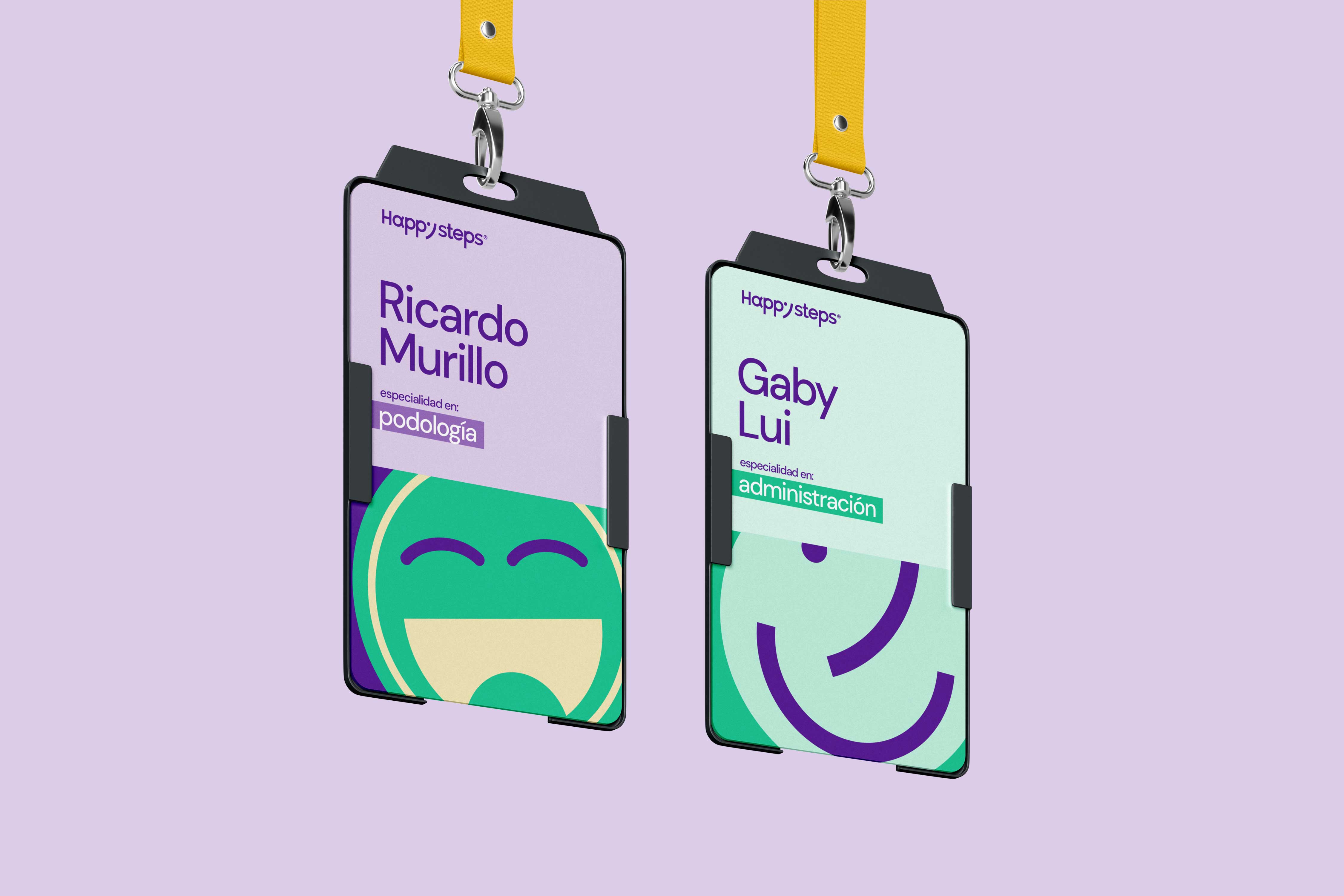
The graphic concept lies in 5 design pillars, mainly the ability to be a brand that it expresses happiness and a smile with which its final clients are received. The shape of the foot implicit in the construction of the logo (Letter y), the circle shape is vital to its narrative, each of our letters in the name happysteps detonate a very strong way towards curves and shapes circulars, and finally the story subtly reflected in the letter a, inspired by Greek culture where it is believed that they were the first beginnings of podiatry. The happysteps logo is inspired by everything that makes us happy and makes us smile, It is the sensation in which we feel well-being when we take care of ourselves and are happy with ourselves. Our state of health, and the general creative concept of the brand is inspired by this.


CREDIT
- Agency/Creative: REDS
- Article Title: Happysteps Branding and Logo Design by REDS Celebrates Curves and Smiles
- Organisation/Entity: Agency
- Project Type: Identity
- Project Status: Published
- Agency/Creative Country: Costa Rica
- Agency/Creative City: San José
- Market Region: North America
- Project Deliverables: Art Direction, Brand Design, Brand Identity
- Industry: Health Care
- Keywords: happysteps
-
Credits:
Director de Arte: Andru00e9s Rojas


