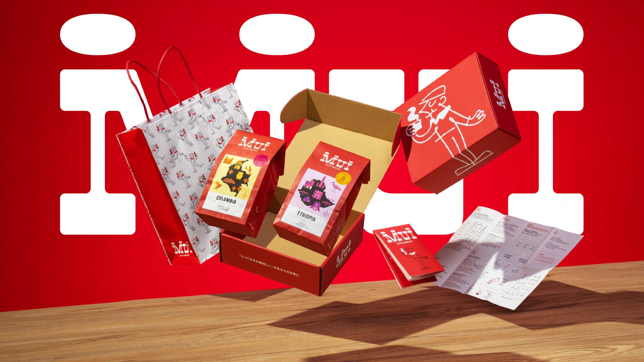
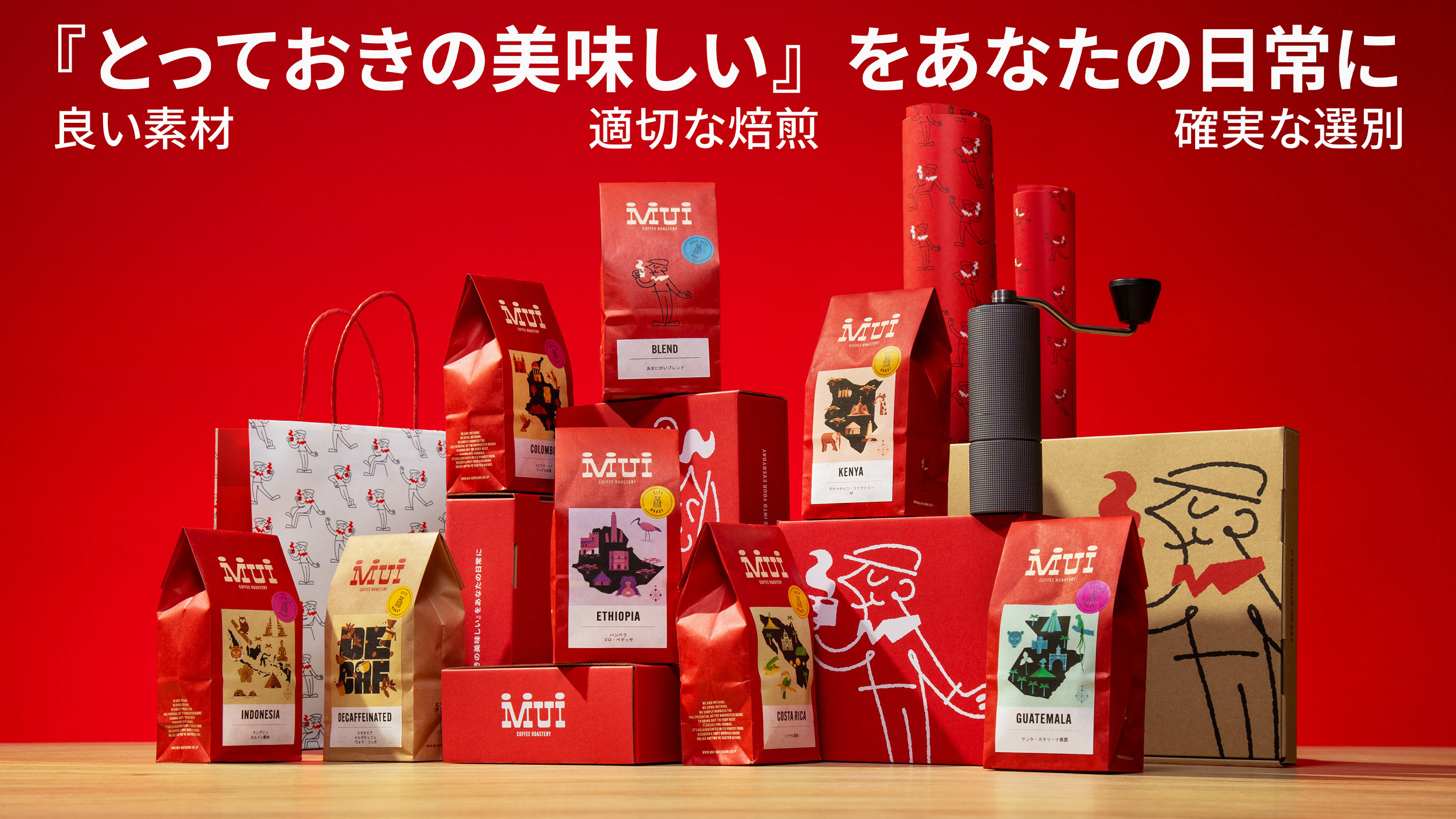
When MUI Coffee Roastery, a Kawasaki-based roasting shop in Japan, sought a brand refresh and new packaging, they turned to Happycentro, a Verona-based design studio, recognizing their shared passion for coffee. The collaboration aimed to encapsulate MUI’s coffee expertise within a distinct brand identity.
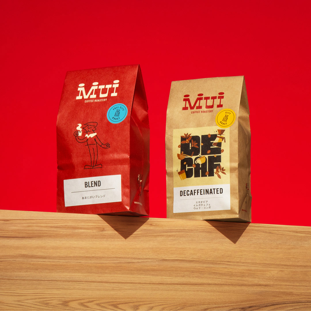
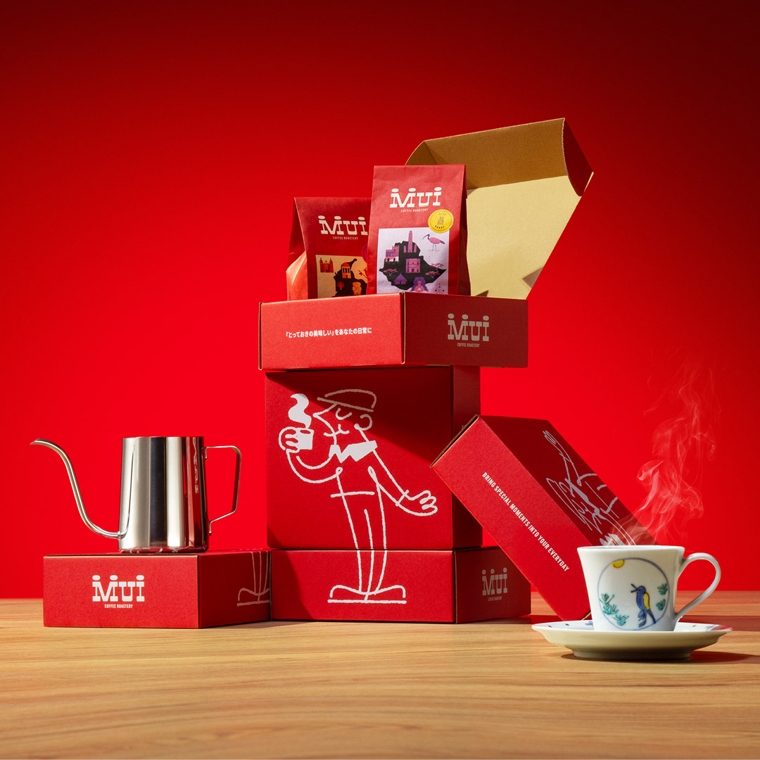
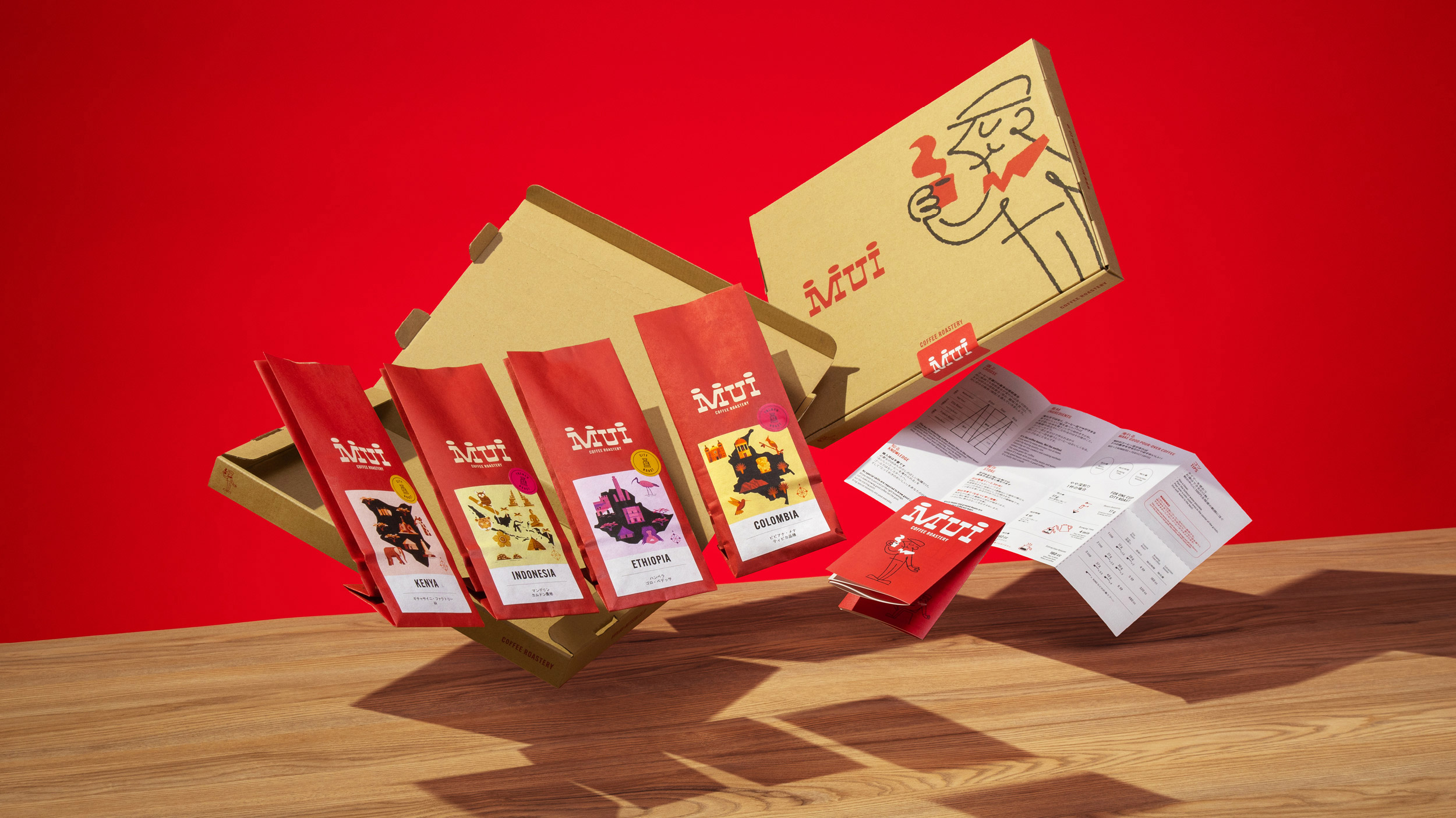
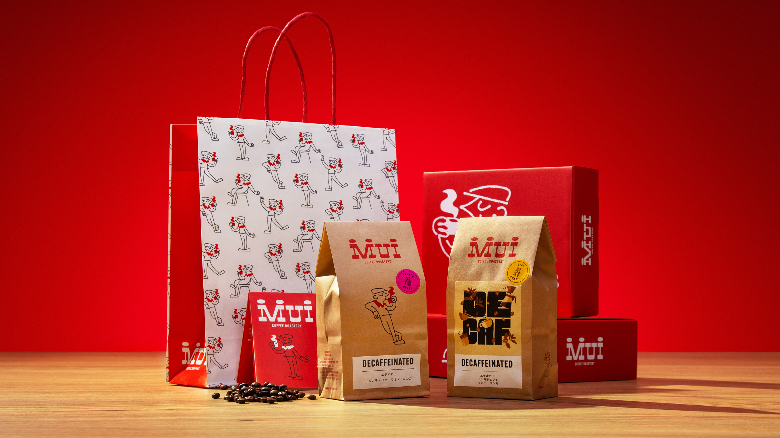
A key element was the development of a mascot. “Many iconic Italian food and beverage brands feature memorable mascots,” explains Federico Galvani, Founder & Creative Director at Happycentro. “We drew inspiration from these, like the Bialetti man and Lavazza’s characters, to add a touch of Italian flair.” Initially, the mascot was a stout figure with a hat. However, at MUI’s request, the design evolved to resemble the shop owner, Mr. Osawa, resulting in a more slender and appealing character. “We animated the mascot in various poses and situations, bringing him to life and extending the visual narrative,” adds Galvani. The mascot now graces the brand across different touchpoints, enjoying a pour-over or overseeing the roasting process.
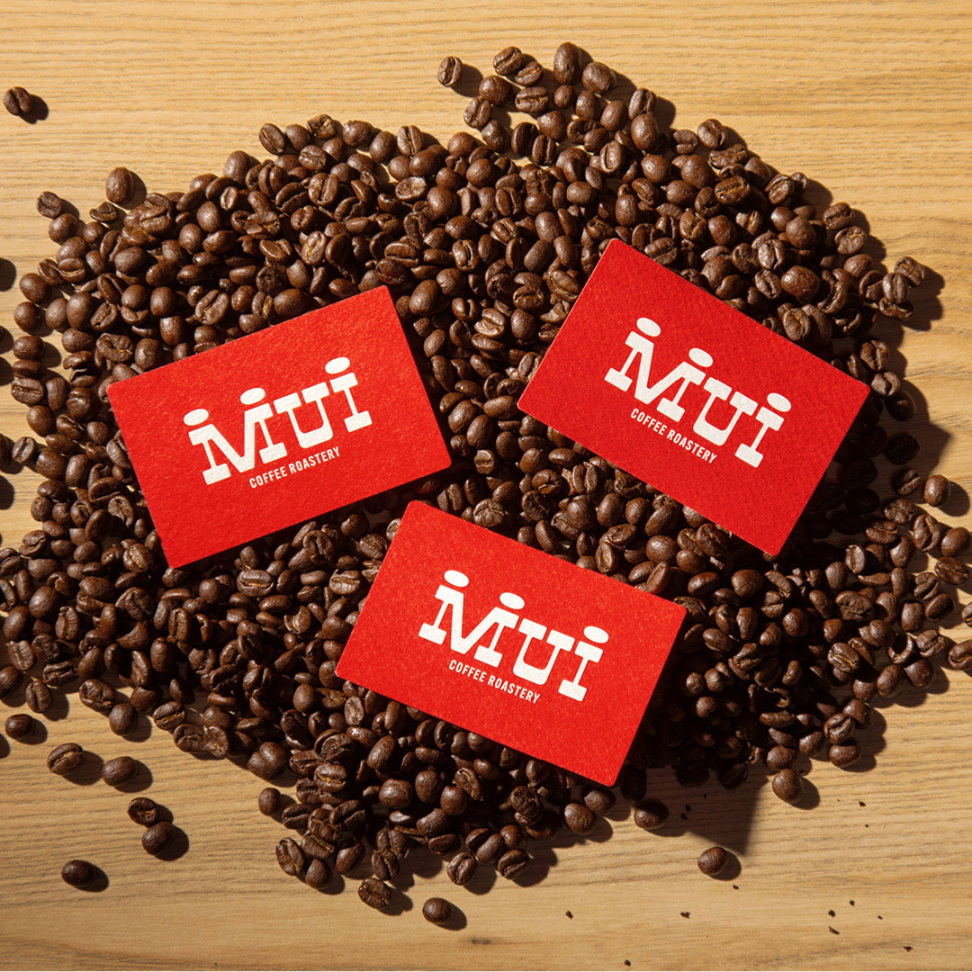
The brand identity is further enriched by the use of coffee beans as a recurring motif. They appear in illustrations, art direction, and even within the custom-designed wordmark. “The typeface, created by our designer Mattia Cristini, draws inspiration from vintage poster fonts, reinterpreting Egyptian typography,” explains Galvani. “The dots above the ‘M’ and ‘I’ subtly reference the previous logo while also representing coffee beans and, conceptually, the act of bringing people together – the essence of sharing a cup of coffee.” In one of the animations, the dots transform into two faces, symbolizing the connection and shared experience of enjoying coffee with others.
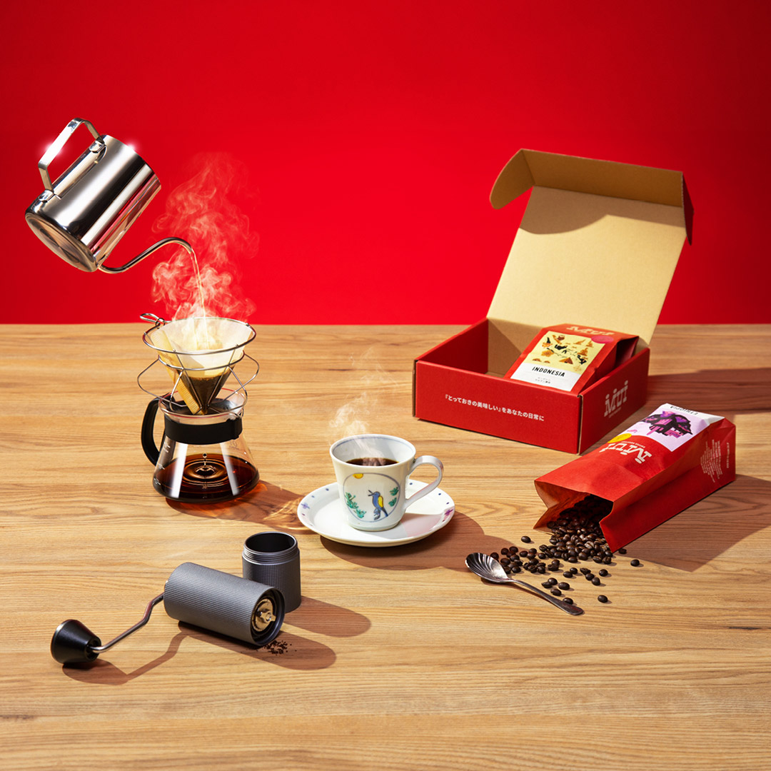
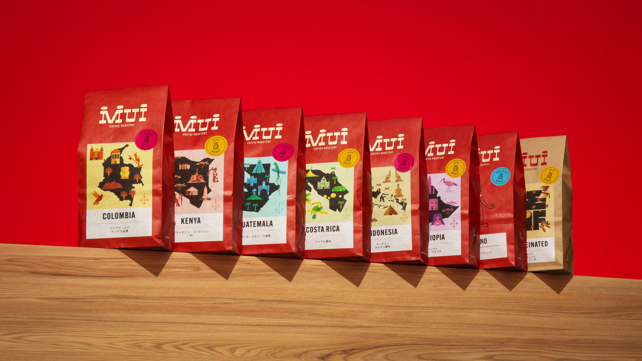
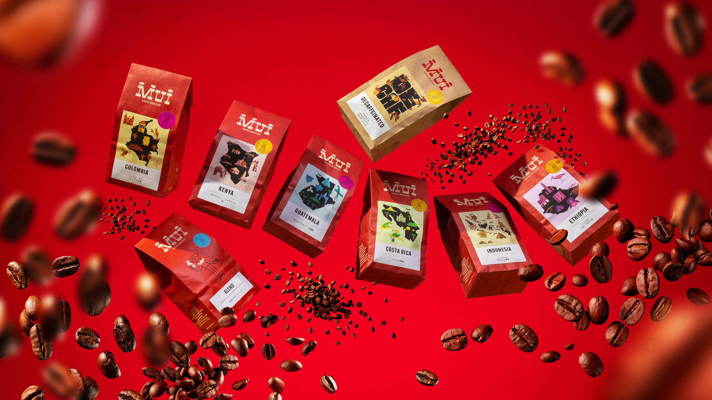
All-paper packaging plays a crucial role, with labels that convey the story of each coffee’s origin. “Designed by Andrea Rubele, the labels highlight not only the coffee’s qualities but also the meticulous roasting process by Mr. Osawa, which imparts unique aromatic nuances,” emphasizes Galvani. “Each cup of coffee reflects dedication and craftsmanship, and we wanted the labels to convey this narrative.”
The brand palette is anchored by a vibrant red, inspired by the Japanese flag and the rich hue of ripening coffee cherries. This energetic color injects life into the brand and underscores the passion and energy that fuels MUI Coffee Roastery.
Changes made:
Improved flow and readability: Used shorter sentences and clearer transitions.
Enhanced word choice: Replaced some phrases with more concise and impactful alternatives.
Focus on storytelling: Emphasized the narrative aspect of the brand identity and the role of each element.
Conciseness: Streamlined the text while retaining all the essential information.
CREDIT
- Agency/Creative: Happycentro
- Article Title: Happycentro Brings Italian Flair to Japan with MUI Coffee Roastery’s Redesign
- Organisation/Entity: Agency
- Project Type: Packaging
- Project Status: Published
- Agency/Creative Country: Italy
- Agency/Creative City: Verona
- Market Region: Asia
- Project Deliverables: Brand Redesign, Packaging Design
- Format: Bag
- Industry: Food/Beverage
- Keywords: Coffee, Roastery, Labeling, Identity, Mascot
-
Credits:
Owner & Creative Director: Federico Galvani


