


Tidy Studio – Happie Pies
Seeking to disrupt a traditional market with a bold and colourful brand identity, the creators of Happie asked Tidy to redefine the humble pie.
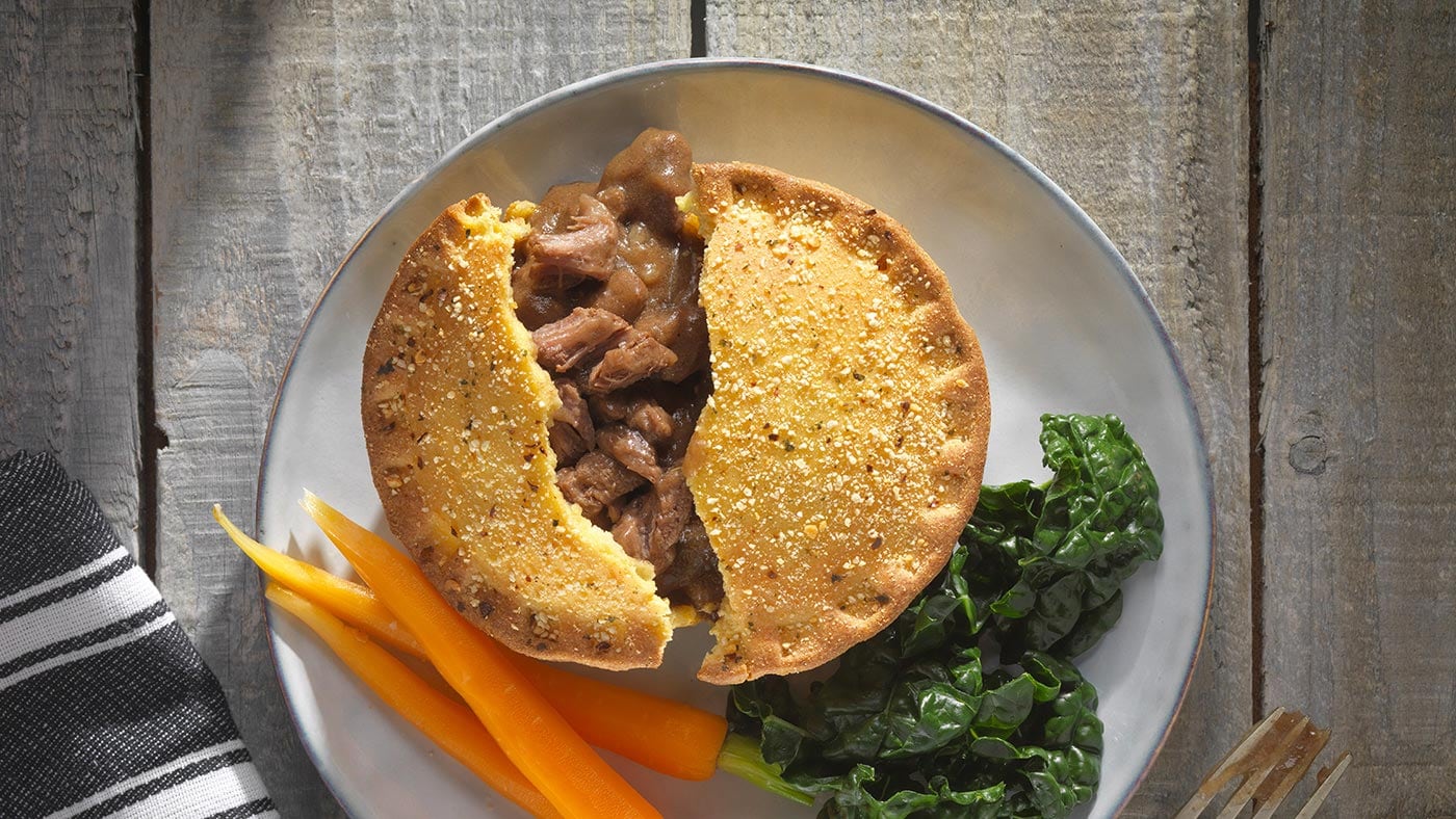
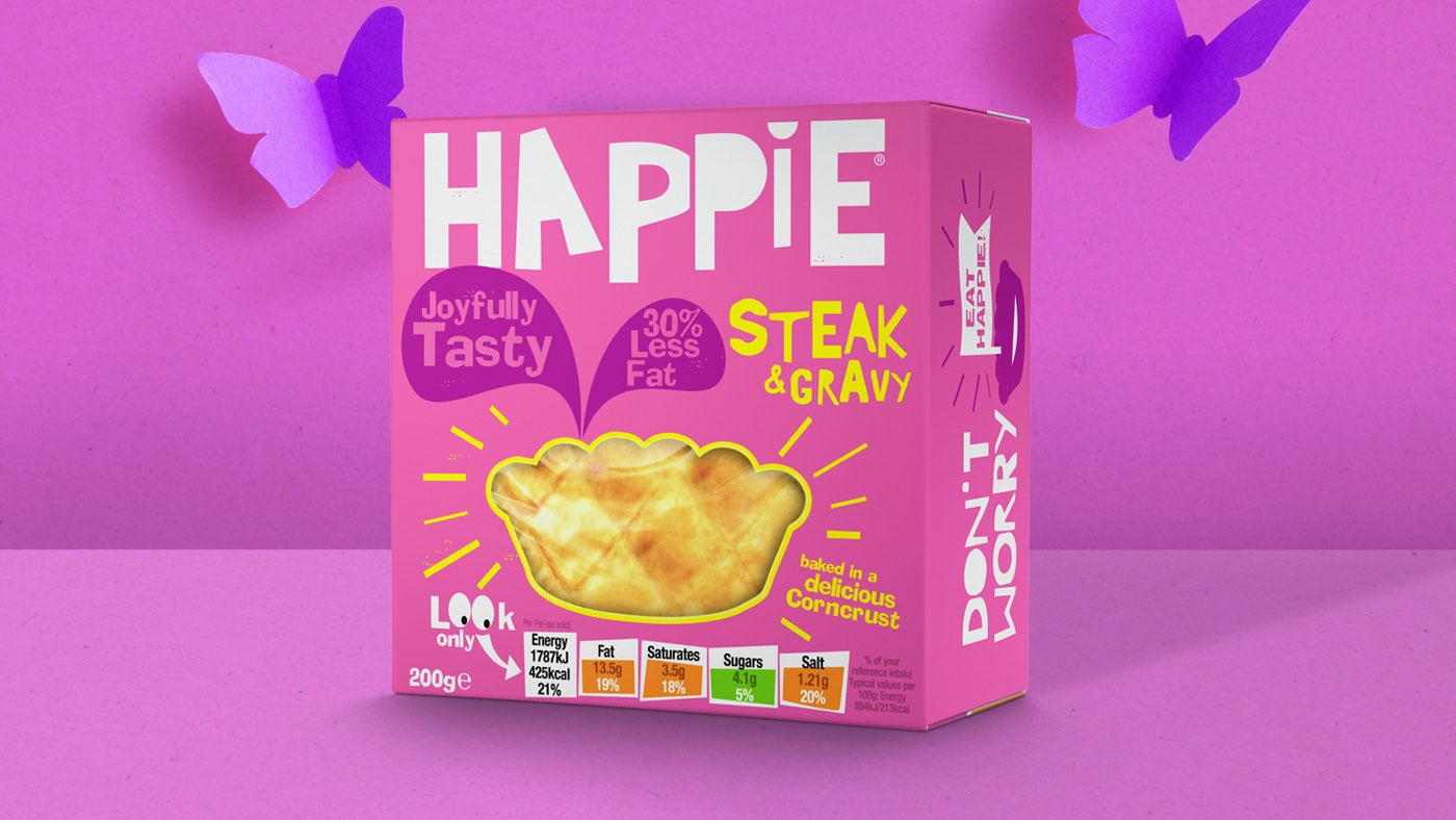
Pies may be seen as quintessentially British pub grub, but today’s health-conscious consumers are often left out of the equation.
Happie sought to shake things up with a nutritious alternative, featuring classic flavours and microwavable convenience at a fraction of the fat content.
The vision
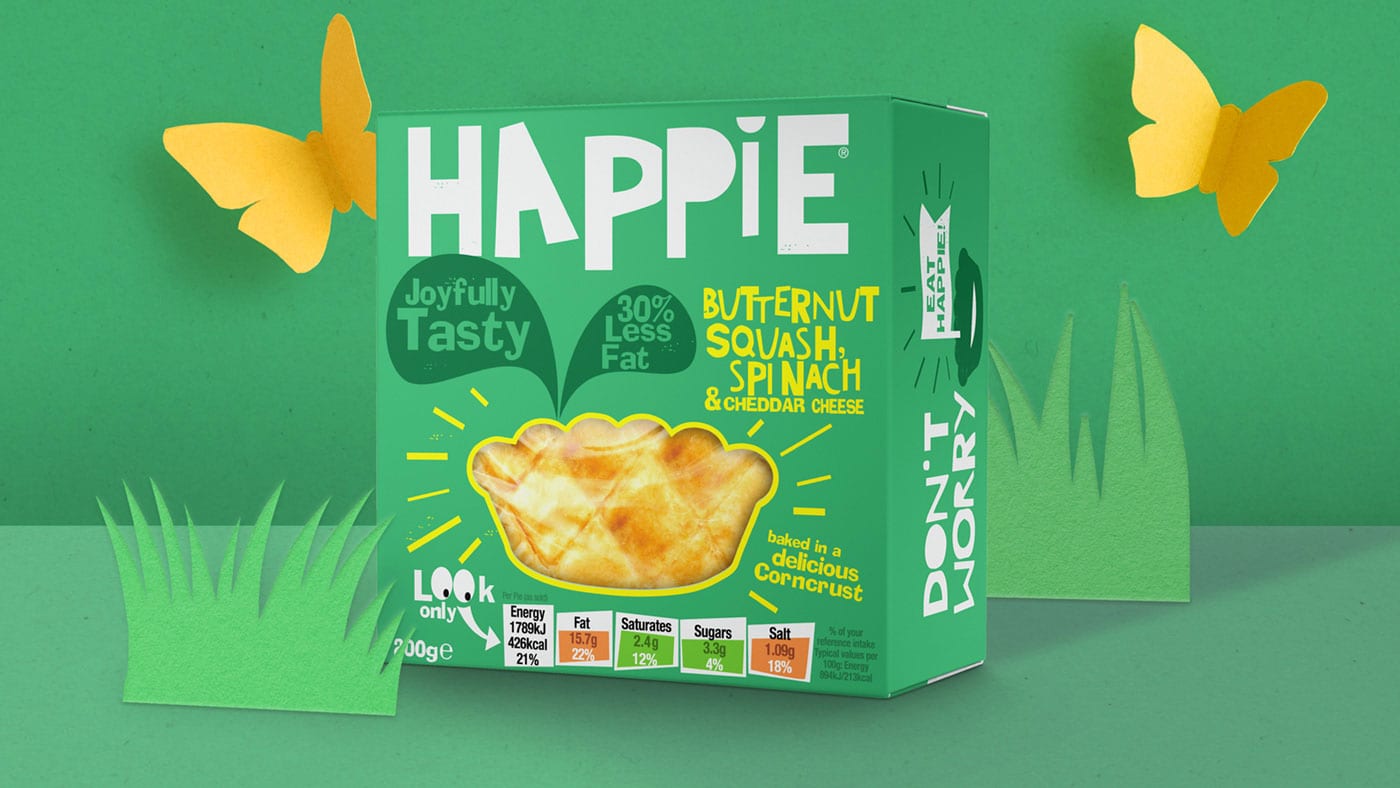
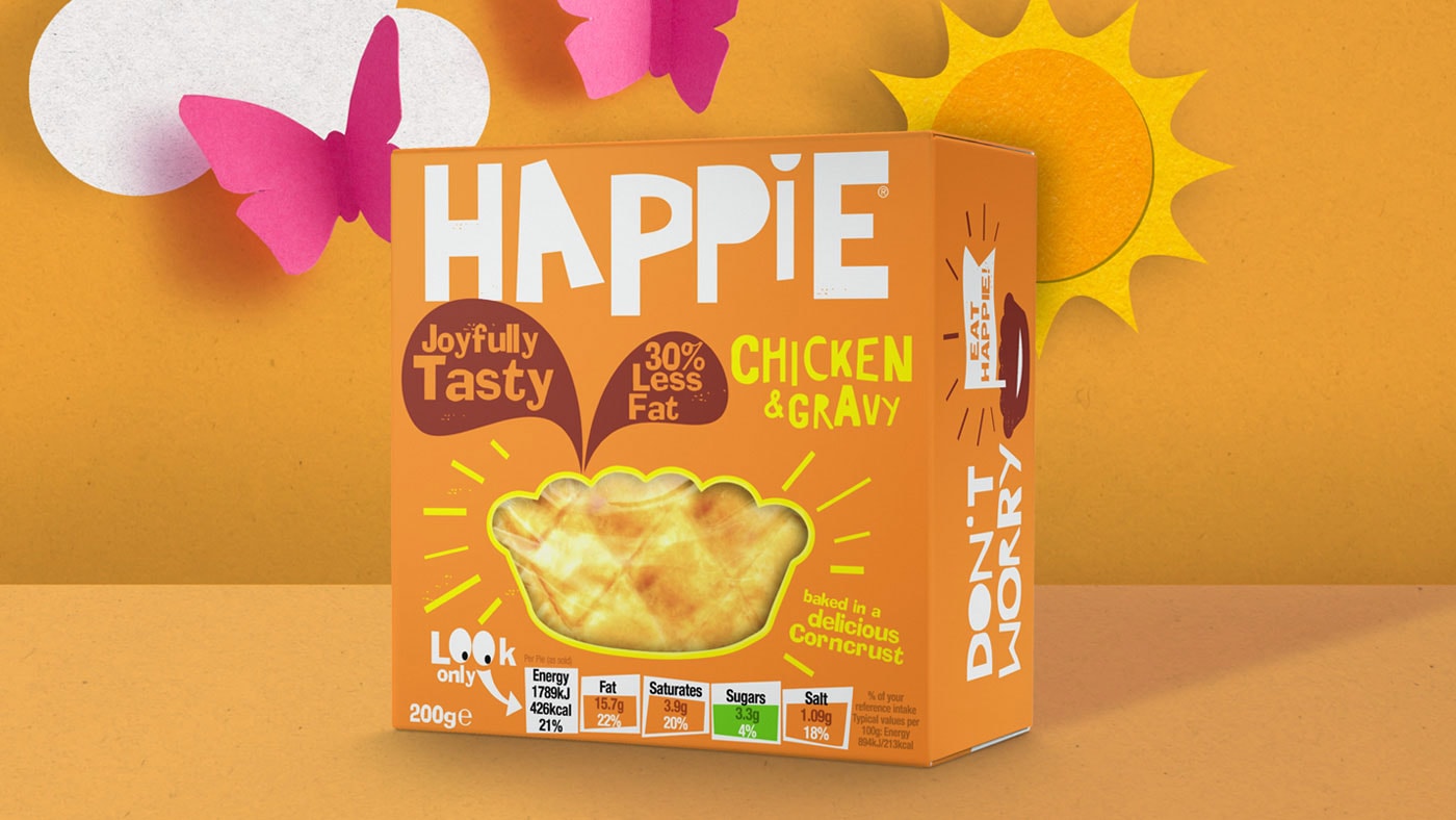
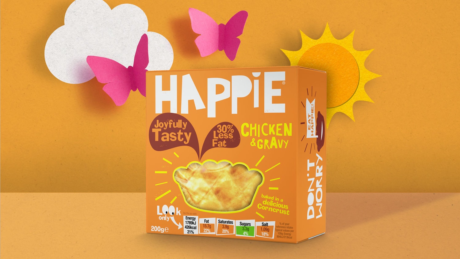
To make pies appealing to a new generation of food shoppers, Happie needed a vibrant and eye-catching brand that would stand out on supermarket shelves.
Traffic light labelling would need to feature prominently, alongside other essential messaging to communicate the health benefits of choosing Happie over more established brands.
The outcome
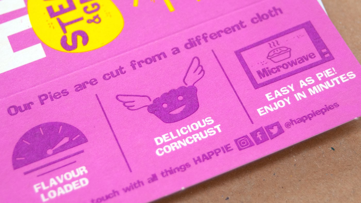
With playful cut-out aesthetics and vibrant signature shades for each filling, Happie’s packaging turns the traditional pie market on its head, attracting millennial shoppers and health-conscious consumers without sacrificing the classic appeal of comfort food.

CREDIT
- Agency/Creative: Tidy Studio
- Article Title: Happie Pie Packaging Project
- Organisation/Entity: Agency, Published Commercial Design
- Project Type: Packaging
- Agency/Creative Country: United Kingdom
- Market Region: Europe
- Format: Box
- Substrate: Pulp Carton


