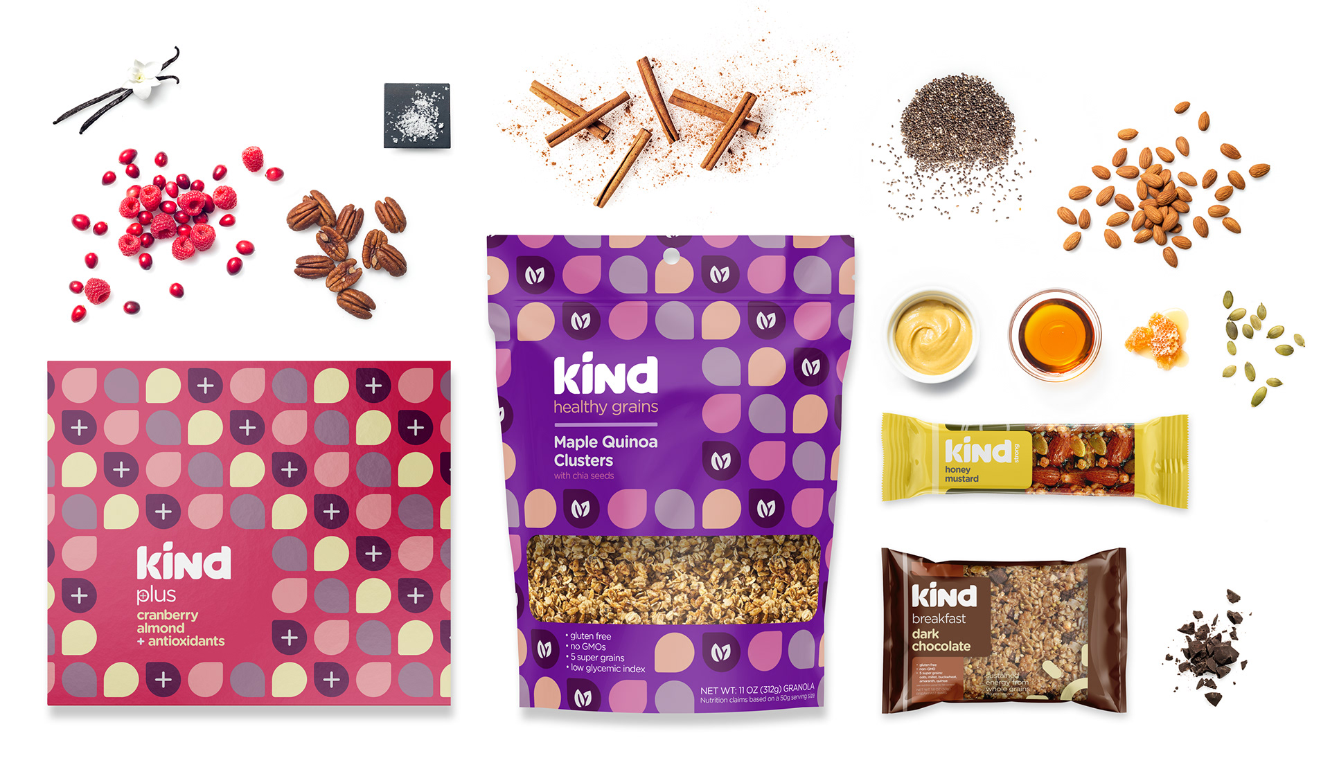
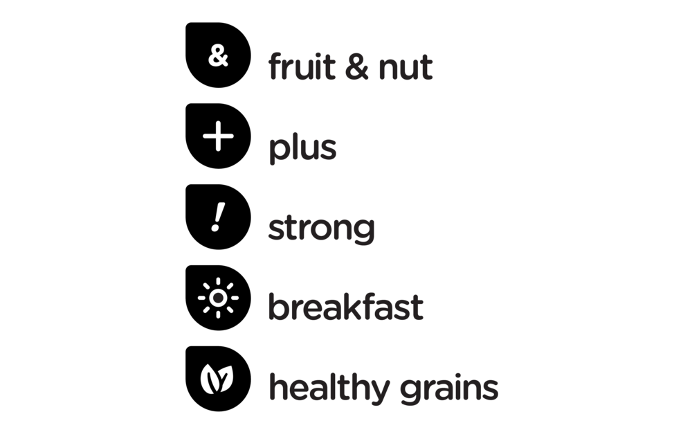
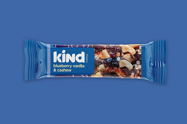
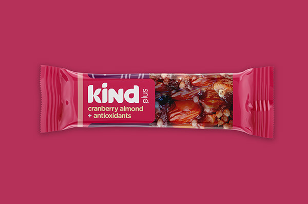
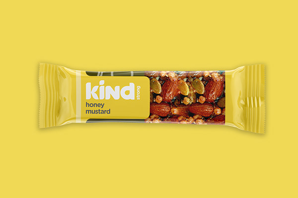
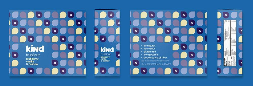
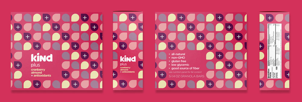
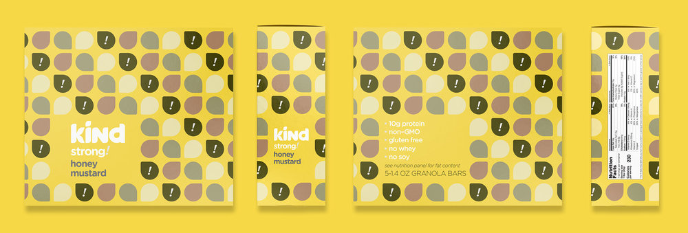
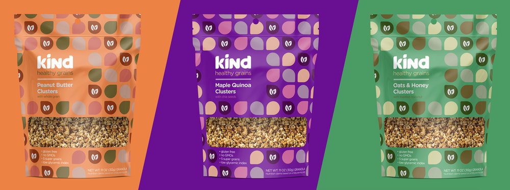
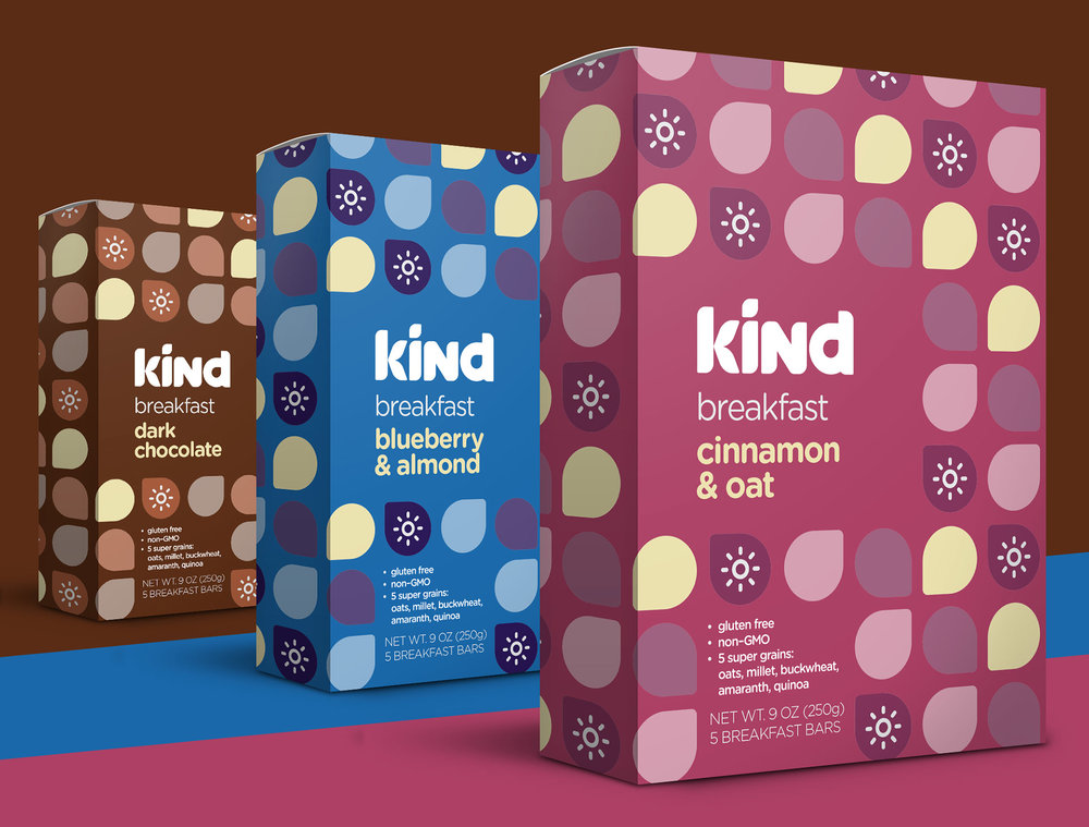
” “Do the KIND thing for your body, your taste buds and your world.”This very ambitious mission statement wasn’t quite matching up with their products on the shelves.A new logotype was created to more truly reflect the brand. Harsh, grotesque all-caps characters were replaced with gentle curves and natural shapes.Previously, the packaging was clinical and geometric. Categories & varieties were treated inconsistently. The little color on the wrappers was desaturated.Now, flavors incorporate bold colors and natural shapes. Kind’s whole portfolio of delicious snacks is easily translated to this new visual language. Outer packaging utilizes a pattern inspired by the logotype, and iconography for each sub-brand makes flavors and patterns unique but also consistent and recognizable.This complete 180 of Kind’s brand more closely aligns its aesthetic with its mission, creating a flexible and dynamic system that’s easily applicable to any and all packages while still maintaining the brand’s emphasis on high–quality ingredients.”
CREDIT
- Agency/Creative: Hans Slade
- Article Title: Hans Slade – Kind Snacks Rebrand (Concept)
- Project Type: Packaging
- Format: Box, Wrap
- Substrate: Pulp Paper


