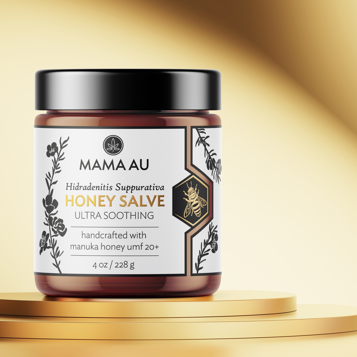
The Mama Au is a brand focused on creating organic, natural, and Manuka honey-infused skincare products for anyone who has been diagnosed with a chronic auto-inflammatory skin condition. It has become The Mama Au’s primary mission to bridge the gap between Hidradenitis Suppurativa and peace of mind. Due to a lack of products tailored towards people who suffer from HS, Anjel Marii created a wholesome product line as a solution for self-care treatments of lesions and open wounds at home.
On researching this dreadful condition, Hidradenitis Suppurativa, she realized that there were very few natural treatment alternatives available to its sufferers. So, Anjel Marii decided to create a holistic line of products to treat the skin inflammation, lesions, and abscesses that sufferers of HS have to endure.
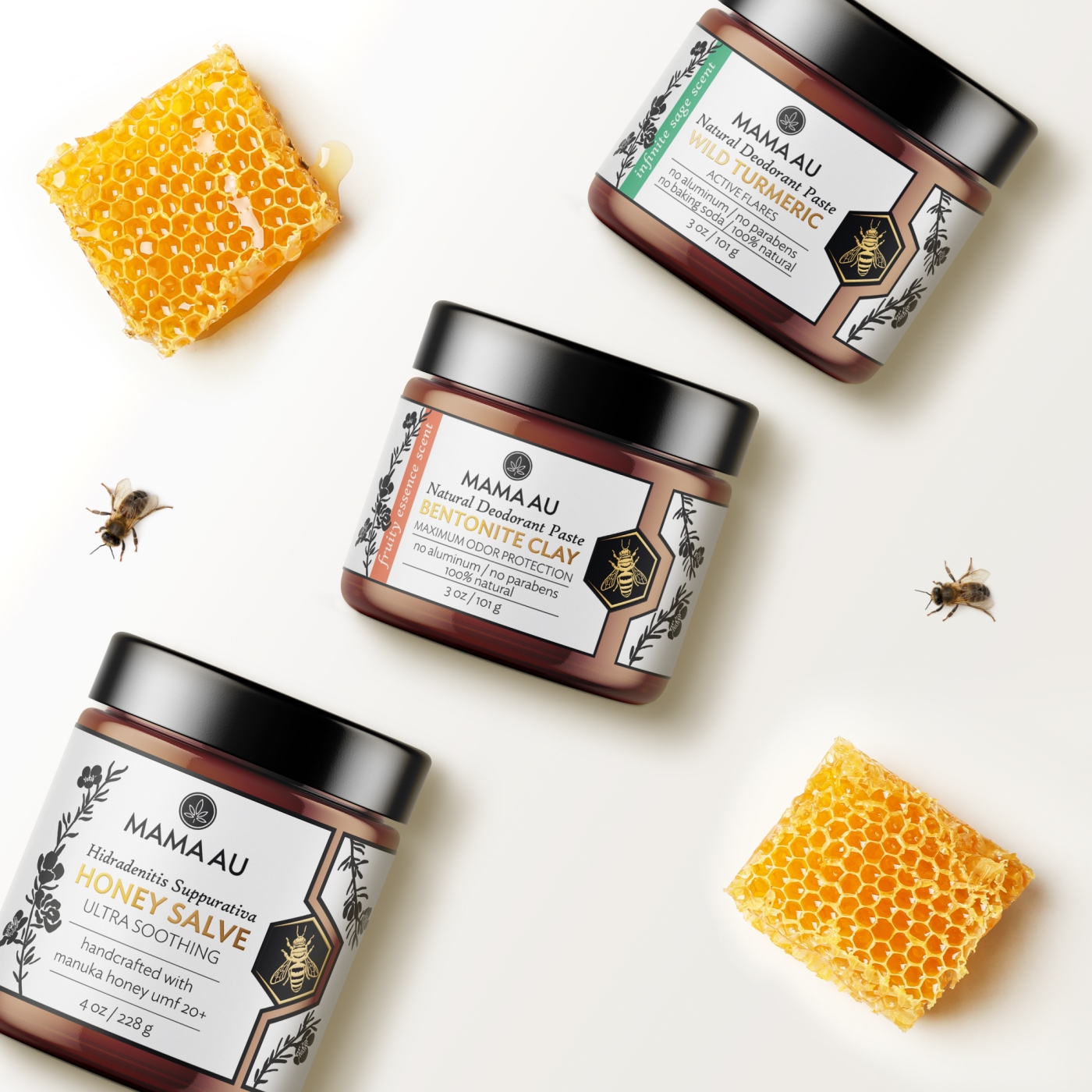
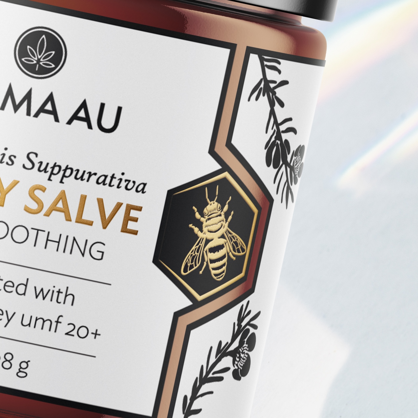
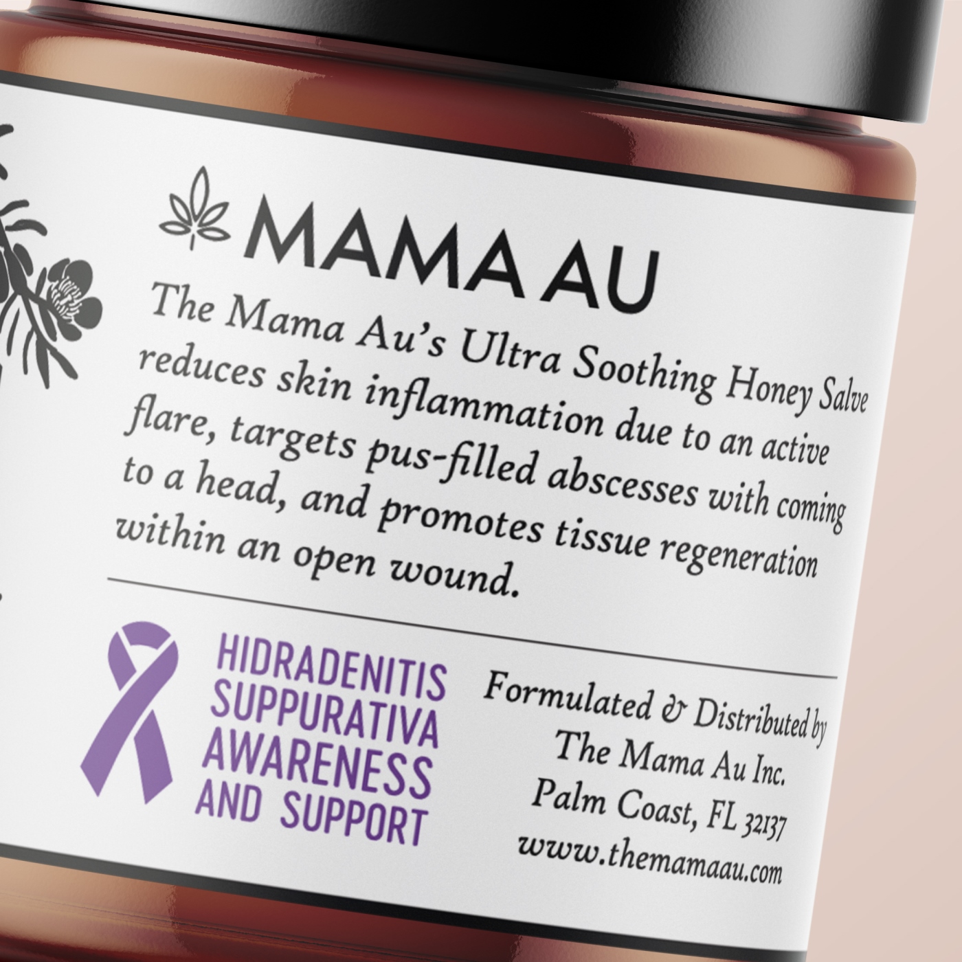
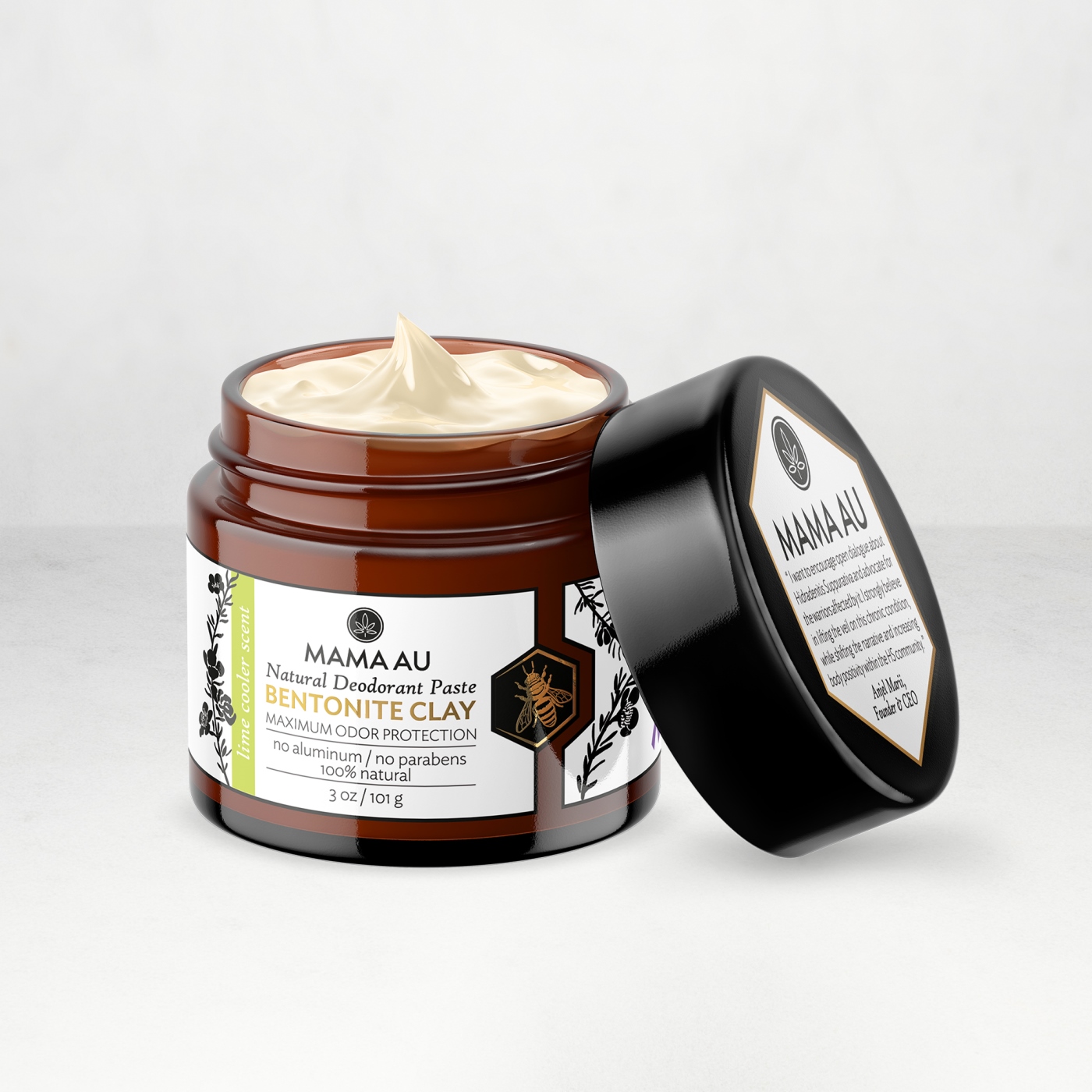
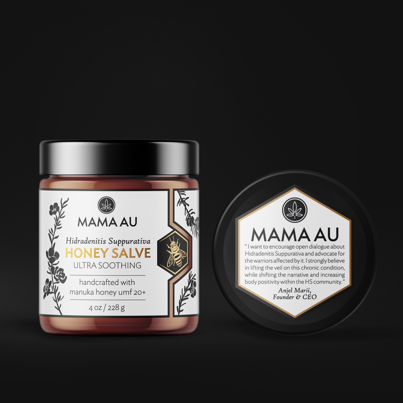
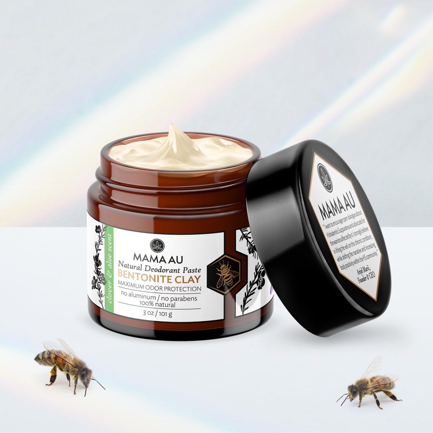
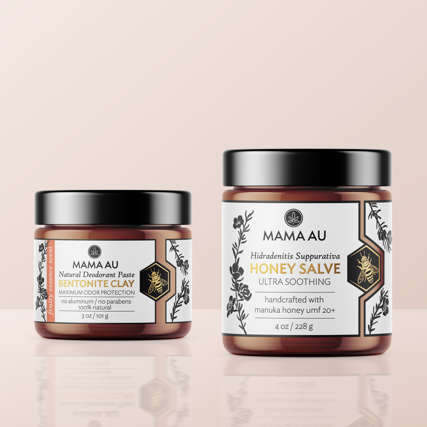
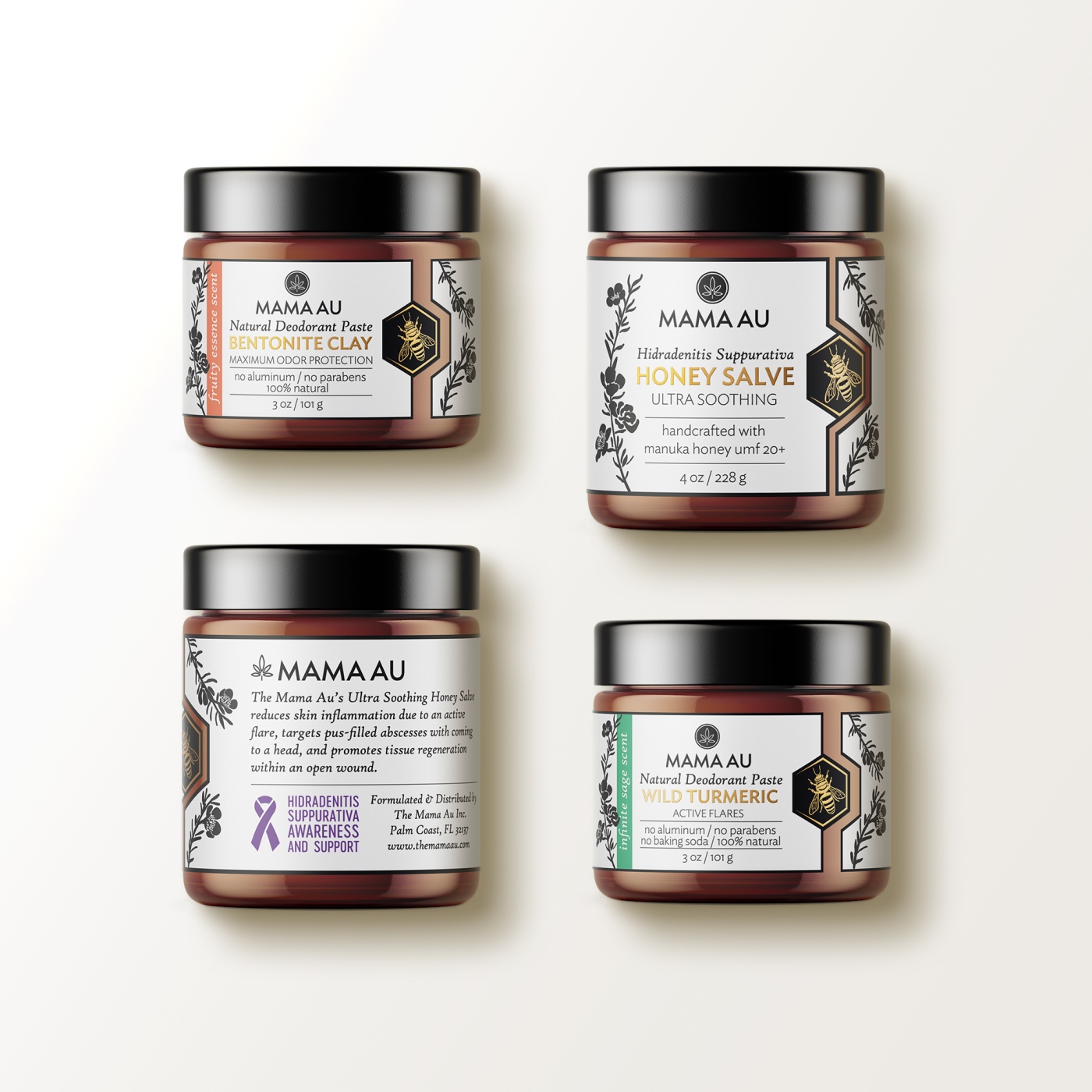
Mama AU means a brand specializing in skin-care products for people suffering from Hidradenitis Suppurativa. Due to a severe shortage of products intended for people suffering from chronic autoinflammatory skin diseases, the brand founder, Anjel Marii, makes with her own hands all organic skin-care products based on manuka honey and beeswax. Mama AU is aiming to encourage an open dialogue concerning HS, and this aim is illustrated in the label design. “AU” in the brand name means a chemical element – gold (from the Latin word “Aurum”). In this regard, we found it necessary to add the gold color to the design; it reflects a truly unique product on the market. It was important to display in the label the HS logo in purple in order to appeal directly to customers. The band colors provide the necessary distinction between the different flavors of the products. We have developed a special and innovative form of labels to reflect the product’s uniqueness, purity and naturality, which speaks of the unique essence of the product and its premium base – manuka honey collected in New Zealand. The bee’s cell shape used in the design, combined with the unique hand-drawn illustrations of a bee and manuka tree branches, represents the brand’s organic and natural quality.
CREDIT
- Agency/Creative: Hamster & Hammer
- Article Title: Hamster & Hammer Creates Label Designs for the Mama AU Brand
- Organisation/Entity: Agency, Published Commercial Design
- Project Type: Packaging
- Project Status: Published
- Agency/Creative Country: Belarus
- Market Region: North America
- Project Deliverables: Brand Architecture, Graphic Design, Illustration, Packaging Design
- Format: Jar
- Substrate: Glass, Glass Jar


