


Since Hamburg Brewing’s founding in 2013 they’ve developed a great reputation for both their flagship and their experimental beers. They pride themselves on quality products while maintaining a quirky, fun and approachable vibe. As they rapidly expanded, their existing system of labeling and branding quickly began to fracture. Hamburg needed fresh eyes to look at the entirety of their growing portfolio, and to develop a new system that could offer flexibility while creating an iconic brand and packaging that can be immediately identified on shelf.
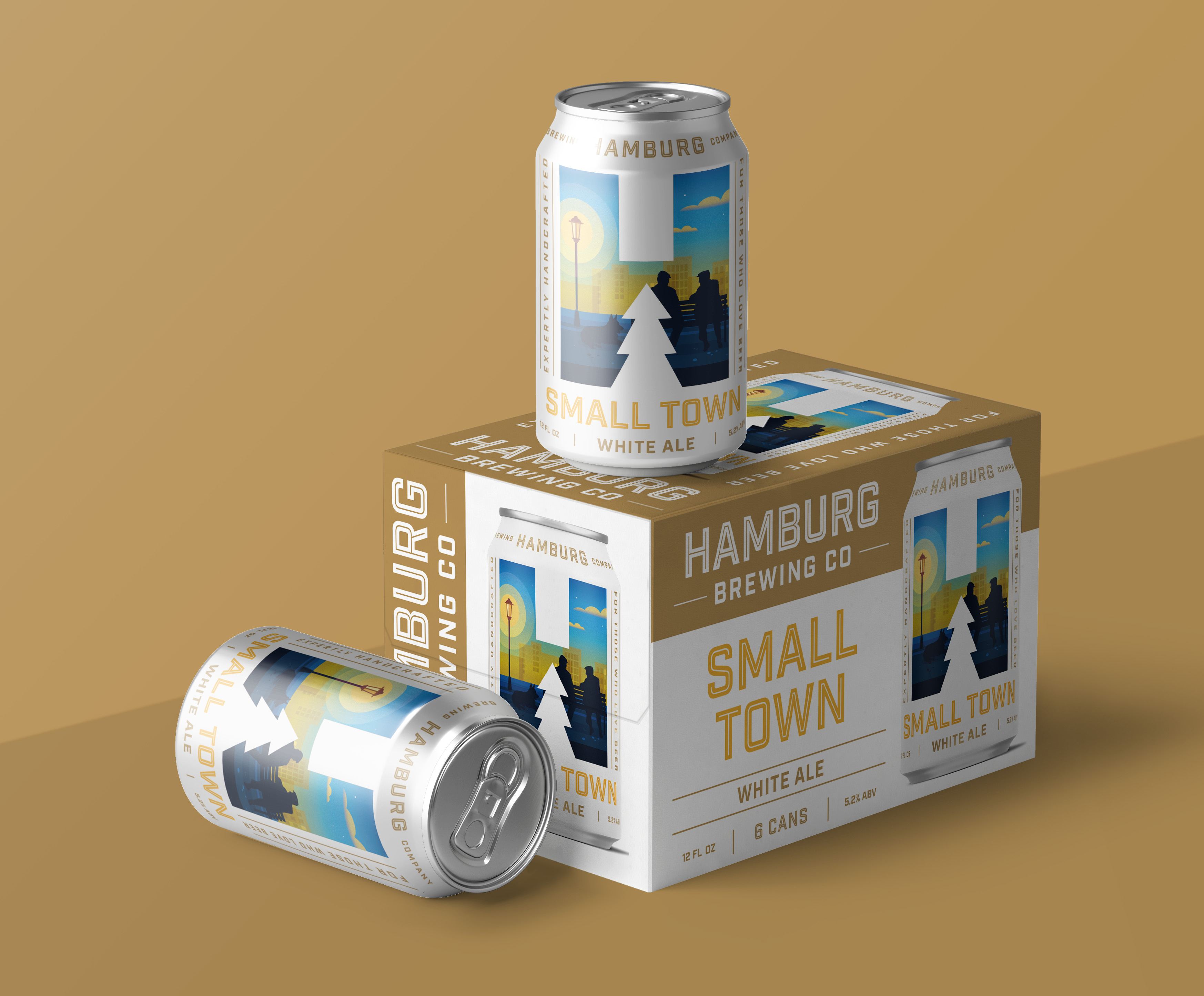
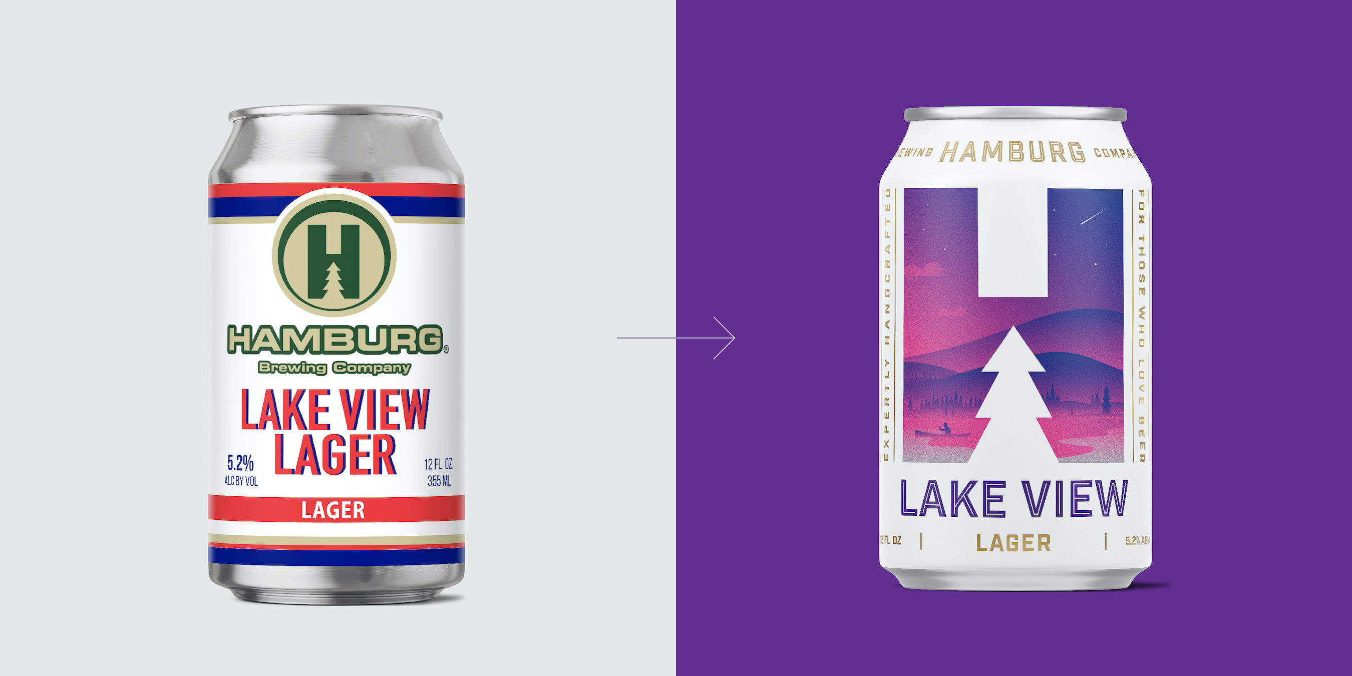
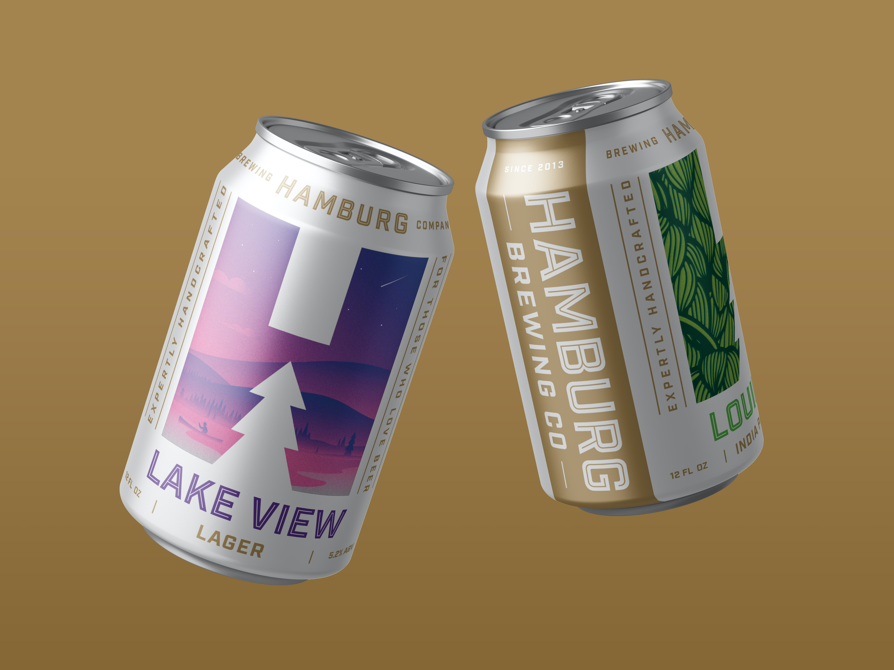
Works started out with taking a look at the branding and packaging for their flagship beer offerings. We went through several rounds playing with the overall hierarchy, colors and organization. One key point that Hamburg stressed in the process was that while they wanted a consistent brand look, they wanted to let their personality shine within each variety. The solution was to streamline and simplify their existing “H” mark to better be featured on the front of the can while creating a window into the personality and flavor profile of the beer. Using a white background and gold details for the main brand—paired with bright illustrations and bold variety typography— allowed the packaging to stand out on an increasingly busy craft beer shelf.
With our completion of the primary can packaging, we wanted to extend it’s simplicity and clarity to the secondary paperboard packaging. Hamburg’s flagship offerings are sold in 6 packs, and in the chaotic craft beer aisles of many retail stores these 6 packs can be shelved in many orientations. Works was careful to create an easily shoppable experience on all six sides of the package, while prominently displaying the fun illustrations that make every variety unique.
CREDIT
- Agency/Creative: Works Design Group
- Article Title: Hamburg Brewing Company Branding and Packaging
- Organisation/Entity: Agency
- Project Type: Packaging
- Project Status: Published
- Agency/Creative Country: United States
- Agency/Creative City: Pennsauken
- Market Region: North America
- Project Deliverables: Brand Design, Brand Redesign, Graphic Design, Packaging Design
- Format: Can
- Industry: Food/Beverage
- Keywords: Beer
-
Credits:
Art Director: Chris Burton


